Quantcast
Channel: Studies from the Cato Institute
Viewing all 298 articles
Browse latest View live

The Problem with the Light Footprint: Shifting Tactics in Lieu of Strategy

$
0
0

Brad Stapleton

Executive Summary

In the wake of the wars in Iraq and Afghanistan, President Barack Obama has sought to avoid becoming embroiled in another conventional ground war. To minimize that risk, he has adopted a “light footprint” approach to military intervention: employing standoff strike capabilities and special operations forces, often in support of indigenous ground forces. That approach essentially represents a tactical shift. The United States has continued to attempt to defeat terrorism and promote democratization abroad with military force. Yet those strategic objectives are unlikely to be secured militarily—with either a heavy or light footprint.

The United States should therefore adopt a gradualist, nonmilitary strategy, which conceives of eradicating terrorism and promoting democratization throughout the world as very long-term objectives. Rather than attempting to defeat terrorism on the battlefield, the United States should focus on mitigating the risk of terrorist attacks through improved intelligence and law enforcement. And instead of catalyzing revolutionary democratization, the United States should encourage authoritarian states to introduce gradual liberal reforms—so that democratization is more likely to succeed when it does eventually occur.

Introduction

As the United States got bogged down in military quagmires in Iraq and Afghanistan, many observers anticipated that war-weariness or an Iraq/Afghanistan syndrome would inhibit U.S. foreign policy in subsequent years.1

Yet the U.S. intervention in Libya in 2011, as well as the intensifying campaign against the Islamic State, suggests that the wars in Iraq and Afghanistan have not significantly diminished the United States’ propensity to use military force. The lessons of Iraq and Afghanistan have merely prompted the adoption of what has come to be known as the light footprint. The Obama administration has sought to combat foreign security threats with standoff strike capabilities and small contingents of Special Operations Forces, often in support of indigenous ground troops, in lieu of major contingents of U.S. ground troops.

In employing the light footprint, however, the Obama administration has failed to present a clear strategy detailing how those military tools will accomplish the United States’ ultimate foreign policy goals. Unfortunately, that strategic deficit has obscured the inherent limitations of the light footprint. Although airstrikes and Special Forces raids may be useful for toppling dictators and decapitating terrorist hierarchies, they contribute little toward the realization of larger political objectives such as the eradication of radical Islamic terrorism or the democratization of the greater Middle East. Given those limitations, Washington should do more than simply tinker with the manner in which it employs military force.

The United States needs to devise a new strategy to combat terrorism and promote democracy throughout the Middle East. After more than a decade of war, it should be clear that those objectives are unlikely to be accomplished with military force. Rather than attempting to defeat terrorism abroad, the United States should therefore focus on improving intelligence and law enforcement capabilities to mitigate the threat of terrorist attacks at home. And rather than attempting to catalyze democratization with military force, the United States should pressure authoritarian regimes to introduce gradual liberal reforms—so that when those countries do eventually democratize, those transitions are more likely to endure. In short, the United States should adopt a less militaristic strategy.

To support these recommendations, I begin by providing an overview of the core elements of the light footprint, as well as the motivation for the Obama administration’s adoption of the approach. I then analyze the extent to which the light footprint represents a tactical, rather than a strategic, shift. Following discussion of the benefits and limitations of the light footprint, I conclude by detailing the merits of a gradualist, nonmilitary approach.

Obama’s Light Footprint

Upon entering the White House in 2009, President Obama appeared intent upon putting an end to America’s entanglement in foreign military conflicts. He had campaigned vigorously on a pledge to extricate U.S. forces from Iraq, promising, “when I am Commander-in-Chief, I will set a new goal on Day One: I will end this war.” Although he portrayed withdrawal from Iraq as a necessary precondition for refocusing on “the central front of the war against al Qaeda in Afghanistan and Pakistan,” Obama was clearly committed to ending that conflict as well.2 In his view, pulling out of Iraq would free up resources that would enable the United States to “finish the job in Afghanistan.”3

Moreover, the wars in Afghanistan and Iraq have made Obama extremely wary of embarking upon new foreign military adventures. Although he studiously avoided ruling out such eventualities, Obama promised to dispense his responsibilities as Commander-in-Chief with greater pragmatism than his predecessors. To his mind, “The lesson of Iraq is that when we are making decisions about matters as grave as war, we need a policy rooted in reason and facts, not ideology and politics.”4 Americans thus had good reason to anticipate that nearly a decade of war would soon be over.

To a surprising extent, however, Obama has struggled to resist the temptation to employ military force abroad. Following the start of the Syrian Civil War in 2011, the president did refrain from intervening in Syria in support of rebel efforts to topple Bashar al Assad. In March 2011, however, he authorized U.S. participation in a multinational military operation in Libya, which ultimately toppled Muammar el-Qaddafi. Before U.S. forces had completely withdrawn from either Iraq or Afghanistan, the United States was thus engaged in another war (although the administration preferred the euphemism “kinetic action”). Although U.S. forces wrapped up their mission in Libya in relatively short order, the administration was at it again two years later. On September 10, 2014, Obama announced that he had ordered “a systematic campaign of airstrikes” as part of a strategy to “degrade, and ultimately destroy, [The Islamic State].”5 All the while, the Obama administration has prosecuted an ongoing campaign in which unmanned aerial vehicles (drones) have been used to strike suspected terrorists in Pakistan, Yemen, and Somalia.

As noted above, Obama’s authorization of new military operations in Libya and Iraq/Syria suggests that war-weariness has not substantially diminished the United States’ willingness to use military force. The trials of more than a decade of war in Iraq and Afghanistan do, however, appear to have influenced how Obama has employed military force by encouraging the adoption of the light footprint—the use of standoff strike capabilities and small contingents of special forces, often in support of allied ground troops.

The defining characteristic of Obama’s light footprint is an extreme aversion to putting “boots on the ground.” Although he reluctantly authorized a military surge in Afghanistan in 2009, the president appears determined not to employ conventional ground troops in new military operations. He has understandably refused to categorically rule out such a possibility in order to preserve flexibility. But the president is clearly averse to authorizing any major ground combat operations. To some extent, that aversion is probably founded upon the widespread perception that Americans are war-weary, and consequently unwilling to sacrifice the lives of more American service members on foreign crusades.

Casualty-aversion is not, however, the only factor that has dissuaded Obama from dispatching ground troops abroad. It appears as though the bloody aftermath of the U.S. invasion of Iraq fostered a belief that “organic” solutions to foreign conflicts are necessary insofar as the presence of American troops naturally engenders anti-American resistance. On the campaign trail in 2008, for instance, Obama warned that actions such as the invasion of Iraq perversely “fan the flames of extremism and terrorism.”6 Nor was that simply campaign rhetoric. That consideration reinforced the administration’s determination not to deploy ground troops to Libya. During deliberations over intervention in Libya, for instance, Obama expressed concern that U.S. intervention could inflame the conflict. He was particularly wary of undermining the nascent Arab Spring by legitimizing the argument made by dictators, such as Qaddafi, that the protest movements sweeping across the region were part of a neo-imperial Western conspiracy to dominate the Middle East and North Africa.7 Even though Obama ultimately felt compelled to employ airpower in support of the Libyan rebels, the prospect of deploying ground troops consequently remained anathema. The administration was convinced that the Libyan revolution would be more likely to succeed if Americans were “not around on the ground, where [they] breed resentment.”8

Since Obama is loath to employ ground troops, his administration has emphasized the importance of building the military capacity of U.S. partners. In 2010, Defense Secretary Robert Gates asserted that dealing with “fractured or failing states” requires the United States to improve its proficiency in “helping other countries defend themselves or, if necessary, fight alongside U.S. forces by providing them with equipment, training, and other forms of security assistance.”9 In other words, the United States should do more to help other countries help themselves.

The United States’ efforts to build the capacity of Iraqi security forces have been a key element of the campaign against the Islamic State. The United States had continued to provide military support to Iraq following the withdrawal of U.S. forces at the end of 2012—primarily through foreign military sales and financing. Yet the rise of the Islamic State prompted the Obama administration to launch a much more intensive effort to train, advise, and assist the Iraqi military. Since December 2014, when Congress appropriated $1.6 billion for an Iraq Train and Equip Fund, the United States and its coalition partners have trained more than 20,000 Iraqi Security Force personnel. Obama has not limited U.S. security assistance to state partners, however. In 2014, the administration secured congressional approval of a program that aimed to train and equip 5,400 moderate rebels a year to combat the Islamic State in Syria.10 Although that program has proved an unmitigated failure, it highlights the fact that the administration has sought to circumscribe the U.S. role in foreign conflicts by delegating ground combat to indigenous forces—both state and nonstate.

Although Obama has encouraged U.S. partners to shoulder the burden of engaging in major ground combat, he has demonstrated an enduring willingness to support those forces with American air/naval power. During the first two weeks of the campaign to oust Qaddafi, U.S. pilots conducted 370 strike missions—roughly half the coalition total.11 Although the Obama administration made a point of subsequently relinquishing leadership of the mission to NATO allies, the United States continued to strike Qaddafi’s forces with Predator drones until rebel forces succeeded in toppling the regime. In the campaign to degrade and destroy the Islamic State, the Obama administration has employed standoff strike capabilities on an even greater scale. As of April 26, 2016, the United States had executed 11,876 strikes against Islamic State targets in Iraq and Syria—an average of about 19 per day.12

In addition to airpower, Obama has been willing to deploy small contingents of Special Forces in support of indigenous partners on the ground in Iraq and Syria. Toward the end of October 2015, for instance, the White House announced the deployment of dozens of Special Operations Forces to Syria. Although that announcement created quite a stir in the media, it essentially constituted a public acknowledgement of U.S. Special Operations Forces’ long-standing involvement in the campaign against the Islamic State. Not only have those forces provided advice and assistance to rebel forces; they have also conducted occasional unilateral raids against Islamic State targets in both Iraq and Syria.13 In essence, the administration has thus adopted a division of labor in which the United States employs standoff strike capabilities in support of regional proxy forces, but remains prepared to employ Special Forces discreetly to eliminate high-value targets.

Such a division of labor is by no means a necessary condition for U.S. military action, however. Obama has shown that he remains prepared to launch standoff strikes independently of regional allies. In his first two years in office, he authorized a dramatic increase in CIA drone strikes against suspected terrorists in Pakistan. Only about 50 such attacks had been launched during the entire tenure of George W. Bush. Obama, in contrast, authorized over 350 drone strikes during his first term.14 Although the frequency of such strikes in Pakistan has gradually diminished since its peak in 2010, the Obama administration has begun striking targets farther afield, in places such as Yemen and Somalia. Drone strikes have thus become a key element of the administration’s counterterrorism strategy.

The Strategic Deficit

It is crucial to recognize that the light footprint is not a strategy. Standoff strike capabilities, Special Operations Forces, and allied ground troops are military tools. Strategy involves conceptualizing how such tools can be employed to achieve specific objectives. Since the tools appropriate for achieving one objective may be totally inappropriate for achieving others, serious thinking about causation is vital. The strategist must estimate: if I employ these capabilities, in this way, given these circumstances, I will achieve this objective. As military theorist Carl von Clausewitz put it, “the aim will determine the series of actions intended to achieve it.”15 The light footprint should therefore be employed as a means to particular ends.

To a surprising degree, the Obama administration has attempted to achieve the same strategic objectives as the George W. Bush administration—in particular, the preemption of terrorist threats and the promotion of liberal democracy in the Middle East—with less obtrusive military force. The Obama administration’s use of the light footprint consequently amounts to little more than a tactical shift.

To be fair, military force has never been the sole element of U.S. counterterrorism strategy. Following the September 11, 2001, terrorist attacks President Bush adopted a comprehensive strategy in which the United States sought to employ financial instruments to cut off terrorist financing, law enforcement and legal measures to arrest and convict suspected terrorists, and public diplomacy/media to undermine terrorist recruiting and propaganda. Nevertheless, military force has been central to U.S. strategy toward the greater Middle East. In launching a global war on terrorism, Bush sought to eradicate the threat posed by radical Islam largely by conducting preemptive attacks against both known and potential terrorists as well as their state sponsors. By overthrowing the authoritarian regimes in Afghanistan and Iraq, the Bush administration sought to foster the construction of democratic governments that would help undermine the supposed root causes of terrorism.

In response to ongoing turmoil in the greater Middle East, the Obama administration essentially defaulted to a revised version of the Bush strategy. Although Obama has conscientiously refrained from speaking of a war on terrorism, he has continued to employ military force as a core element of U.S. counterterrorism strategy. And although Obama deserves credit for long resisting substantial pressure to intervene in the Syrian Civil War, he was unable to resist the temptation to orchestrate regime change in Libya. As detailed in the previous section, Obama has distinguished himself from his predecessor primarily in the manner in which he has employed military force—not whether or not to do so.

Unfortunately, the Obama administration’s focus on employing a light footprint has created a situation in which the means are driving the ends. For instance, in announcing the beginning of the U.S. campaign against the Islamic State in September 2014, Obama declared that the administration’s objective was to “degrade and ultimately destroy ISIL.”16 Although that remains the stated objective, it is clear that the limitations of the light footprint have since prompted the administration to scale back its goals. Since indigenous ground forces have proved incapable of destroying the Islamic State (even with the support of U.S. airstrikes), Obama appears to have settled for merely degrading the threat.

A thorough strategic reassessment is consequently in order. It is imperative to evaluate how employing the light footprint (or military force more generally) is likely to advance various U.S. objectives—and just as importantly, how it may militate against the accomplishment of those objectives.

The Few Benefits of the Light Footprint

There are certainly virtues to Obama’s light footprint. First and foremost, the approach has kept Americans out of harm’s way. During the seven-month allied campaign in Libya, the United States did not suffer a single fatality. As of May 4, 2016, only 16 U.S. service members have died in the course of the campaign against the Islamic State—and only three of those were killed in action.17 By almost any standard, the two conflicts have imposed an extremely small human cost on the United States.

From the perspective of the Obama administration, the avoidance of U.S. casualties has probably forestalled opposition to the persistent use of U.S. military force abroad. Neither the U.S. intervention in Libya nor that against the Islamic State has engendered much public opposition. According to polling data compiled by the Pew Research Center, a plurality in the range of 45 to 50 percent thought it was the right decision “to conduct military air strikes in Libya.”18 Throughout most of 2015, a majority of Americans also approved of the U.S. military campaign against Islamic militants in Iraq and Syria—even though most felt the campaign was not going well.19 In fact, Obama has received greater criticism for not striking the Islamic State more forcefully than for intervening in the first place.

The Obama administration’s selective use of airstrikes has also accomplished a number of tactical objectives. The allied air campaign in Libya forestalled Qaddafi’s forces’ impending assault on Benghazi without much difficulty. Although there is some debate whether U.S. intervention prevented an impending massacre, continuing offensive air strikes were indispensable in enabling the Libyan rebels to mount an offensive ground campaign that ultimately toppled the Qaddafi regime.20 In only 215 days, the United States was able to remove a brutal dictator at relatively little cost in blood or treasure. At the time, Obama appeared to have good reason to extol that “Without putting a single U.S. servicemember on the ground, we achieved our objectives.”21

The campaign to degrade and destroy the Islamic State has already dragged on much longer than the Libya operation, and it has certainly engendered much more criticism. Yet even though the Islamic State has been able to consolidate its control in a number of Sunni areas within Iraq and Syria, U.S. intervention has helped to thwart substantial further territorial expansion. In fact, coalition forces have even succeeded in driving the Islamic State from most of the Kurdish-majority regions in northern Iraq and Syria. Although U.S. air strikes in support of indigenous ground forces have, to this point, proved insufficient to ultimately destroy the Islamic State, they have succeeded in containing it.

Likewise, the Obama administration’s ongoing drone campaign has probably succeeded in disrupting the operations of numerous terrorist organizations. The strikes have decimated the hierarchy of al Qaeda and its affiliates. According to data compiled by New America, drone strikes in Pakistan and Yemen have killed somewhere in the range of 2,649 to 4,061 militants, including more than 100 senior leaders.22 Moreover, the deterrent threat of additional drone attacks has stymied the reconstitution of terrorist training camps in areas such as Pakistan’s Waziristan region, where government control is weak—the types of camps that al Qaeda maintained with relative impunity prior to the September 11 terrorist attacks.23

The Limits of the Light Footprint

Although the Obama administration’s light footprint has yielded some tactical dividends, the approach entails inherent limitations. Employing standoff strike capabilities, often in support of indigenous ground forces, may be a viable means of preempting and containing terrorist threats, and even overthrowing repugnant dictators. But if the United States’ ultimate goals are to promote the spread of liberal democracy and stability in the greater Middle East, and in so doing to eradicate the root causes of terrorism, those same tools are likely to be of little use.

One of the primary problems with the light footprint is that the United States’ objectives and priorities invariably diverge from those of potential indigenous allies. In Syria, for instance, Obama explained quite clearly that U.S. forces would degrade and ultimately destroy the Islamic State primarily by executing airstrikes in support of indigenous ground forces, including both Iraqi security forces and Syrian rebels.24 Yet the Syrian opposition, which Obama characterized as “the best counterweight to extremists like ISIL,” appears to be much more interested in toppling Assad than in combating the Islamic State. That is the primary reason the administration’s program to train and equip Syrian fighters proved such an abysmal failure.25 Most Syrian rebels were simply unwilling to accede to the administration’s insistence that recruits pledge to battle only the Islamic State, not Assad. In such circumstances, accomplishing U.S. strategic objectives will be extremely difficult, insofar as success hinges on the contributions of allies who are uninterested in playing the role that Washington casts them in.

Even when indigenous forces’ goals do coincide with those of the United States, they are unlikely to be able to develop the capacity to establish and preserve post-conflict stability. That is evident from the U.S. security assistance programs in Iraq and Afghanistan. From 2004 to 2014, the United States devoted more than $85 billion to training and equipping security forces in those two countries—a level of commitment that is unlikely to be matched in the near future.26 In spite of such massive assistance, the Iraqi and Afghan security forces have remained incapable of preserving peace and stability in the territory under their nominal control. In 2014, the Iraqi security forces collapsed in the face of the Islamic State onslaught through Anbar and Nineveh provinces. Although government forces were able to recapture Ramadi at the close of 2015, they had been unable, as of May 2016, to dislodge Islamic State fighters from strongholds in Mosul and Fallujah. Likewise, the Afghan security forces have struggled to combat the resurgence of the Taliban. That became painfully obvious in October 2015, when several hundred Taliban fighters overwhelmed a 7,000-man government security force and occupied Kunduz, Afghanistan’s sixth largest city, for two weeks—a development that prompted Obama to announce that he will keep a minimum of 5,500 U.S. troops in Afghanistan through the end of his presidency.27 The reality is that even the most ambitious training programs will rarely enable the security forces at the disposal of newly established governments to impose stability in post-conflict environments characterized by bitter ethno-religious cleavages.

Since many states in the Middle East and North Africa will likely continue to experience substantial difficulty exercising sovereignty and projecting security throughout the territory under their nominal control, it is certainly tempting for the United States to launch airstrikes (especially using drones) to deny terrorists safe haven in those territories. If other states are either unwilling or unable to do the job, we will. As noted above, the Obama administration’s drone campaign appears to have succeeded in decimating the al Qaeda hierarchy and disrupting the operation of terrorist training camps. Unfortunately, terrorist leaders are replaceable. Attempts to decapitate terrorist organizations can disrupt operations, but they are unlikely to cripple such groups. In some cases, eliminating one terrorist leader might perversely empower a new leader who is more radical, influential, or competent.28

Although airstrikes may be useful for disrupting the operation of terrorist organizations, they cannot mitigate the root causes of terrorism. As numerous critics have suggested, the U.S. drone program could actually undermine the campaign to eradicate terrorism by engendering anti-American resentment.29 It is impossible to assess the extent to which drone strikes may be creating new terrorists. But there is no denying that the United States has a serious image problem in many of the countries that spawn anti-American terrorists. According to the 2014 Pew Global Attitudes Survey, only small minorities in countries throughout the greater Middle East view the United States favorably: 10 percent in Egypt, 12 percent in Jordan, 41 percent in Lebanon, 14 percent in Pakistan, and 19 percent in Turkey. Moreover, large majorities of respondents in those countries disapprove of the ongoing U.S. drone campaign: 87 percent in Egypt, 90 percent in Jordan, 71 percent in Lebanon, 66 percent in Pakistan, and 83 percent in Turkey.30 As some observers have noted, opposition to the U.S. drone campaign may not be as widespread as those figures suggest, and the ongoing drone campaign is certainly not the original source of anti-Americanism throughout the region.31 Nevertheless, the United States will probably be unable to repair its image throughout the Muslim world as long as the drone strikes continue.

Moreover, as troubling as simmering anti-Americanism throughout the greater Middle East may be, the impact of the drone campaign on Muslims living in the West should not be overlooked. Within Muslim communities that already suffer socioeconomic marginalization (particularly within Europe), U.S. drone strikes play into the narrative that the United States and its European allies are at war with Islam. In so doing, the drone campaign has probably contributed to the radicalization of disaffected Muslims living throughout the West. So although drone strikes can successfully disrupt the operations of terrorist organizations abroad, they may perversely stimulate the growth of home-grown terrorists.

The Case for a Gradualist (Nonmilitary) Strategy

The limitations of the light footprint suggest that the United States needs to do more than simply alter tactics in pursuit of the same objectives.32 In the wake of the wars in Iraq and Afghanistan, and amidst ongoing strife throughout the greater Middle East, it is imperative to rethink strategy, including both ends and means. After 15 years of warfare, it is abundantly clear that military force can do little to defeat terrorism or catalyze democratization. The United States should therefore adopt a gradualist nonmilitary strategy, which conceives of the eradication of terrorism and the spread of liberal democracy as very long-term goals. Under such a strategy, military force should be used much more sparingly to achieve limited objectives in extraordinary circumstances—such as the operation to kill Osama bin Laden.

Many policymakers do seem to recognize that defeating terrorism is a long-term challenge. As Obama has asserted: “the task of rejecting sectarianism and extremism is a generational task.”33 The more important point, though, which is often overlooked, is that defeating terrorism cannot be accomplished militarily—with either a heavy or light footprint.34 Since the global war on terrorism is an ideological struggle, it can only be won by undermining the appeal of radical Islam—in essence, by starving terrorist organizations of foot soldiers willing to die for the cause. To the extent that U.S. military strikes against terrorist targets in the greater Middle East seemingly confirm the narrative of radical Islamists, as detailed in the previous section, they are therefore counterproductive to the ultimate eradication of Islamic terrorism.

Since the ideology of Islamic extremism cannot be defeated militarily, it is tempting to focus instead on eradicating the root causes of terrorism. Unfortunately, we still do not possess a strong understanding of what those root causes are. Politicians and pundits have pointed to factors such as poverty, poor education, social marginalization, and political repression. But a growing body of research has failed to generate any consensus that any of those factors do, in fact, drive terrorism.35 That is not to say that the United States should not promote economic development, political liberalization, or educational reform throughout the greater Middle East—or, for that matter, the socioeconomic assimilation of Muslim immigrants living in Western countries. Those are worthy endeavors, which deserve the United States’ attention. But we should temper our expectations that their gradual accomplishment will do much to diminish the threat of terrorism in the near term.

Rather than trying to eradicate terrorism, the United States should focus on mitigating the threat of terrorist attacks through intelligence and law enforcement. Those are domains in which the United States has had a fair amount of success. Since September 11, 2001, law enforcement is known to have foiled 53 potential attacks against U.S. targets (most of which were embryonic, half-baked plots).36 At most, Islamic terrorists have only committed nine successful terrorist attacks within the United States over the past 14 years; those attacks resulted in 45 deaths.37 In recent years, European countries have suffered much more devastating attacks than the United States: 191 people died in the 2004 Madrid train bombings, 56 died in the 2005 London bombings, 137 died in the November 2015 Paris attacks, and at least 35 died in the March 2016 attacks in Brussels. Unfortunately, those dramatic attacks have obscured the fact that U.S. law enforcement and intelligence agencies have been quite effective—thanks, in part, to the incompetence of most would-be terrorists. Because people instinctively pay more attention to the few sensational attacks that do occur than those that are thwarted or never materialize, most Americans overestimate the threat posed by Islamic terrorists.38

Despite their successes, law enforcement and intelligence agencies certainly have room for improvement. Better cooperation amongst security services is clearly necessary. A number of the perpetrators of successful attacks were on different countries’ radars, but evaded apprehension due to poor intelligence sharing (both domestically and internationally). Prior to the 2013 Boston Marathon bombing, for instance, information supplied by Russia’s Federal Security Service (FSB) prompted the United States to place Tamerlan Tzarnaev on its terrorism watch list. Yet the FSB failed to respond to FBI requests for additional intelligence, and the FBI, in turn, failed to share its intelligence with local law enforcement in Boston. The result was that Tzarnaev avoided greater scrutiny.39 Likewise, Abdelhamid Abaaoud, the mastermind of the November 2015 Paris attacks, was on a Belgian watch list, having been suspected of involvement in four previous plots that had been foiled. Because of poor intelligence sharing amongst European agencies, however, Abaaoud was able to stay a step ahead of law enforcement in traveling back and forth between Europe and Syria.40 Such intelligence failures can never be completely eliminated. Improving domestic and international counterterrorism coordination can, however, further reduce the threat of terrorism at little cost. Rather than throwing more money and resources at the problem, improved cooperation will enable the United States and its allies to get more bang for the buck from their existing programs.

Much like defeating terrorism, the institutionalization of liberal democracy throughout the globe is a long-term challenge—a challenge that has become one of the United States’ primary foreign policy objectives in the post–Cold War era. In 1995, the Clinton administration’s first National Security Strategy asserted that “All of America’s strategic interests—from promoting prosperity at home to checking global threats abroad before they threaten our territory—are served by enlarging the community of democratic and free market nations.”41 Since then, the Bush and Obama administrations have both embraced that same objective. In his second inaugural address in 2005, Bush affirmed that “it is the policy of the United States to seek and support the growth of democratic movements and institutions in every nation and culture, with the ultimate goal of ending tyranny in our world.”42 Six years later, following the eruption of the Arab Spring, Obama echoed those sentiments, pledging that “it will be the policy of the United States to promote reform across the region, and to support transitions to democracy.”43

There is nothing inherently wrong with highlighting the spread of democracy as a major foreign policy objective. That goal is consistent with the norms and values on which the American political system is founded. Democratization would almost surely improve the lives of millions of people living under authoritarianism around the world by endowing them with civil liberties and political rights that we in the West often take for granted. In the long run, the spread of democracy could also potentially produce a more peaceful world. If democratic peace theory holds, an increase in the number of democratic states should reduce the incidence of interstate conflict. Given those potential benefits, democratization is an entirely worthy foreign policy goal.

The problem is that American leaders consistently fail to recognize (or accept) the limits on their ability to accomplish that objective—particularly limits associated with the use of military force. They frequently pay lip service to such limits, insisting “this is not primarily the task of arms,”44 or “we will be wary of efforts to impose democracy through military force.”45 Too often, however, U.S. actions defy those protestations, as U.S. policy toward Afghanistan, Iraq, and Libya demonstrates. It is therefore high time for policymakers to practice the restraint that they preach.

After more than a decade of war, the United States should desist from promoting violent regime change in highly fractionalized states. The simple fact is that foreign-imposed regime change rarely catalyzes sustainable democratization in poor, ethnically diverse societies—in other words, the type of country in which the United States is most tempted to intervene.46 In fact, helping to install new leaders in such countries is likely to increase the risk of civil war, regardless of whether American troops are on the ground.47 Rather than merely reducing the size of the U.S. footprint, while remaining committed to the same goal, the United States should stop promoting revolutionary democratization altogether and instead focus on encouraging evolutionary change.

One of the primary reasons that democratization fails (at least at first) in so many countries is that authoritarian regimes typically suppress the development of civil society, which is a foundational element of any successful democracy. In Libya, for instance, Qaddafi had stifled the development of any truly national institutions, including the military, which might have posed a threat to his authority. After his downfall, new leaders consequently had to build a functional state almost from scratch. Having failed to develop any collective Libyan identity, it is unsurprising that rival factions have been unable to work cooperatively on that endeavor. In essence, the lack of any democratic experience renders the consolidation of democracy extremely difficult.

Rather than orchestrating the overthrow of authoritarian regimes, the United States should focus on encouraging, cajoling, and pressuring such regimes to gradually introduce more democratic norms and institutions—most notably, the rule of law, civil liberties, and nongovernmental/civic organizations. By encouraging the development of relatively vibrant civil society, the United States can potentially increase the probability that democracy takes hold when authoritarian states do attempt to transition to democracy. In theory, refocusing on that objective should be quite feasible, since the United States already does much to promote political liberalization throughout the world—for example, discouraging authoritarian rule through the imposition of economic and political sanctions, offering trade incentives to encourage political liberalization, funneling democracy aid through nongovernmental organizations, and financing election monitoring.48

The recent elections in Burma suggest that such gradual pressure can work. For the past five decades, a military junta has exercised authoritarian control over every sphere of Burmese society. Following the junta’s suppression of popular protests in 1988, the United States imposed increasingly harsh economic and political sanctions in response to recurring violations of Burmese citizens’ political and human rights. For years, those sanctions appeared to have little effect. Over the past five years, however, the Burmese regime has permitted a number of important democratic reforms. In 2010, Aung San Suu Kyi, the head of Burma’s National League for Democracy (NLD), was freed from house arrest. Under the leadership of Thein Sein, a former general who assumed power in 2011, the Burmese regime freed most political prisoners, relaxed media censorship, and conducted a series of relatively free parliamentary elections. As a result of those reforms, the NLD was able to secure a parliamentary majority in last November’s parliamentary elections—in so doing, earning the right to form a new government. Burma’s democratic transition is certainly imperfect and reversible. The military will continue to exercise substantial control because of provisions in the constitution it passed through a rigged referendum in 2008. Moreover, low-level ethnic violence still percolates within Burma’s border territories. Nevertheless, recent developments suggest that sustained pressure (both domestic and international) can foster gradual, relatively peaceful democratization.49

Burma’s gradual democratization will surely not be replicable everywhere. Previous research has found that military dictatorships are typically more willing than other types of authoritarian regimes to relinquish power voluntarily.50 Particularly in personalist dictatorships, authoritarian regimes do things like censor the media, ban nongovernmental political organizations, and imprison political dissidents in order to suppress potential threats to their authority. In order to build a strong support base, many dictators also bestow a range of lucrative political favors upon narrow sociopolitical groups. Insofar as they view their political survival as dependent upon such policies, international pressure is unlikely to prompt authoritarian rulers to abolish institutional corruption or dramatically relax restrictions on citizens’ personal liberties.

Policymakers should therefore accept that the United States’ ability to catalyze gradual democratization is extremely limited, and however hard the United States might try to encourage gradual democratization, many authoritarian regimes will end with a revolutionary bang. In those cases, the United States should resist the temptation to play kingmaker because the individuals and groups that Washington might like to see empowered will often be incapable of brokering durable political settlements in post-revolutionary societies. Establishing stable, legitimate new governments is something that societies must accomplish themselves.51 When the dust settles, the United States can, and should, use all the leverage at its disposal, from economic sanctions to democracy aid, to encourage new regimes to institutionalize democratic reforms—but U.S. policymakers should recognize that democratization is an evolutionary process.

Conclusion

In retrospect, the Bush administration’s interventions in Afghanistan and Iraq were clearly flawed, if not completely ill-advised. To many Americans, the primary benefit of the two quagmires was the development of an Iraq/Afghanistan syndrome. They anticipated that “war-weariness” or the lessons of Iraq and Afghanistan would induce greater restraint in U.S. foreign policy. Yet that expectation is proving to be somewhat unjustified. Like his predecessor, Obama has continued to employ military force to effect regime change and preempt terrorist threats, but he has sought to circumscribe the risks of military operations by employing a light footprint—the use of standoff strike capabilities and small contingents of Special Operations Forces in support of indigenous ground forces. The conflicts in Iraq and Afghanistan have thus influenced U.S. decisionmaking on how to use military force to a much greater extent than whether to do so.

Unfortunately, the light footprint merely constitutes a tactical shift. The Obama administration has attempted to accomplish the same objectives—democratization in the greater Middle East and the eradication of Islamic terrorism—with slightly different military tools. Yet airstrikes and Special Forces raids are no more likely to accomplish those goals than were the large-scale invasions of Afghanistan and Iraq. Limited military operations can be useful for disrupting terrorist organizations and overthrowing authoritarian regimes. They are of little use, however, in promoting the development of stable democracies or the eradication of the root causes of terrorism. In fact, the ongoing use of military force may perversely spawn the creation of new terrorists by confirming the narrative that the West is at war with Islam. The turmoil that has followed the U.S. interventions in Libya and Iraq/Syria thus highlights the need for a new strategy, not just different military tactics.

It is high time to abandon the crusade to defeat terrorism and foster democratization with military force. Rather than encouraging revolutionary democratization, the United States should focus on pressuring and enticing dictatorial regimes to introduce gradual liberal reforms so that when those countries do eventually transition from authoritarianism democracy is more likely to flourish. And because neither democratization nor military force is likely to eliminate the threat of Islamic terrorism, Washington should focus on mitigating that threat through intelligence and law enforcement—areas in which the United States has been relatively successful. The indeterminacy of such a gradualist approach may be unappealing to many Americans. But after more than a decade of war, it is time to recognize the inherent limits of U.S. power.

Notes

1. John Mueller, “The Iraq Syndrome,” Foreign Affairs 84, no. 6 (2005): 44–54.

2. Barack Obama, “The World beyond Iraq,” speech delivered in Fayetteville, North Carolina, on March 19, 2008.

3. Barack Obama, “My Plan for Iraq,” New York Times, July 14, 2008.

4. Obama, “The World beyond Iraq.”

5. Barack Obama, “Statement by the President on ISIL,” September 10, 2014, https://www.whitehouse.gov/the-press-office/2014/09/10/statement-president-isil-1. The Obama administration has preferred the acronym ISIL for the Islamic State. Other popular abbreviations or terms include ISIS, or Daesh, from the Arabic.

6. Barack Obama, “Obama’s Speech, ‘Lessons on Iraq’,” Council on Foreign Relations, October 12, 2007, http://www.cfr.org/iraq/obamas-speech-lessons-iraq/p14662.

7. Michael Hastings, “Inside Obama’s War Room,” Rolling Stone, October 27, 2011; Mark Landler and Thom Shanker, “U.S. Readies Military Options on Libya,” New York Times, February 28, 2011.

8. David E. Sanger, Confront and Conceal: Obama’s Secret Wars and Surprising Use of American Power (New York: Crown, 2012), pp. 346, 355.

9. Robert M. Gates, “Helping Others Defend Themselves: The Future of U.S. Security Assistance,” Foreign Affairs 89, no. 3 (May/June 2010): 2–6.

10. Christopher M. Blanchard and Amy Belasco, “Train and Equip Program for Syria: Authorization, Funding, and Issues for Congress,” CRS Report R43727, June 9, 2015.

11. Deborah C. Kidwell, “The U.S. Experience: Operational,” in Precision and Purpose: Airpower in the Libyan Civil War, ed. Karl P. Mueller (Santa Monica: RAND Corporation, 2015), p. 135.

12. “Operation Inherent Resolve: Targeted Operations against ISIL Terrorists,” U.S. Department of Defense, http://www.defense.gov/News/Special-Reports/0814_Inherent-Resolve.

13. “Department of Defense Background Briefing on Enhancing Counter-ISIL Operations,” October 30, 2015, http://www.defense.gov/News/News-Transcripts/Transcript-View/Article/626814/department-of-defense-background-briefing-on-enhancing-counter-isil-operations.

14. Detailed data on U.S. drone strikes can be accessed at the Bureau of Investigative Journalism, “Get the Data: Drone Wars,” https://www.thebureauinvestigates.com/category/projects/drones/drones-graphs/.

15. Carl von Clausewitz, On War, trans. and ed. Michael Howard and Peter Paret (Princeton: Princeton University Press, 1976), p. 177.

16. Barack Obama, “Address to the Nation on United States Strategy to Combat the Islamic State of Iraq and the Levant Terrorist Organization (ISIL),” September 10, 2014.

17. The Department of Defense reports casualty figures at http://www.defense.gov/casualty.pdf.

18. The Pew Research Center for the People and the Press, “Libya: Steady Views, Declining Interest,” September 8, 2011, http://www.people-press.org/files/legacy-pdf/09-08-11%20Libya%20Release.pdf.

19. The Pew Research Center for the People and the Press, “A Year Later, U.S. Campaign against ISIS Garners Support, Raises Concerns,” July 22, 2015, http://www.people-press.org/files/2015/07/07-22-2015-ISIS-release.pdf.

20. For the argument that Qaddafi would not have committed a massacre if the U.S. had not intervened, see Alan J. Kuperman, “Obama’s Libya Debacle: How a Well-Meaning Intervention Ended in Failure,” Foreign Affairs 94, no. 2 (March/April 2015): 66–77.

21. Barack Obama, “Remarks on the Death of Former Leader Muammar Abu Minyar al-Qadhafi of Libya,” October 20, 2011.

22. International Security Data Site, The International Security Program, New America, http://securitydata.newamerica.net/. .

23. Daniel Byman, “Why Drones Work: The Case for Washington’s Weapon of Choice,” Foreign Affairs 92, no. 4 (July/August 2013): 32–43.

24. Barack Obama, “Address to the Nation on the United States Strategy to Combat the Islamic Star of Iraq and the Levant Terrorist Organization (ISIL),” September 10, 2014.

25. In testimony to the Senate Armed Services Committee on July 7, 2015, Secretary of Defense Ashton Carter indicated that the $500 million program had only successfully vetted 60 Syrian fighters for training. U.S. Congress, Senate, Committee on Armed Services, “Counter ISIL (Islamic State of Iraq and the Levant) Strategy: Hearing before the Armed Services Committee,” 114th Cong., 1st sess., July 17, 2015, http://www.armed-services.senate.gov/imo/media/doc/15-81%20-%2010-27-15.pdf.

26. Amy Belasco, “The Cost of Iraq, Afghanistan, and other Global War on Terror Operations since 9/11,” Congressional Research Service Report RL33110, December 8, 2014.

27. Rod Norland, “Taliban End Takeover of City after 15 Days,” New York Times, October 14, 2015, A6.

28. For different perspectives on the efficacy of decapitation as a counterterrorism strategy, see Jenna Jordan, “When Heads Roll: Assessing the Effectiveness of Leadership Decapitation,” Security Studies 18, no. 4 (2009): 719–55; Bryan C. Price, “Targeting Top Terrorists: How Leadership Decapitation Contributes to Counterterrorism,” International Security 36, no. 4 (Spring 2012): 9–46; Stephanie Carvin, “The Trouble with Targeted Killing,” Security Studies 21, no. 3 (2012): 529–55; and Jenna Jordan, “Attacking the Leader, Missing the Mark: Why Terrorist Groups Survive Decapitation Strikes,” International Security 38, no. 4 (Spring 2014): 7–38.

29. David Kilcullen and Andrew McDonald Exum, “Death from Above, Outrage down Below,” New York Times, May 17, 2009, A13; Audrey Kurth Cronin, “Why Drones Fail: When Tactics Drive Strategy,” Foreign Affairs 92, no. 4 (May/June 2013): 44–54; Micah Zenko, “Reforming U.S. Drone Strike Policies,” Council on Foreign Relations Special Report no. 65 (January 2013); and Paul R. Pillar and Christopher A. Preble, “Don’t You Know There’s a War On? Assessing the Military’s Role in Counterterrorism,” in Terrorizing Ourselves: Why U.S. Counterterrorism Policy IsFailing and How to Fix It, eds. Benjamin H. Friedman, Jim Harper, and Christopher A. Preble (Washington: Cato Institute, 2010), pp. 72–73.

30. Pew Research Center, “Global Opposition to U.S. Surveillance and Drones, but Limited Harm to America’s Image,” July 2014, http://www.pewglobal.org/files/2014/07/2014-07-14-Balance-of-Power.pdf.

31. C. Christine Fair, Karl Kaltenthaler, and William J. Miller, “Pakistani Opposition to American Drone Strikes,” Political Science Quarterly 129, no. 1 (2014): 3, 18.

32. On this point, see Benjamin H. Friedman, Harvey M. Sapolsky, and Christopher Preble, “Learning the Right Lessons from Iraq,” Cato Institute Policy Analysis no. 610, February 13, 2008.

33. Barack Obama, “Address to the United Nations General Assembly,” September 24, 2014.

34. Seth G. Jones and Martin C. Libicki, How Terrorist Groups End: Lessons for Countering al Qa’ida (Santa Monica: RAND Corporation, 2008).

35. A brief review of research on the root causes of terrorism can be found in Mia Bloom, “Are There Root Causes for Terrorist Support? Revisiting the Debate on Poverty, Education, and Terrorism,” in Terrorizing Ourselves: Why U.S. Counterterrorism Policy Is Failing and How to Fix It, pp. 45–59.

36. See Appendix A in John Mueller and Mark G. Stewart, Chasing Ghosts: The Policing of Terrorism (New York: Oxford University Press, 2016), pp. 267–73.

37. These figures are drawn from the New America Foundation’s International Security Data Site at http://securitydata.newamerica.net/extremists/deadly-attacks.html.

38. This tendency to overestimate the threat of terrorism is an example of what Daniel Kahneman and Amos Tversky called the “availability heuristic.” See Amos Tversky and Daniel Kahneman, “Availability: A Heuristic for Judging Frequency and Probability,” Cognitive Psychology 5, no. 2 (1973): 207–32; and Cass R. Sunstein, “Terrorism and Probability Neglect,” Journal of Risk and Uncertainty 26, nos. 2–3 (2003): 121–36.

39. Inspectors General of the Intelligence Community, Central Intelligence Agency, Department of Justice, and Department of Homeland Security, “Unclassified Summary of Information Handling and Sharing Prior to the April 15, 2013, Boston Marathon Bombings,” April 10, 2014, at https://oig.justice.gov/reports/2014/s1404.pdf.

40. Rukmini Callimachi, Katrin Bennhold, and Laure Fourquet, “How the Paris Attackers Honed Their Assault through Trial and Error,” New York Times, November 30, 2015.

41. A National Security Strategy of Engagement and Enlargement (Washington: The White House, 1995), p. 22.

42. George W. Bush, “Inaugural Address,” January 20, 2005, http://www.presidency.ucsb.edu/ws/index.php?pid=58745.

43. Barack Obama, “Remarks at the Department of State,” May 19, 2011, http://www.presidency.ucsb.edu/ws/index.php?pid=90397.

44. George W. Bush, “Inaugural Address.”

45. Barack Obama, “Remarks to the U.N. General Assembly,” September 24, 2013, http://www.presidency.ucsb.edu/ws/index.php?pid=104276.

46. Alexander B. Downes and Jonathan Monten, “Forced to Be Free? Why Foreign-Imposed Regime Change Rarely Leads to Democratization,” International Security 37, no. 4 (Spring 2013): 90–131.

47. Goran Peic and Dan Reiter, “Foreign-Imposed Regime Change, State Power, and Civil War Onset, 1920–2004,” British Journal of Political Science 41, no. 3 (2011): 453–75.

48. A thorough analysis of the concept of democracy promotion can be found in Jeff Bridoux and Milja Kurki, Democracy Promotion: A Critical Introduction (New York: Routledge, 2014).

49. For more detail on Burma’s political transition, see Priscilla Clapp, “Myanmar: Anatomy of a Political Transition,” United States Institute of Peace Special Report no. 369 (April 2015).

50. Barbara Geddes, “What Do We Know about Democratization after Twenty Years?” Annual Review of Political Science 2, no. 1 (1999): 115–44.

51. For a provocative argument along these lines, see Edward N. Luttwak, “Give War a Chance,” Foreign Affairs 78, no. 4 (July/August 1999): 36–44.

Brad Stapleton is a Visiting Research Fellow in Defense and Foreign Policy Studies at the Cato Institute.

25 Years of Reforms in Ex-Communist Countries: Fast and Extensive Reforms Led to Higher Growth and More Political Freedom

$
0
0

Oleh Havrylyshyn, Xiaofan Meng, and Marian L. Tupy

Executive Summary

The transition from socialism to the market economy produced a divide between those who advocated rapid, or “big-bang” reforms, and those who advocated a gradual approach. More than 25 years have passed since the fall of the Berlin Wall in 1989, providing ample empirical data to test those approaches. Evidence shows that early and rapid reformers by far outperformed gradual reformers, both on economic measures such as GDP per capita and on social indicators such as the United Nations Human Development Index.

A key argument for gradualism was that too-rapid reforms would cause great social pain. In reality, rapid reformers experienced shorter recessions and recovered much earlier than gradual reformers. Indeed a much broader measure of well-being, the Human Development Index, points to the same conclusion: the social costs of transition in rapidly reforming countries were lower.

Moreover, the advocates of gradualism argued that institutional development should precede market liberalization, thus increasing the latter’s effectiveness. In a strict sense, it is impossible to disprove this argument, for no post-communist country followed that sequence of events. In all post-communist countries, institutional development lagged considerably behind economic reforms. Waiting for institutional development before implementing economic reforms could easily have become a prescription for no reforms at all.

However, after 25 years, rapid reformers ended up with better institutions than gradual reformers. This outcome is consistent with the hypothesis that political elites who were committed to economic liberalization were also committed to subsequent institutional development. Conversely, political elites that advocated gradual reforms often did so in order to extract maximum rents from the economy. One extreme consequence of gradualism was the formation of oligarchic classes.

When it comes to the speed and depth of reforms, the relative position of countries has remained largely unchanged. Most countries that moved ahead early are still farthest ahead.

Introduction

More than 25 years have passed since the fall of communism. That span of time provides researchers with an enormous amount of information about the transition experiences of nearly 30 countries. It also allows for a much fuller analysis of moves from authoritarianism and central planning to democracy and market economics than had been possible in the past. This paper looks at those experiences and addresses the following questions:

What happened?

  • How far has the transition process come in different post-communist countries?
  • How have post-communist countries performed along three main dimensions: economic, democratic, and social?
  • Earlier reviews have generally agreed that different groups of countries followed different paths, with Central Europe and the Baltics (CEB) moving and staying ahead, while others lagged behind. Is that still true today? Or have any of the lagging countries managed to break out and join the leading group?

Why did the transition happen the way it did?

  • To what extent was the performance of post-communist countries related to the strategy of transition? What other factors played an important role in determining the divergent outcomes?
  • Does the evidence of 25 years answer any of the key questions that have been raised in the early debates about the best way forward? These questions include the choice between gradual and rapid reforms and the sequencing of financial stabilization, market liberalization, and institutional development.
  • A particularly bitter debate that continues to the present day concerns the failure or success of the so-called Washington Consensus (WC). Does the evidence available today provide any insight into that dispute?

Whither transition in the future?

  • For countries where transition remains incomplete — and some have fallen very far behind — what implications can we draw from the experience of a quarter century? Are there lessons to be learned, perhaps, for Cuba, North Korea, or other countries that may begin the transition away from command economies in the future?

Before proceeding, a few clarifying remarks are in order. First, it is important to be careful with oversimplified terminology. For obvious reasons, popular writings discuss transition as a change from socialism to capitalism. To understand what had to change, what did change, and the sequencing of different reforms, we must first consider the most important political and economic characteristics of the countries in the “socialist camp.”

A socialist state is characterized by authoritarianism and one-party rule. National assets are almost entirely state-owned. There is a virtual prohibition on individual market activity (large-scale buying and selling is a criminal act labelled as “speculation” in the pejorative sense of the word) and the economy is run by central planners. Transition, therefore, means a change away from these characteristics. China, for example, moved extensively, but not fully, toward private ownership and market forces, while doing little in terms of democratization. At the other extreme are the CEB countries, which embraced both free markets and democracy. Russia, Ukraine, and others ended up somewhere in the middle — with partial democratization, considerable private ownership, and a very incomplete market competition.

While this complexity may seem to pose a problem for analysis, there exists a reasonable quantitative metric called the Transition Progress Index (TPI), produced by the European Bank for Reconstruction and Development (EBRD). The TPI is measured on a scale from 1 to 4.3, with 1 representing “little or no change from a rigid centrally planned economy and 4.3 represent[ing] the standards of an industrialized market economy.”1

Second, many of the more judgmental writings on transition do not use the TPI or any other quantitative indicator, but oversimplify relevant terminologies and concepts. Perhaps the most surprising example of this oversimplification is the well-known critique of transition by the Nobel laureate economist Joseph Stiglitz, who argued in 1999 that early and rapid reforms greatly harmed the social fabric in Russia. The only yardstick that Stiglitz used to argue that Russia was indeed a rapid reformer was its deeply flawed process of privatization.2

As we show later, apart from privatization of state-owned assets, Russian reforms were far less rapid than those in the CEB — a fact consistent with alternative interpretations of the Russian transition. For example, Yegor Gaidar, the acting prime minister who presided over Russia’s early moves toward the free market, argued that the huge social costs imposed on the Russian population were not due to rapid reforms, but due to slow or nonexistent reforms.3

In a similar vein, it is often claimed that the decline in the GDP and hence, standard of living, was larger than that during the Great Depression. Here statistics seem to show the GDP figures falling by huge percentages — between 25 percent and 50 percent from the pre-transition high in 1989. According to some estimates, in countries such as present-day Ukraine, GDP is supposed to be only about 90 percent of what it had been before the transition. Anyone who remembers Ukraine in 1989 and saw the country change over the next 25 years will not believe that for a moment.

There are two important reasons why GDP estimates exaggerate the post-communist decline and underestimate the subsequent growth. The Soviet measure of output (the so-called “Net Material Product”) overstated real values due to the well-known distortions of the communist system of central planning. By contrast, current estimates understate GDP because they omit underground economic activities.4

Third, we must be aware of inertia in the transition literature. Many studies have tended to view the effects of transition in a relatively negative light, pointing to the decline of GDP, substantial deterioration of living standards, and a considerable widening of the income-distribution gap. The early and inevitable costs of transition were best described by the Hungarian economist Janos Kornai in 1994.5 As Kornai argued, a recession would be necessary before a new market system could deliver benefits because of the “soft-budget” system, whereby any factory losses were automatically paid for from the state budget. As a result of the soft-budget system, ex-communist economies were overindustrialized, highly inefficient, and subject to considerable overemployment in the form of nonproductive labor.

Kornai’s views were widely discussed by scholars. Surely, therefore, a period of deterioration after the collapse of communism was thus to be expected. Researchers should have understood that studies covering only the early years of transition were bound to show only the “bad” part of Kornai’s cycle. As time went on, economies in ex-communist countries improved, and comprehensive reviews of transition became more positive. By then, however, the transition process became less interesting to both the public and academics. Hence, rather unfortunately, the early writings remained better known and the somewhat negative perception of the transition process persists to the present day. Thus, Thomas Piketty of the Paris School of Economics writes in his Capital in the Twenty-First Century, “The Asian financial crisis … convinced many countries including Indonesia, Brazil and Russia that the policies known as ‘shock therapies’ dictated by the international community were not always well advised.”6

A major purpose of this paper is to correct misperceptions created by what were surely premature analyses of the early 1990s.

A Brief Review of the Literature on Transition So Far

Conclusions of earlier reviews, which began to appear in the mid-1990s, pointed to a sharp decline in GDP and were quite negative. In 1996, Peter Murrell of the University of Maryland noted the increased poverty in transition countries.7 In 1996, Mathias Dewatripont of the Université Libre de Bruxelles and Gérard Roland of the University of California — Berkeley, came to a similar conclusion.8 In 1998, Branko Milanovic from the World Bank wrote about the sharp widening of income distribution.9 Also in 1998, the United Nations Development Programme (UNDP) noted a decline in the overall standard of living.10 All were concerned that big-bang reforms were too harsh and caused massive social pain.

In 1999, Joseph Stiglitz, then chief economist at the World Bank, spearheaded this new criticism of the so-called Washington Consensus. The term “Washington Consensus” refers to a set of economic policy prescriptions for developing countries promoted by Washington, D.C.–based institutions, including the International Monetary Fund (IMF), the World Bank, and the U.S. Treasury Department. The policy prescriptions included macroeconomic stabilization, liberalization of trade and investment, and the expansion of competition within the domestic economy.11 As Stiglitz argued, “big-bang,” or rapid and deep reforms, should give way to a more gradual liberalization that would ease the pain of transition. He further argued in favor of institutional development. He was particularly emphatic with regard to Russia, where he saw big-bang reforms leading to great political turmoil. However, it is significant that even he and other strong critics of the big-bang approach to reforms did accept the primacy of financial stabilization, which formed a major part of the International Monetary Fund’s transition programs.12

Overall, studies done in the 1990s concluded that early and rapid reformers were causing undue social pain and that big-bang reforms needed to be reconsidered. In the following section, we will review those criticisms on the basis of 25 years’ of evidence.

Following the start of the new millennium, new analyses began to tell a somewhat less negative story. Already in 1999, Milanovic noted that deteriorating income distribution and poverty rates were not nearly as bad in CEB as in the countries further to the east and south. In 2002, Jan Svejnar of Columbia University was also concerned about social pain in the early years of transition, but argued that it was far less severe in CEB.13 He concluded that the superior performance of the CEB countries may have been related to early and rapid reforms. Importantly, Svejnar also added that CEB’s economic performance was much better than that in the former Soviet Union (FSU) countries. In many CEB countries, GDP recovered as early as 1993 and 1994. Foreign investments began to flow in by the mid-1990s, and export growth and diversification to Western Europe were both evident by that time as well.14

In 2003, Leszek Balcerowicz, who presided over the early Polish reforms as deputy prime minister and minister of finance, was among the first economists to argue that CEB performed better not because of luck, geographic location, or accession talks with the EU, but because the CEB undertook early financial stabilization and rapid and resolute market liberalization. In a word, CEB pursued the big-bang strategy.15 Another of the key architects of rapid reform, Václav Klaus, who was the minister of finance of Czechoslovakia and later prime minister and president of the Czech Republic, made a similar case in 2006.16 Analyzing 15 years of data, Havrylyshyn concluded in a study in 2007 that countries that undertook early and rapid reforms achieved the best results.17

The critics of the big-bang, however, remained unconvinced. By the middle of the first decade of the new millennium, transition was so close to completion (at least in the CEB countries) that the excitement among social scientists about this singularly unique historical experiment had waned. Thus, the audience for newer studies was quite small. Furthermore, some of the stars of the transition process, such as Estonia and Latvia, were hit hard by the Great Recession. And strangely, big-bang reforms in Poland were not credited for the fact that Poland emerged from the Great Recession unscathed.

Testing the Major Hypotheses on Transition

In spite of the availability of conventional statistics and the newer category of quantitative indicators of institutional quality (including ratings of democracy, corruption, and the rule of law), it is surprising and unfortunate how superficially quantitative indicators have been used in the literature. Sometimes, the literature even confuses quantitative indicators of progress toward a market economy with those of economic performance. To avoid similar misinterpretations, we make a clear distinction between “input” variables, or policies that moved countries from central planning to the market system, and “output” variables, or actual economic performance results. The correlation between input variables and output variables will allow for the most objective testing of various hypotheses about the optimal transition strategy.

Measuring the Inputs: Progress toward Market Democracy

As discussed, the TPI measures progress toward a market economy in such areas as privatization of large-scale and small-scale enterprises, price liberalization, trade and foreign exchange liberalizations, interest-rate liberalization, banking and competition policies, and others.18 While imperfect, the TPI is broadly accepted by transition specialists as a reasonable indicator of the relative position of transition countries on the path toward the free market. Happily, the data goes back all the way to 1989 (see Figure 1).

Since Figure 1 may be a little too busy to follow differences among countries, we have divided transition countries into groups. These groups are based on their speed of transition in the first few years after the collapse of communism (see Table 1, “Transition Countries Grouped by Early Reform Strategies” Table 1). Countries that increased their score by at least one point in the first three to four years are grouped as rapid reformers. Clearly, Poland, Czechoslovakia (later the Czech Republic and Slovakia), and Hungary belong in that group.

Croatia and Slovenia, which started from a more advanced position because of a lower level of centralization in the former Yugoslavia, did not increase their score as early as the four Central European countries, but caught up to the rapid reformers by 1995. Hence Croatia and Slovenia should also be considered rapid reformers.

Following the dissolution of the USSR in 1991, the three Baltic countries quickly caught up with Central Europe and should also be counted as rapid reformers. The other FSU countries reformed more slowly and at varying speeds. The EBRD score of the laggards (Belarus, Turkmenistan, and Uzbekistan), for example, has never exceeded 2.5.

A special case that has caused a lot of misunderstanding is Russia. Its huge leap forward between 1991 and 1994 approximates that of Poland, but Russia’s transition was not sustained. Yegor Gaidar’s 1992 reforms soon ran into opposition and he was removed from government. Some of his reforms were eventually reversed. For that reason, Russia is categorized in Table 1 as an “aborted big-bang” country. Unfortunately, much of the writing about Russia does not recognize that the big-bang reforms were short-lived and then reversed.

In Figure 1, the graph on the top indicates the transition progress of Central European, Southeast European, and Baltic countries. The graph on the bottom indicates the transition progress in the rest of the former USSR.19

Several characteristics of the transformation process are worth noting. First, there was a wide divergence among countries. Most countries started at the lowest level of 1.0 (with Hungary and Yugoslavia in slight lead because of a lower level of centralization). By 1995, the transition values spread widely and that widening tendency has continued to the present. While Poland’s big-bang reforms were the first among transition countries, the rest of Central Europe and the Baltics caught up with Poland by the middle of the 1990s. Within the FSU, Ukraine stands out as an early laggard, delaying any reforms until 1994, although Georgia was also quite slow in starting its reforms. In contrast, Belarus under Prime Minister Vyacheslav Kebich started to reform earlier than Ukraine. In 1994, however, Alyaksandr Lukashenko became Belarusian president and led the country back to an essentially Soviet economic regime.

Figure 1. Progress toward a Market Economy in Ex-communist Countries
image

image
Source: European Bank for Reconstruction and Development, “Forecasts, Macro Data, Transition Indicators,” http://www.ebrd.com/what-we-do/economic-research-and-data/data/forecasts-macro-data-transition-indicators.html.

Despite some notable special cases, the broad pattern of transition for different groups of countries was established in the first years after the fall of communism and has largely held to the present day. This pattern is best reflected in Figure 2, where we have slightly modified the groupings from Table 1, “Transition Countries Grouped by Early Reform Strategies”Table 1. We separated Central European and Baltic countries because the Baltic countries were a part of the USSR and started the transition process slightly later than Central Europe. Apart from the two Yugoslav economies of Croatia and Slovenia, which we have grouped with Central Europe, the rest of South-East Europe started to transition much later. That was partly due to the Yugoslav wars and partly due to policy decisions.

Table 1. Transition Countries Grouped by Early Reform Strategies
image

Source: Oleh Havrylyshyn, Divrgent Paths in Post-Communist Transformation: Capitalism forAll or Capitalism for the Few? (Houndmills, UK: Palgrave MacMillan, 2006), p. 10, Table 2.
Note: Slovakia underwent rapid economic reforms between 1990 and 1992, when it was a part of the Czechoslovak federation.

Figure 2. Transition Values by Country Groups between 1989 and 2013
imageSource: European Bank for Reconstruction and Development, “Forecasts, Macro Data, Transition Indicators,” http://www.ebrd.com/what-we-do/economic-research-and-data/data/forecasts-macro-data-transition-indicators.html.
Note: CE = Central European; SEE = Southeast European; FSUREF = Former Soviet Union, gradual reforms; FSULAG = Former Soviet Union, lagged reforms.

By 2013, as Figure 3 shows, Bulgaria and Romania improved greatly. That was probably because of the effects of the EU accession talks that we will discuss later. Figure 3 also confirms the distinction between the nine former Soviet republics that undertook gradual, but real, reforms (FSUREF), and those former Soviet republics where reforms lagged (FSULAG). One of the main conclusions of this paper is that speed and outcomes of transition were largely set in the early 1990s. Countries that started early generally continued to move forward. They remain leading achievers to this day.

Figure 3. Transition Scores of Countries by Group and Rank in 2013
image
Source: European Bank for Reconstruction and Development, “Forecasts, Macro Data, Transition Indicators,” http://www.ebrd.com/what-we-do/economic-research-and-data/data/forecasts-macro-data-transition-indicators.html.
Note: CE = Central European; SEE = Southeast European; FSUREF = Former Soviet Union, gradual reforms; FSULAG = Former Soviet Union, lagged reforms.

Let us now turn to democratization. There are many quantitative measures of democratization, but they all show similar patterns. Figure 4, for example, shows data from the American nongovernmental organization Freedom House, which ranks political freedom around the world on a scale from one (most free) to seven (least free). Two key observations merit attention. First, Central European and Baltic countries saw the most dramatic improvements in terms of political freedom. Conversely, political freedom in the laggard countries is worse than in the dying days of communism.

Figure 4. Freedom Rating by Country Groups, 1990–2013
image
Source: Freedom House Database, https://freedomhouse.org/report-types/freedom-world.
Note: CE = Central European; SEE = Southeast European; FSUREF = Former Soviet Union, gradual reforms; FSULAG = Former Soviet Union, lagged reforms.

Second, the ordering of country groups by democratization mirrors the ordering of country groups by market liberalization. As Gérard Roland and Daniel Treisman from the University of California–Los Angeles show, there is a close correlation between the two processes.20

Let’s now look at institutional development. The World Bank’s World Governance Indicators and Doing Business Reports, and Transparency International’s Corruption Perception Index, offer a full look at institutional development in transition countries. But the EBRD’s data on institutional development has the great advantage of being available for a much longer period of time. Analysts might be comforted by the high correlation among all the indexes during the times when it can be measured. Using the EBRD data, therefore, we have constructed a comparison between market liberalization and institutional development.

In Figure 5, “Economic Liberalization” denotes progress made by ex-communist countries in the areas of small-scale privatization, price liberalization, and trade and foreign exchange liberalizations. “Institutional Development” denotes progress made by ex-communist countries in the areas of large-scale privatization, enterprise restructuring and governance, competition policy, banking reform, and reform of securities markets and nonbank financial institutions.

The critics of the big-bang approach to reform have often pointed to the lack of attention paid to institutional development. Many have gone further, saying that institutions should have come first to ensure that liberalized markets functioned most efficiently. We will look at that debate below.

In the meantime, data shows that even the leaders in institutional development have not come close to achieving scores in this area as impressive as they have achieved in the area of market liberalization. To give one example, in 2010 the Baltic countries, which performed the best in terms of economic liberalization out of all the ex-communist countries, scored the maximum 4.3. But that year the Baltics only scored 3.54 out of the possible 4.3 in terms of institutional development.

Figure 5. Comparison between Market Liberalization and Institutional Development
image
image
Source: European Bank for Reconstruction and Development, “Forecasts, Macro Data, Transition Indicators,” http://www.ebrd.com/what-we-do/economic-research-and-data/data/forecasts-macro-data-transition-indicators.html.
Note: CE = Central European; SEE = Southeast European; FSUREF = Former Soviet Union, gradual reforms; FSULAG = Former Soviet Union, lagged reforms.

Nonetheless, the countries that moved fastest on institutional reforms were the very same countries that also moved fastest on market liberalization, even if the two types of reform progressed at unequal rates. Importantly, countries that delayed market liberalization did not move faster in terms of institutional development. There was no apparent trade-off between them. Thus we continue to see the ordering of country groups established at the outset. Countries that led in terms of economic liberalization also led in terms of democratization and even institutional development.

Today, a vast array of much more sophisticated institutional indicators exists. Let us look at some of them. Figures 6 and 7 show the average rule of law scores of our country groupings as measured by the World Bank’s World Governance Indicators, and the extent of corruption as measured by Transparency International’s Corruption Perception Index.

The corruption indicator is not an input per se. Rather, it is an output. However, corruption reflects a vast array of economic and legal changes — with good policies resulting in minimal corruption and bad policies leading to extensive corruption. As World Bank researchers have recognized, therefore, corruption is a good proxy for overall institutional quality.21

Once again, we find that early leaders in market liberalization performed better than other countries on measures of institutional quality. Within each group, we see some variation, of course. Thus Croatia scores far below the Central European average. That said, the country’s overall trend is positive. In the 1990s, Croatia’s institutional quality was similar to that of other Southeast European countries. By 2007, Croatia’s institutional quality was far superior to that in the rest of Southeast Europe as well as the FSU countries.

When it comes to the Baltic countries, all were close to each other from the beginning of transition, even though Estonia was always in the lead. In the FSUREF group, Georgia has improved the most following the Rose Revolution in 2003. That was dramatically reflected in Georgia’s rankings in the Doing Business and Corruption Perceptions Indexes. In the former, Georgia rose from 112th place in 2006 to 37th place the following year. In the latter, Georgia moved from 134th place in 2004 to 51st place in 2012 — ahead of some EU countries. Moldova had the second-most improved institutional environment.

Figure 6. World Bank’s Rule of Law Indicator by Country Group, 1996–2010
image
Source: World Bank, “World Governance Indicators,” http://databank.worldbank.org/data/reports.aspx?source=world-development-indicators.
Note: CE = Central European; SEE = Southeast European; FSUREF = Former Soviet Union, gradual reforms; FSULAG = Former Soviet Union, lagged reforms.

The Corruption Perception Index tells the same story. The CEB did much better from the start and continued to improve. The FSUREF countries show limited improvement throughout the transition period. Indeed, there was a slight tendency in some countries to worsen after 2000 (e.g., Russia and Ukraine). As for the FSULAG countries, Figure 7 shows an anomalous improvement between 1998 and 2002, but that improvement may have been due to a measurement error.22 Whatever the explanation, after 2000 these lagging and very authoritarian countries continued to score very poorly on corruption.

Figure 7. Transparency International’s Corruption Perception Index by Country Group, 1998–2011
image
Source: Transparency International, “Corruption Perception Index,” http://www.transparency.org/research/cpi/overview.
Note: CE = Central European; SEE = Southeast European; FSUREF = Former Soviet Union, gradual reforms; FSULAG = Former Soviet Union, lagged reforms.

Measuring the Outputs: Economic and Social Performance

Here we start by looking at the change in GDP per capita for the entire sample of 29 transition countries.23 Some have argued that rising incomes do not tell the full story. Income inequality, for example, rose as well. As such, we will look at both income distribution and other proposed measures of social well-being.

igure 8 shows the evolution of GDP per capita in constant 2011 U.S. dollars adjusted for purchasing power parity for different groups of transition countries between 1990 and 2015. The similarity between Figure 2, which traces market liberalization, and Figure 8, which traces income, is striking. Clearly, countries which moved early and rapidly on market liberalization (and we now know from Figure 5 that they also moved fastest on institutional development) also performed the best on GDP per capita. In addition to including Poland and Ukraine in their respective groups of countries, we have included them as standalone countries. The contrast between rapid and gradual reformers is striking. As we have already noted, Ukraine delayed any reforms for a number of years and then embraced only gradual change. As we explain later, postponement of reform proved to be an opening for rent-seeking and the rise of oligarchs. The Ukrainian example is significant not only because of the current visibility of Ukraine, but also because it shows what happens when reforms are postponed. As noted, Ukrainians (especially of the younger generation) see a big difference in performance between their country and the CEB group. They seem to relate Ukraine’s poor performance to too few reforms, rather than to too many reforms.

Figure 8. GDP per Capita by Country Group, 1990–2015 (in 2011 U.S. Dollars Adjusted for Purchasing Power Parity)
image
Source: World Bank, “World Development Indicators,” http://data.worldbank.org/indicator/NY.GDP.PCAP.PP.KD.
Note: CE = Central European; SEE = Southeast European; FSUREF = Former Soviet Union, gradual reforms; FSULAG = Former Soviet Union, lagged reforms.

In addition to including Poland and Ukraine in their respective groups of countries, we have included them as standalone countries. The contrast between rapid and gradual reformers is striking. As we have already noted, Ukraine delayed any reforms for a number of years and then embraced only gradual change. As we explain later, postponement of reform proved to be an opening for rent-seeking and the rise of oligarchs. The Ukrainian example is significant not only because of the current visibility of Ukraine, but also because it shows what happens when reforms are postponed. As noted, Ukrainians (especially of the younger generation) see a big difference in performance between their country and the CEB group. They seem to relate Ukraine’s poor performance to too few reforms, rather than to too many reforms.

Of course, skeptics would not be incorrect to point out that so far we have only given a post hoc, ergo propter hoc argument in favor of rapid reforms. In fact, early econometric studies, including a 1996 paper by Stanley Fischer, Ratna Sahay, and Carlos Vegh of the International Monetary Fund, found that reforms had a strong effect on economic growth — as did good institutions.24 Treisman confirmed those early findings in 2014.25

Let us now turn to foreign direct investment (FDI). Ordinarily, countries that attract more FDI per capita do so because of a better investment climate. Such countries will then benefit from higher economic growth and strong export performance. Table 2, “Cumulative FDI Inflows by Country Group, 1989–2012”Table 2 shows that the more reform-oriented country groups achieved much higher FDI inflows. The values shown are not annual. Instead, they show a cumulative total since the ex-communist countries opened up to global trade and investment. The differences between countries are overwhelming, with the two reformist blocs receiving much more than the rest of the ex-communist countries.

The similarity between the amount of FDI flowing into gradual reformers and laggards may seem surprising. A large part of the explanation rests with Turkmenistan’s enormous gas reserves. As always, petroleum attracts large investments, notwithstanding the nature of the political regime. And that raised the FSULAG average. In a strange contrast, Russia has received little FDI, in spite of having large petroleum reserves. That happened because Russia has pursued a policy of maximizing state control over the oil reserves and also because Russia does not provide an attractive investment climate for its very large, and relatively advanced, manufacturing sectors.

Table 2. Cumulative FDI Inflows by Country Group, 1989–2012
image
Source: European Bank for Reconstruction and Development Transition Report 2009 and World Bank World Development Indicators, http://www.ebrd.com/downloads/research/transition/TR09.pdf and http://data.worldbank.org/indicator/BX.KLT.DINV.CD.WD.

There is also a high degree of correlation between market liberalization and export performance. According to a 2005 study by Harry Broadman of the World Bank, rapid reformers were fastest in reaching “normal” trade-to-GDP ratios.26

Let us now turn to the social outcomes of transition. Observers of the transition process will recall the heated discussions about the social pain that rapid reforms were supposed to have caused and the soul-searching about the optimal transition strategy to follow. Thus Adam Przeworski, an expert on Latin American democracy, wrestled with what he saw as a potential inconsistency between democracy and rapid economic reforms. The Przeworski hypothesis stated that rapid economic reforms would inevitably cause a lot of pain to the population. Given the newly established democratic decisionmaking, the reformist governments, Przeworski reasoned, would lose in the next elections and economic reforms would be reversed or at least halted. As we explain in the next section of this paper, Przeworski’s hypothesis was only half right.27

Now consider three specific social indicators: inequality, poverty ratios, and the United Nations’ Human Development Index (HDI). Table 3 summarizes, by country groups, the trends in inequality as measured by the Gini coefficient. The Gini coefficient measures the income distribution among country’s residents. The coefficient ranges from zero, which indicates complete equality (i.e., everyone’s incomes are perfectly equal) to one, which indicates complete inequality (i.e., one person has all the income in the country). Note first that the Gini coefficient in the socialist camp was much lower than in most market economies — with a partial exception of the Nordic countries. But it is also notable that the Gini coefficient was higher in the FSU than in Central Europe. While the official Soviet estimates implied a Gini coefficient in the low .20s, scholars found that these were largely based on urban estimates. Searching through internal writings by Soviet academics, scholars have discovered that rural and low-income regions had a much wider income distribution.

Table 3. Trends in the Gini Coefficient by Country Group
image
Source: The first three columns come from Oleh Havrylyshyn, Divergent Paths in Post-Communist Transformation: Capitalism for All or Capitalism for the Few? (Houndmills, UK: Palgrave MacMillan, 2006), p. 106, Table 3.9. All 2010 values come from the World Bank, “World Development Indicators,” http://databank.worldbank.org/data/reports.aspx?source=world-development-indicators.
Note: CE = Central European; SEE = Southeast European; FSUREF = Former Soviet Union, gradual reforms; FSULAG = Former Soviet Union, lagged reforms; OECD = Organisation for Economic Co-operation and Development; DEVPG = Developing Countries.

Table 3 includes adjusted figures for the FSU. Clearly, all transition countries saw a widening of income distribution. That was to be expected, given the earlier artificial suppression of different outcomes and the lack of capital-based income for individuals. However, the extent of the widening was by far greater in the gradual and lagging reformers. That is consistent with the early finding of Branko Milanovic, who showed in 1999 that the “worst” deterioration of income distribution was not in the Central European countries, but in the FSU.28 Moreover, the Gini coefficient has started to shrink in recent years, but less so in the gradual or non-reforming countries.

A similar story can be told by looking at an alternative indicator of distribution of income: the poverty ratio (i.e., the share of the population living on less than $2.00 a day adjusted for inflation and purchasing power parity) (see Figure 9). The differences between rapid reformers on the one hand, and gradualists and laggards on the other hand, are dramatic. All ex-communist countries saw some worsening at the outset of the post-communist recession that lasted from about 1990 to about 1995. All experienced a return to lower poverty ratios. But the gap between country groups is far greater than was the case with the Gini coefficient. The Central European and Baltic countries, and even the countries in Southeast Europe, saw their poverty ratios remain at very low levels, while both FSU groups peaked at more than 40 percent before falling back again, although gradualists and laggards have yet to match the other groups by this measure. This evidence strongly confirms the view that rapid reforms caused less — not more — transitional poverty than gradual reforms.

Figure 9. Poverty Ratio at Two Dollars per Capita per Day by Country Group
image
Source: World Bank, “World Development Indicators,” http://databank.worldbank.org/data/reports.aspx?source=world-development-indicators. The 1990 estimates (dashed lines) are from Oleh Havrylyshyn, Divergent Paths in Post-Communist Transformation: Capitalism for All or Capitalism for the Few? (Houndmills, UK: Palgrave MacMillan, 2006), p. 105, Table 3.8.
Note: CE = Central European; SEE = Southeast European; FSUREF = Former Soviet Union, gradual reforms; FSULAG = Former Soviet Union, lagged reforms.

An even more compelling piece of evidence for the last conclusion comes from the UNDP’s Human Development Index. Like all subjective or composite indices that have become common over time, the HDI has its problems. Still, the HDI provides a fuller picture of human well-being than GDP per capita alone. Thus, in addition to GDP per capita, the HDI includes measures of life expectancy and education.

When it comes to social conditions, all transition countries suffered some initial deterioration as incomes fell and unemployment rose. But this deterioration was quite minimal in Central Europe. By the mid 1990s, HDI was on the rise again. Once again, the Baltic countries performed better than other ex-Soviet countries. By 2000, reforming countries reached their pre-transition levels. In contrast, the HDI in FSUREF countries only started to recover in 2000, while HDI in FSULAG countries continued to fall until at least 2005 (see Table 4).

To sum up, different measures of “outputs,” covering many dimensions of economic, political, and social life, consistently point in the same direction — early and rapid reformers outperformed those countries that moved more gradually.

Table 4. The Human Development Index, 1990–2012
image
Source: UNDP’s Human Development Index at http://hdr.undp.org/en/data, accessed September 12, 2014. Values of the Index range from 0 to 1. The higher values denote a higher level of well-being.
Note: CE = Central European; SEE = Southeast European; FSUREF = Former Soviet Union, gradual reforms; FSULAG = Former Soviet Union, lagged reforms.

The only significant anomaly concerns the relative performance of the three FSULAG countries compared to the FSUREF countries. A literal interpretation of the positive correlation between reforms and performance would imply worse performance among the laggards than among gradual reformers. After all, FSULAG progress toward the market was even slower than that of FSUREF. The slightly better economic performance of the laggards remains one of the still-unresolved puzzles of the transition period. Many writers have suggested possible explanations. Turkmenistan, for example, has large gas reserves that can pay for the policy mistakes of the Turkmen government. Belarus receives direct and implicit subsidies from Russia amounting to between 10 percent and 20 percent of GDP. Even then, however, Russian subsidies do not fully resolve the Belarusian puzzle. Still, these very special cases are not enough to undermine the overall trend.

Seven Key Findings after a Quarter Century of Transition

Let us now sum up our main findings. The first key finding is that, with the exception of Belarus, all the non-Asian post-communist transition economies have moved a long way from centrally planned socialist regimes towards market-based capitalist systems. Indeed, the Czech Republic, Slovakia, Poland, Hungary, Estonia, Latvia, and Lithuania can be said to have completed their transitions. Gérard Roland and the EBRD differ from the above assessment by pointing to lagging institutional development in Central Europe and the Baltic countries.29 We will tum to this issue below.

Second, the EBRD data shows sharp divergence between the most advanced countries and the slower reformers. While all ex-communist countries started from about the same position (that is, very far from a market economy), by the mid-1990s the differences among them were huge and kept growing. It is important to note that the gap grew because countries that led from the start continued to move resolutely forward, while the gradualists moved less quickly.

Third, the basic pattern — of who led the reform process and who lagged behind — was set within the first four to five years. It has stayed that way ever since, with, perhaps, one significant exception: Georgia has been steadily catching up after its 2003 Rose Revolution.30 Because of their late start due to the Yugoslav wars, several of the former Yugoslavia states, despite their more market-oriented status at the beginning of the 1990s, were surpassed by the gradual reformers of the FSU. But once the wars stopped, the ex-Yugoslav countries moved faster in an effort to catch up to the transition leaders in Central Europe and the Baltics.

Fourth, institutional development in ex-communist countries did, in fact, lag behind economic liberalization. However, no country has followed the recommendation of the advocates of gradualism and put in place good institutions before liberalizing (although many leaders in the gradual and lagging countries explained the delays by saying that they must first develop good institutions). Thus, the leaders of both Belarus and Uzbekistan have frequently stated that their aim was a so-called “social market economy” and that the first stage of this process involved development of conditions in which markets can function properly. From the late 1990s, some countries started to move a little faster in terms of institutional development, but those countries were not gradualist. In fact, countries that moved the fastest and farthest in terms of institutional development turned out to be the very same countries that had moved earliest and most forcefully in terms of market liberalization.

Fifth, the CEB countries that led in market liberalization have also followed a consistent path to democratization. This is important because democratization and economic transformation are linked. In sharp contrast to the CEB countries, the FSUREF countries implemented only partial democratization. Most of the FSUREF members started to revert to authoritarianism. In the FSULAG, this lack of democratization was fairly explicit and extreme. For the FSUREF, it was more subtle, with a formal electoral process legally permitting many parties. In practice, democracy was so restricted by the incumbent government that it came to be labelled by political scientists as “managed democracy.” This failure to democratize and the excesses of the oligarchs led in many countries to popular resentment, demonstrations, and the so-called “color revolutions.” A number of these color revolutions initially succeeded — at least to the extent of overthrowing the existing governments in Serbia (2000), Georgia (2003), Ukraine (2004), and the Kyrgyz Republic (2005). However, only in Georgia did the color revolution lead to real changes in the economic direction of the country.

Sixth, transition in some countries has led to the rise of an oligarchic class, which uses nontransparent means to influence policy, protects its monopoly-like status, and impedes a truly open and competitive market economy. The use of money in market economies for lobbying in order to obtain special treatment with regard to taxes, licenses, and exemptions is well-known historically and internationally. Oligarchic support for favored political parties or entities is also not unique to ex-communist countries. What troubles a lot of observers of transition is that oligarchs in ex-communist countries go far beyond the usual rent-seeking activities and use their influence to determine the general philosophical direction of government, reform policies, and geostrategic decisions.31

There is some evidence that oligarchies are stronger in countries that followed gradual and slow reforms. For example, the Baltic countries and CEE have 0.11 and 0.255 billionaires per million inhabitants, respectively. The FSUREF region, in contrast, has 0.485 billionaires per million inhabitants, or twice as many as those in CEE. Delays in liberalization, in other words, seemed to have allowed for stronger oligarchy formation and entrenchment.32

Seventh,”inputs and output” are positively correlated. Countries that did the most to liberalize achieved the highest GDP per capita increases, experienced the least widening income distribution, suffered the lowest poverty ratio increase, and achieved the best scores in the HDI. It should also be noted that non-GDP performance more or less mirrored GDP performance. That is to say, all countries that saw a decline in output in their first years experienced a worsening of welfare and a widening of the income gap between rich and poor. Yet as soon as GDP recovery began, social deterioration stopped. Since the early reformers were the first to experience a recovery of economic output, they also experienced the least social costs. They were additionally the first to enjoy the benefits of transition — higher income, an end to shortages, access to a wide variety of goods, and improved quality of goods.

Why Transition Happened the Way It Did

The most important question facing ex-communist nations was whether to opt for gradual or rapid reforms. If economic performance is the main measure of success, the data speaks loudly. Countries that moved early and rapidly on reforms have performed far better. Why?

As Anders Åslund of the Atlantic Council, Peter Boone of the London School of Economics, and Simon Johnson of Duke University noted in 1996, notwithstanding the mathematical sophistication and elegance of gradualist models, big-bang reforms worked better because of the political economy in ex-communist countries.33As these authors correctly understood, the former communist elites in gradualist countries generally accepted that a new capitalist regime was inevitable, but they wanted to retain their privileged or ruling status. Soon, they enriched themselves through corrupt privatization schemes. In a word, the gradualist model was too easily abused.

Moreover, rapid reforms, including price liberalization, trade liberalization, and business deregulation, quickly induced resource reallocation from inefficient communist dinosaurs to new firms, and that led to an early recovery of output. Even in Poland and Slovenia, where the privatization of large state enterprises was long delayed, economic recovery came between 1993 and 1994.34 The huge social pain of much longer recessions in the gradualist countries should not be underestimated. Certainly the continued decline of HDI values in the FSU suggests that the social pain was considerable.35

As mentioned, institutional development in big-bang countries lags behind market liberalization, although it trends upward. The extensive literature on the New Institutional Economics (NIE) clearly shows that institutions matter. But they matter more for sustaining growth over the long term than for jumpstarting growth after a recession. So a complete establishment of good institutional structure was not initially needed. That it took centuries, not years, to build institutions in today’s advanced market economies is one of the key lessons from the pioneer of the NIE school, the Nobel laureate economist Douglass North.36 Just how much institutional development is needed to restart growth remains an unanswered question, but it is clear that the progress achieved by the mid-1990s in the CEB group was sufficient to sustain a comparatively higher rate of growth (see Figure 5).

The evidence on sequencing also points to the fact that political leaders in gradualist countries may have been less than sincere. In spite of their frequent protestations that going slowly was necessary to allow time to build proper market institutions, nothing of the sort has happened (see Figure 5). There is not a single case of a country where improved institutional quality preceded liberalization.

Critics of rapid reforms contended that the stress on economic fundamentals caused international financial institutions to ignore institutional development. Again, Figure 5 contradicts that contention. The countries that took care of fundamentals early (that is, countries that achieved financial stabilization and market liberalization), also moved earlier and more resolutely in terms of institutional development.

In 2013, Christopher Hartwell of the Center for Social and Economic Research in Warsaw offered a detailed history of the actual sequence of reforms that were followed in ex-communist countries, as well as the nature of the IMF, World Bank, and EBRD advice to the transition countries.37 He made a powerful counterargument against the contention that institutions were ignored. His conclusions support our view that it was not the international financial institutions or big-bang reformers who ignored institutional development, rather, it was the political leadership of the slow-reforming countries that did so.

While the promoters of the so-called Washington Consensus may or may not have had the ability to effectively push institutional development, institutional development was always recognized as an integral part of any reform program.38 Comparing the structure and the timing of the Washington Consensus recommendations with the actual path of reforms that was followed by the big-bang countries suggests that the Washington Consensus was, by and large, applied by the successful top performers.

The concern about lagging institutional development in ex-communist countries has not entirely disappeared. Many recent analyses focus on cases of advanced countries, especially the new EU member states. These analyses suggest that after their accession to the EU, the reformist drive in ex-communist countries waned — especially with regard to institutional development. Figure 5 seemingly justifies such an assessment. While economic liberalization in big-bang countries has almost reached its maximum, institutional development continues to lag behind. Thus in 2013 the EBRD argued that the pace of reforms has sharply declined. A year later, Gérard Roland warned that “reforms to improve institutions literally stopped in transition countries.”39 That institutional development is not yet complete is an undeniable fact, but the above interpretations of institutional reforms overstate the problem by using the wrong benchmark.

It has been generally recognized by advocates of both gradual and rapid reforms that institutional changes cannot be done as quickly as changes in laws that allow for a more liberal market. North, as mentioned, long ago emphasized that institutional development in advanced countries took a very long time.40 By the late 1990s, EBRD reports explicitly distinguished liberalization components as the “first generation of reforms” and institutional development as the “second generation of reforms.” The second, the EBRD recognized, were more complex legally and politically, and necessarily took more time.41

A better approach to assess the speed and status of institutional developments in big-bang countries is to compare those countries with an appropriate group of non-transition countries. East Asian Tiger economies are relevant for two reasons. First, they are market economies at about the same level of development as CEB countries. Second, they are considered very successful economies that have been among the world’s leading export performers. The comparison between the two is presented in Figure 10.

Figure 10. Comparison of the Rule of Law in the New EU Member States and East Asian Countries
image
Source: World Bank, “World Governance Indicators,” http://databank.worldbank.org/data/reports.aspx?source=world-development-indicators.
Note: The higher values denote a higher level of well-being.

As Figure 10 shows, no matter how fast the CEB countries have moved on institutional development since the EU accession, today the CEB countries are very much in the same range of institutional development as the East Asian Tigers. Only the very mature economies of Singapore and Hong Kong rank higher.

Two additional issues about transition merit a brief consideration — privatization and the role of the EU in sustaining reforms in ex-communist countries. The share of private sector GDP is easy to measure. The CEB countries top the list with over 70 percent, and the SEE countries are not far behind. In the FSUREF countries, private sectors account for between 50 percent and 70 percent of GDP. The FSULAG are far behind, with between 25 percent and 30 percent.

The literature on privatization is large, but as Simeon Djankov of the Peterson Institute for International Economics and Peter Murrell noted in 2002, not easy to interpret.42 There is, for example, no consensus on how precisely to measure the results of privatization. Is it higher profit ratios, greater revenues, or larger productivity increases? Even so, there appears to be a consensus on some very broad and tentative conclusions.43 First, privatization by outsiders outperformed privatization by insiders. Some degree of foreign investment led to greater improvements no matter how they are measured. Second, as we have argued elsewhere, what mattered most was the transparency of privatization and avoidance of insider privileges. Third, much of the literature largely ignores the role of private sector development. How much of the increase in the private sector share of the economy was due to the creation of new enterprises as opposed to the privatization of previously state-owned enterprises? A meaningful assessment of the role played by private sector development, both new and denationalized, cannot be done without answers to this question.

The EU played an important role in promoting reforms in accession candidates, but there remains some dispute on the degree to which the prospect of EU membership worked as an external pressure toward reforms on governments in ex-communist countries. That internal commitment to reform was important is exemplified by the Baltic countries, which were not accepted into the EU accession process until 1995 — some three or four years later than the Central European countries. Yet, even without the EU membership incentive, the Baltic countries embraced far-reaching reforms. In contrast, external pressure was very effective in the case of Slovakia in 1998. Under Prime Minister Vladimir Mečiar few reforms took place and Slovakia was warned that it could be dropped from the first group of EU entrants. Partly as a result of the EU snub, Mečiar was voted out of office in the fall of 1998 and replaced by a reformist prime minister, Mikuláš Dzurinda.

Finally, let us propose a way of tying together the various aspects of transition that we have discussed in this paper and explain how they provide support for the central hypothesis — that early and speedy reforms delivered much better results, while delayed and hesitant reforms created conditions for poor performance and barriers to completion of reforms.44

Reforms may be delayed or be gradual for different reasons, but in most cases delays or gradualism happened because the preceding communist ruling class remained in power and sought to become the new capitalist class. To achieve that aim, the former communists needed time. With private ownership allowed, but market liberalization delayed or partial, arbitrage and rent-seeking opportunities were created that were most favorable to insiders. As the new capitalists developed and gradually became rich enough to acquire oligarch power, they continued to prefer a partially reformed economy, nontransparency, a privileged insider position, a monopoly-like status, and protection against new entrants based on onerous regulations for small- and medium-sized businesses. This process was also abetted by the retention of government subsidies, poor rule of law, and other institutional deficiencies. Also, EU membership requirements run exactly counter to the interests of the new oligarchy. The EU insists on competitive markets, transparency, the rule of law, and so on.

Many economists recognized the trap of this rent-seeking model, and some have argued that more privatization would eventually lead the new capitalists to demand protection of property rights and rule of law. That was an important part of the rationale for rapid privatization in Russia in the mid-nineties.45 In retrospect, it is not clear that this process evolved quite as predicted. The oligarchs discovered that their informal power provided all the protection that they needed, and that liberalization threatened their position.46 Hence they continued to influence government policy to remain within the vicious circle.

Conclusion

Twenty-five years of evidence resolves most, but not all, of the major questions concerning transition from communist dictatorship to capitalism and democracy. The main debate between rapid and gradual reformers seems to be settled in favor of the former. The empirical correlation between the speed of reforms and relevant measures of economic and social results shows that rapid reformers far outperformed gradual reformers. The argument of the big-bang proponents that delaying reforms would permit rent-seeking and state capture by the economic elite has been largely confirmed in the rise of the oligarchs. Rich capitalists have, of course, arisen in all transition economies, but their concentration and degree of political influence appears to be far higher in slowly reforming countries, in particular the large economies of the former USSR.

Moreover, trends held strongly over the past 25 years. Early reform leaders still lead, and most of the laggards still lag. Breaking out of the gradualist mold is not easy, although that was precisely what some people tried to accomplish through the various “color revolutions.” Alas, only one true success story can be found. That success story is Georgia, and even the Georgian example is not a complete success.47

As to the timing of institutional development, the arguments that it should precede liberalization are not supported by the historical facts. Neither the rapid reformers, nor the international financial institutions, ignored institutional development. The fastest progress on institutions was made by the very same countries that undertook rapid liberalization.

The above does not, of course, rule out the logic of a counterfactual argument that some scholars still make today — that is, had the rapid reformers moved even earlier and faster on institutional development, things would have turned out even better. Unfortunately, no basis exists for testing this hypothesis. There has not been a single case of a country that reformed its institutions in advance of market liberalization.48

While the transition is largely over in the most advanced ex-communist countries, legal and regulatory reforms remain unfinished. The lessons from the most advanced countries are not complicated. Countries need to ensure financial stability, and to continue to deregulate and simplify their regulations in order to eliminate corruption and rent-seeking.

The countries of the former USSR are much farther behind. State capture and rent-seeking by oligarchs is high, and vested interests have a lot to lose from liberalization.49 In a few instances, where popular democratic movements created a new window of opportunity for reform (Serbia, 2000; Georgia, 2003; Ukraine, 2004; Kyrgyz Republic, 2005; and Ukraine again, 2014), governments became more amenable to reform, although the new efforts may not have always succeeded.50

Notes

This monograph is dedicated to the millions of Ukrainians who, in the cold winter of 2004, and then again in the winter of 2013, came out on the streets of Kyiv to demand their freedom and a release from the grip of abusive and self-serving politicians. In particular, may this monograph help to preserve the memory of those who gave their lives in the noble fight for freedom. We want to thank Raluca Stan, a PhD student at West Virginia University, for her early and speedy assistance with the initial data analysis.

1. For details regarding the Transition Progress Index methodology see European Bank for Reconstruction and Development, “Transition Indicators Methodology,” http://www.ebrd.com/cs/Satellite?c=Content&cid=1395237866249&pagename=EBRD%2FContent%2FContentLayout.

2. Joseph Stiglitz, “Whither Reform? Ten Years of Transition,” World Bank Economic Review (Washington: World Bank, 1999).

3. Anders Åslund and Simeon Djankov (eds.), The Great Rebirth: Lessons from the Victory of Capitalism over Communism (Washington: Peterson Institute of International Economics, 2014).

4. The European Bank for Reconstruction and Development, which was helpful in quantifying the process of transition progress, has nonetheless unintentionally perpetrated the myth of a huge decline in well-being in ex-communist countries after the fall of communism. The bank did so by providing in its annual Transition Reports GDP values indexed to official, but faulty, 1989 GDP figures. For a more realistic assessment of the state of Soviet bloc economies at the time of the fall of communism, see Anders Åslund, The Myth of Output Collapse after Communism (Washington: Carnegie Endowment for International Peace, 2001); and Oleh Havrylyshyn, Divergent Paths in Post-Communist Transformation: Capitalism for All or Capitalism for the Few? (Houndmills, UK: Palgrave MacMillan, 2006).

5. Janos Kornai, “The Transformational Recession: The Main Causes,” Journal of Comparative Economics 19, no. 1 (1994): 34–63.

6. Thomas Piketty, Capital in the Twenty-First Century (Cambridge, MA: Harvard University Press, 2014), p. 835.

7. Peter Murrell, “How Far Has the Transition Progressed?” Journal of Economic Perspectives 10, no. 2 (1996): 25–44.

8. Mathias Dewatripont and Gérard Roland, “Transition as a Process of Large-Scale Institutional Change,” Economics of Transition 4, no. 1 (1996): 1–30.

9. Branko Milanovic, Income Inequality and Poverty during the Transition from Planned to Market Economy (Washington: World Bank, 1998).

10. United Nations Development Programme, Human Development Report 1998 (UK: Oxford University Press, 1998).

11. The “Washington Consensus” by no means represents a complete set of market-oriented policy prescriptions, nor were the policies advocated by the proponents of the “Washington Consensus” all necessarily consistent with market reforms. See Ian Vásquez, “What Changes Should Be Made to the Washington Consensus?” Latin America Advisor, November 12, 2002, role="underline">http://www.cato.org/publications/commentary/what-changes-should-be-made-washington-consensus.

12. Stiglitz, “Whither Reform?”

13. Jan Svejnar, “Transition Economies’ Performance and Challenges,” Economic Perspectives 16, no. 1 (2002): 3–28.

14. It was common for critics to argue that this improved performance was due to the EU accession process, but foreign direct investment flows and export reorientation began very early — more than a decade before EU accession in 2004.

15. One of the biggest myths, common in Ukraine to the present day, is that some Central Europeans were invited to the EU, while others were not. Formally, there is no such thing as an “invitation” in EU law. Informally, Central Europeans were made to understand that their “association agreements” with the EU were not automatic pathways to membership. See Leszek Balcerowicz, “Post-Communist Transition Some Lessons,” Institute of Economic Affairs, Occasional Working Paper no. 127, September 16, 2002.

16. Václav Klaus, “The Economic Transformation of the Czech Republic: Challenges Faced and Lessons Learned,” Cato Institute, Economic Development Bulletin no. 6, February 14, 2006.

17. Oleh Havrylyshyn, “Fifteen Years of Transformation in the Post-Communist World: Rapid Reformers Outperformed Gradualists,” Cato Institute, Development Policy Analysis no. 4, November 7, 2007.

18. For detailed methodology, see European Bank for Reconstruction and Development, “Transition Indicators Methodology,” http://www.ebrd.com/cs/Satellite?c=Content&cid=1395237866249&pagename=EBRD%2FContent%2FContentLayout.

19. Note that values for the Czech Republic stop in 2007, when the Czech Republic left the European Bank for Reconstruction and Development. It is likely that the Czech Republic continued to improve in terms of its institutions at about the same pace as other leading reformers. Unfortunately, this expectation cannot be verified.

20. See Gerard Roland, “Transition in Historical Perspective,” and Daniel Treisman, “Economic Reform after Communism: The Role of Politics,” in Aslund and Djankov, eds., The Great Rebirth.

21. In econometric analyses of transition progress it is consistently found that level of corruption has a negative effect on growth, and is negatively correlated with institutional quality. See also World Bank, “Indicators of Governance and Institutional Quality,” http://siteresources.worldbank.org/INTLAWJUSTINST/Resources/IndicatorsGovernanceandInstitutionalQuality.pdf.

22. Until 2004, Transparency International did not have enough information to properly evaluate Turkmenistan. Instead, the country’s value was based on an average of two Former Soviet Union, lagged reforms countries.

23. In recent years the European Bank for Reconstruction and Development has sometimes added, retroactively, information on Mongolia and Kosovo, as well as, for its new mandate, several Arab Spring countries. This paper generally does not look at these.

24. Stanley Fischer, Ratna Sahay, and Carlos Vegh, “Stabilization and Growth in Transition,” Journal of Economic Perspectives 10, no. 2 (1996): 45–66.

25. Treisman, “Economic Reform after Communism.”

26. Harry G. Broadman, From Disintegration to Reintegration: Eastern Europe and the Former Soviet Union in International Trade (Washington: World Bank, 2005).

27. Adam Przeworski, Democracy and the Market: Political and Economic Reforms in Eastern Europe and Latin America (Cambridge: Cambridge University Press, 1991).

28. Milanovic, Income Inequality and Poverty during the Transition.

29. See Roland, Transition in Historical Perspective; and European Bank for Reconstruction and Development, European Bank for Reconstruction and Development 2013 Transition Report (London: EBRD, 2013).

30. The catch-up is less evident in the Transition Progress Index value than in other indicators. By 2012, Georgia had risen to the 19th position in the rankings of the Doing Business Report, higher than any of the Central Europe and the Baltics country. That year, Georgia ranked 19th out of 152 countries surveyed by the Fraser Institute’s Economic Freedom of the World report. See James Gwartney, Robert Lawson, and Joshua Hall, Economic Freedom of the World: 2014 Annual Report (Vancouver: Fraser Institute, 2014).

31. See Havrylyshyn, Divergent Paths in Post-Communist Transformation, pp. 199–202. Havrylyshyn discusses in detail the differences between Western billionaires and post-Soviet oligarchs.

32. Authors’ calculations. Also see Havrylyshyn, Divergent Paths in Post-Communist Transformation, ch. 6.

33. Anders Åslund, Peter Boone, and Simon Johnson, “How to Stabilize: Lessons from Post-Communist Countries,” Brookings Institution Papers on Economic Activity 1 (1996): 217–313.

34. This process is not complete in Slovenia.

35. True, unemployment rates were much lower in the former Soviet Union, which had an unemployment rate of between 5 percent and 8 percent. Poland, in contrast, had an unemployment rate in the high teens. However, early recovery in Poland allowed unemployment benefits to be paid. In the former Soviet Union employment did not ensure wage payments (as the state sometimes did not have enough revenue to pay the workers). This is shown in Eswar Prasad and Michael Keane, “Consumption and Income Inequality in Poland during the Economic Transition,” IMF Working Paper no. 14 (1999). Also, it is important to bear in mind that official figures, which claimed that unemployment was low (or in the case of Turkmenistan, “zero”), were often false.

36. Douglass C. North, Institutions, Institutional Change and Economic Performance (New York: Cambridge University Press, 1990).

37. Christopher Hartwell, Institutional Barriers in the Transition to Market (Houndmills, UK: Palgrave MacMillan, 2013).

38. Stanley Fischer and Alan Gelb, “The Process of Socialist Economic Transformation,” Journal of Economic Perspectives 5, no. 4 (1991): 91–101.

39. Gérard Roland, Transition in Historical Perspective, p. 252.

40. North, Institutions, Institutional Change and Economic Performance.

41. There is a purely mechanical question of how to measure the speed of institutional reforms. For a more thorough discussion, see Andrzej Rzońca and Piotr Ciżkowicz, “A Comment on the Relationship between Policies and Growth in Transition Countries,” Economics of Transition 11, no. 4 (2003): 743–48.

42. Simeon Djankov and Peter Murrell, “Enterprise Restructuring in Transition: A Quantitative Survey,” Journal of Economic Literature 40, no. 3 (2002): 739–92.

43. After Djankov and Murrell many other articles appeared, but with little modification of their tentative conclusions. See Simeon Djankov, “The Microeconomics of Post-Communist Transformation,” in Åslund and Djankov, eds., The Great Rebirth.

44. This is based on the detailed analysis in chapter 4 of Havrylyshyn, Divergent Paths in Post-Communist Transformation.

45. A representative study of this position is Maxim Boycko, Andrei Shleifer, and Robert Vishny, Privatizing Russia (Cambridge, MA: MIT Press, 1995).

46. See, for example, Oleh Havrylyshyn, Divergent Paths in Post-Communist Transformation; Willem Buiter, “From Production to Accumulation,” Economics of Transition 8, no. 3 (2000): 603–22; and Leonid Polishchuk and Alexei Savvateev, “Spontaneous (Non) Emergence of Property Rights,” Economics of Transition 12, no. 1 (2004): 103–27.

47. See Mikheil Sakashvili and Kakha Bendukidze, “Georgia: The Most Radical Catch-up Reforms,” in Aslund and Djankov, eds., The Great Rebirth.

48. Another unresolved debate, even if not central to the overall transition story, is that of Belarus’s relatively good performance, despite its virtually unreformed economic system. One reason for ignoring the Belarusian example is that it is only one exception that counters evidence from 28 other countries. Another reason is to note that as “the last dictatorship in Europe,” Belarus is hardly a desirable model of post-communist transformation. Moreover, many skeptics doubt the veracity of Belarusian statistics or suggest that much of the Belarusian success is thanks to huge subsidies from Russia. However, attempts to estimate a more realistic GDP or to measure the value of Russian subsidies are not enough to label Belarus as an economic failure. This paper has not attempted to resolve the Belarusian puzzle and leaves it for future research.

49. A brief history of the color revolutions is a cautionary tale. Once the oligarchic and bureaucratic vested interests are in place, a mere change of government does not ensure success. The failures of Ukraine’s Orange Revolution and Kyrgyz’s Tulip Revolution attest to the difficulty of sustaining reforms. In contrast, Georgia’s Rose Revolution has met with success, albeit limited, and showed that reform is possible with enough forcefulness and resoluteness by both the street activists and a new, committed government.

50. Moldova’s political establishment, while formally communist, has reacted to the population’s desire to move closer toward the European Union. As such, the regime undertook reforms that went against some of the new vested interests.

Oleh Havrylyshyn is an adjunct professor of economics at the George Washington University and a former deputy minister of finance of Ukraine. Xiaofen Meng is a PhD student at George Washington University. Marian L. Tupy is a senior policy analyst at the Cato Institute’s Center for Liberty and Prosperity.

Our Foreign Policy Choices: Rethinking America's Global Role

$
0
0

Christopher A. Preble, Emma Ashford, and Travis Evans

The end of the Cold War ushered in a unipolar world, cementing U.S. dominance over a generally liberal international order. Yet where once it seemed that U.S. foreign policy would be simpler and easier to manage as a result, the events of the past 15 years — the 9/11 attacks, the invasions of Afghanistan and Iraq, the Arab Spring, and Russia’s invasions of Georgia and Ukraine — strongly suggest otherwise. The world today is certainly safer for Americans than it was under the existential threat posed by the Soviet Union. But the world is undoubtedly more complex, as nonstate actors, shifting alliances, and diverse domestic political factors complicate U.S. foreign policy formation and implementation. A robust debate on America’s foreign policy choices is urgently needed.

Instead, policymakers and political candidates generally embrace the status quo. Bipartisan support exists for extensive alliance commitments, frequent military intervention, and higher defense spending. Though this orthodoxy is unsurprising since many candidates receive advice from a limited number of sources, it is deeply concerning. Debates tend to focus on which specific actions the United States should take, only rarely asking whether the United States should be involved, militarily or otherwise, in various global crises.

Even President Barack Obama, elected in large part thanks to his repudiation of the Bush administration’s conduct of foreign policy, has failed to alter the underlying bipartisan consensus that America remains the “indispensable nation” whose leadership is required in perpetuity. It is easy to see why this idea persists: America’s invaluable and outsized role in protecting the liberal international order during the Cold War was followed by two decades of unipolar primacy, where Washington attempted to exert its influence nearly everywhere.

But, as President Obama has discovered, America’s “unipolar moment” is waning. As he told the Atlantic Monthly’s Jeffrey Goldberg in April 2016: “Almost every great world power has succumbed” to overextension. “What I think is not smart is the idea that every time there is a problem, we send in our military to impose order. We just can’t do that.”

U.S. influence in the world remains preeminent, but with a rising China, a reassertive Russia, and emerging regional rivalries, it is no longer unchallenged. America’s foreign policy cannot simply rely on the business-as-usual policies that have sustained us in recent years. Instead, the country must look to alternative approaches to foreign policy, many of which are better suited to dealing with the complexities of the 21st century.

The United States is the richest, most secure, and most powerful country in the world; therefore, the range of possible choices available to American policymakers is extremely broad. That doesn’t mean, however, that we can avoid choosing, nor that those choices will be easy. America’s foreign policy decisions have an impact on our security, today and in the future, as well as on other nations. In the long term, the lack of debate on foreign policy, by precluding serious consideration of our options, will damage American interests. It will blind us to the changes taking place in the world today and will prevent us from capitalizing on new opportunities to advance U.S. security and prosperity.

This volume seeks to advance this much-needed debate over our country’s global choices, presenting solutions to a number of today’s top foreign policy concerns. These choices are broadly based on a grand strategy of restraint, which emphasizes that America’s global influence is strongest when spread by peaceful — rather than military — means.

Americans are fortunate enough to enjoy substantial security; we rarely need to use our military might. Yet our current grand strategy — known as primacy or liberal hegemony — demands a massive, forward deployed military. That strategy tempts policymakers to use force even when U.S. vital interests are not directly threatened.

To conserve American power and security, a strategy of restraint focuses on avoiding distant conflicts that do not threaten American interests. Restraint argues that the U.S. military should be used rarely and only for clearly defined reasons.

Though restraint forms the basis for the chapters included here, our contributors focus on practical, realistic responses to today’s top challenges. This volume includes chapters focusing on regional threats, broader challenges to national security, as well as some thoughts on how to implement the policy proposals presented here. In some policy areas — such as Syria or Afghanistan — authors advocate a continuation of current policies or relatively minor course corrections, whereas in others — for example, our relations with allies such as Taiwan, Japan, or even the countries in NATO — they suggest a more dramatic approach to U.S. foreign policy in the future.

Christopher Preble is the vice president for defense and foreign policy studies at the Cato Institute and an instructor at the University of California, Washington Center. Emma Ashford is a research fellow for defense and foreign policy studies at the Cato Institute. Travis Evans is the external relations manager for defense and foreign policy studies at the Cato Institute and is a graduate of the School of International and Public Affairs at Columbia University.

After Brexit: Charting a Course for the United Kingdom’s Trade Policy

$
0
0

Simon Lester

Introduction 

Last month’s vote by the United Kingdom to leave the European Union gives control over trade policy back to British officials, who are now faced with the difficult task of creating new domestic institutions and formulating trade and other international economic policies.

Some of their immediate work is obvious. The UK must negotiate a new economic relationship with Europe, both with the EU and with non-EU countries. The UK’s relationship with the EU could be along the lines of what Norway or Switzerland currently have with the EU, or it could be something less extensive, such as the trade agreement Canada and the EU have been negotiating. As to trade with the non-EU part of Europe, it makes sense for the UK to negotiate a free trade agreement with the European Free Trade Association (EFTA) (it could even consider becoming part of EFTA). In addition, the UK will need to make a decision on whether to be part of the EU customs union, which will have a significant impact on how much control it has over its trade policy.

The UK must also restructure its relationship with its trading partners at the World Trade Organization (WTO). It was an original member of the General Agreement on Tariffs and Trade (GATT) and remains a member of the WTO in its own right. However, as it subsumed its trade policy to that of the EU over the years, the EU took over negotiations on its behalf, and the UK’s WTO membership is now intertwined with that of the EU. The job of the UK trade negotiators is to disentangle themselves, and establish the UK as a fully independent member of the WTO.1

Beyond Europe and existing international institutions, the possibilities for UK trade policy are more open ended, with a great deal of discretion on future directions. Two big questions are: (1) How free-trade oriented will the UK be? And (2) how will the UK approach trade negotiations with countries outside Europe? This paper evaluates the UK’s options, and makes recommendations for how it should proceed.

Will Brexit Be about Free Trade or Protectionism? 

The motivations for the UK leaving the EU were complex and varied, and many issues played a role. In the area of trade policy, it is difficult to discern a single view among those supporting Brexit. Some Leave proponents have hinted at protectionism, whereas others were strong free traders.

On the protectionist side, UK Independence Party (UKIP) leader Nigel Farage noted that leaving the EU would offer greater protection against China’s dumping of steel. He also complained about EU procurement laws, stating: “Whether we are building a warship or whatever it is, under EU rules we have to tender this out to German companies and French companies as well.”2 On the free trade side, by contrast, economist Patrick Minford, a member of the Economists for Brexit group, argued for cutting import tariffs to zero immediately after the vote.3

So how will this conflict between supporters of the vote to leave the EU be resolved? There is a tradition of free trade within the UK. The repeal of the Corn Laws in 1846 is still held out as one of the great examples of unilateral free trade. In today’s political climate, pure free trade of this sort is difficult to achieve. Nonetheless, hopefully the post-EU leaders of the UK will draw on the views of their ancestors, and try to keep the UK as a champion of free trade. When there are choices to be made as to whether to be protectionist or not, the UK should err on the side of openness and liberalization.

Negotiating New Trade Treaties 

These days, however, free trade is largely an international issue. Governments negotiate mutual reductions in trade barriers, with international agreements to enforce their commitments.

But there are many models for these negotiations, with different countries taking different views about what a trade agreement should involve. The UK has a blank slate in front of it and thus has many options available.4 The two most important questions for future UK trade agreements are: (1) With whom should the UK negotiate? And (2) what should it negotiate about?

Whom to Negotiate With 

As noted, the UK will be negotiating a new relationship with the EU and with other European neighbors. This is not in doubt. There are questions, though, about how the UK should select other trade negotiating partners.

To maximize the value of its initial trade negotiations, the UK should think about several factors: (1) Which countries have the most to offer in terms of a substantial economic relationship; (2) with which countries would the negotiations be the smoothest; and (3) which countries would involve the least external controversy in a trade negotiation.

To achieve the greatest economic gains, the UK should look for fairly large economies as negotiating partners, so as to maximize the impact of its initial negotiations.

To ensure a speedy and smooth negotiation, the UK should look for countries with whom it shares cultural ties and/or political values. Trade negotiations often get bogged down in various disagreements. Having a good overall relationship can help minimize this.

And to minimize controversy, the UK should avoid, at least for its initial trade negotiations, trade agreements with large developing countries, whose cheap labor is seen by some as a threat. This is a political reality, rather than a rational economic assessment.

With this guidance in mind, and weighing and balancing all of these factors, the best candidates for the initial trade negotiations would be Australia, Canada, New Zealand, and the United States; and perhaps developed countries such as South Korea and Japan. These countries maximize the potential value of an international economic agreements; the agreement could be done relatively quickly, and they would minimize any controversy. Of these countries, Australia and New Zealand are likely to be the ones most open to fully liberalized trade. Some of the others might resist full liberalization, but the size of their markets makes them important nonetheless.

With regard to developing countries, one possible exception to their initial exclusion would be a North Atlantic trade agreement that included Mexico in addition to Canada and the United States. But as a general matter, if the UK wants to complete trade agreements quickly and without controversy, large developing countries may have to wait a bit. China and India, for example, offer great possibilities. Unfortunately, negotiations with these countries will lead to objections from a range of groups.5

What to Negotiate About 

Perhaps the most important question for the UK in deciding on a new trade agreement policy is what to negotiate about. Ongoing trade negotiations such as the Trans Pacific Partnership (TPP), the Comprehensive Economic and Trade Agreement (CETA) between Canada and the EU, and the Transatlantic Trade and Investment Partnership (TTIP) have dragged on for years. The UK should try to avoid a process that takes five years or more. A quick agreement done in one or two years would be preferable.

To achieve this, the UK should consider a streamlined approach to negotiating trade agreements that focuses on core trade liberalization issues and leaves out the more complex and controversial regulatory and governance issues that have led to delays in other trade negotiations.

To get a sense of this, consider various chapters in the CETA. There are chapters on technical barriers to trade and sanitary and phytosanitary measures, which mostly duplicate what already exists at the WTO. There is a chapter on investment, even though investment barriers between Canada and the EU are limited. And the investor state dispute settlement mechanism engenders great controversy, without clear evidence that it actually encourages investment. There is a competition policy chapter that achieves very little. There is a chapter on intellectual property, even though the benefits of intellectual property protections that go further than what already exists are questionable, and including such chapters in trade agreements has been controversial. And there are chapters on sustainable development, labor, and the environment that stray far beyond trade liberalization.

Instead of the broad global economic governance agreements that have become the norm in the trade negotiating world, the UK should negotiate trade agreements that focus on trade liberalization. They should cover tariff reductions, services liberalization, and opening procurement markets. There should also be a placeholder for negotiating future mutual recognition agreements for trade in specific goods and services.

With regard to tariffs, the UK should be bold and propose zero tariffs on all products. Trade negotiations can get bogged down in balancing out the demands from each side for continued tariff protection and in determining how long phase-out periods should be. However, the simplest and most beneficial tariff policy is to remove all tariffs as quickly as possible. Certain trading partners may resist, but UK trade negotiators should take zero tariffs as the starting point. If the UK is willing to eliminate all of its tariffs, it sends the right message about its seriousness in the negotiations and will, hopefully, lead to trading partners reciprocating with zero tariffs of their own.

Services are traded differently than goods, and the barriers tend to be regulatory in nature. That makes services negotiations inherently more controversial than simple tariff lowering. With services trade, the UK should focus on particular areas that are less sensitive. As an example of a controversial sector, the TTIP negotiations have been undermined by concerns that the UK’s National Health Service could be subject to challenge by U.S. healthcare companies. The UK should make clear at the outset that regulations and policies such as this are not going to be covered by a trade negotiation (although domestic reform of the National Health Service would be welcome). It needs to establish general principles and specific rules that leave no doubt about this.

A cross-cutting area, which covers both trade in goods and services, is government procurement. Many trade agreements in the past have been successful in opening procurement markets to competition from foreign providers. The UK should also push hard in these negotiations to open its market and those of its trading partners.

Beyond these core issues, there is the potential for mutual recognition of domestic regulations related to product standards and services qualifications, under which goods and services that satisfy the regulations of one country are deemed to satisfy those of other countries as well. But trying to negotiate these issues comprehensively has proved extremely controversial in the TTIP context, and is unlikely to have greater success in UK trade negotiations. Instead, the agreements should merely refer to the possibility of future discussions on specific products and services, and leave this issue for a later date.

By keeping trade negotiations simple and focused in the ways described above, the UK can push quickly for significant trade liberalization, without the process getting bogged down, either during the negotiations or subsequently with the domestic ratification.

A Chance to Remedy Trade Remedies 

One final area where the UK has an opportunity to be bold is trade remedies, which covers antidumping, countervailing duties, and safeguards. Ideally, the UK would use these measures in a very limited manner, or even not at all, as part of its domestic trade regime. But practically speaking, these trade measures are a core part of today’s trade policy world, and it is unlikely the UK will abandon them.

However, what is possible is that, for its trade relations with close trading partners, the UK might consider a mutual decision not to apply trade remedies. There is precedent for this in various free trade agreements, such as the Australia-New Zealand Closer Economic Relations agreement, in which Australia and New Zealand agreed not to apply antidumping duties against each other.6 Anti-dumping laws are a particular problem in trade relations, and have been criticized for their lack of economic justification.7 The negotiation of new UK trade agreements provides an opportunity for reform, as allegations of “dumping” often focus on competition with cheap labor in developing countries. With trading partners who are at similar development levels, it may be possible to escape the usual arguments about fear of low-priced products.

With regard to the potential trading partners mentioned above, the United States is the least likely to agree to such a proposal. However, as noted, Australia and New Zealand have already agreed to this between themselves. And Japan was traditionally only a limited user of trade remedies (although it has increased its use in recent years). Thus, there is a chance that if the UK proposed the elimination of one or more trade remedies, some of these countries might agree.

Conclusion 

The UK faces some difficult tasks in terms of formulating a new trade policy. First of all, it needs to hire trade negotiators. While there are some UK government officials who have expertise in this area, this type of work has been largely farmed out to European officials for decades. The UK needs to start from scratch to a great extent, which could slow down its progress.

But it will put a team in place eventually, and that team will be faced with many difficult choices. In this short paper, I have tried to kick off the debate by suggesting some general ideas for how the UK might approach the negotiation of trade treaties in a manner that draws on its tradition of free trade. In the coming months and years, after the UK sorts out its trade relationship with the EU and takes back competence over trade policy,8 the specific details will continue to be fleshed out.

NOTES

1. For some discussions of this process, see Alan Matthews, “WTO Dimensions of a UK ‘Brexit’ and Agricultural Trade,” CAP Reform, January 5, 2016, http://capreform.eu/wto-dimensions-of-a-uk-brexit-and-agricultural-trade/; Peter Ungphakorn, “Nothing Simple about UK Regaining WTO Status Post-Brexit,” Trade β Blog, June 7, 2016, https://tradebetablog.wordpress.com/2016/06/07/uk-wto-brexit/, and Katrin Fernekeß, Solveiga Palevičienė and Manu Thadikkaran, “The Future of the United Kingdom in Europe: Exit Scenarios and Their Implications on Trade Relations,” Graduate Institute Geneva’s Centre for Trade and Economic Integration, January 7, 2014, http://graduateinstitute.ch/files/live/sites/iheid/files/sites/ctei/shared/CTEI/Law%20Clinic/Memoranda%202013/Group%20A_The%20Future%20of%20the%20United%20Kingdom%20in%20Europe.pdf

2. Greg Heffer, “Farage: Remaining in the EU Is a Death Sentence for Britain’s Steel Industry,” Daily Express, March 31, 2016, http://www.express.co.uk/news/politics/657124/Tata-steel-crisis-Nigel-Farage-Brexit-EU-referendum-David-Cameron; and UK Independence Party, “Farage Calls on Welsh First Minister to Defy the EU to Save Welsh Steel ahead of Major Debate in Cardiff,” http://www.ukip.org/farage_calls_on_welsh_first_minister_to_defy_the_eu_to_save_welsh_steel_ahead_of_major_debate_in_cardiff.

3. Phillip Inman, “What Would British Business Be Like after Brexit?” Guardian, June 18, 2016, https://www.theguardian.com/business/2016/jun/18/british-business-after-brexit.

4. With certain trade arrangements between the UK and EU, such as a customs union, the UK’s options for agreements with other countries would be constrained.

5. One of the goals expressed by some of the Leave campaigners was to take protective action against Chinese steel imports: “Mr Farage said leaving the EU would … offer greater protection against China’s dumping of cheap steel on international markets.” Heffer, “Farage: Remaining in the EU Is a Death Sentence for Britain’s Steel Industry.”

6. See Tania Voon, “Eliminating Trade Remedies from the WTO: Lessons from Regional Trade Agreements,” International and Comparative Law Quarterly 59 (July 2010):625. See also, Sweden, Kommerskollegium “Eliminating Anti-Dumping Measures in Regional Trade Agreements: The European Union Example,” 2013, http://www.kommers.se/Documents/dokumentarkiv/publikationer/2013/rapporter/report-eliminating-anti-dumping-measures_webb.pdf.

7. See, e.g., Daniel Ikenson, “Protection Made to Order: Domestic Industry’s Capture and Reconfiguration of U.S. Antidumping Policy,” Cato Institute Trade Policy Analysis no. 44 (December 2010).

8. There are questions about when it can actually start negotiating trade agreements. See, Simon Lester, “When Can the UK Negotiate Its Own Trade Agreements?” International Economic Law and Policy Blog, World Trade Law, June 27, 2016, http://worldtradelaw.typepad.com/ielpblog/2016/06/when-can-the-uk-negotiate-its-own-trade-agreements.html.

Simon Lester is a trade policy analyst with Cato’s Herbert A. Stiefel Center for Trade Policy Studies.

U.S. Immigration Levels, Urban Housing Values, and Their Implications for Capital Share

$
0
0

Ryan Murphy and Alex Nowrasteh

Piketty (2014) argues that capitalism is increasing the share of earning from capital share while shrinking that of wages, thus exacerbating income inequality. Rognlie (2015) criticizes and extends Piketty, showing that the increases in capital share and inequality tie in directly with long run increases in housing values. There is much scholarly work on how immigration affects earning inequality and the housing market but none that combines the two using the recent Piketty-Rognlie findings that real-estate prices drive inequality.

We seek to bridge this gap by using the findings from Saiz (2007) that show a one percentage point increase in foreign born individuals as a percentage of the total population corresponds to a one percentage point increase in housing rents. Following the result that the observed increase in inequality is caused by increases in housing prices, we use this to indirectly determine what proportion of the total change in wealth inequality observed by Piketty-Rognlie is attributable to immigrants bidding up housing prices. To make our estimation in the spirit of Saiz’s results, we estimate this for a small cross section of urban counties in America. Doing so restricts the richness of the data available, but extrapolating beyond these types of counties is not externally valid. Our results are consistent with Card (2009), who attributes little of the increase in inequality to immigration.

We started with the county-level data associated with the fifteen largest Metropolitan Statistical Areas in the United States. Because this data was unavailable for the state of Texas in 1970, we then dropped Houston and Dallas. This left us with New York City, Los Angeles, Miami, San Francisco, Philadelphia, Washington, DC, Atlanta, Boston, Phoenix, Riverside, Detroit, and Seattle. Excepting New York City and San Francisco, a single county sufficed to represent the city. We used population-weighted averages of the counties for each of the boroughs to represent New York City and the populationweighted average of San Francisco and San Mateo counties for San Francisco. We calculate the percentage of foreign born in the county population in 1970 and the percentage of foreign born in the county population in 2010 according to the U.S. Census. Our primary variable of interest is the forty year long-difference of foreign born from 1970 to 2010.

Ryan H. Murphy, Southern Methodist University; Alex Nowrasteh, Cato Institute.

The Genesis and Evolution of China’s Economic Liberalization

$
0
0

James A. Dorn

China has made much progress since it first opened to the outside world in 1978 under the guidance of paramount leader Deng Xiaoping. The devastation caused by Mao Zedong during the Great Leap Forward (1958–60), the Great Famine (1959–61), and the Cultural Revolution (1966–76) led Deng to rethink Marxist ideology and central planning. Rather than adhering to Chairman Mao’s “Little Red Book” and engaging in class struggle, Deng elevated economic development to the primary goal of socialism. His vision of “market socialism with Chinese characteristics” — and his mantra, “Seek truth from facts” — paved the way for the emergence of the nonstate sector and the return of private entrepreneurs. The success of that vision is evident from the fact that China is now the world’s largest trading nation and the second largest economy.

This article tells the story of how China’s pro-market reforms were initiated and continued despite many bumps in the road. What is striking is that many of the reforms began at the local level and were motivated by the desire for greater economic freedom. Entrenched interests opposed departing from state-led development under the plan, but courageous individuals were willing to experiment with market alternatives to increase their freedom and prosperity.

The bottom-up reform movement eventually led to the creation of a vibrant market economy sanctioned by the state. It would be misleading, however, to think that China has established a genuine free-market economy. Such a change would require limited government, widespread private property rights enforced by an independent judiciary, and the safeguarding of basic human rights.

There is still no free market for ideas, and state planning is far from dead. The Chinese Communist Party (CCP) continues to hold a monopoly on power and to thwart criticism. President Xi Jinping made it clear in his remarks at the party’s 95th anniversary (July 1, 2016) that Marxism, not liberalism, is the bedrock of China’s political regime: “Turning our backs or abandoning Marxism means that our party would lose its soul and direction” (Wong 2016).

Initially the goal of China’s reform movement was to improve the performance of state-owned enterprises (SOEs). However, the nonstate sector, including private enterprises, became the engine for creating new wealth and employment as constraints on entrepreneurship and trade were gradually relaxed. But even before they were relaxed, brave individuals were willing to violate the law by engaging in private enterprise.

This article begins with the state of China’s economic and social life under Mao and proceeds to examine the genesis of economic reform that took place between Mao’s death in September 1976 and the Third Plenum of the Eleventh Central Committee of the CCP in December 1978, which is considered the official start of Deng’s economic liberalization. We then investigate the unfolding of reforms from 1978 to the present, what motivated those reforms, and the prospect for future reform. The focal point will be the quest for economic freedom and the relation between the state and the market in the process of development.

James A. Dorn is vice president for monetary studies, editor of the Cato Journal, senior fellow, and director of Cato’s annual monetary conference.

Freedom of Speech under Assault on Campus

$
0
0

Daniel Jacobson

Executive Summary

Freedom of speech has been severely criticized at many American universities. Meanwhile, such prestigious transnational institutions as the United Nations and the European Union have endorsed censorship of hate speech, as well as denial of Holocaust and climate change, and even blasphemy.

Those trends are antithetical to classically liberal ideals about both the freedom of speech and the purpose of the university. John Stuart Mill thought higher education should not tell us what it is our duty to believe, but should “help us to form our own belief in a manner worthy of intelligent beings.” He added that “there ought to exist the fullest liberty of professing and discussing, as a matter of ethical conviction, any doctrine,” regardless of its falsity, immorality, or even harmfulness.

The classical liberal argument for free speech has historically been championed in two distinct ways. First, the Founding documents of the United States recognize freedom of speech as a natural right. Second, alternatively, that right might be grounded in utility, meaning its acceptance best promotes human flourishing. Ironically, the very trends on campus that threaten freedom of speech also lend strong support to both justifications for it.

Introduction 

Many academics now consider freedom of speech just another American eccentricity, like guns and religion. What they call free speech fundamentalism is misguided at best, in their view, and an embarrassment before our more sophisticated European counterparts. Meanwhile, such prestigious transnational institutions as the United Nations and the European Union have endorsed censorship of a wide range of opinions classified as hate speech, as well as Holocaust and climate change denial, and even blasphemy—when called defamation of religion or incitement to religious hatred (and selectively applied). These developments coincide with the growing antagonism toward freedom of speech at American universities, especially from the most politically assertive groups on campus.

In considering this phenomenon, note that academia is now overwhelmingly dominated by progressives and other leftists, many of whom are not only skeptical of freedom of speech but intolerant of dissenting opinion.1 When students protest speakers who challenge political orthodoxy, claiming to be oppressed by hateful opinions whose expression constitutes aggression against them, they often see no reason to limit their tactics to criticism and demonstration. Their violent rhetoric of aggression and assault encourages violent countermeasures. Not surprisingly, student protests are increasingly designed to punish their opponents and to prevent them from speaking or being heard: to shut them up or shout them down. The protesters are supported and encouraged by a vocal segment of activist faculty and are appeased by administrators—even when the protests shut down student events and transgress official university policy. Academic freedom, too, is now championed primarily as a matter of guild privilege, in defense of an activist pedagogy that promotes political orthodoxy and does not shrink from stifling dissent.

These trends are antithetical to classically liberal ideals about both the freedoms of conscience and the purpose of the university.2 John Stuart Mill expressed these ideals incisively by advocating a “more expository, less polemical, and above all less dogmatic” system of education, especially moral and religious education. The mission of higher education is not to tell us what it is our duty to believe, Mill held, but to “help us to form our own belief in a manner worthy of intelligent beings.”3 The autonomy of an individual requires that she be left free to make up her mind on the basis of evidence, acquainted with the strongest arguments for the opposing positions. Although the substance of academic orthodoxy has changed drastically since Mill’s time (for example, professors were required to swear an oath to the articles of the Church of England), skepticism about its dogmas is treated much the same: less to be defeated by argument than abolished by social sanction. When dissent is treated as immoral—a kind of secular heresy—the goal is not so much persuasion as decontamination. This is the current situation. Marxist philosophy professors argue on prominent blogs that conservative thinkers should be banned from campus lest they corrupt impressionable minds. Socrates would have recognized the argument.

Mill held that an atmosphere of intellectual freedom not only cultivates genius but is also a prerequisite for even commonplace knowledge. For our beliefs to be justified, we must be able to respond to the best arguments against them. Yet people naturally dislike what Mill called adverse discussion—that is, exposure to opposing arguments—and tend to avoid it. Hence, they are led to argue against straw men as much from ignorance as dishonesty. For those reasons and others, Mill defended freedom of speech in uncompromising terms: “[T]here ought to exist the fullest liberty of professing and discussing, as a matter of ethical conviction, any doctrine,” regardless of its falsity, immorality, or even harmfulness.4

Mill’s arguments for free speech anticipated several psychological phenomena that are now widely recognized: epistemic closure, group polarization, and confirmation bias, as well as simple conformism. Epistemic closure is the tendency to restrict one’s sources of information, including other people, to those largely in agreement with one’s views, thereby avoiding adverse discussion. Group polarization describes how like-minded people grow more extreme in their beliefs when unchecked by the presence of dissenters. (Whence Nietzsche: “Madness is rare in individuals—but in groups, parties, nations, and ages it is the rule.”5Confirmation bias is the tendency to focus on evidence that supports what we already believe and to discount contrary evidence. These phenomena are widespread and well documented, and they all tend to undermine the justification of our beliefs. Hence, the toleration of unpopular opinions constitutes a prerequisite for knowledge. Yet such toleration amounts only to its immunity to punishment, not its protection from criticism.

The classical liberal argument for free speech has historically been championed in two distinct ways. First, the Founding documents of the United States recognize freedom of speech as a natural right: self-evident, inalienable, and endowed by our Creator. Those words still inspire many people, and the Bill of Rights stands among the paramount achievements of classical liberalism. But there is a problem with natural rights claims in general: they are vulnerable to competing claims about exactly what rights we have.6 Thus, in this election cycle, we hear that among our moral rights are access to health care at unspecified levels, free college tuition, and an increased minimum wage. Of course, not all these claims are equally compelling. The point is that sincere disagreement over rights claims makes less plausible the idea that they are self-evident truths. The second way to defend rights claims is to ground them in utility, by claiming that their acceptance best promotes human flourishing.

That was Mill’s approach, but it has problems of its own. The trouble with this utilitarian argument is that it is always open to dispute: Would it be optimal to violate a right in exceptional circumstances? In short, the natural rights approach to freedom of speech can seem too dogmatic, and the utilitarian approach too contingent. The two approaches to classical liberalism are embodied, in the philosophical tradition, by John Locke and Mill, respectively. (Note that, although the natural rights approach inspired the U.S. Constitution, and the utilitarian Philosophical Radicals led the liberal movement in 19th-century England, neither the natural rights nor the utilitarian tradition has been uniformly liberal in the classical sense that I use in this essay.7) But if freedom of speech is now especially in need of defense within academia, then, ironically, the very trends on campus that threaten it also lend strong support to both versions of the liberal argument.

Academic Challenges to Freedom of Speech 

The traditional objection to free speech is straightforward. It holds that some opinions are so dangerous or immoral—and of such little value—that their expression should be prohibited. Hence, we must reject the liberal claim to rights of free expression for the sake of the common good or the preservation of the moral ecology. The current hostility toward freedom of speech among academics and intellectuals arises from three novel developments. Although the arguments are not entirely distinct or mutually exclusive, it is helpful to differentiate them as the postmodern, the progressive, and the multiculturalist challenges to freedom of speech. The postmodern challenge holds that freedom of speech is impossible, because censorship is ubiquitous and inevitable. The progressive challenge holds that freedom of speech ought to be sacrificed to equality, understood in terms characteristic of the social justice ideology. And the multiculturalist challenge holds that certain opinions constitute violence against marginalized groups such as minorities and therefore fall beyond the pale of free speech protection; they are analogous to incitement or even assault.

Consider first the postmodern argument that freedom of speech is not so much misguided as impossible. Although defenders of free speech advance a seemingly absolute and neutral doctrine—the toleration of all opinions, liberal and illiberal alike—no one doubts that some speech must inevitably be prohibited and punished. Even Mill did not intend the immunity provided to the expression of all opinions and sentiments to extend to threats and fraud; that was his point in referring specifically to the fullest liberty of their profession and discussion as a matter of ethical conviction. Yet the claim that freedom of speech is impossible relies crucially on the truism that it would be impossible to tolerate all of what philosophers call speech acts: actions performed by speaking. The clichéd example here is shouting “fire” in a crowded theater, which—in certain contexts, such as when intended to induce panic—lies beyond the pale of free speech immunity.8

That objection, however, presupposes a conception of freedom of speech as the freedom to perform any speech act, which is to argue against a straw man. No defender of free speech advocates the liberty to do anything that can be done merely by speaking, such as to incite a riot or suborn murder. A more sophisticated version of this challenge admits that no one defends such sweeping immunity, but it claims these examples to show that what seems to be an argument about principle is really a political dispute over who is allowed to speak and who will be silenced. Yale law professor Robert Post insists that censorship is inevitably “the norm rather than the exception” and celebrates the Left’s liberation from the constraints of toleration.9 Thus, contemporary debates over freedom of speech on campus have become power struggles in which the dominant political force silences opposition while claiming to represent the disempowered. Yet, this ironic state of affairs does not arise from any incoherence in the liberal conception of free speech but from a misguided or disingenuous caricature of it.

Mill used two examples to illustrate the liberal conception; together they anticipate and answer the crux of the postmodern challenge. First, Mill noted that the question of the morality of the doctrine of tyrannicide—the opinion that it is legitimate to assassinate a tyrant—is irrelevant to his argument, because even immoral opinions are to be tolerated. Yet, he also discussed an example that might seem to vindicate the postmodern claim that censorship is inevitable: the case of the corn dealer and the mob. Mill insisted that the opinions that corn dealers are starvers of the poor and that property is theft must be allowed to be professed and discussed. Nevertheless, he agreed that the expression of those opinions can be punished, consistent with freedom of speech, when they are advocated to an angry mob gathered outside a corn dealer’s house. If Mill had been willing to prohibit opinions on the basis of their potential harmfulness, the postmodern challenge would have force against him. Disputes over whether moral and factual opinions have good or bad consequences are indeed inevitable, like disputes over their truth, as Mill acknowledged. Anyone who thinks some opinion is harmful would then claim that it falls beyond the pale of toleration. Because we all hold that view of one opinion or another, censorship would be ubiquitous, and the “free speech” debate would inevitably become merely political: a power struggle.

However, the corn dealer example does not constitute an exception for harmful speech as such, since the opinion that corn dealers are starvers of the poor threatens to harm the interests of corn dealers simply by being advocated, regardless of the context of its expression. In fact, Mill considered Proudhon’s dictum that property is theft (the other opinion mentioned in this passage) to be harmful to the interests of the poor as well as the rich.10 But he rejected the notion that even a false opinion such as that one, which would be harmful if generally believed, should be silenced in any ordinary context where its expression does not constitute some legitimately prohibited speech act. He thus made a point of reiterating that those opinions must be tolerated. Otherwise, this example would indeed conflict with his doctrine that even the “pernicious consequences” of an opinion do not put it beyond the pale of toleration.

Mill’s point was rather to illustrate the proper conception of freedom of speech, which protects it from the specious objection that censorship is ubiquitous and inevitable. Freedom of speech is not the freedom to say anything at any time, anywhere. It does not conflict with noise regulations at libraries or prohibitions on speech in monasteries. Even more significantly, it does not immunize all of the things that one can do with words. As Mill put it, no one pretends that actions should be as free as opinions. The corn dealer example illustrates that, in certain peculiar but not unrealistic contexts, an act that would ordinarily be merely an expression of opinion constitutes a performative speech act: incitement to violence. Although certain tokens of expression of an opinion can be prohibited, that prohibition does not count as an exception to the absolute freedom of speech Mill advocated because it does not prohibit the expression of any doctrine as a matter of ethical (or scientific, political, or religious) discussion.11

The postmodern challenge thus founders but nonetheless illustrates an important point about the argumentative strategy employed by opponents of free speech. As soon as it is established that freedom of speech involves the freedom to express any opinion or sentiment but not to do more performative things with words (such as conspire to murder or incite riot), the antagonist will try to shoehorn despised opinions into the class of speech acts that lie beyond the pale of free speech immunity.

That tactic is the most insidious aspect of recent attempts to ban so-called incitement to religious hatred, which would prohibit those opinions deemed to be hateful or harmful in all contexts. To take a realistic case, an individual would not be free to question the dogma that Islam is a religion of peace. Again, the issue is not whether the opinion is true or false, moral or immoral, or even so vague as to be meaningless. It is rather that the postmodern challenge must either conflate speech and action (for instance as incitement to hatred) or ban certain opinions as intolerable (for instance by calling them hate speech). Here is one example: United Nations Secretary-General Ban Ki-moon has stated that, as much as he supports free speech, “When some people use this freedom of speech to provoke or humiliate some others’ values and beliefs, then this cannot be tolerated.”12 Notice that the criterion for toleration—that no one’s values or beliefs can be humiliated, or anyone provoked—would, if taken seriously and applied consistently, make censorship commonplace. Of course, no one actually proposes to apply the standard consistently; it merely serves as a heckler’s veto, or rather a rioter’s veto, of speech by incentivizing claims of provocation and humiliation.

Yet, many academics—including leading constitutional law scholars—consider this standard more sophisticated than what they decry as American exceptionalism. “In much of the developed world, one uses racial epithets at one’s legal peril,” Frederick Schauer, a First Amendment scholar at Harvard Law School, writes approvingly, “and one urges discrimination against religious minorities under threat of fine or imprisonment.”13 Even a ban on racial epithets faces the same problem: there is no principle for what counts as a slur and no prospect for consistency of application. Worse yet, the proposal that it be illegal to urge discrimination empowers the politically powerful to censor dissent by declaring opinions to be discriminatory. Does it count as urging discrimination to publish polls on the percentages of Muslims in various countries who agree with various less-than-peaceful, even extremist, ideas? If we accepted the proposals of Schauer and others, that question would be answered at our legal peril. Clearly, those are not the conditions under which we can conduct an honest discussion of the claim that Islam is a religion of peace.

The crux of the matter is that a ban on incitement to believe some opinion or to feel some sentiment differs from a ban on incitement to riot. To ban an opinion on the grounds of its value (whether it is truth value or moral value) would be to rule out its profession and discussion, which would eradicate the conditions under which it could be justified or undermined. And that would preclude knowledge by preventing us from making up our own minds in the manner worthy of intelligent beings: by weighing the arguments for and against it.

Consider contemporary efforts to suppress climate change “denial.” Those efforts ostensibly address a matter of empirical fact rather than an evaluative judgment. Yet, modern censors consider skepticism about catastrophic anthropogenic global warming so dangerous that it cannot be tolerated. Rather than engage in argument against the skeptical position, they seek to suppress it. The rhetoric of denial is, of course, borrowed from Holocaust denial, which has been banned for decades in Europe without succeeding in eradicating the proscribed view, let alone eliminating the hatred and persecution of Jews. Similarly, the movement to ban climate change skepticism is not based on any calculation of the actual effects of toleration versus suppression. Instead, the argument is simply that because it would be bad for people to doubt the doctrine, skepticism should be suppressed. Again, dissent gets punished rather than refuted—here, in the name of science but contrary to the norms of scientific inquiry. And on matters in which scientific evidence seems to support heretical opinion—as with the existence of innate differences between the sexes—this fealty to science gets sacrificed to ideology.

As Post approvingly puts it, “Liberated from traditional inhibitions against official suppression of speech, the left has mobilized to pursue a rich variety of political agendas.”14 Notably, the agendas are evidently not so various as to include dissent from leftist orthodoxy. Even so, Post’s admission can be seen as admirably frank. Notwithstanding its pretenses to the contrary, the postmodern challenge is not some hypersophisticated “interrogation of all binary oppositions.” It is rather a stalking horse for another argument—the progressive challenge to freedom of speech—which at least has the virtue of being overtly ideological. Progressivism rejects the liberal’s individualistic focus on rights and personal responsibility in favor of collectivism and an expansive view of the legitimate role of state power.

That stark divergence has been obscured by the change in meaning of liberal, especially in American usage, where it has become almost synonymous with progressive as a name for leftist politics. Sometimes progressivism purports to be a merely pragmatic program with an optimistic view of the ability of government to promote the common good through paternalism and redistribution. Classical liberals take a narrower view of the legitimate role of government in principle and of its abilities in practice. But the profoundly illiberal turn of progressivism comes when it goes beyond the softer paternalism of seat belt laws and drug prohibitions—which at least compel people for the sake of goods they accept—to the radical claim of false consciousness. This is the idea that the unenlightened masses are pervasively mistaken about what is good for them, perhaps because they have been duped by repressive social norms, propaganda, or the machinations of the rich.

By its own admission, such a radical program cannot succeed by persuasion but must be subversive. In part, that subversion is linguistic, in that it involves coopting central liberal ideals such as toleration, freedom, and justice. The current illiberal moment cannot be understood without appreciating the manipulation of language at its core, especially through persuasive definition, meaning the redefinition of words to mask ideological claims as matters of fact or uncontroversial value judgments. A prominent figure in this subversive turn was Herbert Marcuse. He argued that “the realization of the objective of tolerance would call for intolerance toward prevailing policies, attitudes, [and] opinions,” which he recommended expressly as “a partisan goal, a subversive liberating notion and practice.”15

The general pattern of that argument is to advance a tendentious view of the objective of some liberal ideal, such as toleration or freedom of speech, and then claim that the end is best advanced through illiberal means. Though the underlying critique of liberalism can be put forward in an intellectually honest manner, the subversive aspect lies in the tendency to coopt the language of liberalism. (Note that Marcuse’s school of thought, critical theory, poses as blandly critical of the status quo rather than as advocating a specific ideology—when, in fact, its central inspiration is Marxist.) Whatever the substantive merits of this view, its political weakness lies in the fact that its conception of liberation is so authoritarian that it can triumph only covertly, at least in the United States. Nevertheless, its success in academia can be seen in the widespread acceptance of the activist or “engaged” conception of the mission of the university.

Consider just one example by way of illustration. On October 22, 2012—two weeks before the presidential election—the University of Michigan sponsored a panel discussion whose original title was “The Republican War on Women.” That was, of course, a Democratic campaign slogan of the season. The panel comprised journalists from Jezebel.com, Salon.com, and The Nation—all overtly leftist publications. The moderator, the chair of the Communications Department, is the author of essays called “It’s the Stupid Republicans, Stupid” and “It’s Okay to Hate Republicans.”16 Inconveniently for the organizers of the event, however, both Michigan law and university rules prohibit using public resources to engage in political activities for or against a candidate.17 The solution found by the event’s organizers, which evidently sufficed for the administration and university lawyers, was to rename the event, “The Republican War on Women?” The addition of a question mark was all that was required.

That is what the so-called scholarship of engagement looks like under one-party rule. It involves indoctrination into leftist causes—to the point of violation of law and university rules and the organized silencing of what exists of the Right—in the name of social justice. The protest side of campus activism silences dissenting opinion in two ways. It uses the traditional heckler’s veto methods of shouting down the opposition, blocking access to auditoriums, and otherwise menacing its antagonists. But the novel turn might be called the victim’s veto, which amplifies the offense taken to expressions of dissent into harm, in order to accuse those expressing unpopular opinions of violence.18 However benign the label—whether it is called the scholarship of engagement or campus activism—such fashionable deviations from the liberal conception of the mission of the university are hard to distinguish from indoctrination and censorship.

Subversive semantics allow many academics to deny that they are engaged in indoctrination despite championing activism that amounts to just that. Often, they sincerely see themselves as engaged merely in the pursuit of social justice: a substantive political program that purports to be simply morality. As F. A. Hayek noted, however, one would be hard pressed to find a definition of social justice that does not simply recapitulate leftist ideology. Insofar as the term has a determinate meaning, it opposes the liberal conception of justice as a criterion of individual conduct according to moral rules. “The most common attempts to give meaning to the concept of ‘social justice’ resort to egalitarian considerations,” Hayek wrote, “and argue that every departure from equality of material benefits enjoyed has to be justified by some recognizable common interest which these differences serve.”19

Perhaps some form of egalitarianism is true, but it requires an honest argument rather than persuasive definition. How can one oppose social justice except by being anti-social or anti-justice? Yet, that ideology subverts the liberal conception of justice, which is premised on equality under the law and other rules about what counts as permissible means to a desired end. And it has come into conflict with freedom of speech because its champions are now firmly in power on campus.

The great irony at the heart of the current attack on freedom of speech in academia is that the antagonists of free speech claim to be defending the victimized when, in fact, they are the oppressors. The social justice warriors on campus ignore the actual power structure of the university to maintain the pretense that those groups disempowered in society at large are similarly victimized within academia. Hence the third argument against freedom of speech, the multiculturalist challenge, has—in the name of diversity—become the driving force behind the antagonism to intellectual and political diversity on campus. This argument shares the ideology of the progressive argument and accepts the postmodern doctrine that censorship is inevitable. What is novel about the multiculturalist argument is that it invokes the rhetoric of violence as justification for its own threats. In this view, the only issue is how violence is going to be used: in service of the social justice agenda or against it.

Speech and Violence 

American universities have steeped themselves in the rhetoric of violence at the expense of their traditional mission: training students to form beliefs in a manner fit for intelligent beings. College campuses haven’t actually become more violent. In fact, violent crime has decreased on campus, corresponding to its general decrease in recent decades. Certainly, Yale University—a recent flashpoint for the battle over free speech—is far safer than when I was a student there in the 1980s. Those days, the campus was less an oasis than a fort in the midst of blighted New Haven.20 Of course, most campuses are far safer than Yale’s. The current rash of violence is metaphorical, however, in that it fundamentally concerns opinions and their expression. This is a war of and about words.

The leading thought of this movement is that the expression of hateful ideas is literally an act of violence, which should be treated accordingly. In that view, words wound like weapons, and hate speech traumatizes its targets like the injuries caused by violent actions.21 But according to the multiculturalist argument, only specifically protected groups of people are vulnerable to the harms of hate speech. (No one considers punishing a department head who calls Republicans stupid and encourages hatred of them, for instance, on the grounds that she thereby commits violence against conservative students.) Moreover, those of us who reject the assimilation of speech with violence, without engaging in hate speech ourselves, are often claimed to be complicit in the assault on victims of institutional oppression. Our arguments are not disputed so much as denigrated as vestiges of privilege, even though they protect the speech rights of all students and faculty regardless of their politics or identity.

One of the most blatant examples of persuasive definition can be found in the claim, now approaching a dogma in academia, that only the powerful can be racist. That definition is not the commonplace meaning of racism but a politically motivated redefinition, designed to obscure its subversion of the liberal commitment to equality under the law.22 Even if the racially motivated murder of a member of a nonprotected group cannot be racist, because the murderer lacks social or institutional power, that does not change anything about the action’s underlying nature. It just does not count as racist by stipulation, given the persuasively defined term.23 But moral arguments cannot rest on semantic fiat. If the racially motivated murder of a “privileged” victim cannot be racism, because of the persuasive definition, that does not change its character. We could call it racist* instead, though that approach would be to capitulate to subversive semantics.

Perhaps the most objectionable aspect of such a rhetorical ploy is that it gets used to defend hateful and even racist (or racist*) speech against dissenters who are women or minorities—even when the objectionable speech is perpetrated by white men, so long as it supports the progressive orthodoxy. As a matter of sociological fact, the immunity to racism and hate speech ordinarily given to members of protected groups does not extend to those who fail to espouse progressive positions. On the contrary, they are attacked even more vehemently as race traitors, often in overtly racist or sexist terms. Women, minorities, or gays and lesbians who dare to stray from the opinions they are supposed to have—that is, those considered representative of their assigned identity—not only are subject to abuse by the supposedly oppressed campus activists but also forfeit the special protections they would otherwise be granted.24 Thus, Ayaan Hirsi Ali and Condoleezza Rice have been disinvited and heckled at academic events, and they have been attacked by the very groups that claim to defend women of color against assaultive speech. But white progressive allies who champion the correct ideology—who “check their privilege”—are allowed to speak, albeit as social inferiors who must defer to their more authentic superiors.

In short, to advocate a position contrary to the orthodox ideology is de facto racist, regardless of the speaker’s reasoning or motivation; but progressives are given broad immunity to engage in what would otherwise be considered hate speech against their political opponents regardless of race, class, and gender. Again, mere partisan intolerance of unpopular opinion gets framed as an exception for speech that somehow constitutes violence. Yet, such putatively hateful or violent speech is not identified by its motivation or effect, because analogous speech that targets dissenting opinion is immune. What matters is whether the speech serves the social justice ideology or not. That is the realization of Marcuse’s “liberating” practice of intolerance, an overtly partisan goal carried out subversively.

In fact, the popular conflation of speech and violence is the inevitable consequence of the dogma that hateful speech is beyond the pale of free speech immunity. Here is the crux of the matter. The idea that opinions can wound, that they can trigger traumatic emotional episodes—which lead to (often violent) behavior for which the victim is not responsible—and that people should be safe from offensive views amounts to a substantive and dangerous claim that masquerades as innocuous and benign. The practical effect of banning hate speech is to present a new weapon to the antagonists of free speech: to argue that some doctrine is beyond the pale of toleration, one merely needs to claim that it constitutes hate speech. If putatively harmful or hateful speech is banned, then those who wish to suppress unorthodox opinion will attempt to frame it as hateful and violent. That is just what we now see playing out on campus.

Consider the degree to which political argument gets couched in terms that censure the motives of the opposition. We can put entirely to the side the question of the merits of various positions on gay rights. The relevant issue is semantic: positions held to be anti-gay are now almost universally called homophobic. That usage is highly tendentious, implying that the only basis for opposition to the legalization of same-sex marriage, or so-called bathroom equality, is the irrational fear of homosexuality. That is the nature of a phobia. The same rhetorical ploy is now being taken up by people who use the term Islamophobia as their analogue to anti-Semitism. Moreover, what can be done with fear can also be done with hate. When hatefulness becomes the criterion of speech that is beyond the pale, subject to either legal or social sanction, then that criterion creates a powerful incentive to label one’s opponents’ motives as hateful. It should be no surprise to see this happening.

The great irony of these developments is that they buttress both of the liberal arguments for freedom of speech, whether founded in natural rights or utility. The natural rights argument needed to show that the claim to a right of freedom of speech—properly understood, as the right to profess and discuss any opinion or sentiment, regardless of its truth or consequences—is better justified than any conflicting rights claim. The crucial point to notice is that the attempt to control the moral ecology of a campus (or the country) by banning putative hate speech amounts to just such a claim: that students (or citizens) have a right to a safe space free from opinions and sentiments that they find offensive. Note, too, that since it is impossible for everyone to be protected from ideas and emotions they find abhorrent, this right can be granted only unequally—to some, not to all. And no one proposes to grant the right to a safe space to dissenters. Thus, the claim of a right to a safe space free from hurtful opinions undermines not only the freedoms of conscience but also the principle of equality of rights. This point does not vindicate the natural rights argument for freedom of speech, but it shows that it rests on a much stronger foundation than does the illiberal counterargument.

The utilitarian argument for freedom of speech needed to show that attempts to promote the common good by circumventing individual rights would be so prone to abuse as to have worse consequences than a doctrine that tolerates all opinion and sentiment without exception. That argument gets even stronger support from the ongoing assault on unpopular speech in academia. The cognitive biases that undermine knowledge—conformism, group polarization, confirmation bias, and epistemic closure—are all exacerbated by the idea that certain opinions constitute “microaggressions” that should be prohibited and subject to sanction. A recent list of such heretical ideas approved by the University of California warned professors against claiming, for example, that America is the land of opportunity, that the most qualified person should get the job, and that affirmative action is racist. By officially discouraging the profession and discussion of these ideas, the university shuns adverse discussion and undermines the mission of teaching its students how to form their beliefs in a manner worthy of intelligent beings. Instead, it establishes an orthodoxy of political opinion and encourages the punishment of dissenting opinion as racist or otherwise hateful and, hence, unworthy of counterargument. That orthodoxy makes political opposition tantamount to heresy.

What is more, such intolerance creates an incentive for hypersensitivity, since it empowers campus activists—again exclusively leftist activists—to suppress dissent. The multiculturalist assimilation of speech with violence, alongside the postmodern and progressive arguments that preceded it, amounts to an invitation to turn opposition into abhorrence and to exaggerate emotional trauma. This movement encourages the cultivation of intellectual vices that are antithetical to an intellectually diverse society by granting power to the thin-skinned and the hotheaded—or at any rate to those most ready to claim injury or to threaten violence. And it does so subversively, by pretending to enforce norms of civility and tolerance, while doing violence to the classically liberal ideals of a freethinking and intellectually diverse university.

Notes

1. See Daniel B. Klein and Charlotta Stern, “Groupthink in Academia: Majoritarian Departmental Politics and the Professional Pyramid.” The Independent Review 13 (2009): 585–600. See also José L. Duarte, Jarret T. Crawford, Charlotta Stern, Jonathan Haidt, Lee Jussim, and Philip E. Tetlock, “Political Diversity Will Improve Social Psychological Science,” Behavioral and Brain Sciences 38 (2015): 1–13.

2. This essay endorses norms of academic freedom and non-indoctrination, in line with not just the classically liberal approach but also common assumptions about the mission of academia (at least outside of religious institutions, which advertise their alternative missions), and to illustrate ways in which our universities are increasingly deviating from those norms. That is not to say that private universities must be legally required to adhere to free speech. If Harvard were to declare itself a Progressive institution dedicated to social justice, even at the expense of academic freedom, then they should not be barred from doing so. That would be a bad idea, but—putting to the side complex issues about tax exemptions and the like—plenty of bad ideas should not be legally prohibited.

3. John Stuart Mill, “Inaugural Address Delivered to the University of St. Andrews,” February 1, 1867, in Collected Works11 ed., John M. Robson (Toronto: University of Toronto Press, 1984), p. 248.

4. John Stuart Mill, “On Liberty” (1859), in Collected Works 18, ed. John M. Robson (Toronto: University of Toronto Press, 1984), p. 228fn. Mill’s advocacy for tolerating opinions and sentiments regardless of claims about their “pernicious consequences” (ibid., p. 234) is often misconstrued by those who attribute to him a “harm principle” rather than what he more aptly termed a principle of liberty. For more discussion, see Daniel Jacobson, “Review of David O. Brink, Mill’s Progressive Principles,” Ethics 126, no. 1 (2015): 204–10.

5. Friedrich Nietzsche, Beyond Good and Evil, trans. and ed. Walter Kaufmann (New York: Vintage, 1966), p. 90.

6. It is important to differentiate between legal rights, which are established procedurally, and moral rights that purport to be independent and prior to the law. Natural rights claims (like “human rights”) are about moral rights.

7. The term liberal used to describe a coherent set of beliefs and values centered around liberty, which stressed individual rights and personal responsibility. Even in 1973, Milton Friedman described himself simply as a liberal, in Capitalism and Freedom, without fear of massive misunderstanding. But that semantic battle is lost; outside of a few circles, one now needs to refer to classical liberalism to refer to this position rather than generic progressivism.

8. Ironically, the metaphor was inapt from its conception, as the case that spawned the cliché, Schenk v. United States, concerned anti-war protesters in World War I who circulated pamphlets opposing the draft. Nevertheless, the point remains that the intentional provocation of a panic, when it constitutes a clear and present danger, is not protected speech under the First Amendment.

9. For just one example, see Robert C. Post, ed., Censorship and Silencing: Practices of Cultural Regulation (Los Angeles, CA: The Getty Research Institute, 1998), especially Post’s introduction to the volume. Post is the dean and the Sol and Lillian Goldman Professor at Yale Law School; he is a constitutional law scholar who specializes in the First Amendment. The locus classicus for the postmodern argument is perhaps Stanley Fish, There’s No Such Thing as Free Speech…and It’s a Good Thing, Too (New York: Oxford University Press, 1994).

10. “We suppose the majority [of the poor] sufficiently intelligent to be aware that it is not to their advantage to weaken the security of property.” John Stuart Mill, “Considerations on Representative Government,” in Collected Works, 18, ed. John M. Robson (Toronto: University of Toronto Press, 1984), p. 442.

11. This account is not yet comprehensive enough to satisfy defenders of the free society—or even to reflect the state of First Amendment jurisprudence—but it will serve our focus on moral and political speech.

12. Secretary-General Ban Ki-moon, Press Conference at United Nations Headquarters, New York, September 19, 2012, http://www.un.org/press/en/2012/sgsm14518.doc.htm.

13. Quoted in Adam Liptak, “Hate Speech or Free Speech? What Much of the West Bans Is Protected in the U.S.,” New York Times, June 11, 2008, http://www.nytimes.com/2008/06/11/world/americas/11iht-hate.4.13645369.html?_r=0. The exceptional nature of American speech rights is a longstanding theme of Schauer’s work.

14. Post, Censorship and Silencing, p. 2.

15. Herbert Marcuse, “Repressive Tolerance,” in Robert Paul Wolff, Barrington Moore Jr., and Herbert Marcuse, A Critique of Pure Tolerance (Boston, MA: Beacon Press, 1965), p. 81; emphasis added.

16. See Michigan Capitol Confidential, http://www.michigancapitolconfidential.com/17724.

17. See University of Michigan, http://publicaffairs.vpcomm.umich.edu/key-issues/guidelines-for-political-campaigns-and-ballot-initiatives/.

18. On this tendency, see Jason Kuznicki, “Attack of the Utility Monsters: The New Threats to Free Speech,” Cato Institute Policy Analysis no. 652, November 16, 2009.

19. F. A. Hayek, Law, Legislation, and Liberty (London: Routledge, 1993), p. 243.

20. According to the Yale Daily News, “In 2008, Yale reported 296 major crimes on campus, one-fifth as many as reported in 1990. And New Haven has followed a similar trend—in 1994, there were 2,648 violent crimes in the city; in 2008, there were just 1,637.” According to this article and official crime statistics, crime on Yale’s campus peaked in 1990 at 1,439 major crimes and has continued to decline in New Haven since 2009. See http://yaledailynews.com/blog/2009/09/15/safety-in-new-haven-a-tale-of-two-cities/.

21. The locus classicus is Mari Matsuda et al., Words That Wound: Critical Race Theory, Assaultive Speech, and the First Amendment (Boulder, CO: Westview Press, 1993).

22. Although one might differentiate in an intellectually honest way between, say, racism and racial prejudice, those who make this argument typically trade illicitly on the claim that an action can’t be racist unless it targets minorities.

23. This point is entirely independent of the issue of whether a racially motivated crime is as bad when committed by a member of a minority group as when committed by a nonminority.

24. Question: how can a Muslim student be subject to a hate crime that goes almost unpublicized on campus, and its perpetrators go unpunished? Answer: if he is a conservative or libertarian. See http://reason.com/blog/2014/12/15/social-justice-bandits-vandalize-apartme.

Daniel Jacobson is professor of philosophy at the University of Michigan. He works primarily in ethics, moral psychology, and political philosophy.

Five Myths about Economic Inequality in America

$
0
0

Michael D. Tanner

Executive Summary

Economic inequality has risen to the top of the political agenda, championed by political candidates and best-selling authors alike. Yet, many of the most common beliefs about the issue are based on misperceptions and falsehoods.

Although we are frequently told that we are living in a new Gilded Age, the U.S. economic system is already highly redistributive. Tax policy and social welfare spending substantially reduce inequality in America. But even if inequality were growing as fast as critics claim, it would not necessarily be a problem.

For example, contrary to stereotypes, the wealthy tend to earn rather than inherit their wealth, and relatively few rich people work on Wall Street or in finance. Most rich people got that way by providing us with goods and services that improve our lives.

Income mobility may be smaller than we would like, but people continue to move up and down the income ladder. Few fortunes survive for multiple generations, while the poor are still able to rise out of poverty. More important, there is little relationship between inequality and poverty. The fact that some people become wealthy does not mean that others will become poor.

Although the wealthy may indeed take advantage of political connections for their own benefit, there is little evidence that, as a group, they pursue a political agenda designed to suppress the poor or prevent policies designed to help them. At the same time, rather than reducing economic inequality, more government intervention may actually make the situation worse. Since policies to reduce inequality, such as increased taxes or additional social welfare programs, are likely to have unintended consequences that could cause more harm than good, we should instead focus on implementing policies that actually reduce poverty, rather than attacking inequality itself.

Introduction 

Over the past several years, economic inequality has risen to the forefront of American political consciousness. Politicians, pundits, and academics paint a picture of a new Gilded Age in which a hereditary American gentry becomes ever richer, while the vast majority of Americans toil away in near-Dickensian poverty. As economist and New York Times columnist Paul Krugman puts it, “Describing our current era as a new Gilded Age or Belle Époque isn’t hyperbole; it’s the simple truth.”1

Political candidates have leapt on the issue. Hillary Clinton, the Democratic nominee for president, has made it one of the central themes of her presidential campaign, warning, “Inequality of the kind that we are now experiencing is bad for individuals, bad for our economy, bad for our democracy.”2 Her campaign speeches are laced with comments that “there is too much inequality” and “inherited wealth and concentrated wealth is not good for America.”3 She claims “Economists have documented how the share of income and wealth going to those at the very top, not just the top 1 percent but the top 0.1 percent, the 0.01 percent of the population, has risen sharply over the last generation.” And, echoing Krugman or Thomas Piketty, she says, “Some are calling it a throwback to the Gilded Age of the robber barons.”4

Republicans too, have tried to tap into concerns about rising inequality, albeit in more muted tones. Part of Republican nominee Donald Trump’s appeal has been an implicit criticism of an “unfair” system that has enriched some while leaving the broad middle class behind. And other candidates have laced their speeches with appeals to workers who have not participated in the economic gains of recent decades.

Polls show that the public believes that inequality is a problem. Sixty-three percent of respondents to a 2015 Gallup poll said they felt that money and wealth in the country should be more evenly distributed.5 In a New York Times/CBS News Poll from last year, 65 percent of respondents said they thought the gap between the rich and poor in the country is a problem that needs to be addressed now.6

It’s a compelling political narrative, one that can be used to advance any number of policy agendas, from higher taxes and increases in the minimum wage to trade barriers and immigration restrictions. But it is fundamentally wrong, based on a series of myths that sound good and play to our emotions and sense of fairness, but that don’t hold up under close scrutiny.

MYTH 1. Inequality Has Never Been Worse 

The basic premise for the current debate over inequality was perhaps best expressed by French economist Thomas Piketty in his widely cited 2014 book, Capital in the Twenty-First Century.7 Piketty argues that income inequality in the United States is as high as it has been in a century, and is rising. His data (Figure 1) show that a high degree of inequality was, in fact, the rule throughout much of U.S. history, but plunged rapidly in the years following World War II.

Piketty credits this post-war decline in inequality to a number of factors, such as the redistributionist policies of Franklin Roosevelt, high marginal tax rates on the wealthy (in particular high tax rates on capital), and the strength of the labor movement, among other things. But as these pillars of the modern welfare state have eroded, Piketty contends that inequality has risen. Today, it hovers just below its peak in 1930 (a small dip resulting from the recent recession), and is poised to rise to new heights. Piketty sees no end to this trend, ultimately “threaten[ing] our democratic institutions and values.”8

Figure 1. Income Inequality in the United States, 1910–2010, According to Piketty

image

Source: Thomas Piketty, Capital in the Twenty-First Century (Cambridge, MA: The Belknap Press of Harvard University Press, 2014), Figure I.1.


There have, of course, been many critiques of Piketty’s methodology. For example, it has been noted that there is a lack of citations for some of his data. Chris Giles, economics editor for the Financial Times, notes that in calculating wealth share for the top 10 percent in the United States before 1950, “none of the sources Prof. Piketty uses contain these numbers, hence he assumes the top 10 percent wealth share is his estimate for the top 1 percent share plus 36 percentage points… . However, there is no explanation for this number, nor why it should stay constant over time.”9 Giles also argues that Piketty combines different data sources arbitrarily, using surveys of households in the United States versus estate tax data for Britain, for example.10 Piketty also appears to have arbitrarily added 2 percentage points to the share of wealth held by the top 1 percent of earners in the United States in 1970.11

Perhaps more significantly, Piketty insists that, over time, the return to capital always exceeds the overall growth of the economy—his famous “r > g” equation, his “fundamental force for divergence.”12 This forms the heart of his case: that the average rate of return on capital will remain higher than the average rate of overall growth. In his words, “When the rate of return on capital significantly exceeds the growth rate of the economy … then it logically follows that inherited wealth grows faster than output and income.”13 These growing levels of wealth and income inequality will continue into the future, with inheritance and legacy playing an increasingly outsized role in the future, absent other policy changes.

But, as Massachusetts Institute of Technology (MIT) economist Matthew Rognlie and others have pointed out, housing—that is, home price appreciation—accounts for almost all of the long-term increase in the net capital share of income.14 By failing to correctly account for the role of housing, Piketty’s model fails to explain the true dynamics of wealth.

Lawrence Summers suggests that, when it comes to elasticities of substitution and diminishing returns to capital, Piketty “misreads the literature by conflating gross and net returns to capital.”15 The elasticity of substitution between capital and labor is critical for Piketty’s mechanism: if this elasticity is not greater than one, then a higher ratio of capital to income is associated with a lower share of capital income. Defining this term is also crucial, particularly the distinction of whether the measure is in gross or net terms. The net return is the gross return minus depreciation, and by subtracting depreciation net is mechanically lower than gross. When discussing the distribution of the control of resources, the net term is more relevant, as Piketty acknowledges in the book, saying “savings used to cover depreciation simply ensure that the existing capital stock will not decrease” and cannot be used to increase capital stock.16 Rognlie provides a simple illustrative example to help understand this distinction between net and gross terms: “if someone earns $1 in revenue from renting out a building but loses $0.40 as the building deteriorates, her command over resources has only increased by $0.60.”17 Focusing then, on the more relevant net term, Summers argues that “[i]t is plausible that as the capital stock grows, the increment of output produced declines slowly, but there can be no question that depreciation increases proportionally… . I know of no study suggesting that measuring output in net terms, the elasticity of substitution is greater than 1.”18 Focusing on the more relevant net term, which accounts for depreciation, it does not seem plausible that higher shares of capital would then lead to more capital accumulation due to diminishing returns.

University of California–Berkeley economist Alan Auerbach and Kevin Hassett of the American Enterprise Institute also criticize Piketty’s failure to consider risk and volatility in calculating the rate of return to capital. Using assumptions based on a simulation model developed by the National Bureau for Economic Research, they conclude that post-tax returns to capital remain substantially lower than growth in gross national product.19

Chairman Jason Furman of President Obama’s Council of Economic Advisers and others have suggested that labor income plays a bigger role in the growth of inequality than returns to capital, as suggested by Piketty. Furman and former director of the Congressional Budget Office (CBO) Peter Orszag estimate that roughly two-thirds of the increased share of income going to the top 1 percent since 1970 is attributable to increases in labor-income inequality.

Finally, in an article in the Journal of Economic Perspectives, MIT economist Daren Acemoglu and University of Chicago economist and political scientist James A. Robinson note that, while readers of Piketty’s book may be given the “impression that the evidence supporting his proposed laws of capitalism is overwhelming… . He does not present even basic correlations between r–g and changes in inequality, much less any explicit evidence of a causal effect.”21 They run cross-country regressions to analyze the relationship between top-level inequality and the gap between rand g; whereas Piketty’s theory would predict a significant positive relationship between the two, they find a statistically insignificant negative estimate.

Some of these criticisms have been answered with greater or lesser satisfaction, while others have not been answered at all. And it is important to note that other, less heralded, critiques of inequality have avoided some of Piketty’s errors while reaching similar conclusions about a general increase in market income inequality.22

However, such technical debates, while important, miss a more fundamental problem with claims of record inequality.

Most claims that income inequality is at a record high in the United States, including Piketty’s, are based on a measure of “market income,” which does not take into account taxes or transfer payments (or changes in household size or composition). The failure to consider those factors considerably overstates effective levels of inequality.23

What the pundits, politicians, and others fail to understand is that the U.S. tax and transfer system is already highly redistributive. Taxes are progressive, significantly so. The top 1 percent of tax filers earn 19 percent of U.S. income, but in 2013 they paid 37.8 percent of federal income taxes.24 The inclusion of other taxes (payroll, sales, property, and so on) reduces this disparity, but does not eliminate it: a report from the Congressional Budget Office estimates that the top 1 percent paid 25.4 percent of all federal taxes in 2013, compared to 15 percent of pre-tax income.25 The wealthy pay a disproportionate amount of taxes.

At the same time, lower-income earners benefit disproportionately from a variety of wealth transfer programs. The federal government alone, for example, currently funds more than 100 anti-poverty programs, dozens of which provide either cash or in-kind benefits directly to individuals. Federal spending on those programs approached $700 billion in 2015, and state and local governments added another $300 billion.26

Figure 2 shows the amount of redistribution taking place within the current tax and transfer system. In 2012, individuals in the bottom quintile (that is, the bottom 20 percent) of incomes (families with less than $17,104 in market income) received $27,171 on average in net benefits through all levels of government, while on average those in the top quintile (families with market incomes above $119,695) pay $87,076 more than they receive. The top 1 percent paid some $812,000 more.

Figure 2. Redistribution by Income Quintile and Top 1 Percent, 2012

image

Source: Gerald Prante and Scott A. Hodge, “The Distribution of Tax and Spending Policies in the United States,” The Tax Foundation, November 8, 2013, http://taxfoundation.org/article/distribution-tax-and-spending-policies-united-states.


Taking this existing redistribution into account significantly reduces inequality. According to the CBO, accounting for taxes reduces the amount of inequality in the United States by more than 8 percent, while including transfer payments reduces inequality by slightly more than 18 percent. By fully accounting for redistribution from taxes and transfers, true inequality is almost 26 percent less than it initially appears. (Figure 3.)

Figure 3. Reduction in Gini Index from Federal Taxes and Government Transfers, 1979–2013

image

Source: Congressional Budget Office, “The Distribution of Household Income and Federal Taxes, 2013,” Figure 15, “Reduction in Income Inequality from Government Transfers and Federal Taxes, 1979 to 2013,” https://www.cbo.gov/sites/default/files/114th-congress-2015-2016/reports/51361-FigureData.xlsx.

Note: The Gini index, or Gini coefficient, is a common measure of income inequality based on the relationship between cumulative income shares and distribution of the population. The measure typically ranges from 0, which would reflect complete equality, and 1, which would correspond to complete inequality. Some sources, such as the World Bank, use an equivalent range of 0 to 100.


A new study from the Brookings Institution reaches similar conclusions. The study, by Jesse Bricker, Alice Henriques, and John Sabelhaus of the Federal Reserve Board and Jacob Krimmel of the University of Pennsylvania, found that while the concentration of wealth and income of the top 1 percent has indeed increased since 1992, it increased far less than prior research, including Piketty’s, has claimed. By including government transfers and in-kind compensation in their calculations, the study’s authors found that the share of income earned by the top 1 percent rose from 11 percent in 1991 to 18 percent in 2012, substantially less than, for instance, the 23 percent estimated by Piketty and his colleague Emmanuel Saez in their updated work on the issue.27

In another study in the American Economic Review, Philip Armour, Richard Burkhauser, and Jeff Larrimore controlled for changes in household composition (that is, adjusting for size and dependency) and transfers (both cash and in-kind), and found that there were significant gains across the income spectrum from 1979 to 2007 and for the period 1989–2007. However, gains at the top were smaller than gains at the bottom, meaning by this measure, inequality actually decreased from 1989 to the Great Recession.28

Given these problems, a better way to measure inequality might be to look at differences in consumption between income groups.

A study by Hassett and Aparna Mathur, also of the American Enterprise Institute, found that the “consumption gap across income groups has remained remarkably stable over time. If you sort households according to their pretax income, in 2010 the bottom fifth accounted for 8.7% of overall consumption, the middle fifth for 17.1%, and the top fifth for about 38.6%. Go back 10 years to 2000—before two recessions, the Bush tax cuts, and continuing expansions of globalization and computerization—and the numbers are similar. The bottom fifth accounted for 8.9% of consumption, the middle fifth for 17.3%, and the top fifth for 37.3%” (Figure 4).29

Figure 4. Share of Consumption Expenditure across Income Quintiles, 2000 and 2010

image

Source: Kevin A. Hassett and Aparna Mathur, “A New Measure of Consumption Inequality,” American Enterprise Institute, June 2012, https://www.aei.org/wp-content/uploads/2012/06/-a-new-measure-of-consumption-inequality_142931647663.pdf.


Although Hassett and Mathur did not specifically look at the top 1 percent of incomes, their study does demonstrate that, even if there have been gains at the top, it has not resulted in adverse consumption effects for those further down the income ladder.

Of course, these different conclusions depend in part on different measures of economic inequality. Piketty and others are more concerned about the disparity in accumulated wealth, the residue of year after year of income. The highest quintile, after all, may be saving their increased wealth rather than spending it. Over time, this can lead to increasing disparity. But even here, the evidence shows that the disparity in wealth distribution has not increased nearly as fast as Piketty and his supporters believe. For example, Bricker and his colleagues also found that the share of total wealth held by the top 1 percent increased from roughly 27 percent to 33 percent over that period, compared to the 42 percent share estimated by Saez and Gabriel Zucman in updated work related to Piketty’s.30

Bricker’s study actually shows a larger increase in wealth disparity than some others. For example, according to research using the Federal Reserve’s Survey of Consumer Finances, the wealthiest 1 percent of Americans held 34.4 percent of the country’s wealth in 1969. By 2013, the last year for which data are available, that proportion had barely risen, to roughly 36 percent.31

Moreover, the recent recession hit the wealthy especially hard. Indeed, the Tax Foundation has found that from 2007 to 2009 there was a 40 percent decline in the number of tax returns with at least $1 million in earnings. Among the “super-rich,” the decline was even sharper: the number of tax returns reporting more than $10 million in earnings fell by 54 percent.32 In fact, while in 2006 the top 1 percent earned almost 20 percent of all income in America, that figure declined to just over 15 percent in 2009.33 Such volatility reflects the greater exposure that the wealthy face to risks associated with investment income. The stock market, for example, declined sharply during the recession, as did, obviously, the value of real estate. If inequality is your big concern, you should have been delighted by the recession. Inequality declined.

It appears, then, that inequality may not be as big a problem as commonly portrayed. After considering taxes, transfers, and other factors, the gap between rich and poor is neither as large nor growing as rapidly as Piketty and others have alleged. But even if it were, the question arises as to why that should be condemned. Why is inequality ipso facto bad?

MYTH 2. The Rich Didn’t Earn Their Money 

Much of the debate over inequality is tied together with notions of fairness. Fairness, after all, is one of the most fundamental values of American politics.

Americans don’t necessarily resent wealth or the fact the some people are wealthier than others. For instance, a 2015 Cato/YouGov poll found that Americans agreed with the statement “people who produce more should be rewarded more than those who just tried hard” by a 42–26 percent margin.34 But this belief is counterbalanced by a feeling that the rich haven’t “earned” their wealth. For example, a study published in the International Journalof Business and Social Research found that while the so-called “Horatio Alger effect” still meant that Americans admired wealthy entrepreneurs, there is “‘relative disdain’ for those who inherit their wealth or obtain it from financial trading.”35

Inherited wealth, after all, is pretty much the quintessential definition of “unearned” reward. The parents may have earned their estates through hard work, but the heirs did nothing beyond an accident of birth—pure, random luck—to earn an inheritance.

And, in the wake of recent Wall Street malfeasance, the bank bailout, and the recent recession, the public increasingly believes that financial traders are up to no good. After all, how many people really understand what derivative trading and other financial activities are and how they benefit the overall economy? Movies such as The Big Short regularly portray Wall Street operators as shady. And there certainly has been more than a little outright criminal activity in the finance industry. Recall Bernie Madoff.

But do the stereotypes hold? Are the wealthy really either trust fund babies who inherited their money or shady Wall Street traders?

Although Piketty and others worry a great deal about the role of inherited wealth, the evidence suggests that inheritance plays a very small role in how people become wealthy. Surveys vary, but it can be said with a fair degree of accuracy that the overwhelming majority of the rich did not inherit their wealth. For example, a study of billionaires around the world finds that fewer than 3 in 10 American billionaires got to that position by inheriting their wealth, and that “the share of self-made billionaires has been expanding most rapidly in the United States.”36 And while that represents the richest of the rich, the slightly less wealthy may be even less likely to have inherited their wealth. A report from BMO Financial Group found that two-thirds of high-net-worth Americans could be considered self-made, compared to a mere 3 percent who inherited the majority of their wealth. Interestingly, this study also found that nearly a third of these people are either first-generation Americans or were themselves born elsewhere. Among these wealthy “new Americans,” 80 percent reported that they earned, rather than inherited, their wealth.37 Finally, a survey by US Trust found that 70 percent of wealthy Americans grew up in middle-class or lower-income households. Even among those with assets in excess of $5 million, only a third grew up wealthy.38

Moreover, the role of inheritance has diminished over the last generation. A recent study by finance professors Steven Neil Kaplan of the University of Chicago and Joshua Rauh of Stanford found that fewer of those who made it on to the Forbes 400 list in recent years grew up wealthy than in previous decades, falling from 60 percent in 1982 to just 32 percent today.39 Roughly 20 percent of the Forbes 400 actually grew up poor, roughly the same percentage today as it was in 1982. Nor did most individuals on the Forbes 400 list inherit the family business. Kaplan and Rauh found that 69 percent of those on the list in 2011 started their own business, compared with only 40 percent in 1982.40 Similarly, an analysis by finance researchers Robert Arnott, William Bernstein, and Lillian Wu for the Cato Journal concluded that “half of the wealth of the 2014 Forbes 400 has been newly created in one generation.”41

Further support for the minor role of inheritance can be seen from the fact that wage income is responsible for a majority of net worth for wealthy Americans. Among the top 10 percent in terms of net worth, wages accounted for 47 percent of their income in 2013, higher than the proportion in 1989 (Figure 5). Components such as interest, dividends, or capital gains, which are more likely, but by no means exclusively, derived from an inheritance, accounted for less than 18 percent of income for the top decile.42

Figure 5. Income Composition of Households in the Top Decile of Net Worth

image

Source: Board of Governors of the Federal Reserve System, “2013 Survey of Consumer Finances,” Table 2, “Amount of Before-tax Family Income, Distributed by Income Sources, by Percentile of Net Worth, 1989–2013 Surveys,”http://www.federalreserve.gov/econresdata/scf/files/scf2013_tables_public_real.xls.


In fact, it is not entirely clear that inheritance plays a role in increasing inequality: a recent paper by economists Edward Wolff of New York University and Maury Gittleman of the U.S. Bureau of Labor Statistics found that wealth transfers tend to be equalizing, because although richer households receive greater wealth transfers than poorer ones, “as a proportion of their current wealth holdings, wealth transfers are actually greater for poorer households.”43 As an illustration, although white households receive greater wealth transfers, a third of wealth in black households come from wealth transfers, compared to a fifth in white households. The same dynamic holds for younger households and low-income households, in general.

Nor are the rich primarily involved in stock trading or other financial services. According to one survey of the top 1 percent of American earners, slightly less than 14 percent were involved in banking or finance.44 Roughly a third were entrepreneurs or managers of nonfinancial businesses. Nearly 16 percent were doctors or other medical professionals. Lawyers accounted for slightly more than 8 percent, and engineers, scientists, and computer professionals another 6.6 percent.45 Sports and entertainment figures comprised almost 2 percent (see Figure 6).46 The ultrawealthy are somewhat more likely to be involved in finance, but not much more. Roughly 22 percent of those earning more than $30 million are involved in “finance, banking, and investments.”47

Figure 6. Distribution of Occupations of Primary Taxpayers in Top 1 Percent, Including Capital Gains

image

Source: Jon Bakija, Adam Cole, and Bradley T. Heim, “Jobs and Income Growth of Top Earners and the Causes of Changing Income Inequality: Evidence from U.S. Tax Return Data,” April 2012, http://web.williams.edu/Economics/wp/BakijaColeHeimJobsIncomeGrowthTopEarners.pdf.


Overall, the rich get rich because they work for it. And they work hard. For example, research by economists Mark Aguiar of the Federal Reserve Bank of Boston and Erik Hurst of the University of Chicago found that the working time for upper-income professionals has increased since 1965, while working time for low-skill, low-income workers has decreased.48 Similarly, according to a study by economists Peter Kuhn of the University of California–Santa Barbara and Fernando Lozano of Pomona College, the number of men in the bottom fifth of the income ladder who work more than 49 hours per week has dropped by almost 40 percent since 1980.49 But among the top fifth of earners, work weeks in excess of 49 hours have increased by almost 80 percent. Dalton Conley, chairman of NYU’s sociology department, concludes that “higher-income folks work more hours than lower-wage earners do.”50

Research by Nobel Economics Prize–winning psychologist Daniel Kahneman showed that those earning more than $100,000 per year spent, on average, less than 20 percent of their time on leisure activities, compared with more than a third of their time for people who earned less than $20,000 per year. Kahneman concluded that “being wealthy is often a powerful predictor that people spend less time doing pleasurable things and more time doing compulsory things.”51

None of this is to suggest that luck and privilege and government policies (see below) don’t play a role in who becomes wealthy. Clearly they do. But, for the most part the rich become wealthy because they earn it. And they earn it by creating, producing, or providing goods and services that improve the lives of the rest of us. This would seem to fit exactly the sort of wealth accumulation that Americans believe is “fair.”

MYTH 3. The Rich Stay Rich; the Poor Stay Poor 

Certainly some families stay wealthy for generation after generation. Yet it is also true that wealth often dissipates across generations; research shows that the wealth accumulated by some intrepid entrepreneur or businessperson rarely survives long. In many cases, as much as 70 percent has evaporated by the end of the second generation and as much as 90 percent by the end of the third.52

Even over the shorter term, the composition of the top 1 percent often changes dramatically. If history is any guide, roughly 56 percent of those in the top income quintile can expect to drop out of it within 20 years.53 Of course, they may retain accumulated wealth, but even by this measure shifts can occur rapidly. Indeed, just as rises in capital markets can make some people rich, declines can wipe out their wealth quickly. It is notable that of those on the first edition of the Forbes 400 in 1982, only 34 remain on the 2014 list, and only 24 have appeared on every list.54 Some dropped about because they died, of course, but most simply did not see their wealth grow sufficiently to maintain their place. And, this would not have required major gains. For instance, Lawrence Summers estimates that even a 4 percent real rate of return on their wealth would have kept them on the list.55 That they were unable to meet even this modest goal suggests that the rich are not continuing to increase their wealth at rates well above the rate of economic growth as claimed by Piketty.

The heirs of great fortunes have done especially poorly. For example, we might think of the du Ponts or Rockefellers as personifying multigenerational wealth. Thirty-eight people from those two families appeared on the 1982 list but none of the 16 du Pont heirs are currently on the Forbes 400 list and there is just one Rockefeller, 100-year-old David Sr. Nor are there any heirs to the Hearst fortune. The Mellons are out too, as are the Dursts and the Searles.56 Inheritance does not play an outsized or increasing role in the composition of the list: since 2005, those that inherited their money comprised just 10 percent of newcomers and 15 percent of newcomer’s wealth. The descendants of families on the inaugural list account for only 39 percent of the total wealth on the 2014 list.

For those who reach the 1 percent of income, spending long periods of time in that bracket is relatively rare. According to Hirschl and Rank, only about 2.2 percent of people spend five or more years in the top 1 percent of the income distribution from age 25 to 60. Just 1.1 percent spend 10 or more years in the top 1 percent. Attaining 10 consecutive years in the top 1 percent of income is even rarer: just over half of 1 percent do so.57 In short, there is no calcified class of 1 percenters who stay there, earning enormous incomes year after year.

At the same time, it remains possible for the poor to become rich, or, if not rich, at least not poor. Studies show that roughly half of those who begin in the bottom quintile move up to a higher quintile within 10 years.58 A more recent working paper found that 43 percent of families in the poorest income quintile and 27 percent of those in the second quintile saw earnings growth of at least 25 percent over a two-year period.59 These numbers may be somewhat distorted by one-time asset sales (such as a house), but still show considerably more economic mobility than commonly understood.

And their children can expect to rise even further. One out of every five children born to parents in the bottom income quintile will reach one of the top two quintiles in adulthood.60

Figure 7. Children’s Relative Economic Mobility by Parent’s Income

image

Source: Raj Chetty, Nathaniel Hendren, Patrick Kline, and Emmanuel Saez, “Where Is the Land of Opportunity? The Geography of Intergenerational Mobility in the United States,” http://www.equality-of-opportunity.org/images/mobility_geo.pdf.


Moreover, these studies focus on relative income mobility. Looking at absolute mobility, which considers whether children grow up to have higher incomes than their parents after adjusting for things like cost of living and household size, the vast majority of Americans have family income higher than their parents (Figure 8).

Figure 8. Absolute Mobility by Parents’ Family Income Quintile

image

Source: Pew Charitable Trusts, “Pursuing the American Dream: Economic Mobility across Generations,” July 2012, http://www.pewtrusts.org/~/media/legacy/uploadedfiles/wwwpewtrustsorg/reports/economic_mobility/pursuingamericandreampdf.pdf.


Economic mobility may not be as robust as we would like. In particular, upward mobility has been sluggish for decades. There is plenty of room to debate causes and solutions for this problem. But, it is simply untrue to suggest that the rich will stay rich and the poor will stay poor.

MYTH 4. More Inequality Means More Poverty 

Perhaps the reason that there is so much concern over economic inequality is that we instinctively associate it with poverty. After all, poverty is the flip side of wealth. And, despite across-the-board gains in standards of living, too many Americans remain poor (at least by conventional measures). Slightly less than 15 percent of Americans lived in poverty in 2014, including 16 percent of women, 26.2 percent of African-Americans, and 21.1 percent of children.61

But, it is important to note that poverty and inequality are not the same thing. Indeed, if we were to double everyone’s income tomorrow, we would do much to reduce poverty, but the gap between rich and poor would grow larger. Would this be a bad thing?

There is little demonstrable relationship between inequality and poverty. Poverty rates have sometimes risen during periods of relatively stable levels of inequality and declined during times of rising inequality. The idea that gains by one person necessarily mean losses by another reflects a zero-sum view of the economy that is simply untethered to history or economics. The economy is not fixed in size, with the only question being one of distribution. Rather, the entire pie can grow, with more resources available to all.

Comparing the Gini coefficient, the official poverty measure, and two additional poverty measures (one based on income and accounting for taxes and transfers, and one based on consumption) developed by economists Bruce D. Meyer of the University of Chicago and James X. Sullivan of Notre Dame reveals no clear relationship between poverty and inequality (Figure 9).62 While the Gini coefficient has increased almost without interruption, the official poverty rate has fluctuated mostly in the 13–15 percent range and the two measures from Meyer and Sullivan have both decreased markedly since 1980.63 Again, the mid-1990s was an interesting period because the inequality was markedly higher than previously, but both the supplemental poverty measure (SPM) and the official rate saw significant decreases.

Figure 9. Changes in the Gini Coefficient and Poverty Rates Since 1980

image

Sources: Census Bureau; Bruce D. Meyer and James X. Sullivan, “Winning the War: Poverty from the Great Society to the Great Recession,” NBER Working Paper no. 18718, (January 2013), http://www.nber.org/papers/w18718.


Comparison with the consumption-based poverty measure is especially interesting, with poverty showing a substantial decline despite rising inequality. Since many observers believe that consumption is the best measure of the poor’s actual standard of living, this suggests that not only does rising inequality not correlate with greater poverty, but a rising tide may truly lift all boats. That is, those same economic factors that make it possible for the rich to become rich may make life better for the poor as well.

One can see similar results from comparing the poverty rate to the share of after-tax income earned by the wealthiest 1 percent. There is no discernable correlation (Figure 10).64

Figure 10. Poverty and the 1 Percent

image

Sources: Facundo Alvaredo, Tony Atkinson, Thomas Piketty, Emmanuel Saez, and Gabriel Zucman, “The World Wealth and Income Database”; and United States Census Bureau, “Historical Poverty Tables: People,” https://www.census.gov/hhes/www/poverty/data/historical/people.html.


The relationship between poverty and inequality remains unclear, in part because the number of confounding variables and broader societal changes make any kind of determination difficult. But what research there is generally finds that poverty cannot be tied to inequality.

For instance, a recent paper by Dierdre Bloome of Harvard finds “little evidence of a relationship between individuals’ economic mobility and the income inequality they experienced when growing up… . Over a twenty year period in which income inequality rose continuously, the intergenerational income elasticity showed no consistent trend.” While most studies examine these trends at the national level, she delves into state-level variation in inequality and social mobility. Again, she finds no evidence of a relationship, as “the inequality to which children were exposed in their state when growing up provides no information about the mobility they experienced as adults.”65

We should also note that international experience parallels the United States. Using World Bank data, which puts the Gini coefficient on a scale of 100, we can see that there are multiple countries where this has been the case recently.66 For example, China had a Gini coefficient of 32.43 in 1990 and it rose to 42.06 in 2009, meaning China became much more unequal. At the same time, the proportion of the population living below $1.25 a day (adjusted for purchasing power parity), the measure usually used for international poverty lines, fell from 60.18 percent in 1990 to only 11.8 percent in 2009.

Moreover, in discussing poverty and inequality, we should keep in mind that while the official poverty rate in the United States has been relatively stable since the mid-1970s, the sort of deep poverty that was once common among poor Americans has been largely eliminated despite whatever increase in inequality has occurred over the last 50 years. Take hunger, for example. In the 1960s, as much as a fifth of the U.S. population and more than a third of poor people had diets that did not meet the Recommended Dietary Allowance for key nutrients. Conditions in 266 U.S. counties were so bad that they were officially designated as “hunger areas.”67 Today, malnutrition has been significantly reduced. According to the U.S. Department of Agriculture, just 5.6 percent of U.S. households had “very low food security” in 2013, a category roughly comparable to the 1960s measurements.68 Even among people below the poverty level, only 18.5 percent report very low food security.69

Housing provides another example. As recently as 1975, more than 2.8 million renter households (roughly 11 percent of renter households and 4 percent of all households) lived in what was considered “severely inadequate” housing, defined as “units with physical defects or faulty plumbing, electricity, or heating.” Today that number is down to roughly 1.2 million renter households (1 percent of all households).70 In 1970, fully 17.5 percent of households did not have fully functioning plumbing; today, just 2 percent do not.71

And if you look at material goods, the case is even starker. In the 1960s, for instance, nearly a third of poor households had no telephone. Today, not only are telephones nearly universal, but roughly half of poor households own a computer. More than 98 percent have a television, and two-thirds have two or more TVs. In 1970, less than half of all poor people had a car; today, two-thirds do.72 Clearly, the material circumstances of poor families have improved significantly despite any possible increase in inequality.

Not only do more people across the income distribution have access to more of these things, but adoption of new technologies and products is speeding up. Whereas it took decades for the telephone and electricity to make their way into the majority of American homes, new products, such as the cellphone and Internet, have a much faster adoption rate, as indicated in

Figure 11. Adoption of New Technologies

image

Source: Federal Communications Commission, “Inquiry Concerning Deployment of Advanced Telecommunications Capability to All Americans in a Reasonable and Timely Fashion, and Possible Steps to Accelerate Such Deployment Pursuant to Section 706 of the Telecommunications Act of 1996,” Appendix B, https://transition.fcc.gov/Bureaus/Common_Carrier/Notices/2000/fc00057a.xls; and Pew Research Center, “Device Ownership,” http://www.pewresearch.org/data-trend/media-and-technology/device-ownership/.

Note: Breaks in the lines indicate years that the FCC does not have data or for which is it unavailable.


Thus, even as inequality, as measured by Piketty and others, has risen, people at the bottom of the income scale have better standards of living. It becomes an open question, therefore, whether inequality matters as long as everyone is becoming better off. In other words, if the poor are richer, do we care if the rich are even richer?

MYTH 5. Inequality Distorts the Political Process 

Recently, a new argument against inequality has come to the fore: that inequality skews the political process in ways that benefit the wealthy and penalize the poor. In doing so, it locks in the status quo, limiting economic mobility, and enabling the wealthy to become still wealthier. There is certainly some merit to this argument. The federal government can and does dispense favors to those with connections to the levers of power. This has enabled some individuals to accumulate wealth that they could not have earned in a truly free market. In that sense, disparities of political power may exacerbate inequality. On the other hand, there is far less evidence that the wealthy are able to use their political power to enact a broad agenda that favors the wealthy or penalizes the poor.

A complete review of campaign finance law is beyond the scope of this paper. However, the assumption that all wealthy people share a similar political orientation is simply not supported by the data. According to a Gallup Poll, about one-third of the top 1 percent of wealthiest Americans self-identify as Republicans, compared to roughly a quarter who self-identify as Democrats, a statistically significant, but far from overwhelming, tilt toward Republicans.73 Wealthy Americans are slightly more likely to call themselves conservatives than liberals, but so is the American public as a whole. As for policy preferences, while there are some signs that there are some policy areas where the very wealthy hold different views, on most issues they do not diverge significantly from the rest of the public.74 Simply look at such wealthy political activists as George Soros, Charles Koch, Sheldon Adelson, and Tom Steyer. Clearly, there is no common political denominator in that group.

Moreover, while many wealthy individuals are politically active, that activism is often offset by groups that represent lower-income individuals, or groups whose politics cut across the socioeconomic spectrum. For example, 14 of the top 25 spenders during the 2012 election were unions, which ostensibly advocate for the working class.75

Even if the wealthy were more uniform in their political involvement, there is little evidence to show that money can buy elections. Obviously, a certain minimum amount of money is necessary to become a viable candidate. For a U.S. House candidate, for example, the first $500,000 or so is considered crucial to establishing a viable campaign. After that, additional funds and spending have diminishing returns.76

Finally, as noted above, the U.S. system is highly redistributive. The wealthy pay a disproportionate share of taxes. The regulatory state and the overall size of government have grown substantially. If the wealthy are attempting to tilt the playing field in favor of the rich, they have been remarkably unsuccessful.

That said, and as noted previously, we should not ignore the fact that some individuals and businesses are able to secure favors and privileges from the government, often to the detriment of their competitors. A recent study by Didier Jacobs for Oxfam International claimed that as many as three-quarters of the richest Americans owe their wealth to factors such as cronyism, Ricardian rents (meaning excess profits that are gained because of advantaged positions in the marketplace), and monopolies.77 The study itself is not especially rigorous and inflates its conclusions by lumping everything from corporate welfare to asymmetries of information into its broad definitions of unfairly earned wealth. Nonetheless, it does raise an important issue: the degree to which government itself exacerbates inequality through policies that reward favored businesses, punish the unfavored, protect monopolies, and otherwise limit competition.

In the popular imagination, it is an unrestrained free market that gives rise to inequality, and a powerful government is necessary to act as a counterweight. In reality, big government is often complicit with, and frequently the cause, of inequality.

Inequality caused by such crony capitalism may be particularly pernicious on economic grounds as well as principles of fairness. For instance, some studies suggest that high degrees of inequality can actually slow economic growth or reduce the amount of freedom in a country. Among them, a study by Southern Methodist University economist Ryan Murphy for the Cato Journal found “inequality appears to have a negative impact on economic freedom.”78 But, other studies show that the key component in this equation is whether the inequality results from normal free-market forces or from government-dispensed favors. According to economists Sutirtha Bagchi of the University of Michigan and Jan Svejnar of Columbia University, “When we control for the fact that some billionaires acquired wealth through political connections, the effect of politically connected wealth inequality is negative, while politically unconnected wealth inequality, income inequality, and initial poverty have no significant effect.”79

By most measures, cronyism is a far smaller contributor to inequality in the United States than in many other countries, such as Russia, Malaysia, or Ukraine. One index of crony capitalism ranks the U.S. 17th in the world in terms of the proportion of billionaire wealth generated in industry sectors with a high degree of government involvement.80 The United States also has a higher percentage of billionaire wealth generated in non-cronyist sectors than most other countries. This listing may overstate the degree of cronyism in the United States since cronyist sectors include casinos; infrastructure; ports and airports; oil, timber, and mining; banking and finance; and real estate—many of which are far more open in the United States than they are in other counties. We should also understand that not everyone who earns wealth in a crony-controlled industry is involved in cronyism.

Still, it is easy to see that some U.S. industries, and therefore some fortunes, benefit from government action. And it is undeniable that politically derived benefits are far more likely to go to those who already have wealth, power, and the connections that flow from them. But there is little to suggest that inequality lies at the heart of the problem. Indeed, many of the countries that rank higher than the United States in terms of cronyism have much smaller Gini coefficients.

Another way to measure the effect of crony capitalism is to consider various indexes of economic freedom. The degree of economic freedom in a country can be considered a fair proxy for the lack of cronyism. That is, the freer an economy is, the less likely that it is dominated by cronyism. Studies measuring Gini coefficients over time against indexes of economic freedom (adjusted to exclude exogenous factors such as educational levels, climate, agricultural share of employment, and so forth) show a small but statistically significant reduction in inequality in countries with high economic freedom scores.81 In other words, countries with less government intervention in the economy tend to have lower levels of inequality. It is worth noting, however, that not all areas of economic freedom had the same effect. For example, sound monetary policy, property rights, and a fair legal system reduced inequality more than did trade liberalization.

Consider, for example, how government regulations can prevent competition, thereby entrenching currently successful companies and reducing the economic mobility—both up and down the income scale—that might otherwise occur. Economic theory holds that companies can enjoy only a brief period of competitive advantage, during which they can make extremely high profits, and after which competitors will enter the marketplace, driving profits down. However, as The Economist points out, American business profits have been unusually high for an unusually long period of time, and profitable firms have maintained their profits for longer periods than in the past. In the 1980s, for example, the odds that a very profitable U.S. company would still be as profitable 10 years later were about one out of two. Today, those odds are about 80 percent.82 The Economistattributes much of this change to decreased competition.

Increasingly, costly and restrictive regulations can create barriers to entry that reduce competition and preserve excess profits in regulated industries. The U.S. rate of new business creation is half of what it was in the 1980s, and the United States is 33rd in the World Bank’s rankings of how easy it is to start a business.83 The Economist warns, “Small firms normally lack both the working capital needed to deal with red tape and long court cases, and the lobbying power that would bend rules to their purposes.”84 The result may be undeservedly high profits for existing firms and unearned wealth for those who manage and invest in them.

Government may intervene even more directly to support businesses with political connections. The Cato Institute, for example, estimates that the federal government spends more than $100 billion every year on corporate welfare. Most of this spending provides favors to the politically powerful and well connected, rather than tax breaks meant to increase overall economic growth.

It may be reasonable to say, therefore, that far from being the enemy of inequality, big government can actually be an engine, or at least an accomplice, to greater inequality. It is not that inequality tilts the political playing field so much as it is that government provides the mechanism through which inequality can flourish.

Conclusion 

Of course, even if one accepts the premise that inequality is increasing, undeserved, and leads to the problems discussed above, the more interesting question from a policy perspective is what we can—or should—do about it. There are, after all, two ways to reduce inequality. One can attempt to bring the bottom up by reducing poverty, or one can bring the top down by, in effect, punishing the rich.

Traditionally, we have tried to reduce inequality by taxing the rich and redistributing that money to the poor. And, as noted above, we have achieved some success. But we may well have reached a point of diminishing returns from such policies. Despite the United States spending roughly a trillion dollars each year on anti-poverty programs at all levels of government, by the official poverty measure we have done little to reduce poverty.85 Even by using more accurate alternative poverty measures, gains leveled out during the 1970s, apart from the latter part of the 1990s when the booming economy and the reform of the welfare system produced significant reductions in poverty. Additional increases in spending have yielded few gains. Thus, while redistribution may have reduced overall inequality, it has done far less to help lift people out of poverty.

And even in terms of attacking inequality, redistribution may have reached the limits of its ability to make a difference. A new study from the Brookings Institution, for example, suggests that further increasing taxes on the wealthy, accompanied by increased transfers to the poor, would have relatively little effect on inequality. This study by William Gale, Melissa Kearney, and Peter Orszag looked at what outcome could be expected if the top tax rate was raised to 50 percent from its current 39.6 percent, and all additional revenue raised was redistributed to households in the lowest quintile of current incomes. To bias the study in favor of redistribution, the authors assume no change in behavior from the wealthy in an effort to reduce their exposure to the higher tax rate. The tax hike, therefore, would raise $96 billion in additional revenue, which would allow additional redistribution of $2,650 to each household in the bottom quintile—an amount that would not significantly reduce inequality. The authors conclude, “That such a sizable increase in the top personal income tax rate leads to a strikingly limited reduction in income inequality speaks to the limitations of this particular approach to addressing the broader challenge.”86

Indeed, many advocates of increased taxes for the wealthy seem to concede that their efforts would do little to reduce poverty. Rather, they would reduce inequality from the top down. Piketty, for example, argues for a globally imposed wealth tax and a U.S. income tax rate of 80 percent on incomes over $500,000 per year.87 He acknowledges this tax “would not bring the government much in the way of revenue,” but that it would “distribute the fruits of growth more widely while imposing reasonable limits on economically useless (or even harmful) behavior.”88

Other critics of inequality seem equally concerned with punishing the rich. Hillary Clinton, for instance, argues that fighting inequality requires a “toppling” of the one percent.89 But the ultimate losers of such policies are likely to be the poor. Piketty’s plan might indeed lead to a society that would be more equal, but it would also likely be a society where everyone is far poorer.

Economic growth, after all, depends on people who are ambitious, skilled risk-takers. We need such people to be ever-striving for more in order to fuel economic growth. That means they must be rewarded for their efforts, their skills, their ambitions, and their risks. Such rewards inevitably lead to greater inequality. But as Nobel Economics Prize–winning economist Gary Becker pointed out, “It would be hard to motivate the vast majority of individuals to exert much effort, including creative effort, if everyone had the same earnings, status, prestige, and other types of rewards.”90

To be sure, since the 1970s the relationship between economic growth and poverty reduction has been uneven at best. But we are unlikely to see significant reductions in poverty without strong economic growth. Punishing the segment of society that most contributes to such growth therefore seems a poor policy for serious poverty reduction.

But one needn’t be a fan of the Laffer curve to realize that raising taxes on the rich can have unforeseen consequences. Recall 19th-century French economist and classical liberal Frédéric Bastiat’s What Is Seen and What Is Not Seen, which argues that the pernicious effects of government policies are not easily identified because they affect incentives and thus people’s willingness to work and take risks.91 And recall that money earned by the rich is either saved or spent. If saved, it provides a pool of capital that fuels investment and provides jobs to the non-rich. Likewise, if spent, it increases consumption, similarly providing increased employment opportunities for the non-rich.

Back in 1991, for example, Congress decided to impose a luxury tax on such frivolous items as high-priced automobiles, aircraft, jewelry, furs, and yachts. The tax “worked” in a sense: the rich bought fewer luxury goods—and thousands of Americans who worked in the jewelry, aircraft, and boating industries lost their jobs. According to a study done for the Joint Economic Committee, the tax destroyed 7,600 jobs in the boating industry alone.92 Most of the tax was soon repealed, although the luxury tax provision lasted until 2002.

Too much of the debate over economic inequality has been driven by emotion or misinformation. Yes, there is a significant amount of inequality in America, but most estimates of that inequality fail to account for the amount of redistribution that already takes place in our system. If one takes into account taxes and social welfare programs, the gap between rich and poor shrinks significantly. Inequality does not disappear after making these adjustments, but it may not be as big a problem or be growing as rapidly as is sometimes portrayed.

But even if inequality were as bad as advertised, one has to ask why that should be considered a problem. Of course, inequality may be a problem if the wealthy became rich through unfair means. But, in reality, most wealthy people earned their wealth, and did so by providing goods and services that benefit society as a whole. Moreover, there remains substantial economic mobility in American society, although as noted above, there are policy reforms often unmentioned in the inequality debate that could expand the opportunities available to people toward the bottom of the income distribution, such as education reform, reducing occupational licensing and other regulatory barriers to entrepreneurship, reforming the criminal justice system, and eliminating the perverse incentives of the welfare system. Those who are rich today may not remain rich tomorrow. And those who are poor may still rise out of poverty.

While inequality per se may not be a problem, poverty is. But there is little evidence to suggest that economic inequality increases poverty. Indeed, policies designed to reduce inequality by imposing new burdens on the wealthy may perversely harm the poor by slowing economic growth and reducing job opportunities.

Notes

1. Paul Krugman, “Why We’re in a New Gilded Age,” New York Review of Books, May 8, 2014, http://www.nybooks.com/articles/2014/05/08/thomas-piketty-new-gilded-age/.

2. Dan Merica, “With Hopes of Winning Issue, Group Trumpets Hillary Clinton’s Income Inequality Record,” CNN, April 17, 2014, http://politicalticker.blogs.cnn.com/2014/04/17/with-hopes-of-winning-issue-group-trumpets-hillary-clintons-income-inequality-record.

3. Hillary Clinton, “Speech on College Affordability at Plymouth State University in Plymouth, New Hampshire,” October 11, 2007, Gerhard Peters and John T. Woolley, The American Presidency Project, www.presidency.ucsb.edu/ws/?pid=77063.

4. Benjy Sarlin, “Hillary Clinton Slams Inequality in Populist Speech,” MSNBC, May 16, 2014, http://www.msnbc.com/msnbc/hillary-clinton-goes-populist.

5. Frank Newport, “Americans Continue to Say U.S. Wealth Distribution is Unfair,” Gallup, May 4, 2015, http://www.gallup.com/poll/182987/americans-continue-say-wealth-distribution-unfair.aspx.

6. “Americans’ Views on Income Inequality and Workers’ Rights,” New York Times and CBS News, June 3, 2015, http://www.nytimes.com/interactive/2015/06/03/business/income-inequality-workers-rights-international-trade-poll.html.

7. Thomas Piketty, Capital in the Twenty-First Century (Cambridge, MA: The Belknap Press of Harvard University Press, 2014).

8. Thomas Piketty, interview by Eduardo Porter, “Q&A: Thomas Piketty on the Wealth Divide,” New York Times, Economix Blog, March 11, 2014, http://economix.blogs.nytimes.com/2014/03/11/qa-thomas-piketty-on-the-wealth-divide/.

9. Chris Giles, “Data Problems with Capital in the 21st Century,” Financial Times, May 23, 2014, http://blogs.ft.com/money-supply/2014/05/23/data-problems-with-capital-in-the-21st-century/.

10. Ibid.

11. Ibid.

12. Piketty, Capital in the Twenty-First Century, p. 25.

13. Ibid., p. 26

14. Matthew Rognlie, “Deciphering the Fall and Rise in the Net Capital Share: Accumulation or Scarcity?” Brookings Institution, Brookings Papers on Economic Activity, March 19, 2015, http://www.brookings.edu/about/projects/bpea/papers/2015/land-prices-evolution-capitals-share.

15. Lawrence H. Summers, “The Inequality Puzzle,” Democracy no. 33 (Summer 2014), http://democracyjournal.org/magazine/33/the-inequality-puzzle/.

16. Piketty, Capital in the Twenty-First Century, p. 173.

17. Matthew Rognlie, “A Note on Piketty and Diminishing Returns to Capital,” June 15, 2014, p. 4, http://www.mit.edu/~mrognlie/piketty_diminishing_returns.pdf.

18. Summers, “The Inequality Puzzle.”

19. Alan Auerbach and Kevin Hassett, “Capital Taxation in the 21st Century,” preview of paper presented at American Economic Association meetings, January 2015, https://www.aeaweb.org/aea/2015conference/program/retrieve.php?pdfid=421.

20. Jason Furman and Peter Orszag, “A Firm-Level Perspective on the Role of Rents in the Rise in Inequality,” presentation at “A Just Society” Centennial Event in Honor of Joseph Stiglitz, Columbia University, October 2015,https://www.whitehouse.gov/sites/default/files/page/files/20151016_firm_level_perspective_on_role_of_rents_in_inequality.pdf.

21. Daron Acemoglu and James A. Robinson, “The Rise and Decline of General Laws of Capitalism,” Journal of Economic Perspectives 29, no. 1 (Winter 2015): 3–28, http://economics.mit.edu/files/11348.

22. See, for example, Emmanuel Saez and Gabriel Zucman, “Wealth Inequality in the United States since 1913: Evidence from Capitalized Income Tax Data,” Quarterly Journal of Economics (forthcoming), http://eml.berkeley.edu/~saez/saez-zucmanNBER14wealth.pdf; and Jesse Bricker, Alice Henriques, Jacob Krimmel, and John Sabelhaus, “Measuring Income and Wealth at the Top Using Administrative and Survey Data,” Brookings Papers on Economic Activity, Conference Draft, March 10–11, 2016, http://www.brookings.edu/~/media/Projects/BPEA/Spring-2016/BrickerEtAl_MeasuringIncomeAndWealthAtTheTop_ConferenceDraft.pdf?la=en.

23. Use of income data may also overstate the growth in inequality because changes in the tax code have caused more private business income to pass through to the owners’ individual tax returns via partnerships, LLCs, and Subchapter S corporations. From 1980 to 2007, according to the Congressional Budget Office, “the share of receipts generated by pass-through entities more than doubled over the period—from 14 percent to 38 percent.” See Richard V. Burkauser, Philip Armour, and Jeff Larrimore, “Levels and Trends in United States Income and Its Distribution: A Crosswalk from Market Income Towards a Comprehensive Haig-Simons Income Approach,” Southern Economic Journal 81, no. 2 (October 2014): 271–93. Moving capital income from one tax form to another did not mean the wealth of the top 1 percent increased, it was simply shifted around. In addition, tax changes from 1981 to 1997 required that more capital income of high-income taxpayers be reported on their individual returns, while excluding most capital income of middle-income savers and homeowners. And, finally, there were significant increases in reported capital gains among the top 1 percent after the capital-gains tax was reduced in 1997 and 2003. Alan Reynolds, “Why Piketty’s Wealth Data Are Worthless,” Wall Street Journal, July 9, 2014, http://online.wsj.com/articles/alan-reynolds-why-pikettys-wealth-data-are-worthless-1404945590.

24. Scott Greenberg, “Summary of Latest Federal Income Tax Data, 2015 Update,” Tax Foundation, November 19, 2015, http://taxfoundation.org/article/summary-latest-federal-income-tax-data-2015-update.

25. Congressional Budget Office, “The Distribution of Household Income and Federal Taxes, 2013” Supplemental Data, Tables 2–3, June 8, 2016, https://www.cbo.gov/sites/default/files/114th-congress-2015-2016/reports/51361-SupplementalData.xlsx.

26. Michael Tanner, “The American Welfare State: How We Spend Nearly $1 Trillion a Year Fighting Poverty—And Fail,” Cato Institute, Policy Analysis no. 694, April 11, 2012, http://www.cato.org/publications/policy-analysis/american-welfare-state-how-we-spend-nearly-$1-trillion-year-fighting-poverty-fail.

27. Bricker et al., “Measuring Income and Wealth at the Top Using Administrative and Survey Data.”

28. Philip Armour, Richard V. Burkhauser, and Jeff Larrimore, “Deconstructing Income and Income Inequality Measures: A Crosswalk from Market Income to Comprehensive Income,” American Economic Review 103, no. 3: 173–77, https://www.aeaweb.org/articles.php?doi=10.1257/aer.103.3.173.

29. Kevin A. Hassett and Aparna Mathur, “A New Measure of Consumption Inequality,” American Enterprise Institute, June 2012, https://www.aei.org/wp-content/uploads/2012/06/-a-new-measure-of-consumption-inequality_142931647663.pdf; Kevin A. Hassett and Aparna Mathur, “Hassett and Mathur: Consumption and the Myths of Inequality,” Wall Street Journal, October 24, 2012, http://www.wsj.com/articles/SB10000872396390444100404577643691927468370.

30. Bricker et al., “Measuring Income and Wealth at the Top Using Administrative and Survey Data.” The difference is attributable to different data sources and the more comprehensive definition of income that these sources allow Bricker and colleagues to incorporate. They analyze families instead of individual tax units and their use of the Survey of Consumer Finances and National Income and Product Accounts data sources provide a much more comprehensive measure of total income, including in-kind and untaxed transfers.

31. Ibid.; and Edward N. Wolff, “The Asset Price Meltdown and the Wealth of the Middle Class,” Table 2, “The Size Distribution of Wealth and Income, 1962–2010,” NBER Working Paper no. 18559, November 2012, http://www.nber.org/papers/w18559.

32. Scott A. Hodge, “How Do You Tax a Millionaire? First, You Get a Millionaire,” Tax Foundation, October 6, 2011, http://taxfoundation.org/blog/how-do-you-tax-millionaire-first-you-get-millionaire.

33. Bricker et al., “Measuring Income and Wealth at the Top Using Administrative and Survey Data.”

34. Emily Ekins, “Cato/YouGov November 2015 National Survey,” Cato Institute, Topline Results Release 2, “Moral Foundations and Election 2016,” http://object.cato.org/sites/cato.org/files/wp-content/uploads/toplines_roleofgovt.pdf.

35. Lyle Sussman, David Dubofsky, Alan S. Levitan, and Hassan Swidan, “Good Rich, Bad Rich: Perceptions about the Extremely Wealthy and Their Sources of Wealth,” International Journal of Business and Social Research 4, no. 8 (2014), http://thejournalofbusiness.org/index.php/site/article/view/585.

36. Caroline Freund and Sarah Oliver, “The Origins of the Superrich: The Billionaire Characteristics Database,” Peterson Institute for International Economics, Working Paper 16-1, February 2016, https://piie.com/publications/wp/wp16-1.pdf.

37. BMO Financial Group, “Changing Face of Wealth,” June 2013, https://newsroom.bmo.com/press-releases/bmo-private-bank-changing-face-of-wealth-study-tw-tsx-bmo-201306130880202001.

38. U.S. Trust, “2015 U.S. Trust Insights on Wealth and Worth Survey,” Bank of America Private Wealth Management, http://www.ustrust.com/publish/content/application/pdf/GWMOL/USTp_ARTNTGDB_2016-05.pdf.

39. Steven Neil Kaplan and Joshua Rauh, “Family, Education, and Sources of Wealth among the Richest Americans, 1982–2012,” American Economic Review 103, no. 3 (May 2013): 158-162.

40. Ibid.

41. Robert Arnott, William Bernstein, and Lillian Wu, “The Myth of Dynastic Wealth: The Rich Get Poorer,” Cato Journal 35, no. 3 (Fall 2015): 447–85, http://object.cato.org/sites/cato.org/files/serials/files/cato-journal/2015/9/cj-v35n3-1_0.pdf.

42. Board of Governors of the Federal Reserve System, “Changes in U.S. Family Finances from 2007 to 2010: Evidence from the Survey of Consumer Finances,” Federal Reserve Bulletin 98, no. 2 (June 2012).

43. Edward N. Wolff and Maury Gittleman, “Inheritances and the Distribution of Wealth or Whatever Happened to the Great Inheritance Boom,” Journal of Economic Inequality 12 (2014): 439–68, http://piketty.pse.ens.fr/files/WolffGittleman2013.pdf.

44. Jon Bakija, Adam Cole, and Bradley T. Heim, “Jobs and Income Growth of Top Earners and the Causes of Changing Income Inequality: Evidence from U.S. Tax Return Data,” January 2012, http://web.williams.edu/Economics/wp/BakijaColeHeimJobsIncomeGrowthTopEarners.pdf.

45. Ibid.

46. Ibid.

47. Wealth-X, “World Ultra Wealth Report 2013,” http://wuwr.wealthx.com/Wealth-X%20and%20UBS%20World%20Ultra%20Wealth%20Report%202013.pdf.

48. Mark Aguiar and Erik Hurst, “Measuring Trends in Leisure: The Allocation of Time over Five Decades,” Quarterly Journal of Economics 122, no. 3 (2007): 969–1006, 2007.

49. Peter Kuhn and Fernando Lozano, “The Expanding Workweek? Understanding Trends in Long Work Hours Among U.S. Men, 1979–2006,” Journal of Labor Economics 26, no. 2 (April 2008): 311–43.

50. Dalton Conley, “Rich Man’s Burden,” New York Times, September 2, 2008, http://www.nytimes.com/2008/09/02/opinion/02conley.html?_r=0.

51. Daniel Kahneman, Alan B. Krueger, David Schkade, Norbert Schwarz, and Arthur A. Stone, “Would You Be Happier if You Were Richer? A Focusing Illusion,” Science 312, no. 5782 (June 2006): 1908–10.

52. Missy Sullivan, “Lost Inheritance,” Wall Street Journal, March 8, 2013, http://www.wsj.com/articles/SB10001424127887324662404578334663271139552.

53. Gerald Auten, Geoffrey Gee, and Nicholas Turner, “New Perspectives on Income Mobility and Inequality,” National Tax Journal 66, no. 4 (December 13): 893–912, https://www.law.upenn.edu/live/files/2934-autengeeturner-perspectives-on-mobility-inequality.

54. William McBride, “Thomas Piketty’s False Depiction of Wealth in America,” Tax Foundation, August 14, 2014; and Arnott et al., “The Myth of Dynastic Wealth.”

55. Lawrence Summers, “The Inequality Puzzle,” Democracy 33 (Summer 2014), http://democracyjournal.org/magazine/33/the-inequality-puzzle/.

56. McBride, “Thomas Piketty’s False Depiction of Wealth in America.”

57. Thomas A Hirschl and Mark R. Rank, “The Life Course Dynamics of Affluence,” PLoS ONE 10, no. 1 (January 2015): e0116370, http://journals.plos.org/plosone/article?id=10.1371/journal.pone.0116370.

58. United States Department of the Treasury, “Income Mobility in the U.S. from 1996 to 2005,” November 13, 2007, https://www.treasury.gov/resource-center/tax-policy/Documents/Report-Income-Mobility-2008.pdf.

59. Jeff Larrimore, Jacob Mortenson, and David Splinter, “Income and Earnings Mobility in U.S. Tax Data,” Washington Center for Equitable Growth Working Paper 2016-06 (April 2016), http://equitablegrowth.org/income-and-earnings-mobility-in-us-tax-data/.

60. Raj Chetty, Nathaniel Hendren, Patrick Kline, and Emmanuel Saez, “Where is the Land of Opportunity? The Geography of Intergenerational Mobility in the United States,” http://www.equality-of-opportunity.org/images/mobility_geo.pdf.

61. Carmen DeNavas-Walt and Bernadette D. Proctor, “Income and Poverty in the United States: 2014,” United States Census Bureau, P60-252, September 2015, https://www.census.gov/content/dam/Census/library/publications/2015/demo/p60-252.pdf.

62. Bruce D. Meyer and James X. Sullivan, “Winning the War: Poverty From the Great Society to the Great Recession,” NBER Working Paper no. 18718 (January 2013), http://www.nber.org/papers/w18718.

63. United States Census Bureau, “Historical Income Tables: Income Inequality,” Table H-4, “Gini Ratios for Households, by Race and Hispanic Origin of Householder, 2015,” https://www2.census.gov/programs-surveys/cps/tables/time-series/historical-income-households/h04.xls ; United States Census Bureau, “Historical Poverty Tables: People and Families, 1959 to 2014,” Table 5, “Percent of People by Ratio of Income to Poverty Level, 2015,” https://www2.census.gov/programs-surveys/cps/tables/time-series/historical-poverty-people/hstpov5.xls ; Meyer and Sullivan, “Winning the War: Poverty from the Great Society to the Great Recession.”

64. Facundo Alvaredo, Tony Atkinson, Thomas Piketty, Emmanuel Saez, and Gabriel Zucman, “The World Wealth and Income Database, ” http://www.wid.world/; United States Census Bureau, “Historical Poverty Tables: People,”https://www.census.gov/hhes/www/poverty/data/historical/people.html.

65. Dierdre Bloome, “Income Inequality and Intergenerational Income Mobility in the United States,” Social Forces 93, no. 3 (2015): 1047–80, http://sf.oxfordjournals.org/content/93/3/1047.

66. World Bank, Poverty and Equity Data, “Gini Index,” http://data.worldbank.org/indicator/SI.POV.GINI/countries; World Bank, Poverty and Equity Data, “Income Share Held by Highest 10%,” http://data.worldbank.org/indicator/SI.DST.10TH.10/countries; World Bank, Poverty and Equity Data, “Poverty Headcount Ratio at $1.90 a Day (2011 PPP) (% of Population),” http://data.worldbank.org/indicator/SI.POV.DDAY/countries).

67. Citizens Board of Inquiry into Hunger and Malnutrition, “Hunger, U.S.A.: A Report by the Citizens’ Board of Inquiry into Hunger and Malnutrition in the United States” (Washington: New Community Press, 1968).

68. The “very low food security” category identifies households in which food intake of one or more members was reduced and eating patterns disrupted because of insufficient money and other resources for food. Households classified as having low food security have reported multiple indications of food access problems and reduced diet quality, but typically have reported few, if any, indications of reduced food intake. Those classified as having very low food security have reported multiple indications of reduced food intake and disrupted eating patterns because of inadequate resources for food. In most, but not all, households with very low food security, the survey respondent reported that he or she was hungry at some time during the year but did not eat because there was not enough money for food.

69. Alisha Coleman-Jensen, Christian Gregory, and Anita Singh, “Household Food Security in the United States in 2013,” United States Department of Agriculture, Economic Research Report no. 173, September 2014,http://www.ers.usda.gov/media/1565415/err173.pdf.

70. John Quigley and Steven Raphael, “Is Housing Unaffordable? Why Isn’t it More Affordable?” Journal of Economic Perspectives 18, no. 1 (Winter 2004): 191–214, http://urbanpolicy.berkeley.edu/pdf/QRJEP04PB.pdf. Their data for households in severely inadequate housing are divided by the total number of households , as found in United States Census Bureau, “Table HH-1. Households, by Type: 1940 to Present,” https://www.census.gov/hhes/families/files/hh1.xls.

71. Nicholas Eberstadt, The Poverty of “The Poverty Rate: Measure and Mismeasure of Want in Modern America (Washington: American Enterprise Institute, 2008), http://www.aei.org/files/2014/03/27/-the-poverty-of-the-poverty-rate_102237565852.pdf.

72. U.S. Energy Information Administration, “2009 Residential Energy Consumption Survey (RECS),” http://www.eia.gov/consumption/residential/data/2009/#undefined.

73. Lydia Saad, “U.S. ‘1%’ Is More Republican, but not More Conservative,” Gallup, December 5, 2011, http://www.gallup.com/poll/151310/u.s.-republican-not-conservative.aspx.

74. Martin Gilens, “Inequality and Democratic Responsiveness,” Public Opinion Quarterly 69, no. 5 (Special Issue 2005): 778–96; Martin Gilens and Benjamin Page, “Testing Theories of American Politics: Elites, Interest Groups, and Average Citizens,” Perspectives on Politics 12, no. 3 (September 2014): 564–81; and Benjamin Page, Larry M. Bartels, and Jason Seawright, “Democracy and the Policy Preferences of Wealthy Americans,” Perspectives on Politics 11, no. 1 (March 2013): 51–73.

75. Center for Responsive Politics, “Top Organization Contributors,” http://www.opensecrets.org/orgs/list.php.

76. Trevor Burrus, “Three Things You Don’t Know about Money in Politics,” Forbes, April 11, 2014, http://www.cato.org/publications/commentary/three-things-you-dont-know-about-money-politics.

77. Didier Jacobs, “Extreme Wealth Is not Merited,” Oxfam International, Oxfam Discussion Papers, November 2015, https://www.oxfam.org/sites/www.oxfam.org/files/file_attachments/dp-extreme-wealth-is-not-merited-241115-en.pdf.

78. Ryan H. Murphy, “The Impact of Economic Inequality on Economic Freedom,” Cato Journal 35, no. 1 (Winter 2015): 117–31.

79. Sutirtha Bagchi and Jan Svejnar, “Does Wealth Inequality Matter for Growth? The Effect of Billionaire Wealth, Income Distribution, and Poverty,” Journal of Comparative Economics 43, no. 3 (August 2015): 505–30, http://www.sciencedirect.com/science/article/pii/S0147596715000505.

80. Editorial, “Planet Plutocrat,” The Economist, March 15, 2014, http://www.economist.com/news/international/21599041-countries-where-politically-connected-businessmen-are-most-likely-prosper-planet.

81. Daniel Bennett and Richard Cebula, “Misperceptions about Capitalism, Government, and Inequality,” in Economic Behavior, Economic Freedom, and Entrepreneurship, ed. Richard Cebula, Joshua C. Hall, Franklin G. Mixon, Jr., and James E. Payne (Northhampton, MA: Edward Elgar Publishing Inc., 2015), pp. 1–21.

82. Editorial, “Too Much of a Good Thing,” The Economist, March 26, 2016, http://www.economist.com/news/briefing/21695385-profits-are-too-high-america-needs-giant-dose-competition-too-much-good-thing.

83. Tad DeHaven, “Corporate Welfare in the Federal Budget,” Cato Institute Policy Analysis no. 703, July 25, 2012, http://www.cato.org/publications/policy-analysis/corporate-welfare-federal-budget; and Charles Hughes, “Zombie Corporate Welfare,” Cato at Liberty, October 30, 2015, http://www.cato.org/blog/zombie-corporate-welfare.

84. The Economist, “Too Much of a Good Thing,”

85. Michael Tanner and Charles Hughes, “War on Poverty Turns 50: Are We Winning Yet?” Cato Institute Policy Analysis no. 761, October 20, 2014, http://www.cato.org/publications/policy-analysis/war-poverty-turns-50-are-we-winning-yet.

86. William G. Gale, Melissa S. Kearney, and Peter R. Orszag, “Would a Significant Increase in the Top Income Tax Rate Substantially Alter Income Inequality?” Brookings Institution, September 2015, http://www.brookings.edu/~/media/research/files/papers/2015/09/28-taxes-inequality/would-top-income-tax-alter-income-inequality.pdf.

87. Piketty, Capital in the Twenty-First Century.

88. Ibid., p. 513.

89. Zach Carter, “Hillary Clinton Calls for ‘Toppling’ the 1 Percent,” Huffington Post, April 21, 2015, http://www.huffingtonpost.com/2015/04/21/hillary-clinton-calls-for_0_n_7108026.html.

90. Gary Becker, “Bad and Good Inequality,” The Becker-Posner Blog, January 30, 2011, http://www.becker-posner-blog.com/2011/01/bad-and-good-inequality-becker.html.

91. Frédéric Bastiat, “What Is Seen and What Is not Seen,” in “Selected Essays on Political Economy,” Library of Economics and Liberty, http://www.econlib.org/library/Bastiat/basEss1.html.

92. Joint Economic Committee Republican Staff, “The Cost of Tax-Related Job Loss versus Projected Revenue Gain from Luxury Taxes in Fiscal 1991,” July 1991; Government Accountability Office, Luxury Excise Tax Issues and Estimated Effects (Washington: GAO, 1992), http://www.gao.gov/assets/220/215770.pdf.

Michael Tanner is a senior fellow with the Cato Institute.

Should Free Traders Support the Trans- Pacific Partnership? An Assessment of America’s Largest Preferential Trade Agreement

$
0
0

Daniel J. Ikenson, Simon Lester, Scott Lincicome, Daniel R. Pearson, & K. William Watson

After nearly six years of negotiations, a Trans-Pacific Partnership agreement was reached in October 2015. The deal was subsequently signed by the governments of the United States and 11 other parties in Wellington, New Zealand in February 2016. In terms of the value of trade and share of global output accounted for by the 12 member countries, the TPP is the largest U.S. trade agreement to date.

Legislation to implement the TPP could be introduced in Congress this year, but with caustic anti-trade rhetoric permeating the presidential election campaigns and the major-party candidates publicly opposing the deal, prospects for passing such legislation in 2016 look bleak. Election-year politics aside, skepticism and, in some cases, outright opposition to the TPP have been registering across the political and ideological spectra. The usual anti-trade arguments from labor, environmental, and other groups on the left have been supplemented by free-market oriented assertions that the TPP is too much about global governance and too little about market liberalization.

Although often referred to as a free trade agreement, the TPP is not really about free trade. Like all so-called free trade agreements, the TPP is about managed trade. The deal includes broad swaths of liberalization — “freer” trade — as well as rules and provisions that serve other, sometimes less liberal purposes.

The agreement’s 30 chapters deal with traditional trade issues, such as: market access for goods, services, and agricultural products; rules of origin; and, customs- and other border-related issues. But it also includes rules affecting e-commerce, the operations of state-owned enterprises, the formulation of regulations, intellectual property, investment policy, labor policy, environmental policy, and other policy areas that are less obviously associated with trade or trade barriers.

Whether free traders should support ratification of the TPP depends on whether, and to what extent, they wish to avoid making the perfect the enemy of the good. If free trade purity is the benchmark, then the TPP fails the test. But what if the deal includes more trade liberalization than protectionism and can be deemed net liberalizing? Should that be enough? Does it depend on specific provisions in specific chapters?

This paper presents a chapter-by-chapter analysis of the TPP from a free trader’s perspective.1 Brief summaries, assessments, scores on a scale of 0 (protectionist) to 10 (free trade), and scoring rationales are provided for each evaluated chapter. Of the 22 chapters analyzed, we found 15 to be liberalizing (scores above 5), 5 to be protectionist (scores below 5), and 2 to be neutral (scores of 5). Considered as a whole, the terms of the TPP are net liberalizing.

Note
1 We were able to analyze and “score” 22 of the 30 TPP chapters. Eight chapters did not lend themselves to qualification or scoring.

Daniel Ikenson is director of the Cato Institute’s Herbert A. Stiefel Center for Trade Policy Studies. Simon Lester is a policy analyst at the Cato Institute’s Herbert A. Stiefel Center for Trade Policy Studies. Scott Lincicome is an adjunct scholar at the Cato Institute; the views expressed are his own and do not necessarily reflect those of his employers. Daniel Pearson is a Senior Fellow in Trade Policy Studies at the Cato Institute. K. William Watson is a policy analyst at the Cato Institute’s Herbert A. Stiefel Center for Trade Policy Studies.

Terrorism and Immigration: A Risk Analysis

$
0
0

Alex Nowrasteh

Terrorism is a hazard to human life and material prosperity that should be addressed in a sensible manner whereby the benefits of actions to contain it outweigh the costs. Foreign-born terrorists who entered the country, either as immigrants or tourists, were responsible for 88 percent (or 3,024) of the 3,432 murders caused by terrorists on U.S. soil from 1975 through the end of 2015. This paper presents the first terrorism risk analysis of the visa categories those foreign-born terrorists used to enter the United States.

Including those murdered in the terrorist attacks of September 11, 2001 (9/11), the chance of an American perishing in a terrorist attack on U.S. soil that was committed by a foreigner over the 41-year period studied here is 1 in 3.6 million per year. The hazard posed by foreigners who entered on different visa categories varies considerably. For instance, the chance of an American being murdered in a terrorist attack caused by a refugee is 1 in 3.64 billion per year while the chance of being murdered in an attack committed by an illegal immigrant is an astronomical 1 in 10.9 billion per year. By contrast, the chance of being murdered by a tourist on a B visa, the most common tourist visa, is 1 in 3.9 million per year. Any government response to terrorism must take account of the wide range of hazards posed by foreign-born terrorists who entered under various visa categories.

The federal government has an important role to play in screening foreigners who enter the United States, and to exclude those who pose a threat to the national security, safety, or health of Americans. This terrorism risk analysis of individual visa categories can aid in the efficient allocation of scarce government security resources to those categories that are most exploitable by terrorists. The hazards posed by foreign-born terrorists are not large enough to warrant extreme actions like a moratorium on all immigration or tourism.

Introduction


The December 2, 2015, terrorist attack that left 14 people dead in San Bernardino, California, was committed by American-born Syed Rizwan Farook and his foreign-born wife, Tashfeen Malik, who entered the United States two years earlier on a K-1 fiancé(e) visa.1 Their attack was dramatic and brutal, and it prompted calls for heightened immigration restrictions, additional security checks for K-1 immigrants, and even a complete moratorium on all immigration.2

Substantial administrative hurdles and barriers are in place to block foreign-born terrorist infiltration from abroad.3 Any change in immigration policy for terrorism prevention should be subject to a cost-benefit calculation. A sensible terrorism screening policy must do more good than harm to justify its existence. That means the cost of the damage the policy prevents should at least equal the cost it imposes.

Government security resources should be allocated to the most efficient means of reducing the costs of terrorism. The Strategic National Risk Assessment (SNRA) seeks to evaluate the risk of threats and hazards, like terrorism, to help the government more effectively allocate security resources to the “threats that pose the greatest risk.”4 However, the SNRA did not include a thorough terrorism risk analysis of different visa categories.

This policy analysis identifies 154 foreign-born terrorists in the United States who killed 3,024 people in attacks from 1975 through the end of 2015. Ten of them were illegal immigrants, 54 were lawful permanent residents (LPR), 19 were students, 1 entered on a K-1 fiancé(e) visa, 20 were refugees, 4 were asylum seekers, 34 were tourists on various visas, and 3 were from Visa Waiver Program (VWP) countries. The visas for 9 terrorists could not be determined. During that period, the chance of an American being murdered by a foreign-born terrorist was 1 in 3,609,709 a year. The chance of an American being killed in a terrorist attack committed by a refugee was 1 in 3.64 billion a year. The annual chance of being murdered by somebody other than a foreign-born terrorist was 252.9 times greater than the chance of dying in a terrorist attack committed by a foreign-born terrorist.

The first part of this policy analysis provides a quantification of the risks of foreign-born terrorists entering the United States in each U.S. visa category. It does so by identifying known foreign-born terrorists, counting how many people they murdered in terrorist attacks, and estimating the costs of those attacks. The second part of this policy analysis compares the costs of terrorism with the costs of proposed policy solutions such as an immigration moratorium.

Brief Literature Survey


Few researchers have tried to identify the specific visas used by terrorists, and none have used that information to produce a risk assessment for each U.S. visa category. John Mueller and Mark Stewart have produced superb terrorism risk analyses, but they did not focus specifically on the terrorism risk from visa categories.5 Robert S. Leiken and Steven Brooke wrote the most complete survey of visas used by foreign-born terrorists.6 However, their published work does not allow separating threats by country, their analysis ended in 2006, their data set is no longer available, and they did not produce a risk analysis.7

Broader links between immigration and terrorism are the subject of additional strands of research. Immigrants are overrepresented among those convicted of terrorist-related offenses post-9/11.8 In the developing world, heavy refugee flows are correlated with increased terrorism.9

Methodology


This analysis focuses on the 41-year period from January 1, 1975, to December 31, 2015, because it includes large waves of Cuban and Vietnamese refugees that posed a terrorism risk at the beginning of the time period and bookends with the San Bernardino terrorist attack. It identifies foreign-born terrorists who were convicted of planning or committing a terrorist attack on U.S. soil and links them with the specific visa they were first issued as well as the number of people they individually murdered, if any, in their attacks.10 This report counts terrorists who were discovered trying to enter the United States on a forged passport or visa as illegal immigrants. Asylum seekers usually arrive with a different visa with the intent of applying for asylum once they arrive, so they are counted under the asylum category. For instance, the Tsarnaev brothers, who carried out the Boston Marathon bombing on April 15, 2013, traveled here with a tourist visa but their family immediately applied for asylum, so they are included in that category.

Next, information on the individual terrorists, their visa types, and number of victims is compared with the estimated costs per victim and the total number of visas issued in each category. Where conflicting numerical estimates exist, the highest plausible figures are used with the intent to maximize the risks and costs of terrorism in terms of human life. The appendix lists all of the terrorists identified.

Finally, other costs of terrorism, such as property damage, losses to businesses, and reduced economic growth, are considered. Only three terrorist attacks committed by foreigners on U.S. soil have created significant property, business, and wider economic damage: the 1993 World Trade Center bombing, the 9/11 attacks, and the Boston Marathon bombing. The costs of the government’s responses to terrorism are excluded. his analysis is concerned primarily with the cost of human lives taken in terrorist attacks.

Counting Foreign-Born Terrorists and Their Victims


This policy analysis examines foreign-born and immigrant terrorists and so excludes American-born terrorists except for purposes of comparison. For attacks planned or carried out by native-born Americans in concert with foreigners, the Americans are excluded and the immigrants are credited entirely for the terrorist plots and murders. That choice increases the estimates of the harm caused by foreign-born terrorists. For plots that included many foreign-born terrorists and victims, each terrorist is credited with an equal number of victims. For instance, the 1993 World Trade Center attack was committed by six foreign-born terrorists; six people were murdered, so each terrorist is responsible for one murder. Airplane hijackings that started in the United States and ended in different countries — such as the September 10, 1976, hijacking of TWA Flight 355 by Croatian nationalists that eventually terminated in Paris, France — are also included. However, this analysis excludes terrorist attacks in which the identities of the perpetrators were unknown, as well as attacks that occurred or were intended to occur (but were not successfully carried out) abroad.

Sources


The identities of the terrorists come from nine main data sets and documents. The first is Terrorism Since 9/11: The American Cases, edited by John Mueller.11 This voluminous work contains biographical and other information related to attacks and cases since September 11, 2001. Mueller’s work is indispensable because he focuses on actual terrorism cases rather than questionable instances of people who were investigated for terrorism but then cleared of terrorism, convicted under other statutes, and ultimately counted as “terrorism-related” convictions. For instance, the widely cited March 2010 Department of Justice (DOJ) report, National Security Division Statistics on Unsealed International Terrorism and Terrorism-Related Convictions,12 included only 107 convictions based on actual terrorism statutes out of 399 “terrorism-related” convictions.13 Many of those terrorism-related convictions were for citizenship fraud, passport fraud, or false statements to an immigration officer by immigrants who never posed an actual terrorism threat to the homeland.14 The convictions of Nasser Abuali, Hussein Abuali, and Rabi Ahmed provide context for the government’s use of the term “terrorism-related.” An informant told the Federal Bureau of Investigation (FBI) that the trio tried to purchase a rocket-propelled grenade launcher, but the FBI found no evidence supporting the accusation. The three individuals were instead charged with receiving two truckloads of stolen cereal and convicted.15 The government classified their convictions as “terrorism-related” despite the lack of an actual terrorist connection, terror threat, planned attack, conspiracy, or any actual tentative steps taken toward carrying out a terror attack. That case is an especially absurd one to count as terrorism, but it is not too different from many of the other 289 convictions in the DOJ report.

The second source is the Fordham University Center on National Security’s compilation of all of the trials for Islamic State of Iraq and Syria (ISIS) members in the United States.16 Third is the 2013 Congressional Research Service report American Jihadist Terrorism: Combating a Complex Threat.17 The fourth source of terrorist identities is the RAND Database of Worldwide Terrorism Incidents (RDWTI), which covers the years 1968-2009.18 Fifth is the Global Terrorism Database (GTD) maintained by the National Consortium for the Study of Terrorism and Responses to Terrorism at the University of Maryland, College Park.19 The RDWTI and GTD overlap considerably. Sources six through nine are the New America Foundation,20Mother Jones,21 the Investigative Project on Terrorism,22 and the research of University of North Carolina professor Charles Kurzman.23

Individual immigration information for the terrorists comes from the sources mentioned above, news stories, court documents, government reports, and publicly accessible databases. Many of the terrorists analyzed here entered the United States on one visa but committed their terrorist attack after they switched to another visa or were naturalized. This report classifies those individuals under the first visa they had when they entered. The only exception to that rule is for those seeking asylum in the United States — they are counted under the asylum visa. That exception is important because those individuals usually make their claim at the U.S. border or after they have entered on another visa, often with the intention of applying for asylum. For instance, Faisal Shahzad entered initially on a student visa and then obtained an H-1B visa before he unsuccessfully attempted to detonate a car bomb in Times Square in 2010. He is counted as having entered on a student visa.

The Attacks


These data sets identify 154 foreign-born terrorists in the United States from 1975 to the end of 2015. Ten of the subjects were illegal immigrants, 54 were lawful permanent residents (LPR), 19 were students, 1 entered on a K-1 fiancé(e) visa, 20 were refugees, 4 were asylum seekers, 34 were tourists on various visas, and 3 were from Visa Waiver Program (VWP) countries. The visas for 9 terrorists could not be determined.

The number of murder victims per terrorist attack comes from government reports, the RDWTI, the GTD, and John Mueller’s research. From 1975 through 2015, those 154 foreign-born terrorists murdered 3,024 people, 98.6 percent of whom were killed on September 11, 2001. The other 1.4 percent of murder victims were dispersed over the 41- year period, with two spikes in 1993 and 2015. The spikes were produced by the 1993 World Trade Center bombing that killed 6 people and the combination of two 2015 incidents — the Chattanooga shooting on July 16, 2015, that killed 5 people and the San Bernardino attack on December 2, 2015, that killed 14 people. (The 2013 Boston Marathon bombing killed 3 people.)

From 1975 through 2015, the annual chance that an American would be murdered in a terrorist attack carried out by a foreign-born terrorist was 1 in 3,609,709. Foreigners on the Visa Waiver Program (VWP) killed zero Americans in terrorist attacks, whereas those on other tourist visas killed 1 in 3.9 million a year. The chance that an American would be killed in a terrorist attack committed by a refugee was 1 in 3.64 billion a year. Of the roughly 768,000 total murders committed in the United States from 1975 to the end of 2015, 3,024 (or 0.39 percent) were committed by foreign-born terrorists in an attack.24 Those risk statistics are summarized in Table 1. The annual chance of being murdered was 252.9 times as great as dying in an attack committed by a foreign-born terrorist on U.S. soil.

The U.S. murder rate declined from a high of 10.17 per 100,000 in 1980 to a low of 4.45 per 100,000 in 2015 (see Figure 1). The 1975-2015 rate of murder committed by foreign-born terrorists was 0.026 per 100,000 per year, spiking to 1.047 in 2001. Zero Americans were killed in a domestic attack committed by foreign-born terrorists in 30 of the 41 examined years. In the 14 years after 9/11, only 3 years were marred by successful foreign-born terrorist attacks. Figure 1 shows a single perceptible blip for terrorism on the 9/11 attacks and a flat line otherwise.

Table 1. Chance of Dying in an Attack by a Foreign-Born Terrorist, 1975-2015
image
Sources: John Mueller, ed., Terrorism Since 9/11: The American Cases; RAND Database of Worldwide Terrorism Incidents; National Consortium for the Study of Terrorism and Responses to Terrorism Global Terrorism Database; U.S. Census Bureau, “American Community Survey”; Disaster Center, “United States Crime Rates 1960-2014”; and author’s calculations.

Note: Nonwhole numbers for deaths result from dividing the number of victims among multiple terrorist perpetrators.

Figure 1. U.S. Murder Rates, Excluding Foreign-Born Terrorism

image
Source: Disaster Center, “United States Crime Rates 1960-2014”; RAND Database of Worldwide Terrorism Incidents; National Consortium for the Study of Terrorism and Responses to Terrorism Global Terrorism Database; and author’s calculations.

Uniqueness of 9/11


The foreign-born terrorist murder rate by itself has a single spike in 2001 and is virtually a flat line for every other year (see Figure 1). The foreign-born terrorist murder rate of 1.047 per 100,000 in 2001 is 176.3 times as great as the next highest annual rate of 0.0059 in 2015. The statistical mode (meaning the most common number) of the annual murder rate by foreign-born terrorists is zero.

The 9/11 attacks killed 2,983 people (not counting the 19 hijackers). The attacks were a horrendous crime, but they were also a dramatic outlier. The year 2015 was the deadliest year excluding 9/11, with 19 Americans killed by foreign-born terrorists. Fourteen of those victims were killed in the San Bernardino attack — the second deadliest ever committed by a foreign-born terrorist on U.S. soil. The attacks on 9/11 killed about 213 times as many people as were killed in San Bernardino.

To put the deaths by foreign-born terrorists into perspective, a total of 3,432 Americans were murdered in terrorist attacks during the 41-year time period. Of those, 408 were killed by native-born Americans or unknown terrorists, and 3,024 were killed by foreigners.25

Government officials frequently remind the public that we live in a post-9/11 world where the risk of terrorism is so extraordinarily high that it justifies enormous security expenditures.26 The period from 1975 to 2001 had only 17 murders committed by 16 foreign-born terrorists of a total of 64 who either tried or were successful in their attacks. During the same time period, 305 people were killed in terrorist attacks committed by native-born Americans and those with unknown nationalities. The majority of those victims (168) were killed in the 1995 Oklahoma City bombing that was committed by Timothy McVeigh and Terry Nichols, who were both U.S. natives.

From September 12, 2001, until December 31, 2015, 24 people were murdered on U.S. soil by a total of 5 foreign-born terrorists, while 65 other foreign-born terrorists attempted or committed attacks that did not result in fatalities. During the same period, 80 people were murdered in terrorist attacks committed by native-born Americans and those with unknown nationalities.

The number of murders committed by terrorists who are native-born or have unknown nationalities is higher than the number committed by foreigners in pre- and post-9/11 United States. The horrendous death toll from the terrorist attacks of 9/11 dominates deaths from other attacks.

Estimating the Cost per Terrorist Victim


When regulators propose a new rule or regulation to enhance safety, they are routinely required to estimate how much it will cost to save a single life under their proposal.27 Human life is very valuable but not infinitely so. Americans are willing to take risks that increase their chance of violent death or murder, such as enlisting in the military, living in cities that have more crime than rural areas, or driving at high speeds, actions that would be unthinkable if individuals placed infinite value on their own lives. It then stands to reason that there is a value between zero and infinity that people place on their lives. In public policy, a review of 132 federal regulatory decisions concerning public exposure to carcinogens found that regulatory action never occurs if the individual fatality risk is lower than 1 in 700,000, indicating that risks are deemed acceptable if the annual fatality risk is lower than that figure.28 A similar type of analysis for foreign-born terrorism will help guarantee that scarce resources are devoted to maximizing the number of lives saved relative to the costs incurred.

In 2010, the Department of Homeland Security (DHS) produced an initial estimate that valued each life saved from an act of terrorism at $6.5 million, then doubled that value (for unclear reasons) to $13 million per life saved.29 Hahn, Lutter, and Viscusi use data from everyday risk-reduction choices made by the American public to estimate that the value of a statistical life is $15 million.30 This policy analysis uses Hahn, Lutter, and Viscusi’s $15 million estimate to remove any suspicion of undervaluation.

There are other costs of terrorism, such as property damage, medical care for the wounded, and disruptions of economic activity.31 However, those costs are highly variable and confined to three major terrorist attacks caused by foreigners. They are the 1993 World Trade Center bombing, the 9/11 attacks, and the Boston Marathon bombing. The highest plausible cost estimates for those events are $1 billion,32 $170 billion,33 and $25 million,34 respectively. The combined amount of just over $171 billion excludes the costs of the government’s response to terrorism but captures virtually the entirety of the property and other economic damage. The cost of lives lost was greater than the value of property and other economic damages in every terrorist attack examined here except for the 1993 World Trade Center bombing and 9/11 attacks.

Terrorism Risk for Each Visa Category


The DHS annual Yearbook of Immigration Statistics35 provided the statistics for the numbers of lawful permanent residents, student visas, K-1 fiancé(e) visas, asylum seekers, B-tourist visas, and entrants through the VWP. The numbers of student visas, K-1 fiancé(e) visas, and B-tourist visas issued are available from 1981 onward, and the VWP numbers are available only beginning in 1986, when the program was created. The particulars of the various visa programs will be described in their individual sections.

The Refugee Processing Center has recorded the number of refugees going back to 1975. The annual gross inflow of illegal immigrants is estimated on the basis of data from DHS, Pew Research Center, the Pew Hispanic Center, and other sources.36 For the purposes of this report, only the illegal immigrants who actually entered the country illegally are included in that category.37 Immigrants who entered on legal visas and became illegal by overstaying are counted under the legal visa category on which they entered. There are other vastly greater estimates of the number of illegal immigrants who entered the United States from 1975 to 2015; this analysis assumes the smaller estimated number of illegal entries to maximize the danger posed by that class of immigrants.38 This estimation methodology could exaggerate the number of terrorists who entered the United States with an LPR status, thus diminishing the relative danger of other categories. At the time of writing, data were unavailable for 2014 or 2015, so for those years this paper uses an estimate of the previous two years of available visa numbers.

The terrorist risk for each visa category can be understood in different ways. The following sections will present the number of foreign-born terrorists in each visa category, the number of murders carried out by terrorists in each visa category, the chance of a terrorist getting a visa, and how many deaths can be expected by each foreign-born terrorist on a particular visa. Multiplying the number of murders in each visa category by the $15 million cost per victim yields the estimate of the costs of terrorism.

Each subsection that follows presents two estimates: one includes all victims from all foreign-born terrorist attacks from 1975 to the end of 2015 and the other excludes 9/11 because it is such an extreme outlier. The number of victims from the 9/11 attacks is more than two orders of magnitude greater than the next deadliest foreign-born terror attack on U.S. soil.39 That scale of attack is unlikely to be repeated, whereas other attacks on a smaller and less deadly scale will certainly occur in the future. Presenting the terrorism hazard data in two formats, one including 9/11 and the other excluding it, enables the reader to focus on understanding the risks from the more common smaller-scale attacks that terrorists commit on U.S. soil.

Terrorism Risk for All Visa Categories


The U.S. government issued 1.14 billion visas under the categories exploited by 154 foreign-born terrorists who entered from 1975 to the end of 2015.40 Of those, only 0.0000136 percent were actually granted to terrorists. In other words, one foreign-born terrorist entered the United States for every 7.38 million nonterrorist foreigners who did so in those visa categories. Table 2 and Figure 2 display these numbers, broken out in subcategories.

The 9/11 terrorist attacks were the deadliest in world history. Table 3 gives the same statistics as Table 2, except that it excludes the 9/11 attacks. Excluding the 9/11 terrorists and Zacarias Moussaoui, who intended to participate but could not because he was in jail at the time, 134 foreign-born terrorists entered the United States of a total of 1.14 billion visas issued in these categories from 1975 through 2015. That means that only 0.00001 percent of all foreigners who entered on these visas were terrorists. For each terrorist, excluding the 9/11 attackers, 8.48 million visas were granted to nonterrorist foreigners.

Of the 19 9/11 hijackers, 18 were on tourist visas. The 19th hijacker was Hani Hanjour who entered the United States on a student visa. Zacarias Moussaoui was not a hijacker on 9/11, but he was involved in the plot. His French citizenship allowed him to enter the United States on the VWP. Omitting the 9/11 terrorist attackers would make the student and the tourist visa categories look substantially safer and slightly improve the safety of the VWP.

Table 2. All Terrorists, by Visa Category, 1975-2015
image

Sources: John Mueller, ed., Terrorism Since 9/11: The American Cases; RAND Database of Worldwide Terrorism Incidents; National Consortium for the Study of Terrorism and Responses to Terrorism Global Terrorism Database; Center on National Security; Charles Kurzman, “Spreadsheet of Muslim-American Terrorism Cases from 9/11 through the End of 2015,” University of North Carolina-Chapel Hill, http://kurzman.unc.edu/islamic-terrorism/; Department of Homeland Security; Pew Hispanic Research Center; Worldwide Refugee Admissions Processing System; and author’s estimates.

Note: LPR = lawful permanent resident; VWP = Visa Waiver Program; K-1 = fiancé(e) visa; NA = Not available.
*1981 onward.
^1986 onward.

Figure 2. All Terrorists, by Visa Category
image
Sources: John Mueller, ed., Terrorism Since 9/11: The American Cases; RAND Database of Worldwide Terrorism Incidents; National Consortium for the Study of Terrorism and Responses to Terrorism Global Terrorism Database; Center on National Security; and Charles Kurzman, “Spreadsheet of Muslim-American Terrorism Cases from 9/11 through the End of 2015,” University of North Carolina-Chapel Hill, http://kurman.unc.edu/islamic-terrorism/ .

Note: LPR = lawful permanent resident; VWP = Visa Waiver Program; K-1 = fiancé(e) visa.

Number and Cost of Terrorism Victims for All Visa Categories


As previously noted, 3,024 people were murdered by foreign-born terrorists in attacks in the United States from 1975 to the end of 2015. Those terrorist attacks cost $45.36 billion in human life or $1.11 billion per year on average as displayed in Table 4.41 The terrorism cost equals $39.93 per visa issued over that time.

Excluding the 9/11 terrorist attacks lowers the human cost of terrorism to $615 million during the period or $15 million per year as displayed in Table 5. The murder-cost of terrorism committed by the foreign-born inside the United States, excluding 9/11, is $0.54 per visa issued.

Of the 154 terrorists, 114 did not murder anyone in a terrorist attack. Many of them were arrested before they were able to execute their attacks or their attacks failed to take any lives. Including all terrorists and the 9/11 hijackers, even the ones who did not kill anybody, each terrorist killed about 20 people on average for a total human cost of $294.6 million. Excluding 9/11, each terrorist killed an average of 0.31 people, for a total human cost of $4.6 million per terrorist analyzed here.

Only 40 of the 154 foreign-born terrorists actually killed anyone. Of those terrorists, each one killed an average of 75.6 people and took $1.13 billion worth of human life. Excluding 9/11, each successful terrorist killed an average of just under two people for a human cost of $29.29 million inflicted by each successful terrorist.

Excluding the 9/11 attackers, 21 foreign-born terrorists succeeded in murdering 41 people from 1975 through 2015. Sixteen of those terrorists committed their attacks prior to 9/11 and killed a total of 17 people — an average of 1.06 murders per terrorist. Only two terrorists during this time period killed more than one person each: Mir Aimal Kasi shot and killed Central Intelligence Agency (CIA) employees Frank Darling and Lansing Bennett as they were waiting in traffic outside of CIA headquarters in Langley, Virginia, on January 25, 1998; and El Sayyid Nosair assassinated Meir Kahane on November 5, 1990, and then participated in the first World Trade Center attack on February 26, 1993, which killed six people. Over time the number of terrorists has shrunk but their deadliness has increased.

Table 3. Terrorists, by Visa Category, Excluding 9/11 Attacks, 1975-2015
image
Sources: John Mueller, ed., Terrorism Since 9/11: The American Cases; RAND Database of Worldwide Terrorism Incidents; National Consortium for the Study of Terrorism and Responses to Terrorism Global Terrorism Database; Center on National Security; Charles Kurzman, “Spreadsheet of Muslim-American Terrorism Cases from 9/11 through the End of 2015,” University of North Carolina-Chapel Hill, http://kurzman.unc.edu/islamicterrorism/; Department of Homeland Security; Pew Hispanic Research Center; Worldwide Refugee Admissions Processing System; and author’s estimates.

Note: LPR = lawful permanent resident; VWP = Visa Waiver Program; K-1 = fiancé(e) visa; NA = Not available.
*1981 onward.
^1986 onward.

Table 4. Deadliness of All Terrorists, by Visa Category, 1975-2015
image

Sources: John Mueller, ed., Terrorism Since 9/11: The American Cases; RAND Database of Worldwide Terrorism Incidents; National Consortium for the Study of Terrorism and Responses to Terrorism Global Terrorism Database; Center on National Security; Department of Homeland Security; Pew Hispanic Research Center; Worldwide Refugee Admissions Processing System; and author’s estimates.

Note: Nonwhole numbers for deaths result from dividing the number of victims among multiple terrorist perpetrators; NA = Not available.

Table 5. Deadliness of All Terrorists, by Visa Category, Excluding 9/11, 1975-2015
image
Sources: John Mueller, ed., Terrorism Since 9/11: The American Cases; RAND Database of Worldwide Terrorism Incidents; National Consortium for the Study of Terrorism and Responses to Terrorism Global Terrorism Database; Center on National Security; Department of Homeland Security; Pew Hispanic Research Center; Worldwide Refugee Admissions Processing System; and author’s estimates.

Note: Nonwhole numbers for deaths result from dividing the number of victims among multiple terrorist perpetrators; NA = Not available.

There were five successful attacks after 9/11 that killed 24 people, with each terrorist responsible for an average of 4.8 murders. Egyptian-born Hesham Mohamed Hedayet killed two people on July 4, 2002, at Los Angeles International Airport; the Tsarnaev brothers killed three people in the Boston Marathon bombing on April 15, 2013; Mohammad Abdulazeez murdered five people on July 16, 2015; and Tashfeen Malik, along with her U.S.-born husband, killed 14 on December 2, 2015, in San Bernardino, California. The pre-9/11, 9/11, and post-9/11 numbers are summarized in Table 6.

Table 6. Foreign-Born Terrorists and Murders in Pre- and Post-9/11 United States
image
Sources: John Mueller, ed., Terrorism Since 9/11: The American Cases; RAND Database of Worldwide Terrorism Incidents; National Consortium for the Study of Terrorism and Responses to Terrorism Global Terrorism Database; Center on National Security; Department of Homeland Security; Pew Hispanic Research Center; Worldwide Refugee Admissions Processing System; and author’s estimates.

Foreign-born terrorists on tourist visas have killed more Americans in attacks than those on any other type of visa, followed distantly by those who entered on student visas. The 2,983 deaths on 9/11 account for all but 41 of those deaths. Excluding the 9/11 attacks, the K-1 fiancé(e) visa appears to be the deadliest (due entirely to the San Bernardino attack) followed by LPRs and tourists.

The following subsections discuss the terrorism risks and costs for each specific visa category. Summary data for the categories are provided in Table 7.

Table 7. Summary of Terrorism Incidents and Costs, by Visa Category
image
Sources: John Mueller, ed., Terrorism Since 9/11: The American Cases; RAND Database of Worldwide Terrorism Incidents; National Consortium for the Study of Terrorism and Responses to Terrorism Global Terrorism Database; Center on National Security; Charles Kurzman, “Spreadsheet of Muslim-American Terrorism Cases from 9/11 through the End of 2015,” University of North Carolina-Chapel Hill, http://kurzman.unc.edu/islamic-terrorism/; Department of Homeland Security;Pew Hispanic Research Center; Worldwide Refugee Admissions Processing System; and author’s estimates.

Illegal Immigrants


Only 10 illegal immigrants became terrorists, a minuscule 0.000038 percent of the 26.5 million who entered from 1975 through 2015 as summarized in Table 7. In other words, 2.65 million illegal immigrants entered the United States for each one who ended up being a terrorist.

Only one of those illegal immigrants, Ahmed Ajaj, actually succeeded in killing an American as he was one of the 1993 World Trade Center conspirators. The human cost of terrorism caused by illegal immigrants was thus $15,000,000 or equal to $0.57 cents per illegal immigrant. As a reminder, none of the 9/11 hijackers entered the United States illegally.

Lawful Permanent Residents


An LPR is also commonly known as a green card holder. An LPR can reside and work permanently in the United States until such time as he naturalizes or commits a serious enough crime to lose his green card and be deported.42

More terrorists have taken advantage of the LPR category than any of the other visa categories. From 1975 through 2015, 54 foreign-born terrorists were LPRs — an average of 1.32 terrorists per year. Over the 41-year period, more than 35 million LPRs were allowed in, meaning that just 0.00016 percent of LPRs were actual terrorists. In other words, one terrorist entered for every 644,990 nonterrorist legal permanent residents.

Those 54 LPR terrorists killed only eight people in terrorist attacks. The human cost of LPR terrorism was thus $120 million, equal to $3.45 per green card issued. None of the 9/11 hijackers had green cards.

Student Visas


Student visas allow foreigners to enter the United States temporarily to attend an educational institution such as a college, university, seminary, private elementary school, or vocational training program.43

A total of 19 students — 0.00008 percent of the 24,176,617 student visas issued from 1981 to 2015 — were terrorists.44 In other words, one terrorist was issued a student visa for every 1,272,454 students who were not terrorists.

Terrorists on student visas appear especially deadly because one of them was a 9/11 hijacker. Altogether, students caused 158.5 fatalities, or one for every 152,534 students admitted.45 The human cost of terrorism caused by foreigners on student visas was thus $2.38 billion, equal to 5.23 percent of all the terrorism costs to human life. The average terrorism cost per student visa issued is $98.34.

Excluding 9/11, 18 terrorists entered the United States as students, or one entry for every 1.34 million student visas issued. Those 18 committed a total of 1.5 murders that cost $22.5 million or $0.93 per student visa issued.

K-1 Fiancé(e) Visas


The K-1 visa permits a foreign-citizen fiancé or fiancée to travel to the United States to marry his or her U.S.-citizen sponsor within 90 days of arrival. Once married, the foreign-citizen can then apply to adjust his or her immigration status to that of LPR.46

Tashfeen Malik entered the United States on a K-1 visa sponsored by her U.S.-born husband, Syed Rizwan Farook. Together they murdered 14 people during the San Bernardino terrorist attack of December 2, 2015. Because it is unknown which attacker specifically killed which victims, this report attributes all 14 murders to Malik.

The San Bernardino attack is the only one to involve this visa. However, because of the relatively small number — 604,132 — of these visas issued over the 41-year time frame examined, this lone attack makes the K-1 look like a very dangerous visa, with a single murder for every 43,152 K-1 visas issued. The single terrorist on the K-1 visa has imposed $210 million in costs or an average of $347.61 for every K-1 visa issued — by far the highest cost per visa issued. So while it is the second deadliest visa, there is no trend of K-1 visa holders committing attacks.47

Refugees


A refugee is a person who is located outside of the United States and is of special humanitarian concern; demonstrates that he or she was persecuted or fears persecution because of race, religion, nationality, political opinion, or membership in a particular social group; is not firmly settled in another country; and does not violate other immigration bars on admission such as posing a national security or public health risk.48 Refugees apply from a third country and then enter the United States after they have been granted their visa. Refugees must apply for a green card after one year of residing in the United States.

Of the 3,252,493 refugees admitted from 1975 to the end of 2015, 20 were terrorists, which amounted to 0.00062 percent of the total. In other words, one terrorist entered as a refugee for every 162,625 refugees who were not terrorists. Refugees were not very successful at killing Americans in terrorist attacks. Of the 20, only three were successful in their attacks, killing a total of three people and imposing a total human cost of $45 million, or $13.84 per refugee visa issued. The three refugee terrorists were Cubans who committed their attacks in the 1970s and were admitted before the Refugee Act of 1980 created the modern rigorous refugee-screening procedures currently in place. Prior to that act, a hodgepodge of poorly managed post-World War II refugee and displaced persons statutes, presidential grants of parole, and ad hoc congressional legislation allowed Hungarian, Cuban, Vietnamese, and other refugee groups to settle in America.49 All of the murders committed by foreign-born refugees in terrorist attacks were committed by those admitted prior to the 1980 act.

Two of the Cuban terrorists assassinated a Chilean dissident and his American aide. The third Cuban terrorist assassinated a Cuban exile leader who supported a closer United States relationship with Fidel Castro. The GTD and RDWTI showed many more terrorist attacks and assassinations in the 1970s and 1980s that were likely perpetrated by Cuban or Vietnamese refugees, but no one was ever arrested for the crimes so they could not be included here.

Many of the refugees arrested after 9/11 were admitted as children, and in some cases there is doubt over whether their attacks even qualify as terrorism.50 Other refugees have been arrested for terrorism or the vague “terrorism-related charges,” but they were planning terrorist attacks overseas or providing material support for foreign groups operating overseas.51 No refugees were involved in the 9/11 attacks.

Asylum Seekers


Asylum seekers are those who ask U.S. border officials for protection because they have suffered persecution or fear that they will suffer persecution because of their race, religion, nationality, membership in a particular social group, or political opinions.52 Unlike refugees, asylum seekers must apply in person at the border and are often detained before being granted asylum. Four asylum seekers, or 0.0006 percent of the 700,522 admitted from 1975 through 2015, later turned out to be terrorists. For every terrorist who was granted asylum, 175,131 nonterrorist asylum seekers were admitted.

Terrorists who were asylum seekers killed four people in terrorist attacks, three of them in the Boston Marathon bombing on April 15, 2013, carried out by the Tsarnaev brothers. The brothers entered the United States as young children and later became terrorists. Ramzi Yousef, who helped plan the 1993 World Trade Center bombing that killed six people, was the other asylum seeker. Because Yousef planned and carried out those attacks as a member of a six-person team, this report considers him to be responsible for one of the six murders.

Altogether, asylum seekers caused four fatalities, or one for every 175,131 admitted. The total human cost of terrorism by asylum seekers was $60 million, equal to an average of $85.65 per asylum seeker admission. No asylum seekers were involved with 9/11.

Tourist Visas


Tourists on the B visa are allowed to tour the United States for business or pleasure as well as enroll in short recreational courses of study.53 These are the tourist visas available to most residents of the world.

The tourist visa categories were the second most abused by terrorists. A total of 34 terrorists entered the United States on tourist visas over the 35-year period (1981-2015) for which data are available. That is an average of 0.97 terrorists who entered on a tourist visa annually. Almost 658 million tourists entered the United States on tourist visas, so a single terrorist was issued a visa in this category for every 19.35 million issued.

The 34 terrorists on tourist visas killed 2,834 people in attacks or one victim for every 232,157 visas issued. The total terrorism cost in terms of human life by terrorists on tourist visas was $42.51 billion, or $64.61 per visa.

Eighteen of the terrorists who carried out the 9/11 attacks held tourist visas, so this visa category is responsible for 93.7 percent of all deaths caused by terrorists. Excluding 9/11 lowers the number of fatalities to eight and the total death-related costs to $120 million or $0.18 per tourist visa issued. Excluding the 9/11 hijackers, one terrorist entered on a tourist visa for every 41.12 million nonterrorist tourists. There was one murder victim for every 82.24 million nonterrorist tourists who entered.

Visa Waiver Program


The VWP enables most citizens of the participating countries to travel to the United States for business or tourism for up to 90 days without first obtaining a visa.54 The participating countries are developed nations in Europe, East Asia, and South America that have established security procedures to exclude terrorists and share traveler information with the U.S. government, and whose citizens rarely overstay illegally in the United States.55

There were three terrorists on the VWP out of a total of 388 million entries during the life of the program (since 1986), or a single terrorist for every 129 million entries. That makes the VWP the safest visa category. The three VWP terrorists killed zero people. One was French national Zacarias Moussaoui, who was originally part of the 9/11 conspiracy but was in jail on unrelated charges during the attacks. The second was the British shoe bomber Richard Reid, who attempted to ignite his shoe on a transatlantic flight en route to the United States. The last was Qaisar Shaffi, who cased New York buildings for a future attack that was broken up by British intelligence. Besides those three, Ahmed Ajaj and Ahmed Ressam were apprehended at John F. Kennedy International Airport while attempting to enter the country illegally using forged passports from nations that were part of the VWP. Because they were captured at the border and their documents were forgeries, they are classified as illegal immigrants.56

In addition, a few international terrorist suspects have been apprehended while trying to enter through the VWP. These include a member of the Provisional Irish Republican Army, a French-Bolivian dual-national who was implicated in a 1990 bombing of U.S. Marines in La Paz, and a British mercenary who tried to buy a fighter jet for the infamous Colombian drug lord Pablo Escobar.57

According to the historical data, the VWP was the least likely category to be used by terrorists.

Unknown


The visa statuses of nine terrorists are unknown. Those individuals committed their attacks or were arrested between 1975 and 1990. Only two of the nine actually succeeded, and they are responsible for 1.5 murders with a total human cost of $22.5 million.58

Cost-Benefit Analysis


Immigration screening for counter-terrorism purposes is important, but it will never be perfect.59 As Steven Camarota at the Center for Immigration Studies wrote, “To be sure, in a nation as large as the United States, it is impossible to prevent terrorists from entering the country 100 percent of the time.”60 Even though terrorists rarely achieve their ultimate policy goals, the United States will always be vulnerable to terrorist attacks in the sense that the possibility of harm will be greater than zero.61

Confronted with the threat of Islamic terrorism, well-known conservatives like Larry Kudlow, David Bossie, and Ann Coulter have called for a complete moratorium on immigration.62 They presumably want to restrict only LPRs, student visas, fiancé(e) visas, illegal immigrants, refugees, and asylum seekers, but they may also want to prevent the entry of tourists. The following sections will separate tourists from immigrants and migrants to estimate how many Americans must die from terrorism to justify a moratorium on foreigners entering the United States. Finding the break-even point at which the benefits of reduced terrorism justify the cost incurred by stopping all legal immigration and tourism helps form the outer-most boundaries of a sensible policy.63 If the benefits of the different policies proposed below outweigh the costs, then the measure is cost-effective. If, however, the costs of the policies proposed below are greater than the benefits, then they are not cost-effective.

This cost-benefit analysis considers the cost of human deaths, property damage, injuries, and economic disruption caused by terrorism. In virtually all cases of terrorism, with the notable exception of the 9/11 attacks, property damage is minuscule while the cost of injuries is minor compared with the cost of the deaths. Government reactions to terrorism, such as the virtual shutdown of Boston in the wake of the Marathon bombing and the grounding of all air travel after 9/11, are not considered.64

Broad Immigration Moratorium


The economic cost of a moratorium on all future immigration is tremendous. Professor Benjamin Powell of Texas Tech University estimated the economic costs of a total immigration moratorium at $229 billion annually.65

This section includes two cost projections. The first conservatively estimates the economic costs of a moratorium to be only $35 billion annually, which is the number used by Harvard economist George Borjas.66 That $35 billion counts only the immigration surplus, which is the increase in American wages caused by immigration. The figure ignores other enormous economic benefits, including the economic gains to the immigrants themselves. The second cost projection assumes the $229 billion annual price tag of a moratorium calculated by Benjamin Powell.

The greatest possible benefit of an immigration moratorium would be the elimination of all terrorism by immigrants. Including the devastation caused by the 9/11 attacks, 190 people were murdered on U.S. soil in terrorist attacks committed by 117 illegal immigrants, LPRs, students, fiancé(e)s, refugees, asylum seekers, and those with unknown visa statuses since 1975 — accounting for 6.3 percent of all fatalities caused by foreign-born terrorists on American soil. The other 2,834 murders, or 93.7 percent, were committed by 34 tourists who would have been unaffected by an immigration moratorium. Those 34 tourists account for 22.1 percent of all foreign-born terrorists but 93.7 percent of murders caused by foreign-born terrorist attacks. Some 99.7 percent of the murders committed by terrorists on tourist visas occurred on 9/11. A ban on immigration will barely diminish the costs of terrorism.

The costs of an immigration moratorium vastly exceed the benefits, even with very generous assumptions buttressing the pro-moratorium position. According to a break-even analysis, which seeks to find when the cost of an immigration restriction would equal the benefit of reduced terrorism, an immigration moratorium would have to prevent 2,333 deaths annually at an estimated $15 million per death. In reality, an average of 4.6 murders were committed per year by immigrant (non-tourist) terrorists during the 41-year period. An immigration moratorium would have to prevent 504 times as many such murders in any given year as actually occurred annually from 1975 through 2015 for the costs of a moratorium to equal the benefits.

Benjamin Powell’s more realistic $229 billion annual estimate of the economic costs of an immigration moratorium means the ban would have to prevent 15,267 murders by terrorists each year at a cost savings of $15 million per murder for the benefits of the ban to equal the costs. That number is about 3,294 times as great as the average annual number of terrorist deaths caused by immigrants (excluding tourists) and more than five times as great as all of the murders committed by all foreign-born terrorists (including tourists) from 1975 through 2015.

In short, an immigration moratorium produces huge economic costs for minuscule benefits.

Tourism Moratorium


Given the role that tourism played in the 9/11 attacks, it is tempting to think that limiting an immigration ban to tourism might be a preferable policy. Yet the economic costs of a tourism moratorium are even larger. The World Travel and Tourism Council estimated that international tourists added $194.1 billion directly and indirectly to the U.S. economy in 2014.67 A moratorium on tourism would deny the U.S. economy an amount of economic activity equal to just over 1 percent of U.S. gross domestic product.

The majority of all murders committed by foreign-born terrorists, 93.7 percent, were committed by 34 different terrorists on tourist visas. A total of 99.7 percent of all terrorist murders committed by those on tourist visas were committed by 18 such men on 9/11. Over the entire 41-year period of this study, an average of 69.1 Americans were murdered each year in terrorist attacks committed by those on tourist visas, producing an average annual cost of $1.037 billion — which is what would be saved if there was a moratorium.

But the costs of a tourist moratorium vastly exceed the benefits. Such a moratorium would have to deter at least 12,940 murders by terrorists per year to justify the loss in economic activity. The annual number of murders committed by tourists in terrorist attacks would have to be 187.2 times as great as they currently are to justify a moratorium. To put in perspective the 12,940 murders that would have to be prevented each year, that is about 4.3 times as great as all the deaths caused by all foreign-born terrorists over the entire 41-year period studied here. Counterterrorism cannot justify a tourist moratorium.

Including Nonhuman Costs


The destruction of private property, businesses, and economic activity caused by foreign-born terrorism during the 1975-2015 time period is estimated to have cost $171 billion. The combined human, property, business, and economic costs of terrorism from 1975 through 2015 are thus estimated at $216.39 billion. Spread over 41 years, the average annual cost of terrorism is $5.28 billion, which is still far less than the minimum estimated yearly benefit of $229.1 billion from immigration and tourism ($35 billion + $194.1 billion). The average yearly costs of terrorism, including the loss of human life, injuries, property destruction, and economic disruptions, would have to be 43.4 times as great as they have been to justify a moratorium on all foreigners entering the United States. A moratorium on foreigners entering the United States is more costly than the benefits even when including the property, business, and greater economic costs caused by foreign-born terrorism.

Conclusion


Foreign-born terrorism on U.S. soil is a low-probability event that imposes high costs on its victims despite relatively small risks and low costs on Americans as a whole.68 From 1975 through 2015, the average chance of dying in an attack by a foreign-born terrorist on U.S. soil was 1 in 3,609,709 a year. For 30 of those 41 years, no Americans were killed on U.S. soil in terrorist attacks caused by foreigners or immigrants. Foreign-born terrorism is a hazard to American life, liberty, and private property, but it is manageable given the huge economic benefits of immigration and the small costs of terrorism. The United States government should continue to devote resources to screening immigrants and foreigners for terrorism or other threats, but large policy changes like an immigration or tourist moratorium would impose far greater costs than benefits.

A. Appendix


All identified foreign persons who attempted terrorism in the United States over the time period 1975-2015 are listed in Table A1.

Table A.1. Identified Foreign Persons Who Attempted or Committed Terrorism on U.S. Soil, 1975-2015
image
image
image
image
image
Note: A=asylee, F=student on F or M visa, I=illegal, K=K-1 fiancé(e), L=lawful permanent resident, R=refugee, T=tourist on B-visa,

U=unknown, V=visa waiver program.

*If multiple attackers, all casualties spread evenly across all attackers.

Notes

1. Matt Pearce, “A Look at the K-1 Visa That Gave San Bernardino Shooter Entry into U.S.,” Los Angeles Times, December 8, 2015, http://www.latimes.com/world/europe/la-fg-k1-visas-20151208-story.html.

2. Alicia A. Caldwell, “U.S. Reviewing Fiancé Visa Program after San Bernardino Shooting,” Associated Press, December 8, 2015, http://www.pbs.org/newshour/rundown/u-s-reviewing-fiance-visa-program-after-san-bernardino-shooting/; Larry Kudlow, “I’ve Changed. This Is War. Seal the Borders. Stop the Visas,” National Review, December 11, 2015, http://www.nationalreview.com/article/428411/larry-kudlow-seal-borders-stop-visas; David Bossie, “Conservatives Should Think Bigger on Immigration Ban,” Breitbart, December 11, 2015, http://www.breitbart.com/big-government/2015/12/11/conservatives-should-think-bigger-on-immigration-ban/; Ann Coulter, interview by Breitbart News Saturday, December 12, 2015, https://soundcloud.com/breitbart/breitbart-news-saturday-ann-coulter-december-12-2015.

3. See Jared Hatch, “Requiring a Nexus to National Security: Immigration, ‘Terrorist Activities,’ and Statutory Reform,” BYU Law Review 3 (2014): 697-732.

4. U.S. Department of Homeland Security [DHS], “The Strategic National Risk Assessment in Support of PPD 8: A Comprehensive Risk-Based Approach toward a Secure and Resilient Nation” (Washington: DHS, December 8, 2011), https://www.dhs.gov/xlibrary/assets/rma-strategic-national-risk-assessment-ppd8.pdf.

5. John Mueller, ed., Terrorism Since 9/11: The American Cases (Columbus: Ohio State University, March 2016), http://politicalscience.osu.edu/faculty/jmueller/since.html.

6. Robert S. Leiken and Steven Brooke, “The Quantitative Analysis of Terrorism and Immigration: An Initial Exploration,” Terrorism and Political Violence 18, no. 4 (2006): 503-21.

7. Emails with Robert Leiken on March 14, 2016, and Steven Brooke on March 17, 2016, confirmed that the data set their paper was based on does not exist anymore. Emails are available upon request.

8. U.S. Government Accountability Office [GAO], “Criminal Alien Statistics: Information on Incarcerations, Arrests, and Costs,” GAO-11-187 (Washington: GAO, March 2011), p. 25.

9. Daniel Milton, Megan Spencer, and Michael Findley, “Radicalism of the Hopeless: Refugee Flows and Transnational Problems,” International Interactions (August 2013): 3.

10. Illegal immigrants are included in a visa category called “illegal” to improve readability.

11. Mueller, Terrorism and Political Violence.

12. U.S. Department of Justice [DOJ], National Security Division Statistics on Unsealed International Terrorism and Terrorism-Related Convictions 9/11/01-3/18/10 (Washington: DOJ), https://fas.org/irp/agency/doj/doj032610-stats.pdf.

13. GAO, “Criminal Alien Statistics,” pp. 25-26.

14. DOJ, National Security Division Statistics.

15. “Profiles in Terror: Nasser Abuali,” Mother Jones, http://www.motherjones.com/fbi-terrorist/nasser-abuali-stolen-cereal.

16. “By the Numbers: ISIS Cases in the United States, March 1, 2014-January 25, 2016,” New York, Center on National Security at Fordham Law, January 25, 2016, http://static1.squarespace.com/static/55dc76f7e4b013c872183fea/t/56a7a90a2399a387c5bc9eeb/1453828362342/ISIS+Cases-+Statistical+Overview+01-25-16.pdf.

17. Jerome P. Bjelopera, “American Jihadist Terrorism: Combating a Complex Threat,” CRS Report for Congress no. R41416 (Washington: Congressional Research Service, January 23, 2013), https://www.fas.org/sgp/crs/terror/R41416.pdf.

18. RAND National Security Division, “RAND Database of Worldwide Terrorism Incidents,” http://www.rand.org/nsrd/projects/terrorism-incidents.html.

19. “Global Terrorism Database” (College Park: University of Maryland), http://www.start.umd.edu/gtd/.

20. “Homegrown Extremism 2011-2015” (Washington: New America Foundation), http://securitydata.newamerica.net/extremists/analysis.html.

21. “Profiles in Terror,” Mother Jones, http://www.motherjones.com/fbi-terrorist.

22. The Investigative Project on Terrorism, “International Terrorism and Terrorism-Related Convictions 9/11/01-3/18/10,” http://www.investigativeproject.org/documents/misc/627.pdf.

23. Charles Kurzman, “Spreadsheet of Muslim-American Terrorism Cases from 9/11 through the End of 2015,” University of North Carolina-Chapel Hill, http://kurzman.unc.edu/islamic-terrorism/.

24. United States Crime Rates 1960-2014, Disaster Center website, http://www.disastercenter.com/crime/uscrime.htm.

25. I used the Global Terrorism Database (GTD) at the University of Maryland to estimate the total number of terrorist deaths in the United States during this time period except for 1993 because the data are missing for that year. I used data from the RAND Database to fill in the missing 1993 GTD data.

26. John Mueller and Mark G. Stewart, Chasing Ghosts: The Policing of Terrorism (New York: Oxford University Press, 2016), pp. 13-21.

27. John Mueller and Mark G. Stewart, “Responsible Counterterrorism Policy,” Cato Institute Policy Analysis no. 755, September 10, 2014, p. 4.

28. Mueller and Stewart, Chasing Ghosts, p. 137.

29. Lisa A. Robinson, James K. Hammitt, Joseph E. Aldy, Alan Krupnick, and Jennifer Baxter, “Valuing the Risk of Death from Terrorist Attacks,” Journal of Homeland Security and Emergency Management 7, no. 1 (2010): article 14.

30. Robert W. Hahn, Randall W. Lutter, and W. Kip Viscusi, “Do Federal Regulations Reduce Mortality?” Washington, AEI-Brookings Joint Center for Regulatory Studies, 2000, https://law.vanderbilt.edu/files/archive/011_Do-Federal-Regulations-Reduce-Mortality.pdf. See also Benjamin H. Friedman, “Managing Fear: The Politics of Homeland Security,” Political Science Quarterly 126, no. 1 (2011): 85, footnote 31.

31. See Karen C. Tumlin, “Suspect First: How Terrorism Policy Is Reshaping Immigration Policy,” California Law Review 92, no. 4 (July 2004): 1173-239; and John Mueller and Mark G. Stewart, “Evaluating Counterterrorism Spending,” Journal of Economic Perspectives 28, no. 3 (Summer 2014): 237-48.

32. Phil Hirschkorn, “New York Remembers 1993 WTC Victims,” CNN New York Bureau, February 26, 2003, http://www.cnn.com/2003/US/Northeast/02/26/wtc.bombing/.

33. Mueller and Stewart, Chasing Ghosts, pp. 144, 279.

34. “Insurers Have Paid $1.2M for Boston Bombing P/C Claims So Far; Health Claims to Top $22M,” Insurance Journal, August 30, 2013, http://www.insurancejournal.com/news/east/2013/08/30/303392.htm.

35. U.S. Department of Homeland Security, “Yearbook of Immigration Statistics” (Washington: DHS, multiple years), https://www.dhs.gov/yearbook-immigration-statistics.

36. Thomas J. Espenshade, “Unauthorized Immigration to the United States,” Annual Review of Sociology 21 (1995): 195-216; Doug S. Massey and Audrey Singer, “New Estimates of Undocumented Mexican Migration and the Probability of Apprehension,” Demography 32, no. 2 (May 1995): 203-13; and “Estimates of the Unauthorized Immigrant Population Residing in the United States: 1990 to 2000” (Washington: Office of Policy and Planning, U.S. Immigration and Naturalization Service), https://www.dhs.gov/xlibrary/assets/statistics/publications/Ill_Report_1211.pdf.

37. U.S. General Accounting Office, “Overstay Tracking: A Key Component of Homeland Security and a Layered Defense,” GAO-04-82 (Washington: GAO, May 2004), http://www.gao.gov/new.items/d0482.pdf.

38. Combining three sources for three time periods yields an astonishing 50,052,500 illegal entries: (1) the estimated gross illegal entries from Massey and Singer, “New Estimates,” for the years 1975 to 1989; (2) Robert Warren and Donald Kerwin, “Beyond DAPA and DACA: Revisiting Legislative Reform in Light of Long-Term Trends in Unauthorized Immigration to the United States,” Journal on Migration and Human Security 3, no. 1 (2015), for the years 1990 to 2009; and (3) estimating from Jeffrey S. Passel and D’Vera Cohn, “Trends in Unauthorized Immigration: Undocumented Inflow Now Trails Legal Inflow” (Washington: Pew Research Center, 2008), for the years 2009 to 2015.

39. “San Bernardino Shooting,” CNN, http://www.cnn.com/specials/san-bernardino-shooting.

40. Illegal immigrants are not really a visa category, but they are listed as such for simplicity’s sake.

41. No discount rate adjustment.

42. U.S. Citizenship and Immigration Services, “Lawful Permanent Resident (LPR)” (Washington: DHS), https://www.uscis.gov/tools/glossary/lawful-permanent-resident-lpr.

43. Bureau of Consular Affairs, “Student Visa” (Washington: U.S. Department of State), https://travel.state.gov/content/visas/en/study-exchange/student.html.

44. F and M visas are for students.

45. Wadih el-Hage was on a student visa when he and Glen Cusford Francis likely assassinated Dr. Rashad Khalifa on January 31, 1990, in Tucson, Arizona.

46. Bureau of Consular Affairs, “Nonimmigrant Visa for a Fiancé(e) (K-1)” (Washington: U.S. Department of State), https://travel.state.gov/content/visas/en/immigrate/family/fiance-k-1.html.

47. Alex Nowrasteh, “Secret Policy to Ignore Social Media? Not So Fast,” Cato at Liberty, December 15, 2015, http://www.cato.org/blog/secret-policy-ignore-social-media-not-so-fast.

48. U.S. Citizenship and Immigration Services, “Refugees” (Washington: DHS), https://www.uscis.gov/humanitarian/refugees-asylum/refugees.

49. Charlotte J. Moore, “Review of U.S. Refugee Resettlement Programs and Policies,” Congressional Research Service (Washington: Government Printing Office, March 1, 1981), pp. 3-16.

50. Matthew Hendley, “Paul Gosar Thinks Abdullatif Aldosary, Alleged Bomber, Is a ‘Known Terrorist’; He Is Not,” Phoenix New Times, December 7, 2012, http://www.phoenixnewtimes.com/news/paul-gosar-thinks-abdullatif-aldosary-alleged-bomber-is-a-known-terrorist-he-is-not-6647318.

51. U.S. Government Accountability Office, “Combating Terrorism: Foreign Terrorist Organization Designation Process and U.S. Agency Enforcement Actions,” GAO-15-629 (Washington: GAO, June 2015), http://www.gao.gov/assets/680/671028.pdf.

52. U.S. Citizenship and Immigration Services, “The United States Refugee Admissions Program (USRAP) Consultation & Worldwide Processing Priorities” (Washington: DHS), https://www.uscis.gov/humanitarian/refugees-asylum/refugees/united-states-refugee-admissions-program-usrap-consultation-worldwide-processing-priorities.

53. Bureau of Consular Affairs, “Visitor Visa” (Washington: U.S. Department of State), https://travel.state.gov/content/visas/en/visit/visitor.html.

54. . Bureau of Consular Affairs, “Visa Waiver Program” (Washington: U.S. Department of State), https://travel.state.gov/content/visas/en/visit/visa-waiver-program.html#reference.

55. Ibid.

56. Steven A. Camarota, “The Open Door: How Military Islamic Terrorists Entered and Remained in the United States, 1993-2001,” Center for Immigration Studies, Center Paper no. 21, May 2002, http://cis.org/sites/cis.org/files/articles/2002/theopendoor.pdf.

57. Office of Inspector General, “An Evaluation of the Security Implications of the Visa Waiver Program,” OIG-04-26 (Washington: DHS, April 2004), pp. 11-12, https://www.oig.dhs.gov/assets/Mgmt/OIG_SecurityImpVisaWaiverProgEval_Apr04.pdf.

58. Two terrorists killed one person in an attack, so they each got credit for one-half of the murder.

59. DHS, “The Strategic National Risk Assessment in Support of PPD 8.”

60. Camarota, “The Open Door: How Military Islamic Terrorists Entered and Remained in the United States, 1993-2001.”

61. Max Abrahms, “Why Terrorism Does Not Work,” International Security 31, no. 2 (Fall 2006): 42-78.

62. Kudlow, “I’ve Changed”; Bossie, “Conservatives Should Think Bigger”; and Ann Coulter, interview by Breitbart News Saturday.

63. See Mueller and Stewart, “Evaluating Counterterrorism Spending.”

64. Mueller and Stewart, Chasing Ghosts, p. 188.

65. Benjamin Powell, “Coyote Ugly: The Deadweight Cost of Rent Seeking for Immigration Policy,” Public Choice 150 (2012): 195-208.

66. George Borjas, “Immigration and the American Worker: A Review of the Academic Literature” (Washington: Center for Immigration Studies, April 2013), p. 2, http://cis.org/immigration-and-the-american-worker-review-academic-literature.

67. World Travel and Tourism Council, “Travel & Tourism: Economic Impact 2015, United States of America,” London, World Travel and Tourism Council, p. 5, http://www.wttc.org/-/media/files/reports/economic%20impact%20research/countries%202015/unitedstatesofamerica2015.pdf.

68. Mueller and Stewart, “Evaluating Counterterrorism Spending,” pp. 239-40.

Alex Nowrasteh is the immigration policy analyst at the Cato Institute’s Center for Global Liberty and Prosperity.

Dose of Reality: The Effect of State Marijuana Legalizations

$
0
0

Angela Dills, Sietse Goffard, and Jeffrey Miron

EXECUTIVE SUMMARY

In November 2012 voters in the states of Colorado and Washington approved ballot initiatives that legalized marijuana for recreational use. Two years later, Alaska and Oregon followed suit. As many as 11 other states may consider similar measures in November 2016, through either ballot initiative or legislative action.

Supporters and opponents of such initiatives make numerous claims about state-level marijuana legalization. Advocates think legalization reduces crime, raises tax revenue, lowers criminal justice expenditures, improves public health, bolsters traffic safety, and stimulates the economy. Critics argue that legalization spurs marijuana and other drug or alcohol use, increases crime, diminishes traffic safety, harms public health, and lowers teen educational achievement. Systematic evaluation of these claims, however, has been largely absent.

This paper assesses recent marijuana legalizations and related policies in Colorado, Washington, Oregon, and Alaska.

Our conclusion is that state marijuana legalizations have had minimal effect on marijuana use and related outcomes. We cannot rule out small effects of legalization, and insufficient time has elapsed since the four initial legalizations to allow strong inference. On the basis of available data, however, we find little support for the stronger claims made by either opponents or advocates of legalization. The absence of significant adverse consequences is especially striking given the sometimes dire predictions made by legalization opponents.

Introduction

In November 2012 the states of Colorado and Washington approved ballot initiatives that legalized marijuana for recreational use under state law. Two years later, Alaska and Oregon followed suit.1 In November 2016 as many as 11 other states will likely consider similar measures, through either ballot initiative or state legislative action.2

Supporters and critics make numerous claims about the effects of state-level marijuana legalization. Advocates think that legalization reduces crime, raises revenue, lowers criminal justice expenditure, improves public health, improves traffic safety, and stimulates the economy.3 Critics argue that legalization spurs marijuana and other drug or alcohol use, increases crime, diminishes traffic safety, harms public health, and lowers teen educational achievement.4 Systematic evaluation of those claims after legalization, however, has been limited, particularly for Oregon and Alaska.5

This paper assesses the effect to date of marijuana legalization and related policies in Colorado, Washington, Oregon, and Alaska.

Each of those four legalizations occurred recently, and each rolled out gradually over several years. The data available for before and after comparisons are therefore limited, so our assessments of legalization’s effect are tentative. Yet some post-legalization data are available, and considerable data exist regarding earlier marijuana policy changes—such as legalization for medical purposes—that plausibly have similar effects. Thus available information provides a useful if incomplete perspective on what other states should expect from legalization or related policies. Going forward, additional data may allow stronger conclusions.

Our analysis compares the pre- and post-policy-change paths of marijuana use, other drug or alcohol use, marijuana prices, crime, traffic accidents, teen educational outcomes, public health, tax revenues, criminal justice expenditures, and economic outcomes. These comparisons indicate whether the outcomes display obvious changes in trend around the time of changes in marijuana policy.

Our conclusion is that state-level marijuana legalizations to date have been associated with, at most, modest changes in marijuana use and related outcomes. Our estimates cannot rule out small changes, and related literature finds some effects from earlier marijuana policy changes such as medicalization. But the strong claims about legalization made by both opponents and supporters are not apparent in the data. The absence of significant adverse consequences is especially striking given the sometimes dire predictions made by legalization opponents.

The remainder of the paper proceeds as follows. The next section outlines the recent changes in marijuana policy in the four states of interest and discusses the timing of those changes. Subsequent sections examine the behavior of marijuana use and related outcomes before and after those policy changes. A final section summarizes and discusses implications for upcoming legalization debates.

History of State-Level Marijuana Legalizations

Until 1913 marijuana was legal throughout the United States under both state and federal law.6 Beginning with California in 1913 and Utah in 1914, however, states began outlawing marijuana, and by 1930, 30 states had adopted marijuana prohibition.7 Those state-level prohibitions stemmed largely from anti-immigrant sentiment and in particular racial prejudice against Mexican migrant workers, who were often associated with use of the drug. Prohibition advocates attributed terrible crimes to marijuana and the Mexicans who smoked it, creating a stigma around marijuana and its purported “vices.”8

 Meanwhile, film productions like Reefer Madness (1936) presented marijuana as “Public Enemy Number One” and suggested that its consumption could lead to insanity, death, and even homicidal tendencies.9

Starting in 1930, the Federal Bureau of Narcotics pushed states to adopt the Uniform State Narcotic Act and to enact their own measures to control marijuana distribution.10 Following the model of the National Firearms Act, in 1937 Congress passed the Marijuana Tax Act, which effectively outlawed marijuana under federal law by imposing a prohibitive tax; even stricter federal laws followed thereafter.11 The 1952 Boggs Act and 1956 Narcotics Control Act established mandatory sentences for drug-related violations; a first-time offense for marijuana possession carried a minimum sentence of 2 to 10 years in prison and a fine of up to $20,000.12 Those mandatory sentences were mostly repealed in the early 1970s but reinstated by the Anti-Drug Abuse Act under President Ronald Reagan. The current controlling federal legislation is the Controlled Substances Act, which classifies marijuana as Schedule I. This category is for drugs that, according to the Drug Enforcement Administration (DEA), have “no currently accepted medical use and a high potential for abuse” as well as a risk of “potentially severe psychological or physical dependence.”13

Despite this history of increasing federal action against marijuana (and other drugs), individual states have been backing away from marijuana prohibition since the 1970s. Beginning with Oregon 11 states14 decriminalized possession or use of limited amounts of marijuana between 1973 and 1978.15 A second wave of decriminalization began with Nevada in 2001; nine more states and the District of Columbia have since joined the list.16 Fully 25 states and the District of Columbia have gone further by legalizing marijuana for medical purposes. In some states, these medical regimes approximate de facto legalization.

The most dramatic cases of undoing state prohibitions and departing from federal policy have occurred in the four states (Colorado, Washington, Oregon, and Alaska) that have legalized marijuana for recreational as well as medical purposes. We next examine these four states in detail.

Colorado 

In 1975 Colorado became one of the first states to decriminalize marijuana after a landmark report by the presidentially appointed Shafer Commission recommended lower penalties against marijuana use and suggested alternative methods to discourage heavy drug use. Decriminalization made possessing less than an ounce of marijuana a petty offense with a $100 fine.

In November 2000 Colorado legalized medical marijuana through a statewide ballot initiative. The proposal, known as Amendment 20 or the Medical Use of Marijuana Act, passed with 54 percent voter support. It authorized patients and their primary caregivers to possess up to two ounces of marijuana and up to six marijuana plants. Patients also needed a state-issued Medical Marijuana Registry Identification Card with a doctor’s recommendation. State regulations limited caregivers to prescribing medical marijuana to no more than five patients each.

The number of licensed medical marijuana patients initially grew at a modest rate. Then, in 2009, after Colorado’s Board of Health abandoned the caregiver-to-patient ratio rule, the medical marijuana industry took off.17 That same year, in the so-called “Ogden Memo,”18 the U.S. Department of Justice signaled it would shift resources away from state medical marijuana issues and refrain from targeting patients and caregivers.19 Thus, although medical marijuana remained prohibited under federal law, the federal government would tend not to intervene in states where it was legal. Within months, medical marijuana dispensaries proliferated. Licensed patients rose from 4,800 in 2008 to 41,000 in 2009. More than 900 dispensaries operated by the end of 2009, according to law enforcement.20

In fall 2006 Colorado voters considered Amendment 44, a statewide ballot initiative to legalize the recreational possession of up to one ounce of marijuana by individuals aged 21 or older. Amendment 44 failed, with 58 percent of voters opposed.

In November 2012, however, Colorado voters passed Amendment 64 with 55 percent support, becoming one of the first two states to relegalize recreational marijuana. The ballot initiative authorized individuals aged 21 and older with valid government identification to grow up to six plants and to purchase, possess, and use up to one ounce of marijuana.21 Colorado residents could now buy up to one ounce of marijuana in a single transaction, whereas out-of-state residents could purchase 0.25 ounces.22

In light of Amendment 64, Colorado’s government passed new regulations and taxes to prepare for legalized recreational marijuana use. A ballot referendum dubbed Proposition AA that was passed in November 2013 imposed a 15 percent tax on sales of recreational marijuana from cultivators to retailers and a 10 percent tax on retail sales (in addition to the existing 2.9 percent state sales tax on all goods). Local governments in Colorado were permitted to impose additional taxes on retail marijuana.23

Following about a year of planning, Colorado’s first retail marijuana businesses opened on January 1, 2014. Each business was required to pay licensing fees of several hundred dollars and adhere to other requirements.

Washington 

In 1971 Washington’s legislature began loosening its marijuana laws and decreed that possession of less than 40 grams would be charged as a misdemeanor. The state legalized medical marijuana in 1998 after a 1995 court case involving a terminal cancer patient being treated with marijuana brought extra attention to the issue and set the stage for a citizen-driven ballot initiative. In November 1998 state voters approved Initiative 692, known as the Washington State Medical Use of Marijuana Act, with 59 percent in favor. Use, possession, sale, and cultivation of marijuana became legal under state law for patients with certain medical conditions that had been verified by a licensed medical professional. Initiative 692 also imposed dosage limits on the drug’s use. By 2009 an estimated 35,500 Washingtonians had prescriptions to buy medical marijuana legally.

In November 2012 Washington joined Colorado in legalizing recreational marijuana. Voters passed ballot Initiative 502 with 56 percent in support amid an 81 percent voter turnout at the polls. The proposal removed most state prohibitions on marijuana manufacture and commerce, permitted limited marijuana use for adults aged 21 and over, and established the need for a licensing and regulatory framework to govern the state’s marijuana industry. Initiative 502 further imposed a 25 percent excise tax levied three times (on marijuana producers, processors, and retailers) and earmarked the revenue for research, education, healthcare, and substance-abuse prevention, among other purposes.24

Legal possession of marijuana took effect on December 6, 2012. A year and a half later, Washington’s licensing board began accepting applications for recreational marijuana shops. After some backlog, the first four retail stores opened on July 8, 2014. As of June 2016, several hundred retail stores were open across the state.

Oregon 

In October 1973 Oregon became the first state to decriminalize marijuana upon passage of the Oregon Decriminalization Bill. The bill eliminated criminal penalties for possession of up to an ounce of marijuana and downgraded the offense from a “crime” to a “violation” with a fine of $500 to $1,000.25 State law continued to outlaw using marijuana in public, growing or selling marijuana, and driving under the influence. In 1997, state lawmakers attempted to recriminalize marijuana and restore jail sentences as punishment for possessing less than one ounce, and Oregon’s governor signed the bill. Activists gathered swiftly against the new law, however, and forced a referendum; the attempt to recriminalize ended up failing by a margin of 2 to 1.26

Oregon medicalized marijuana by ballot initiative in November 1998, with 55 percent support. The Oregon Medical Marijuana Act legalized cultivation, possession, and use of marijuana by prescription for patients with specific medical conditions.27 A new organization was set up to register patients and caregivers. In 2004 voters turned down a ballot proposal to increase to 6 pounds the amount of marijuana a patient could legally possess. Six years later, voters also rejected an effort to permit medical marijuana dispensaries, but the state legislature legalized them in 2013.28 As of July 2016, Oregon’s medical marijuana program counted nearly 67,000 registered patients, the vast majority claiming to suffer severe pain, persistent muscle spasms, and nausea.29

Recreational marijuana suffered several defeats before eventual approval. In 1986 the Oregon Marijuana Legalization for Personal Use initiative failed with 74 percent of voters opposed.30 In November 2012, a similar measure also failed, even as neighboring Washington passed its own legalization initiative. Oregon Ballot Measure 80 would have allowed personal marijuana cultivation and use without a license, plus unlimited possession for those over age 21. To oversee the new market, the measure would have established an industry-dominated board to regulate the sale of commercial marijuana. This proposal failed with more than 53 percent of the electorate voting against it.31

Full legalization in Oregon finally passed on November 4, 2014, when voters approved Measure 91, officially known as the Oregon Legalized Marijuana Initiative. This measure legalized recreational marijuana for individuals over age 21 and permitted possession of up to eight ounces of dried marijuana, along with four plants, with the Oregon Liquor Control Commission regulating sales of the drug. More than 56 percent of voters cast ballots in favor of the initiative, making Oregon the third state in the nation (along with Alaska) to legalize recreational marijuana.32

Oregon’s legislature then adopted several laws to regulate the marijuana industry. Legislators passed a 17 percent state sales tax on marijuana retail sales and empowered local jurisdictions to charge their own additional 3 percent sales tax.33 Later, the state legislature gave individual counties the option to ban marijuana sales if at least 55 percent of voters in those counties opposed Measure 91.34

Legal sales went into effect on October 1, 2015. As of June 2016, Oregon had 426 locations where consumers could legally purchase recreational marijuana.35

Alaska 

Alaska’s debate over marijuana policy began with a 1972 court case. Irwin Ravin, an attorney, was pulled over for a broken taillight and found to be in possession of marijuana. Ravin refused to sign the traffic ticket while he was in possession of marijuana so that he could challenge the law. Ultimately, the Alaska Supreme Court deemed marijuana possession in the privacy of one’s home to be constitutionally protected, and Ravin v. State established legal precedent in Alaska for years to come.36

Alaska’s legislature decriminalized marijuana in 1975, two years after Oregon. Persons possessing less than one ounce in public—or any amount in one’s own home—could be fined no more than $100, a fine eliminated in 1982. Marijuana opponents, however, mobilized later in the decade as law enforcement busted a number of large, illegal cultivation sites hidden in residences. A voter initiative in November 1990 proposed to ban possession and use of marijuana even in one’s own home, punishable by 90 days of jail time and a $1,000 fine. The initiative passed with 54 percent support.37

In 1998 Alaska citizens spearheaded an initiative to legalize medical marijuana, and 69 percent of voters supported it. Registered patients consuming marijuana for health conditions certified by a doctor could possess up to one ounce of marijuana or up to six plants.38

Advocates then turned to recreational legalization. A ballot initiative in 2000 proposed legalizing use for anyone 18 years and older and regulating the drug “like an alcoholic beverage.” The initiative failed, with 59 percent of voters opposed. Voters considered a similar ballot measure in 2004 but again rejected it.

A third ballot initiative on recreational marijuana legalization passed in November 2014 with 53 percent of voters in support. It permitted adults aged 21 and over to possess, use, and grow marijuana. It also legalized manufacture and sale. The law further created a Marijuana Control Board to regulate the industry and establish excise taxes.

State regulators had originally planned to start issuing applications to growers, processors, and stores in early to mid-2016. At the time of this writing, retail marijuana shops are not yet open. This delay, along with data limitations, makes it difficult to evaluate post-legalization outcomes in Alaska.

Key Dates

To determine the effect of marijuana legalization and similar policies on marijuana use and related outcomes, we examine the trends in use and outcomes before and after key policy changes. We focus mostly on recreational marijuana legalizations, because earlier work has covered other modifications of marijuana policy such as medicalization.39 The specific dates we consider, derived from the discussion above, are as follows:

Colorado 

  • 2001, after legalization of medical marijuana

  • 2009, after liberalization of the medical marijuana law

  • 2012, after legalization of recreational marijuana

  • 2014, after the first retail stores opened under state-level legalization

Washington 

  • 1998, after legalization of medical marijuana

  • 2012, after legalization of recreational marijuana

  • 2014, after the first retail stores opened under state-level legalization

Oregon 

  • 1998, after legalization of medical marijuana

  • 2013, after the state legislature legalized medical marijuana dispensaries

  • 2014, after legalization of recreational marijuana

  • 2015, after the first retail stores opened under state-level legalization

Alaska 

  • 1990, after voters recriminalized marijuana

  • 1998, after legalization of medical marijuana

  • 2014, after legalization of recreational marijuana

Our analysis examines whether the trends in marijuana use and related outcomes changed substantially after these dates. Observed changes do not necessarily implicate marijuana policy because other factors might have changed as well. Similarly, the absence of changes does not prove that policy changes had no effect; the abundance of potentially confounding variables makes it possible that, by coincidence, a policy change was approximately offset by some other factor operating in the opposite direction. Thus, our analysis focuses on the factual outcomes of marijuana legalization, rather than on causal inferences.

Drug Use

Arguably the most important potential effect of marijuana legalization is on marijuana use or other drug or alcohol use. Opinions differ on whether increased use is problematic or desirable, but because other outcomes depend on use, a key step is to determine how much policy affects use. If such effects are small, then other effects of legalization are also likely to be small.

Figure 1 shows past-year use rates in Colorado for marijuana and cocaine, along with past-month use rates for alcohol.40 The key fact is that marijuana use rates were increasing modestly for several years before 2009, when medical marijuana became readily available in dispensaries, and continued this upward trend through legalization in 2012. Post-legalization use rates deviate from this overall trend, but only to a minor degree. The data do not show dramatic changes in use rates corresponding to either the expansion of medical marijuana or legalization. Similarly, cocaine exhibits a mild downward trend over the time period but shows no obvious change after marijuana policy changes. Alcohol use shows a pattern similar to marijuana: a gradual upward trend but no obvious evidence of a response to marijuana policy.

Figure 1. Colorado National Survey on Drug Use and Health Results (all respondents, aged 12+)

image

Source: National Survey on Drug Use and Health, Substance Abuse and Mental Health Services Administration (SAMHSA), http://www.samhsa.gov/data/population-data-nsduh/reports?tab=33.


Figure 2 graphs the same variables in Washington State. As in Colorado, marijuana, cocaine, and alcohol use proceed along preexisting trends after changes in marijuana policy.

Figure 2. Figure 2. Washington State National Drug Survey on Drug Use and Health Results (all respondents, aged 12+)

image

Source: National Survey on Drug Use and Health, Substance Abuse and Mental Health Services Administration (SAMHSA), http://www.samhsa.gov/data/population-data-nsduh/reports?tab=33.


Figure 3 presents analogous data for Oregon.41 Legalization only took effect in 2015 (i.e., after the end of currently available substance use data), inhibiting any measurement of the effect of policy on data observed thus far. However, as in other legalizing states, past-year marijuana use has been rising since the mid-2000s.

Figure 3. Oregon National Survey on Drug Use and Health Results (all respondents, aged 12+)

image

Source: National Survey on Drug Use and Health, Substance Abuse and Mental Health Services Administration (SAMHSA), http://www.samhsa.gov/data/population-data-nsduh/reports?tab=33.


Figure 4 presents data on current (past-month) marijuana use by youth by youth from the Youth Risk Behavior Survey, a survey of health behaviors conducted in middle schools and high schools. Data are unfortunately unavailable for Washington and Oregon. The limited available data for Colorado and Alaska show no obvious effect of legalization on youth marijuana use.

Figure 4. Youth Risk Behavior Survey Past Month Marijuana Use

image

Source: Youth Risk Behavior Survey, Centers for Disease Control and Prevention, http://www.cdc.gov/healthyyouth/data/yrbs/data.htm.


All those observed patterns in marijuana use might provide evidence for a cultural explanation behind legalization: as marijuana becomes more commonplace and less stigmatized, residents and legislators become less opposed to legalization. In essence, rising marijuana use may not be a consequence of legalization, but a cause of it.

Consistent with this possibility, Figure 5 plots, for all four legalizing states, data on perceptions of “great risk” from smoking marijuana monthly.42 All four states exhibit a steady downward trend, indicating that fewer people associate monthly marijuana use with high risk. These downward trends predate legalization, consistent with the view that changing attitudes toward marijuana fostered both policy changes and increasing use rates. Interestingly, risk perceptions rose in Colorado in 2012–2013, immediately following legalization. This rise may have resulted from public safety and anti-legalization campaigns that cautioned residents about the dangers of marijuana use.

Figure 5. Perception of Risk

image

Source: National Survey on Drug Use and Health, Substance Abuse and Mental Health Services Administration (SAMHSA), http://www.samhsa.gov/data/population-data-nsduh/reports?tab=33.


Data on marijuana prices may also shed light on marijuana use. One hypothesis before legalization was that use might soar because prices would plunge. For example, Dale Gieringer, director of California’s NORML (National Organization for Reform of Marijuana Laws) branch, testified in 2009 that in a “totally unregulated market, the price of marijuana would presumably drop as low as that of other legal herbs such as tea or tobacco—on the order of a few dollars per ounce—100 times lower than the current prevailing price of $300 per ounce.”43 A separate study by the Rand Corporation44 estimated that marijuana prices in California would fall by 80 percent after legalization.45 Using data from Price of Weed (priceofweed.com), which crowdsources real-time information from thousands of marijuana buyers in each state, we derive monthly average prices of marijuana in Colorado, Washington, and Oregon.46 See Figures 6, 7, and 8.

Figure 6. Colorado Marijuana Prices


Figure 7. Washington Marijuana Prices


Figure 8. Oregon Marijuana Prices


In Colorado, monthly average prices were declining even before legalization and have remained fairly steady since. The cost of high-quality marijuana hovers around $230 per ounce while that of medium-quality marijuana remains around $200. The opening of shops in January 2015 seems to have had little effect. In Washington State, marijuana prices have been similarly steady and have converged almost exactly to Colorado prices—roughly $230 for high-quality marijuana and $190 for medium-quality marijuana. Oregon prices show a rise after legalization, catching up to Colorado and Washington levels. Although we cannot draw a conclusive picture on the basis of consumer-reported data, the convergence of prices across states makes sense. This convergence is also consistent with the idea that legalization helped divert marijuana commerce from the black market to legalized retail shops.47 Overall, these data suggest no major drop in marijuana prices after legalization and consequently less likelihood of soaring use because of cheaper marijuana.

Health and Suicides

Previous studies have suggested a link between medicalization of marijuana and a lower overall suicide rate, particularly among demographics most likely to use marijuana in general (males ages 20 to 39).48 In fact, supporters believe that marijuana can be an effective treatment for bipolar disorder, depression, and other mood disorders—not to mention a safer alternative to alcohol. Moreover, the pain-relieving element of medical marijuana may help patients avoid more harmful prescription painkillers and tranquilizers.49 Conversely, certain studies suggest excessive marijuana use may increase the risk of depression, schizophrenia, unhealthy drug abuse, and anxiety.50 Some research also warns about long-lasting cognitive damage if marijuana is consumed regularly, especially at a young age.51

Figure 9 displays the overall yearly suicide rate per 100,000 people in each of the four legalizing states between 1999 and 2014.52 Figure 10 presents the analogous suicide rate for males aged 20 through 39 years.53 Suicide rates in all four states trend slightly upward during the 15-year-long period, but it is difficult to see any association between marijuana legalization and any changes in these trends. These findings contrast with many previous studies, so it is possible that any effects will take longer to appear. In addition, previous research has suggested a link between medical marijuana and a lower suicide rate; it is not obvious that recreational marijuana would lead to the same result, or that legalization of recreational marijuana after medical marijuana is already legalized would have much of an extra effect.54M.

Figure 9. Annual Suicide Rates (per 100,000 people)

image

Source: Centers for Disease Control and Prevention, CDC Wonder Portal, http://wonder.cdc.gov/.


Figure 10. Suicide Rates for Males 20-39 Years Old

image

Source: Centers for Disease Control and Prevention, CDC Wonder Portal, http://wonder.cdc.gov/.


Data on treatment center admissions provide a proxy for drug abuse and other health hazards associated with misuse. Figures 11 and 12 plot rates of annual admissions involving marijuana and alcohol to publicly funded treatment centers in Colorado55 and King County, Washington (which encompasses Seattle).56 Marijuana admissions in Colorado were fairly steady over the past decade but began falling in 2013 and 2014, just as legalization took effect. Alcohol admissions began declining around the same time. In King County, admissions for marijuana and alcohol continued their downward trends after legalization. These patterns suggest that extreme growth in marijuana abuse has not materialized, as some critics had warned before legalization.

Figure 11. Colorado Treatment Admissions

image

Source: Rocky Mountain High Intensity Drug Trafficking Area (RMHIDTA) report, “The Legalization of Marijuana in Colorado: The Impact” (Vol. 3, September 2015), http:// www.rmhidta.org/html/2015%20final%20legalization%20of%20marijuana%20in%20colorado%20the%20impact.pdf.


Figure 12. Treatment Admissions by Drug—King County, Washington

image

Source: University of Washington Alcohol and Drug Abuse Institute, http://adai.washington.edu/pubs/cewg/Drug%20Trends_2014_final.pdf.


Crime

In addition to substance use and health outcomes, legalization might affect crime. Opponents think these substances cause crime through psychopharmacological and other mechanisms, and they note that such substances have long been associated with crime, social deviancy, and other undesirable aspects of society.57 Although those perspectives first emerged in the 1920s and 1930s, marijuana’s perceived associations with crime and deviancy persist today.58

Before referendums in 2012, police chiefs, governors, policymakers, and concerned citizens spoke up against marijuana and its purported links to crime.59 They also argued that expanding drug commerce could increase marijuana commerce in violent underground markets and that legalization would make it easy to smuggle the substance across borders where it remained prohibited, thus causing negative spillover effects.60

Proponents argue that legalization reduces crime by diverting marijuana production and sale from the black market to legal venues. This shift may be incomplete if high tax rates or significant regulation keeps some marijuana activity in gray or black markets, but this merely underscores that more legalization means less crime. At the same time, legalization may reduce the burden on law enforcement to patrol for drug offenses, thereby freeing budgets and manpower to address larger crimes. Legalization supporters also dispute the claim that marijuana increases neurological tendencies toward violence or aggression.61

Figure 13 presents monthly crime rates from Denver, Colorado, for all reported violent crimes and property crimes.62 Both metrics remain essentially constant after 2012 and 2014; we do not observe substantial deviations from the illustrated cyclical crime pattern. Other cities in Colorado mirror those findings. Analogous monthly crime data for Fort Collins, for example, reveal no increase in violent or property crime.63

Figure 13. Denver Monthly Crime Rate (violent and property crime rates per 100,000 residents)

image

Source: Denver Police Department, Monthly Crime Reports, https://www.denvergov.org/content/denvergov/en/police-department/crime-information/crime-statistics-maps.html. Population data source: U.S. Census Bureau Estimates, http://www.census.gov/popest/data/intercensal/index.html.


Figure 14 shows monthly violent and property crime rates as reported by the Seattle Police Department.64 Both categories of crime declined steadily over the past 20 years, with no major deviations after marijuana liberalization. Property crime does appear to spike in 2013 and early 2014, and some commentators have posited that legalization drove this increase.65 That connection is not convincing, however, since property crime starts to fall again after the opening of marijuana shops in mid-2014. All told, crime in Seattle has neither soared nor plummeted in the wake of legalization.66

Figure 14. Seattle Monthly Crime Rate

image

Source: Seattle Police Department, Online Crime Dashboard, http://www.seattle.gov/seattle-police-department/crime-data/crime-dashboard. Population data source: U.S. Census Bureau Estimates. http://www.census.gov/popest/data/intercensal/index.html.


Monthly violent and property crime remained steady after legalization in Portland, Oregon, as seen in Figure 15.67 Portland provides an interesting case because of its border with Washington. Between 2012 and 2014, Portland (and the rest of Oregon) prohibited the recreational use of marijuana, while marijuana sales and consumption were fully legal in neighboring Washingtonian towns just to the north. This situation creates a natural experiment that allows us to look for spillover effects in Oregon. Figure 15 suggests that legalization in Washington and the opening of stores there did not produce rising crime rates across the border. Elsewhere in Oregon, we see no discernible changes in crime trends before and after legalization or medical marijuana liberalization.68

Figure 15. Portland Monthly Crime Rate

image

Source: Portland Police Bureau Neighborhood Statistics, http://www.portlandonline.com/police/crimestats/. Population data source: U.S. Census Bureau Estimates, http://www.census.gov/popest/data/intercensal/index.html.


Road Safety

We next evaluate how the incidence of traffic accidents may have changed in response to marijuana policy changes. Previous literature and political rhetoric suggest two contrasting hypotheses. One holds that legalization increases traffic accidents by spurring drug use and thereby driving under the influence. This hypothesis presumes that marijuana impairs driving ability.69 The opposing theory argues legalization improves traffic safety because marijuana substitutes for alcohol, which some studies say impairs driving ability even more.70 Moreover, some consumers may be able to drive better if marijuana serves to relieve their pain.

Rhetoric from experts and government officials has been equally divided. Kevin Sabet, a former senior White House drug policy adviser, warned that potential consequences of Colorado’s legalization could include large increases in traffic accidents.71 A recent Associated Press article noted that “fatal crashes involving marijuana doubled in Washington after legalization.”72 Yet Coloradan law enforcement agents are themselves unsure whether legal marijuana has led to an increase in accidents.73 Research by Radley Balko, an opinion blogger for the Washington Post and an author on drug policy, claims that, overall, “highway fatalities in Colorado are at near-historic lows” in the wake of legalization.74

Figure 16 presents the monthly rate of fatal accidents and fatalities per 100,000 residents in Colorado.75 No spike in fatal traffic accidents or fatalities followed the liberalization of medical marijuana in 2009.76 Although fatality rates have reached slightly higher peaks in recent summers, no obvious jump occurs after either legalization in 2012 or the opening of stores in 2014.77 Likewise, neither marijuana milestone in Washington State appears to have substantially affected the fatal crash or fatality rate, as illustrated in figure 17.78 In fact, more granular statistics reveal that the fatality rate for drug-related crashes was virtually unchanged after legalization.79

Figure 18 depicts the crash fatality rate in Oregon.80 Although few post- legalization data were available at the time of publication, we observe no signs of deviations in trend after the opening of medical marijuana dispensaries in 2013. We can also test for possible spillover effects from neighboring Washington. Legalization there in 2012 and the opening of marijuana shops in 2014 do not seem to materially affect road fatalities in Oregon in either direction.

Finally, Figure 19 presents annual data on crash fatality rates in Alaska; these show no discernible increase after legalization and may even decline slightly.


Figure 17. Washington Car Crashes and Fatality Rate

image

Source: Washington Traffic Safety Commission, Quarterly Target Zero Reports, http://wtsc.wa.gov/research-data/quarterly-target-zero-data/.


Figure 18. Oregon Car Crashes and Fatality Rate

image

Source: Oregon Department of Transportation, online Crash Summary Reports and in-person data request. Special thanks to Theresa Heyn and Coleen O’Hogan, http://www.oregon.gov/ODOT/TD/TDATA/pages/car/car_publications.aspx.


Figure 19. Alaska Car Crashes and Fatalities

image

Source: Alaska Highway Safety Office, http://www.dot.state.ak.us/stwdplng/hwysafety/fars.shtml.


Youth Outcomes

Much of the concern surrounding marijuana legalization relates to its possible effect on youths. Many observers, for example, fear that expanded legal access—even if officially limited to adults age 21 and over—might increase use by teenagers, with negative effects on intelligence, educational outcomes, or other youth behaviors.8182

Figure 20 displays the total number of school suspensions and drug-related suspensions in Colorado public high schools during each academic year.83 Total suspensions trend downward over time, with a slight bump after 2014, but that bump was not one driven by drug-related causes. Drug-related suspensions appear to rise after medical marijuana commercialization in 2009 but stay level after full legalization and the opening of retail shops. Figure 21 shows public high school expulsions, both overall and drug-related. It reveals a parallel bump in drug-related expulsions right after marijuana liberalization in 2009, but expulsions drop steeply thereafter. In fact, by 2014, expulsions drop back to their previous levels.

Figure 20. School Suspensions—Colorado

image

Source: Colorado Department of Education, 10-Year Trend Data, http://www.cde.state.co.us/cdereval/suspend-expelcurrent.


Figure 21. School Expulsions—Colorado

image

Source: Colorado Department of Education, 10-Year Trend Data, http://www.cde.state.co.us/cdereval/suspend-expelcurrent.


We also consider potential effects on academic performance. Standardized test scores measuring the reading proficiency of 8th and 10th graders in Washington State show no indication of significant positive or negative changes caused by legalization, as illustrated in Figure 22.84 Although some studies have found that frequent marijuana use impedes teen cognitive development, our results do not suggest a major change in use, thereby implying no major changes in testing performance.

Figure 22. Washington Standardized Test Scores

image

Source: Washington State Office of the Superintendent of Public Instruction, http://reportcard.ospi.k12.wa.us/.


Economic Outcomes

Changing economic and demographic outcomes are unlikely to be significant effects of marijuana legalization, simply because marijuana is a small part of the overall economy. Nevertheless, we consider this outcome for completeness. Before legalization, many advocates thought that legalization could drive a robust influx of residents, particularly young individuals enticed to move across state lines to take advantage of loose marijuana laws. More recently, various news articles say housing prices in Colorado (particularly around Denver) are soaring at growth rates far above the national average, perhaps as a consequence of marijuana legalization. One analyst went so far as to say that marijuana has essentially “kick-started the recovery of the industrial market in Denver” and led to record-high rent levels.85

Figure 23 sheds doubt on these extreme claims by presenting the Case-Shiller Home Price Index for Denver, Seattle, and Portland, along with the national average.86 Data show that home prices in all three cities have been rising steadily since mid-2011, with no apparent booms after marijuana policy changes. Housing prices in Denver did rise at a robust rate after January 2014, when marijuana shops opened, but this increase was in step with the national average.

Figure 23. Case Shiller Home Price Index

image

Source: S&P Core Logic Case-Shiller Home Price Indices, http://us.spindices.com/index-family/real-estate/sp-corelogic-case-shiller.


Furthermore, marijuana legalization in all four legalizing states had, at most, a trivial effect on population growth.87 Whereas some people may have moved across states for marijuana purposes, any resulting growth in population has been small and unlikely to cause noticeable increases in housing prices or total economic output.

Advocates also argue that legalization boosts economic activity by creating jobs in the marijuana sector, including “marijuana tourism” and other support industries, thereby boosting economic output.88 Marijuana production and commerce do employ many thousands of people, and Colorado data provide some hint of a measurable effect on employment. As Figure 24 indicates, the seasonally adjusted unemployment rate began to fall more dramatically after the start of 2014, which coincides with the opening of marijuana stores.89 These gains, however, have yet to be seen in Washington, Oregon, and Alaska. One hypothesis may be that Colorado, as the first state to open retail shops, benefitted from a “first mover advantage.” If more states legalize, any employment gains will become spread out more broadly, and marijuana tourism may diminish.

Figure 24. Unemployment Rates

image

Source: Bureau of Labor Statistics, Local Area Unemployment Statistics, http://www.bls.gov/lau/.

Note: Rates are seasonally adjusted.


Figure 25. Marijuana Tax Revenues—Colorado (all values are nominal)


Figure 26. Marijuana Tax Revenues—Washington (all values are nominal)

image

Source: Washington State Department of Revenue, http://dor.wa.gov/Content/AboutUs/StatisticsAndReports/stats_MMJTaxes.aspx; Initiative 502 Data, http://www.502data.com/.


Figure 27. State Correctional Expenditures (all values are nominal)

image

Source: United States Census Bureau, American FactFinder Database, http://factfinder.census.gov/.


Figure 28. State Police Protection Expenditures (all values are nominal)

image

Source: United States Census Bureau, American FactFinder Database, http://factfinder.census.gov/.


Data from the Bureau of Economic Analysis show little evidence of significant gross domestic product (GDP) increases after legalization in any state.90 Although it is hard to disentangle marijuana-related economic activity from broader economic trends, the surges in economic output predicted by some proponents have not yet materialized. Similarly, no clear changes have occurred in GDP per capita.

One area where legal marijuana has reaped unexpectedly large benefits is state tax revenue. Colorado, Washington, and Oregon all impose significant excise taxes on recreational marijuana, along with standard state sales taxes, other local taxes, and licensing fees. As seen in Figure 25, Colorado collects well over $10 million per month from recreational marijuana alone.91 In 2015 the state generated a total of $135 million in recreational marijuana revenue, $35 million of which was earmarked for school construction projects. These figures are above some pre-legalization forecasts, although revenue growth was disappointingly sluggish during the first few months of sales.92 A similar story has unfolded in Washington, as illustrated in Figure 26, where recreational marijuana generated approximately $70 million in tax revenue in the first year of sales93—double the original revenue forecast.94 Oregon only began taxing recreational marijuana in January 2016, so data are still preliminary; however, state officials report revenues of $14.9 million so far, well above the initial estimate of $2.0 million to $3.0 million for the entire calendar year95 The tax revenues in these states may decline.

Limited post-legalization data prevent us from ruling out small changes in marijuana use or other outcomes. As additional post-legalization data become available, expanding this analysis will continue to inform the debate. The data so far provide little support for the strong claims about legalization made by either opponents or supporters.

Notes

1. In November 2014, the District of Columbia voted overwhelmingly in favor of Initiative 71, which legalized the use, possession, and cultivation of limited amounts of marijuana in the privacy of one’s home. It also permitted adults age 21 and over to “gift”—or transfer—up to two ounces of marijuana provided no payment or other exchange of goods or services occurred. Selling marijuana or consuming it in public, however, remain criminal violations. In addition, because of ongoing federal prohibition, marijuana remains illegal on federal land, which makes up 30 percent of the District. Therefore, we do not examine data for D.C. For more, see http://mpdc.dc.gov/marijuana.

2. In June 2016, the California secretary of state announced that a ballot referendum on marijuana legalization would occur in November, after a state campaign amassed enough signatures to put the question to a vote. Other likely candidates include Arizona, Florida, Maine, Massachusetts, Michigan, Missouri, Nevada, New York, Rhode Island, and Vermont. Organizations and private citizens in additional states have raised the idea of ballot initiatives but have not yet garnered the requisite signatures to hold a vote. See Jackie Salo, “Marijuana Legalization 2016: Which States Will Consider Cannabis This Year,” International Business Times, December 30, 2015, http://www.ibtimes.com/marijuana-legalization-2016-which-states-will-consider-cannabis-year-2245024.

3. Ethan Nadelmann, for example, has asserted that legalization is a “smart” move that will help end mass incarceration and undermine illicit criminal organizations. See Nadelmann, “Marijuana Legalization: Not If, But When,” HuffingtonPost.com, November 3, 2010, http://www.huffingtonpost.com/ethan-nadelmann/marijuana-legalization-no_b_778222.html.Former New Mexico governor and current Libertarian Party presidential candidate Gary Johnson has also advocated marijuana legalization, predicting that the measure will lead to less overall substance abuse because individuals addicted to alcohol or other substances will find marijuana a safer alternative. See Kelsey Osterman, “Gary Johnson: Legalizing Marijuana Will Lead to Lower Overall Substance Abuse,” RedAlertPolitics.com, April 24, 2013, http://redalertpolitics.com/2013/04/24/gary-johnson-legalizing-marijuana-will-lead-to-less-overall-substance-abuse/.Denver Police Chief Robert White argues that violent crime dropped almost 9 percent in 2012. See Sadie Gurman, “Denver’s Top Law Enforcement Officials Disagree: Is Crime Up or Down?” Denver Post, January 22, 2014, http://www.denverpost.com/2014/01/22/denvers-top-law-enforcement-officers-disagree-is-crime-up-or-down/.

4. Colorado governor John Hickenlooper (D) opposed initial efforts to legalize marijuana because he thought the policy would, among other things, increase the number of children using drugs. See Matt Ferner, “Gov. John Hickenlooper Opposes Legal Weed,” HuffingtonPost.com, September 12, 2012, http://www.huffingtonpost.com/2012/09/12/gov-john-hickenlooper-opp_n_1879248.html. Former U.S. attorney general Edwin Meese III, who is now the Heritage Foundation’s Ronald Reagan Distinguished Fellow Emeritus, and Charles Stimson have argued that violent crime surges when marijuana is legally abundant and that the economic burden of legalization far outstrips the gain. See Meese and Stimson, “The Case against Legalizing Marijuana in California,” Heritage Foundation, October 3, 2010, http://www.heritage.org/research/commentary/2010/10/the-case-against-legalizing-marijuana-in-california. Kevin Sabet, a former senior White House drug policy adviser in the Obama administration, has called Colorado’s marijuana legalization a mistake, warning that potential consequences may include high addiction rates, spikes in traffic accidents, and reductions in IQ. See Sabet, “Colorado Will Show Why Legalizing Marijuana Is a Mistake,” Washington Times, January 17, 2014, http://www.washingtontimes.com/news/2014/jan/17/sabet-marijuana-legalizations-worst-enemy/. The former director of the Drug Enforcement Administration, John Walters, claims that “what we [see] in Colorado has the markings of a drug use epidemic.” He argues that there is now a thriving black market in marijuana in Colorado and that more research on marijuana’s societal effects needs to be completed before legalization should be considered. See Walters, “The Devastation That’s Really Happening in Colorado,” Weekly Standard, July 10, 2014, http://www.weeklystandard.com/the-devastation-thats-really-happening-in-colorado/article/796308. John Walsh, the U.S. attorney for Colorado, defended the targeted prosecution of medical marijuana dispensaries located near schools by citing figures from the Colorado Department of Education showing dramatic increases in drug-related school suspensions, expulsions, and law enforcement referrals between 2008 and 2011. See John Ingold, “U.S. Attorney John Walsh Justifies Federal Crackdown on Medical-Marijuana Shops,” Denver Post, January 20, 2012, http://www.denverpost.com/2012/01/19/u-s-attorney-john-walsh-justifies-federal-crackdown-on-medical-marijuana-shops-2/. Denver District Attorney Mitch Morrissey points to the 9 percent rise in felony cases submitted to his office during the 2008–11 period, after Colorado’s marijuana laws had been partially liberalized, as evidence of marijuana’s social effects. See Sadie Gurman, “Denver’s Top Law Enforcement Officials Disagree: Is Crime Up or Down?” Denver Post, January 22, 2014, http://www.denverpost.com/2014/01/22/denvers-top-law-enforcement-officers-disagree-is-crime-up-or-down/. Other recent news stories that report criticisms of marijuana liberalization include Jack Healy, “After 5 Months of Legal Sale, Colorado Sees the Downside of a Legal High,” New York Times, May 31, 2014, http://www.nytimes.com/2014/06/01/us/after-5-months-of-sales-colorado-sees-the-downside-of-a-legal-high.html, and Josh Voorhees, “Going to Pot, Slate.com, May 21, 2014, http://www.slate.com/articles/news_and_politics/politics/2014/05/colorado_s_pot_experiment_the_unintended_consequences_of_marijuana_legalization.html. Also, White House policy research indicates that marijuana is the drug most often linked to crime. See Rob Hotakainen, “Marijuana Is Drug Most Often Linked to Crime,” McClatchy News Service, May 23, 2013, http://www.mcclatchydc.com/news/politics-government/article24749413.html.

5. MacCoun et al. (2009) review the decriminalization literature from the first wave of decriminalizations in the 1970s, noting a lack of response. See MacCoun, et al., “Do Citizens Know Whether Their State Has Decriminalized Marijuana? Assessing the Perceptual Component of Deterrence Theory.” Review of Law and Economics 5 (2009): 347–71. Analysis of the recent U.S. state legalizations is more limited. Some noteworthy studies include Jeffrey Miron, “Marijuana Policy in Colorado,” Cato Institute Working Paper no. 24, 2014; Andrew A. Monte et al., “The Implications of Marijuana Legalization in Colorado,” Journal of the American Medical Association 313, no. 3 (2015): 241–42; Stacy Salomonsen-Sautel et al., “Trends in Fatal Motor Vehicle Crashes Before and After Marijuana Commercialization in Colorado,” Drug and Alcohol Dependence 140 (2014): 137–44, which found a statistically significant uptick in drivers involved in a fatal motor vehicle crash after commercialization of medical marijuana in Colorado; Beau Kilmer et al., “Altered State?: Assessing How Marijuana Legalization in California Could Influence Marijuana Consumption and Public Budgets,” Occasional Paper, Rand Drug Policy Research Center, Santa Monica, CA, 2010; Angela Hawken et al., “Quasi-Legal Cannabis in Colorado and Washington: Local and National Implications,” Addiction 108, no. 5 (2013): 837–38; and Howard S. Kim et al., “Marijuana Tourism and Emergency Department Visits in Colorado,” New England Journal of Medicine, 374 (2016): 797–98.For an analysis of whether Colorado has implemented its legalization in a manner consistent with the law, see John Hudak, “Colorado’s Rollout of Legal Marijuana Is Succeeding,” Governance Studies Series, Brookings Institution, Washington, D.C., July 31, 2014, http://www.brookings.edu/~/media/research/files/papers/2014/07/colorado-marijuana-legalization-succeeding/cepmmjcov2.pdf. International evidence from Portugal (Glenn Greenwald, “Drug Decriminalization in Portugal,” Cato Institute White Paper, 2009, http://object.cato.org/sites/cato.org/files/pubs/pdf/greenwald_whitepaper.pdf), the Netherlands (Robert J. MacCoun, “What can we learn from the Dutch cannabis coffeeshop system,” Addiction 2011: 1-12 and Ali Palali and Jan C. van Ours, “Distance to Cannabis Shops and Age of Onset of Cannabis Use,” Health Economics 24, no. 11 (2015): 1482-1501, parts of Australia (Jenny Williams and Anne Line Bretteville-Jensen, “Does Liberalizing Cannabis Laws Increase Cannabis Use?” Journal of Health Economics 36 (2014): 20–32) and parts of London (Nils Braakman and Simon Jones, “Cannabis Depenalization, Drug Consumption and Crime—Evidence from the 2004 Cannabis Declassification in the UK,” Social Science and Medicine 115 (2014): 29–37) suggest little to no effects of these laws on drug use. Jérôme Adda et al., “Crime and the Depenalization of Cannabis Possession: Evidence from a Policing Experiment,” Journal of Political Economy 122, no. 5 (2014): 1130-1201 consider depenalization in a London borough, finding declines in crime caused by the police shifting enforcement to non-drug crime.

6. Opium, cocaine, coca leaves, and other derivatives of coca and opium had been essentially outlawed in 1914 by the Harrison Narcotic Act. See C. E. Terry, “The Harrison Anti-Narcotic Act,” American Journal of Public Health 5, no. 6 (1915): 518, http://www.ncbi.nlm.nih.gov/pmc/articles/PMC1286619/?page=1.

7. “When and Why Was Marijuana Outlawed,” Schaffer Library of Drug Policyhttp://druglibrary.org/schaffer/library/mj_outlawed.htm.

8. Ibid.

9. Mathieu Deflem, ed., Popular Culture, Crime, and Social Control, vol. 14, Sociology of Crime, Law and Deviance, (Bingley, UK: Emerald Group Publishing, 2010), p. 13, https://goo.gl/ioAoVY.

10. Kathleen Ferraiolo, “From Killer Weed to Popular Medicine: The Evolution of Drug Control Policy, 1937–2000,” The Journal of Policy History 19 (2007): 147–79, https://muse.jhu.edu/article/217587.

11. David Musto, “Opium, Cocaine and Marijuana in American History,” Scientific American 20-27 (July 1991), http://www.ncbi.nlm.nih.gov/pubmed/1882226.

12. United Nations Office on Drugs and Crime, “Traffic in Narcotics, Barbiturates and Amphetamines in the United States,” https://www.unodc.org/unodc/en/data-and-analysis/bulletin/bulletin_1956-01-01_3_page005.html.

13. “Drug Schedules,” U.S. Drug Enforcement Administration, https://www.dea.gov/druginfo/ds.shtml.

14. The 11 states were Oregon (1973), Alaska (1975), California (1975), Colorado (1975), Maine (1975), Minnesota (1976), Ohio (1976), Mississippi (1977), New York (1977), North Carolina (1977), and Nevada (1978). See Rosalie Pacula et al., “Marijuana Decriminalization: What Does It Mean for the United States?” (National Bureau of Economic Research Working Paper no. 9690, NBER and RAND Corporation, Cambridge, MA, January 2004), http://www.rand.org/content/dam/rand/pubs/working_papers/2004/RAND_WR126.pdf.

15. Not all states followed such a straightforward path towards marijuana liberalization. Alaska, for example, decriminalized marijuana use and possession in one’s home in 1975. In 1990, however, a voter initiative recriminalized possession and use of marijuana. See the section on Alaska for more details.

16. “States That Have Decriminalized,” National Organization for the Reform of Marijuana Laws, http://norml.org/aboutmarijuana/item/states-that-have-decriminalized.

17. “The Legalization of Marijuana in Colorado: The Impact. A Preliminary Report,” Rocky Mountain HIDTA, 1 (August 2013): 3, http://www.rmhidta.org/html/final%20legalization%20of%20mj%20in%20colorado%20the%20impact.pdf.

18. David Ogden, the deputy attorney general at the time, issued a memorandum stating it would be unwise to “focus federal resources … on individuals whose actions are in clear and unambiguous compliance with existing state law providing for the medical use of marijuana.” See “Memorandum for Selected United State Attorneys on Investigations and Prosecutions in States Authorizing the Medical Use of Marijuana,” U.S. Department of Justice, October 19, 2009. https://www.justice.gov/opa/blog/memorandum-selected-united-state-attorneys-investigations-and-prosecutions-states.

19. The Ogden Memorandum did not permanently resolve confusion about the role of federal law in state marijuana policy. In 2011, the Department of Justice issued another memo entitled the “Cole Memo” which somewhat backpedaled on the Ogden Memo’s position; it cautioned that “the Ogden Memorandum was never intended to shield such activities from federal enforcement action and prosecution, even where those activities purport to comply with state law.” It was not until 2013 when those in the marijuana industry received a clear answer. A third memo unambiguously outlined the eight scenarios in which federal authorities would enforce marijuana laws in states where the substance was legal. Beyond those eight priorities, the federal government would leave marijuana law enforcement to local authorities. For more, see “Guidance Regarding the Ogden Memo in Jurisdictions Seeking to Authorize Marijuana for Medical Use,” U.S. Department of Justice, June 29, 2011, https://www.justice.gov/sites/default/files/oip/legacy/2014/07/23/dag-guidance-2011-for-medical-marijuana-use.pdf. See also “Guidance Regarding Marijuana Enforcement,” U.S. Department of Justice, August 29, 2013, https://www.justice.gov/iso/opa/resources/3052013829132756857467.pdf.

20. “The Legalization of Marijuana in Colorado: The Impact. A Preliminary Report,” Rocky Mountain HIDTA 1 (August 2013): 4, http://www.rmhidta.org/html/final%20legalization%20of%20mj%20in%20colorado%20the%20impact.pdf.

21. “Amendment 64: Use and Regulation of Marijuana,” City of Fort Collins, Colorado, http://www.fcgov.com/mmj/pdf/amendment64.pdf.

22. Ibid.

23. Numerous counties, including Denver County and others, have enacted local taxes on top of state taxes. In Denver, retail marijuana products are subject to a local sales tax of 3.65 percent in addition to a special marijuana tax of 3.5 percent. See “City and County of Denver, Colorado: Tax Guide, Topic No. 95,” City of Denver (revised April 2015), https://www.denvergov.org/Portals/571/documents/TaxGuide/Marijuana-Medical_and_Retail.pdf.

24. This system of three separate taxes was eventually replaced by a single, 37 percent excise tax levied at the retail point of sale in July 2015. See “FAQs on Taxes,” Washington State Liquor and Cannabis Board, http://www.liq.wa.gov/mj2015/faqs-on-taxes. See also Rachel La Corte, “Washington State Pot Law Overhaul: Marijuana Tax Reset at 37 Percent,” Associated Press, The Cannabist, July 1, 2015, http://www.thecannabist.co/2015/07/01/washington-state-pot-law-overhaul-marijuana-tax-reset-at-37-percent/37238/.

25. “State by State Laws: Oregon,” National Organization for the Reform of Marijuana Laws, 2006, http://norml.org/laws/item/oregon-penalties-2.

26. See “Oregon Legislature Ends 24 Years of Marijuana Decriminalization,” National Organization for the Reform of Marijuana Laws, news release, July 3, 1997, http://norml.org/news/1997/07/03/oregon-legislature-ends-24-years-of-marijuana-decriminalization/. See also “State by State Laws: Oregon,” National Organization for the Reform of Marijuana Laws, 2006.

27. “Medical Marijuana Rules and Statutes: Oregon Medical Marijuana Act,” Oregon Health Authority, June 2016, http://public.health.oregon.gov/DiseasesConditions/ChronicDisease/MedicalMarijuanaProgram/Pages/legal.aspx#ors.

28. “Oregon Medical Marijuana Allowance Measure 33 (2004),” Ballotpedia, https://ballotpedia.org/Oregon_Medical_Marijuana_Allowance_Measure_33_(2004).

29. “Oregon Medical Marijuana Program Statistics,” Oregon Health Authority, July 2016, https://public.health.oregon.gov/diseasesconditions/chronicdisease/medicalmarijuanaprogram/pages/data.aspx.

30. “Oregon Marijuana Legalization for Personal Use, Ballot Measure 5 (1986),” Ballotpedia, https://ballotpedia.org/Oregon_Marijuana_Legalization_for_Personal_Use,_Ballot_Measure_5_(1986).

31. “Oregon Cannabis Tax Act Initiative, Measure 80 (2012),” Ballotpedia, https://ballotpedia.org/Oregon_Cannabis_Tax_Act_Initiative,_Measure_80_(2012).

32. “Measure 91,” Oregon Liquor Control Commission, https://www.oregon.gov/olcc/marijuana/Documents/Measure91.pdf.

33. Several counties in Oregon have enacted their own local taxes.

34. As of June 2016, 87 municipalities and 19 counties in Oregon had prohibited recreational marijuana businesses or producers in their jurisdiction. See “Record of Cities/Counties Prohibiting Licensed Recreational Marijuana Facilities,” Oregon Liquor Control Commission, https://www.oregon.gov/olcc/marijuana/Documents/Cities_Counties_RMJOptOut.pdf.

35. “Medical Marijuana Dispensary Directory,” Oregon Health Authority http://www.oregon.gov/oha/mmj/Pages/directory.aspx.

36. Ravin v. State, 537 F.2d 494 (Alaska 1975).

37. “Alaska Marijuana Criminalization Initiative, Measure 2 (1990),” Ballotpedia, https://ballotpedia.org/Alaska_Marijuana_Criminalization_Initiative_Measure_2_(1990).

38. “Ballot Measure 8: Bill Allowing Medical Use of Marijuana,” Alaska Division of Elections, http://www.elections.alaska.gov/doc/oep/1998/98bal8.htm.

39. Recent work includes the following: D. Mark Anderson et al., “Medical Marijuana Laws and Suicides by Gender and Age,” American Journal of Public Health 104, no. 1 (December 2014): 2369–76; D. Mark Anderson et al., “Medical Marijuana Laws and Teen Marijuana Use,” American Law and Economic Review 17, no. 2 (2015): 495–528; Choo, Esther K et al., “The Impact of State Medical Marijuana Legislation on Adolescent Marijuana Use,” Journal of Adolescent Health, forthcoming.Yu-Wei Luke Chu, “Do Medical Marijuana Laws Increase Hard-Drug Use?” Journal of Law and Economics 58, no. 2 (May 2015): 481–517; Gorman, Dennis M. and J. Charles Huber, Jr. “Do Medical Cannabis Laws Encourage Cannabis Use?” The International Journal of Drug Policy 18, no. 3 (May 2007): 160–67; S. Harper et al., “Do Medical Marijuana Laws Increase Marijuana Use? Replication Study and Extension,” Annals of Epidemiology 22(2012): 207-212; Sarah D. Lynne-Landsman et al., “Effects of State Medical Marijuana Laws on Adolescent Marijuana Use,” American Journal of Public Health, 103 (2013): 1500-1506; Karen O’Keefe and Mitch Earleywine, “Marijuana Use by Young People: The Impact of State Medical Marijuana Laws,” manuscript, Marijuana Policy Project (2011) and Hefei Wen et al., “The Effect of Medical Marijuana Laws on Marijuana, Alcohol, and Hard Drug Use,” NBER Working Paper no. 20085, National Bureau of Economic Research, Cambridge, MA, 2014, which found that medical marijuana laws led to a relatively small increase in marijuana use by adults over age 21 and did nothing to change use of hard drugs.Rosalie Liccardo Pacula et al., “Assessing the Effects of Medical Marijuana Laws on Marijuana and Alcohol Use: The Devil Is in the Details,” NBER Working Paper no. 19302, National Bureau of Economic Research, Cambridge, MA, 2015, found that legalizing home cultivation and medical marijuana dispensaries were associated with higher marijuana use, while other aspects of medical marijuana liberalization were not.Choo et al., “The Impact of State Medical Marijuana Legislation on Adolescent Marijuana Use,” Journal of Adolescent Health 55, no. 2 (2014): 160–66, found no statistically significant differences in adolescent marijuana use after state-level medical marijuana legalization.

40. Data are reported as two-year averages. Data are from “National Survey on Drug Use and Health 2002–2014,” Center for Behavioral Health Statistics and Quality, Substance Abuse and Mental Health Services Administration, http://www.icpsr.umich.edu/icpsrweb/content/SAMHDA/help/nsduh-estimates.html.

41. No post-legalization data were available for Alaska.

42. State-level data from “National Survey on Drug Use and Health, 2002–2014,” Center for Behavioral Health Statistics and Quality.

43. Dale H. Gieringer, director, California NORML, “Testimony on the Legalization of Marijuana,” Testimony before the California Assembly Committee on Public Safety, October 28, 2009, http://norml.org/pdf_files/AssPubSafety_Legalization.pdf.

44. Rand Corporation, “Legalizing Marijuana in California Would Sharply Lower the Price of the Drug,” news release, July 7, 2007, http://www.rand.org/news/press/2010/07/07.html.

45. These analyses consider legalization at both the federal and state levels which would allow additional avenues for lower prices such as economies of scale, although also additional avenues for higher prices because of federal taxation and advertising.

46. The website Price of Weed allows anyone to submit anonymous data about the price, quantity, and quality of marijuana he or she purchases, as well as where the marijuana was purchased. Founded in 2010, the website has logged hundreds of thousands of entries across the country, and many analysts and journalists look to it as a source of marijuana price data. It has obvious limitations: the data are not a random sample; the consumer reports do not distinguish between marijuana bought through legal means and through the black market; self-reported data may not be accurate; and the data are probably from a self-selecting crowd of marijuana enthusiasts. Nevertheless, Price of Weed provides large samples of real-time data. To reduce the impact of inaccurate submissions, the website automatically removes the bottom and top 5 percent of outliers when calculating its average prices. We were not able to calculate meaningful marijuana price averages from Alaska because of a relatively low number of entries from that state.

47. One further trend we observe in all three states is a widening price gap between high-quality and medium-quality marijuana. Among other things, this gap may be the result of fewer information asymmetries in the marijuana market. On the black market, it can be hard to know the true quality of a product. Marijuana trade is complex, with hundreds of different strains and varieties. Yet in the black market, consumers often have a difficult time differentiating between them and may end up paying similarly high prices for medium- and high-quality marijuana. In all three states, the gap between the prices rose after legalization, suggesting that consumers have had an easier time distinguishing between different qualities and strains of marijuana.

48. Anderson, Rees, and Sabia, “Medical Marijuana Laws and Suicides by Gender and Age.”

49. D. Mark Anderson et al., “High on Life?: Medical Marijuana and Suicide,” Cato Institute Research Briefs in Economic Policy, no. 17, January 2015, http://www.southerncannabis.org/wp-content/uploads/2015/01/marijuana-suicide-study.pdf. David Powell et al., “Do Medical Marijuana Laws Reduce Addictions and Deaths Related to Pain Killers?” NBER Working Paper no. 21345, National Bureau of Economic Research, Cambridge, MA, July 2015.

50. See, for example, Zammit et al., “Self-reported Cannabis Use as a Risk Factor for Schizophrenia in Swedish Conscripts of 1969,” British Medical Journal, 325 (2002); Henquet et al., “Prospective Cohort Study of Cannabis Use, Predisposition for Psychosis, and Psychotic Symptoms in Young People,” British Medical Journal, (December 2004) ; Goldberg, “Studies Link Psychosis, Teenage Marijuana Use,” Boston Globe, January 26, 2006; Shulman, “Marijuana Linked to Heart Disease and Depression,” U.S. News, May 14, 2008.See also Jan C. van Ours et al., “Cannabis Use and Suicidal Ideation,” Journal of Health Economics 32, no. 3 (2013): 524–37; Jan C. van Ours and Jenny Williams, “The Effects of Cannabis Use on Physical and Mental Health,” Journal of Health Economics 31, no. 4 (July 2012): 564–77; Jan C. van Ours and Jenny Williams, “Cannabis Use and Mental Health Problems,” Journal of Applied Econometrics 26, no. 7 (November 2011): 1137–56; and Jenny Williams and Christopher L. Skeels, “The Impact of Cannabis Use on Health,” De Economist 154, no. 4 (December 2006): 517–46.

51. National Institute on Drug Abuse, “What Are Marijuana’s Long-Term Impacts on the Brain?” Research Report Series, March 2016, https://www.drugabuse.gov/publications/research-reports/marijuana/how-does-marijuana-use-affect-your-brain-body. Kelly and Rasul evaluate the depenalization of marijuana in a London borough and find large increases in hospital admissions related to hard drug use, particularly among younger men. See Elaine Kelly and Imran Rasul, “Policing Cannabis and Drug Related Hospital Admissions: Evidence from Administrative Records,” Journal of Public Economics 112 (April 2014): 89–114.

52. “Detailed Mortality Statistics,” Centers for Disease Control and Prevention, WONDER Online Databases, http://wonder.cdc.gov/.

53. Ibid.

54. The link between medical marijuana and lower suicide rates may stem partly from the fact that medical marijuana can substitute for other, more dangerous painkillers and opiates. Research by Anne Case and Angus Deaton found suicides and drug poisonings led to a marked increase in mortality rates of middle-aged white non-Hispanic men and women in the United States between 1999 and 2013. Other studies have linked opioid and painkiller overdoses to a recent surge in self-inflicted drug-related deaths and suicides. Medical marijuana, as a less risky pain reliever, may thus help lessen the rate of drug deaths and suicides. For more, see Case and Deaton, “Rising Morbidity and Mortality in Midlife among White Non-Hispanic Americans in the 21st Century,” National Academy of Sciences 112, no. 49 (November 2015), http://www.pnas.org/content/112/49/15078.

55. Kevin Wong and Chelsey Clarke, The Legalization of Marijuana in Colorado: The Impact Vol. 3 (Denver: Rocky Mountain High Intensity Drug Trafficking Area, September 2015), http://www.rmhidta.org/html/2015%20final%20legalization%20of%20marijuana%20in%20colorado%20the%20impact.pdf.

56. Caleb Banta-Green et al., “Drug Abuse Trends in the Seattle-King Country Area: 2014,” Report, University of Washington Alcohol and Drug Abuse Institute, Seattle, June 17, 2015, http://adai.washington.edu/pubs/cewg/Drug%20Trends_2014_final.pdf.

57. David Musto, “Opium, Cocaine and Marijuana in American History,” Scientific American 265, no. 1 (July 1991): 40–47, http://www.ncbi.nlm.nih.gov/pubmed/1882226.

58. U.S. Drug Enforcement Administration, “The Dangers and Consequences of Marijuana Abuse,” U.S. Department of Justice, Washington, DC, May 2014, p. 24, https://www.dea.gov/docs/dangers-consequences-marijuana-abuse.pdf.

59. For example, Sheriff David Weaver of Douglas County, Colorado, warned in 2012, “Expect more crime, more kids using marijuana, and pot for sale everywhere.” See Matt Ferner, “If Legalizing Marijuana Was Supposed to Cause More Crime, It’s Not Doing a Very Good Job,” The Huffington Post, July 17, 2014, http://www.huffingtonpost.com/2014/07/17/marijuana-crime-denver_n_5595742.html.

60. Jeffrey Miron, “Marijuana Policy in Colorado,” Cato Institute Working Paper, October 23, 2014, http://object.cato.org/sites/cato.org/files/pubs/pdf/working-paper-24_2.pdf.

61. “Marijuana Is Safer Than Alcohol: It’s Time to Treat It That Way,” Marijuana Policy Project, Washington, DC, https://www.mpp.org/marijuana-is-safer/. See also Peter Hoaken and Sherry Stewart, “Drugs of Abuse and the Elicitation of Human Aggressive Behavior,” Addictive Behaviors 28: (2003): 1533–54, http://www.ukcia.org/research/AgressiveBehavior.pdf.

62. Denver Police Department, Uniform Crime Reporting Program, “Monthly Citywide Data—National Incident-Based Reporting System,” http://www.denvergov.org/police/PoliceDepartment/CrimeInformation/CrimeStatisticsMaps/tabid/441370/Default.aspx

63. Fort Collins crime data yield similar factual conclusions, showing no consistent rise in crime following either the November 2012 legalization or the January 2014 opening of stores.

64. “Crime Dashboard,” Seattle Police Department, http://www.seattle.gov/seattle-police-department/crime-data/crime-dashboard.

65. Sierra Rayne, “Seattle’s Post-Marijuana Legalization Crime Wave,” American Thinker, November 13, 2015, http://www.americanthinker.com/blog/2015/11/seattles_postmarijuana_legalization_crime_wave.html

.

66. Elsewhere in Washington State, this conclusion seems equally robust. Tacoma, a large city in northeastern Washington where stores have opened, has generally seen stable crime trends before and after legalization. Total monthly offenses, violent crime, and property crime have shown no significant deviation from their recent trends. See Kellie Lapczynski, “Tacoma Monthly Crime Data,” Washington Association of Sheriffs and Police Chiefs, 2015, p377–78, http://www.waspc.org/assets/CJIS/crime%20in%20washington%202015.small.pdf.

67. “City of Portland—Neighborhood Crime Statistics,” Portland Police Bureau, http://www.portlandonline.com/police/crimestats/.

68. In Salem, Oregon, violent crime, property crime, and drug offenses show no significant jumps post -legalization. Although Salem is farther from the border with Washington, there are no indications of major spillover effects between 2012 and 2014. See Linda Weber, “Monthly Crime Statistics,” Salem Police Department, 2015, http://www.cityofsalem.net/Departments/Police/HowDoI2/Pages/CrimeStatistics.aspx. Alaska is not covered in this section because reliable recent crime data for major Alaskan cities were unavailable at the time of writing.

69. For a review of this issues, see Rune Elvik, “Risk of Road Accident Associated with the Use of Drugs: A Systematic Review and Meta-Analysis of Evidence from Epidemiological Studies,” Accident Analysis and Prevention 60 (2013): 254–67, doi:10.1016/j.aap.2012.06.017, http://www.ncbi.nlm.nih.gov/pubmed/22785089.

70. Academic studies examining this issue have suggested a possible substitution effect. A 2015 report by the Governors Highway Safety Organization cited one study revealing that marijuana-positive fatalities rose by 4 percent after legalization in Colorado. However, another study from the same report discovered no change in total traffic fatalities in California after its decriminalization of the drug in 2011. See also Andrew Sewell et al., “The Effect of Cannabis Compared with Alcohol on Driving,” American Journal on Addictions 18, no. 3 (2009): 185–93, http://www.ncbi.nlm.nih.gov/pmc/articles/PMC2722956/.

71. Kevin A. Sabet, “Colorado Will Show Why Legalizing Marijuana Is a Mistake,” Washington Times, January 17, 2014, http://www.washingtontimes.com/news/2014/jan/17/sabet-marijuana-legalizations-worst-enemy/.

72. Associated Press, “Fatal Crashes Involving Marijuana Doubled in Washington after Legalization,” The Oregonian, August 20, 2015, http://www.oregonlive.com/marijuana/index.ssf/2015/08/fatal_crashes_involving_mariju.html.

73. Noelle Phillips and Elizabeth Hernandez, “Colorado Still Not Sure Whether Legal Marijuana Made Roads Less Safe,” Denver Post, December 29, 2015, http://www.denverpost.com/2015/12/29/colorado-still-not-sure-whether-legal-marijuana-made-roads-less-safe/.

74. Radley Balko, “Since Marijuana Legalization, Highway Fatalities in Colorado Are at Near-Historic Lows,” Washington Post, August 5, 2014, https://www.washingtonpost.com/news/the-watch/wp/2014/08/05/since-marijuana-legalization-highway-fatalities-in-colorado-are-at-near-historic-lows/.

75. These data include any kinds of crashes on all types of roads, as recorded by each state’s department of transportation. See Colorado Department of Transportation’s “Fatal Accident Statistics by City and County,” http://www.coloradodot.info/library/traffic/traffic-manuals-guidelines/safety-crash-data/fatal-crash-data-city-county/fatal-crashes-by-city-and-county.

76. Annual crash data from the National Highway Traffic Safety Administration (NHTSA) confirm these findings. Our analysis uses state-level traffic accident data from individual state transportation departments because their data are mostly reported monthly and have a shorter reporting time lag than NHTSA data. For NHTSA data, see “State Traffic Safety Information,” NHTSA, http://www-nrd.nhtsa.dot.gov/departments/nrd-30/ncsa/STSI/8_CO/2014/8_CO_2014.htm.

77. We additionally analyzed fatality rates for accidents involving alcohol impairment. Similarly, this time series shows no clear signs of significant swings after marijuana policy changes, suggesting that any substitution effect associated with marijuana has been small compared to overall drunk driving.

78. Washington Traffic Safety Commission, 2015, http://wtsc.wa.gov/research-data/crash-data/.

79. Washington State police routinely test drivers involved in car crashes for traces of various substances. The official legalization of marijuana use at the end of 2012 appears to have had at most a negligible effect on crash fatalities. The Washington Traffic Safety Commission recorded a total of 62 marijuana-related crash fatalities in 2013, compared to 61 in 2012. There does seem to be a temporary increase in fatalities caused by marijuana-related crashes around the same time as the establishment of Washington’s first marijuana shops. Nevertheless, any sort of spike seems to have been temporary. In the first six months following the opening of stores, 46 crash fatalities were tied to using marijuana while driving; over the following six months, that number dropped to 32.

80. Monthly data on fatal crashes themselves were not available. Monthly 2015 data were also not available at the time of writing.

81. For instance, Meier et al. analyze a large sample of individuals tracked from birth to age 38 and find that those who smoked marijuana most heavily prior to age 18 lost an average of eight IQ points, a highly significant drop. See Madeline Meier et al., “Persistent Cannabis Users Show Neuropsychological Decline from Childhood to Midlife,” Proceedings of the National Academy of Sciences 109, no. 40 (2012): E2657–E2664, http://www.ncbi.nlm.nih.gov/pubmed/22927402. However, other studies have found results that rebut Meier et al. Mokrysz et al. examine an even larger sample of adolescents and, after controlling for many potentially confounding variables, discover no significant correlation between teen marijuana use and IQ change. See Claire Mokrysz et al., “Are IQ and Educational Outcomes in Teenagers Related to Their Cannabis Use? A Prospective Cohort Study,” Journal of Psychopharmacology 30, no. 2 (2016): 159–68, http://jop.sagepub.com/content/30/2/159.

82. Cobb-Clark et al. show that much of relationship between marijuana use and educational outcomes is likely due to selection, although there is possibly some causal effect in reducing university entrance scores. See Deborah A. Cobb-Clark et al., “‘High’-School: The Relationship between Early Marijuana Use and Educational Outcomes,” Economic Record 91, no. 293 (June 2015): 247–66. Evidence in McCaffrey et al. supports this selection explanation of the association between marijuana use and educational outcomes. See Daniel F. McCaffrey et al., “Marijuana Use and High School Dropout: The Influence of Unobservables,” Health Economics 19, no. 11 (November 2010): 1281–99.Roebuck et al. suggest that chronic marijuana use, not more casual use, likely drives any relationship between marijuana use and school attendance. See M. Christopher Roebuck et al., “Adolescent Marijuana Use and School Attendance,” Economics of Education Review 23, no. 2 (2004), 133–41.Marie and Zölitz estimate grade improvements are likely due to improved cognitive functioning among students whose nationalities prohibited them from consuming marijuana. See Olivier Marie and Ulf Zölitz, “‘High’ Achievers? Cannabis Access and Academic Performance,” CESifo Working Paper Series no. 5304, Center for Economic Studies and Ifo Institute, Munich, 2015.Van Ours and Williams review the literature concluding that cannabis may reduce educational outcomes, particularly with early onset of use. See Jan van Ours and Jenny Williams, “Cannabis Use and Its Effects on Health, Education and Labor Market Success,” Journal of Economic Surveys, 29, no. 5 (December 2015): 993–1010.For additional evidence on likely negative effects of early onset of use see also Paolo Rungo et al., “Parental Education, child’s grade repetition, and the modifier effect of cannabis use,” Applied Economics Letters 22(3)(2015): 199-203; Jan C. van Ours and Jenny Williams, “Why Parents Worry: Initiation into Cannabis Use by Youth and Their Educational Attainment,” Journal of Health Economics 28, no. 1 (2009): 132–42; and Pinka Chatterji, “Illicit Drug Use and Educational Attainment,” Health Economics 15, no. 5 (2006): 489–511.

83. “Suspension/Expulsion Statistics,” Colorado Department of Education, 2015, http://www.cde.state.co.us/cdereval/suspend-expelcurrent.

84. “Washington State Report Card, 2013–14 Results,” Washington State Office of the Superintendent of Public Instruction, http://reportcard.ospi.k12.wa.us/summary.aspx?groupLevel=District&schoolId=1&reportLevel=State&year=2013-14&yrs=2013-14.

85. Sarah Berger, “Colorado’s Marijuana Industry Has a Big Impact on Denver Real Estate: Report,” International Business Times, October 20, 2015, http://www.ibtimes.com/colorados-marijuana-industry-has-big-impact-denver-real-estate-report-2149623.

86. “S&P/Case-Schiller Denver Home Price Index,” S&P Dow Jones Indices, http://us.spindices.com/indices/real-estate/sp-case-shiller-co-denver-home-price-index/.

87. U.S. Department of Commerce, Bureau of Economic Analysis, http://www.bea.gov/iTable/iTable.cfm?reqid=70&step=1&isuri=1&acrdn=1#reqid=70&step=30&isuri=1&7022=36&7023=0&7024=non-industry&7033=-1&7025=0&7026=02000,08000,41000,53000&7027=-1&7001=336&7028=-1&7031=0&7040=-1&7083=levels&7029=36&7090=70

88. As an example, Oregon state legislator Ann Lininger wrote an op-ed predicting a “jobs boom” in southern Oregon after marijuana legalization. See Lininger, “Marijuana: Will Legalization Create an Economic Boom?” The Huffington Post. October 1, 2015. http://www.huffingtonpost.com/ann-lininger/marijuana-will-legalizati_b_8224712.html.

89. “Local Area Unemployment Statistics,” Bureau of Labor Statistics, http://www.bls.gov/lau/.

90. U.S. Department of Commerce, Bureau of Economic Analysis, http://www.bea.gov/iTable/iTable.cfm?reqid=70&step=1&isuri=1&acrdn=1#reqid=70&step=10&isuri=1&7003=200&7035=-.

91. Colorado Department of Revenue, “Colorado Marijuana Tax Data,” Colorado Official State Web Portal, https://www.colorado.gov/pacific/revenue/colorado-marijuana-tax-data.

92. Tom Robleski, “Up in Smoke: Colorado Pot Biz Not the Tax Windfall Many Predicted,” January 2015, http://www.silive.com/opinion/columns/index.ssf/2015/01/up_in_smoke_colorado_pot_biz_n.html.

93. Washington State Department of Revenue, “Marijuana Tax Tables,” http://dor.wa.gov/Content/AboutUs/StatisticsAndReports/stats_MMJTaxes.aspx and http://www.502data.com/.

94. “Washington Rakes in Revenue from Marijuana Taxes,” RT (Russia Today television channel), July 13, 2015, https://www.rt.com/usa/273409-washington-state-pot-taxes/.

95. Oregon Department of Revenue, “Marijuana Tax Program Update,” Joint Interim Committee on Marijuana Legalization, May 23, 2016, https://olis.leg.state.or.us/liz/2015I1/Downloads/CommitteeMeetingDocument/90434.

Angela Dills is the Gimelstob-Landry Distinguished Professor of Regional Economic Development at Western Carolina University. Sietse Goffard is a director’s analyst at the Consumer Financial Protection Bureau and a researcher in the Department of Economics at Harvard University. Jeffrey Miron is director of economic studies at the Cato Institute and director of undergraduate studies in the Department of Economics at Harvard University. The views expressed in this paper do not necessarily represent the views of the Consumer Financial Protection Bureau or the federal government.

A Costly Commitment: Options for the Future of the U.S.-Taiwan Defense Relationship

$
0
0

Eric Gomez

Executive Summary

America’s security commitment to Taiwan faces a significant test. China’s growing power presents a challenge to U.S. military superiority, while Taiwan’s investment in its own defense has languished. Adding to the challenge of keeping peace in the Taiwan Strait is the shifting political situation in Taiwan, exemplified by the January 2016 elections in which voters rejected the cross-strait rapprochement policies of the Kuomintang (KMT) and turned over control of the presidency and legislature to the Democratic Progressive Party (DPP). The China-Taiwan relationship has remained relatively calm, but changes in the U.S.-China balance of power could make the Taiwan Strait a dangerous place once more if the implicit U.S. defense commitment to Taiwan loses credibility.

This paper outlines three broad policy options for the United States: shoring up the defense commitment by restoring military superiority over China; sustaining a minimum level of military advantage over China; or stepping down from the commitment to use military force to maintain Taiwan’s de facto independence. It concludes that the United States should step down from the defense commitment eventually, ideally through an incremental and reciprocal process with China that would draw concessions from Beijing. In the long term, the U.S. security commitment to Taiwan is neither beneficial nor advantageous for the United States. Taiwan will have to take responsibility for its own defense.

Stepping down from the implicit commitment to come to Taiwan’s rescue with military force carries risks, but other options leave the United States worse off in the long term. The likely damage to U.S.-Chinese relations caused by pushing for military superiority in the region outweighs the benefits. Sustaining a minimum level of military advantage is possible, but absent a long-term economic slowdown and/or political changes in China—both of which are beyond U.S. control—maintaining such an advantage in perpetuity will be difficult. Stepping down from the commitment through a long-term process would give Taiwan the time it needs to make necessary changes in its defense technology and military strategy. Peace in the Taiwan Strait is an important American interest, but it must be weighed against the difficulty of maintaining credibility and the growing costs of deterrence failure.

Introduction 

The U.S. defense relationship with Taiwan is a risky and costly commitment that has become increasingly difficult to sustain. Barry Posen of the Massachusetts Institute of Technology put it best when he wrote, “The U.S. commitment to Taiwan is simultaneously the most perilous and least strategically necessary commitment that the United States has today.”1 The United States can and should strive for a peaceful resolution of the Taiwan dispute, but through means other than an implicit commitment to use military force to defend the island.

Washington’s approach to keeping the peace in the Taiwan Strait during the latter years of Taiwan’s Lee Teng-hui (1988–2000) and most of the Chen Shui-bian (2000—2008) administrations was known as “dual deterrence.” Under dual deterrence the United States issued a combination of warnings and reassurances to both China and Taiwan to prevent either from unilaterally changing the status quo.2 America’s overwhelming military advantage over the People’s Liberation Army (PLA) deterred China from using military force, while Taiwan moderated its behavior lest U.S. forces not come to its rescue.3 However, the dual deterrence concept is ill-suited to the current military environment in the Taiwan Strait.

Dual deterrence is no longer viable because the modernization of the PLA has improved Beijing’s ability to inflict high costs on U.S. military forces that would come to Taiwan’s aid in the event of a Chinese invasion attempt.4 The deployment of two U.S. Navy aircraft carriers to the waters around Taiwan during the 1995–1996 Taiwan Strait Crisis was a major embarrassment for the PLA, and it has played an important role in driving China’s military modernization.5 Improvements in China’s anti-access/area denial (A2/AD) capabilities have significantly complicated the ability of the United States to defend Taiwan by making it difficult for the U.S. Navy and Air Force to operate in and around the Taiwan Strait.6 According to a recent RAND Corporation study, “a Taiwan [conflict] scenario will be extremely competitive by 2017, with China able to challenge U.S. capabilities in a wide range of areas.”7 This shifting balance of power strains the credibility of the U.S. defense commitment to Taiwan by increasing the costs the United States would have to pay in an armed conflict.

Two additional developments will challenge the cross-strait peace. First, the period of rapprochement that has characterized cross-strait relations since 2008 has ended. The former Taiwanese president, Ma Ying-jeou (2008–2016), championed cross-strait cooperation and economic linkages that brought a welcome sense of calm after the tumultuous administrations of Lee and Chen.8 However, the January 2016 landslide victory of the DPP in both presidential and legislative elections revealed popular dissatisfaction with Ma’s policies and a weakening economy.9 President Tsai Ing-wen pledged to maintain peace. But her unwillingness to declare support for the “1992 Consensus” (simply stated as “one China, different interpretations”) caused Beijing to suspend communication between the Taiwan Affairs Office and Taipei’s equivalent, the Mainland Affairs Council.10 It is too early to tell how Tsai’s administration and a DPP-controlled legislature will affect cross-strait relations, but the relatively high level of cooperation the Ma administration promoted is likely over.11

Second, China’s slowing economy adds uncertainty to cross-strait relations. China’s GDP growth rate was 6.9 percent during the first nine months of 2015, well below the double-digit GDP growth rates of the last couple of decades.12 Sliding growth and the resulting social instability could encourage China’s leaders to behave more aggressively toward Taiwan to bolster domestic legitimacy and ensure regime survival.13 However, a slowing economy could also restrict military spending and encourage Chinese policymakers to avoid big conflicts as they focus on shoring up the economy. At the very least, China’s economic situation is a source of uncertainty that was not present when the United States relied on dual deterrence.

What approach should the United States take in this shifting environment? Generally speaking, there are three options for the United States: it could do more to shore up the defense relationship with Taiwan and restore its military superiority over China; sustain a minimum level of military advantage over China; or step down from the implicit commitment to use military force in defense of Taiwan. This paper explores each of these and concludes that stepping down from the commitment is the best of the three options. The success of dual deterrence should be praised, but American policymakers must begin adjusting to a new state of affairs in the Taiwan Strait.

The Vague U.S. Security Commitment and the Challenges it Faces 

The U.S. security commitment to Taiwan consists of two pillars established in the Taiwan Relations Act (TRA) of 1979: arms sales and an implicit promise to defend Taiwan with military force should it be attacked. Both are set forth in Section 3 of the TRA, which states, in part, that the United States is permitted to sell Taiwan “defense articles and defense services in such quantity as may be necessary to enable Taiwan to maintain a sufficient self-defense capability.”14 Comparatively, the implicit commitment to use force to defend Taiwan is less clear. Section 3, part 3, authorizes the president and Congress to “determine, in accordance with constitutional processes, appropriate action by the United States” in response to “any threat to the security or the social or economic system of the people on Taiwan and any danger to the interests of the United States arising therefrom.”15 Military force is not explicitly mentioned, but it falls within the category of appropriate action that the United States could take.

The imprecise wording of the TRA has served the United States well by creating “strategic ambiguity,” the underpinning of dual deterrence.16 Strategic ambiguity, the open question of whether or not the U.S. military would intervene in a cross-strait conflict, had two important effects. First, it gave the United States greater freedom of action in trilateral relations. By not binding itself to one particular position, the United States could better adapt to unpredictable events. Second, strategic ambiguity restricted China and Taiwan’s freedom of action. Upsetting the status quo carried high costs for both sides. The United States could warn Taiwan that no cavalry would come to the rescue if Taiwan provoked China by making moves toward de jure independence.17 Likewise, the high costs that would be inflicted on the PLA by a U.S. intervention prevented Beijing from initiating a conflict.

China’s growing military power has diminished the value of strategic ambiguity by improving Beijing’s ability to inflict high costs on an intervening American force. The mere possibility of American intervention may no longer be enough to deter China if the PLA is better prepared to mitigate the effects.

Further complicating the U.S.-Taiwan defense relationship is the slow but steady erosion of U.S. credibility over the last two decades. This analysis uses the “Current Calculus” theory set forth by Dartmouth professor Daryl G. Press as the basis for assessing U.S. credibility. Press states, “Decisionmakers assess the credibility of their adversaries’ threats by evaluating the balance of power and interests … Future commitments will be credible if—and only if—they are backed up by sufficient strength and connected to weighty interests.”18 From Beijing’s perspective, the U.S. commitment to defend Taiwan is credible if American military power can pose a threat to Chinese forces and the United States has a strong interest in defending Taiwan.

On the subject of interests, Taiwan carries much more importance for China than it does for the United States. Charles Glaser of George Washington University writes “China considers Taiwan a core interest—an essential part of its homeland that it is determined to bring under full sovereign control.”19 Beijing does not appear eager to reunite Taiwan with the mainland by force in the near future, but China’s president Xi Jinping has warned that “political disagreements that exist between the two sides … cannot be passed on from generation to generation.”20 Maintaining Taiwan’s de facto independence may be important for the U.S. position in East Asia, but it does not carry the same significance that China places on reunification.21

Since China enjoys an advantage in the balance of interests, the credibility of the U.S. commitment rests on American military power. According to Press’s model, if the United States can carry out its threat to intervene with relatively low costs, then the threat is credible.22 When the TRA was passed in 1979, the United States enjoyed a clear advantage over a militarily weak China. That is no longer the case. Several recently published assessments of a U.S.-China conflict over Taiwan have sobering conclusions: America’s lead is shrinking, victory is less certain, and the damage inflicted on the U.S. military would be substantial. In China’s Military Power, Roger Cliff of the Atlantic Council writes, “Although China’s leadership could not be confident that an invasion of Taiwan in 2020 would succeed, it is nonetheless possible that it could succeed… . Even a failed attempt, moreover, would likely be extremely costly to the United States and Taiwan.”23 The RAND Corporation reached a similar conclusion: “At a minimum, the U.S. military would have to mount a substantial effort—certainly much more so than in 1996—if it hoped to prevail, and losses to U.S. forces would likely be heavy.”24 It is impossible to determine exactly how many American ships, aircraft, and lives would be lost to defend Taiwan from a PLA attack. But given the improved quality of PLA weapons systems and training exercises, it is safe to assume that the U.S. military would have to cope with losses that it has not experienced in decades.

Of course, it is important to note that high costs do not flow one way. In a war, the United States and Taiwan would make an invasion very costly for China, which reduces the credibility of Beijing’s threats to use force. However, U.S. military superiority in a Taiwan Strait conflict was nearly absolute until very recently. This superiority made victory relatively cheap, which enhanced the credibility of the American commitment.25 Improvements to already formidable Chinese weapons systems, combined with recent reforms that enhance command and control for fighting modern war, continue to ratchet up the costs the United States would have to absorb.26

If the PLA continues to improve at the rate it has done over the last 20 years, the United States could be in the unpleasant position of fighting a very costly conflict over a piece of territory that China has a much stronger interest in controlling than the United States has in keeping independent. Close economic ties between the United States and China (bilateral trade in goods was valued at $598 billion in 2015 in nominal dollars) would likely suffer as well.27 The high costs the United States would face in a conflict over Taiwan undermine U.S. credibility. China’s stronger interests and ability to inflict high costs on the United States could encourage Beijing to take risks that until recently would have been considered unacceptable.

Three Policy Options for the United States 

Broadly speaking, the United States has three options for dealing with the diminishing credibility of its implicit commitment to defend Taiwan. In this section I explain what kinds of policies would most likely accompany each option and present favorable arguments for each.

Restore U.S. Military Superiority 

The most straightforward way to bolster American credibility would be to increase the U.S. military presence close to Taiwan and clearly demonstrate the political will to honor the defense commitment. The combination of increased military presence and unequivocal political support would be a clear break from dual deterrence. Instead of directing warnings and reassurances toward both Taiwan and China, the United States would only warn China and only reassure Taiwan.28 The United States would welcome a stronger Taiwan, but U.S. support would not be preconditioned on Taiwan’s willingness to develop its defenses.

The ultimate goal of this policy option would be the establishment of a decisive and durable U.S. military advantage over the PLA. The clearest indicator of the U.S. commitment is military resources. Increasing the survivability of American air power in the area around Taiwan would send a clear signal of support. The American forces currently deployed in Japan would be the first to respond in a Taiwan conflict. Increasing the number of hardened aircraft shelters at U.S. bases in Japan, especially at Kadena Air Base on Okinawa, would protect aircraft from ballistic missile attacks.29 Additionally, the United States would revive the annual arms-sale talks with Taiwan that occurred from 1983 until 2001. Advocates for returning to annual talks argue that moving away from scheduled talks resulted in arms sales becoming less frequent.30 Future arms sales would include more advanced equipment that Washington is currently unwilling to sell to Taiwan, such as the F-35 Joint Strike Fighter aircraft and diesel attack submarines.31

Politically, American policymakers would clarify that U.S. military intervention in a Taiwan conflict is guaranteed. They would interpret the TRA as a serious commitment to Taiwan’s security, and, according to Walter Lohman of the Heritage Foundation, “[make] abundantly clear to Beijing the consequences that will ensue from the use of force.”32 The TRA would not be modified in any way that reduces the scope of America’s commitment. Supporters in Congress would regularly issue resolutions that reaffirm support for the TRA, especially the parts related to the defense of Taiwan.33 Strict interpretation of the TRA would be a clear demonstration of American willpower to take a hard line against China.

Public statements by American officials about U.S. intervention would not carry any preconditions or caveats. Such statements would be similar to the one made by President George W. Bush in April 2001 that the United States would do “whatever it takes” to defend Taiwan.34 Bush eventually walked back this statement, but successful implementation of the restore-superiority option would require similarly categorical shows of support. Removing preconditions from the commitment would bolster credibility by removing an off ramp the United States could take to avoid intervention. Additionally, Taiwan would not be expected to spend a certain percentage of its GDP on defense to secure U.S. arms sales or intervention.

Finally, the U.S. government would actively support de jure Taiwanese independence. As Weekly Standard editor William Kristol warns, “Opposing independence … might give Beijing reason to believe that the U.S. might not resist China’s use of force against Taiwan or coercive measures designed to bring about a capitulation of sovereignty.”35 However, supporting Taiwanese independence would be risky. In 2005, China passed the Anti-Secession Law (ASL) in response to the growing political power of the pro-independence movement in Taiwan.36 Article 8 of the ASL states that “non-peaceful means and other necessary measures” will be employed if “secessionist forces … cause the fact of Taiwan’s secession from China.”37 The increased American military presence resulting from the restore-superiority option would have to be strong enough to prevent China from invoking the ASL.

Advocates of the U.S. military commitment to Taiwan argue that the island’s success as a liberal democracy is linked to the regional security interests of the United States. For example, during his failed campaign for president, Sen. Marco Rubio (R-FL) said that “Taiwan’s continued existence as a vibrant, prosperous democracy in the heart of Asia is crucial to American security interests there and to the continued expansion of liberty and free enterprise in the region.”38 In the U.S. Congress the ideologically driven, “pro-democracy” camp of Taiwan supporters is large and influential.39 Proponents of a strong U.S. commitment to Taiwan also argue that Taiwan’s political system is evidence that Chinese culture is compatible with democracy. According to John Lee of the Hudson Institute, “Taiwan terrifies China because the small island represents a magnificent vision of what the mainland could be and what the [Chinese] Communist Party is not. This should be a reason to reaffirm that defending democracy in Taiwan is important to America and the region.”40 Supporters of a strong U.S. defense commitment to Taiwan through restoring America’s military superiority want to send a clear message to Beijing that the security commitment has not been shaken by China’s growing military power.

Sustaining a Minimum Advantage 

The second option, sustaining a minimum advantage, would maintain the current U.S. military commitment with some slight modifications. This option is much less resource-intensive than the restore-superiority option. The United States would maintain its implicit military commitment, but with preconditions that encourage Taiwan to invest more in its own defense. Importantly, the United States would reserve the right not to intervene if Taiwan provoked an armed conflict with China. The overarching themes of this option are balance and moderation. It has taken the United States years of effort to create what appears to be a relatively stable status quo, so, its supporters ask, why risk destabilizing it by significantly altering the U.S.-Taiwan relationship without very good reason?41

Under this option, the United States would improve the military assets for defending Taiwan, but at a much smaller scale than with the restore-superiority option. The PLA’s steadily improving capabilities diminish the credibility of the U.S. commitment to Taiwan by raising the costs of conflict. Maintaining a qualitative advantage over the PLA as it continues to develop will enhance the credibility of the U.S. commitment to Taiwan by keeping the costs of war high for the PLA. However, such improvements would be tempered to mitigate the chance of overreaction by Beijing and possible damage to U.S.-China relations.

American arms sales to Taiwan would continue under this policy option. Arms sales create tension in the U.S.-China relationship, but three benefits of arms sales mitigate the costs they create.42 First, arms sales complicate PLA planning and raise the costs of conflict for China. Second, damage done to U.S.-China relations as a result of the arms sales is relatively small. A joint report from the Project 2049 Institute and the U.S.-Taiwan Business Council on China’s reactions to arms sales concludes, “Past behavior indicates that the PRC is unlikely to challenge any fundamental U.S. interests in response to future releases of significant military articles and services to Taiwan.”43 Finally, arms sales demonstrate the commitment to Taiwan’s defense, especially in times of political transition.

Arms sales to Taiwan would also be adjusted to counteract the PLA’s quantitative advantage and operational strengths. Expensive items such as AV-8B Harriers, F-16 fighters, and Perry-class frigates would no longer be sold because they are highly vulnerable to Chinese weapons systems.44Instead, arms sales would prioritize cheaper, more numerous precision-guided weapons and advanced surveillance assets that would prevent Chinese forces from achieving a quick victory and buy time for the United States to come to Taiwan’s rescue.45 Such weapons systems are, generally speaking, much cheaper and easier to maintain than aircraft and ships. A report from the Center for Strategic and Budgetary Assessments argues that by “forego[ing] further acquisitions of costly, high-end air and naval surface combat platforms” Taiwanese policymakers can focus their economic resources on more “cost-effective platforms” better suited to Taiwan’s defense.46

The United States would expect Taiwan to make serious defense investments by increasing military spending and developing indigenous weapons systems. Taiwan’s military spending has increased in nominal terms after a precipitous drop in the late 1990s and early 2000s, but since 1999 defense spending has not risen above 3 percent of GDP.47 Taipei’s unwillingness to spend more on defense has upset some officials in Washington. In a November 2015 letter to President Obama calling for a new arms sale to Taiwan, Sen. John McCain (R-AZ) and Sen. Benjamin L. Cardin (D-MD) wrote, “We are increasingly concerned that, absent a change in defense spending, Taiwan’s military will continue to be under-resourced and unable to make the investments necessary to maintain a credible deterrent across the strait.”48 Thankfully, Tsai Ing-wen and the DPP have made increased defense spending a major policy goal.

The development of Taiwan’s defense industry would provide an additional source of high-quality military equipment for the island’s defense. Taiwan has experience designing and manufacturing sea and air defense weapons. James Holmes of the U.S. Naval War College notes, “[In 2010] Taiwanese defense manufacturers secretly designed and started building a dozen stealthy, 500-ton fast patrol craft [Tuo Chiang–class] armed with indigenously built, supersonic anti-ship missiles.”49 Indigenously produced air defense systems include the Tien Kung (TK) family of missiles, the Indigenous Defense Fighter, and anti-aircraft guns.50 Importantly, “Made in Taiwan” is not a byword for poor quality. According to Ian Easton of the Project 2049 Institute, the TK surface-to-air (SAM) missiles are “comparable to [U.S.-made] Patriot systems in terms of capability,” and the Hsiung Feng III anti-ship missile “is more capable than any comparable system fielded by the U.S. Navy in terms of range and speed.”51

Sustaining a minimum advantage would be the easiest of the three policy options for the United States to implement. Inertia is a powerful force. The United States has invested a considerable amount of resources and effort to reach a stable status quo in the Taiwan Strait, creating an “if it isn’t broken, don’t fix it” mentality. Advocates of maintaining the status quo, such as the Center for Strategic and International Studies, argue that it is “critically important to U.S. interests” to deter Chinese coercion of Taiwan, lest instability spread in East Asia.52 In prepared testimony before the House Foreign Affairs Committee, Deputy Assistant Secretary of State Susan Thornton said, “The United States has an abiding interest in cross-Strait peace and stability.”53 Congress, historically a strong bastion of support for Taiwan, shows no indication of changing America’s Taiwan policy anytime soon.

Buttressing support for this policy option is the belief that America’s commitment to Taiwan is a bellwether for the U.S. position in East Asia. According to John J. Mearsheimer of the University of Chicago, “America’s commitment to Taiwan is inextricably bound up with U.S. credibility in the region … If the United States were to sever military ties with Taiwan or fail to defend it in a crisis with China, that would surely send a strong signal to America’s other allies in the region that they cannot rely on the United States for protection.”54 Advocates of maintaining the U.S. commitment argue that East Asia would become more dangerous if other allies lose faith in the United States and start building up military capabilities of their own.55 Supporters of the U.S. commitment also contend that backing down on Taiwan would embolden Chinese aggression in other territorial disputes.

Stepping Down from the Commitment 

The final policy option would do away with America’s commitment to Taiwan’s defense on the grounds that military intervention to preserve the island’s de facto independence has become too costly and dangerous for the United States. Stepping down from the commitment to come to Taiwan’s rescue would be a major change in U.S. policy. However, other factors unrelated to the U.S. commitment would still make the use of force unattractive for Beijing. Taiwan would therefore not be defenseless or subject to imminent Chinese attack if the United States chose this policy option.

Without a U.S. commitment, Taiwan would have to improve its self-defense capability to deter an attack by China and fight off the PLA if deterrence failed. Taiwan does face an unfavorable balance of power vis-à-vis China, but this does not doom Taiwan to military defeat. In fact, research by Ivan Arreguín-Toft of Boston University indicates that large, powerful actors (such as China) have lost wars against weaker actors “with increasing frequency over time.”56 However, in order to have the greatest chance of success, the weaker side must have the right military strategy. A head-on, symmetric fight with the PLA would likely end in disaster for Taiwan, but Taiwan could successfully deny the PLA from achieving its strategic objectives through the same kind of asymmetric strategy that China uses to make it difficult for the United States to defend Taiwan.57 A military strategy emphasizing mobility, concealment, and area denial would both raise the costs of war for China and be sustainable, given Taiwan’s limited means.

Changing Taiwan’s defense strategy would not be a quick or easy task. The most immediate roadblocks to change are the equipment and mindset of Taiwan’s military. The upper echelons of the military have resisted implementing changes that could improve their ability to fight a war against the modern PLA. For example, James Holmes points out that Taiwan’s navy “[sees] itself as a U.S. Navy in miniature, a force destined to win decisive sea fights and rule the waves.”58 This is a dangerous mindset given the PLA Navy’s dominance in fleet size, strength, and advanced equipment. The Taiwan Marine Corps (TMC) is also ill-suited to meeting the threat posed by China. Instead of being a light, agile force, the TMC is “heavy, mechanized, and not particularly mobile,” reflecting “a glaring failure by Taiwan’s defense establishment to recognize the TMC’s essential role in national defense.”59 Overcoming the forces of bureaucratic inertia will be very difficult, but doing so is necessary if Taiwan can no longer count on the United States.

Stepping down from the U.S. defense commitment would likely involve reductions in U.S. arms sales. Reductions in the size, quantity, and frequency of arms sales would likely precede any reductions to the defense commitment because arms sales are a measurable signal of American support for Taiwan. Lyle J. Goldstein of the U.S. Naval War College points out, “Arms sales have for some time taken on a purely symbolic meaning.”60 This implies that the negative effects of reducing arms sales would be relatively small, since China’s extant military advantages are not being offset by U.S. weaponry. Additionally, stopping the arms sales would not have to be instantaneous. The United States could reduce arms sales incrementally to give Taiwan time to improve its self-defense capabilities.

One common argument made by opponents of stepping down from the commitment is that it is the only thing preventing China from attacking Taiwan. This argument ignores several important factors that make the use of force unattractive for Beijing. First, China’s reputation and standing in East Asia would be seriously damaged. Other countries in East Asia would harshly criticize China’s use of force, and would likely take steps to defend themselves. For example, countries involved in territorial disputes with Beijing in the South China Sea have responded to Chinese aggressiveness by improving their military power and pushing back politically and diplomatically.61 China’s reputational costs for attacking Taiwan would be very high. Additionally, any military operation against Taiwan would tie up a great deal of resources. Other states could take advantage of a Taiwan-focused Beijing to push back against other Chinese territorial claims.

Second, the PLA has problems with both “hardware” (equipment) and “software” (experience) that would restrict its options for using military force against Taiwan.62 The modern PLA has no experience conducting large-scale amphibious landings, which are complicated operations that would be very costly to execute against a dug-in defender.63 On the hardware side, the PLA still lacks the amphibious-lift capabilities and replenishment ships necessary to mount a successful invasion attempt.64 China has made big strides shifting the relative balance of power in the Taiwan Strait, but it still faces significant challenges that will take time to overcome.65 Presently, the PLA is more prepared to push back against American intervention than to initiate an invasion of Taiwan.

How the United States goes about stepping down from its commitment is important. Suddenly abrogating the TRA would be practically impossible given the entrenched support for Taiwan within Congress. The most realistic, feasible approach requires incremental reductions in U.S. support for Taiwan. Examples of such reductions could include setting a cap on the value and/or quality of military equipment that can be sold to Taiwan, changing the TRA to more narrowly define what constitutes a threat to Taiwan, or requiring Taiwan to spend a certain percentage of its GDP on defense in order to receive U.S. military support.

Incremental reduction would be easier to sell to U.S. policymakers because it buys time for Taiwan to improve its defenses, thus increasing the credibility of the island’s military deterrent. As discussed earlier, Taiwan’s defense industries have proven they can make high-quality military equipment that meets the island’s defense needs. Taiwan has the ability to develop a robust and effective military deterrent, but it needs time to overcome existing challenges and address unforeseen obstacles. If the United States were to reduce its commitment incrementally, Taiwan’s political and military leadership would have the time to address such challenges.

Incremental implementation of this policy option would also provide the United States with opportunities to learn about Chinese intentions, based on Beijing’s reaction.66 Stepping down from the defense commitment to Taiwan would be a major accommodation on a core Chinese security interest. American policymakers should demand some sort of reciprocal actions from Beijing that reduce the military threat the PLA poses to Taiwan. In Meeting China Halfway, Lyle J. Goldstein explains how “cooperation spirals” in the U.S.-China relationship can build “trust and confidence … over time through incremental and reciprocal steps that gradually lead to larger and more significant compromises.”67 However, if Washington takes accommodating policy positions and Beijing responds with obstinacy or increased aggression, then American policymakers would likely want to adjust their approach.

Stepping down from the U.S. defense commitment to Taiwan, regardless of how it is implemented, is a controversial policy option that would face significant opposition. However, there is a strong case to be made for the benefits of such a policy. Taiwan’s fate carries much more significance for China than the United States, and American military superiority over China is eroding. Although Taiwan faces serious challenges, it would be capable of maintaining a military deterrent without American support, especially given the other factors that rein in Chinese aggression. A self-defense strategy emphasizing asymmetric warfare could raise the costs of military conflict for China to unacceptably high levels. Most important, the risk of armed conflict between the United States and China would be significantly reduced.

Shortcomings of Each Policy Option 

Each of the three policy options has problems and shortcomings that would make their implementation difficult and limit their effectiveness. In this section I will discuss the most important flaws of each policy option.

Restore U.S. Military Superiority  

Restoring U.S. military superiority would shore up the credibility of the American commitment to Taiwan at the cost of severe damage to the U.S.-China relationship. China might be deterred from attacking Taiwan, but it would have ample reason to strongly oppose the United States across other issue areas, including the South China Sea, trade issues, and reining in North Korea. Additionally, unequivocal American support would reduce incentives for Taiwan to improve its defenses.

The most important negative consequence of restoring U.S. military superiority is the severe damage that would be done to U.S.-China relations. China and the United States do not see eye-to-eye on many issues, but this does not make China an outright adversary.68 Chinese cyber espionage against American companies, the rise of alternative development institutions led by Beijing, and island-building in the South China Sea are of great concern to policymakers in Washington.69 However, U.S.-Chinese cooperation on other pressing issues, especially environmental concerns and punishing North Korea after its recent nuclear tests, has supported U.S. goals.70 China is certainly not a friend or ally of the United States, but treating it as an enemy that needs to be contained is unwise.71 Restoring U.S. military superiority would set back much of the progress made in U.S.-China relations.

Restoring U.S. military superiority might be a boon to America’s credibility in the short term, but superiority may be fleeting. The growing U.S. military presence in East Asia, a result of the Obama administration’s “pivot” or “rebalance” to the region, has exacerbated the Chinese perception of the United States as a threat.72 Restoring U.S. military superiority will likely support this perception and provide a strong incentive for China to invest even more resources in its military. Additionally, falling behind in the conventional balance of power could prompt China to increase the quantity and quality of its nuclear weapon arsenal.73 If Beijing quickly offsets the advantages of stronger U.S. military support for Taiwan, the United States could end up in a similar position to the one it’s in now, but with a stronger China to deter.

Increasing American support for Taiwan without any preconditions regarding Taiwan’s role in its own defense would be detrimental in the long run. Taiwan and the United States’ other East Asian allies are willing to cheap-ride on American security guarantees.74 Taiwan is not disinterested in self-defense, but if someone else is shouldering the burden there is less urgency to do more, especially if increasing military spending means reducing social spending. China could exacerbate Taiwan’s “guns vs. butter” dilemma if it restricted economic exchanges (trade, investment, and tourism) with Taiwan as a result of a stronger U.S. posture.

Increasing the American commitment to Taiwan carries significant risks and costs for a benefit that would likely be fleeting. The likely negative consequences of restoring U.S. military superiority would not be worth the benefits. American policymakers should not go down this path.

Sustaining a Minimum Advantage 

The biggest weakness of sustaining a minimum U.S. military advantage is that it does not resolve any of the underlying issues in the cross-strait dispute, most important of which is the fact that Taiwan matters more to China than it does to the United States. Since the United States cannot equalize the imbalance of stakes vis-à-vis China, credible deterrence will require the United States to maintain military superiority over a steadily improving PLA. The United States is capable of absorbing these costs in the short run, but the recent history of the U.S.-China military balance suggests that China will be able to narrow the gap eventually.

Maintaining stability in the Taiwan Strait will become more complicated as a result of two trends in cross-strait relations and one higher-level trend. First, a distinct identity is taking hold in Taiwan; the people living there see themselves as Taiwanese instead of Chinese. Surveys conducted in 2014 showed that “fewer than 4 percent of respondents [in Taiwan] self-identified as solely Chinese, with a clear majority (60 percent) self-identifying solely as Taiwanese.”75 A unique Taiwanese identity is dangerous to Beijing because it makes China’s ultimate goal of reunification more difficult, especially if the identity issue leads to greater political support for independence. Thankfully, the Taiwanese people have been very pragmatic and have not yet made a significant push for de jure independence.76

Second, if China’s economy continues to slow down Beijing could become more aggressive toward Taiwan. A parade of doom and gloom headlines reveal the weaknesses of China’s economic miracle. The Chinese stock market experienced downturns in August 2015 and January 2016 that affected global financial markets.77 China Labor Bulletin, a Hong Kong-based workers’ rights group, recorded more than 2,700 strikes and worker protests throughout China in 2015—more than double the 1,300 recorded the year before.78 In February 2016, Reuters reported that 1.8 million workers in China’s state-owned coal and steel companies will be laid off in the coming years.79 This is not to say that China’s economy is in imminent danger of a catastrophic collapse. However, the political instability resulting from economic troubles could create an incentive for Beijing to act aggressively to burnish the Chinese Communist Party’s image at home.80 Exacerbating this risk is the rise of nationalist forces within Chinese society that could push the government into a more aggressive cross-strait policy. Such forces played an important role in the government’s heavy-handed response to 2014’s Occupy Central protests in Hong Kong.81 Economic problems coupled with aggressive ideology could prompt China to back away from any rapprochement with Taiwan. This could make the task of deterring a Chinese attack harder for the United States.

Third, America’s other security commitments could draw attention and resources away from Taiwan. Keeping pace with the PLA in the Taiwan Strait will require investments in military power that will become more difficult to sustain, barring either a reduction in global commitments or a significant decrease in China’s own economic and military power. The fight against ISIS in the Middle East and North Africa, the Russian threat to Eastern Europe, and Chinese island-building in the South China Sea are all vying for the attention of the U.S. military. The military has been able to cope with these contingencies, but there are signs of strain on the force.82 Given America’s current global security posture, it will be difficult for the United States to sustain a minimum advantage over the PLA in perpetuity.

Sustaining a minimum U.S. military advantage is growing more difficult and costly over time as these above trends develop. Fortunately, the costs are likely to increase slowly and could be mitigated by advances in U.S. military technology. However, ultimately the United States will be stuck in the unenviable position of trying to defend Taiwan from a China that has growing military power and a strong interest in prevailing in any dispute.

Stepping Down from the Commitment 

The two most important potential negative consequences of stepping down from the defense commitment to Taiwan are the reputational and credibility costs to the United States and the worsening of America’s military position in the region. Advocates of maintaining the U.S. commitment also contend that Chinese control over Taiwan would lead to a substantial PLA presence, which would pose a serious threat to American and allied interests. The military dominance that the United States has enjoyed since the end of World War II would be called into question. Advocates of U.S. primacy in East Asia consider such an outcome dangerous and unacceptable.83

Opponents of stepping down from the commitment argue that both China and the United States’ Asian allies will view such a change as a sign of American weakness and unwillingness to live up to other commitments.84 If the United States does not show strong resolve as China grows more powerful, Beijing would take advantage of American weakness to more forcefully pursue objectives that are detrimental to U.S. allies and partners.85 The Brookings Institution’s Richard Bush argues that “[the United States] cannot withdraw from the cross-Strait contest altogether because U.S. allies and partners would likely read withdrawal as a sign that the U.S. security commitments to them are no longer dependable.”86 Stepping down from the commitment to Taiwan would have two mutually reinforcing harmful effects: China would grow bolder in threatening U.S. allies and the allies would presume that the United States would not fulfill its commitments as the threat from China grows.

Fears over these negative consequences stem from a popular misconception of credibility in which the past actions of a state are considered indicative of how the state will behave in the future. As noted earlier, academic research indicates that states take other factors into account when making judgements of credibility, but the dogmatic adherence to this misconception among the American policymaking elite makes stepping down from the commitment an uphill battle.87 Formal treaty commitments to states like Japan and South Korea carry more weight than America’s vague commitment to Taiwan, but fears of abandonment will likely weigh heavily on the minds of policymakers in Seoul, Tokyo, and Washington.88 Overturning the assumptions that credibility is bound up in upholding past promises will take a great deal of time and effort.

Ending the U.S. defense commitment to Taiwan could be detrimental to the U.S. military’s broader goals in East Asia. Taiwan lies in the middle of an island chain that runs from Japan to the South China Sea. Control of Taiwan has important strategic implications because of this location. The PLA could use Taiwan as a staging area to more easily project power into the South China Sea, the East China Sea, and the western Pacific.89 Keeping this island chain free of Chinese military bases and friendly to the United States is therefore seen as essential for America’s position in the region. Indeed, Taiwan has loomed large in American military strategy in the region for decades. In 1950 General Douglas MacArthur described Taiwan as “an unsinkable aircraft carrier and submarine tender ideally located to accomplish offensive strategy and at the same time checkmate defensive or counter-offensive operations” from the surrounding area.90 If Taiwan becomes the PLA’s ‘unsinkable aircraft carrier,’ it would make U.S. military actions in support of other regional interests more difficult.

Fears over China’s improved military position that would follow seizing control over Taiwan are valid, but there are roadblocks to this outcome that exist independent of the U.S. defense commitment. As mentioned earlier in this analysis, China would face numerous hurdles and negative consequences if it tried to invade Taiwan, given the difficulty of conducting amphibious invasions, the high likelihood of regional backlash, and the materiel and training limitations of the PLA.91 Taiwan could also do more to raise the costs of conflict for China through changes in military technology and warfighting doctrine.92 For example, Taiwan’s fleet of fighter aircraft is costly to maintain and outclassed by PLA fighters and surface-to-air missile capabilities.93 Reducing the size of Taiwan’s fighter fleet and redirecting funds to build up mobile missile forces that could support ground units fighting against a PLA invasion attempt would improve Taiwan’s ability to resist the PLA and inflict heavy losses on Chinese forces.94 If President Tsai and the DPP can deliver on their promises to increase defense spending and develop Taiwan’s defense industries, Taiwan could be capable of mounting an effective self defense without American intervention in the coming decades.

Why the United States Should Step Down from its Commitment 

The United States should step down from the implicit commitment to use military force to preserve Taiwan’s de facto independence. American credibility is slowly eroding as China becomes more powerful, and the commitment will be more costly to maintain for a relatively minor benefit. Broadly speaking, the United States has two options for how it could implement this policy option: it could try to draw concessions from China to get something in return for stepping down from the commitment, or it could unilaterally drop the commitment. In either scenario, Taiwan would have to take on sole responsibility for deterring Chinese military action.

A policy that wins concessions from China would be the more desirable of the two options. Concessions could include resolution of other territorial disputes involving China and American allies or dropping the Chinese threat to use force against Taiwan. This would be characteristic of what Charles Glaser calls a grand bargain, “an agreement in which two actors make concessions across multiple issues to create a fair deal … that would have been impossible in an agreement that dealt with a single issue.”95 Making the end of the U.S. commitment to Taiwan contingent upon Chinese concessions to resolve its other territorial disputes peacefully would benefit both the United States and China.96 The United States would free itself of an increasingly costly and risky commitment to Taiwan’s defense, but only if China compromises in ways that align with U.S. allies’ interests in the South and East China Seas. China would have to limit its objectives in the South and East China Seas, but in return would earn a major policy concession from the United States on a core national interest that has much more importance than the other territorial disputes.

If China proves unwilling to make concessions across multiple issue areas, the United States could still push for concessions on China’s military posture toward Taiwan. Instead of demanding a concession on the South China Sea dispute, U.S. policymakers could press China to take actions that reduce the military threat it poses to Taiwan via an incremental, reciprocal process of concessions.97 Refusing to sell Taiwan any new military equipment would be a good way to initiate a cooperation spiral.

Stopping the sale of new equipment would not significantly reduce the Taiwanese military’s ability to defend itself for three reasons. First, most equipment sold to Taiwan by the United States does not represent the latest in U.S. military technology and is not necessarily superior to new capabilities fielded by the PLA.98 Second, Taiwan’s domestic defense industry is capable of producing new equipment that is well-suited to asymmetric defense, although it will take time for Taiwan’s relatively small and underdeveloped defense industry to reach its full potential.99 Finally, stopping the sale of new weapons still gives the United States the latitude to sell spare parts and ammunition for weapons systems that have already been sold. Halting the sale of new types of weapons systems will signal a reduced U.S. commitment to Taiwan’s security that would not be overly disruptive to Taiwan’s self-defense.

One of several ways that Beijing might respond to this U.S. concession on arms sales would be to reduce the number of short-range ballistic missiles (SRBMs) within firing range of Taiwan. Currently there are more than 1,000 conventionally armed SRBMs (with a maximum range of approximately 500 miles) in the PLA arsenal that could strike Taiwan.100 Improvements in guidance technology have transformed these missiles from inaccurate “terror weapons” that would likely target cities to precision munitions better suited for strikes against military airfields and ports.101Stationing the SRBMs out of range of Taiwan would be a low-cost, but symbolically important, action. The missiles are fired from mobile launchers that could be moved back into range of Taiwan. However, the act of moving the missiles out of range would, according to Lyle J. Goldstein, “show goodwill and increasing confidence across the Strait and also between Washington and Beijing.”102 If China agrees to America’s demand to relocate its ballistic missiles, then additional steps could be taken to further reduce the threat China poses to Taiwan.

If China proved unwilling to make any concessions, either in other territorial disputes or in cross-strait relations, the United States could still unilaterally withdraw from its military commitment to Taiwan. No demands or conditions would be placed on Chinese behavior. American policymakers are unlikely to accept such a course of action given recent shows of Chinese assertiveness. Charles Glaser explains, “China appears too likely to misinterpret [unilaterally ending the U.S. commitment to defend Taiwan], which could fuel Chinese overconfidence and intensify challenges to U.S. interests.”103 Unilateral withdrawal would reduce the likelihood of U.S.-Chinese armed conflict, but the dearth of other benefits would make the policy difficult for policymakers to implement. Extracting some kind of concession from China, either in cross-strait relations or in other territorial disputes, should be a priority.

Finally, stepping down from the commitment to defend Taiwan with military force does not remove America’s interest in keeping the Taiwan Strait free of armed conflict. The United States would retain the ability to punish China in other ways should it attack Taiwan. Diplomatic isolation and economic sanctions may not inflict the same kinds of costs on Beijing as military force, but they are additional costs that would have to be absorbed.104 Additionally, U.S. arms sales are separate from the implicit commitment to defend Taiwan and could continue, albeit in some reduced or modified form.105 Continuing to sell arms to Taiwan while stepping down from the implicit commitment to use military force to defend the island allows the United States to demonstrate support for Taiwan’s defense without taking on the risks associated with direct intervention.106

Conclusion 

The United States should no longer provide the military backstop for Taiwan’s de facto independence. The security commitment to Taiwan outlined in the TRA is a product of a different time, when the United States enjoyed clear military advantages over China, and Taiwan could be defended on the cheap. China’s growing military power strains the credibility of the American commitment. Policymakers in Washington could respond to this changing environment by restoring American military superiority, sustaining a minimum military advantage, or stepping down from the commitment. All of these options carry risks and negative consequences, but it is in the best long-term interest of the United States to step down from the commitment to Taiwan.

American policymakers must come to terms with the idea that the balance of power has become much more favorable for Beijing since the TRA was adopted in 1979. Defending Taiwan is more difficult now than ever before, and this trend will be very hard to reverse. The most realistic way to reorient U.S. policy is to reach out to China to take incremental, reciprocal steps that slowly bring about the end of America’s commitment. This policy will be very difficult for the United States to implement, but the advantages to U.S.-China relations could be substantial. Changing the U.S.-Taiwan security relationship would greatly reduce the likelihood of armed conflict between the United States and China and could create opportunities for U.S.-China cooperation that are currently beyond reach.

Notes

1. Barry R. Posen, Restraint: A New Foundation for U.S. Grand Strategy (Ithaca, NY: Cornell University Press, 2014), p. 102.

2. Richard Bush, “Taiwan’s January 2016 Elections and Their Implications for Relations with China and the United States,” Asia Working Group Paper no. 1, Brookings Institution, December 2015, p. 5.

3. Andrew Scobell, “China and Taiwan: Balance of Rivalry with Weapons of Mass Democratization,” in China’s Great Leap Outward: Hard and Soft Dimensions of a Rising Power, ed. Andrew Scobell and Marylena Mantas (New York: The Academy of Political Science, 2014), pp. 130–31.

4. Invasion is not the only military option available to China. The PLA could also conduct a blockade of Taiwan or conduct decapitation strikes to eliminate Taiwan’s political leadership. This analysis focuses on a Chinese invasion attempt because it is the most severe military option in terms of costs for all sides involved, and it carries the best chance for Beijing to accomplish its ultimate goal of reunifying Taiwan with the mainland via direct military and political control.

5. For an excellent overview of the 1995–1996 crisis, see: Ted Galen Carpenter, America’s Coming War with China: A Collision Course over Taiwan (New York: Palgrave Macmillan, 2005), pp. 66–70; Robert S. Ross, “The 1995–96 Taiwan Strait Confrontation: Coercion, Credibility, and the Use of Force,” International Security 25, no. 2 (Fall 2000): 87–123. On the role of the crisis on China’s military modernization, see: Michael S. Chase et al., China’s Incomplete Military Transformation: Assessing the Weaknesses of the People’s Liberation Army (PLA) (Santa Monica, CA: RAND Corporation, 2015), p. 14; Andrew J. Nathan and Andrew Scobell, China’s Search for Security (New York: Columbia University Press, 2012), pp. 303–08.

6. Dean Cheng, “Countering China’s A2/AD Challenge,” The National Interest, September 20, 2013, http://nationalinterest.org/commentary/countering-china%E2%80%99s-a2-ad-challenge-9099?page=show; Henry J. Hendrix, At What Cost a Carrier? Disruptive Defense Papers (Washington: Center for a New American Security, 2013); Ronald O’Rourke, China’s Naval Modernization: Implications for U.S. Navy Capabilities—Background and Issues for Congress (Washington: Congressional Research Service, 2015).

7. Eric Heginbotham et al., The U.S.-China Military Scorecard: Forces, Geography, and the Evolving Balance of Power 1996–2017 (Santa Monica, CA: RAND Corporation, 2015), p. 330.

8. Lyle J. Goldstein, Meeting China Halfway: How to Defuse the Emerging U.S.-China Rivalry (Washington: Georgetown University Press, 2015), pp. 52–53.

9. Tom Phillips, “Taiwan Elects First Female President,” Guardian (London), January 16, 2016, http://www.theguardian.com/world/2016/jan/16/taiwan-elects-first-female-president.

10. Javier C. Hernandez, “China Suspends Diplomatic Contact With Taiwan,” New York Times, June 25, 2016, http://www.nytimes.com/2016/06/26/world/asia/china-suspends-diplomatic-contact-with-taiwan.html.

11. Bush, “Taiwan’s January 2016 Elections and Their Implications for Relations with China and the United States,” pp. 15–19.

12. Shannon Tiezzi, “China’s ‘New Normal’ Economy and Social Stability,” The Diplomat, November 24, 2015, http://thediplomat.com/2015/11/chinas-new-normal-economy-and-social-stability/.

13. Ted Galen Carpenter, “Could China’s Economic Troubles Spark a War?” The National Interest, September 6, 2015, http://nationalinterest.org/feature/could-chinas-economic-troubles-spark-war-13784.

14. The full text of the Taiwan Relations Act can be found at American Institute in Taiwan, “Taiwan Relations Act,” January 1, 1979, http://www.ait.org.tw/en/taiwan-relations-act.html.

15. Ibid.

16. Brett V. Benson and Emerson M. S. Niou, “Comprehending Strategic Ambiguity: U.S. Security Commitment to Taiwan,” November 12, 2001, http://people.duke.edu/~niou/teaching/strategic%20ambiguity.pdf; Carpenter, America’s Coming War with China, pp. 7–8; J. Michael Cole, “Time to End U.S. ‘Ambiguity’ on Taiwan,” The Diplomat, July 6, 2012, http://thediplomat.com/2012/07/time-to-end-u-s-ambiguity-on-taiwan/; and Michal Thim, “Time for an Improved Taiwan-U.S. Security Relationship,” American Citizens for Taiwan, February 21, 2016,http://www.americancitizensfortaiwan.org/time_for_an_improved_taiwan_u_s_security_relationship/.

17. Carpenter, America’s Coming War with China, pp. 84–85; Scobell, “China and Taiwan: Balance of Rivalry with Weapons of Mass Democratization,” pp. 135–36.

18. Daryl G. Press, Calculating Credibility: How Leaders Assess Military Threats (Ithaca, NY: Cornell University Press, 2005), p. 3.

19. Charles L. Glaser, “A U.S.-China Grand Bargain? The Hard Choice between Military Competition and Accommodation,” International Security 39, no. 4 (Spring 2015): 61.

20. “China’s Xi says Political Solution for Taiwan Can’t Wait Forever,” Reuters, October 6, 2013, http://www.reuters.com/article/us-asia-apec-china-taiwan-idUSBRE99503Q20131006.

21. On the asymmetry of interests between China and the United States, see: Charles Glaser, “Will China’s Rise Lead to War? Why Realism Does Not Mean Pessimism,” Foreign Affairs 90, no. 2 (March/April 2011): 86; Glaser, “A U.S.-China Grand Bargain?” p. 50; Goldstein, Meeting China Halfway, p. 65; John J. Mearsheimer, “Say Goodbye to Taiwan,” The National Interest no. 130 (March/April 2014): 103; Posen, Restraint, p. 103; and Ross, “The 1995-96 Taiwan Strait Confrontation,” p. 123.

22. Press, Calculating Credibility, p. 3.

23. Roger Cliff, China’s Military Power: Assessing Current and Future Capabilities (New York: Cambridge University Press, 2015), p. 221. Emphasis in original quote.

24. Heginbotham et al., The U.S.-China Military Scorecard, p. 331.

25. Press, Calculating Credibility, p. 21.

26. Philip C. Saunders and Joel Wuthnow, China’s Goldwater-Nichols? Assessing PLA Organizational Reforms (Washington: National Defense University, April 2016).

27. The trade value figure from the U.S. Census Bureau represents the sum of U.S. exports to ($116.2 billion) and imports from ($481.9 billion) China. See United States Census, “Trade in Goods with China,” https://www.census.gov/foreign-trade/balance/c5700.html.

28. Richard C. Bush, Untying the Knot: Making Peace in the Taiwan Strait (Washington: Brookings Institution Press, 2005), p. 258.

29. Cliff, China’s Military Power, p. 197.

30. Michael Mazza, “Taiwanese Hard Power: Between a ROC and a Hard Place,” in A Hard Look at Hard Power: Assessing the Defense Capabilities of Key U.S. Allies and Security Partners, ed. Gary J. Schmitt (Carlisle Barracks, PA: U.S. Army War College Press, 2015), p. 221.

31. Kent Wang, “Why the U.S. Should Sell Advanced Fighters to Taiwan,” The Diplomat, January 10, 2014, http://thediplomat.com/2014/01/why-the-us-should-sell-advanced-fighters-to-taiwan/.

32. Walter Lohman, “What the United States Owes to Taiwan and Its Interests in Asia,” War on the Rocks, January 27, 2016, http://warontherocks.com/2016/01/what-the-united-states-owes-to-taiwan-and-its-interests-in-asia/.

33. Riley Walters, “Affirming the Taiwan Relations Act,” The Daily Signal, March 27, 2014, http://dailysignal.com/2014/03/27/affirming-taiwan-relations-act/.

34. Quoted in Scobell, “China and Taiwan: Balance of Rivalry with Weapons of Mass Democratization,” p. 131. Also see David E. Sanger, “U.S. Would Defend Taiwan, Bush Says,” New York Times, April 26, 2001, http://www.nytimes.com/2001/04/26/world/us-would-defend-taiwan-bush-says.html?pagewanted=all.

35. William Kristol, “The Taiwan Relations Act: The Next 25 Years,” in Rethinking “One China,” ed. John J. Tkacik, Jr. (Washington: The Heritage Foundation, 2004), p. 17.

36. Zhidong Hao, “After the Anti-Secession Law: Cross-Strait and U.S.-China Relations,” in Challenges to Chinese Foreign Policy: Diplomacy, Globalization, and the Next World Power, ed. Yufan Hao, George Wei, and Lowell Dittmer (Lexington, KY: The University Press of Kentucky, 2009), p. 201.

37. Full text of the Anti-Secession Law can be found at Embassy of the People’s Republic of China in the United States of America, “Anti-Secession Law” (full text), March 15, 2005, http://www.china-embassy.org/eng/zt/999999999/t187406.htm. See also, Chunjuan Nancy Wei, “China’s Anti-Secession Law and Hu Jintao’s Taiwan Policy,” Yale Journal of International Affairs 5, no. 1 (Winter 2010): 112–27.

38. “Following Historic China-Taiwan Meeting, Rubio Calls for Strengthening U.S.-Taiwan Relations,” press release, Marco Rubio’s official website, November 7, 2015, http://www.rubio.senate.gov/public/index.cfm/press-releases?ID=2ae3bcfd-82f8-4ffe-9580-6b988123c1d0.

39. Eric Gomez, discussion with staffer for a senior Member of the House Armed Services Committee, October 6, 2015.

40. John Lee, “Why Does China Fear Taiwan?” The American Interest, November 6, 2015, http://www.the-american-interest.com/2015/11/06/why-does-china-fear-taiwan/.

41. Eric Gomez, conversation with Andrew Scobell, Senior Political Scientist, RAND Corporation, November 23, 2015.

42. Michael Forsythe, “China Protests Sale of U.S. Arms to Taiwan,” New York Times, December 17, 2015, http://www.nytimes.com/2015/12/18/world/asia/taiwan-arms-sales-us-china.html.

43. US-Taiwan Business Council and Project 2049 Institute, Chinese Reactions to Taiwan Arms Sales, ed. Lotta Danielsson (Arlington: US-Taiwan Business Council and Project 2049 Institute, 2012), p. 36.

44. On the subject of AV-8 aircraft, see Wendell Minnick, “Despite Pressures from China, Taiwan Might Procure Harriers,” Defense News, January 16, 2016, http://www.defensenews.com/story/defense/air-space/strike/2016/01/16/despite-pressures-china-taiwan-might-procure-harriers/78733284/. On Perry-class frigates, see Ankit Panda, “US Finalizes Sale of Perry-class Frigates to Taiwan,” The Diplomat, December 20, 2014, http://thediplomat.com/2014/12/us-finalizes-sale-of-perry-class-frigates-to-taiwan/. On F-16 aircraft, see: Van Jackson, “Forget F-16s for Taiwan: It’s All About A2/AD,” The Diplomat, April 8, 2015, http://thediplomat.com/2015/04/forget-f-16s-for-taiwan-its-all-about-a2ad/.

45. William S. Murray, “Revisiting Taiwan’s Defense Strategy,” Naval War College Review 61, no. 3 (Summer 2008): 13–38; and Jim Thomas et al., Hard ROC 2.0 Taiwan and Deterrence through Protraction (Washington: Center for Strategic and Budgetary Assessments, 2014).

46. Thomas et al., Hard ROC 2.0, p. 4.

47. Bonnie Glaser and Anastasia Mark, “Taiwan’s Defense Spending: The Security Consequences of Choosing Butter over Guns,” Asia Maritime Transparency Initiative, March 18, 2015, http://amti.csis.org/taiwans-defense-spending-the-security-consequences-of-choosing-butter-over-guns/. Also see: Justin Logan and Ted Galen Carpenter, “Taiwan’s Defense Budget: How Taipei’s Free Riding Risks War,” Cato Institute Policy Analysis no. 600, September 13, 2007.

48. For the full text of the letter, see Taiwan Defense and National Security, “Benjamin L. Cardin and John McCain Letter to President Obama Regarding Arms Sales to Taiwan,” November 19, 2015, http://www.ustaiwandefense.com/benjamin-l-cardin-john-mccain-letter-to-president-obama-regarding-arms-sales-to-taiwan-november-19-2015/.

49. James Holmes, “Securing Taiwan Starts with Overhauling Its Navy,” The National Interest, February 5, 2016, http://nationalinterest.org/feature/securing-taiwan-starts-overhauling-the-navy-15122.

50. Ian Easton, Able Archers: Taiwan Defense Strategy in an Age of Precision Strike (Arlington: Project 2049 Institute, September 2014), pp. 35–37.

51. Ibid., p. 36 (TK surface-to-air missile), and p. 64 (HF-3 anti-ship missile). It should be noted that the quote comes from a report written in late 2014. In February 2016, the U.S. Navy announced that the Standard Missile-6 (SM-6), which is capable of greater range and speed than the HF-3, will be modified for use as an anti-ship missile. Sam LaGrone, “SECDEF Carter Confirms Navy Developing Supersonic Anti-Ship Missile for Cruisers, Destroyers,” USNI News, February 4, 2016, http://news.usni.org/2016/02/04/secdef-carter-confirms-navy-developing-supersonic-anti-ship-missile-for-cruisers-destroyers.

52. Michael Green et al., Asia-Pacific Rebalance 2025: Capabilities, Presence and Partnerships (Washington: Center for Strategic and International Studies, January 2016), p. 94.

53. Susan Thornton, “Testimony of Susan Thornton,” House Foreign Affairs Committee, Subcommittee on Asia and the Pacific (Washington: House Foreign Affairs Committee, February 11, 2016), p. 4, http://docs.house.gov/meetings/FA/FA05/20160211/104457/HHRG-114-FA05-Wstate-ThorntonS-20160211.pdf.

54. Mearsheimer, “Say Goodbye to Taiwan,” p. 35.

55. Shelley Rigger, “Why Giving Up Taiwan Will Not Help Us with China,” American Enterprise Institute (November 2011), p. 3.

56. Ivan Arreguín-Toft, “How the Weak Win Wars: A Theory of Asymmetric Conflict,” International Security 26, no. 1 (Summer 2001): 96.

57. Michael J. Lostumbo et al., Air Defense Options for Taiwan: An Assessment of Relative Costs and Operational Benefits (Santa Monica, CA: RAND Corporation, 2016); Murray, “Revisiting Taiwan’s Defense Strategy,” p. 13.

58. Holmes, “Securing Taiwan Starts with Overhauling Its Navy.”

59. Grant Newsham and Kerry Gershaneck, “Saving Taiwan’s Marine Corps,” The Diplomat, November 16, 2015, http://thediplomat.com/2015/11/saving-the-taiwan-marine-corps/.

60. Goldstein, Meeting China Halfway, p. 65.

61. Dan De Luce et al., “Why China’s Land Grab Is Backfiring on Beijing,” Foreign Policy, December 7, 2015, http://foreignpolicy.com/2015/12/07/why-chinas-land-grab-is-backfiring-on-beijing/; Prashanth Parameswaran, “Indonesia Plays Up New South China Sea ‘Base’ after China Spat,” The Diplomat, March 28, 2016, http://thediplomat.com/2016/03/indonesia-plays-up-new-south-china-sea-base-after-china-spat/; and Richard Sisk, “Japan Sends ‘Destroyer’ to South China Sea in Message to China,” Military.com, April 6, 2016, http://www.military.com/daily-news/2016/04/08/japan-sends-destroyer-to-south-china-sea-in-message-to-china.html#disqus_thread.

62. Chase et al., China’s Incomplete Military Transformation; and Scott L. Kastner, “Is the Taiwan Strait Still a Flash Point? Rethinking the Prospects for Armed Conflict between China and Taiwan,” International Security 40, no. 3 (Winter 2015/16): 71–74.

63. David A. Shlapak et al., A Question of Balance: Political Context and Military Aspects of the China-Taiwan Dispute (Santa Monica, CA: RAND Corporation, 2009), p. 118.

64. Chase et al., China’s Incomplete Military Transformation, p. 100.

65. Recent military reforms could speed up the pace of solving these challenges. See “Xi’s New Model Army,” The Economist, January 16, 2016, http://www.economist.com/news/china/21688424-xi-jinping-reforms-chinas-armed-forcesto-his-own-advantage-xis-new-model-army; Kor Kian Beng, “A Different PLA with China’s Military Reforms,” Straits Times (Singapore), January 5, 2016, http://www.straitstimes.com/asia/a-different-pla-with-chinas-military-reforms; and Mu Chunshan, “The Logic Behind China’s Military Reforms,” The Diplomat, December 5, 2015,http://thediplomat.com/2015/12/the-logic-behind-chinas-military-reforms/.

66. Glaser, “A U.S.-China Grand Bargain?” p. 51.

67. Goldstein, Meeting China Halfway, p. 12.

68. In a recent Pew survey, 23 percent of U.S. respondents considered China to be an adversary of the United States, while 44 percent considered China to be a “serious problem, but not an adversary.” Pew Research Center, “International Threats, Defense Spending,” May 5, 2016,http://www.people-press.org/2016/05/05/3-international-threats-defense-spending/.

69. On cyber espionage, see: Jon R. Lindsay, “The Impact of China on Cybersecurity: Fiction and Friction,” International Security 39, no. 3 (Winter 2014/15): 7–47; and Ellen Nakashima, “Chinese Breach Data of 4 Million Federal Workers,” Washington Post, June 4, 2015,https://www.washingtonpost.com/world/national-security/chinese-hackers-breach-federal-governments-personnel-office/2015/06/04/889c0e52-0af7-11e5-95fd-d580f1c5d44e_story.html. On alternative institutions, see: Jane Perlez, “China Creates a World Bank of Its Own, and the U.S. Balks,” New York Times, December 4, 2015, http://www.nytimes.com/2015/12/05/business/international/china-creates-an-asian-bank-as-the-us-stands-aloof.html?_r=0. On the South China Sea, see: Melissa Sim, “U.S., China Cross Swords over South China Sea,” Straits Times (Singapore), February 25, 2016, http://www.straitstimes.com/world/united-states/us-china-cross-swords-over-south-china-sea.

70. Joshua P. Meltzer, “U.S.-China Joint Presidential Statement on Climate Change: The Road to Paris and Beyond,” Brookings Institution, September 29, 2015, http://www.brookings.edu/blogs/planetpolicy/posts/2015/09/29-us-china-statement-climate-change-meltzer; and Somini Sengupta, “U.S. and China Agree on Proposal for Tougher North Korea Sanctions,” New York Times, February 25, 2016, http://www.nytimes.com/2016/02/26/world/asia/north-korea-sanctions.html.

71. Posen, Restraint, pp. 93–96.

72. Exacerbating tensions: Andrew J. Nathan and Andrew Scobell, “How China Sees America: The Sum of Beijing’s Fears,” Foreign Affairs 91, no. 5 (September/October 2012): 32–47; and Robert S. Ross, “The Problem with the Pivot,” Foreign Affairs 91, no. 6 (November/December 2012): 70–82. On the subject of Taiwan’s role in the pivot, see: Green et al., Asia-Pacific Rebalance 2025, pp. 87–94.

73. Fiona S. Cunningham and M. Taylor Fravel, “Assuring Assured Retaliation: China’s Nuclear Posture and U.S.-China Strategic Stability,” International Security 40, no.2 (Fall 2015): 16–19; and Gregory Kulacki, China’s Military Calls for Putting Its Nuclear Forces on Alert (Cambridge, MA: Union of Concerned Scientists, January 2016).

74. Jennifer Lind, “Japan’s Security Evolution,” Cato Institute Policy Analysis no. 788, February 25, 2016; Logan and Carpenter, “Taiwan’s Defense Budget.”

75. Kastner, “Is the Taiwan Strait Still a Flash Point?” p. 76.

76. Ibid.

77. “The Causes and Consequences of China’s Market Crash,” The Economist, August 24, 2015, http://www.economist.com/news/business-and-finance/21662092-china-sneezing-rest-world-rightly-nervous-causes-and-consequences-chinas.

78. James Griffiths, “China on Strike,” CNN, March 29, 2016, http://www.cnn.com/2016/03/28/asia/china-strike-worker-protest-trade-union/index.html.

79. Kevin Yao and Meng Meng, “China Expects to Lay Off 1.8 Million Workers in Coal, Steel Sectors,” Reuters, February 29, 2016, http://www.reuters.com/article/us-china-economy-employment-idUSKCN0W205X.

80. Carpenter, “Could China’s Economic Troubles Spark a War?”

81. Taisu Zhang, “China’s Coming Ideological Wars,” Foreign Policy, March 1, 2016, http://foreignpolicy.com/2016/03/01/chinas-coming-ideological-wars-new-left-confucius-mao-xi/.

82. David Larter, “Carrier Scramble: CENTCOM, PACOM Face Flattop Gaps This Spring Amid Tensions,” Navy Times, January 7, 2016, http://www.navytimes.com/story/military/2016/01/07/carrier-scramble-centcom-pacom-face-flattop-gaps-spring-amid-tensions/78426140/; and Andrea Shalal, “U.S. Arms Makers Strain to Meet Demand as Mideast Conflicts Rage,” Reuters, December 4, 2015, http://www.reuters.com/article/us-mideast-crisis-usa-arms-insight-idUSKBN0TN2DA20151204.

83. Dana R. Dillon and John J. Tkacik, Jr., “China and ASEAN: Endangered American Primacy in Southeast Asia,” Heritage Foundation Backgrounder no. 1886, October 19, 2005, http://www.heritage.org/research/reports/2005/10/china-and-asean-endangered-american-primacy-in-southeast-asia.

84. Ross, “The 1995-96 Taiwan Strait Confrontation,” p. 109.

85. Nancy Bernkopf Tucker and Bonnie Glaser, “Should the United States Abandon Taiwan?” The Washington Quarterly 34, no. 4 (Fall 2011): 32–33; Mearsheimer, “Say Goodbye to Taiwan”; Peter Navarro, “Is It Time for America to ‘Surrender’ Taiwan?” The National Interest, January 18, 2016, http://www.nationalinterest.org/blog/the-buzz/it-time-america-%E2%80%98surrender%E2%80%99-taiwan-14955; and Daniel Twining, “(Why) Should America Abandon Taiwan?” Foreign Policy, January 10, 2012, http://foreignpolicy.com/2012/01/10/why-should-america-abandon-taiwan/.

86. Bush, “Taiwan’s January 2016 Elections and Their Implications for Relations with China and the United States,” p. 21.

87. Max Fisher, “The Credibility Trap,” Vox, April 29, 2016, http://www.vox.com/2016/4/29/11431808/credibility-foreign-policy-war; Paul Huth and Bruce Russett, “What Makes Deterrence Work? Cases from 1900 to 1980,” World Politics 36, no. 4 (July 1984): 496–526; Jonathan Mercer Reputation and International Politics (Ithaca, NY: Cornell University Press, 1996), pp. 22–25; and Press, Calculating Credibility, pp. 20–24.

88. Glaser, “A U.S.-China Grand Bargain?” pp. 77–78.

89. Bosco, “Taiwan and Strategic Security.”

90. Quoted in Andrew S. Erickson and Joel Wuthnow, “Why Islands Still Matter in Asia,” The National Interest, February 5, 2016, http://nationalinterest.org/feature/why-islands-still-matter-asia-15121?page=show.

91. Nathan and Scobell, China’s Search for Security, pp. 307–08.

92. J. Michael Cole, “How A2/AD Can Defeat China,” The Diplomat, November 12, 2013, http://thediplomat.com/2013/11/how-a2ad-can-defeat-china/; Eric Gomez, “Taiwan’s Best Option for Deterring China? Anti-Access/Area Denial,” Cato at Liberty (blog), April 7, 2016,http://www.cato.org/blog/taiwans-best-option-deterring-china-anti-accessarea-denial; Holmes, “Securing Taiwan Starts with Overhauling Its Navy”; and Thomas et al., Hard ROC 2.0.

93. Lostumbo et al., Air Defense Options for Taiwan, pp. 2–11.

94. Ibid., pp. 73–89.

95. Glaser, “A U.S.-China Grand Bargain?” p. 79.

96. Ibid., pp. 78–83.

97. Goldstein, Meeting China Halfway, p. 12.

98. Sam LaGrone, “UPDATED: U.S. Plans Modest $1.83B Taiwan Arms Deal; Little Offensive Power in Proposed Package,” USNI News, December 16, 2015, https://news.usni.org/2015/12/16/breaking-u-s-plans-modest-1-83b-taiwan-arms-deal-little-offensive-power-in-proposed-package.

99. For Taiwan’s indigenously produced equipment, see Easton, Able Archers.

100. Kastner, “Is the Taiwan Strait Still a Flash Point?” p. 70; and Mazza, “Taiwanese Hard Power: Between a ROC and a Hard Place,” p. 202.

101. Murray, “Revisiting Taiwan’s Defense Strategy,” pp. 17–19; and Thomas et al., Hard ROC 2.0, pp. 12–14.

102. Goldstein, Meeting China Halfway, p. 63.

103. Glaser, “A U.S.-China Grand Bargain?” p. 85.

104. Carpenter, America’s Coming War with China, p. 177.

105. Eric Gomez, “The U.S.-Taiwan Relationship Needs a Change,” Cato at Liberty (blog), November 30, 2015, http://www.cato.org/blog/us-taiwan-relationship-needs-change>.

106. Carpenter, America’s Coming War with China, p. 176.

Eric Gomez is a policy analyst in defense and foreign policy studies at the Cato Institute.

Fiscal Policy Report Card on America's Governors 2016

$
0
0

Chris Edwards

EXECUTIVE SUMMARY

State governments have been in an expansionary phase in recent years. Even though U.S. economic growth since the last recession has been sluggish, general fund revenues of state governments have grown 33 percent since 2010. Some of the nation’s governors have used the growing revenues to expand spending programs, while others have pursued tax cuts and tax reforms.

That is the backdrop to this year’s 13th biennial fiscal report card on the governors, which examines state budget actions since 2014. It uses statistical data to grade the governors on their taxing and spending records—governors who have cut taxes and spending the most receive the highest grades, while those who have increased taxes and spending the most receive the lowest grades.

Five governors were awarded an “A” on this report: Paul LePage of Maine, Pat McCrory of North Carolina, Rick Scott of Florida, Doug Ducey of Arizona, and Mike Pence of Indiana. Ten governors were awarded an “F”: Robert Bentley of Alabama, Peter Shumlin of Vermont, Jerry Brown of California, David Ige of Hawaii, Dan Malloy of Connecticut, Dennis Daugaard of South Dakota, Brian Sandoval of Nevada, Kate Brown of Oregon, Jay Inslee of Washington, and Tom Wolf of Pennsylvania.

With the growing revenues of recent years, most states have balanced their short-term budgets without major problems, but many states face large challenges ahead. Medicaid costs are rising, and federal aid for this huge health program will likely be reduced in coming years. At the same time, many states have high levels of unfunded liabilities in their pension and retiree health plans. Those factors will create pressure for states to raise taxes. Yet global economic competition demands that states improve their investment climates by cutting tax rates, particularly on businesses, entrepreneurs, and skilled workers.

This report discusses fiscal policy trends and examines the tax and spending actions of each governor in detail. The hope is that the report encourages more state policymakers to follow the fiscal approaches of the top-scoring governors.

Introduction


Governors play a key role in state fiscal policy. They propose budgets, recommend tax changes, and sign or veto tax and spending bills. When the economy is growing, governors can use rising revenues to expand programs or they can return extra revenues to citizens through tax cuts. When the economy is stagnant, governors can raise taxes to close budget gaps or they can trim spending.

This report grades governors on their fiscal policies from a limited-government perspective. Governors receiving an A are those who have cut taxes and spending the most, while governors receiving an F raised taxes and spending the most. The grading mechanism is based on seven variables, including two spending variables, one revenue variable, and four tax-rate variables. The same methodology was used on Cato’s 2008, 2010, 2012, and 2014 fiscal report cards.

The results are data-driven. They account for tax and spending actions that affect short-term budgets in the states. But they do not account for longer-term or structural changes that governors may make, such as reforms to state pension plans. Thus the results provide one measure of how fiscally conservative each governor is, but they do not reflect all the fiscal actions that governors make.

Tax and spending data for the report come from the National Association of State Budget Officers, the National Conference of State Legislatures, the Tax Foundation, the budget agencies of the states, and news articles in State Tax Notes and other sources. The data cover the period January 2014 through August 2016, which was a time of budget expansion in most states.1 The report covers 47 governors. It excludes the governors of Kentucky and Louisiana because of their short time in office, and it excludes Alaska’s governor because of peculiarities in that state’s budget.

The following section discusses the highest-scoring governors, and it reviews some recent policy trends. The section after that looks at the outlook for state budgets, with a focus on the longer-term burdens of debt and underfunded retirement plans. Appendix A discusses the report card methodology. Appendix B provides summaries of the fiscal records of the 47 governors included in this report.

Main Results


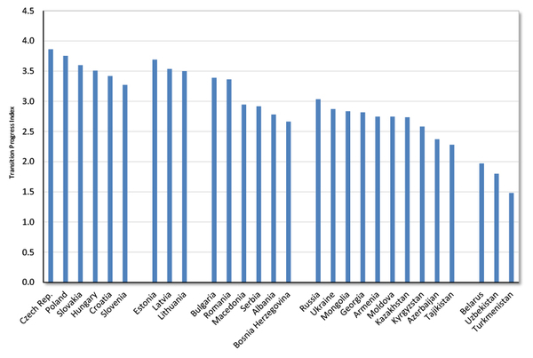
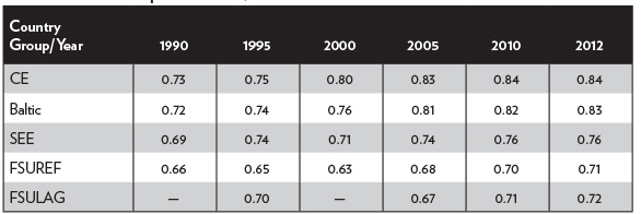
Table 1 presents the overall grades for the governors. Scores ranging from 0 to 100 were calculated for each governor based on seven tax and spending variables. Scores closer to 100 indicate governors who favored smaller-government policies. The numerical scores were converted to the letter grades A to F.

Table 1. Overall Grades for the Governors

image
image

Highest-Scoring Governors


The highest-scoring governors are those who supported the most spending restraint and tax cuts. Here are the five governors who received grades of A:
  • Paul LePage of Maine has been a staunch fiscal conservative. He has held down spending growth, and state government employment has fallen 9 percent since he took office. LePage has been a persistent tax cutter. In 2011 he approved large income tax cuts, which reduced the top individual rate and simplified tax brackets. In 2015 he vetoed a tax-cut plan passed by the legislature partly because the cut was not large enough. The legislature overrode him, and Maine enjoyed another income tax reduction. In 2016 LePage pushed for more reforms, including estate tax repeal and further income tax rate cuts.

  • Pat McCrory of North Carolina came into office promising major tax reforms, and he has delivered. In 2013 he signed legislation to replace individual income tax rates of 6.0, 7.0, and 7.75 percent with a single rate of 5.8 percent. That rate was later reduced to 5.75 percent. The law also increased standard deductions, repealed the estate tax, and cut the corporate tax rate from 6.9 to 4.0 percent, with a scheduled fall to 3.0 percent next year. In 2015 McCrory approved a further individual income tax cut from 5.75 to 5.5 percent. McCrory has matched his tax cuts with spending restraint. The general fund budget will be just 8 percent higher in 2017 than it was when the governor took office in 2013.

  • Rick Scott of Florida says that he wants to make Florida the best state for business in the nation, and tax cuts are a key part of his strategy. In 2012 Scott raised the exemption level for the corporate income tax, which eliminated the burden for thousands of small businesses. In 2014 he signed into law a $400 million cut to vehicle fees. In 2015 Scott approved a cut to the state’s tax on communication services and reductions in sales taxes and business taxes. In 2016 he approved the elimination of sales taxes on manufacturing equipment, which is an important pro-investment reform. Scott also scored well on spending, and he has trimmed state government employment by 4 percent.

  • Doug Ducey of Arizona was the head of Cold Stone Creamery, and he has brought his business approach to the governor’s office. He has overseen lean budgets, with general fund spending on track to rise just 2 percent between 2015 and 2017. He approved major pension reforms, including trimming benefit costs and giving new state employees the option of a defined contribution plan. Ducey has approved substantial tax cuts, including ending sales taxes on some business purchases, reducing insurance premium taxes, increasing depreciation deductions, and indexing Arizona’s income tax brackets for inflation.

  • Mike Pence of Indiana has been a champion tax cutter and fairly frugal on spending. In 2013 he signed into law a cut to Indiana’s flat individual income tax rate from 3.4 percent to 3.23 percent. He also approved a repeal of Indiana’s inheritance tax. In 2014 he cut the corporate income tax rate, which has fallen from 7.5 percent to 6.25 percent since 2014, and is scheduled to fall to 4.9 percent in coming years. Pence also reduced property taxes on business equipment to spur increased capital spending. Indiana’s ranking on the Tax Foundation’s business competitiveness index has risen to eighth-highest in the nation.

Comparing Republicans and Democrats


Supporters of smaller government lament that politicians of both major parties tax and spend too much. While that is true, Cato report cards have found that Republican governors are more fiscally conservative, on average, than Democratic governors. In the 2008 report, Republican and Democratic governors had average scores of 55 and 46, respectively. In the 2010 report, they had average scores of 55 and 47. In the 2012 report, they had average scores of 57 and 43. In the 2014 report, they had average scores of 57 and 42.

That pattern continues in the 2016 report card. This time, Republican and Democratic governors had average scores of 54 and 43, respectively. And, on average, Republicans received higher scores than Democrats on both spending and taxes.

Three of the 10 F grades on this report went to Republicans, but none of the five A grades went to Democrats. When states develop budget gaps, Democratic governors often pursue tax increases to regain budget balance, while Republicans tend to pursue spending restraint. And when the economy is growing and state coffers are full, Democrats increase spending, while Republicans tend to both increase spending and pursue tax cuts.

Fiscal Policy Trends


Figure 1 shows state general fund spending since 2000, based on data from the National Association of State Budget Officers.2 Spending soared between 2002 and 2008, and then it fell during the recession as states trimmed their budgets.3 Spending has bounced back strongly in recent years, growing 4.1 percent in 2013, 4.6 percent in 2014, 4.1 percent in 2015, 5.6 percent in 2016, and a projected 2.5 percent in 2017.

Figure 1. State General Fund Spending
image
Source: National Association of State Budget Officers, “Fiscal Survey of the States,” Spring 2016. Fiscal years.

A key driver of state spending growth is Medicaid. This giant program pays for health care and long-term care for 67 million people with moderate incomes.4 The program is funded jointly by federal and state taxpayers. It is the largest component of state budgets, accounting for 26 percent of total spending.5

Medicaid has grown rapidly for years, and the Affordable Care Act of 2010 (ACA) expanded it even more.6 For states that implement the ACA’s expanded Medicaid coverage, the federal government is paying 100 percent of the costs of through 2016, and then a declining share after that. As the federal cost share declines, state budgets will be put under more stress. But aside from the federal portion of Medicaid, the state-funded portion of the program is also growing quickly and stressing budgets. State-funded Medicaid spending grew 6.0 percent in 2015 and an estimated 8.3 percent in 2016.7

On the revenue side of state budgets, policymakers have been enacting a mix of tax cuts and tax increases. Overall, the states enacted a modest net tax cut in 2014 and 2015, but they swung to a net tax increase in 2016.8 Cigarette tax increases have been common, with a dozen states enacting them since 2014.9 Gasoline tax increases have also been common, with about half the states enacting them since 2013.10

There is also a trend toward reductions in individual and corporate income tax rates. There have been substantial rate cuts in Arizona, Indiana, Kansas, Maine, New Mexico, New York, North Carolina, North Dakota, Ohio, and Oklahoma in recent years. In some states, the revenues from income tax cuts have been partly offset with revenue increases from higher retail sales taxes.

These income tax reforms are good news, and they should help spur growth by making states more attractive for investment. However, there is also bad news regarding state efforts to attract investment, which is the proliferation of narrow tax breaks and subsidies for particular companies and industries. The classic example of such “corporate welfare” is the film production tax credits that most states now offer.

The 2014 Cato governors report card discussed why narrow business tax breaks and subsidies are bad policy, and research for this 2016 report confirmed that such breaks are rampant. Consider Nevada’s recent tax policy. Governor Brian Sandoval imposed a huge $600 million per year tax increase on businesses, including higher license fees, an increase in the state’s Modified Business Tax, and the imposition of a new Commerce Tax. At the same time, Sandoval has been eagerly handing out narrow tax breaks to Tesla, Amazon, data center companies, and other favored businesses. So Nevada’s tax policy entails large increases for all businesses, but special breaks for companies favored by the politicians. That is a prescription for corruption, not long-term economic growth.

Longer-Term Outlook


This report card focuses on the short-term taxing and spending decisions of the governors. But a full assessment of a governor’s performance should also examine his or her policies affecting long-term fiscal health. This section looks at state debt levels, unfunded pension obligations, and unfunded retirement health obligations, and ranks the states based on those fiscal measures.

State and Local Debt


State and local governments are major investors in infrastructure, including highways, bridges, and schools and other facilities. A portion of this investment is financed by long-term borrowing, or the issuance of state and local bonds. The interest and principal on government bonds is paid back over time from either taxes or user fees. State and local governments have been issuing debt for infrastructure since at least 1818, when New York floated bonds to finance the Erie Canal.

However, debt is not the only way to fund infrastructure. Indeed, most state infrastructure investment is financed on a pay-as-you-go basis.11 That approach entails governments looking ahead and planning to construct needed facilities over time with an allocated portion of annual tax revenues.

Pay-as-you-go financing is generally preferable to debt financing. The Erie Canal was a big success, and it is thought to have generated positive economic returns. But that success spurred many other states at the time to borrow heavily and spend lavishly on their own, more dubious, canal schemes. State politicians in the mid-19th century overestimated the demand for canals and underestimated the construction costs. It turned out that the Erie Canal was a uniquely high-return route, while most state-sponsored canals in the 19th century were money-losing failures.12

The failures of many debt-backed state projects in the 19th century led to sweeping budget reforms. Nineteen states imposed constitutional limits on state debt issuance between 1840 and 1855.13 Further constitutional limits on state and local debt were passed in the 1870s. The limits took numerous forms, including requiring voter approval of debt issuance, limiting overall quantities of debt, and limiting the purposes for which state debt can be issued.

Today, all state governments operate within statutory and/or state constitutional limits on debt. Limits make sense because politicians have an incentive to issue debt in excess: debt-financed investment is not constrained by the unpopular need to raise current taxes, as it is for pay-as-you-go investment. Political incentives to deficit-spend can create severe economic damage if debt reaches high levels, as we have seen recently in Greece, Puerto Rico, Detroit, and other jurisdictions.

U.S. state and local government debt totaled $3 trillion in 2016.14 Table 2 shows that state and local debt per capita varies widely by state.15 The most indebted states by this measure are New York, Massachusetts, Alaska, Connecticut, and Rhode Island.

Governments in some states, such as Idaho and Wyoming, issue very little debt. They finance most of their capital expenditures on a pay-as-you-go basis. These states have per capita debt loads only one-quarter as large as the highly indebted states, and thus governments in these states are imposing much lower costs on future taxpayers.

California’s budget this year discusses how the state is painting itself into a corner with debt: “Budget challenges over the past decade resulted in a greater reliance on debt financing, rather than pay-as-you-go spending… . The increasing reliance on borrowing to pay for infrastructure has meant that roughly one out of every two dollars spent on infrastructure investments goes to pay interest costs, rather than construction costs… . Annual expenditures on debt service have steadily grown from $2.9 billion in 2000-01 to $7.7 billion in 2015-16.”16 To politicians, debt might seem like an easy way to fund infrastructure, but the servicing costs eventually eat away at current budgets.

Debt financing costs more than pay-as-you-go financing because of the interest payments, but also because governments pay substantial fees to the municipal bond industry. State and local borrowing creates an overhead cost in the form of thousands of high-paid experts in underwriting, trading, advising, bond insurance, and related activities. A study by economist Marc Joffe found that fees average about 1 percent of the principal value of municipal bonds.17 Since municipal bond issuance has averaged about $350 billion a year recently, fees are about $3.5 billion a year. That is taxpayer money that is not going toward building highways or schools.

A further cost of borrowing is the risk of corruption. The municipal bond industry has suffered from many scandals related to political influence. If you Google “municipal bond market” and “pay-to-play,” you will find story after story about bond underwriters using bribes and campaign contributions to win bond business from state and local officials.

Debt financing also makes government budgeting less transparent. Capital budgets that rely on debt are difficult for citizens to understand, especially given the myriad and complex ways that governments borrow these days. Also, citizens have less appreciation for the costs of new government projects if they do not feel the bite of current taxes to pay for them.

Perhaps the most important reason to worry about state debt is that other large fiscal burdens are looming over the states. Medicaid costs are growing rapidly, as noted. And retirement plans for government employees have large unfunded liabilities, as discussed next.

Table 2. State and Local Government Debt and Unfunded Pension and OPEB Liabilities (Dollars Per Capita, Ranked Highest to Lowest)
image
image
Sources: Author’s calculations based on data from U.S. Bureau of the Census, “State Government Finances,” www.census.gov/govs/state; Joshua D. Rauh, “Hidden Debt, Hidden Deficits,” Hoover Institution, April 2016; and Alicia H. Munnell, Jean-Pierre Aubry, and Caroline V. Crawford, “How Big a Burden Are State and Local OPEB Benefits?” Center for Retirement Research at Boston College, March 2016. The pension data from Rauh are the stated or official figures.

Pension Plans and Retiree Health Costs


The largest component of state and local government spending is compensation for 16 million employees.18 Total wages and benefits for state and local workers was $1.4 trillion in 2015, which accounted for 53 percent of all state and local spending.19

State and local workers typically receive more generous benefit packages than do private-sector workers. On average, retirement benefits for state and local workers cost $4.80 per hour, compared to $1.23 per hour for private-sector workers. Insurance benefits (mainly health insurance) for state and local workers cost $5.43 per hour, compared to $2.59 per hour for the private sector.20 Most state and local workers receive retirement health benefits, whereas most private-sector workers do not.

The costs of government pension and retirement health benefits are expected to rise rapidly in coming years. Governments have promised their workers generous retirement benefits, but most states have not put enough money aside to pay for them. As a consequence, state and local governments will either have to cut benefits in coming years or impose higher taxes.

Let’s look at pensions first. Most state and local governments provide their workers with defined-benefit (DB) pensions. Governments pre-fund their DB plans, building up assets to pay future benefits when they come due. Unfortunately, governments have overpromised benefits and underfunded their plans, creating large funding gaps. Total benefits paid by the nation’s more than 500 state and local pension plans are $260 billion a year and rising.21

In a recent study, Stanford University’s Joshua Rauh found that state and local pension assets in 2014 were $3.6 trillion, liabilities were $4.8 trillion, and thus unfunded liabilities were $1.2 trillion.22 State and local pension plans have only enough assets to pay 75 percent of accrued benefits.

A study by Alicia Munnell and Jean-Pierre Aubry found similar results.23 They found that the average funding level of pension plans grew during the 1990s, peaked at more than 100 percent in 2000, and then fell to just 74 percent today. That average is quite low, and there are many plans with dangerously low funding. The State of Illinois, Illinois Teachers, and Illinois Universities systems, for example, all had funding levels of 43 percent or less. For the State of Illinois, pension spending soared from $1.1 billion in 2000 to $7.7 billion in 2015, which was a substantial share of the state’s $35 billion general fund budget that year.24 Major reforms are needed in such plans to reduce spending and bring liabilities in line with assets.

Pension shortfalls are actually larger than these figures indicate. Those are the officially reported figures, but financial experts think that the discount rates used to report pension liabilities are too high. Higher discount rates reduce reported liabilities and create an overly optimistic picture of pension plan health.

In his study, Rauh recalculated pension plan funding using a 2.7 percent discount rate, rather than the official average rate of 7.4 percent. His recalculated unfunded liability jumps from $1.2 trillion to $3.4 trillion. Similarly, Munnell and Aubry found that their unfunded pension liabilities jumped to $4.1 trillion if plans are estimated using a 4 percent discount rate.25 Under that assumption, the funding level of state and local pension plans averages just 45 percent.

Which states have the most underfunded pensions? Table 2 ranks the states on unfunded state and local pension liabilities per capita using the stated or official figures from Rauh. The level of pension liabilities varies widely. The highest liabilities are in New Jersey, Illinois, Alaska, Kentucky, and Connecticut. Note that using Rauh’s recalculated figures at the lower discount rate, the unfunded liabilities are two or more times higher for most states.

Greater media focus on pension plans in recent years has prompted many state and local governments to trim their unfunded liabilities. But a pension report from Pew Charitable Trusts found that still only about half of the states are contributing the full “actuarial required contributions” to their plans, with the result that “pension debt is continuing to increase in many states.”26

A good reform would be for states to scrap their defined-benefit (DB) pension plans for new hires, and instead offer them defined-contribution (DC) plans. Defined-contribution plans reduce risks for taxpayers and are the dominant type of retirement plan in the private sector. Alaska and Michigan have adopted DC plans for new employees, and a number of states have moved to systems that are hybrids of DB and DC.

In addition to pension liabilities, there is another type of liability that looms over state budgets: other post-employment benefits (OPEB). The main component of OPEB is retirement health care coverage, which includes benefits for early retirees before Medicare kicks in at age 65 and supplemental benefits after Medicare kicks in. California, for example, pays 100 percent of retirement medical costs for state workers after they have put in just 20 years of service.27 Very few private companies offer such generous benefits.

Total annual OPEB benefits nationwide are about $18 billion, and the costs are rising quickly as health costs grow and the number of retirees increases. In California, the share of the state’s general fund budget spent on retiree health costs nearly tripled from 0.6 percent in 2001 to 1.6 percent by 2016.28

Unlike pension benefits, most state and local governments have not pre-funded OPEB at all. Annual benefits are simply paid from the general fund budget. A few states have started to prefund OPEB, but for the nation as a whole, the funding ratio — assets-to-liabilities — of state and local OPEB plans is less than 10 percent.29

Fortunately, this imprudent approach to financing OPEB has started to change. An accounting rule change in 2007 required governments to calculate and disclose unfunded OPEB obligations.30 Governments must now account for OPEB as they do their pensions, which is by estimating the future stream of promised benefits, discounting to the present value, and comparing those liabilities to plan assets.

How large are OPEB liabilities? A 2016 study by Alicia Munnell and coauthors estimated that unfunded state and local OPEB liabilities were $862 billion in 2013.31 Pew put the number at $627 billion, but the figure calculated by Munnell and coauthors captures a broader universe of plans.32 These figures are the costs of unfunded benefits that have been already accrued. But without reforms, OPEB liabilities will continue to rise as workers accrue more retiree benefits every year.

Table 2 shows that unfunded OPEB liabilities vary widely by state. The largest liabilities are in Alaska, New York, Connecticut, New Jersey, and Hawaii. OPEB liabilities also vary dramatically across local governments. When Detroit declared bankruptcy in 2013, people pointed to the city’s $3 billion in unfunded pension liabilities, but finance expert Robert Pozen noted that it also had $6 billion of unfunded OPEB, which compounded the city’s fiscal woes.33

To fix OPEB funding gaps, states are beginning to trim retirement health benefits. They can do so by increasing the age of eligibility, reducing the types of benefits provided, or increasing deductibles and copays for plan members. State and local governments have substantial legal flexibility in cutting health benefits for current workers and retirees, but less so with pension benefits.

Some local governments, and at least one state (Idaho), have ended retiree health benefits for new employees. Since the 2007 accounting change, the share of state and local government workers receiving retirement health benefits has fallen to about 70 percent.34 In the private sector, just 28 percent of medium and large businesses offer their retirees such benefits.35

In sum, state governments should reduce their retirement benefits to lighten the load on future taxpayers. Unfunded benefits are not just a problem for the future; they cause problems right now because credit rating agencies assign lower scores to states that have high debt and unfunded liabilities. Standard and Poor’s says that they “differentiate states’ credit quality by the status of their long-term liability profile.”36 Lower credit ratings mean higher borrowing costs. So governors should make it a high priority to reduce their states’ debt, pension, and OPEB liabilities.

Appendix A: Report Card Methodology


This study computes a fiscal policy grade for each governor based on his or her success at restraining taxes and spending since 2014, or since 2015 for governors entering office that year. The spending data used in the study come from the National Association of State Budget Officers (NASBO), and in some cases, the budget documents of individual states. The data on proposed and enacted tax cuts come from NASBO, the National Conference of State Legislatures, and news articles in State Tax Notes and other sources.37 Tax-rate data come from the Tax Foundation, but is updated by the author for recent changes.38

This year’s report uses the same methodology as the 2008, 2010, 2012, and 2014 Cato report cards. The report focuses on short-term taxing and spending actions to judge whether the governors take a small-government or big-government approach to policy. Each governor’s performance is measured using seven variables: two for spending, one for revenue, and four for tax rates. The overall score is calculated as the average score of these three categories. Tables A.1 and A.2 summarize the governors’ scores.

Spending Variables

  1. Average annual percent change in per capita general fund spending proposed by the governor.

  2. Average annual percent change in actual per capita general fund spending.

Revenue Variable

  1. Average annual dollar value of proposed, enacted, and vetoed tax changes. This variable is measured by the reported estimates of the annual dollar effects of tax changes as a percentage of a state’s total tax revenues. This is an important variable, and it is compiled from many news articles, budget documents, and reports.39

Tax Rate Variables

  1. Change in the top personal income tax rate approved by the governor.

  2. Change in the top corporate income tax rate approved by the governor.

  3. Change in the general sales tax rate approved by the governor.

  4. Change in the cigarette tax rate approved by the governor.

The two spending variables are measured on a per capita basis to adjust for state populations growing at different rates. Also, the spending variables are only for general fund budgets, which are the budgets that governors have the most control over. Variable 1 is measured through fiscal 2017, while variable 2 is measured through fiscal 2016. Variables 3 through 7 cover changes during the period of January 2014 to August 2016, or January 2015 to August 2016 for governors entering office in 2015.40

For each variable, the results are standardized, with the worst scores near 0 and the best scores near 100. The score for each of the three categories — spending, revenue, and tax rates — is the average score of the variables within the category. One exception is that the cigarette tax rate variable is quarter-weighted because that tax is a smaller source of state revenue than income and sales taxes. The average of the scores for the three categories produces the overall grade for each governor.

Measurement Caveats


This report uses publicly available data to measure the fiscal performance of the governors. There are, however, some unavoidable problems in such grading. For one thing, the report card cannot fully isolate the policy effects of the governors from the fiscal decisions of state legislatures. Governors and legislatures both influence tax and spending outcomes, and if a legislature is controlled by a different party, a governor’s control may be diminished. To help isolate the performance of governors, variables 1 and 3 measure the effects of each governor’s proposed, but not necessarily enacted, recommendations.

Another factor to consider is that the states grant governors differing amounts of authority over budget processes. For example, most governors are empowered with a line-item veto to trim spending, but some governors do not have that power. Another example is that the supermajority voting requirement to override a veto varies among the states. Such factors give governors different levels of budget control that are not accounted for in this study.

Nonetheless, the results presented here should be a good reflection of each governor’s fiscal approach. Governors receiving an A have focused on reducing tax burdens and restraining spending. Governors receiving an F have put government expansion ahead of the public’s need to keep its hard-earned money. In the middle are many governors who gyrate between different fiscal approaches from one year to the next.

Table A.1 Spending and Revenue Changes


image
image

Table A.2 Tax Rate Changes


imageimage
Note: These are the tax rate changes since 2014 that were approved by the governors. It excludes the expiration of prior temporary changes. The changes are the actual changes in the rates. For example, Andrew Cuomo cut New York’s corporate tax rate from 7.1 to 6.5 percent, so the table shows -0.60.

Appendix B: Fiscal Policy Notes on the Governors


Below are highlights of the fiscal records of the 47 governors covered in this report. The discussion is based on the tax and spending data used for grading the governors, as well as other information that sheds light on each governor’s fiscal approach.41 Note that the grades are calculated based on each governor’s record since 2014, or since 2015 if that was the governor’s first year in office.

Alabama


Robert Bentley, Republican; Legislature: Republican

Grade: F; Took Office: January 2011

Governor Robert Bentley dropped from a B in the last report card to an F in this one due to his support of major tax increases. In his first few years in office, Bentley generally opposed tax increases, but in 2015 he made a U-turn. He proposed a tax increase of more than $500 million a year, including increases on businesses, cigarettes, automobile sales, automobile rentals, and other items.

The governor’s plan was opposed by the legislature, but after months of wrangling they reached a compromise on a $100 million tax package. Bentley signed into law a cigarette tax increase of 25 cents per pack, and higher taxes and fees on nursing facilities, prescriptions, and the insurance industry. In 2016 Bentley supported a gasoline tax increase, but that legislation did not pass.

On spending, Governor Bentley scored lower than average among the governors. He proposed substantial general fund budget increases the past two years.

Arizona


Doug Ducey, Republican; Legislature: Republican

Grade: A; Took Office: January 2015

Doug Ducey has a background in business and finance, and he was CEO of Cold Stone Creamery. As governor, he has overseen lean budgets, with general fund spending on track to rise just 2 percent between 2015 and 2017. In 2016 Ducey approved major pension reforms, which included trimming benefit costs and giving new hires the option of a defined contribution plan.

Governor Ducey has signed into law individual and business tax cuts. He approved legislation ending sales taxes on some business purchases, reducing insurance premium taxes, increasing depreciation deductions, and indexing Arizona’s income tax brackets for inflation. Ducey has also been supportive of the corporate tax rate cut passed by the prior governor, which is being phased in over time. The corporate tax rate is falling from 7 percent in 2013 to 4.9 percent in 2017.

Arkansas


Asa Hutchinson, Republican; Legislature: Republican

Grade: B; Took Office: January 2015

Former U.S. Representative and federal official Asa Hutchinson entered the Arkansas governor’s office in January 2015. Hutchinson campaigned on a middle-class tax cut, and he delivered soon after taking office. He signed into law a cut to tax rates for households with incomes of less than $75,000, providing savings of about $90 million a year.42 The governor said, “Arkansas has been an island of high taxation for too long, and I’m pleased that we are doing something about that.”43 Enjoying substantial budget surpluses in 2016, Hutchinson has promised further tax cuts. On spending, Hutchison scored a bit better than average among the governors.

California


Jerry Brown, Democrat; Legislature: Democratic

Grade: F; Took Office: January 2011

Governor Jerry Brown was graded as the worst governor in America on the 2014 Cato report card. Brown is not the lowest-scoring governor this time, but he is assigned another F based on his support of large tax and spending increases.

California’s general fund budget increased 13 percent in 2015 and 2.7 percent in 2016, and it is set to increase more than 5 percent in 2017. The state has been on a hiring spree, with state government employment rising 7 percent over the past three years.44

Perhaps Brown’s most wasteful spending project is on the state’s high-speed rail system, which has a huge cost but will do little to reduce congestion. The projected cost of the project has doubled from $33 billion to $68 billion. An investigation in 2016 discovered that taxpayers will be on the hook not only for the project’s capital costs, but also its operating costs.45 State officials had been promising that passenger ticket revenues would cover operating costs, but it is clear now that will not happen.

On taxes, Brown has pushed a transportation plan to raise $3 billion a year from higher gasoline and diesel taxes and a $65 per vehicle annual fee. Luckily for California motorists, the plan has not passed, although the legislature did approve a small vehicle registration fee increase in 2016.

Californians have been spared major tax increases the past couple of years because money has poured into state coffers from growth in Silicon Valley and other regions in the state. However, the next recession will cause the California budget to descend into crisis, as it has during past recessions. That occurs because California tax revenues are highly dependent on high earners and capital gains. As the stock market faltered earlier this year, for example, state revenue projections were slashed by $2 billion.46 If the California economy slumps, the budget will not be able to support the extra spending that Brown has added in recent years.

Brown recognizes these problems. In 2016 he noted of the state’s tax system: “We are taxing the highest income earners, and as you know, 1 percent of the richest people pay almost half the income tax… . That’s fair, but it also creates this volatility. So in order to manage this budget, it’s like riding a tiger.”47 Brown has favored building up the state’s rainy-day fund, but he has not supported reforms to reduce revenue volatility, such as moving toward a more stable consumption-based tax system.

This November, voters will decide on various ballot measures on taxes. One measure would raise $1 billion a year from a cigarette tax hike of $2 per pack. Another measure would extend higher income tax rates on households earning more than $250,000 a year. And yet another measure will ask voters to legalize recreational marijuana. There would be a 15 percent excise tax on retail sales and a separate cultivation tax, which would together raise about $1 billion a year.48

Colorado


John Hickenlooper, Democrat; Legislature: Divided

Grade: D; Took Office: January 2011

General fund spending has ballooned under Governor John Hickenlooper, rising 48 percent between 2011 and 2016. State government employment has soared 22 percent since Hickenlooper took office.49

Hickenlooper pushed for a large individual income tax increase on the ballot in 2013, which would have replaced Colorado’s flat-rate 4.63 percent tax with a two-rate structure of 5.0 and 5.9 percent. That increase was rejected by voters, 65 to 35 percent.50 The governor has not pushed for major tax increases since then, but with a growing economy, revenues have poured into state government.

The state has a new source of revenue: marijuana. After citizens legalized the drug for recreational use on a 2012 ballot, Colorado has become “the first state in history to generate more annual marijuana tax revenue than alcohol tax revenue… . The state collected $69.9 million from marijuana-specific taxes in fiscal 2015 and just under $41.8 million from alcohol specific taxes in the same period.”51

While not pushing major tax increases in recent years, Hickenlooper has opposed taxpayer interests by seeking to undermine the state constitution’s Taxpayer Bill of Rights (TABOR). TABOR requires voter approval of tax increases and requires the government to refund excess taxes above an annual revenue cap. Revenues have been exceeding the cap recently, which is “prompting Gov. John Hickenlooper (D) and Democrats in the legislature to look for ways around the law.”52

Connecticut


Dan Malloy, Democrat; Legislature: Democratic

Grade: F; Took Office: January 2011

Governor Dan Malloy received poor grades on prior Cato report cards due mainly to his enormous tax increases. In 2011 Governor Malloy raised taxes by $1.8 billion annually, which increased total annual state tax collections by 14 percent.

Malloy received an F on this report for his continued support of large tax increases. In 2015 he signed legislation increasing taxes more than $900 million annually. He increased the top individual income tax rate from 6.7 percent to 6.99 percent, and he extended a corporate income tax surcharge of 20 percent. He increased the cigarette tax by 50 cents per pack and broadened the bases of the sales tax and income tax. He also increased health provider taxes and other taxes and fees.

Despite all the tax increases, Connecticut still faced a large budget gap in 2016 because spending keeps rising and growth is sluggish. Connecticut’s economy has lagged the national economy, and the state’s fiscal future is very troubled. It has some of the highest debt and unfunded retirement liabilities of any state on a per capita basis, as discussed above.

While neighboring New York has cut business taxes in recent years, Connecticut has raised them. In 2016 General Electric made headlines by moving its headquarters from Connecticut to Massachusetts. In 2015 GE head Jeffrey Immelt sent a letter to his employees saying that the company was looking to relocate “to another state with a more pro-business environment.”53 GE announced in 2016 that it was moving to Boston, after being headquartered in Connecticut for more than 40 years.

Delaware


Jack Markell, Democrat; Legislature: Democratic

Grade: D; Took Office: January 2009

Former businessman Jack Markell is completing his second term as Delaware governor. He has scored fairly poorly on past Cato report cards. He signed into law large “temporary” tax increases in 2009, and then pushed to extend them in 2013. The top individual income tax rate was increased from 5.95 percent to 6.6 percent, where it remains today. In 2014 Markell signed into law a substantial increase in the corporate franchise tax, and he proposed a 10 cent per gallon gas tax increase and a new tax on water service. In 2015 he approved increases in various motor vehicle fees. In 2016 Markell approved modest business tax reductions.

Florida


Rick Scott, Republican; Legislature: Republican

Grade: A; Took Office: January 2011

Governor Rick Scott received an A on Cato’s 2012 report, and he receives an A on this report for restraining spending and continuing to push for tax cuts. Scott often says that his goal is to make Florida the best state for business in the nation, and tax cuts are a key part of his strategy.

In 2012 Scott raised the exemption level for the corporate income tax, eliminating the burden for thousands of small businesses. In 2013 he approved a temporary elimination of sales taxes on manufacturing equipment. In 2014 he signed into law a $400 million cut to vehicle fees and proposed a further increase in the corporate tax exemption level.

In 2015 Scott approved a large cut to the state’s tax on communication services and modest reductions in sales and business taxes. In 2016 he proposed more than $900 million in tax relief, including a cut to the sales tax on commercial rents and a full exemption for manufacturers and retailers from the corporate income tax.54 The legislature did not approve those two proposals, but it did pass Scott’s plan to permanently eliminate sales taxes on manufacturing equipment, which is a solid pro-growth reform.

Governor Scott scored well on spending in this report. He has proposed low-growth general fund budgets the past three years. State government employment has been cut 4 percent under Scott.55

Georgia


Nathan Deal, Republican; Legislature: Republican

Grade: D; Took Office: January 2011

Governor Nathan Deal earned a D due to his poor performance on both spending and taxes. Georgia’s general fund budget grew 27 percent between 2011 and 2016, and Deal proposed a substantial increase for 2017.

With regard to taxes, Deal supported a ballot measure in 2012 to increase sales taxes, but voters shot that plan down by a large margin.56 In 2015 Deal signed into law a large increase in gasoline taxes, hotel taxes, and other levies to raise more than $600 million a year. In general, Deal has favored raising broad-based taxes and shown little interest in major tax reform. Meanwhile, he has pushed narrow breaks for favored industries and companies, such as tax credits for the film industry and an exemption for major sports team tickets from the sales tax.

Hawaii


David Ige, Democrat; Legislature: Democratic

Grade: F; Took Office: January 2015

Before being elected governor, David Ige was a state legislator and also an engineer and manager in the telecommunications industry. Ige defeated incumbent Hawaii governor Neil Abercrombie in the Democratic primary in 2014. Abercrombie had received poor grades on Cato reports, and Ige pointed to his tax hikes as one of the causes of his political demise.57

Ige let expire temporary income tax increases put in place by Abercrombie, but he proposed increases in gasoline taxes and vehicle registration fees in 2016. However, it was the governor’s excessive spending that pushed down his grade on this report. General fund spending rose 7 percent in 2016, and Ige proposed to increase it 12 percent in 2017.

Idaho


C. L. “Butch” Otter, Republican; Legislature: Republican

Grade: D; Took Office: January 2007

Former congressman Butch Otter is in his third term as Idaho governor. He has a moderately pro-growth record on taxes, but a poor record on spending.

In 2012 he signed legislation cutting the corporate tax rate from 7.6 to 7.4 percent and the top individual income tax from 7.8 to 7.4 percent. In 2015 he proposed cutting income tax rates further, to 6.9 percent, over five years. He also proposed ending property taxes on business equipment, which would have been a pro-growth reform. However, Otter did not push these cuts very hard, and they did not get passed.

In 2015 the governor approved a 7 cent per gallon increase in the gasoline tax. In 2016 Otter said that he was against tax cuts that were being considered by the legislature because they would jeopardize his spending priorities.58

Otter scores poorly on spending in this report. The general fund budget increased 5.6 percent in 2015 and 4.6 percent in 2016. He proposed a 7.3 percent increase for 2017.

Illinois


Bruce Rauner, Republican; Legislature: Democratic

Grade: B; Took Office: January 2015

Businessman Bruce Rauner took office as Illinois governor in January 2015 eager to fix his state’s severe fiscal problems. Unfortunately, Rauner and the state legislature have been at loggerheads, and so budgeting has mainly ground to a halt the past two years.

The good news for Illinois is that Rauner replaced Pat Quinn, a repeated F governor on Cato reports. It is also good news that large personal and corporate income tax increases passed under Quinn have expired as scheduled. Furthermore, the budget standoff has meant that state general fund spending has been flat since 2014.

The bad news is that Illinois has not tackled its serious fiscal problems, including large structural deficits and unfunded pension obligations. Quinn’s temporary tax increases had raised about $6 billion a year for the state, which the government quickly became dependent on as spending rose. When the extra tax revenue disappeared in 2015, large deficits reappeared.

In 2015 Rauner proposed a state budget that partly closed the gap between spending and revenues, and the legislature responded with an even more unbalanced budget. Rauner vetoed the legislature’s budget, and the state was in a stalemate until June 2016, when a compromise deal was finally signed.

Rauner had said that he would not agree to higher taxes unless the legislature agreed to some of his Turnaround Agenda, which includes worker compensation reform and lawsuit reform. In a 2016 address, Rauner said, “I won’t support new revenue unless we have major structural reforms to grow more jobs and get more value for taxpayers… . I’m insisting we attack the root causes of our dismal economic performance.”59 In the end, a deal was struck that did not include Rauner’s reforms, but it also did not give the legislature the extra taxes and spending that it wanted.60

During the budget standoff, the state built up IOUs to businesses providing services to the government. That fits with the state’s pattern of pushing its costs to the future. Table 2, above, showed that Illinois is near the top of the 50 states in terms of per capita debt, unfunded pensions, and unfunded OPEB. These problems have been building for years — the underfunding of state pensions, for example, has roots two decades old.61 Rising pension spending is exacerbating budget gaps — pension spending soared from $1.1 billion in 2000 to $7.7 billion in 2015, which is a large share of the $35 billion Illinois general fund budget.62

Governor Rauner is trying to put the state on a more business-like posture, but he is receiving little help from the legislature. In his 2016 State of the State speech, he argued that Quinn’s large tax increases hurt the state’s economic growth, and he noted that the state’s credit rating was downgraded five times during the high-tax Quinn years.63

Indiana


Mike Pence, Republican; Legislature: Republican

Grade: A; Took Office: January 2013

Governor Mike Pence has been a champion tax cutter and fairly frugal on spending. In 2013 he signed into law a cut to Indiana’s flat individual income tax rate from 3.4 percent to 3.23 percent. He also approved a repeal of Indiana’s inheritance tax.

In 2014 he cut the corporate income tax rate, adding to the reductions made by prior governor Mitch Daniels. The rate has fallen from 7.5 percent to 6.25 percent since 2014 and is scheduled to fall to 4.9 percent by 2021.64 Pence also targeted property taxes on business equipment for reform, and in 2014 he signed off on a plan to allow local governments to cut these anti-investment levies. These and other changes have helped Indiana increase its ranking among the states on the Tax Foundation’s competitiveness index to 8th-highest this year.65

At the same time, Pence has restrained state spending growth. The general fund budget increased 2.6 percent in 2015 and 1.1 percent in 2016. It is set to grow 3.0 percent in 2017. Under Pence, Indiana has maintained the top credit rating from the three main credit rating agencies.

Iowa


Terry Branstad, Republican; Legislature: Divided

Grade: D; Took Office: January 2011

Terry Branstad was governor of Iowa for 16 years between 1983 and 1999, and he returned to the governorship in 2011. His main pro-growth fiscal reform was a large property tax cut in 2013. The reform created a growth cap for agriculture and residential assessments, reduced assessment levels for commercial and industrial property, and cut property taxes for small businesses.

In recent years, Branstad has cut some taxes and increased others. He cut sales taxes on inputs to manufacturing and approved other modest business tax breaks. He also created a system of income tax rebates for years with budget surpluses. However, Branstad also approved a 10 cent per gallon gas tax increase, which raised more than $200 million annually.

On spending, Branstad has performed poorly. He came into office promising to cut the size of state government by 15 percent, but instead general fund spending has soared. Spending has increased 11 percent in the past two years, and has increased 34 percent since he took office in 2011.

Kansas


Sam Brownback, Republican; Legislature: Republican

Grade: D; Took Office: January 2011

Governor Sam Brownback signed into law major income tax reforms his first few years in office. In 2012 he replaced individual tax rates of 3.5, 6.25, and 6.45 percent with rates of 3.0 and 4.9 percent. The reform increased standard deductions and eliminated special-interest breaks. In 2013 Brownback cut income tax rates further, while reducing income tax deductions and raising the sales tax rate from 5.7 to 6.15 percent.66

Brownback’s tax cuts have become controversial. The problem is that the governor and legislature did not fully match the reduced revenues with reduced spending, which created chronic budget gaps. The fairly slow-growing economy in Kansas has not helped matters.

The governor has taken steps to reduce budget gaps. In 2015 he raised the sales tax rate from 6.15 percent to 6.5 percent, increased the cigarette tax by 50 cents per pack, and reduced deductions under the individual income tax.67 The 2015 package raised about $300 million a year.

Those large tax increases pushed down Brownback’s grade on this report, but his relatively frugal spending kept his grade out of the basement. Kansas general fund spending increased less than 10 percent between 2011 and 2016, and is expected to increase just 1 percent in 2017.68

Brownback’s reforms do not illustrate that state tax cuts are a bad idea, as some pundits have suggested. In most states in most years, government revenues grow as the economy grows. Well-designed reforms, phased in over time, let taxpayers keep some of that growth dividend, and that can be achieved within a balanced-budget framework if spending is trimmed. Brownback’s basic reform idea — to cut income tax rates in exchange for sales tax increases — should strengthen the Kansas economy over the long term since sales taxes are less harmful than income taxes.

The challenge for tax-cutting states is to ensure that policymakers fully match tax cuts with spending cuts. Both strengthen the economy, and both are needed to meet state balanced-budget requirements. Brownback has worked to close budget gaps, and in 2016 he proposed various savings options, including across-the-board spending cuts.

Maine


Paul LePage, Republican; Legislature: Divided

Grade: A; Took Office: January 2011

Governor Paul LePage has been a staunch fiscal conservative. He has held down general fund spending in recent years, and he has cut state government employment 9 percent since he took office.69 LePage has signed into law cost-cutting reforms to welfare and health programs, and he has decried the negative effects of big government: “Big, expensive welfare programs riddled with fraud and abuse threaten our future. Too many Mainers are dependent on government. Government dependency has not — and never will — create prosperity.”70

LePage has been a persistent tax cutter. In 2011 he approved large income tax cuts, which reduced the top individual rate, simplified tax brackets, and reduced taxes on low-income households. He also increased the estate tax exemption, cut business taxes, and halted automatic annual increases in the gas tax.

In 2013 LePage vetoed the legislature’s budget because it contained tax increases, including an increase in the sales tax rate from 5.0 to 5.5 percent. However, his veto was overridden by the legislature.

In 2015 the Maine budget process broke down. LePage proposed a plan to reduce the top individual income tax rate from 7.95 to 5.75 percent, reduce the top corporate tax rate from 8.93 to 6.75 percent, eliminate narrow tax breaks, repeal the estate tax, and raise sales taxes.71

When the legislature rejected the plan, LePage said that he would veto any bills sponsored by Democrats. In the end, the legislature passed a budget that included substantial tax cuts over the veto of LePage, who wanted larger cuts. The plan cut the top personal income tax rate from 7.95 to 7.15 percent, reduced taxes for low-income households, increased the estate tax exemption, and made the prior sales tax rate increase permanent.

In 2016 LePage pushed for more tax cuts. In his State of the State address, he proposed reducing the individual income tax rate to 4 percent over time and repealing the estate tax. Over the years, he has also called for abolishing the state income tax altogether.

While LePage is a strong fiscal conservative, his political combativeness sometimes gets the better of him. In 2016 he even challenged one legislator to an old-fashioned duel, although he later apologized. Surely, the governor would better accomplish his fiscal policy goals by putting aside his anger and trying to work cooperatively with state lawmakers.

On the November ballot, Maine voters will face two questions affecting taxes. Question 1 would legalize marijuana and impose on it a sales tax of 10 percent. Question 2 would impose higher income taxes on households earning more than $200,000 a year. LePage opposes both ballot initiatives.

Maryland


Larry Hogan, Republican; Legislature: Democratic

Grade: C; Took Office: January 2015

Larry Hogan won an upset victory in November 2014 in this Democratic-leaning state. Governor Hogan has gained a high favorability rating in polls, and he has nudged Democrats in the legislature toward spending restraint and tax relief. In one popular move, he repealed the “rain tax,” which was a new stormwater fee enacted by the prior governor. Another popular move by Hogan has been to use his executive authority to cut highway tolls and fees for many state services.

In 2016 Hogan proposed a package of tax cuts for families and businesses. The plan would have reduced taxes on seniors and low-income families, and also reduced business fees. Furthermore, it would have cut taxes on manufacturers, but in a complex way. New manufacturing firms in some regions would be exempt from the income tax for 10 years, and employees of those firms would also get tax breaks. The legislature did not pass the plan, and such micromanagement of tax relief is misguided. Hogan should instead focus on cutting taxes broadly by dropping Maryland’s 8.25 percent corporate income tax rate.

Massachusetts


Charlie Baker, Republican; Legislature: Democratic

Grade: C; Took Office: January 2015

After a career in the health care industry and state government, Charlie Baker was elected Massachusetts governor in November 2014. The governor is viewed as being socially moderate and fiscally conservative, and he is enjoying high popularity ratings.

In running for office, Baker said that he would not raise taxes, and he has stuck to that promise so far. The state income tax rate dropped slightly in 2015 and 2016 after budget targets were met, and the governor was supportive of those reductions.

The Massachusetts constitution requires that the state income tax be levied at a flat rate, currently 5.1 percent. But the legislature has been talking about amending the constitution and imposing a “millionaire tax.” Baker opposes that idea, and the public likely supports him. Residents of Massachusetts have voted against imposing a graduated income tax five times since 1960.72

A 2014 ballot measure repealed automatic increases in the state’s gas tax. In supporting that change, Baker said, “I’m not talking taxes, period. Not talking taxes, because as far as I’m concerned we have a long way to go here to demonstrate to the public, to each other and to everybody else that this is a grade-A super-functioning [highway department] machine that’s doing all the things it should be doing.”73

The spending side of the budget is where Baker’s grade is pulled down a bit. The general fund budget rose 6.1 percent in 2016.

This November, Massachusetts will vote on a ballot question to legalize recreational marijuana, and to impose the state sales tax plus a 3.75 percent excise tax on the product. Governor Baker opposes the initiative.

Michigan


Rick Snyder, Republican; Legislature: Republican

Grade: C; Took Office: January 2011

After a successful business career, Rick Snyder came into office eager to solve Michigan’s deep-seated economic problems. The governor has pursued important reforms, such as restructuring Detroit’s finances and signing into law right-to-work legislation. He repealed the damaging Michigan Business Tax and replaced it with a less harmful corporate income tax. In 2014 he pushed through a large reduction in property taxes on business equipment, which should help spur capital investment. The cut was approved by Michigan voters in August 2014.

In 2015 he signed into law a mechanism that will automatically decrease state income taxes whenever general fund revenue growth exceeds inflation by a certain percentage. Unfortunately, the mechanism does not kick in until 2023.

Snyder’s grade was pulled down by his tax increases to fund transportation. In 2015 he increased gasoline taxes from 19 to 26.3 cents per gallon and vehicle fees by 20 percent. Those hikes will cost taxpayers about $600 million a year. Snyder and the legislature pushed through the package despite Michigan voters having rejected by an 80-20 margin a sales and gas tax increase for transportation on a May 2015 referendum (Proposal 1). That “rejection was the most one-sided loss ever for a proposed amendment to the state constitution of 1963.”74 Yet later in 2015, Snyder and the legislature hiked taxes for transportation anyway.

Minnesota


Mark Dayton, Democrat; Legislature: Divided

Grade: C; Took Office: January 2011

Governor Mark Dayton has rebounded from his prior Cato grade of “F.” His poor grade had stemmed from large tax hikes, including raising the top individual income tax rate and raising cigarette taxes. The cigarette tax rate is now indexed and rises automatically every year. In 2014 Dayton reversed course and signed into law tax cuts totaling about $500 million a year, including reductions to income taxes, estate taxes, and sales taxes on business purchases.

But during 2015 and 2016, Dayton proposed various options to raise about $400 million a year from increases in gasoline taxes and vehicle registration fees. Those proposed increases did not pass the legislature.

With a substantial budget surplus developing in 2016, Republicans in the legislature proposed major tax cuts. One reform would have substantially reduced property taxes on business equipment. It seemed as if Dayton might reach some compromise with the legislature on a package of cuts, but the bill that passed the legislature included a drafting error and Dayton refused to sign it.

Mississippi


Phil Bryant, Republican; Legislature: Republican

Grade: B; Took Office: January 2012

Until this year, Governor Phil Bryant had been a modest tax cutter. He had trimmed some business taxes and repealed motor vehicle inspection fees. But in 2016 he signed into law major tax cuts for businesses and individuals that were initiated by the legislature. The most important reform was phasing out over 10 years the corporate franchise tax, which is imposed on businesses in addition to the state’s corporate income tax.75 This reform was a priority of the Senate Finance Committee chairman, who said that the franchise tax “puts us at an economic disadvantage [and] … is really an outdated form of tax.”76 Governor Bryant was hesitant to cut the franchise tax, but in the end he did sign this important reform.

The 2016 tax package included other reductions. It cut taxes for self-employed individuals and cut the bottom individual income tax rate from 3 percent to zero, which provided across-the-board savings. Bryant had wanted to swap income tax cuts for a gas tax increase, but the legislature did not go along with the gas tax idea.

Missouri


Jay Nixon, Democrat; Legislature: Republican

Grade: D; Took Office: January 2009

Governor Jay Nixon has battled the legislature over taxes for years. In 2013 the legislature passed an $800 million tax cut that would have reduced corporate and individual income tax rates. Nixon vetoed the bill, and the legislature was unable to override. In 2014 the legislature tried again and passed a bill over Nixon’s veto. The package of tax cuts reduced the top individual income tax rate from 6.0 to 5.5 percent, and it provided a 25 percent deduction for business income on individual returns. The cuts are to be phased in beginning in 2017. However, they are contingent on state revenue targets being met, and they had not been met as of mid-2016.

Montana


Steve Bullock, Democrat; Legislature: Republican

Grade: C; Took Office: January 2013

Governor Steve Bullock scored well on spending in this report. But his grade was pulled down by his repeated vetoes of tax reform plans passed by the legislature. One plan he vetoed in 2015 would have trimmed the corporate tax rate, reduced the number of individual income tax brackets, raised the standard deduction and personal exemption, and scrapped narrow breaks in the code to simplify the system.

Bullock has approved at least one substantial reform, which was a 2013 law that reduced property taxes on business equipment. Bullock’s Republican challenger for the governorship in 2016 is calling for further reductions in property taxes on business equipment, as well as individual income tax cuts.

Nebraska


Pete Ricketts, Republican; Legislature: Nonpartisan

Grade: B; Took Office: January 2015

Pete Ricketts is an entrepreneur and former executive with TD Ameritrade. He is a conservative who favors tax reductions and spending restraint.

In 2015 Governor Ricketts vetoed a 6 cent per gallon gas tax increase, arguing that the state should solve its infrastructure challenges without tax hikes. The legislature overrode him to enact the increase.

In running for governor, Ricketts campaigned on property tax reduction, and he signed into law relief for homeowners, businesses, and farms in the form of state credits for local taxes. In 2015 the legislature considered various proposals for major income tax reform. Governor Rickets is favorably disposed toward such reforms, but no plan has passed the legislature yet.

Nevada


Brian Sandoval, Republican; Legislature: Republican

Grade: F; Took Office: January 2011

Brian Sandoval came into office promising no tax increases. But Governor Sandoval made a U-turn in 2015 and signed into law the largest package of tax increases in Nevada’s history at more than $600 million per year. The package included a $1 per pack cigarette tax increase, extension of a prior sales tax hike, an increase in business license fees, a new excise tax on transportation companies, and an increase in the rate of Nevada’s existing business tax, the Modified Business Tax (MBT).

However, the worst part of the package was the imposition of a whole new business tax in Nevada, the Commerce Tax.77 This tax is imposed on the gross receipts of all Nevada businesses that have revenues of more than $4 million a year. The new tax has numerous deductions and 27 different rates based on the industry, and it interacts with the MBT.

The Commerce Tax is complex, distortionary, and hidden from the general public. As a gross receipts tax, it will hit economic output across industries unevenly, and it will likely spur more lobbying as industries complain that their tax burdens are higher than other industries. Imposing the tax was a major policy blunder.

The Commerce Tax was imposed to increase funding for education. But Sandoval and the legislature had been directly rebuked by the public in 2014 for their effort to impose a new tax for education. In a November 2014 ballot, Nevada voters overwhelming rejected by a 79-21 margin the adoption of a new franchise tax to fund education.

Meanwhile, in recent years Sandoval and the legislature have been handing out narrow tax breaks to electric car companies, data centers, and other favored businesses. In 2014, for example, Sandoval approved a deal to provide $1.25 billion in special tax breaks and subsidies over 20 years to car firm Tesla. So Nevada’s tax policy entails large increases for all businesses, but narrow breaks for the lucky few.

This November, Nevada voters will weigh in on a ballot question, Question 2, to legalize recreational marijuana and impose the state sales tax and a 15 percent excise tax on the product. Governor Sandoval opposes legalization.

New Hampshire


Maggie Hassan, Democrat; Legislature: Republican

Grade: C; Took Office: January 2013

Governor Maggie Hassan received a middling grade on this report, as she did on the 2014 report. She performed below average on spending, highlighted by a 7 percent increase in the general fund budget in 2016. On taxes, Hassan has signed into law a mix of increases and cuts. In 2013 she proposed a cigarette tax increase of 30 cents a pack, and the legislature agreed to 10 cents. In 2014 she approved a gasoline tax increase of 4.2 cents per gallon.

In 2015 Hassan reversed course and cut taxes after she initially resisted. She approved small rate cuts to the Business Profits Tax and the Business Enterprise Tax, and she increased the research tax credit. Those changes were a compromise with the legislature after the governor’s veto of an initial tax-cut package. The compromise plan includes a second round of tax cuts in 2019 if state revenues hit specified targets.

In 2016 Hassan signed bills increasing business depreciation deductions and repealing a tax that had been imposed on stock offerings.

New Jersey


Chris Christie, Republican; Legislature: Democratic

Grade: B; Took Office: January 2010

New Jersey has struggled with a sluggish economy, budget gaps, and a large unfunded retirement obligation for state workers. In 2016 the state had to deal with a budget gap when revenue projections were reduced by $1 billion. The state treasurer argued that revenues are volatile because they depend heavily on the incomes of high earners: “Our progressive tax code makes us far too reliant upon extraordinary sources of income from our highest income earners.”78 To reduce volatility and spur economic growth, the state should move away from income taxes and toward sales taxes in its revenue base.

Governor Chris Christie has tried to reduce income taxes. He signed into law substantial business tax cuts in 2011, and he has proposed across-the-board individual income tax cuts. He has repeatedly vetoed income tax hikes passed by the legislature, insisting that “income taxes being raised in any way, shape or form will not happen while I’m governor — under no circumstances.”79

In 2016 he said raising taxes would be “insanity” and called for lower taxes to “stop people from leaving New Jersey.”80 The New York Times profiled one New Jersey billionaire who moved to Florida in 2016 and single-handedly appears to have cost the state hundreds of millions of dollars in lost tax revenues.81 In his 2016 State of the State address, Christie called for elimination of the state’s estate tax: “Our tax structure incentivizes people to move to other states as they age, and when they do they take their businesses and capital with them.”82

Christie and the legislature struggled for months this year to agree on a deal to raise the gasoline tax 23 cents per gallon in return for cutting the estate tax and possibly the sales tax. As of August, Christie, the House, and the Senate could not come to an agreement.

Christie scored quite well on spending in this report, with below average increases in the general fund budget in recent years. State government employment has been cut 5 percent since Christie took office.83

Major fiscal problems loom for New Jersey. The state has one of the lowest credit ratings, partly as a result of its large unfunded retirement obligations. Reflecting on a negative assessment from Standard and Poor’s in 2016, Bloomberg noted, “New Jersey’s mounting tab from its employee retirement plans are squeezing its finances because years of failing to set aside enough to cover promised benefits have caused the annually required contributions to soar.”84 To Christie’s credit, he established a blue ribbon commission to propose reforms to the state’s retirement systems.85 Unfortunately, the reforms have not been enacted.

New Mexico


Susana Martinez, Republican; Legislature: Divided

Grade: B; Took Office: January 2011

Governor Susana Martinez scored above average on spending and taxes in this report. Her proposed budget increases have been modest, although the legislature has usually spent more. On taxes, Martinez has pursued reforms to make New Mexico more economically competitive. In 2012 she signed a bill reducing gross receipts taxes on inputs to construction and manufacturing. But her biggest tax policy success was in 2013, when she pushed through a cut to the corporate income tax rate from 7.6 to 5.9 percent, phased in over five years.

New York


Andrew Cuomo, Democrat; Legislature: Democratic

Grade: B; Took Office: January 2011

Governor Andrew Cuomo received a grade of B on the 2014 Cato report, and he repeats his B this time around for his impressive tax cutting.

In 2014 Cuomo signed into law a package of tax reforms for businesses. The package cut the corporate income tax rate from 7.1 percent to 6.5 percent, reduced the corporate tax rate on qualified manufacturers from 5.9 percent to zero, ended a separate bank tax system, ended a surcharge on utility customers, and reduced the property tax burden on manufacturers.86

In 2016 Cuomo approved substantial individual income tax cuts in a compromise with Senate Republicans. The cuts will be phased in between 2018 and 2025, at which time they are expected to be saving taxpayers about $4 billion annually. The cuts will reduce statutory income tax rates on taxpayers with incomes below $300,000 a year. The deal did not include tax hikes on high earners, which Democrats in the legislature were promoting.

However, New York’s spending is rising briskly. The general fund budget increased more than 8 percent in 2016 and is expected to increase more than 5 percent in 2017.87 Spending has been buoyed by an inflow of cash from legal settlements that the state has extracted from financial institutions. In 2015 and 2016, the state received more than $8 billion in settlements from 20 major companies.88 Cuomo’s plan is to spend the money — mainly on capital projects — rather than using it to pay down the state’s debt load, which is projected to continue rising.89

North Carolina


Pat McCrory, Republican; Legislature: Republican

Grade: A; Took Office: January 2013

Governor Pat McCrory came into office promising major tax reforms and he has delivered. In 2013 he signed legislation to replace individual income tax rates of 6.0, 7.0, and 7.75 percent with a single rate of 5.8 percent. That rate was then reduced to 5.75 percent. The reform also eliminated the personal exemption and expanded the standard deduction. The 2013 law also cut the corporate income tax rate from 6.9 to 4.0 percent today, with a scheduled fall to 3.0 percent in 2017. The estate tax was repealed, and the sales tax base was expanded to cover more services.

In 2015 McCrory approved a further cut in the individual income tax rate from 5.75 to 5.5 percent, combined with an increase in the standard deduction. The 2015 law partly offset the revenue loss from income tax reductions with a broadening of the sales tax base. In 2016 McCrory approved another increase in the standard deduction.

McCrory has a good record on spending. The general fund budget will be just 8 percent higher in 2017 than it was when he took office in 2013. North Carolina retains the highest ratings on its debt from all three major credit-rating agencies.

North Dakota


Jack Dalrymple, Republican; Legislature: Republican

Grade: B; Took Office: December 2010

North Dakota’s boom from energy production has turned into a bust, as the price of oil has plunged since 2014. The strong economy had created a government revenue gusher fueled by rising severance taxes on oil production. Governor Jack Dalrymple and the legislature increased state spending substantially during the boom years.

But now that the economy is stagnant and tax revenues are falling, North Dakota policymakers are retrenching. Dalrymple has ordered broad-based cuts, and one-time appropriations have fallen substantially in the current two-year budget compared to the last one. Also, during the boom years, policymakers transferred substantial revenues into budget reserve funds, and those funds are now helping the state weather the downturn.

Dalrymple has signed into law numerous tax cuts. In 2013 he cut the top individual income tax rate from 3.99 to 3.22 percent and the top corporate tax rate from 5.15 to 4.53 percent. In 2015 he cut the individual rate further to 2.9 percent and the corporate rate to 4.31 percent. Despite the large budget gap this year, Dalrymple has resisted the urge to raise taxes.

Ohio


John Kasich, Republican; Legislature: Republican

Grade: B; Took Office: January 2011

John Kasich has been one of the best tax-cutting governors of recent years. In 2013 he approved a plan that cut individual income tax rates by 10 percent, with the top rate falling from 5.93 to 5.33 percent. The plan also exempted a portion of small business income from taxation. To partly offset the revenue loss, the plan broadened the sales tax base and raised the sales tax rate from 5.5 to 5.75 percent. In 2014 the income tax rate reductions were accelerated and personal exemptions were increased.

In 2015 Kasich signed further income tax rate cuts into law. Individual rates were slashed across the board, with the top rate dropping to 5.0 percent. The 2015 legislation also expanded the small business exemption. Taxpayers can now exempt the first $250,000 of business income, with business income over that amount taxed at just 3 percent.

The revenue losses from the 2015 tax cuts were partly offset by a cigarette tax increase from $1.25 to $1.60 per pack. In his 2016 State of the State address, Kasich promised further tax reforms next year.

Kasich’s score was reduced by his substantial spending increases, including a general fund increase in 2016 of more than 9 percent. State government employment is up 11 percent since the governor took office.90

Oklahoma


Mary Fallin, Republican; Legislature: Republican

Grade: B; Took Office: January 2011

Governor Mary Fallin’s record on spending has been very good, which pushed up her grade on this report. Partly this is due to the tough budget situation faced by Oklahoma. The depressed energy industry has reduced government revenues, and so Fallin and the legislature have needed to restrain spending. The general fund budget fell 2 percent between 2014 and 2016, and Fallin proposed another reduction for 2017. Oklahoma’s state government employment has been on a downward trend since 2013.

However, a large gap in the state budget this year prompted Fallin to pursue tax increases, which pulled down her Cato grade. She proposed hiking the cigarette tax by $1.50 per pack to raise $180 million a year, broaden the sales tax base to raise $200 million, and repeal an income tax deduction for state taxes to raise $85 million. The latter item was enacted.

This pro-tax stance is a reversal for Fallin, who came into office promising tax cuts. In past years, she pursued that goal, and in 2014 she cut the top individual income tax rate from 5.25 to 5.00 percent.

This November, Oklahoma voters will decide on a major tax change at the ballot box. They can support or oppose Question 779 to increase the state sales tax rate by 1 percentage point. As of this writing, Fallin appears to oppose the increase.

Oregon


Kate Brown, Democrat; Legislature: Democratic

Grade: F; Took Office: February 2015

Kate Brown, an attorney and former legislator, became governor in February 2015 after Governor John Kitzhaber resigned during a corruption scandal. Oregon has enjoyed a strong economy in recent years, which has pushed up state revenues and encouraged spending. State government employment has soared, rising 12 percent over the past three years under Kitzhaber and then Brown.91

Even with state coffers filling up from the growing economy, Governor Brown has sought tax increases. She pushed tax and fee increases to raise hundreds of millions of dollars for transportation spending, but that effort did not succeed. She approved an extension of the state’s hospital tax. And she signed into law a 17 percent tax on recreational marijuana in 2015, which is the state’s first sales tax.

Oregon voters face a big tax decision in November. Liberal groups have placed a question, Measure 97, on the ballot to impose a gross receipts tax on Oregon businesses to raise $3 billion a year. At first, Governor Brown — who is up for election this November — hesitated on endorsing the increase, but in August she announced her support.92

Pennsylvania


Tom Wolf, Democrat; Legislature: Republican

Grade: F; Took Office: January 2015

Tom Wolf was elected governor in 2014 after a career running a family business. The thrust of Wolf’s fiscal policy as governor has been to raise just about every state tax as much as he can. His score is the lowest of all the governors on this report.

In 2015 Wolf and the Republican-controlled legislature battled for nine months over how to close a budget gap, with Wolf pushing for large tax increases and Republicans opposing. One area of possible agreement was swapping a sales tax increase for a property tax cut. In the end, the budget passed with no major tax changes.

In 2016 Wolf’s budget proposed many large tax increases. He proposed increasing the individual income tax rate from 3.07 to 3.4 percent to raise $1.3 billion a year. He pushed for a new severance tax on natural gas production to raise more than $200 million. He proposed raising tobacco taxes by more than $600 million, raising sales taxes by more than $400 million, and raising numerous other taxes. At $2.7 billion a year, it was one of the largest tax-increase plans of any state in recent years. In July the legislature agreed to more than $700 million in hikes, including a $1 per pack increase in the cigarette tax.

Wolf reduced his score on this report further by supporting hefty spending increases. General fund spending rose 4.8 percent in 2016, and Wolf proposed to increase it 7.1 percent in 2017. After falling for about 5 years, state government employment has jumped more than 5 percent in the year and a half since Wolf entered office.93

Pennsylvania has spent too much money for too long. On a per capita basis, the state is among the top 10 states for debt and unfunded pension liabilities. Pennsylvania has one of the lowest credit ratings from Standard and Poor’s, and earlier this year the agency threatened to reduce its rating further for “failure to pass a budget package … that addresses long-term structural balance.”94

Rhode Island


Gina Raimondo, Democrat; Legislature: Democratic

Grade: B; Took Office: January 2015

Governor Gina Raimondo is the best-scoring Democrat in this report. Raimondo has a background in economics, law, and the venture capital industry. As Rhode Island’s Treasurer in 2011, she made national headlines for successfully pushing through major reforms of the state’s pension system, including benefit reductions.

As governor since January 2015, Raimondo has a fiscally moderate record. She has overseen below-average increases in the general fund budget. She has also signed into law a number of modest tax cuts, including reductions in taxes on Social Security and pension income, reductions in sales taxes and alcohol taxes, and reductions in the corporate minimum tax. However, she also signed into law a cigarette tax increase in 2015, and proposed another increase in 2016.

South Carolina


Nikki Haley, Republican; Legislature: Republican

Grade: D; Took Office: January 2011

Governor Nikki Haley has championed tax cuts, but spending has risen quickly during her tenure. South Carolina general fund spending rose 38 percent between 2011 and 2016. Spending will rise at least 17 percent during the three-year period of this report (2014 to 2017). State government employment has edged up since Haley entered office.

On taxes, Haley has pushed for reforms, but the South Carolina legislature has not been cooperative. In 2012 Haley proposed collapsing the current six individual income tax brackets to three and phasing out the corporate income tax. The plan did not pass, but she did sign into law a cut in the tax rate on small business income from 5 to 3 percent.

In recent years, she has proposed reducing income tax rates in exchange for gas tax increases to fund transportation. One proposal was to swap a 10 cent per gallon gas tax increase for a phased-in reduction of the top individual income tax rate from 7 percent to 5 percent. Unfortunately, the legislature has not moved forward with reform.

South Dakota


Dennis Daugaard, Republican; Legislature: Republican

Grade: F; Took Office: January 2011

Governor Dennis Daugaard’s poor grade is attributable to his large tax increases the past two years. Daugaard began his tenure opposed to tax increases, and he was a defender of South Dakota’s low-tax environment. In 2012, for example, he came down on the side of voters who soundly defeated a ballot measure to raise the state sales tax rate from 4 percent to 5 percent.

But Daugaard has reversed course on taxes. In 2015 he signed into law substantial increases in gas taxes, excise taxes on vehicles, and vehicle fees. In 2016 he signed into law an increase in the state sales tax rate from 4.0 percent to 4.5 percent. That hike generated a large increase in overall state revenues because sales taxes are the dominant revenue source in South Dakota. Relative to total state tax revenues, this was one of the largest tax increases among the states in recent years, hence Daugaard’s low grade on this report.

Tennessee


Bill Haslam, Republican; Legislature: Republican

Grade: B; Took Office: January 2011

Governor Bill Haslam has received middling grades on prior Cato reports, but he scored better this year on both spending and taxes. His big fiscal achievement in 2016 was signing the repeal of the “Hall tax,” which was a 6 percent tax on dividends and interest. Tennessee has no broad-based income tax, but it has had this special anti-investment levy. Haslam had opposed repeal in the past, but in 2016 he agreed to phase it out over time. The reform reduces the tax by 1 percentage point a year until it is eliminated. Other than the Hall tax repeal, Haslam has approved a smattering of other modest tax cuts and increases in recent years.

Texas


Greg Abbott, Republican; Legislature: Republican

Grade: B; Took Office: January 2015

Greg Abbott was the Attorney General of Texas under Governor Rick Perry, who served 14 years in office. Abbott assumed the governorship in January 2015 with a reputation as a staunch conservative.

On tax policy, Abbott’s reputation has been affirmed. He took aim against the state’s damaging franchise tax, called the Texas Margin Tax, and signed into law a permanent 25 percent cut to save Texas businesses $1.3 billion annually. He also approved legislation to scrap needless annual licensing fees on doctors and other professionals, saving them $125 million a year.

Utah


Gary Herbert, Republican; Legislature: Republican

Grade: D; Took Office: August 2009

Governor Gary Herbert’s low grade on this report stems mainly from his large spending increases. Utah’s general fund budget increased almost 7 percent in 2015 and more than 9 percent in 2016. State government employment has soared under Herbert, growing a remarkable 20 percent since he took office in mid-2009.95

In 2015 Herbert approved a number of substantial tax increases. One was a restructuring of the gas tax from a cents-per-gallon levy to a 12 percent tax on the wholesale price, which raised the burden on motorists $75 million a year. He also approved a statewide property tax increase and a law to allow local governments to raise their sales taxes with local ballot approval. Herbert has also proposed raising taxes on e-cigarettes, but the legislature has rejected that idea.

Vermont


Peter Shumlin, Democrat; Legislature: Democratic

Grade: F; Took Office: January 2011

Governor Peter Shumlin has increased taxes and spending substantially, earning him an F on this report. Vermont’s general fund budget grew 27 percent between 2011 and 2016 under Shumlin, even though the state’s population has not grown at all. State government employment has risen more than 10 percent since he took office.96

Shumlin scored poorly on taxes. In 2013 he approved an increase in fuel taxes. In 2014 he approved an increase in cigarette taxes of 13 cents per pack, and in 2015 he approved another increase of 33 cents per pack. Also in 2015, he reduced income tax deductions, broadened the sales tax base, and increased property taxes. In 2016 Shumlin signed into law a package of tax and fee increases, including $20 million a year of new fees on mutual funds. He has also proposed numerous new taxes and fees to fund expanded health spending.

Virginia


Terry McAuliffe, Democrat; Legislature: Republican

Grade: D; Took Office: January 2014

Terry McAuliffe is a businessman and long-time political operative. On this report, he scored below average on spending and above average on taxes. He has supported a smattering of tax increases and cuts. His best proposal has been to reduce the state’s corporate income tax rate from 6.0 to 5.75 percent. The governor said that he was motivated to cut the corporate tax because of North Carolina’s reforms: “In order to build the new Virginia economy, we have to make the commonwealth competitive in the global market.”97 McAuliffe has also proposed increasing research tax credits and increasing personal exemptions under the income tax. Unfortunately, the tax reductions have not moved through the legislature. The governor has appeared to tie the tax cuts to his proposal for Medicaid expansion, which the Republicans do not support.

Washington


Jay Inslee, Democrat; Legislature: Divided

Grade: F Took; Office: January 2013

Governor Jay Inslee has pushed for numerous large tax increases, which pushed his grade down to the bottom on this report. Inslee originally campaigned on a promise not to raise taxes, but within months of taking office in 2013 he proposed more than $1 billion in higher taxes in the upcoming two-year budget.98 In 2014 he proposed a new 7 percent tax on capital gains, increases in cigarette taxes, and other hikes. In 2015 he approved a gas tax increase of 11.9 cents per gallon, as well as tax increases on businesses. In 2016 he pushed another package of tax increases, including broadening the sales tax base and increasing business taxes.

The past two years, Inslee has pushed various plans for a state cap-and-trade system for carbon emissions, which would raise hundreds of millions of dollars a year for the government.99 Inslee’s plans have not passed the legislature, but voters will decide on the November ballot, on Initiative 732, whether or not to impose a new carbon tax.

Inslee scores poorly on spending. The current two-year general fund budget is up 13 percent over the prior budget. State government employment has risen about 5 percent since Inslee took office.100

West Virginia


Earl Ray Tomblin, Democrat; Legislature: Republican

Grade: D; Took Office: November 2010

Governor Earl Ray Tomblin was the highest-scoring Democrat on the 2014 Cato report. The general fund budget has been virtually flat in recent years, and Tomblin has approved a smattering of modest tax cuts. Tomblin recently signed into law a reduction in severance taxes to aid the struggling energy industry in his state.

However, as the state developed a budget gap this year, Tomblin threw in the towel on his moderate fiscal approach and proposed a range of large tax increases. He proposed a cigarette tax increase, a broadening of the sales tax base, and an increase in the sales tax rate by 1 percentage point. When the legislature passed the state budget without his hikes, he vetoed it. But then the legislature partly caved in and approved a 65 cent per pack cigarette tax increase to raise about $100 million a year.

Wisconsin


Scott Walker, Republican; Legislature: Republican

Grade: C; Took Office: January 2011

Governor Scott Walker has reformed retirement plans and union rules for government workers. Act 10, passed in 2011, imposed restrictions on collective bargaining and required increases in worker contributions for health and pension plans. The changes have saved state and local governments — and thus taxpayers — in Wisconsin billions of dollars over the years.101 In addition, Walker signed a law requiring a two-thirds supermajority in both legislative chambers to raise income, sales, or franchise tax rates.

Walker approved individual income tax cuts in 2013 and followed up with further cuts for low- and middle-income taxpayers in 2014. Wisconsin’s five income tax rates were reduced to four lower rates. The standard deduction was increased, a new deduction for private-school tuition created, and various modest breaks for businesses were passed. Walker has also approved substantial property tax relief. However, Walker has not reduced Wisconsin’s high corporate tax rate, and he only made a tiny trim to the top individual income tax rate.

Walker’s grade is pulled down a bit by his spending increases, as was his grade on the 2014 Cato report. The Wisconsin general fund budget is expected to increase 7.3 percent in 2017.102

Wyoming


Matt Mead, Republican; Legislature: Republican

Grade: B; Took Office: January 2011

The Tax Foundation reports that Wyoming has the best tax climate for businesses in the nation.103 Wyoming has neither a corporate income tax nor an individual income tax. Governor Matt Mead has not tampered with that efficient tax structure, although he did raise gas taxes in 2013.

There have been no substantial tax changes since then. With the decline in the coal industry and low energy prices, the resource-dependent state is facing a tough economy and falling state revenues. But so far, Mead and the legislature are standing firm against tax increases.

Instead, as the energy boom in Wyoming has turned to a bust, Mead has been focused on closing a large budget gap with spending restraint. In 2016 the governor signed into law a package of spending reductions, combining specific program cuts with across-the-board reductions. He has also frozen state hiring, and total state employment has fallen since 2013. Wyoming general fund spending in the 2017-2018 biennium is expected to be down from the 2015-2016 level. Mead, however, has been a supporter of Medicaid expansion, but he has not convinced the legislature to go along with that spending increase.104

Notes

1. For governors elected in the fall of 2014, the data cover the period from January 2015 to August 2016.

2. National Association of State Budget Officers, “The Fiscal Survey of States, Spring 2016.” These are fiscal years.

3. Note that while state general fund spending fell during the recession, total state spending was roughly flat.

4. Congressional Budget Office, “Federal Subsidies for Health Insurance Coverage for People under Age 65: 2016-2026,” March 2016, p. 4.

5. National Association of State Budget Officers, “State Expenditure Report,” 2015, p. 6.

6. For an overview, see Laura Snyder and Robin Rudowitz, “Trends in State Medicaid Programs: Looking Back and Looking Ahead,” Kaiser Family Foundation, June 21, 2016.

7. National Association of State Budget Officers, “The Fiscal Survey of States, Spring 2016,” pp. ix, 65. These are fiscal years.

8. Ibid.

9. Campaign for Tobacco-Free Kids, “Cigarette Tax Increases by State per Year 2000-2016,” July 14, 2016.

10. Transportation for America, “State Transportation Funding,” http://t4america.org/maps-tools/state-transportation-funding. And see Keith Laing, “Six States Increasing Gas Taxes on July 1,” The Hill, June 29, 2016.

11. National Association of State Budget Officers data show that state-level capital expenditures are funded about one-third by bonds and two-thirds by other state funds and federal aid. See National Association of State Budget Officers, “State Expenditure Report,” 2015, Table 47. Looking at state and local governments together, National Income and Product Accounts data show that gross capital investment has averaged $336 billion annually over the past five years, 2011 to 2015. Over the same period, total new money state and local government bond issues have averaged $150 billion annually. That suggests that less than half of state and local capital investment is financed by debt. Bond issue data are from The Bond Buyer, “Annual Bond Sales (Dollar Volume),” accessed September 9, 2016.

12. Burton W. Folsom, Jr., and Anita Folsom, Uncle Sam Can’t Count (New York: Broadside Books, 2014), chap. 3.

13. Julie A. Roin, “Privatization and the Sale of Tax Revenues,” University of Minnesota Law Review 95, no. 6 (2011): 1975.

14. Federal Reserve Board of Governors, “Z.1. Financial Accounts of the United States,” June 9, 2016, Table D.3.

15. U.S. Bureau of the Census, “State and Local Government Finance Data,” http://www.census.gov/govs/local. Data are for 2013.

16. State of California, “Five-Year Infrastructure Plan 2016,” p. 2, www.ebudget.ca.gov/2016-Infrastructure-Plan.pdf.

17. Marc Joffe, “Doubly Bound: The Costs of Issuing Municipal Bonds,” Hass Institute, December 2015.

18. This is full-time equivalent workers. There were about 14 million full-time and 5 million part-time workers in 2014. Bureau of the Census, “Government Employment and Payroll,” www.census.gov/govs/apes.

19. Bureau of Economic Analysis, “National Income and Product Accounts,” Tables 3.3 and 6.2D, www.bea.gov/iTable/index_nipa.cfm.

20. Bureau of Labor Statistics, “Employer Costs for Employee Compensation,” June 9, 2016, Tables 4 and 5.

21. Joshua D. Rauh, “Hidden Debt, Hidden Deficits,” Hoover Institution, April 2016, Table 1.

22. Joshua D. Rauh, “Hidden Debt, Hidden Deficits,” Hoover Institution, April 2016.

23. Alicia H. Munnell and Jean-Pierre Aubry, “The Funding of State and Local Pensions: 2015-2020,” Center for Retirement Research at Boston College, June 2016.

24. Office of Governor Bruce Rauner, “Illinois State Budget, Fiscal Year 2017,” February 17, 2016, p. 40.

25. Even those higher numbers do not reflect the full funding gaps in state pension plans because they only include the unfunded benefits that have already accrued. A Cato study estimated that the funding gap for accrued benefits plus future accruals under today’s pension rules is about $10 trillion. See Jagadeesh Gokhale, “State and Local Pension Plans: Funding Status, Asset Management, and a Look Ahead,” Cato Institute White Paper, February 21, 2012.

26. Pew Charitable Trusts, “The State Pensions Funding Gap: Challenges Persist,” July 2015, p. 3.

27. Melody Gutierrez, “California’s $400 Billion Debt Worries Analysts,” San Francisco Chronicle, February 6, 2016.

28. California State Controller’s Office, “State Controller Yee Updates Unfunded Retiree Health Care Liability,” January 26, 2016.

29. Alicia H. Munnell, Jean-Pierre Aubry, and Caroline V. Crawford, “How Big a Burden Are State and Local OPEB Benefits?” Center for Retirement Research at Boston College, March 2016, Table 2.

30. Statement no. 45 issued by the Government Accounting Standards Board (GASB) became effective beginning in 2007. State and local governments were to begin reporting the actuarial accrued unfunded liabilities of their other post-employment benefit (OPEB) plans. The rules were tightened under GASB 75 effective beginning in 2017. The new accounting rules create an incentive for states to prefund OPEB, which is that they are allowed to use a higher discount rate in calculating liabilities.

31. Alicia H. Munnell et al., “How Big a Burden Are State and Local OPEB Benefits?”

32. Pew Charitable Trusts and the John D. and Catherine T. MacArthur Foundation, “State Retiree Health Plan Spending,” May 2016.

33. Robert C. Pozen, “Unfunded Retiree Healthcare Benefits Are the Elephant in the Room,” Brookings Institution, August 5, 2014.

34. Alicia H. Munnell et al., “How Big a Burden Are State and Local OPEB Benefits?” Figure 1.

35. These are businesses with more than 200 employees. Pew Charitable Trusts and the John D. and Catherine T. MacArthur Foundation, “State Retiree Health Plan Spending,” May 2016, p. 1.

36. Standard and Poor’s Ratings Services, “U.S. State Pension Roundup,” June 18, 2015, p. 2.

37. For data on enacted state tax changes, see National Conference of State Legislatures, “State Tax Actions 2014,” January 2015; and see National Conference of State Legislatures, “State Tax Actions 2015,” March 2016. Note that State Tax Notes is published by Tax Analysts, Falls Church, Virginia.

38. For the Tax Foundation’s information, see Tax Foundation, “State Taxes,” http://taxfoundation.org/tax-topics/state-taxes.

39. The National Association of State Budget Officers (NASBO) compiles tax changes proposed by governors and the National Conference of State Legislatures (NCSL) compiles enacted tax changes. However, these data sources have substantial shortcomings, and so I examined hundreds of news articles and state budget documents to assess major tax changes during each governor’s tenure. Tax changes seriously proposed by governors, tax changes vetoed, and tax changes signed into law were taken into account. It is, however, difficult to measure this variable in an entirely precise manner. Legislation creating temporary tax changes was valued at one-quarter that of permanent tax changes. Unemployment compensation taxes and local property taxes were generally excluded. Also, earned income tax credits were excluded because they mainly increase spending, rather than reduce taxes.

40. The tax rate variables also include changes already enacted in law to take effect by January 2017.

41. For simplicity, all the general fund spending changes mentioned in the text are the overall increases. But the actual scoring was based on the per capita changes. Also note that all spending data refers to state fiscal years.

42. The income tax cuts were strangely complicated. See Liz Malm, “Arkansas Lawmakers Enact (Complicated) Middle Class Tax Cut,” Tax Foundation, March 9, 2015.

43. Eric Yauch, “Governor Signs $100 Million Tax Cut Bill into Law,” State Tax Notes, February 16, 2015.

44. U.S. Bureau of Labor Statistics, “State and Metro Area Employment, Hours, & Earnings,” www.bls.gov/sae. Measured from mid-2013 to mid-2016. Seasonally adjusted.

45. Ralph Vartabedian, “Did Bullet Train Officials Ignore Warning about Need for Taxpayer Money?” Los Angeles Times, June 20, 2016.

46. Alejandro Lazo, “California Gov. Jerry Brown Offers Revised $122 Billion Budget Plan,” Wall Street Journal, May 13, 2016.

47. Paul Jones, “Governor Says Dependence on Income Tax Hurts Revenue Stability,” State Tax Notes, May 23, 2016.

48. Paul Jones, “Marijuana Initiative Qualifies for Ballot,” State Tax Notes, July 4, 2016.

49. U.S. Bureau of Labor Statistics, “State and Metro Area Employment, Hours, & Earnings,” www.bls.gov/sae. Measured from January 2011 to July 2016. Seasonally adjusted.

50. Kevin Simpson, “Amendment 66 School Tax Measure Goes Down to Defeat,” Denver Post, November 5, 2013.

51. Jennifer DePaul, “State’s Marijuana Tax Revenues Surpass Alcohol Revenues,” State Tax Notes, September 21, 2015.

52. Brian Bardwell, “House Approves Bill to Circumvent TABOR Spending Caps,” State Tax Notes, May 9, 2016.

53. Jennifer DePaul, “Corporations Threaten to Relocate over Tax Increases,” State Tax Notes, June 15, 2015.

54. Kurt Wenner, “BudgetWatch,” Florida Tax Watch, November 2015.

55. U.S. Bureau of Labor Statistics, “State and Metro Area Employment, Hours, & Earnings,” www.bls.gov/sae. Measured from January 2011 to July 2016. Seasonally adjusted.

56. Ariel Hart, “Voters Reject Transportation Tax,” Atlanta Journal-Constitution, August 1, 2012.

57. “Hawaii Gov. Abercrombie Ousted by Ige in Primary,” USA Today, August 10, 2014.

58. Bill Dentzer, “Idaho Gov. Otter Discounts Tax Cuts; Education ‘My Priority’,” Idaho Statesman, February 11, 2016.

59. Maria Koklanaris, “Governor Gives Budget Address in State Without a Budget,” State Tax Notes, February 22, 2016.

60. Sara Burnett, “Election, Voters Near Revolt Prompt Illinois Budget Deal,” Associated Press, July 1, 2016.

61. Ted Dabrowski and John Klingner, “Former Gov. Edgar’s Compromise Pension Plan Led to Illinois’ Fiscal Crisis,” Illinois Policy Institute, June 9, 2016.

62. Office of Governor Bruce Rauner, “Illinois State Budget, Fiscal Year 2017,” February 17, 2016, p. 40.

63. Maria Koklanaris, “Governor Again Calls for Reforms Before Tax Increases,” State Tax Notes, February 1, 2016.

64. Scott Drenkard, “Indiana’s 2014 Tax Package Continues State’s Pattern of Year-Over-Year Improvements,” Tax Foundation, April 7, 2014.

65. Jared Walczak, Scott Drenkard, and Joseph Henchman, “2016 State Business Tax Climate Index,” Tax Foundation, November 17, 2015.

66. To be precise, the sales tax rate had been scheduled to fall to 5.7 percent, but the 2013 tax reform package reset the rate to 6.15 percent.

67. Joseph Henchman, “Kansas Approves Tax Increase Package, Likely Will Be Back For More,” Tax Foundation, June 12, 2015.

68. State of Kansas, Division of the Budget, “Comparison Report, FY2017,” July 20, 2016, p. 16, http://budget.ks.gov/comparis.htm.

69. U.S. Bureau of Labor Statistics, “State and Metro Area Employment, Hours, & Earnings,” www.bls.gov/sae. Measured from January 2011 to July 2016. Seasonally adjusted.

70. Niraj Chokshi, “Maine Gov. Paul LePage Is on a Welfare-Reform Crusade,” Washington Post, March 25, 2014.

71. Jared Walczak and Scott Drenkard, “Maine Gears Up for a Serious Tax Reform Conversation,” Tax Foundation, January 9, 2015.

72. Neil Downing, “Governor Signs Millionaire’s Tax Initiative Petition,” State Tax Notes, October 26, 2015.

73. “Sliver of Gas Tax Indexing Survived Repeal Effort,” Worcester Business Journal, October 13, 2015.

74. Paul Egan and Kathleen Gray, “Michigan Voters Soundly Reject Proposal 1 Road Tax Plan,” Detroit Free Press, May 6, 2015.

75. Joseph Henchman, “Mississippi Approves Franchise Tax Phasedown, Income Tax Cut,” Tax Foundation, May 16, 2016.

76. Ted Carter, “Republicans Want to Abolish Corporate Franchise Tax in 2016,” State Tax Notes, January 4, 2016.

77. Jared Walczak, “Nevada Approves New Tax on Business Gross Receipts,” Tax Foundation, June 8, 2015.

78. New Jersey State Treasurer Ford Scudder quoted in Stephanie Cumings, “Revenue Projections Fall Nearly $1 Billion From April Forecast,” State Tax Notes, May 23, 2016.

79. Salvador Rizzo, “NJ Democrats Push Millionaires Tax Christie Has Vetoed,” New Jersey Star-Ledger, May 23, 2014.

80. Stephanie Cumings, “Governor’s Budget Calls for Less Spending, No New Taxes,” State Tax Notes, February 22, 2016.

81. Robert Frank, “One Top Taxpayer Moved, and New Jersey Shuddered,” New York Times, April 30, 2016.

82. Jennifer DePaul, “Christie Calls for Estate Tax Repeal, Vetoes Film Tax Credit,” State Tax Notes, January 18, 2016.

83. U.S. Bureau of Labor Statistics, “State and Metro Area Employment, Hours, & Earnings,” www.bls.gov/sae. Measured from January 2010 to July 2016. Seasonally adjusted.

84. Romy Varghese, “New Jersey’s Rating Outlook Revised to Negative by S&P,” Bloomberg, March 22, 2016.

85. The Pension and Benefit Study Commission, “Non-Partisan Study Commission Asked to Think Big and Be Bold,” www.state.nj.us/treasury/pensionandbenefitcommission.shtml.

86. Joseph Henchman, “New York Corporate Tax Overhaul Broadens Bases, Lowers Rates, and Reduces Complexity,” Tax Foundation, April 14, 2014. And see Russell W. Banigan et al., “New York State Corporation Tax Reforms of 2014,” Deloitte Tax LLP, 2014.

87. State of New York, “Enacted Budget Financial Plan, FY2017,” May 2016, p. 7, www.budget.ny.gov/budgetFP/FY2017FP.pdf.

88. Ibid., p. 35.

89. Ibid., pp. 36, 54.

90. U.S. Bureau of Labor Statistics, “State and Metro Area Employment, Hours, & Earnings,” www.bls.gov/sae. Measured from January 2011 to July 2016. Seasonally adjusted.

91. U.S. Bureau of Labor Statistics, “State and Metro Area Employment, Hours, & Earnings,” www.bls.gov/sae. Measured from July 2013 to July 2016. Seasonally adjusted.

92. Taylor W. Anderson, “Gov. Kate Brown Announces Support of $6 Billion Tax Increase,” La Grande Observer, August 4, 2016.

93. U.S. Bureau of Labor Statistics, “State and Metro Area Employment, Hours, & Earnings,” www.bls.gov/sae. Measured from January 2015 to July 2016. Seasonally adjusted.

94. Joseph N. DiStefano, “S&P Threatens to Downgrade Pa.’s Credit Rating,” Philly.com, March 6, 2016.

95. U.S. Bureau of Labor Statistics, “State and Metro Area Employment, Hours, & Earnings,” www.bls.gov/sae. Measured from August 2009 to July 2016. Seasonally adjusted.

96. U.S. Bureau of Labor Statistics, “State and Metro Area Employment, Hours, & Earnings,” www.bls.gov/sae. Measured from January 2011 to July 2016. Seasonally adjusted.

97. Maria Koklanaris, “Governor Would Cut Corporate Tax Rate, Create New Research Credit,” State Tax Notes, December 7, 2015.

98. Numerous Washington governors have promised no tax increases during their campaigns and then reneged once in office. See “Inslee Follows Long Pattern of WA Governors Breaking No-Taxes Promises,” February 27, 2015, https://shiftwa.org/inslee-follows-long-pattern-of-wa-governors-breaking-no-taxes-promises/.

99. Reid Wilson, “Washington Governor Proposes Billion-Dollar Carbon Emissions Cap-and-Trade System,” Washington Post, December 18, 2014. And see Associated Press, “Washington State Unveils Plan to Limit Carbon Pollution,” June 1, 2016.

100. U.S. Bureau of Labor Statistics, “State and Metro Area Employment, Hours, & Earnings,” www.bls.gov/sae. Measured from January 2013 to July 2016. Seasonally adjusted.

101. Nick Novak, “Act 10 Saves Wisconsin Taxpayers More Than $5 Billion Over 5 Years,” MacIver Institute, February 25, 2016.

102. Robert Wm. Lang, Legislative Fiscal Bureau, Letter to the Joint Committee on Finance, Wisconsin Legislature, January 21, 2016. This is the general fund gross appropriations increase, which matches the most recent NASBO data.

103. Walczak et al., “2016 State Business Tax Climate Index.”

104. Trevor Brown, “Mead Signs Budget, Expresses Disappointment in Medicaid Decision,” Wyoming Tribune Eagle, March 4, 2016.

Chris Edwards is director of tax policy studies at the Cato Institute and editor of www.DownsizingGovernment.org.

The Case Against a U.S. Carbon Tax

$
0
0

Robert P. Murphy, Patrick J. Michaels, and Paul C. "Chip" Knappenberger

Some proponents of federal policies to combat climate change are arguing for a federal carbon tax (or similar type of “carbon price”). Within conservative and libertarian circles, some proponents claim that a revenue-neutral carbon tax “swap” could deliver a double dividend, reducing climate change while shifting some of the nation’s tax burden onto carbon emissions, which supposedly would spur the economy.

This analysis describes several serious problems with those claims. The actual economics of climate change — as summarized in the peer-reviewed literature as well as United Nations (UN) and Obama administration reports — reveal that the case for a U.S. carbon tax is weaker than the carbon tax proponents claim.

Future economic damages from carbon dioxide emissions can only be estimated in conjunction with forecasts of climate change. But recent history shows those forecasts are in flux, with an increasing number of forecasts of less warming appearing in the scientific literature in the last four years. Additionally, we show some rather stark evidence that the family of models used by the UN’s Intergovernmental Panel on Climate Change (IPCC) is experiencing a profound failure that greatly reduces their forecast utility.

If the case for emission cutbacks is weaker than the public has been led to believe, the claim of a double dividend is on even shakier ground. There really is a consensus in this literature, and it is that carbon taxes cause more economic damage than generic taxes do on labor or capital, so that in general even a revenue-neutral carbon tax swap would probably reduce economic growth.

When moving from academic theory to historical experience, we see that carbon taxes have not lived up to the promises of their supporters. In Australia, the carbon tax was quickly removed after the public recoiled against electricity price hikes and a faltering economy. Even in British Columbia (BC), Canada — touted as having the world’s finest example of a carbon tax — the experience has been underwhelming. After an initial (but temporary) drop, the BC carbon tax has not yielded significant reductions in gasoline purchases, and it has arguably reduced the BC economy’s performance relative to the rest of Canada.

Both in theory and in practice, economic analysis shows that the case for a U.S. carbon tax is weaker than its most vocal supporters have led the public to believe. At the same time, there is mounting evidence in the physical science of climate change to suggest that human emissions of carbon dioxide do not cause as much warming as is assumed in the current suite of official models. Policymakers and the general public must not confuse the confidence of carbon tax proponents with the actual strength of their case.

Introduction 

Over the years, Americans have been subject to the growing drumbeat of a putatively urgent need for aggressive government action on climate change. After two failed attempts at a U.S. federal cap-and-trade program, those wishing to curb emissions have switched their focus to a carbon tax.

Although environmental regulation and taxes are traditionally associated with the political left, in recent years several vocal intellectuals and political officials on the right have begun pitching a carbon tax to libertarians and conservatives. They argue that climate science respects no ideology and that a carbon tax is a market solution far preferable to the top-down regulations that the left will otherwise implement. In particular, advocates of a carbon tax claim that if it is “revenue neutral”—that is, it does not increase the overall tax burden on the economy—then a “tax swap” deal involving reductions in corporate and personal income tax rates might both deliver stronger economic growth and reduce putative harm from climate change—a double dividend.

Although they often claim to be merely repeating the findings of consensus science on the need to combat climate change now, advocates of aggressive government intervention stand on very shaky ground. Using standard results from the economics of climate change—as codified in the peer-reviewed literature and published reports from the UN and the Obama administration—we can show that the case for a carbon tax is weaker than the public has been led to believe. Furthermore, the real-world experiences of carbon taxes in Australia and British Columbia, Canada, cast serious doubt on the promises of a market-friendly carbon tax in the United States.

The present study will summarize some of the key issues in the climate policy debate, showing that a U.S. carbon tax is a dubious proposal in both theory and practice.

The Social Cost of Carbon 

The social cost of carbon (SCC) is a key concept in the economics of climate change and related policy discussions of a carbon tax. The SCC is defined as the present value of the net future external damages from an additional unit of carbon dioxide (CO2) emissions. In terms of economic theory, the SCC measures the negative externalities from emitting CO2 and other greenhouse gases (expressed in CO2-equivalents) and helps quantify the market failure where consumers and firms do not fully take into account the true costs of their carbon-intensive activities. As a first approximation, the optimal carbon tax would reflect the SCC. In practice, the Obama administration has issued estimates of the SCC that are being used in the cost-benefit evaluation of federal regulations (such as minimum energy efficiency standards) that aim to reduce emissions relative to the baseline.1

It is important to note that the SCC reflects the estimated damages of climate change in the entire world. This means that, if the SCC is used in federal cost-benefit analyses, the analyst is contrasting benefits accruing mostly to non-Americans with costs borne mostly by Americans. Whether the reader thinks such an arrangement is appropriate or not, it is clearly an important issue that has not been made clear in the U.S. debate on climate change policy. In any event, the federal Office of Management and Budget (OMB), in its Circular A-4, clearly states that federal regulatory analyses should focus on domestic effects:

Your analysis should focus on benefits and costs that accrue to citizens and residents of the United States. Where you choose to evaluate a regulation that is likely to have effects beyond the borders of the United States, these effects should be reported separately.2

However, when the Obama administration’s Interagency Working Group (IWG) calculated the SCC, it ignored that clear OMB guideline and reported only a global value of the SCC. Thus, if a U.S. regulation (or carbon tax) is thought to reduce CO2 emissions, then the estimated benefits (calculated using the SCC) will vastly overstate the benefits to Americans.

As an affluent nation, the United States is economically much less vulnerable than other nations to the vagaries of weather and climate. Using two different approaches, the IWG in 2010 “determined that a range of values from 7 to 23 percent should be used to adjust the global SCC to calculate domestic effects. Reported domestic values should use this range.”3 Therefore, following OMB’s clear guideline on reporting the domestic effects of proposed regulations, the SCC value would need to be reduced anywhere from 77 to 93 percent to show the benefit to Americans from stipulated reductions in their CO2 emissions.

To repeat, those figures all derive from the Obama administration’s own IWG report. Whether or not Americans should consider any potential effects of their actions that accrue outside of the United States is outside the scope of this Policy Analysis, but it is important to recognize that the SCC does include such foreign benefits when used to assess the cost-benefit of federal actions, estimate the efficiency of carbon pricing mechanisms, or both.

SCC Calculations  

In addition to such procedural problems with the use of the SCC in federal policy, there are deeper conceptual concerns. The average layperson may have the belief that the SCC is an empirical fact of nature that scientists in white lab coats measure with their equipment. However, in reality the SCC is a malleable concept that is entirely driven by analysts’ (largely arbitrary) initial assumptions. The estimated SCC can be quite large, small, or even negative—the latter meaning that greenhouse gas emissions should arguably be subsidized because they benefit humanity—depending on defensible adjustments of the inputs to the analysis.

But the possibility of such negative SCC values is rarely, if ever, reported. A recent study assessed the scientific literature on the SCC and determined that there exists a large and significant publication bias toward reporting only those results that indicated a positive SCC.4 The authors calculated that the selection bias resulted in a three- to four-times overestimate of the mean SCC value in the current mainstream economics literature. Such selective reporting of results can build upon itself to further enhance the biases in the literature, for example when future studies are developed from extant findings.

The most popular current approach used by U.S. policymakers to estimate the SCC involves the use of computer-based integrated assessment models (IAMs), which are complex simulations of the entire global economy and climate system over hundreds of years. Officially, the IAMs are supposed to rely on the latest results in the physical science of climate change, as well as on economic analyses of the effects of climate change on human welfare. Such effects are measured in monetary units but include a wide range of nonmarket categories (such as flooding and loss of ecosystem services). With particular assumptions about the path of emissions, the physical sensitivity of the climate system to atmospheric CO2 changes, and the effect on humans from changing climate conditions, the IAMs estimate the flow of incremental damages occurring centuries into the future as a result of an additional unit of CO2 emissions in some particular year. Then this flow of additional dollar damages (over the centuries) can be turned into an equivalent present value expressed in the dollars at the date of the emission, using a discount rate chosen by the analyst. The rate typically is not derived from observations of market rates of interest, but is instead picked (quite openly) by the analyst according to the analyst’s ethical views on how future generations should be treated.

In May 2013, the IWG produced an updated SCC value by incorporating revisions to the underlying three IAMs that the IWG used in its initial 2010 SCC determination.5 But at that time, the IWG did not update the equilibrium climate sensitivity (ECS) employed in the IAMs. The ECS is a critical concept in the physical science of climate change. Loosely speaking, it refers to the long-run (after taking into account certain feedbacks) warming in response to a doubling of CO2 concentrations. It is incredibly significant that the published estimates of the ECS have been trending downward, yet the IWG did not adjust this key input into the computer models. Specifically, the IWG made no adjustment in this parameter in its May 2013 update despite there having been, since January 1, 2011, at least 15 new studies and 24 experiments, involving 50 scientists, that examined the ECS, each lowering the best estimate and tightening the error distribution about that estimate.

Although it is not universally accepted that both the median estimate of the ECS and the risk of higher-than-anticipated warming are falling, such findings have come to dominate the contemporary scientific literature on the topic. The new, lower sensitivity findings are largely derived from improved estimates of the historical changes in climate forcings and temperatures over timespans ranging from centuries6 to millennia.7 In many cases, the new findings have supplanted earlier estimates that were based on poor assumptions and older parameter estimates.8 The few published findings in support of the status quo for sensitivity estimates have been met with methodological critique9 or exhibit a poor match to current evolution of global surface temperature patterns.10

The dramatically lowered sensitivity estimates found in the recent literature are graphically shown in Figure 1. The range used by the IWG is clearly outdated; it was calibrated using findings through 2007,11 a calibration that no longer best describes the existing scientific literature.

Figure 1. Low Climate Sensitivity Estimates from the Recent Scientific Literature Compared with Roe and Baker Calibration Used by the Interagency Working Group

image

Note: The median (indicated by the small vertical line) and 90 percent confidence range (indicated by the horizontal line with arrowheads) of the climate sensitivity estimate used by the Interagency Working Group on the Social Cost of Carbon Climate (Roe and Baker 2007) is indicated by the top black arrowed line. The average of the similar values derived from 21 different determinations reported in the recent scientific literature is given by the gray arrowed line (second line from the top). The sensitivity estimates from the 21 individual determinations of the Equilibrium Climate Sensitivity (ECS) as derived from new research published after January 1, 2011, are indicated by the arrowed lines in the lower portion of the chart. The arrows indicate the 5 to 95 percent confidence bounds for each estimate along with the best estimate (median of each probability density function; or the mean of multiple estimates; short vertical line). M. J. Ring et al. present four estimates of the climate sensitivity and the box encompasses those estimates. See M. J. Ring et al., “Causes of the Global Warming Observed since the 19th Century,” Atmospheric and Climate Sciences2 (2012): 401–15, doi: 10.4236/acs.2012.24035. Spencer and Braswell produce a single ECS value best matched to ocean heat content observations and internal radiative forcing.

Roe and Baker 2007 = G. H. Roe and M. B. Baker, “Why is Climate Sensitivity So Unpredictable?,” Science 318 (2007): 629–32; Lewis and Curry 2014 = N. Lewis and J. A. Curry, “The Implications for Climate Sensitivity of AR5 Forcing and Heat Uptake Estimates,” Climate Dynamics 45 (2014): 1009–23; Stevens 2015 = B. Stevens, “Rethinking the Lower Bound on Aerosol Radiative Forcing,” Journal of Climate 28 (2015): 4794–819; Skeie et al. 2014 = R. B. Skeie et al., “A Lower and More Constrained Estimate of Climate Sensitivity Using Updated Observations and Detailed Radiative Forcing Time Series,” Earth System Dynamics 5 (2014): 139–75; Loehle 2014 = C. Loehle, “A Minimal Model for Estimating Climate Sensitivity,” Ecological Modelling 276 (2014): 80–84; Spencer and Braswell 2013 = R. W. Spencer and W. D. Braswell, “The Role of ENSO in Global Ocean Temperature Changes during 1955–2011 Simulated with a 1D Climate Model,” Asia-Pacific Journal of Atmospheric Science 50 (2013): 229–37; Otto et al. 2013 = A. Otto et al., “Energy Budget Constraints on Climate Response,” Nature Geoscience 6 (2013): 415–16; Masters 2013 = T. Masters, “Observational Estimates of Climate Sensitivity from Changes in the Rate of Ocean Heat Uptake and Comparison to CMIP5 Models,” Climate Dynamics 42 (2013): 2173–81; Lewis 2013 = N. Lewis, “An Objective Bayesian Improved Approach for Applying Optimal Fingerprint Techniques to Estimate Climate Sensitivity,” Journal of Climate 26 (2013): 7414–29; Forest et al. 2006 = C. E. Forest et al., “Estimated PDFs of Climate System Properties Including Natural and Anthropogenic Forcings,” Geophysical Research Letters 33 (2006): L01705; Hargreaves et al. 2012 = J. C. Hargreaves et al., “Can the Last Glacial Maximum Constrain Climate Sensitivity?” Geophysical Research Letters 39 (2012): 24702; Ring et al. 2012 = M. J. Ring et al., “Causes of the Global Warming Observed since the 19th Century,” Atmospheric and Climate Sciences 2 (2012): 401–15; van Hateren 2012 = J. H. van Hateren, “A Fractal Climate Response Function Can Simulate Global Average Temperature Trends of the Modern Era and the Past Millennium,” Climate Dynamic 40 (2012): 2651–70; Aldrin et al. 2012 = M. Aldrin et al., “Bayesian Estimation of Climate Sensitivity Based on a Simple Climate Model Fitted to Observations of Hemispheric Temperature and Global Ocean Heat Content,” Environmetrics 23 (2012): 253–71; Lindzen and Choi 2011 = R. S. Lindzen and Y-S. Choi, “On the Observational Determination of Climate Sensitivity and Its Implications,” Asia-Pacific Journal of Atmospheric Science 47 (2011): 377–90; Schmittner et al. 2011 = A. Schmittner et al., “Climate Sensitivity Estimated from Temperature Reconstructions of the Last Glacial Maximum,” Science 334 (2011): 1385–88; Annan and Hargreaves 2011 = J. D. Annan and J.C Hargreaves, “On the Generation and Interpretation of Probabilistic Estimates of Climate Sensitivity,” Climatic Change 104 (2011): 324–436.

The abundance of literature supporting a lower climate sensitivity was at least partially reflected in the latest (2013) IPCC assessment:

Equilibrium climate sensitivity is likely in the range 1.5°C to 4.5°C (high confidence)extremely unlikely less than 1°C (high confidence), and very unlikely greater than 6°C (medium confidence). The lower temperature limit of the assessed likely range is thus less than the 2°C in the [Fourth Assessment Report].12

Given the consensus of recent literature, we believe that the IWG’s assessment of the low end of the probability density function is indefensible and the IWG’s estimate of the shape of the high end of the ECS distribution is increasingly questionable.13

The findings of Otto and others,14 which were available at the time of the IWG’s 2013 revision, are particularly noteworthy in that 15 of the paper’s 17 authors were also lead authors of the 2013 IPCC report. The authors estimate a mean sensitivity of 2.0°C and a 5–95 percent confidence interval of 1.1 to 3.9°C. If the IPCC truly defined the consensus, that consensus is different from what the IWG claims. Instead of a 95th percentile value of 7.14°C, as used by the IWG, a survey of the recent scientific literature suggests a value of 3.5°C—more than 50 percent lower. That is a very important difference because the high end of the ECS distribution has a large effect on the SCC determination—a fact frequently noted by the IWG.

Chapters 17–19 of Michaels and Knappenberger give an extensive discussion of the lower sensitivity research, including some new and paradigm-shifting research by Bjorn Stevens and Nic Lewis.15

Discount Rates 

The problem with the SCC as a tool in policy analysis goes beyond quibbles over the proper parameter values. At least the ECS is an objectively defined (in principle) feature of nature. In contrast, other parameters are needed to calculate the SCC that by their very essence are subjective, such as the analyst’s view on the proper weight to be given to the welfare of future generations. Needless to say, that approach to “measuring” the SCC is hardly the way physicists estimate the mass of the moon or the charge on an electron. To quote Massachusetts Institute of Technology economist Robert Pindyck (who favors a U.S. carbon tax) in a scathing Journal of Economic Literature article:

And here we see a major problem with IAM-based climate policy analysis: The modeler has a great deal of freedom in choosing functional forms, parameter values, and other inputs, and different choices can give wildly different estimates of the SCC and the optimal amount of abatement. You might think that some input choices are more reasonable or defensible than others, but no, “reasonable” is very much in the eye of the modeler. Thus these models can be used to obtain almost any result one desires. [Emphasis added]16

To see just how significant some of the apparently innocuous assumptions can be, consider the latest IWG estimates of the SCC. For an additional ton of emissions in the year 2015, using a 3 percent discount rate, the SCC is $36. However, if we use a 2.5 percent discount rate, the SCC rises to $56 per ton, whereas a 5 percent discount rate yields an SCC of only $11 per ton.17 Note that that huge swing relies on the same underlying models of climate change and economic growth; the only change is in adjustments of the discount rate, and the values used are quite plausible. Indeed, the IWG came under harsh criticism because it ignored explicit OMB guidance to include a 7 percent discount rate in all federal cost-benefit analyses, presumably because the SCC at such a discount rate would be close to $0 per ton or even negative.18

The reason the IWG estimates of the SCC are so heavily dependent on the discount rate is that the three underlying computer models all show relatively modest damages from climate change in the early decades. Indeed, one model (Richard Tol’s FUND model) actually exhibits net benefitsfrom global warming through about 3°C of warming relative to preindustrial temperatures.19 The higher the discount rate, the more weight is placed on earlier time periods (when global warming is not as destructive or is even beneficial) and the less important are the large damages that will not occur in the computer simulations for centuries. Economists do not agree on the appropriate discount rate to use in such settings because the usual arguments in favor of market-based measures (which would yield a very low SCC) are not as compelling when current policy decisions do not bind future policymakers.20 Such are the difficulties in making public policy on the basis of threats that might not fully manifest themselves for another two generations.

If the economic models were updated to more accurately reflect the latest developments from the physical and biological sciences, the estimated SCC would likewise decline between one-third and two-thirds21 because lower temperature increases would translate into reduced climate change damages. That is a sizeable and significant reduction.

Model Design and Inputs  

Then there are problems with the climate models themselves. Clearly, a large and growing discrepancy exists between their predictions and what is being observed, as shown in Figure 2.

Figure 2. A Comparison of Observed and Modeled Temperatures in the Lower Atmosphere

image

Source: Adapted from John Christy’s February 2, 2016, testimony to the U.S. House Committee on Science, Space, and Technology.

Note: Centered five-year running means of 102 individual model projections (black) used in the 2013 IPCC report for the middle troposphere versus both weather balloon (gray circles) and satellite observations (open squares). The linear trend (based on 1979–2014) of all times series intersects zero at 1979. Note that the five-year running means are shown for periods containing at least three nonmissing values.


Our illustration, developed from recent U.S. House of Representatives testimony by John Christy of the University of Alabama, Huntsville,22 dramatically shows the climate modeling problem in a nutshell. It shows model-predicted and observed temperatures in the middle troposphere rather than at the surface, with maximum sampling at about 13,000 feet. Those are less compromised by Earth’s complicated surface and humanity’s role in altering it. More important, though, is that the vertical profile of temperature is what determines atmospheric stability. When the lapse rate—the difference between the lowest layers and higher levels—is large, the atmosphere is unstable. Instability is the principal source for global precipitation. Although models can be (and are) tuned to mimic changes in surface temperatures, the same can’t be done as easily for the vertical profile of temperature changes.

As the figure indicates, the air in the middle troposphere is warming far more slowly than has been predicted, even more slowly than the torpid surface is warming. Consequently, the difference between the surface and the middle troposphere has become slightly greater, a condition which should produce a very slight increase in average precipitation. On the other hand, the models forecast that the difference between the surface and the middle troposphere should become less, a condition which would add pressure to decrease global precipitation.

The models are therefore making systematic errors in their precipitation projections. That has a dramatic effect on the resultant climate change projections. When the surface is wet, which is what occurs after rain, the sun’s energy is directed toward the evaporation of that moisture rather than to directly heating the surface. In other words, much of what is called “sensible weather” (the kind of weather a person can sense) is determined by the vertical distribution of temperature. If the popular climate models get that wrong (which is what is happening), then all the subsidiary weather may also be incorrectly specified.

Therefore, problems and arbitrariness arise not just from the economic assumptions but also from the physical models that are used as inputs to the SCC calculations. The situation is even worse than described by Pindyck.

Although the modeled sensitivities are dropping, there are still indications that the models themselves are too hot. None of the current batch of official SCC calculations accounts for this.

Shifting Emissions  

Another problem with use of the SCC as a guide to setting carbon taxes is the problem of “leakage”—carbon emitting activities in a regulated jurisdiction relocating to a less-regulated jurisdiction. Strictly speaking, it would make sense (even in textbook theory) to calibrate only a worldwide and uniformly enforced carbon tax to the SCC. If a carbon tax were applied only to certain jurisdictions, then emission cutbacks in the affected region would be partially offset by increased emissions (relative to the baseline) in the nonregulated regions. Depending on the specifics, that leakage could greatly increase the economic costs of achieving a desired climate goal. Thus the optimal carbon tax is lower if applied unilaterally in limited jurisdictions.

To get a sense of the magnitude of the problems of leakage, consider the results from William Nordhaus, a pioneer in the economics of climate change, creator of the DICE model (one of the three used by the IWG), and an advocate for a carbon tax.23 After studying his 2007 model runs, Nordhaus reported that, with regard to a globally enforced carbon tax, achieving a given environmental objective (such as a temperature ceiling or atmospheric concentration) with only 50 percent of planetary emissions covered would involve an economic abatement cost penalty of 250 percent. Even if the top 15 countries (by emissions) participated in the carbon tax program, covering three-quarters of the globe’s emissions, compliance costs for a given objective would still be 70 percent higher than for the full-coverage baseline case, according to Nordhaus’s estimates.24

To see the tremendous problem of limited participation from a different perspective, one can use the same model that the U.S. Environmental Protection Agency (EPA) uses to calculate the effect of various policy proposals. The Model for the Assessment of Greenhouse Gas Induced Climate Change (MAGICC) is available in an easy-to-use form on the Cato Institute website.25 This model shows that, even if the United States linearly reduced its emissions to zero by the year 2050, the average global temperature in the year 2100 would be just 0.1°C—that’s one-tenth of a degree—lower than would otherwise be the case. Note that that calculation does not even take into account leakage, that is, the fact that complete cessation of U.S. emissions could induce other nations to increase their economic activities and hence emissions. Our point in using those results from the MAGICC modeling is not to christen them as confident projections but rather to show that, even on their own terms and using an EPA-endorsed model, American policymakers have much less control over global climate change than they often imply.

UN Reports Can’t Justify Popular Climate Goal 

Advocates of government intervention to mitigate climate change have broadly settled on a minimum goal of limiting global warming (relative to preindustrial times) to 2°C, with many pushing for much more stringent objectives (such as limiting atmospheric greenhouse gas concentrations to 350 ppm [parts per million] of CO2, or the temperature rise to 1.5°C). The question is, why that goal and not 0˚C or 4˚C?

The reason is not because the IPCC, the most commonly recognized authority on climate change, specifically endorses 2˚C. According to IPCC’s 2013 report (often referred to as AR5 for Fifth Assessment Report), limiting global warming to 2°C would likely require stabilizing atmospheric concentrations between 430 and 480 ppm by the year 2100.26 The report estimates that this would require a reduction in consumption of 4.8 percent (relative to the baseline projection).27 Those are the costs of achieving the popular 2°C goal.

To determine the benefits of the 2°C goal, we would need to know the reduction in climate change damages that would result under a business-as-usual scenario versus the mitigation scenario (with the 2°C temperature ceiling). Even under the most pessimistic emissions scenario with no government controls (report scenario RCP8.5), by 2100 the AR5’s central estimate of global warming is about 4.5°C.28 A more realistic business-as-usual scenario (between RCP6 and RCP8.5) would involve warming by 2100 of less than 4°C. Therefore, the gross benefits of the stipulated mitigation policy are the climate change damages from 4°C warming minus the climate change damages from 2°C warming.

Unfortunately, the AR5 report does not allow us to compute such figures because just about all of the comprehensive analyses of the effects of global warming consider ranges of 2.5–3°C. The AR5 does contain a table29 summarizing some of the estimates in the literature, out of which the most promising (for our task) are two results from Roson and van der Mensbrugghe.30 They estimate that 2.3°C warming would reduce global economic output by 1.8 percent, whereas 4.9°C warming would reduce output by 4.6 percent. (Note that that particular estimate was the only one in the AR5 table that estimated the effect of warming higher than 3.2°C.)

Therefore, using ballpark figures, we could conclude that limiting climate change to 2°C rather than an unrestricted 4°C would mean that the Earth in the year 2100 would be spared about (4.6 – 1.8 =) 2.8 percent of output loss in climate change damages. In contrast, the report claims that the economic compliance costs of the mitigation goal would be 4.8 percent of consumption in the year 2100. In other words, we would spend 4.8 percent of economic output to avoid a 2.8 percent output loss.

So, if we take the IPCC’s numbers at face value and assume away the practical problems that would prevent mitigation policies from reaching the theoretical ideal, the popular climate goal of limiting global warming to 2°C would most likely entail greater economic damages than it would deliver in benefits (in the form of reduced climate change damages). The pursuit of more aggressive goals and the use of imperfectly designed policy tools to achieve them would, of course, only make the mismatch between costs and benefits even worse.

“Fat Tails” and Carbon Taxes as Insurance? 

As a postscript to those observations, we note that the leaders in the pro–carbon tax camp are abandoning traditional cost-benefit analysis, claiming its use is inappropriate in the context of climate change. One reason given for this is concern over “fat tails”—concern that climate change could result in damages far greater than what is currently considered likely. Worries about fat tails lead some carbon tax proponents, like Harvard economist Martin Weitzman, to argue that, instead of treating a carbon tax as a policy response to a given (and known) negative externality, it should be considered a form of insurance pertaining to a catastrophe that might happen but with unknown likelihood.31

But that argument poses some serious problems. The most obvious is that the utility of such “insurance” is declining, given the emerging evidence that very large warming is unlikely. Beyond that, the whole purpose of the periodic IPCC reports was to produce a compilation of the consensus research to guide policymakers. But Weitzman and others argue that policymakers should be concerned about what we don’t know.32 That argument certainly has some merit, but, as economist David R. Henderson points out, broad-based uncertainty cuts both ways in the climate change policy debate. For example, it is possible that the Earth is headed into a period of prolonged cooling, in which case offsetting anthropogenic warming would be beneficial—meaning that a carbon tax would be undesirable.33 So why should one unlikely but troubling scenario shape our policy thinking but another unlikely but troubling scenario be ignored?

Another problem with Weitzman’s approach—as Nordhaus, among other critics, has pointed out34—is that it could be used to justify aggressive and costly policies against several low-probability catastrophic risks, including asteroid strikes, rogue artificial intelligence developments, and bioweapons. After all, we can’t rule out humanity’s destruction from a genetically engineered virus in the year 2100, and what’s worse we are not even sure how to construct the probability distribution on such events. Yet few people would argue that we should forfeit 5 percent of global output to reduce the likelihood of one of the latter improbable catastrophes. Why then do some people make that argument about climate change?

That question leads to another problem with the insurance analogy. With actual insurance, the risks are well known and quantifiable, and competition among insurers provides rates that are reasonable for the damages involved. Furthermore, for all practical purposes, buying insurance eliminates the (financial) risk. Yet, to be analogous to the type of insurance that Weitzman and others are advocating, a homeowner would be told that a roving gang of arsonists might, decades from now, set his home on fire, that a fire policy would cost 5 percent of income every year until then, and that, even if the house were struck by the arsonists, the company would indemnify the owner for only some of the damages. Who would buy such an insurance policy?

Carbon Tax Reform “Win-Wins”? The Elusive “Double Dividend” 

Some proponents of a carbon tax have tried to decouple it entirely from the climate change debate. They argue that, if the receipts from a carbon tax were devoted to reductions in taxes on labor or capital, then the economic cost of the carbon tax would be reduced and might even be negative. In other words, they claim that, by “taxing bads, not goods,” the United States might experience a double dividend in which we tackle climate change and boost conventional economic growth.

Such claims of a double dividend are emphasized in appeals to libertarians and conservatives to embrace a carbon tax-swap deal. For example, in a 2008 New York Times op-ed calling for a revenue-neutral carbon tax swap, Arthur Laffer and Bob Inglis wrote, “Conservatives do not have to agree that humans are causing climate change to recognize a sensible energy solution.”35 For another example, in his 2015 study titled “The Conservative Case for a Carbon Tax,” Niskanen Center president Jerry Taylor writes, “Even if conservative narratives about climate change science and public policy are to some extent correct, conservatives should say ‘yes’ to a revenue-neutral carbon tax.”36

As a practical matter, it is tempting to dismiss the idea of revenue-neutral, “pro-growth” carbon tax reform as a red herring because it is very unlikely that any national politically feasible deal would respect revenue neutrality. Revenue neutrality has certainly not happened at other levels of government. California governor Jerry Brown, for example, wanted to use revenue from California’s cap-and-trade program to subsidize a high-speed rail network.37 The Regional Greenhouse Gas Initiative—which is the cap-and-trade program for power plants in participating Northeast and Mid-Atlantic states—uses its revenue to subsidize renewables, energy efficiency projects, and other green investments.38 In Washington State, Governor Jay Inslee wants to install a new state-level cap-and-trade levy on carbon emissions to fund a $12.2 billion transportation plan.39

Even Taylor, in his paper, advocates a non–revenue-neutral carbon tax that would impose a net tax hike of at least $695 billion in its first 20 years.40 It is possible that this support was a mere oversight (i.e., that in his study Taylor genuinely believed he was pushing a revenue-neutral plan but failed to appreciate its details), but he did later write on the Niskanen Center blog: “But what if a tax-for-regulation swap were to come up in an attempt to address budget deficits and the looming fiscal imbalance? . . . But even were those fears realized, conservatives should take heart: using carbon tax revenues to reduce the deficit makes good economic sense.”41

With progressives enumerating the various green investments that could be funded by a carbon tax, and, with even one of the leaders in the conservative pro–carbon tax camp laying the intellectual foundation for a net tax hike, it should be clear that a revenue-neutral deal at the federal level is very unlikely.

Putting aside that practical concern, there are economic reasons to be skeptical of the idea. For example, a 2013 Resources for the Future (RFF) study42 considered the different effects on gross domestic product (GDP) of various methods of implementing a revenue-neutral carbon tax at varying levels. Figure 3 reproduces their findings for the case of a $30 per ton tax on CO2 (in 2012 dollars), which would be completely revenue neutral, with the funds being returned to citizens through one of four ways: (1) reductions in the corporate income tax rate and personal income tax rate on dividends, interest, and capital gains (solid black line); (2) reductions in the payroll tax rate and personal income tax rate on labor income (dotted black line); (3) reductions in state sales tax rates (solid gray line); or (4) a lump-sum payment made to each adult citizen (dotted gray line). The carbon tax is imposed in 2015 and revenue neutrality is maintained throughout the scenario. In only one of these scenarios (and only after a few years) does the economic dividend result.

Figure 3. Difference in GDP Relative to Baseline from Revenue-Neutral $30 per Ton Carbon Dioxide (CO2) Tax

image

Source: Adapted from Jared C. Carbone et al., “Deficit Reduction and Carbon Taxes: Budgetary, Economic, and Distributional Impacts,” Resources for the Future, August 2013, Figure 1.

Note: GDP = gross domestic product.


The results of the RFF modeling may surprise readers who are familiar with the pro-growth claims about a carbon tax swap deal. Further, to the extent that a U.S. carbon tax would not be fully revenue neutral, the reality would be much worse than is depicted in the theoretically ideal Figure 3. It should be stressed that RFF is a respected organization in this arena, and it’s fair to say that most of its scholars would endorse a (suitably designed) U.S. carbon tax.

RFF’s modeling results are quite consistent with the academic literature. In a 2013 review article in Energy Economics, Stanford economist Lawrence Goulder—one of the pioneers in the field of environmental tax analysis—surveyed the literature and concluded:

If, prior to introducing the environmental tax, capital is highly overtaxed (in efficiency terms) relative to labor, and if the revenue-neutral green tax reform shifts the burden of the overall tax system from capital to labor (a phenomenon that can be enhanced by using the green tax revenues exclusively to reduce capital income taxes), then the reform can improve (in efficiency terms) the relative taxation of these factors. If this beneficial impact is strong enough, it can overcome the inherent efficiency handicap that (narrow) environmental taxes have relative to income taxes as a source of revenue. . . .

The presence or absence of the double dividend thus depends on the nature of the prior tax system and on how environmental tax revenues are recycled. Empirical conditions are important. This does not mean that the double dividend is as likely to occur as not, however. The narrow base of green taxes constitutes an inherent efficiency handicap. . . . Although results vary, the bulk of existing research tends to indicate that even when revenues are recycled in ways conducive to a double dividend, the beneficial efficiency impact is not large enough to overcome the inherent handicap, and the double dividend does not arise. [Emphasis added]43

In short, Goulder is saying that the bulk of research finds that even a theoretically ideal revenue-neutral carbon tax would probably not promote conventional economic growth (in addition to curbing emissions). The only way such a result is even theoretically possible is if the original tax code is particularly distorted in a certain dimension (such as taxing capital much more than labor) and if the carbon tax revenues are then devoted to reducing that distortion.

It is important for libertarian and conservative readers concerned about the economic effects of a new carbon tax to understand what Goulder means when he explains that the “narrow base of green taxes constitutes an inherent efficiency handicap.”44 If we put aside for the moment concern about climate change, then generally speaking it would be foolish (on standard tax efficiency grounds) to raise revenue by taxing CO2 emissions rather than taxing labor or capital more broadly. The tax on CO2 would have a much narrower base, meaning that it would take a higher rate of taxation to yield a given dollar amount of revenue. Because standard analyses suggest that the economic harms of taxes (the deadweight losses) are proportional to the square of the tax rate, those considerations mean that even a dollar-for-dollar tax swap would nonetheless increase the economic drag of the overall tax code.45

The technical phenomenon in the literature driving such results is the tax interaction effect, in which a new green tax (such as a carbon tax) interacts with the preexisting, distortionary taxes on labor and capital and makes them more damaging. Note that the carbon tax raises consumer prices and effectively reduces the after-tax earnings of labor and capital, acting as its own (implicit) tax on labor and capital, but with the difference that it is concentrated in particular areas rather than spread uniformly over all labor and capital. This distortion is the intuition behind the results found in the literature: as a general rule, even a dollar-for-dollar carbon tax swap deal will hurt the conventional economy.

Thus we see that the typical pro-growth case for the carbon tax gets things exactly backward: generally speaking, to the extent that the U.S. tax code is already filled with distortions, the case for implementing a carbon tax of a particular magnitude is actually weaker, not stronger, even if we assume full revenue-recycling by reduction of those preexisting, distortionary taxes.

To illustrate those nuances, as well as to convey the magnitude of their importance, Table 1 shows the estimates from a numerical simulation of the economic effects of various carbon taxes. This table comes from a pioneering 1996 paper in the American Economic Review by Bovenberg and Goulder.46

Table 1. Textbook Carbon Tax versus Optimal Carbon Tax, with Presence of Prior U.S. Federal Tax Code Distortions

image

Source: Adapted from 1994 simulation in A. Lans Bovenberg and Lawrence H. Goulder, “Optimal Environmental Taxation in the Presence of Other Taxes: General Equilibrium Analyses,” American Economic Review 86 (1996): 985–1000. Table 1 is adapted from Table 2 (in the appendix) from the 1994 NBER Working Paper No. 4897 version of the article, http://www.nber.org/papers/w4897. Note that our table uses their “realistic benchmark” personal income tax rate reduction and lump-sum scenarios.


Much of the contemporary U.S. policy debate on climate change restricts its attention to the first two columns in Table 1. Many analysts assume that, if the SCC is, say, $25 per ton, then the federal government should at least put a price on carbon (such as a carbon tax) at a level of $25 per ton, to reflect the negative externality. Then, to the extent that consideration is given to preexisting taxes, which are themselves distortionary, most analysts—particularly those urging libertarian or conservative readers to embrace a carbon tax—think it is self-evident that full revenue recycling can only enhance the case for a carbon tax, indeed perhaps making it sensible even if one neglects the environmental externality. Yet the third and fourth columns in Table 1 show that such common reasoning is backward,47 at least in typical models in this literature. Generally speaking, the presence of distortionary taxes reduces the case for a new carbon tax, meaning that (considering all economic and environmental aspects) the optimal carbon tax will end up being lower than the SCC.48

The effect of the tax interaction effect on policy design can be enormous. For example, as Table 1 indicates, in the case of a $50 SCC, if the carbon tax receipts are to be returned in lump-sum fashion, then the optimal carbon tax—with all feedback effects on the tax system taken into account—is zero. The outcome reflects the fact that introducing even a very modest carbon tax (such as a mere $1 per ton) would exacerbate the deadweight losses of the preexisting taxes so much that the marginal economic costs swamp the stipulated $50 per ton environmental benefits of the carbon tax, meaning that it would be better—all things considered—not to levy even the modest carbon tax in the first place. The policy wonks advocating a carbon tax almost never consider that type of possibility in their discussions with libertarians and conservatives.

It is true that, given a carbon tax, it is better to use the receipts to reduce tax rates rather than spend the money or return it in a lump sum to citizens. That is why Table 1 shows that, in the case of a $50 social cost of carbon, the optimal carbon tax with personal income tax rate reduction is $27. Thus, putting the U.S. policy debate in terms of Table 1, the analysts advocating a carbon tax have been focusing on the fact that $27 is more than $0 (i.e., it’s better to use carbon tax receipts to fund tax rate reductions than for other uses). But they generally overlook the fact that $27 is less than $50, meaning that carbon taxes make sense only if there are high environmental damages from emissions, and even in that case—and even with a fully revenue-neutral tax rate swap—we would still implement only a carbon tax much lower than the assumed SCC.

Are Carbon Taxes a Market Solution? 

Advocates often refer to a carbon tax (and cap-and-trade programs) as a market solution to the problem of human-caused climate change. This is in contrast to the command-and-control mandates that have been used traditionally to limit various emissions. The virtues of market forces are a central plank in Taylor’s argument for a carbon tax.49

According to textbook theory, it is more efficient for society to achieve a desired emissions reduction by putting a price on carbon and letting individuals in the market determine the specific emissions cutbacks, rather than by having political officials mandate fuel economy standards, power plant rules, building insulation standards, and so on.

But that idea poses several problems. In the first place, even on its own terms, a carbon tax is hardly a genuine market solution analogous to other introductions of property rights. The classic tragedy of the commons conception of a negative externality involved animals overgrazing on English pastureland and the establishment of private property in real estate (enforced at low cost via barbed wire fencing).50 But if policymakers, instead of awarding property rights, had adopted a policy solution akin to a carbon tax, they would have fined only some ranchers and shepherds a certain number of guineas for every acre-year of grazing by their animals and adjusted that fine periodically for reasons that were often little more than whim. Meanwhile, other ranchers would not be assessed any penalty at all, even as their animals degraded the commons. Would that really be a market solution to the original tragedy of the commons?

Another problem with the idea of a carbon tax as a market solution is that left-leaning, progressive environmentalists would be, on their own terms, foolish to go along with such a bargain. Taylor, in an interview with Vox writer David Roberts, estimates that the true SCC (including fat-tail risk) ranges “anywhere from, say, $70 to $80 a ton to a couple hundred dollars a ton.”51 Taylor further agrees with Roberts that any politically feasible U.S. carbon tax will be “almost certainly well south” of $70 per ton.52 Why then would any progressive give up direct regulatory tools if a U.S. carbon tax—especially in the beginning, when much of the world continues to emit without constraint—will be nowhere near the level needed to achieve the stipulated emissions cutbacks for a 2°C goal, let alone a more aggressive goal such as 350 ppm? In the interview, Taylor answers that even a modest carbon tax will achieve more emissions cutbacks than particular regulatory interventions. But how would that satisfy someone worried about catastrophic risks to future generations? It would simply underscore the need to pursue further command-and-control regulations in conjunction with the (inadequate) carbon tax.

Progressives want to use a carbon tax only to augment direct mandates, as they have made clear in public statements. In one of several examples, the group Clean Energy Canada in early 2015 published a pamphlet, “How to Adopt a Winning Carbon Price: Top Ten Takeaways from Interviews with the Architects of British Columbia’s Carbon Tax.” Here is takeaway #8: “A carbon tax can’t do everything; it needs to be just one component of a full suite of climate policies.”53 (A post on the U.S. progressive website Grist.com favorably covered the release of the pamphlet. The author of the post—the same David Roberts—commented, “I certainly hope [carbon] tax advocates take heed of No. 8!”54) We discuss British Columbia’s much-celebrated carbon tax later in this study, but for now we note that the proposal to replace top-down regulations with a carbon tax is a fantasy. Progressives aren’t even agreeing to that in principle. How, then, can we expect them to go along with such a deal in practice?

Finally, to link the discussion in the preceding section with this one, we note that a 2010 RFF analysis by Parry and Williams concluded that the tax interaction effect could be so powerful as to dominate the textbook advantages of a market-based approach. In their words:

The increase in energy prices caused by market-based climate policies causes higher production costs throughout the economy, which in turn leads to a slight contraction in the overall level of economic activity, employment, and investment. As a result, distortions in labor and capital markets due to preexisting taxes are increased, producing an economic cost. This cost is larger for market-based instruments because they tend to have a much greater impact on energy prices than emissions standards, for envisioned CO2 reductions over the medium term. [Emphasis added]55

To be sure, the RFF analysis still favored a carbon tax with full revenue recycling through other tax rate reductions as the best policy. But, if forced to choose between a direct kilowatt-hour emissions mandate on the power sector versus a politically realistic cap-and-trade program containing substantial amounts of free allowances to ease the burdens on certain special interests, the RFF study actually rejected the cap-and-trade market solution as having economic costs 200 percent higher than the command-and-control mandates. Such an outcome doesn’t occur in a simplistic textbook analysis that disregards the existing tax code, but in the real world all market solutions—whether cap-and-trade or a carbon tax—raise energy prices and thus render preexisting taxes much more destructive.

Case Studies: Carbon Taxes in Action 

As of November 2014, at least 39 distinct programs were in place around the world to price some portion of CO2 emissions, whether using a carbon tax, a cap-and-trade program, or a hybrid of the two. Those policies have been implemented over a period spanning three decades, ranging from Finland’s carbon price, which became effective as of 1990, to new policies in Chile that will take effect in 2017. Effective carbon prices range from $1 per ton up to $168 per ton (the last being in Sweden, which does offer major exemptions and rebates for certain businesses).56 In the interest of brevity, this study will explore the history of two prominent examples of real-world carbon taxes, in Australia and British Columbia.

Australia  

On July 1, 2012, the Australian government instituted a carbon tax of $23 (Australian dollars) per ton of CO2-equivalent, and raised it to $24.15 per ton a year later. The tax proved so unpopular that, in the September 2013 elections, the Liberal Party/National Party coalition took control of the government from the Labor Party in a campaign that Liberal leader (and new prime minister) Tony Abbott explicitly billed as a referendum on the carbon tax. The carbon-pricing scheme was formally ended in July 2014.57

Alex Robson, an economics professor from Griffith University in Brisbane, Australia, who has published peer-reviewed papers on the interaction of fiscal and environmental policies,58 authored a 2013 study critical of the Australian carbon tax.59 Robson’s study shows that the introduction of the Australian carbon tax went hand in hand with a spike in household electricity prices (the “highest quarterly increase on record”) and unemployment, and that many Australian business owners anecdotally reported that the carbon tax was a key factor in their decision to lay off workers or shut down entirely. 60

Beyond those drawbacks—which help to explain the Liberal/National victory in 2013—Robson’s study reveals that none of the pillars in the market case for a U.S. carbon tax swap proved reliable in Australia. For example, contrary to the notion that a carbon tax could be used to provide pro-growth tax reform, in Australia the carbon tax was accompanied by so many giveaways (to mitigate negative effects on various special interests) that the Australian government had to raise effective marginal income tax rates on 2.2 million taxpayers. (Income taxes were reduced for 560,000 taxpayers.)

In the same vein, rather than reducing distortionary environmental policies, the Australian carbon tax was not accompanied by any reform of the government’s inefficient wind and solar subsidies, or Renewable Energy Target mandates. On the contrary, Australia’s carbon tax was instituted along with the creation of a Clean Energy Finance Corporation.

Finally, instead of establishing a predictable price for carbon that firms could incorporate into their long-term investment plans, the Australian carbon policy proved to be almost comically unstable. Originally the government promised during the 2010 campaign that it would not implement a carbon tax in the next three-year cycle, but then the carbon tax was introduced in July 2012, with a planned transition to a cap-and-trade scheme in 2015. Later, the government proposed to move to the cap-and-trade scheme in 2014, but this step was never formalized, leaving the business community uncertain. And, of course, with the September 2013 election of Abbott, the policy was upended again, with the abolition of Australia’s carbon tax in July 2014. The real-world case of Australia shows that achieving a carbon tax does not provide policy certainty to allow businesses to make long-term decisions with confidence.

British Columbia  

The Canadian province of British Columbia (BC) established a carbon tax of 10 Canadian dollars (C$) per ton of carbon in 2008, which was ramped up gradually until maxing out at C$30 per ton (roughly equal to $24 per ton in U.S. dollars using current exchange rates) in July 2012.61 This works out to about 6.7 Canadian cents per liter62 of gasoline (about 21 U.S. cents per gallon). The tax is quite broad, with the BC government claiming that its “carbon tax applies to virtually all emissions from burning fuels, which accounts for an estimated 70 per cent of total emissions in British Columbia.”63 Of special interest to the U.S. policy debate among conservatives and libertarians is that the BC carbon tax was explicitly designed to be revenue neutral, with the government periodically reporting on how the carbon tax receipts have been returned to BC residents via other tax cuts.64

Many proponents of a U.S. carbon tax point to the BC example as a model that (they claim) shows that a properly designed carbon tax can significantly reduce emissions while leaving the economy unscathed. For instance, economists Yoram Bauman65 and Shi-Ling Hsu 66 wrote in a 2012 New York Times op-ed:

On Sunday, the best climate policy in the world got even better: British Columbia’s carbon tax—a tax on the carbon content of all fossil fuels burned in the province—increased from $25 to $30 per metric ton of carbon dioxide, making it more expensive to pollute. . . .

A carbon tax makes sense whether you are a Republican or a Democrat, a climate change skeptic or a believer, a conservative or a conservationist (or both). We can move past the partisan fireworks over global warming by turning British Columbia’s carbon tax into a made-in-America solution. [Emphasis added.]67

Other examples could be cited of proponents claiming that British Columbia is one of the prime exhibits that shows that a revenue-neutral carbon tax can reduce emissions without impairing economic growth.68 Yet we challenge that claim.

One popular 2012 econometric analysis of the BC episode concluded that its carbon tax reduced emissions from gasoline about five times as much as would be expected from comparable, market-induced increases in gasoline prices.69 The authors hypothesize that the reduced emissions resulted because BC residents are willing to cut back on driving in an effort to mitigate climate change as long as their fellow BC residents can’t free-ride off their sacrifices. The problem with that notion is that it would indicate very poor reasoning on the part of BC residents: the rest of the world, which is not subject to BC’s carbon tax, can still free-ride off any BC cutbacks.

A much more plausible explanation for the econometric results is that BC residents are (at least partially) buying gasoline in other jurisdictions. Note that a market-induced rise in pump prices in British Columbia would not lead to that effect because, presumably, gas prices in neighboring Alberta or Washington State would also be affected by a change in world supply and demand. However, when BC residents see their gas prices rise because of the BC carbon tax, then (other things being equal) we would expect gasoline in other jurisdictions to become relatively more attractive.

Although pro–carbon tax writers have tried to downplay the significance of that possibility, the data do indicate a sharp increase in cross-border traffic between British Columbia and Washington State after the BC carbon tax was implemented. Figure 4 shows various trends in cross-border vehicle traffic expressed as an index relative to year 2007 levels.

Figure 4. Select U.S.–Canadian Vehicle Border Crossings, Annual, 1998–2014

image

Source: Data are from Statistics Canada, Table 427-0002, “Number of Vehicles Travelling between Canada and the United States,” http://www5.statcan.gc.ca/cansim/a26?lang=eng&id=4270002.


As Figure 4 indicates, a pronounced increase in Canadian vehicle crossings of the BC–Washington State border occurred after the carbon tax was introduced in July 2008. The surge cannot be due to, say, changes in the Canadian–U.S. dollar exchange rate because we don’t see nearly the same rise in Canadian vehicles returning to either Canada as a whole or Ontario in particular. Vehicles returning to British Columbia were up 136 percent in 2013 relative to 2007 levels, whereas in Ontario they were up only 22 percent. The actual number of returning BC vehicles was 3.2 million in 2007 and 7.6 million in 2013, compared with a total BC population of about 4.6 million in 2013.70 Furthermore, the surge can’t be due to changes in border flexibility, as some have suggested, because we don’t see nearly as much of a relative surge in U.S. traffic at the BC border relative to other checkpoints.

Another significant point is that, even if not a statistical artifact, the apparently large reduction in BC emissions proved to be temporary. The studies trumpeting the potency of BC’s carbon tax went only through 2012 data. However, officially reported BC gasoline sales increased sharply in 2013 and 2014, such that as of 2014 annual per capita BC gasoline sales were down only 2 percent compared with 2007, only a percentage point lower than the rest of Canada.71 See Figure 5. On this criterion it seems British Columbia’s carbon tax had a very weak long-term effect on gasoline consumption, even if we ignore the significant leakage problem.

Figure 5. Per capita Official Gasoline Sales in British Columbia vs. Rest of Canada, Annual, 2005–14

image

Source: Data are from Statistics Canada, Table 134-0004, “Supply and Disposition of Refined Petroleum Products,” http://www5.statcan.gc.ca/cansim/a26?lang=eng&id=1340004.


The claim that British Columbia’s carbon tax did not harm the conventional economy—because BC growth has matched overall Canadian growth since 2008—ignores the fact that the BC economy was outperforming the rest of Canada before the carbon tax. Specifically, from 2003 to 2008, BC real output grew by a cumulative 18.6 percent, whereas Canadian real GDP grew by only 12.7 percent. In contrast, from 2008 to 2013 (the latest annual figure available), BC output grew by 8.0 percent, whereas Canadian output grew by 7.7 percent.72

We see a similar pattern in the labor market. In the five years before introduction of the BC carbon tax, the average unemployment rate in British Columbia was 5.6 percent, compared with a Canadian average of 6.6 percent. But, in the five years after the BC carbon tax began, the average unemployment rate in British Columbia was 7.1 percent compared to 7.6 percent in Canada overall.73 Thus the labor market advantage of British Columbia versus Canada was cut in half if we look at the five-year periods before and after introduction of the BC carbon tax. See Figure 6.74

Figure 6. Unemployment and Real Growth Rates, Annual Averages, British Columbia vs. Canada, 2003–13

image

Source: Unemployment data are from Statistics Canada, Table 282-008, “Labour Force Survey Estimates (LFS), by North American Industry Classification System (NAICS), Sex and Age Group,” http://www5.statcan.gc.ca/cansim/a26?lang=eng&id=2820008; economic data are from Statistics Canada, Table 384-0038, “Gross Domestic Product, Expenditure-based, Provincial and Territorial,” http://www5.statcan.gc.ca/cansim/a26?lang=eng&id=3840038.


As a final twist, we note that BC authorities report that they actually (and apparently unintentionally) provided net tax cuts in conjunction with the revenue-neutral carbon tax, presumably because they did not anticipate the sharp fall in gasoline sales in the region.75 In other words, they gave too-generous tax cuts because they assumed the carbon tax receipts would be higher than those ultimately realized. The BC tax cuts took the form of rate reductions and lump-sum payments (the latter directed to low-income groups that would be especially harmed by rising energy prices). Proponents note that the BC carbon tax swap has yielded the lowest personal income tax rates in Canada, but that describes the average effective rates. What really matters is the marginal tax rate, which indicates how much a taxpayer is assessed for an additional unit of labor or income. In 2014 British Columbia had six income tax brackets, ranging up to 16.8 percent, whereas neighboring Alberta had a flat income tax of 10 percent.76 The notion that British Columbia is now an economic powerhouse because of its carbon tax and offsetting adjustments to the tax code is far from reality.

In summary, when we look at British Columbia—the hands-down best real-world example of a carbon tax swap, according to proponents—we find that even the official figures show that British Columbia has had only a modest reduction in gasoline consumption relative to the rest of Canada, and those official figures appear to show significant leakage into other jurisdictions. That may have led authorities to provide larger tax cuts than they had intended. Furthermore, British Columbia’s offsetting tax cuts were not designed solely to encourage labor and economic growth because they included lump-sum transfers to low-income groups. Indeed, in practice the evidence suggests that, even with the associated net tax cuts, BC unemployment and real economic growth rates suffered after the carbon tax was enacted. Inasmuch as any U.S. carbon tax will not be revenue neutral—let alone be phased in with net tax cuts—the BC example leads us to expect modest changes in gas consumption in exchange for a weaker economy.

Conclusion 

Many Americans believe that the U.S. government must adopt aggressive policies to slow greenhouse gas emissions. A handful of vocal intellectuals and political officials are now encouraging libertarians and conservatives to consider a win-win tax-swap deal that ostensibly would give them desired reductions in other taxes and regulations in exchange for conceding to a carbon tax.

This study has shown just how dubious that popular narrative is. Indeed, many proponents of a carbon tax are denying a growing body of low-sensitivity findings as well as a large and growing discrepancy between climate model predictions and temperature observations in the lower atmosphere. Furthermore, relying on standard results in the economics of climate change literature, we have shown serious problems in the estimation of the SCC. We have also shown that, even if we knew the SCC, other considerations would imply a significantly lower optimal carbon tax.

Of particular relevance to libertarians and conservatives, we have further shown that the tax interaction effect suggests no double-dividend boost to conventional economic growth, even if a carbon tax were fully refunded through payroll tax cuts or lump-sum payments. In the more realistic scenario in which a carbon tax would be only partially refunded, the results aren’t even close: such a tax would clearly hurt the conventional economy, meaning that it could be justified only on environmental grounds.

Finally, critical analysis of the real-world carbon tax experiences in Australia and British Columbia show that the promises of a market-friendly U.S. carbon tax were violated in both scenarios. Even in the case of British Columbia—hailed by carbon tax advocates as the best example to date of such a policy—after an initial drop the tax has not yielded significant reductions in gasoline purchases, whereas it has apparently reduced the BC economy’s performance relative to Canada.

Libertarians and conservatives in particular should not simply trust the assurances from the advocates of a carbon tax but should instead read the relevant literature themselves. In both theory and practice, a U.S. carbon tax remains a very dubious policy proposal.

NOTES

The authors gratefully acknowledge David R. Henderson and Jeffrey Miron for comments on an early draft, and Jim Manzi and Philip Cross for providing references.

1. The original social cost of carbon estimates from the Obama administration were published in Interagency Working Group on Social Cost of Carbon, “Technical Support Document: Social Cost of Carbon for Regulatory Impact Analysis—Under Executive Order 12866,” February 2010, http://www.epa.gov/oms/climate/regulations/scc-tsd.pdf. A major update to the estimates was issued in May 2013, “Technical Support Document: Technical Update of the Social Cost of Carbon for Regulatory Impact Analysis Under Executive Order 12866,” https://www.whitehouse.gov/sites/default/files/omb/inforeg/social_cost_of_carbon_for_ria_2013_update.pdf. As of this writing, the latest estimates were released on July 2015: “Technical Support Document: Technical Update of the Social Cost of Carbon for Regulatory Impact Analysis under Executive Order 12866,” https://www.whitehouse.gov/sites/default/files/omb/inforeg/scc-tsd-final-july-2015.pdf.

2. See the Office of Management and Budget Circular A-4 (September 17, 2003) regarding regulatory analysis.

3. Interagency Working Group on Social Cost of Carbon, “Technical Support Document: Social Cost of Carbon for Regulatory Impact Analysis—Under Executive Order 12866,” p. 11.

4. T. Havranek et al., “Selective Reporting and the Social Cost of Carbon,” Energy Economics (2015), doi:10.1016/j.eneco.2015.08.009.

5. Interagency Working Group, “Technical Support Document,” May 2013 revision, https://www.whitehouse.gov/sites/default/files/omb/inforeg/social_cost_of_carbon_for_ria_2013_update.pdf.

6. For example, N. Lewis and J. A. Curry, “The Implications for Climate Sensitivity of AR5 Forcing and Heat Uptake Estimates,” Climate Dynamics 45 (2014): 1009–23, doi:10.1007/s00382-014-2342-y. See also A. Otto et al., “Energy Budget Constraints on Climate Response,” Nature Geoscience 6 (2013): 415–16.

7. For example, A. Schmittner et al., “Climate Sensitivity Estimated from Temperature Reconstructions of the Last Glacial Maximum,” Science 334 (2011): 1385–88, doi:10.1126/science.1203513; J. C. Hargreaves et al., “Can the Last Glacial Maximum Constrain Climate Sensitivity?” Geophysical Research Letters 39 (2012): 24702, doi:10.1029/2012GL053872.

8. J. D. Annan and J. C. Hargreaves, “On the Generation and Interpretation of Probabilistic Estimates of Climate Sensitivity,” Climatic Change 104 (2011): 324–436.

9. For example, N. Lewis, “Does ‘Inhomogeneous Forcing and Transient Climate Sensitivity’ by Drew Shindell Make Sense?” Climate Audit, March 10, 2014, http://climateaudit.org/2014/03/10/does-inhomogeneous-forcing-and-transient-climate-sensitivity-by-drew-shindell-make-sense/; T. Masters, “On Forcing Enhancement, Efficacy, and Kummer and Dessler,” Troy’s Scratchpad, May 9, 2014, https://troyca.wordpress.com/2014/05/09/on-forcing-enhancement-efficacy-and-kummer-and-dessler-2014/; N. Lewis, “Marotzke and Forster’s Circular Attribution of CMIP5 Intermodel Warming Differences,” Climate Audit, February 5, 2015, https://climateaudit.org/2015/02/05/marotzke-and-forsters-circular-attribution-of-cmip5-intermodel-warming-differences/.

10. P. J. Michaels and P. C. Knappenberger, “‘Worse than We Thought’ Rears Its Ugly Head Again,” Cato at Liberty, January 6, 2013, http://www.cato.org/blog/worse-we-thought-rears-ugly-head-again.

11. G. H. Roe and M. B. Baker, “Why is Climate Sensitivity So Unpredictable?” Science 318 (2007): 629–32.

12. “Summary for Policymakers,” Climate Change 2013: The Physical Science Basis. Contribution of Working Group I to the Fifth Assessment Report of the Intergovernmental Panel on Climate Change, eds. T. F. Stocker et al. (Cambridge, UK, and New York: Cambridge University Press, 2013), p. 16, http://www.ipcc.ch/pdf/assessment-report/ar5/wg1/WG1AR5_SPM_FINAL.pdf.

13. N. Lewis and M. Crok, “A Sensitive Matter: How the IPCC Buried Evidence Showing Good News about Global Warming,” Global Warming Policy Foundation, 2014, http://www.thegwpf.org/content/uploads/2014/02/A-Sensitive-Matter-Foreword-inc.pdf.

14. A. Otto et al., “Energy Budget Constraints on Climate Response.”

15. P. J. Michaels and P. C. Knappenberger, Lukewarming: The New Climate Science That Changes Everything (Washington: Cato Institute, 2015); B. Stevens, “Rethinking the Lower Bound on Aerosol Radiative Forcing,” Journal of Climate 28 (2015): 4794–4819; N. Lewis, “Implications of Lower Aerosol Forcing for Climate Sensitivity,” Climate Etc., March 19, 2015, https://judithcurry.com/2015/03/19/implications-of-lower-aerosol-forcing-for-climate-sensitivity/.

16. Robert Pindyck, “Climate Change Policy: What Do the Models Tell Us?” Journal of Economic Literature 51 (2013): 5, http://web.mit.edu/rpindyck/www/Papers/Climate-Change-Policy-What-Do-the-Models-Tell-Us.pdf.

17. Interagency Working Group, “Technical Support Document,” July 2015 revision, https://www.whitehouse.gov/sites/default/files/omb/inforeg/scc-tsd-final-july-2015.pdf.

18. For a comprehensive discussion of the SCC and discount rates, see the Institute for Energy Research’s “Comment on the Technical Support Document,” submitted to the Office of Management and Budget in February 2014, http://instituteforenergyresearch.org/wp-content/uploads/2014/02/IER-Comment-on-SCC.pdf.

19. For example, Interagency Working Group, “Technical Support Document: Social Cost of Carbon for Regulatory Impact Analysis under Executive Order 12866,” February 2010, Figure 1A, https://www3.epa.gov/otaq/climate/regulations/scc-tsd.pdf.

20. Some standard references showcasing various perspectives in the discounting literature are Robert C. Lind, ed., Discounting for Time and Risk in Energy Policy (Washington: Resources for the Future, 1982); and Paul R. Portney and John P. Weyant, eds., Discounting and Intergenerational Equity (New York: Resources for the Future, 1999).

21. S. Waldhoff et al., “The Marginal Damage Costs of Different Greenhouse Gases: An Application of FUND,” Economics: The Open-Access E-Journal, no. 2014-31 (2014), http://www.economics-ejournal.org/economics/journalarticles/2014-31.

22. John Christy, University of Alabama, Huntsville, Testimony before the Committee on Science, Space, and Technology, U.S. House of Representatives, February 2, 2016.

23. It is true that, in the text to this point, we have seriously questioned the accuracy of IAMs such as Nordhaus’s DICE model. However, we are merely illustrating the quantitative significance of “leakage” in terms of the standard models themselves, to show that even on its own merits, the case for a U.S. carbon tax is weaker than the public has been led to believe.

24. William Nordhaus, A Question of Balance: Weighing the Options on Global Warming Policies (New Haven, CT: Yale University Press, 2008), p. 19.

25. The calculator is available at http://www.cato.org/blog/current-wisdom-we-calculate-you-decide-handy-dandy-carbon-tax-temperature-savings-calculator. The estimate relies on a 3°C climate sensitivity assumption.

26. See O. Edenhofer et al., “Technical Summary,” in Climate Change 2014: Mitigation of Climate Change. Contribution of Working Group III to the Fifth Assessment Report of the Intergovernmental Panel on Climate Change, ed. O. Edenhofer et al. (Cambridge, UK, and New York: Cambridge University Press, 2014), p. 25, http://www.ipcc.ch/pdf/assessment-report/ar5/wg3/ipcc_wg3_ar5_technical-summary.pdf.

27. See Intergovernmental Panel on Climate Change, “2014: Summary for Policymakers,” in Climate Change 2014: Mitigation of Climate Change. Contribution of Working Group III to the Fifth Assessment Report of the Intergovernmental Panel on Climate Change, eds. O. Edenhofer et al. (Cambridge, UK, and New York: Cambridge University Press, 2014), Table SPM.2, p. 15, http://www.ipcc.ch/pdf/assessment-report/ar5/wg3/ipcc_wg3_ar5_summary-for-policymakers.pdf.

28. See Figure 12-40, M. Collins et al., “Long-term Climate Change: Projections, Commitments and Irreversibility,” Climate Change 2013: The Physical Science Basis. Contribution of Working Group I to the Fifth Assessment Report of the Intergovernmental Panel on Climate Change, eds. T. F. Stocker et al. (Cambridge, UK: Cambridge University Press, 2013), p. 1100, http://www.ipcc.ch/pdf/assessment-report/ar5/wg1/WG1AR5_Chapter12_FINAL.pdf.

29. See D. J. Arent et al., “Key Economic Sectors and Services, Supplementary Material,” in Climate Change 2014: Impacts, Adaptation, and Vulnerability. Part A: Global and Sectoral Aspects. Contribution of Working Group II to the Fifth Assessment Report of the Intergovernmental Panel on Climate Change, eds. C. B. Field et al., Table SM10.2 (2014), http://www.ipcc.ch/pdf/assessment-report/ar5/wg2/supplementary/WGIIAR5-Chap10_OLSM.pdf; and “Errata in the Working Group II contribution to the AR5,” http://www.ipcc.ch/pdf/assessment-report/ar5/wg2/WGIIAR5_Errata.pdf.

30. Roberto Roson and Dominique van der Mensbrugghe, “Climate Change and Economic Growth: Impacts and Interactions,” International Journal of Sustainable Economy 4 (2012): 270–85.

31. Martin L. Weitzman, “On Modeling and Interpreting the Economics of Catastrophic Climate Change,” Review of Economics and Statistics 91 (2009): 1–19, http://www.mitpressjournals.org/doi/pdf/10.1162/rest.91.1.1.

32. Ibid.

33. David R. Henderson, “Uncertainty Can Go Both Ways,” Regulation 36 (2013): 50–51, http://object.cato.org/sites/cato.org/files/serials/files/regulation/2013/6/regulation-v36n2-1-5.pdf.

34. William Nordhaus, “An Analysis of the Dismal Theorem,” Cowles Foundation Discussion Paper No. 1686, January 20, 2009.

35. Bob Inglis and Arthur Laffer, “An Emissions Plan Conservatives Could Warm To,” New York Times, December 28, 2008, http://www.nytimes.com/2008/12/28/opinion/28inglis.html.

36. Jerry Taylor, “The Conservative Case for a Carbon Tax,” Niskanen Center, March 23, 2015, p. 2, http://niskanencenter.org/wp-content/uploads/2015/03/The-Conservative-Case-for-a-Carbon-Tax1.pdf.

37. See David Siders, “Jerry Brown Eyes Cap-and-Trade Money for High-Speed Rail,” Sacramento Bee, January 6, 2014, http://blogs.sacbee.com/capitolalertlatest/2014/01/jerry-brown-eyes-cap-and-trade-money-for-high-speed-rail.html.

38. See “RGGI Benefits,” Regional Greenhouse Gas Initiative website, http://www.rggi.org/rggi_benefits.

39. See John Stang, “Inslee Wants to Fund Transportation with a Carbon Tax,” Crosscuthttp://crosscut.com/2014/12/inslee-carbon-tax-fund-transportation-john-stang/.

40. The details of this apparent $695 billion oversight are explained in Robert P. Murphy, “Jerry Taylor Strikes Out (Again) on Carbon Tax,” Institute for Energy Research, http://instituteforenergyresearch.org/analysis/jerry-taylor-strikes-out-again-on-carbon-tax/.

41. See Jerry Taylor, “Should Carbon Tax Revenue Be Used to Retire Debt?” Climate Unpluggedhttps://niskanencenter.org/blog/should-carbon-tax-revenue-be-used-to-retire-debt/.

42. Jared C. Carbone et al., “Deficit Reduction and Carbon Taxes: Budgetary, Economic, and Distributional Impacts,” Resources for the Future, August 2013, http://www.rff.org/RFF/Documents/RFF-Rpt-Carbone.etal.CarbonTaxes.pdf.

43. Lawrence H. Goulder, “Climate Change Policy’s Interactions with the Tax System,” Energy Economics 40 (2013): S3–11, http://web.stanford.edu/~goulder/Papers/Published%20Papers/Climate%20Change%20Policy's%20Interactions%20with%20the%20Tax%20System.pdf.

44. Ibid.

45. A commenter on an early draft of this paper pointed out that the effect of higher tax rates is somewhat mitigated if the object of the new tax has a demand that is more inelastic than for the original scenario. The intuition is that deadweight loss occurs when consumers and producers no longer exploit gains from trade on as many units as before. Nonetheless, because the base is smaller on carbon-intensive activities, we are still comparing a higher tax rate on the relatively inelastic activities to a lower tax rate on the relatively elastic ones. In any event, the consensus of the general equilibrium simulations is that carbon taxes do, in fact, hinder conventional growth more than other common taxes do.

46. A. Lans Bovenberg and Lawrence H. Goulder, “Optimal Environmental Taxation in the Presence of Other Taxes: General Equilibrium Analyses,” American Economic Review 86 (1996): 985–1000.

47. A commenter pointed out that the table excludes the analysis of recycling the carbon tax receipts through tax rate reductions on capital. This is true, but the point we are making with the table is that the intuition of some pro–carbon tax writers is simply wrong.

48. Bovenberg and Goulder, in “Optimal Environmental Taxation in the Presence of Other Taxes,” explicitly model changes in the deadweight losses from the pre-existing tax code, to see the effect on optimal carbon taxes. In the case of a stipulated $75 per ton social cost of carbon, our table in the text shows the result that a revenue-neutral personal income tax (PIT) tax swap implies an optimal $48 per ton carbon tax. This result (we recall) was calibrated to the PIT and other tax rates circa the early 1990s. But Bovenberg and Goulder show in Table 3 of their NBER working paper that, if marginal PIT rates had in fact been 50 percent higher, then the new optimal carbon tax—with full PIT revenue recycling—would drop from $48 to $34 per ton. To repeat, this example shows that the reasoning of many pro–carbon tax analysts is backward: the more distortionary the U.S. tax code is originally, the fewer net benefits that flow from introducing a revenue-neutral carbon tax.

49. Taylor, “The Conservative Case for a Carbon Tax,” p. 2.

50. William Foster Lloyd, “Two Lectures on the Checks to Population,” Oxford University, United Kingdom, 1833. See also Garrett Hardin, “The Tragedy of the Commons,” Science 162 (1968): 1243–48.

51. David Roberts, “A Libertarian Makes the Case for a Carbon Tax,” Vox, May 13, 2015, http://www.vox.com/2015/5/13/8594727/conservative-carbon-tax.

52. Ibid.

53. Clean Energy Canada, “How to Adopt a Winning Carbon Price,” Centre for Dialogue at Simon Fraser University, Vancouver, British Columbia, http://cleanenergycanada.org/work/adopt-winning-carbon-price/.

54. David Roberts, “What We Can Learn from British Columbia’s Carbon Tax,” Grist, February 23, 2015, http://grist.org/climate-energy/what-we-can-learn-from-british-columbias-carbon-tax/.

55. Ian Parry and Roberton C. Williams III, “Is a Carbon Tax the Only Good Climate Policy? Options to Cut CO2 Emissions,” Resources 176 (Fall 2010), http://www.rff.org/Publications/Resources/Pages/Is-a-Carbon-Tax-the-Only-Good-Climate-Policy-176.aspx.

56. Information on worldwide carbon pricing programs taken from Kristin Eberhard, “All the World’s Carbon Pricing Systems in One Animated Map,” Sightline Daily, November 17, 2014, http://daily.sightline.org/2014/11/17/all-the-worlds-carbon-pricing-systems-in-one-animated-map/.

57. Rob Taylor and Rhiannon Hoyle, “Australia Becomes First Developed Nation to Repeal Carbon Tax,” Wall Street Journal, July 17, 2014, http://www.wsj.com/articles/australia-repeals-carbon-tax-1405560964.

58. For a list of Alex Robson’s publications, see the Griffith University website, http://www.griffith.edu.au/business-government/griffith-business-school/departments/department-accounting-finance-economics/staff/dr-alex-robson.

59. Alex Robson, “Australia’s Carbon Tax: An Economic Evaluation,” Institute for Energy Research, September 2013, http://instituteforenergyresearch.org/wp-content/uploads/2013/09/IER_AustraliaCarbonTaxStudy.pdf.

60. Ibid., p. 39.

61. See British Columbia Ministry of Finance, “Carbon Tax,” http://www.fin.gov.bc.ca/tbs/tp/climate/carbon_tax.htm.

62. See British Columbia Ministry of Finance, “Tax Rates on Fuels: Motor Fuel Tax Act and Carbon Tax Act,” Bulletin MFT-CT 005, http://www.sbr.gov.bc.ca/documents_library/bulletins/mft-ct_005.pdf.

63. See British Columbia Ministry of Finance, “Myths and Facts about the Carbon Tax,” http://www.fin.gov.bc.ca/tbs/tp/climate/A6.htm.

64. For example, the latest British Columbia Budget and Fiscal Plan (2015/16–2017/18) shows on Table 1 (p. 60) its “Revenue Neutral Carbon Tax Report” for the 2013/14–2014/15 fiscal years, detailing the revenues collected and the offsetting tax cuts provided, http://bcbudget.gov.bc.ca/2015/bfp/2015_Budget_and_Fiscal_Plan.pdf.

65. For a critical discussion of Bauman’s (with Grady Klein) The Cartoon Introduction to Climate Change, see Bryan Caplan’s May 2014 EconLog post, http://econlog.econlib.org/archives/2014/05/the_cartoon_int.html.

66. For example, Shi-Ling Hsu, “A Carbon for Corporate Tax Swap,” Climate Unplugged, January 28, 2015, https://niskanencenter.org/blog/a-carbon-for-corporate-tax-swap/.

67. Yoram Bauman and Shi-Ling Hsu, “The Most Sensible Tax of All,” New York Times, July 4, 2012, http://www.nytimes.com/2012/07/05/opinion/a-carbon-tax-sensible-for-all.html.

68. For example, Sustainable Prosperity, “British Columbia’s Carbon Tax Shift: The First Four Years,” Research Report, June 2012, http://www.sustainableprosperity.ca/sites/default/files/publications/files/British%20Columbia's%20Carbon%20Tax%20Shift.pdf; and “British Columbia’s Carbon Tax: The Evidence Mounts,” The Economist blog post, July 31, 2014, http://www.economist.com/blogs/americasview/2014/07/british-columbias-carbon-tax.

69. Nicholas Rivers and Brandon Schaufele, “Salience of Carbon Taxes in the Gasoline Market,” SSRN Working Paper, Social Science Research Network, October 22, 2014, http://papers.ssrn.com/sol3/papers.cfm?abstract_id=2131468.

70. Some have argued that the cross-border statistics do not affect the general lessons of the BC carbon tax episode. For example, Andy Skuce, “The Effect of Cross-Border Shopping on BC Fuel Consumption Estimates,” Critical Angle, August 18, 2013, https://critical-angle.net/2013/08/18/the-effect-of-cross-border-shopping-on-bc-fuel-consumption-estimates/.

71. Calculations of British Columbia and rest-of-Canada gasoline sales are based on Statistics Canada, “Supply and Disposition of Refined Petroleum Products,” Table 134-0004, http://www5.statcan.gc.ca/cansim/pick-choisir?lang=eng&p2=33&id=1340004. Population figures are from Statistics Canada, “Estimates of Population, by Age Group and Sex for July 1, Canada, Provinces and Territories, Annual (persons unless otherwise noted), Table 051-0001, http://www5.statcan.gc.ca/cansim/pick-choisir?lang=eng&p2=33&id=0510001.

72. Percentages based on chained 2007 Canadian dollars as reported by Statistics Canada.

73. Unemployment data are from Statistics Canada, Table 282-0087, “Labour Force Survey Estimates (LFS), by Sex and Age Group, Seasonally Adjusted and Unadjusted Monthly (persons unless otherwise noted),” http://www5.statcan.gc.ca/cansim/a26?id=2820087. The averages are based on the monthly data (i.e., July 2003 through July 2008, and July 2008 through July 2013).

74. To be sure, if one adjusts the period of comparison, this conclusion can change. For example, if one looks at the seven years before and following the July 2008 introduction of the BC carbon tax, then the difference between average unemployment rates in British Columbia versus Canada differs only by a 10th of a percentage point (and in the other direction).

75. For their claim that (to date) the BC authorities had provided at least $300 million in excess tax cuts compared with the new revenues collected from the carbon tax, see Sustainable Prosperity, “British Columbia’s Carbon Tax Shift,” http://www.sustainableprosperity.ca/sites/default/files/publications/files/British%20Columbia's%20Carbon%20Tax%20Shift.pdf.

76. For provincial income tax rates, see TaxTips.ca, “Current Personal Income Tax Rates,” http://www.taxtips.ca/marginaltaxrates.htm.

Robert P. Murphy is a research assistant professor at Texas Tech University and Senior Economist at the Institute for Energy Research. Patrick J. Michaels and Paul C. Knappenberger are the director and assistant director, respectively, of the Cato Institute’s Center for the Study of Science.

The New Feudalism: Why States Must Repeal Growth-Management Laws

$
0
0

Randal O'Toole

Growth-management laws and plans, which strictly regulate what people can and cannot do with their land in the name of controlling urban sprawl, do far more harm than good and should be repealed.

To correct the problems created by growth management, states should restrict the authority of municipal governments, especially counties, to regulate land uses. Some 13 states have growth-management laws that require local governments to attempt to contain urban growth. These laws take development rights from rural landowners and effectively create a “new feudalism” in which the government decides who gets to develop their land and how. The strictest laws are in California and Hawaii, followed by Oregon, Washington, New Jersey, and several Northeastern states.

Growth-management advocates say that their policies protect farms and open space, save energy and reduce air pollution, and reduce urban service costs. However, farms and open space hardly need saving, as the nation has an abundance of both. There are much better ways of saving energy and reducing pollution that cost less and don’t make housing unaffordable. Finally, the costs of growth management are far greater than the costs of letting people live in densities that they prefer.

As compared to the trivial or nonexistent benefits of growth management, the costs are huge. Median home prices in growth-managed regions are typically two to four times more than those in unmanaged areas. Growth restrictions also dramatically increase home price volatility, making homeownership a riskier investment. Growth management slows regional growth, exacerbates income inequality, and particularly harms low-income families, especially minorities such as African Americans and Latinos.

The key to keeping housing affordable is exactly the opposite of what growth management prescribes: minimizing the regulation of vacant lands outside of incorporated cities. Allowing developers to build on those lands in response to market demand will also discourage cities from overregulation lest they unnecessarily push development outside the city

Introduction


Under the feudalistic system of medieval Europe the monarch owned all of the land in a country and people were allowed to use that land only at his or her sufferance and by paying an annual royalty to the monarch. Substitute “government” for “monarch” and this system still prevails in most of the world today, including much of Africa, Asia, and South America.

In the “more enlightened” parts of Europe and North America, however, a new kind of feudalism has taken hold. Under this new feudalism people may own private property, but what they can do with that property is strictly controlled by the government. The new feudalism was pioneered by Great Britain in 1947, but has since been adopted by many other European countries, Australia, New Zealand, and by several American states and Canadian provinces, most notably British Columbia, California, Florida, Hawaii, Oregon, Washington, and several Northeastern states.

The policies that restrict private property under the new feudalism are collectively known to urban planners as growth management.1 These include any policies designed to influence either where or how fast growth takes place. The most popular form of growth management today is smart growth, which focuses on limiting the expansion of urban areas and increasing population densities in areas that are already urbanized. Some older forms of growth management, which might be called slow growth, attempted to limit the expansion of urban areas while also limiting the density or growth rates of those areas.

Advocates of growth management say that it produces many benefits, including preservation of farm lands, energy savings, reduced air pollution, and lower infrastructure costs. In fact, these benefits are either imaginary or could more easily be achieved in other ways without restricting property rights.

Farm lands, for example, are extremely abundant and do not need protection from urbanization. More energy can be saved and pollution reduced at a far lower cost by making motor vehicles and buildings more energy efficient than by attempting to influence land-use patterns. The small savings in infrastructure costs from growth management also pale in comparison to the high costs of growth management.

In comparison with the dubious benefits of growth management, the costs are overwhelming. The most quantifiable cost is the effect on housing prices. Housing typically costs two to five times more in states with growth-management laws than in states without such laws. While the data are not as readily available for commercial and industrial real estate, growth management has similar effects on their prices as well.

Growth management also increases the volatility of real estate prices, leading to bubbles. In places with no growth management, real estate bubbles are so rare as to be nearly nonexistent. But most places that pass growth-management laws soon begin to experience volatile prices and bubbles: Britain has had at least three bubbles since passing its 1947 law; California has had three and is entering a fourth; and Oregon has had two and is entering a third. Increased volatility discourages homeownership by increasing the risk of purchasing a home.

By increasing real estate prices, growth management slows the growth of states and regions that have adopted it and, in turn, of the nation as a whole. While many states that have not adopted growth management have grown faster as a result of people and businesses migrating from growth-managed states, the cost of such migrations are a deadweight loss on society. As a result, the nation’s overall growth in gross domestic product is close to 10 percent lower than it would be without growth management.

Another major cost is an increase in income and wealth inequality. Indeed, much of the increase in inequality since 1968 (when American inequality was at its lowest) is due to growth management enriching existing homeowners while impoverishing new home buyers and renters.

A final major cost is unemployment. Normally, homeowners have lower unemployment rates than renters. But growth management reverses this because it can make selling a house and moving crushingly expensive. Thus, many homeowners in growth-managed regions remain unemployed rather than search for work in other parts of the country.

These costs fall disproportionately on low-income families, many of whom are minorities. The effect of growth management can be seen by considering African Americans, who remain the least economically mobile minority in America. While urban areas with the most intensive growth management, such as the San Francisco Bay Area and Honolulu, continue to grow, albeit slowly, their Black populations are often declining. African American populations in other growth-managed areas may be growing, but the quality of the housing they live in is declining.

For all these reasons, it is imperative that states repeal laws mandating or authorizing city, county, and regional governments to practice growth management. Local and regional governments that practice growth management should abolish their plans.

The History of Growth Management


The first democratic nation to use growth management was the United Kingdom, whose parliament passed the Town & Country Planning Act in 1947. This law established large greenbelts around all major cities and forbade new developments in those belts.2 Later laws restricted development on most other rural lands as well. A small number of people own most rural land in Britain: just 36,000 own half the land in the country.3 Those landowners were compensated with an annual payment that today exceeds $120 per acre, or more than $5 billion per year nationwide.4 Britain’s example inspired many European nations, as well as Australia and New Zealand, to pass similar laws, while in Canada, the British Columbia legislature passed the first of several increasingly restrictive laws, beginning with the Town Planning Act in 1949, and most recently, the Growth Strategies Act of 1995.5

In 1961, Hawaii became the first American state to pass a growth-management law. Act 187 divided the state into three types of land: urban, agriculture, and conservation, and restricted development on the latter two types. In 1963, a fourth type was added, rural, probably to keep undeveloped lands from being urbanized even if they had no agricultural or conservation value.6

In 1963, the California legislature passed AB 1662, sometimes called the Knox-Nesbit Act, to regulate city annexations and the formation of new cities and service districts.7 Although not intended to be a growth-management law, AB 1662 placed authority over annexations and new governments in the hands of the cities. The cities soon realized that they could force most new development (and associated tax revenues) to stay within their borders by denying applications for new cities and service districts. Many cities and counties soon drew urban-growth boundaries outside of which development was strictly limited.

The barriers to growth created by this law were compounded by the 1970 passage of the California Environmental Quality Act, which required a detailed analysis prior to any public actions. State courts held that expanding an urban-growth boundary required such an analysis, the cost of which became so prohibitive that boundaries are almost never expanded.

The Los Angeles, San Diego, and San Francisco-Oakland urban areas are all heavily constrained by these laws. For example, only 34 percent of the five counties in which the San Francisco-Oakland urban area is located have been urbanized. About 20 percent is public land, leaving 45 percent available for urbanization. But this land, although it is private, cannot be developed because of growth boundaries and other government restrictions. Similarly, two-thirds of the three-county Los Angeles area (Los Angeles, Orange, and Ventura counties) and more than 80 percent of San Diego County are undeveloped rural land.8

Taken together, California’s laws could be considered a slow-growth-management scheme rather than smart growth, as many of the cities and counties that passed urban-growth boundaries also limited population densities within the boundaries. In 2008, the California legislature attempted to convert this to smart growth by passing Senate Bill 375, which requires cities to rezone to higher densities, supposedly in order to reduce greenhouse gas emissions.9 Yet the densities of major California urban areas had already increased to well above the national average for urbanized areas of about 2,500 people per square mile. Between 1980 and 2010, San Francisco’s urban density grew by 32 percent to 5,300 people per square mile; Los Angeles’ by 28 percent to 6,620 people per square mile; and San Diego’s by 45 percent to 4,040 people per square mile.10

Between 1970 and 2000, 11 more states passed statewide planning laws, most of which ended up requiring urban-growth boundaries around most or all cities in those states: Vermont (1970), Oregon (1973), Connecticut (1974), Florida (1985), New Hampshire (1985), New Jersey (1986), Maine (1988), Rhode Island (1988), Washington (1990), Maryland (1992), and Delaware (1995).11 Georgia passed a state planning law in 1989 but never implemented growth boundaries.12 Tennessee passed a 1998 planning law that requires urban-growth boundaries, but those boundaries are solely used to determine where cities may annex land, not to manage growth. Florida partially repealed its law in 2011.13

Of the states that mandate urban-growth boundaries, Oregon’s law is typical and has served as the model for many of the other states. Oregon’s Senate Bill 100 created a state land-use commission that wrote rules that cities and counties were required to follow in their planning and zoning. The commission required that every city have a growth boundary. Although the law requires cities to expand boundaries to meet future housing needs, a 1993 amendment allows them to meet those needs by rezoning neighborhoods within the boundaries to higher densities.

A few other states do not have explicit growth-management laws but still have effective limits on growth. Nearly 85 percent of Nevada is owned by the federal government, and this has hampered growth in the Las Vegas and Reno urban areas. Like most New England states, Massachusetts has mostly given up on the county level of government, so cities and townships control land uses and have limited the geographic expansion of Boston and other cities.

A few cities and urban areas outside of these states also practice growth management. Most notable is Boulder, Colorado, which has purchased land or easements to form a greenbelt around the city equal to more than nine times the land area of the city itself. Boulder’s plan was a slow-growth plan, as it also limited the number of building permits that could be issued within the city each year. The Denver and Minneapolis-St. Paul urban areas also have urban-growth or urban-service boundaries outside of which new development is restricted.

Loudoun County, in northern Virginia, uses large-lot zoning to discourage new development, while Montgomery County, Maryland, has placed most of the undeveloped land in the county in either an agricultural reserve or in easements. Together, these limit the growth of the Washington, D.C., urban area.

Most other cities in America have zoning, but zoning is not growth management. In most cases, zoning exists to protect existing neighborhoods from unwanted intrusions, and many cities and counties readily change zoning at the request of landowners when the changes will not significantly affect neighbors.

Texas does not authorize counties to zone. This allows developers to maintain a large supply of buildable lots that can absorb the rapid population growth of Dallas-Ft. Worth, Houston, San Antonio, and other Texas urban areas. Other states, including Indiana and Nevada, allow counties to zone but do not require it, and several counties in these states don’t zone. Even where counties do zone, they tend to be highly flexible, often putting undeveloped land in a “holding zone” that they will happily alter if the landowners want to develop the property.

Zoning is far from perfect, but city zoning alone does not make housing unaffordable. What makes housing unaffordable is restrictions on development outside the cities. So long as a significant inventory of land is available for development outside of a city, the region will have room to grow and the city itself will have an incentive to minimize land-use regulation lest it lose new developments — and the resulting tax revenues — to the county or other nearby cities. Growth management, whether slow growth or smart growth, aims to use state and regional governments to restrict rural development in order to force most growth into the cities. The cities, in turn, then impose even more restrictions because they know that developers have nowhere else to go.

In sum, growth management affects housing markets in about a dozen states and several more urban areas. It also affects housing markets in cities adjacent to those states. Since Connecticut and New Jersey both have growth management, New York City is affected. Since Maryland and northern Virginia counties both have growth management, Washington, D.C., is affected. In total, around 40 percent of all American housing is made artificially expensive by growth management.

The Benefits of Growth Management


Advocates of growth management argue that it will do everything from curing obesity to reducing teenage angst. Most of these claims are absurd.14 However, at least three arguments deserve detailed consideration as they are most often cited and fervently believed by many public officials. Growth management is necessary, they say, to preserve farms, forests, and open space; to save energy and reduce pollution; and to minimize the costs of infrastructure and urban services.

Saving Farms, Forests, and Open Spaces


The supposed need to protect farms, forests, and open space from urban sprawl is probably the most cited reason for growth management. Yet America is a big country and urbanization is no threat to the nation’s abundance of green spaces. Creating artificial shortages of housing and other urban land uses in order to protect lands that are abundant is poor policy.

The U.S. Department of Agriculture says that, as of 2012, the 48 contiguous states have more than 900 million acres of agricultural land, of which only about 362 million acres (40 percent) is used for growing crops.15 Moreover, the number of acres needed for growing crops has shrunk from 421 million acres in 1982 because per-acre yields of most major crops have grown faster than our population.16 As a result, says the department, urbanization “is not considered a threat to the Nation’s food production.”17

Forests are also abundant. The Forest Service says that the United States had 766 million acres of forests in 2012, up from 721 million acres in 1920.18 The increase is mostly due to the automobile and other motor-powered vehicles that replaced horses and other animal power and allowed farmers to convert tens of millions of acres of pasture land to croplands and forests. Timber inventories have grown from 616 million cubic feet of wood in 1953 to 972 million cubic feet in 2012 because forests have been growing and continue to grow considerably faster than they have been cut.19

Finally, open space is the most abundant land we have, as it includes agricultural lands, forests, and other green spaces. The Census Bureau says that, as of 2010, only 107 million acres of land have been urbanized in the contiguous 48 states, or just 3.6 percent of nearly 3 billion acres. The most heavily developed state, New Jersey, is still 60 percent rural open space.20 Using a somewhat different definition of “urbanized,” the Department of Agriculture found 91 million acres were urbanized in 2012.21 Using either figure, more than 96 percent of the United States remains as rural open space.

There is little danger that population growth will render American farms, forests, and open spaces endangered in the future. The population of Britain is eight times denser than that of the United States, yet even that country has a surplus of rural lands. As economists with the London School of Economics observe, “planning policies seem to considerably overvalue the wider environmental and welfare costs arising from greenfield as compared to brownfield development and especially overvalue the prevention of development on all Greenbelt land regardless of that land’s actual environmental or amenity value.”22

Saving Energy and Reducing Pollution


The claim that denser development will save energy by reducing the distances people need to drive was made in a 1973 book, Compact City, and has been an article of faith among urban planners ever since.23 In fact, as explained in detail in a previous Cato policy analysis, The Myth of the Compact City, the data fail to support this idea.24

As noted in that paper, the Transportation Research Board asked David Brownstone, an economist with the University of California-Irvine, to study this issue. After a detailed literature review, Brownstone found that most of the studies that found a major link between urban form and energy use were guilty of self-selection bias— that is, their finding that people living in dense neighborhoods drove less than those living in less-dense neighborhoods was due to the fact that people who didn’t want to drive tended to live in denser neighborhoods. Based on those studies that corrected for self-selection, Brownstone concluded that the link between density and driving was “too small to be useful” in saving energy or reducing pollution or greenhouse gas emissions.25

To the extent that there is any link at all between density and environmental issues, there are far better ways to save energy and reduce emissions that cost less and do not require people to make major changes in lifestyles. For example, single-family “zero-energy” homes can be built for $125 per square foot, whereas high-rise housing typically costs well over $150 per square foot.26 Similarly, cars can be made more energy efficient than they are today by substituting aluminum for steel, diesel engines for gasoline, and streamlining for boxy styles, all at a far lower cost than trying to shift people out of their cars and onto expensive transit systems.27

Minimizing Infrastructure and Urban Service Costs


The third major justification for growth management is that it reduces the costs of infrastructure and urban services. A city that is twice as dense as another doesn’t need as many miles of streets, water and sewer pipes, and other infrastructure lines. This seems so obvious that urban planners rarely bother to test it.

As it turns out, it isn’t necessarily true that denser cities have lower infrastructure costs, or if it is, that reduction is small. A study by Duke University researcher Helen Ladd compared urban service costs with population densities. As urban planners would predict, Ladd found that urban service costs declined as densities increased up to a density of 200 people per square mile. However, at higher densities, urban service costs increased with increasing densities.28 For reference, the Census Bureau defines densities greater than 1,000 people per square mile as urban and densities below that as rural, meaning that any urban density growth management could actually lead to higher urban service costs.

In 2004, Ladd’s work was updated by demographer Wendell Cox and economist Joshua Utt. They found that higher municipal densities were associated with slightly lower municipal costs per capita. Specifically, “each 1,000 increase in population per square mile is associated with a $43 per capita reduction in municipal expenditures.” In other words, “a virtually unprecedented increase in population density in an already urbanized area would trigger a decrease in expenditure equal to the price of dinner for two at a moderately priced restaurant.”29

A study by urban planners at Rutgers University compared the costs of urban services for greenfield developments of different densities. The study concluded that higher density developments save about $11,000 per home.30 Much, if not most, of this cost is paid by residents, so it is their choice whether to pay a little higher cost or live in higher densities. As will be shown in the next section, a cost of sprawl equal to $11,000 per home is a pittance compared with the cost of growth management.

The problem with the Rutgers costs-of-sprawl study is that, in most cases, the choice offered by growth-management planners is not to build greenfield developments at lower or higher densities but whether to build greenfield developments or to redevelop existing neighborhoods at higher densities. Portland, Oregon, for example, is attempting to meet nearly all future housing needs by such redevelopment. Yet it may cost much more to install infrastructure capable of supporting higher densities into existing areas than to develop greenfields. As urban researchers at Massachusetts Institute of Technology observed, “the cost of creating an additional unit of sewage or water-carrying capacity may be much higher than the unit cost of existing capacity if the old sewage or water lines must be dug up and replaced with larger ones.”31

Rather than attempt to control urban service costs by managing growth, municipal governments should work to ensure that people pay the costs of the services they use. Then people will be able to choose the densities they prefer to live in with a full understanding of the costs of their choices.

The Costs of Growth Management


Compared with the small and sometimes imaginary costs of sprawl, the costs of growth management are huge and reverberate throughout the entire economy. These costs include increases in land, housing, and other real estate prices; increased real estate volatility; a resulting reduction in economic productivity; growing wealth inequality; and increased unemployment.

Housing and Real Estate Prices


The most visible effect of growth management is a dramatic increase in housing prices and concurrent decline in housing affordability. Table 1 compares housing costs and affordability in 14 cities with growth management and 14 cities without growth management.

The first column of numbers shows the average price of a 2,200-square foot, four-bedroom, two-bath home in 2015 as calculated by the Coldwell-Banker home listing report.32 The second column shows the median price of a home as calculated by the 2014 American Community Survey (which means it is the median price in 2013).33 The third column is a standard measure of housing affordability: the value-to-income ratio — that is, the median home value divided by median family income in that city in 2013.34 Finally, the last column shows the population growth of the urban area in which the city is located for the years 2000 through 2010.35

The 2,200-square-foot home price and median home price in most of the areas with growth management are both more than $400,000, while a similar 2,200-square-foot home costs between $200,000 and $300,000 and median prices are between $100,000 and $200,000 in most places without growth management. The few growth-managed cities with apparently low housing prices, such as Hartford and Providence, still have value-to-income ratios that are more than 4.0, while most cities without growth management have value-to-income ratios of 3.0 or less.

The more-affordable cities are not affordable because they are less desirable places to live. In fact, the growth column shows that most urban areas without growth management are growing much faster than most urban areas with it. Of course, affordable housing is a major reason why they are growing faster.

The cities listed in Table 1 are not exceptional. Table 2 shows that the states with the least-affordable housing tend to be those with a state growth-management act (shown in bold); states whose major cities are hemmed in by other states with growth management (for example, Washington, D.C., and New York City); or states whose major cities practice growth management without a state law (for example, Colorado, Montana, and Utah). Of states with growth-management laws, Maine is the most affordable, but at a value-to-income ratio of 2.82 it is still less affordable than the national average of 2.75.

Table 1. Housing Costs and Affordability

image
Sources: First column — Coldwell Banker, “2015 Home Listing Report,” 2015, tinyurl.com/CB2015HLR; second and third columns — 2014 American Community Survey, Census Bureau, 2015, median home values from table B25077 divided by median family incomes from table B19113 for places; fourth column — decennial censuses.

Notes: * The average price of a 2,200 square-foot four-bedroom, two-bath home as calculated by the Coldwell-Banker home listing report.

**Median price (half of homes are more expensive, half are less expensive) as calculated by the American Community Survey for the following year.

Table 2. State Housing Affordability

image
image

Source: 2014 American Community Survey, Census Bureau, 2015, median home values from table B25077 divided by median family incomes from table B19113 for places.

Note: Bold indicates states that have passed growth-management laws.

Housing is not the only real estate that is made less affordable by growth management. Industrial, commercial, retail, and other real estate also become more expensive. However, the best data we have are for housing, so housing should be read as a proxy for all real estate.

Urban planners often deny that growth management makes housing less affordable.36 They seem to think that the laws of supply and demand don’t apply to residential land, so they can constrain the amount of land available for housing without making it expensive. But numerous studies by economists have reached the opposite conclusions. A few of these studies include:

  • University of Washington economist Theo Eicher compared a database of land-use regulations with housing prices and found that high housing prices are “associated with cost-increasing land-use regulations (approval delays) and statewide growth management.”37

  • University of North Carolina real-estate economists Donald Jud and Daniel Winkler found that rapid growth in housing prices is strongly “correlated with restrictive growth management policies and limitations on land availability.”38

  • “Government regulation is responsible for high housing costs,” say Harvard economist Edward Glaeser and Wharton economist Joseph Gyourko.39

  • Canadian real-estate analysts Tsuriel Somerville and Christopher Mayer found that “Metropolitan areas with more extensive regulation can have up to 45 percent fewer [housing] starts and price elasticities that are more than 20 percent lower than those in less-regulated markets.”40

  • Federal Reserve economist Raven Malloy found that “in places with relatively few barriers to construction, an increase in housing demand leads to a large number of new housing units and only a moderate increase in housing prices,” while “places with more regulation experience a 17 percent smaller expansion of the housing stock and almost double the increase in housing prices.”41

  • Research by economists Henry Pollakowsi and Susan Wachter concluded that “land-use regulations raise housing and developed land prices.”42

  • Three economists from the University of California-Berkeley found that “regulatory stringency is consistently associated with higher costs for construction, longer delays in completing projects, and greater uncertainty about the elapsed time to completion of residential developments.”43

Home Price Volatility


Another predictable result of limiting the supply of land for housing is increased volatility. “Restricting housing supply leads to greater volatility in housing prices,” warns Glaeser.44 In economic terms, growth management reduces the elasticity of the supply of land and housing. Supply price elasticity measures the response of supply to a change in demand; a low elasticity means the supply doesn’t respond as much, so small increases in demand can lead to large increases in price while small decreases in demand can lead to large decreases in price.

This is mentioned by Somerville and Mayer in their work and confirmed by other economists as well. “More restrictive residential land use regulations and geographic land constraints are linked to larger booms and busts in housing prices,” say economists Haifang Huang and Yao Tang. Their comparison of land-use regulations and housing prices in more than 300 cities in the United States found that, “the natural and man-made constraints also amplify price responses to an initial positive mortgage-credit supply shock, leading to greater price increases in the boom and subsequently bigger losses.”45

Table 3 shows the volatility of value-to-income ratios by state for the years 1999 through 2013. Volatility is shown for value-to-income ratios rather than actual prices because prices partly reflect incomes and using value-to-income ratios accounts for changes in incomes over this time period. The first column of numbers shows the lowest value-to-income ratio during these years, the second shows the highest, while the third shows the value-to-income ratio in 2013. The last column shows the standard deviation of value-to-income ratios over this 15-year period as a measure of volatility.

Table 3. Volatility of State Value-to-Income Ratios, 1999-2013
image
image

Source: Calculated from American Community Survey census data, tables P077 and H076 for 2000 through 2004 and tables B19113 and B25077 for 2005 through 2014. Census data present incomes and home values for the year before the survey was taken, so data from the 2014 American Community Survey is for 2013.

Note: The table includes the lowest and highest value-to-income ratios between 1999 and 2013, along with the 2013 value-to-income ratio and volatility, as represented by the standard deviation, over this time period.

Not surprisingly, the states with the strictest land-use laws, such as California and Hawaii, have the highest value-to-income ratios and volatilities. Volatilities are also high in the District of Columbia because of growth-management planning in counties surrounding D.C., just as they are high in New York City because of growth restrictions in the Connecticut and New Jersey counties that border the city. From California to Delaware, most of the 14 states with the most volatile housing prices have either state growth-management laws, strong local growth-management plans, or (in the case of Nevada and, to a lesser degree, Arizona) have urban growth limited by large amounts of state and federal land.

At the bottom end of the volatility scale are 18 states — South Carolina through Mississippi — that have minimal statewide planning laws and minimally restrictive local zoning codes. As noted above, most cities in these states use zoning as a way to protect existing development from unwanted intrusions, but they readily change the zoning of undeveloped lands to meet developer expectations of market demand. Not only does housing in these states have low volatility, but value-to-income ratios never reached 3.0.

In the middle are 18 states, from Idaho to New Mexico, with moderate volatilities and median housing values that sometimes exceeded three times median family incomes. In a few cases, such as Michigan and Wyoming, prices were volatile because of major changes in local industry (autos in Michigan, oil in Wyoming). A few other states, including Connecticut, Maine, and Vermont, have statewide planning laws that may not be quite as restrictive as the first 14 states on the list. But most of these states have one or more major urban areas that use some form of growth-management planning without a state mandate. Denver’s urban-growth boundary has already been mentioned; in Minnesota, the Twin Cities has an urban-service boundary; and several cities in Montana, including Kalispell, Missoula, and Bozeman, have worked with counties to restrict growth.

The increased volatility in housing prices that results from land-use restrictions greatly increases the risk in purchasing a home and is harmful in many other ways. Such volatility “transfers asset values between groups; creates financial instability… ; makes monetary policy more difficult … [and] create[s] oscillating wealth effects feeding through to consumption spending,” say economists from the London School of Economics.46

Housing prices in growth-managed areas can undergo huge swings that are often called bubbles. The British housing market has experienced three bubbles since passage of the Town & Country Planning Act, peaking in 1973, 1989, and 2006.47 California’s housing prices bubbled and peaked in 1981, 1990, and 2006. Oregon’s peaked in 1979 and 2006, while Massachusetts’s peaked in 1987 and 2006. Prices in growth-managed states are climbing rapidly today and in some regions, such as the San Francisco Bay Area, they have already exceeded the 2006 peak, suggesting that another crash is inevitable.

Notice that, prior to 2006, bubbles in local housing markets tended to offset one another, minimizing the effect on the nationwide housing market. This misled housing analysts in the early 2000s to believe that the bubbles that were then forming would not have major repercussions on the nation’s economy. Notably, Standard & Poor’s, Moody’s, and Fitch bond-rating companies gave many mortgage bonds AAA ratings because they did not imagine prices falling in so many markets at once. Banks that purchased such bonds were legally required to have a cash reserve equal to a fraction of the bond value that depended on the bond’s rating, with AAA bonds requiring reserves as little as 1.6 percent of a bond’s face value.

In 2007, ratings firms realized their mistake and began downgrading the bonds, sometimes reducing AAA mortgage bonds to lower than BBB ratings — that is, junk bonds. This increased the reserve requirements from 1.6 percent of the mortgage bond’s value to as much as 8 percent, which in turn forced banks such as Bear Stearns and Lehman Brothers to come up with hundreds of millions, or even billions, of dollars in cash overnight to meet the increased reserve requirement. Their inability to do so is what precipitated the 2008 financial crash.48

While more bubbles may be on the horizon, the banks and bond ratings agencies have presumably learned their lesson and such a crash won’t happen again in this way. Still, it is fair to say that the 2008 crash can ultimately be traced to the volatility caused by growth-management planning, as without that volatility there would have been no bubbles and no need to downgrade mortgage bonds.

Regional Growth


High housing and real estate prices depress growth rates for two reasons. First, residents and investors are forced to put a higher share of their incomes into real estate, leaving less money to save or invest in more productive assets. Second, businesses are likely to move their operations to places with more affordable real estate.

The latter effect can be seen by comparing California and Texas. These are the nation’s first- and second-most populous states and the third- and second-largest states by land area. Both are located in the Sun Belt, and both are attractive to a wide range of industries, businesses, and people. But California’s land-use regulation has made it second only to Hawaii as the nation’s least-affordable housing market since the 1970s.

As a result, since 1990, Texas’s economic growth, measured in gross state product, has been 35 percent faster than California’s.49 Since housing prices are a part of a state’s gross state product, California’s high housing prices mask some of the problems with the state’s economy. This is shown by Texas’s annual population growth, which has been 75 percent faster than California’s in the same time period.

While Texas benefits from California’s loss, the effects of high real estate prices on the national economy are not a zero-sum game. They are a negative-sum game, with real estate prices dragging down the economy in growth-managed regions more than other regions benefit. A paper by University of California-Berkeley economist Enrico Moretti and University of Chicago economist Chang-Tai Hsieh found that relieving land-use restrictions in productive cities such as New York and San Jose would increase the gross domestic product of the United States as a whole by 9.5 percent.50 With a 2015 gross domestic product of $17.9 trillion, this represents an annual economic loss of $1.7 trillion.51

Unemployment


High and volatile housing prices can reduce labor mobility and increase unemployment rates by making it costly for people to move. In relatively unregulated housing markets, renters tend to have higher unemployment rates than homeowners. But Britain’s land-use regulation has turned this upside down, as homeowners are more likely to have higher unemployment rates.52 With real estate fees equal to a percentage of sale price, the cost of selling homes is a much higher share of people’s incomes: for example, if a family whose income is $50,000 sells a $100,000 home, a 5 percent realtor fee is 10 percent of their annual income. But if they sell a $500,000 home, a 5 percent fee is half their income. Add this to the higher down payment required for the more expensive home and the cost of moving can become prohibitive. Moreover, during economic downturns, homeowners in volatile housing markets are much more likely to owe more on a home than the house is currently worth. All of these things make it costly to move between or out of growth-managed areas.

Income Inequality


Income inequality has become a major issue in the United States and there is some reason for it, as the Gini index — which is used to measure income inequality — has grown since bottoming out in 1968.53 According to Thomas Piketty in his book, Capital in the Twenty-First Century, income inequality is growing because returns on capital are greater than the rate of economic growth. But a refinement of Piketty’s work by MIT researcher Matthew Rognlie reveals that housing is the main source of growing inequality.

Looking closely at Piketty’s and other data, Rognlie found that “a single component of the capital stock — housing — accounts for nearly 100 percent of the long-term increase in the capital/income ratio, and more than 100 percent of the long-term increase in the net capital share of income.”54 In other words, were it not for housing, inequality would not be growing. Moreover, the reason why housing capital stock is growing is that urban areas in most developed nations, including nearly every country in Europe, Australia, and many states, provinces, and major urban areas in the United States and Canada, have adopted policies intended to limit urban sprawl.

It may be no coincidence that American inequality reached its lowest level in 1968, before urban areas outside of Hawaii adopted growth-management plans.55 American homeownership rates grew rapidly between 1940 and 1970, after which they leveled off. California and Oregon adopted growth-management planning in the early 1970s, leading homeownership rates in those cities to decline after that time. Today, homeownership nationwide stands at 63.5 percent.56 But homeownership rates in some states without growth-management planning are nearly 75 percent.57

The effect of growth management on homeownership is parallel to its effect on inequality. Harvard economists Peter Ganong and Daniel Shoag have shown that income inequality is growing in states where land-use restrictions have increased housing prices, while it continues to shrink (as it did before 1968) in states where there are few such restrictions. They conclude that “housing prices and building restrictions” played a “central role” in the growth of inequality since 1968.58

Effect on Low-Income Groups


Low-income families are the hardest hit by growth management. Some urban areas have seen an outward migration of low- and, in a few cases, middle-income families because of high housing prices. As Glaeser writes, high housing prices will make a city “less diverse and instead evolve into a boutique city catering only to a small, highly educated elite.”59 In other cases, low-income families have suffered a loss in housing quality, with declining homeownership rates and increasing shares living in multifamily housing.

African Americans are a useful bellwether, as their per capita incomes remain at about 60 percent of those of non-Hispanic Whites. Nationally, the number of African Americans grew by 11.0 percent between 2000 and 2010, while the overall population grew by 9.7 percent. But, as shown in Table 4, in many urban areas with growth management, the absolute number of Blacks fell or, at least, grew much more slowly than the overall population.

Among the nation’s 100 largest urbanized areas, the one with the greatest disparity between overall population growth and African American population growth was San Francisco-Oakland. Between 2000 and 2010, the overall population of this area grew by 9.5 percent, or 285,000 people, but the African American population shrank by 14.2 percent, or more than 48,000 people. Another region with a huge disparity is Los Angeles, whose urbanized area population grew by 3.1 percent, or more than 360,000 people, while the Black population declined by 11.4 percent, or nearly 106,000 people.

Other urban areas in which the overall population grew while the African American population declined include New York, Chicago, San Diego, San Jose, Tucson, and Honolulu. Two things most of these urban areas have in common are unaffordable housing and urban-growth boundaries or other land-use regulations restricting outward growth. By comparison, fast-growing regions that have minimal land-use restrictions, such as Atlanta, Dallas-Ft. Worth, and Houston, saw Black populations growing as fast, or faster, than overall populations.

In some urban areas with growth management, the number of African Americans did not decline, but the quality of housing they lived in did. In the Denver-Aurora urban area, for example, the share of families with White heads of households living in single-family housing declined slightly from 69.1 percent in 2000 to 67.8 percent in 2010. But the share of families with African American heads of households living in single-family housing dropped much more, from 54.0 to 46.4 percent.60 Housing prices also affected tenure in the Denver-Aurora urbanized area: between 2000 and 2010, the share of Whites living in their own homes fell by 3.6 percent, but the share of African Americans (which was already well below the White share) fell by 11.9 percent.61

A 2015 Supreme Court decision held that any government policy that makes housing more expensive may potentially violate the Fair Housing Act. Even if a policy is not intentionally designed to discriminate against African Americans or other low-income minorities, if it has the effect of harming those minorities, then it is equally in violation of the law unless the policy can be “justified by a legitimate rationale.” This is known as the disparate impact doctrine.62

Table 4. Change in Overall and African American Populations for Selected Urban Areas, 2000-2010
image
Source: 2000 Census, Table P003; 2010 Census, Table P1, for urbanized areas.

According to disparate-impact regulations published by the Department of Housing and Urban Development (HUD) in February 2013, conduct forbidden by the Fair Housing Act under this doctrine includes “enacting or implementing land-use rules, ordinances, policies, or procedures that restrict or deny housing opportunities or otherwise make unavailable or deny dwellings to persons because of race, color, religion, sex, handicap, familial status, or national origin.”63 Numerous land-use rules, ordinances, and policies increase housing costs. Since some protected minorities, such as African Americans, are more likely to have lower-than-average incomes, any such rules or policies reduce their housing opportunities and therefore potentially violate the Fair Housing Act.

The HUD rules use two tests to determine whether a policy has a “legitimate rationale.” First, the legislative body or agency adopting the policy must show that it is “necessary to achieve one or more of its substantial, legitimate, nondiscriminatory interests.” Second is whether that interest “could be served by a practice that has a less discriminatory effect.”64

For example, requiring that homes in urban areas be hooked up to sewage systems makes the houses a little more expensive but can be justified as a legitimate rationale based on public health concerns. However, saving farm land or open space is probably not a legitimate interest since the United States has an abundance of such land. Saving energy or reducing greenhouse gas emissions may be a legitimate interest, but there are other practices that can achieve these goals better and that do not have a discriminatory effect on low-income minorities. Thus, the disparate impact doctrine provides one more reason why states should repeal growth-management laws and regional and local governments should revoke growth-management plans.

Responses to Affordability Problems


Cities with serious housing affordability problems typically respond in one or both of two ways. First, many encourage developers to build denser housing, a policy that is informally known as build up, not out and more formally known as smart growth.65 Second, they either subsidize or require that developers subsidize some housing for low-income buyers or renters, a policy known as affordable housing because it lowers the cost of a relatively few housing units, as distinct from housing affordability, which refers to the general level of housing prices relative to incomes.

The smart-growth strategy has been explicitly used in the Portland urban area at least since 1993. The region has focused on building higher-density housing since a law was passed that year that allowed Metro, Portland’s regional planning agency, to meet housing demand by directing local governments to rezone existing neighborhoods to higher densities. Partly as a result of this strategy, the population density of urbanized land in and around Portland has grown by 17 percent since 1990.

Until recently, the San Francisco Bay Area did not have a regional government powerful enough to force a smart-growth policy on cities in the region. Some cities actually adopted strict growth policies that, for example, forbade the construction of more than a few homes without a vote of the people. Despite this, the region’s population density increased even more than Portland’s, gaining 32 percent from 1980 to 2010 and 27 percent from 1990 to 2010.66 Similarly, the density of the Los Angeles urbanized area grew by 28 percent between 1980 and 2010, while the Honolulu urbanized area grew by 9 percent and Seattle-Everett grew by 6 percent in the same time period.67

These density increases, however, did not keep housing affordable. Between 1979 and 2009 the median value of homes relative to median family incomes grew by 37 percent in Portland, 76 percent in the San Francisco-Oakland area, 70 percent in Los Angeles, 19 percent in Honolulu, and 40 percent in Seattle-Everett.68

In 2008, the California legislature passed SB 375, which directed regional governments such as the San Francisco Bay Metropolitan Transportation Commission (MTC) to write plans to increase population densities of cities in the region. The dual purpose of this increase was to reduce greenhouse gases and make housing more affordable. The MTC dutifully responded by writing Plan Bay Area. The plan calls for no expansion of urban-growth boundaries despite a projected 28 percent increase in population by the year 2040 and proposes to house this increase by targeting more than a quarter of the developed land in the region for redevelopment at higher densities. Yet the plan admits that this will fail to make housing more affordable, as the share of incomes that people are projected to spend on housing increases.69

There are at least three reasons why rebuilding existing neighborhoods to higher densities will fail to make housing more affordable. First, construction of multifamily housing costs more per square foot than single-family housing. A study in Portland found that a multifamily dwelling typically costs 23 percent more per square foot than a single-family one. The study also found that high-rise housing costs per square foot were more than double the cost of two-story single-family construction.70

Second, land costs in areas designated for high-density housing are often very high. While an acre of land suitable for single-family homes at the urban fringe might cost around $20,000, or $2,500 to $5,000 per developable lot, an acre of urban land designated for redevelopment to higher densities may cost hundreds of thousands or millions of dollars. Even if 50 units of housing are built on a single acre, the land cost per housing unit can be much more than for low-density greenfield developments.

Third, the cost of installing infrastructure in areas of existing development to support higher-density development is likely to be much higher than the cost of infrastructure in greenfield development. As noted above, so-called “cost of sprawl” studies compared the infrastructure costs of low-density greenfield development with high-density greenfield development, but not with high-density brownfield development. For all these reasons, high-density housing ends up being more affordable than low-density housing only if residents are willing to accept much smaller quarters in the high-density housing.

Census data confirm that higher densities are associated with less affordable housing. The 2010 Census reported population densities, median home values, and median family incomes for 382 urban areas and 558 cities. For urban areas, the correlation between affordability (measured by value-to-income ratios) and density is strong (correlation coefficient is 0.53), with a 1,000-person-per-square-mile increase in density being associated with an increase in value-to-income ratios of 0.64 (see Figure 1). For cities, the correlation is even stronger (correlation coefficient is 0.61), with the same population density increase being associated with an increase in value-to-income ratios of 0.27.71

Figure 1. Density and Housing Affordability
image
Note: The graph shows the average population densities and median home value to median family income ratios for 382 urbanized areas in the 2010 census.

Though density itself is not the sole direct cause of reduced housing affordability, the data show that factors associated with higher densities also tend to reduce affordability. Thus, the smart-growth strategy of building up, not out, will inevitably fail to maintain housing affordability.

The second local response to housing affordability problems is to subsidize the construction of selected units of housing and offer them to low-income buyers or renters at less-than-market prices — that is, the “affordable housing” policies mentioned above. Usually, sales of below-cost housing come with restrictions that buyers can only resell to other low-income people and only at the price they paid for it plus inflation. In effect, it turns owners of affordable homes into feudal peasants, allowed to sell their home only to people approved by the government at prices set by the government.

The bigger problem with affordable housing is that it confuses the problem of housing low-income people with the more general problem of housing affordability for everyone. Affordable housing programs such as subsidized housing and inclusionary zoning are aimed at providing a few units of housing for low-income people who might otherwise be homeless or be forced to live in housing that doesn’t meet some basic standards. These measures are completely ineffective against general housing affordability problems.

For example, median homes in Houston cost a little more than twice median family incomes, making it a fairly affordable region. Yet there still may be some people in Houston whose incomes are so low that they cannot afford decent housing. Affordable housing programs are aimed to help those people, and whether those programs work or are worthwhile is beyond the scope of this study.

In contrast, median homes in San Francisco cost more than eight times median family incomes, making it unaffordable to all but the wealthiest — and even they have to accept smaller or lower-quality homes than they might live in elsewhere. Affordable housing programs may help house a relative handful of people, but will not improve the overall level of affordability. While the government could theoretically swamp the market with affordable homes and thereby bring down the general price level, in reality the government doesn’t have the resources to build more than a tiny percentage of the homes being built in a region, so the effect of those affordable homes on the general price level is negligible.

Worse, some affordable housing policies actually make the remaining housing even less affordable. Some cities require homebuilders to sell or rent 15 to 25 percent of the homes they build to low-income families at below-market prices, a policy known as inclusionary zoning. Homebuilders respond by building fewer units of housing and by selling or renting the market-rate homes for higher prices to make up for their losses on the affordable homes. The result is that most renters and homebuyers end up paying more so that a relative handful can have affordable homes.72

Other cities charge homebuilders a fee for every home they build and dedicate the revenues to the construction of affordable housing. For example, Portland recently imposed a 1 percent tax on the value of new homes. The funds raised by this tax over the next 30 years will be used to repay bonds needed to build 1,300 affordable homes.73 Of course, the tax will raise the price of all housing in the city by 1 percent, while 1,300 new homes in a city that has more than 270,000 homes is not going to have a measurable impact on overall affordability.74 Since anything that makes new homes more expensive also leads existing homeowners to increase the price of their homes when they sell them, overall housing affordability will decline.

Policies aimed at providing affordable housing for low-income people are not designed to deal with overall housing affordability. Affordable housing is a Band-Aid solution when the real solution is to end the policies that made housing unaffordable in the first place.

Growth Management vs. Exclusionary Zoning


Many fair-housing advocates blame housing affordability problems on exclusionary zoning, a form of zoning that, they say, is intended to make housing expensive so as to keep lower classes out of zoned neighborhoods, particularly in the suburbs. Without exclusionary zoning, they say, developers would respond to high-priced housing markets such as that in San Francisco by rebuilding existing neighborhoods to higher densities. These advocates usually ignore the role of urban-growth boundaries and other containment measures in local and regional housing markets. For example, a 30-page review of exclusionary zoning literature by legal scholar John Mangin never once mentions urban-growth boundaries.75

When zoning was first developed in the early 20th century, some southern cities explicitly included racial requirements in their zoning codes. For example, Louisville’s first zoning code prohibited the sale of homes in some neighborhoods to African Americans. The Supreme Court ruled this unconstitutional in 1917.76 Suburban communities then supposedly responded by writing their zoning codes to effectively require that homes be expensive, thus making housing unaffordable to low-income families.

The problem with this analysis is that zoning by itself does not make housing expensive or unaffordable. As Mangin notes, the basic cost of a home is “the cost of land plus construction costs and normal profit.”77 As the Supreme Court noted in a 1926 decision, the purpose of zoning is to ensure that unwanted nuisances are not allowed to intrude into a neighborhood that would bring housing prices below this basic cost.78 So long as there is competition for new home construction, zoning alone cannot raise the price of housing much above this basic cost. Amenities such as parks, good schools, and low crime rates may make particular neighborhoods more desirable, but these aren’t particularly influenced by zoning, and even if they were, better schools and less crime would have to be considered legitimate rationales for such policies.

It is only when competition for new home construction is limited — almost always by government regulation — that housing becomes more expensive than the basic cost of land plus construction. The smallest states have plenty of vacant land that can be used for home construction to maintain housing affordability. For example, New Jersey is the nation’s most heavily developed state, yet — as previously noted — 60 percent of the state remained undeveloped rural land as of 2012. Even the island of Oahu, Hawaii’s most crowded island, is 64 percent rural.79 Without government restrictions on the use of such land, zoning cannot make housing much more expensive than its basic cost.

Zoning restrictions in some cities and suburbs may lead to income stratification in those communities. For example, some neighborhoods might be zoned for minimum lot sizes of one acre; other neighborhoods for one-half acre, one-quarter acre, or one-eighth of an acre. Some smaller incorporated suburbs may even zone all residential land in that suburb for larger lots, thus keeping out people who cannot afford that minimum lot size. In this sense, exclusionary zoning is real. Based on the disparate impact doctrine, it is potentially a violation of the Fair Housing Act if the city cannot find adequate justification for such zoning.

Some housing experts have recommended the use of regional governments to prevent this type of exclusionary zoning from taking place. For example, Glaeser suggests that “a more regional approach to housing supply might reduce the tendency of many localities to block new construction.”80 However, an actual review of regional efforts to influence housing supply, such as those in Portland, Denver, and other urban areas that practice growth management, reveals that they do not produce this outcome; instead the political forces to limit housing supply overwhelm those aimed at promoting housing affordability.

For example, Oregon’s land-use planning system has set a goal of having “adequate numbers of needed housing units at price ranges and rent levels which are commensurate with the financial capabilities of Oregon households.” To meet this goal, all incorporated cities of 2,500 people or more have a full range of housing, including single-family and multifamily housing.81 Metro, the regional planning agency for Portland and 23 of its suburbs, interpreted this to mean that half of all new home construction in every city in the region must be multifamily housing, even though two-thirds of the region’s existing homes, and nearly all homes in some suburbs, are single-family housing.82

This has put pressure on suburbs that are currently mostly single-family homes. When a multifamily subdivision in the suburb of Happy Valley failed, the landowners asked for a zoning change to allow single-family construction. Fair housing advocates charged that this violates Metro’s policy of requiring more compact development.83

Yet there is no evidence that more multifamily housing would make the Portland area more affordable. As previously noted, multifamily housing costs more, per square foot, than single-family housing, so it is only more affordable if residents are willing to accept smaller homes.

Similarly, HUD has adopted regulations called “affirmatively furthering fair housing.” These rules require all governments that accept federal housing funds to assess whether they have a balance of incomes and races in their communities and, if not, to take steps to improve that balance.84 In what many people see as a pioneering implementation of this rule, HUD ordered Westchester County, New York, to provide more low-income housing, mostly in the form of multifamily housing.85

At heart, concerns over exclusionary zoning, and HUD’s response in the form of affirmatively furthering fair housing, have to do with racial segregation, not housing affordability. While stratification of neighborhoods by income may be a factor in racial segregation, forcing individual suburbs to build higher density housing is not likely to solve this problem. First, as noted, multifamily housing actually costs more per square foot than single-family. Second, without violating the Fair Housing Act, there is no way to ensure that people occupying supposedly affordable homes are racial minorities. Finally, HUD has a peculiar definition of “fair” if it thinks that minorities living in cramped apartments with little privacy is fair so long as those apartments are in the same suburbs as Whites who live in spacious single-family homes.

According to census data, residential segregation is declining throughout the nation.86 As demographer William Frey says, as of the 2010 census, “minorities represent 35 percent of suburban residents, similar to their share of the overall U.S. population” and “more than half of all minority groups in large metro areas, including African Americans, now reside in the suburbs.”87

However, segregation is declining in different communities for different reasons. In San Francisco, it is declining because housing prices have risen so high that many African Americans have been forced to leave the region entirely, leaving the region less segregated as Whites have replaced African Americans in neighborhoods that were formerly mostly Black. In Portland, it is declining because Whites are gentrifying traditional Black neighborhoods of rented single-family homes, forcing African Americans to move into multifamily housing in other parts of the region and making them more vulnerable to crime.88 In Houston, segregation is declining because the region is rapidly growing, African American numbers are growing faster than Whites, and these African Americans are moving into neighborhoods throughout the region.

Evidence indicates that rapid population growth helps reduce segregation.89 Policies that hinder that growth can severely harm minorities, as in the cases of San Francisco, where Black populations are shrinking, and Portland and Denver, where African Americans are forced into lower-quality housing.

The boundaries of incorporated suburbs tend to be based on historic factors that have far more to do with tax policies than racial politics. Many, if not most, suburbs incorporated to avoid being annexed and taxed by some nearby city. Because most suburbs represent only a small fraction of their urban area, they cannot be expected to all have a perfect balance of incomes and races. Rather than focus on the impossible goal of achieving such a perfect balance in each suburb, fair housing advocates should oppose the growth-management policies that make housing unaffordable in the first place.

Repealing Growth Management


The key to housing affordability is an unlimited supply of vacant land available for development at the urban fringe. “Unlimited” doesn’t mean “infinite”: it simply means that land isn’t limited by physical or legal limits on land development. A city on an island may have a physical limit to land development, but few American cities are on an island and those that are, such as Honolulu, still have plenty of undeveloped land available.

To restore housing affordability, reduce home price volatility, and remove barriers to local economic growth, states must repeal growth-management laws and take steps to forbid city and regional governments from practicing growth management or other regulations that limit the amount of vacant land available for development. This should be one of the highest legislative priorities in California, Florida, Hawaii, Maryland, New Jersey, Oregon, Virginia, and Washington, as well as in several New England states.

Florida partly repealed its growth-management law in 2011, but this appears to have failed to make housing more affordable because local governments kept their own stringent growth-control measures. The Florida story illustrates the need for serious, broad-reaching repeal of government growth management powers.

The state’s 1985 law required local governments to develop comprehensive plans aimed at preventing urban sprawl. Each plan had to be submitted to a state Department of Community Affairs for approval, and rejected plans had to be rewritten.

As early as 2001, Florida researchers found that “adoption of growth management regulations significantly raised home prices” and that growth management in general “reduces housing affordability for middle-class households.”90 A more rapid decline in Florida housing affordability came after 1999: between 1999 and 2005, nominal median family incomes grew by 20 percent but median home values grew by 146 percent. This meant that housing costs, relative to family incomes, more than doubled.91

Alarmed about the effect of the law on housing prices, in 2011 the Florida legislature repealed the requirement that plans be approved by the Department of Community Affairs. However, local municipalities were still allowed to restrict development, and most continued to do so. Housing became far more affordable after the economic downturn, but after bottoming out in 2012, inflation-adjusted prices rose by more than 30 percent by the fourth quarter of 2014. This is in line with other growth-managed states — California prices rose 36 percent; Oregon’s 28 percent — which reduced housing affordability since 2011 as incomes did not keep pace with housing prices.92

It is too early to tell for certain how the partial repeal of Florida’s growth-management law will affect housing affordability, but it appears that the effect will be minimal because cities and counties are maintaining their restrictions on greenfield development. Thus, more comprehensive reforms are needed to truly make housing affordable in growth-managed states and urban areas.

A more thorough reform would be for states to emulate Texas by restricting counties’ ability to zone or regulate land. Cities would still be free to zone to protect neighborhoods from nuisances, but the Dallas-Ft. Worth urban area shows that zoning alone isn’t a barrier to housing affordability. Cities in the Dallas-Ft. Worth urban area are zoned, yet the region’s population is growing nearly as fast as Houston’s, even though Houston and its largest suburb have no zoning. Dallas-Ft. Worth grew by 60 percent between 1990 and 2010, compared with Houston’s 70 percent, and the former remains just about as affordable, with a 2014 value-to-income ratio of 2.3, versus 2.2 in Houston.

An even more thorough reform, and one that could satisfy opponents of exclusionary zoning, would be for states to eliminate zoning altogether. If the purpose of zoning is to protect residential neighborhoods from the traffic, noise, pollution, and other problems that would result from intrusions of commercial, industrial, and higher-density residential uses, then that purpose is met in Houston (as well as on unincorporated lands in Texas) through the use of protective covenants.

About half of the neighborhoods in the city of Houston, and most in its suburbs, have such covenants. In most cases, covenants can be changed by a vote of 75 percent of a neighborhood’s residents. Neighborhoods that don’t have covenants can write them with the support of 75 percent of the residents. This system is flexible, affordable, and gives prospective residents a choice of neighborhoods that have a wide diversity of rules ranging from very strict to none at all.

Conclusion


Growth management takes away people’s property rights in the name of controlling urban sprawl, which is in fact a non-problem. Growth management results in huge transfers of wealth from renters and future homebuyers to people who owned homes at the time the growth-management rules were put into effect. It unnecessarily adds trillions of dollars to housing and other real estate costs even as it slows the economy by trillions of dollars a year.

The effects of growth management are greatest on low-income families, including many African Americans and Latinos. Regions with the most stringent growth-management rules have seen Black populations decline or be forced into lower-quality housing. Intentionally or not, growth-management plans effectively discriminate against working-class and poor families, large numbers of whom are racial minorities.

For all these reasons, the 13 states with state growth-management laws must repeal those laws and replace them with laws preventing counties from restricting development. Other states whose urban areas have written growth-management plans without a state mandate should also reduce the authority of counties to regulate land uses. These actions are the key to restoring housing affordability, reducing real estate volatility, and improving indicators of income inequality.

Notes

1. Arthur C. Nelson and James B. Duncan, Growth Management Principles and Practices (Chicago: American Planning Association, 1995), p. 1.

2. Peter Hall, Cities in Civilization (New York: Pantheon Books, 1998), p. 239.

3. Tamara Cohen, “Look Who Owns Britain,” Daily Mail (London), November 10, 2010, tinyurl.com/2wydny5.

4. Kevin Cahill, “The Great Property Swindle: Why Do So Few People in Britain Own So Much of Our Land?” New Statesman, March 11, 2011, tinyurl.com/4mr8cfk.

5. Randal O’Toole, Unlivable Strategies: The Greater Vancouver Regional District and the Livable Region Strategic Plan (Vancouver: Fraser Institute, 2007), p. 5.

6. Samuel B. K. Chang, “The Land Use Law Revisited: Land Uses Other Than Urban,” University of Hawaii, 1970, p. 2, tinyurl.com/jzg7mbw.

7. Paul Detwiler, “California within Limits: History of California’s Local Boundary Laws,” California Association of Local Area Formation Commissions, Sacramento, 2013, p. 8, tinyurl.com/hrq3794.

8. “Percent Urban and Rural in 2010 by State and County” (spreadsheet), Census Bureau, 2012, tinyurl.com/hu45vhd.

9. “The Basics of SB 375,” Institute for Local Government, Sacramento, 2015, tinyurl.com/79wlqxv.

10. 1980 Census of Population: United States Summary, Number of Inhabitants PC-80-1-A1 (Washington: Census Bureau, 1983), Table 34; and 2010 Census, Table G001, “Geographic Identifiers for Urbanized Areas.” To remain consistent with 1980 definitions of the San Francisco-Oakland and Los Angeles urbanized areas, data for the Concord and Livermore urbanized areas were included in the average for San Francisco-Oakland and data for the Mission Veijo and Santa Clarita urbanized areas were included in the average for Los Angeles in 2010.

11. Nichole Session Purcell, Statewide Planning and Growth Management Programs in the United States (Trenton: New Jersey Office of State Planning, 1997), p. iii, tinyurl.com/gwy7ftp.

12. Emily Ahlquist, Reggie Delahanty, Glenn Frankel, Ilan Guest, Liz Li, and Jing Xu, Smarten Up, Georgia! (Decatur, GA: Georgia Planning Association, 2007), p. 32, tinyurl.com/jazn8js.

13. Mary Ellen Klas, “Florida Lawmakers Wipe Out 30 Years of Growth Management Law,” Tampa Bay Times, May 7, 2011, tinyurl.com/jhednw7.

14. If they have any support at all, it comes from studies that confuse correlation with causation. For example, a study published by Smart Growth America claimed that urban sprawl causes obesity. (Barbara McCann and Reid Ewing, Measuring the Health Effects of Urban Sprawl (Washington: Smart Growth America, 2003), p. 1.) However, analyses by more objective researchers have found that, to the extent that there is a relationship between suburbs and obesity, it is because overweight people prefer to live in the suburbs, not that the suburbs made them overweight. (See, for example, Andrew J. Plantinga and Stephanie Bernell, “The Association between Urban Sprawl and Obesity: Is It a Two-Way Street?” Journal of Regional Science 47, no. 5 (2007): 857-79; and Jean Eid, Henry G. Overman, Diego Puga, and Matthew A. Turner, Fat City: Questioning the Relationship between Urban Sprawl and Obesity (Washington: Center for Economics and Policy Research, 2007), p. 1.

15. Summary Report, 2012 National Resources Inventory (Washington: Natural Resources Conservation Service, 2015), Table 2.

16. Crop Production Historical Track Records (Washington: Department of Agriculture, 2014).

17. Natural Resources Inventory: Highlights (Washington: Natural Resources Conservation Service, 2001), p. 1.

18. U.S. Forest Resource Facts and Trends (Washington: Forest Service, 2014), p. 8.

19. Ibid., p. 23.

20. “Percent Urban and Rural in 2010 by State and County”; 2012 National Resources Inventory, pp. 3-14.

21. 2012 National Resources Inventory, p. 3-2.

22. Paul C. Cheshire, Max Nathan, and Henry G. Overman, Urban Economics and Urban Policy: Challenging Conventional Policy Wisdom (Cheltenham, UK: Edward Elgar, 2014), p. 105.

23. George Dantzig and Thomas Saaty, Compact City: A Plan for a Livable Urban Environment (San Francisco: Freeman, 1973), p. 12.

24. Randal O’Toole, The Myth of the Compact City: Why Compact Development Is Not the Way to Reduce Carbon Dioxide Emissions, Cato Institute Policy Analysis no. 653, November 18, 2009.

25. David Brownstone, “Key Relationships between the Built Environment and VMT,” Transportation Research Board, 2008, p. 7, tinyurl.com/y9mro58.

26. Eric Thomas, “A Net-Zero-Energy House for $125 a Square Foot,” Green Building Advisor, January 7, 2013, tinyurl.com/jnhntyj; and Payton Chung, “Economics of Height,” West North, March 18, 2014, tinyurl.com/zmuash6.

27. Andreas Schäfer, John B. Heywood, Henry D. Jacoby, and Ian A. Waltz, Transportation in a Climate-Constrained World (Cambridge, MA: MIT, 2009).

28. Helen Ladd, “Population Growth, Density and the Costs of Providing Public Services,” Urban Studies 29, no. 2: 273-95.

29. Wendell Cox and Joshua Utt, “The Costs of Sprawl Reconsidered: What the Data Really Show,” Heritage Foundation, Washington, 2004, p. 8, tinyurl.com/mffrofs.

30. Robert Burchell, et al., The Costs of Sprawl 2000 (Washington: National Academy Press, 2002), p. 13.

31. Alan Altshuler and José Gómez-Ibáñez, Regulation for Revenue: The Political Economy of Land Use Exactions (Washington: Brookings Institution Press, 1993), p. 73.

32. “2015 Coldwell Banker Home Listing Report,” Coldwell Banker, 2015, tinyurl.com/CB2015HLR.

33. 2014 American Community Survey, Census Bureau, 2015, Table B25077 (for places).

34. 2014 American Community Survey, Census Bureau, 2015, median home values from table B25077 divided by median family incomes from table B19113 (for places).

35. 2000 Census of Population, Table P001; and 2010 Census of Population, Table P1 (for urbanized areas).

36. See, for example, Arthur C. Nelson, Rolf Pendall, Casey J. Dawkins, and Gerrit J. Knaap, The Link Between Growth Management and Housing Affordability: The Academic Evidence (Washington: Brookings Institution, 2002), p. 6, tinyurl.com/leqe8rs; and Ethan Seltzer, “Stop Blaming Growth Boundaries for Housing Costs,” OregonLive, March 7, 2016, tinyurl.com/hmchj39.

37. Theo S. Eicher, “Growth Management, Land Use Regulations, and Housing Prices: Implications for Major Cities in Washington State,” working paper, University of Washington, Seattle, 2008, tinyurl.com/3ol4u5k.

38. G. Donald Jud and Daniel T. Winkler, “The Dynamics of Metropolitan Housing Prices,” Journal of Real Estate Research 23 (JanuaryFebruary 2002): 29-45.

39. Edward L. Glaeser and Joseph Gyourko, The Impact of Zoning on Housing Affordability (Cambridge, MA: Harvard Institute of Economic Research, 2002), p. 3.

40. C. Tsuriel Somerville and Christopher J. Mayer, “Government Regulation and Changes in the Affordable Housing Stock,” FRBNY Economic Policy Review (June 2003): 53.

41. Raven E. Saks, “Job Creation and Housing Construction: Constraints on Employment Growth in Metropolitan Areas,” Working Paper no. W04-10, Harvard University Joint Center for Housing Studies, Cambridge, MA, December 2004, p. iv.

42. Henry O. Pollakowski and Susan M. Wachter, “The Effects of Land-Use Constraints on Housing Prices,” Land Economics 66, no. 3 (August 1990): 323.

43. John M. Quigley, Steven Raphael, and Larry A. Rosenthal, “Measuring Land-Use Regulations and Their Effects in the Housing Market,” in Housing Markets and the Economy: Risk, Regulation, and Policy, ed. Edward L. Glaeser and John M. Quigley (Cambridge, MA: Lincoln Institute, 2009), p. 296.

44. Edward L. Glaeser, “The Economic Impact of Restricting Housing Supply,” Rappaport Institute, Boston, 2006, p. 1, tinyurl.com/hc7wfks.

45. Haifang Huang and Yao Tang, “Residential Land Use Regulation and the US Housing Price Cycle Between 2000 and 2009,” University of Alberta working paper, 2011, p. 1, tinyurl.com/3nzecs9.

46. Paul C. Cheshire, Max Nathan, and Henry G. Overman, Urban Economics and Urban Policy: Challenging Conventional Policy Wisdom (Northampton, MA: Edward Elgar, 2014), pp. 83-84.

47. Ibid., p. 85.

48. Anna Katherine Barnett-Hart The Story of the CDO Market Meltdown: An Empirical Analysis (Cambridge, MA: Harvard Department of Economics, 2009): 4, 17, 21, tinyurl.com/ygspe7o.

49. U.S. Department of Commerce, Bureau of Economic Analysis, “Gross Domestic Product by State,” 1990 through 2014.

50. Chang-Tai Hsieh and Enrico Moretti, “Why Do Cities Matter? Local Growth and Aggregate Growth,” National Bureau of Economic Research Working Paper no. 21154, 2015, p. 1, www.nber.org/papers/w21154.

51. National Income and Product Accounts Tables, Bureau of Economic Analysis, Table 1.1.15, “Gross Domestic Product.”

52. Andrew Oswald, “Theory of Homes and Jobs,” preliminary paper, 1997, tinyurl.com/2pfwvv.

53. Historical Income Tables, Income Inequality, Census Bureau, 2016, Table F-4, “Gini Ratios for Families, by Race and Hispanic Origin of Householder,” tinyurl.com/GiniFamilies.

54. Matthew Rognlie, “A Note on Piketty and Diminishing Returns to Capital,” MIT working paper, 2014, tinyurl.com/ntutcha.

55. “Gini Ratios for Families” and “Gini Ratios for Households,” Census Bureau, tinyurl.com/GiniHouseholds and tinyurl.com/GiniFamilies.

56. “Residential Vacancies and Homeownership in the First Quarter 2016,” Census Bureau, 2016, p. 1, tinyurl.com/jp69t5w.

57. “Quarterly Vacancy and Homeownership Rates by State and MSA,” Census Bureau, 2016, Table 3, “Homeownership Rates by State: 2006 to Present,” tinyurl.com/jrfkujy.

58. Peter Ganong and Daniel Shoag, “Why Has Regional Convergence in the U.S. Stopped?” HKS Faculty Research Working Paper Series RWP12-028, John F. Kennedy School of Government, May 2012, p. 1.

59. Glaeser, “Economic Impact,” p. 2.

60. See the 2000 Census, Tables HCT030A and HCT030B; and the 2010 Census, Tables B25032A and B25032B for Denver-Aurora (urbanized area).

61. See the 2000 Census, Tables H011A and H011B; and the 2010 Census, Tables H11A and H11B for Portland (urbanized area).

62. Texas Department of Housing v. Inclusive Communities Project, No. 13-1371, 576 U.S. ___ (2015).

63. 24 CFR 100.70(d)(5).

64. “Implementation of the Fair Housing Act’s Discriminatory Effects Standard; Final Rule,” 78 Fed. Reg. 11460 (Feb. 15, 2013).

65. Joe Cortright, “Bursting Portland’s Urban Growth Boundary Won’t Make Housing More Affordable,” City Observatory, March 2, 2016, tinyurl.com/hlvbqur.

66. The San Francisco-Oakland urbanized area included Concord and Livermore before 2000, but was split into three units for the 2000 and 2010 Censuses. Density calculations here are combined for San Francisco-Oakland, Concord, and Livermore for 2000 and 2010.

67. The Los Angeles-Long Beach urbanized area included Mission Viejo and Santa Clarita before 2000, but was split into three units for the 2000 and 2010 Censuses. Density calculations here are combined for Los Angeles-Long Beach, Mission Viejo, and Santa Clarita for 2000 and 2010.

68. The years 1979 and 2009 are used because each decennial census calculates home values and family incomes for the year prior to the census.

69. Draft Plan Bay Area (Oakland: Metropolitan Transportation Commission, 2013), p. 109.

70. William L. White, Robert Bole, and Brett Sheehan, “Affordable Housing Cost Study: An Analysis of Housing Development Costs in Portland, Oregon,” Housing Development Center, Portland, 1997, p. 1.

71. Densities are calculated using geographic identifiers from the 2010 Census Summary File 1; and American Community Survey, 2010, Table B25077 (median home values) and Table B19113 (median family incomes).

72. Tom Means, Edward Stringham, and Edward Lopez, Below-Market Housing Mandates as Takings: Measuring their Impact (Oakland, CA: Independent Institute, 2007), p. 1.

73. Erik Lukens, “Portland OKs Construction Tax to Pay for Affordable Housing,” Oregonian, June 29, 2016, tinyurl.com/zdukjhu.

74. American Community Survey 2014, Census Bureau, table B25001.

75. John Mangin, “The New Exclusionary Zoning,” Stanford Law & Policy Review 25 (2014): 91-120.

76. Buchanan v. Warley, 245 U.S. 60.

77. Mangin, “The New Exclusionary Zoning,” p. 97.

78. Village of Euclid, Ohio v. Ambler Realty, 272 U.S. 365.

79. “Percent Urban and Rural in 2010 by State and County” (spreadsheet), Census Bureau, Washington, 2012, www2.census.gov/geo/docs/reference/ua/PctUrbanRural_County.xls.

80. Edward Glaeser, “Do Regional Economies Need Regional Coordination?” Harvard Institute of Economic Research, 2007, p. 1.

81. “Goal 10: Housing,” in Oregon’s Statewide Planning Goals and Guidelines (Salem, OR: Land Conservation and Development Commission, 2010).

82. Fujimoto v. City of Happy Valley, 640 P.2d 656 (1982).

83. Luke Hammill, “Housing Advocates to Happy Valley, Metro: Follow Statewide Planning Goals,” Oregonian, March 23, 2016, tinyurl.com/j8ytuyb.

84. 24 CFR §5.152.

85. Peter Applebome, “Showdown for Westchester and U.S. over Desegregation Agreement,” New York Times, April 23, 2013, tinyurl.com/jygzcdk.

86. Racial and Ethnic Residential Segregation in the United States: 1980-2000 (Washington: Census Bureau, 2002), Table 5-4.

87. William H. Frey, Melting Pot Cities and Suburbs: Racial and Ethnic Change in Metro America in the 2000s (Washington: Brookings Institution, 2011), p. 1, tinyurl.com/h3w2p5f.

88. “Displacement: The Dismantling of a Community,” Coalition for a Livable Future, Portland, 1999, pp. i-ii.

89. Paola Scommegna, “Least Segregated U.S. Metros Concentrated in Fast-Growing South and West,” Population Reference Bureau, 2011, tinyurl.com/mufjv5z.

90. Jerry Anthony, “The Impact of Growth Management Regulations on Housing Prices,” DeVoe L. Moore Center, Tallahassee, FL, 2001, p. 1.

91. See the 2000 Census, Tables P077 (median family incomes) and H085 (median home values) for states; and the 2006 American Community Survey, Tables B19113 (median family incomes) and B25077 (median home value) for states.

92. “States Home Price Indexes, Quarterly All-Transactions Data (Not Seasonally Adjusted), through Fourth Quarter 2015,” Federal Housing Finance Agency, tinyurl.com/zfg49hk.

Randal O’Toole is a senior fellow with the Cato Institute and author of American Nightmare: How Government Undermines the Dream of Homeownership (Cato Institute, 2012).

Twenty-Five Years of Indian Economic Reform

$
0
0

Swaminathan S. Anklesaria Aiyar

EXECUTIVE SUMMARY

Economic reforms that began 25 years ago have transformed India. What used to be a poor, slow-growing country now has the third-largest gross domestic product (GDP) in the world with regard to purchasing power parity and is projected to be the fastest-growing major economy in the world in 2016 (with 7.6 percent growth in GDP). Once an object of pity, India has become an object of envy. It has been called a potential superpower and the only credible check on Chinese power in Asia in the 21st century. Hence, the United States has backed India for a permanent seat in the United Nations and has persuaded the Nuclear Suppliers Group to exempt India from the usual nuclear nonproliferation rules.

Yet India’s success has been tarnished in several areas. The past 25 years can be largely summed up as a story of private-sector success and government failure, of successful economic reform tainted by institutional erosion. Although many old controls have been abolished, many still continue, and a plethora of new controls have been created in areas relating to the environment, health, tribal areas, and land. What leftist critics have denounced as an era of neoliberalism is better called neo-illiberalism. India remains in the bottom half of countries measured by indicators of economic freedom. Social indicators of education, health, and nutrition have improved much too slowly, and India has been overtaken in some indicators by poorer Bangladesh and Nepal. The delivery of all government services remains substandard. Political interference has eroded the independence and quality of institutions ranging from the police and courts to educational and cultural institutions. India’s economic reforms over 25 years have transformed it from a low-income country to a middle-income one. But to become a high-income country, India must liberalize the economy much further, improve governance, and raise the quality of its institutions.

Introduction

In 1991 India embarked on major reforms to liberalize its economy after three decades of socialism and a fourth of creeping liberalization. Twenty-five years later, the outcome has been an outstanding economic success. India has gone from being a poor, slow-growing country to the fastest-growing major economy in the world in 2016. The World Economic Outlook for 2016 says that the United States and India are the two pillars of strength today that are helping hold up a sagging world economy.1 Once an object of pity, India has become an object of envy among developing countries; it is often called a potential superpower and is backed by the United States for a seat on the UN Security Council.

Yet those successes have been accompanied by significant failures and weaknesses in policies and institutions. The past 25 years of liberalization are largely a story of private-sector success and government failure and of successful economic reform tarnished by institutional erosion. Even as old controls have been abolished, new ones have been created, so what leftist critics call an era of neoliberalism could more accurately be called neo-illiberalism.

The quality of government services remains abysmal, and social indicators have improved much too slowly. The provision of public goods — police, judiciary, general administration, basic health and education, and basic infrastructure — has seriously lagged improvements in economic performance. Political appointees and government interference erode the independence and quality of institutions ranging from the courts and universities to health and cultural organizations. India’s economic reforms have been highly successful in moving the country from low-income to middle-income status, despite little improvement in its institutions and quality of public goods. To sustain rapid growth and to become a high-income country, India will need major reforms to deepen liberalization and build high-quality institutions.

A Brief History of the Indian Economy

It is difficult for youngsters today to grasp that until 1990, India was famous (or perhaps infamous) as the biggest beggar in the world, seeking food aid and foreign aid from all and sundry. It was hamstrung by a million controls, imposed in the holy name of socialism and then used by politicians to create patronage networks and line their pockets. On attaining independence in 1947, Indian politicians were worried that imperial foreign rule would return in the guise of economic domination through trade and investment.

So India sought “economic independence” to buttress political independence, and that took the form of aiming for economic sufficiency, along with a variation on soviet-style five-year plans. India’s share of global trade fell steadily from 2.2 percent at independence to 0.45 percent in 1985, and that was actually hailed as a policy triumph by Indian socialists. The public sector was supposed to gain the commanding heights of the economy. Nothing could be manufactured without an industrial license or imported without an import license, and those licenses were scarce and difficult to get. Any producers who exceeded their licensed capacity faced possible imprisonment for the sin of violating the government’s sacred plan targets. India was perhaps the only country in the world where improving productivity (and hence exceeding licensed capacity) was a crime.

The underlying socialist theory was that the market could not be trusted to produce good social outcomes, so the government in its wisdom must determine where the country’s scarce resources should be deployed and what exactly should be produced, in what location, and by whom. In other words, the people would be best served when they had no right to decide what to produce and no right to decide what to consume: that was all to be left to a benevolent government.2

In its first three decades after independence in 1947, the Indian economy averaged just 3.5 percent GDP growth, which was derisively called the “Hindu rate of growth.” That was half the rate achieved by the Asian tigers.

Indian socialism reached its zenith in the 1970s, when the banks and several major industries were nationalized. The top income tax rate rose to 97.75 percent, and the wealth tax to 3.5 percent. The Garibi Hatao (Abolish Poverty) slogan of Prime Minister Indira Gandhi (1969-77) aimed to cut fat cats to size and create a paradise for the poor. In fact, the poverty ratio did not fall at all until 1983.

Meanwhile, the population had virtually doubled since independence in 1947, meaning that the number of poor people virtually doubled in this socialist era. There could scarcely be a crueler demonstration of how policies in the name of the poor could end up impoverishing them even further. GDP growth improved to 5.5 percent in the 1980s because of some very modest liberalization plus a government spending spree. But the spending spree was unsustainable and ended in tears and empty foreign exchange reserves in 1991.3

P. V. Narasimha Rao became prime minister in 1991. The Soviet Union was collapsing at the time, proving that more socialism could not be the solution for India’s ills. Meanwhile, Deng Xiaoping had revolutionized China with market-friendly reforms. And so Indian politicians turned in the direction of the market too. India had no Thatcher or Reagan leading any ideological charge. Reform was very pragmatic, with Rao insisting he was pursuing a “middle path” and not a radical transformation. The Indian economy took two years to stabilize but then achieved record growth of 7.5 percent in the three years 1994-97. When the reforms began, all opposition parties had slammed them as a sellout to the International Monetary Fund (IMF). But when the outcome was record GDP growth, the objections melted away in practice even if not in rhetoric. Every successive government that came to power continued down the path of economic liberalization, despite some steps backward. The reforms were erratic and half-baked but not reversed.4

The Asian financial crisis of 1997-99 laid India low, yet it proved far more resilient than other Asian nations. Soon after came two droughts (in 2000 and 2002), the dot-com collapse and global recession of 2001, and the huge global uncertainty created in the run-up to the invasion of Iraq in 2003. The Indian economy sputtered in those difficult years, and average GDP growth slowed to 5.7 percent in 1997-2003. But then followed the global boom of 2003-8, spearheaded by China, which lifted all boats across the world. India’s GDP growth soared, and it reached a peak of over 9 percent per year in the three years 2005-8.5

The euphoria of those days has now dimmed. Many serious problems arose after 2010-11, such as widespread charges of mass corruption, which led to paralysis in decisionmaking; a collapse of the public-private partnership model for infrastructure; huge bank losses; huge losses from state electricity boards giving massive subsidies and failing to check electricity theft; and major problems in land acquisition, environmental clearances, and other clearances, which led to delays that killed some capital-intensive projects. The economy slowed, and that plus the anticorruption public mood led to the crushing defeat of the Congress Party-led coalition in the 2014 election after a decade of mostly successful rule.

The new government led by Narendra Modi of the Bharatiya Janata Party has sought to tackle some of the worst problems, and growth has picked up to an estimated 7.5 percent in 2015-16. That growth rate is slower than before, yet China has slowed even more dramatically to 6.5 percent. So India has become the fastest-growing major economy in the world, an unexpected and notable feat, even if it owes more to the slowing of China than to its own acceleration.6

Public anger over corruption and failed government services has risen, so the public mood in India today is far from triumphant. Although India’s position in the world has been transformed beyond recognition in the past 25 years, much reform is still needed, above all reforms in governance, institutions, and the delivery of government services.

The Main Successes over the Past 25 Years

India was in such poor shape before 1991 that it takes an effort to recall how bad things were. Some of the biggest changes since then are described below.

Until 1991 many superpowers (notably the United States) equated India with Pakistan in foreign affairs, even though Pakistan had barely one-eighth of India’s population. India’s slow-growing, inward-looking socialism made it unimportant in global terms, save as an aid recipient. Pakistan’s military ties with the United States made that country seem a more important global player. But today, the United States views India as a potential superpower. President George W. Bush backed India’s entry into the nuclear club. President Barack Obama has backed India for a seat on the UN Security Council. The United States sees India as potentially the only country in Asia that can check a rising Chinese juggernaut in the 21st century. And Newsweek has called India a “potential superpower.”7

Once a poor economic laggard, India now has the third-largest GDP ($7.98 trillion) in the world in purchasing power parity terms after China and the United States (Table 1).

Table 1. Five Biggest Countries in Purchasing Power Parity GDP, 2015 ($ trillion)

image
Source: World Bank, World Development Indicators database, July 1, 2016, http://databank.worldbank.org/data/download/GDP_PPP.pdf.

Per capita income is up from $375 per year in 1991 to $1,700 today. India has long ceased to be a low-income country as defined by the World Bank, which uses a threshold of $1,045, and has become a middle-income country.

India’s annual GDP growth rose from 3.5 percent in 1950-80 and 5.5 percent in 1980-92 to an average of 8 percent since 2003, with a peak exceeding 9 percent in the three years 2005-8 (see Table 2). The International Monetary Fund estimates India’s GDP growth at 7.3 percent in 2015 and 7.5 percent in 2016, faster than China’s rates (6.9 percent and 6.5 percent, respectively). In a depressed global economy, the IMF sees the United States and India as the two bright spots, as the two major economies holding up an otherwise slowing world.

Table 2. Annual Growth of GDP

image
Source: Author’s calculations from tables of the Government of India’s Economic Survey, various years.

Before 1991 India was derisively called a bottomless pit for foreign aid. Every few years, a food crisis or foreign exchange crisis would send Indian ambassadors and politicians scurrying around the world, asking like Oliver Twist for more. Today, aid has not vanished but has become irrelevant to the balance of payments or investment plans. Gross aid flows exceed $5 billion, but after debt servicing, the net inflow is barely $0.5 billion.

An unexpected new development has been the rise of India’s own aid to developing countries (though some would call it quasi-commercial loans to sell Indian equipment). India’s net aid giving is now well over $1 billion per year, with Bhutan ($813 million) being the biggest beneficiary in 2014-15. Prime Minister Modi has offered African countries a $10 billion combined line of credit and Bangladesh $2 billion. The country that used to be a bottomless pit for aid is now a bountiful financier.

Its commercial finance has been spurred by economic reforms that have attracted inflows of foreign exchange other than foreign aid. Total foreign investment (equity plus portfolio inflows) came to $51.2 billion in 2014-15. Foreign commercial borrowing in the same year came to $68.2 billion gross and $10.4 billion net, whereas remittances from Indians overseas exceeded $70 billion. The remittance boom was a consequence of globalization, of Indians going abroad. Remittances remained stable through the Asian financial crisis and Great Recession (2007-9) and have greatly helped counter the volatility of foreign portfolio capital (sometimes called hot money) in difficult times. Critics of globalization once claimed it would make India subservient to foreign masters. Instead, by encouraging the movement of persons and goods, it has created a remittance flow and export strength that makes foreign aid irrelevant.

In the bad old days, any major drought meant India was dependent on food aid. When two droughts occurred in a row, as in 1965 and 1966, India survived only because of record food aid from the United States. A 1967 best-selling book by William and Paul Paddock declared that simply not enough food aid existed to save all needy countries, and so hopeless countries like India should be left to starve, conserving food aid for countries that were capable of survival.8

The Green Revolution made India first self-sufficient and then a surplus producer of food. India suffered two consecutive droughts in 2014 and 2015, yet agricultural production actually rose slightly; India became the world’s largest rice exporter in 2015, exporting 10.23 million tons. India has also become a substantial exporter of wheat and maize in recent years. That is a measure of its agricultural transformation. Paddock and Paddock never imaged that India, which swallowed almost the entire food aid of the world in the mid-1960s, would become a donor of food aid to North Korea in 2010.

India’s poverty ratio did not improve at all between independence in 1947 and 1983; it remained a bit under 60 percent. Meanwhile, the population virtually doubled, meaning the absolute number of poor people doubled. That was a cruel reflection of the failure of the socialist slogan Garibi Hatao (Abolish Poverty). Poverty started declining gradually after 1983, but the big decline came after economic liberalization. In the seven years between 2004-5 and 2011-12, no fewer than 138 million Indians rose above the poverty line (Table 3).

Table 3. India’s Poverty Decline (Tendulkar Committee Methodology)

image
Source: S. Mahendra Dev, Suresh Tendulkar Lecture, 2016.

India’s poverty decline was 0.7 percentage points per year between 1993-94 and 2004-5, when GDP growth averaged about 6 percent per year. The annual rate of decline accelerated to 2.2 percent between 2004-5 and 2011-12, when GDP growth accelerated to over 8 percent per year. The link between fast growth and poverty reduction is striking.9

Between 2004-5 and 2011-12, the all-India poverty ratio fell by 15.7 percent. The decline was much higher at 21.5 percent for Dalits (the lowest Indian caste group) and 17.0 percent for scheduled tribes, traditionally the two poorest groups in India. The decline in the poverty ratio of the upper castes was much lower, at 10.5 percent. Muslims are another historically disadvantaged group. Their poverty ratio declined in that seven-year period by 18.2 percent, faster than the 15.6 percent for Hindus. In as many as seven states, Muslims are less poor than Hindus.10

Table 4 shows a sharp decline in the proportion of people saying they have been hungry in some or all months — from 17.3 percent in 1983 to 2.5 percent in 2004-5. That statistic should be regarded as solid proof of falling hunger. Yet the International Food Policy Research Institute now publishes a supposed Global Hunger Index in which India fares rather badly with a score of 29 (on a scale ranging from zero for no hunger to 100 for complete hunger) against 12.6 for South Africa, 8.6 for China, 6.6 for Russia and less than 5.0 for Brazil.11 That hunger index completely ignores data from India’s National Sample Survey Office data showing that very few Indians declare that they are hungry.

Table 4. Fewer Households Report Any Hunger in Preceding 12 Months

image
Source: Angus Deaton and Jean Drèze, “Food and Nutrition in India: Facts and Interpretations,” Economic and Political Weekly (India), February 14, 2009.

The Global Hunger Index is actually more a measure of nutritional indicators such as underweight and undersized children, and those characteristics are by no means the same thing as hunger. Small size can have genetic roots, as has been argued by Niti Aayog (the new name for a reformed planning commission) chair Arvind Panagariya.12 Besides, research by Dean Spears in India has proved conclusively that even when people get enough calories, open defecation and the disease it spreads prevent the body from absorbing the nutrients.13 The problem, then, is not hunger so much as terrible sanitation. Focusing on hunger instead of sanitation amounts to barking up the wrong tree. The hunger ratio in India has fallen so low that National Sample Survey Office surveys no longer bother to measure it.

In 1991, it took two years for anyone to get a telephone landline connection. N. R. Narayana Murthy, head of top software company Infosys, recalls that in the 1980s, it took him three years to get permission to import a computer and over one year to get a telephone connection.14

Today, the cell phone revolution means instant access to communication even in remote villages. The number of cell phone connections has just exceeded one billion. India has among the cheapest cell phone rates in the world, barely two cents per minute, and second-hand cell phones cost just $5, so even the poor can afford to make calls. That advancement has facilitated migration out of and remittances to poor areas. Once unconnected India is now globally connected.

In 1991 India’s main exports were textiles and cut-and-polished gems. Today, its main exports are computer software, other business services, pharmaceuticals, automobiles, and auto components. Most developing countries grew fast by harnessing cheap labor. India never did so, because its rigid labor laws inhibited labor flexibility, and they still do so today. Software and business services are estimated at $108 billion in 2015-16, up from virtually nothing in 1991. The range of business services has expanded from call centers and clerical work to high-end financial, medical, and legal work. Credit ratings agencies like Moody’s and Standard and Poor’s, which once gave India very poor ratings, now do a significant amount of their work out of India.

In 1991 Indian companies used obsolete technologies based on ancient licensing agreements and did very little research and development. Today, India has emerged as a global research and development (R&D) hub. General Electric has located one of its five global R&D centers in Bengaluru. Suzuki and Hyundai have made India a hub for small-car research and production. Microsoft and IBM are among the global companies using India as an R&D base.

Imports and exports, of both goods and services, have soared as a proportion of GDP because of India’s opening up and consequent globalization. The World Bank estimates that in the period 2011-15, India’s total trade (imports and exports) as a proportion of GDP was 49 percent, higher than the only two other continental-sized economies: China (42 percent) and the United States (30 percent). Many Indian politicians are still instinctively protectionist, yet the data show how much opening up has already happened.15

India has become a global hub for computer software development. Microsoft, Oracle, SAP, IBM, Accenture, and other top international companies use India as a base. IBM has more employees in India than in the United States, because Indian skills are often as good as — and much cheaper than — those in the West. That fact has led to many complaints that IBM is shifting jobs to India. Many Indian engineers and scientists who used to work for multinationals abroad have returned to work in the companies’ Indian subsidiaries and branches. The former brain drain has turned into brain circulation.16 The Guardian carried an analysis titled “India Is an Emerging Geek Power.”

India is now a low-cost commercial satellite launcher. By October 2015, it had launched 51 satellites for foreign countries, with payloads of less than 1,600 kilograms. To gain market share, it needs to develop payload capacity of over 3,000 kilograms, and building that capacity is a work in progress.17

In 1991 India produced fewer than 50,000 engineers per year, mostly from government colleges. India’s economic success after 1991 has spurred the creation of thousands of private engineering colleges, with estimated admissions of 1.5 million students per year.18 The quality of the colleges is spotty, often dreadful. One oft-quoted rule of thumb is that half the graduates are useless, a quarter are usable, and a quarter are world-class. That outlook suggests massive waste. Yet producing up to a quarter million world-class engineers per year is a very solid base for future progress.

In 1991 Indian politicians and industrialists feared that economic liberalization would mean the collapse of Indian industry or its conversion into subsidiaries of multinational companies. Twenty-five years later, Indian companies not only have held their own but also have become multinationals in their own right. Dozens of Indian pharmaceutical companies — such as Sun Pharma, Cipla, Lupin, and Dr. Reddy’s Labs — are now multinationals with higher sales abroad than in India. Through acquisitions, ArcelorMittal became the biggest steel company in the world. The Tata Group acquired Corus Steel and Jaguar Land Rover and in the process became the largest private-sector employer in the United Kingdom. Today, the global slump in metals and the dumping by China have made many acquisitions that were completed in the boom years look like bad deals. Yet the fact remains that Indian companies are now viewed as having global management skills worthy of global takeovers. Ironically, although Tata has decided to sell its steel assets in the United Kingdom, one of the potential buyers is Liberty House, founded by another person of Indian origin, Sanjeev Gupta.19

India is about to reap a demographic dividend that will give it a big edge over rivals. The number of working-age people between 15 and 60 is expected to rise by 280 million between 2013 and 2050, even as China’s workforce dwindles from 72 percent to 61 percent of a soon-to-be declining population.20 All the Asian tigers enjoyed a demographic dividend in their boom years, and all are aging now.

India’s working-age population has started rising, yet participation in the workforce has actually fallen in recent years, especially for females. The reason is partly that more young people are now studying in high school and college instead of working. It is partly because, as families rise from low-income to lower-middle-income status, they pull their women out of manual work as a mark of social superiority. Indeed, young women who do not work can expect to get a better class of husbands in the arranged marriages that dominate Indian social behavior. However, as families move up to upper-middle-class status, their daughters become college graduates and re-enter the workforce. That change means that India’s demographic dividend has been delayed, but will soon come, and its quality will improve because its workforce will be better educated. That holds promise for future GDP growth.

As Table 5 shows, the male work participation rate has remained unchanged in rural areas and has risen marginally in urban areas since 1983. But the rural female participation rate has crashed from 32.7 percent in 2004-5 to 24.8 percent 2011-12, a huge withdrawal, whereas the urban female rate — always among the lowest in the world — is down from 16.6 percent to 14.7 percent. Given that India has roughly 600 million females, the data suggest that over 40 million women pulled out of the workforce between 2004 and 2012. That number is more than the entire female population of all but a handful of countries in the world. That factor makes India’s rapid GDP growth in the 2000s even more remarkable: all other miracle economies in Asia had rapid increases in workforce participation in their fast-growing phase.21

Table 5. Male and Female Work Participation Rates in India

image
Source: S. Mahendra Dev, Suresh Tendulkar Lecture, 2016.

A sudden scarcity of rural labor has helped raise rural wages quickly, a phenomenon buttressed by rapid GDP growth and a National Rural Employment Guarantee Act ensuring 100 days of work per family on government projects after 2008. During the 11th five-year plan (2007-12), nominal farm wages in India increased by 17.5 percent per year, and real farm wages by 6.8 percent per year, the fastest growth ever. Those wage increases were an important cause of the record drop in poverty.22

The Indian word jugaad has crept into management literature. It originated when Indian farmers wanted an inexpensive vehicle and got the idea of strapping an irrigation pump on a steel frame with four wheels to create a functioning vehicle called a jugaad. Many variations of that vehicle are assembled by small local companies in many rural towns using spare parts of existing vehicles. It represents grassroots homegrown ingenuity. The vehicle can ferry goods or carry up to 50 passengers.

Jugaad no longer means just the original vehicle. It has now come to mean, simply, innovation around obstacles of all sorts — in designing, selling, managing, and even surmounting government controls. Thus, jugaad includes forms of corruption and tax evasion no less than frugal engineering. By solving problems by hook or by crook, it raises moral issues but gets things done under the most difficult conditions.23

India has become a world leader in frugal engineering, a concept that did not exist in 1991. Frugal engineering is the capacity to design and produce goods that are not just 10-15 percent cheaper than in Western countries but 50-90 percent cheaper. Tata Motors has produced the cheapest car in the world, the Nano, which costs $2,000. It was a commercial flop and did not meet Indian consumer aspirations. But it was nevertheless an engineering feat. Bajaj Auto has developed a low-cost quadricycle that could put three-wheelers and small cars out of business. India’s telecom industry is the cheapest in the world, with calls costing just two cents per minute. The Jaipur Foot is an Indian artificial limb that is sold at 100th the price of competing artificial limbs in the United States. Narayana Hrudayalaya and Aravind Netralaya are hospitals that provide heart and eye surgery, respectively, at one twentieth or less of the cost of surgery in the West — one reason for the emergence of what is now called medical tourism.24

The Bombay Stock Exchange, set up in 1875, is one of Asia’s oldest. Yet before the economic reforms of the 1990s, it was viewed as a snake pit. A handful of brokers could rig prices at will, fake share certificates abounded, and settlement periods were extended for months on end if that suited the brokers controlling the exchange. A major scandal in 1992 — when broker Harshad Mehta shamelessly rigged the market using illegal borrowings from government banks — led to a stock market overhaul. Various financial agencies created a completely new National Stock Exchange with high technical and ethical standards. It was fully electronic, with no trading floor at all, and bids and offers were matched automatically by computer, preventing a lot of old-style rigging. The National Stock Exchange went fully electronic before London and New York did: it was a state-of-the-art exchange, a rare case when India leapfrogged global bourses.

That change both slashed costs and ended most forms of rigging. The Securities and Exchange Board of India was created, along the lines of the Securities and Exchange Commission of the United States, and gradually brought order and trustworthy practices that were earlier absent. It decreed that paper share certificates must be dematerialized and held in electronic form by depositories, to end the menace of fake certificates. Settlement periods were compressed dramatically to T+2 (payment two days after a transaction), among the fastest rates of settlement in the world (the United States still has a T+3 period). To survive, the Bombay Stock Exchange had to clean up its act and also go electronic. So since the 1990s, India has developed one of the most efficient stock markets in Asia. The daily turnover has gone from a few million dollars to over $100 billion, which explains why portfolio flows into India have been among the highest in Asia.25

Before 1991 very high tax rates (up to a 58 percent corporate tax) plus a high wealth tax meant that businesses kept income off the books. Many listed companies diverted profits into the hands of controlling families by dubious means, cheating minority shareholders. Improving shareholder value meant higher stock market prices, which would have been welcomed in other countries but constituted a recipe for personal bankruptcy in India. High share prices meant high wealth tax liabilities that required promoters to sell shares to pay the tax, with the prospect of losing control.

After 1991 direct tax rates gradually came down substantially (to 30 percent plus surcharges for individuals and corporations). The wealth tax on shares was abolished, making it possible to raise shareholder value without being penalized for it. Indeed, by keeping all profits in a company instead of milking them, a company could raise share prices and attract foreign investors at a handsome premium, making honesty an ingredient for success. Foreign investors soon started paying much higher prices for companies with good governance than those with dodgy tactics.

So corporate honesty began to be rewarded for the first time, and that (rather than any moral imperative) made Indian business cleaner. It attracted household investment and enabled ordinary citizens to participate in the stock market boom that raised the Sensex (India’s equivalent to the Dow Jones Index in the United States) from just 1,000 in 1991 to 28,000 in 2015. The corporate tax was cut from a maximum of 58 percent to 30 percent, yet corporate tax collections increased from 1 percent of GDP to almost 6 percent at one point. That was a major reason for the revenue boom that facilitated increased spending on education, health, and infrastructure.

Personal income tax rates also fell from 50 percent to 30 percent, but once again collections rose, from 1 percent of GDP to almost 2 percent. For the first time, real estate transactions in some cities were conducted entirely by check: earlier, a big chunk of the sale price was paid in black cash to escape high capital gains taxes and the stamp duty. The Bollywood film industry, once run entirely on black money financed by the underworld, is today reputed to make payments to top stars almost entirely by check.26

In many developing countries, a handful of crony capitalists (like Pakistan’s notorious 22 families) have dominated industries, thanks to their political contacts. India was no exception until 1991, because the license-permit raj made all clearances a favor to those with clout. But since then, economic liberalization has facilitated the rise to the top of a vast array of new entrepreneurs. The best known are in software (such as Infosys, Wipro, and HCL), but many have also emerged in pharmaceuticals, as discussed earlier; in infrastructure (Adani, L&T); telecommunications (Bharti Airtel); steel (Jindal, Bhushan); and finance (ICICI Bank, HDFC Bank, Axis Bank, Kotak Bank, Yes Bank).

Most amazing of all has been the rise of Internet-based companies like Flipkart, Snapdeal, MakeMyTrip, Paytm, Ola Cabs, Zomato, Jabong, Naukri.com, and others, each valued at billions of dollars by international investors. Their market value vastly exceeds that of most traditional big business houses.

Some of the new businesspeople (notably in real estate and infrastructure) are called crony capitalists, and certainly they have strong political contacts. Yet they don’t get safe monopolies in return (as in Mexico), and many of them have suffered disastrous falls in recent years (such as DLF, Unitech, Lanco, and IVRCL).

Kickbacks in India are more accurately called extortion by politicians than classical cronyism, because the returns to kickbacks are uncertain and sometimes disastrously negative. Economic liberalization and competition have led to the crash and sometimes bankruptcies of famous old companies (Hindustan Motors, Premier Automobiles, JK Synthetics, DCM), indicating stiff competition and survival only of the fittest. Of the 30 companies constituting the Sensex in 1991, only 9 were still there two decades later. This business churn indicates healthy competition across industry as a whole. Former prime minister Manmohan Singh said of the new entrepreneurs: “These are not the children of the wealthy. They are the children of liberalization.”27

Economic liberalization has benefited Dalits, the lowest of the Hindu castes, once condemned to the dirtiest work, such as cleaning latrines, cremating the dead, and handling dead animals and their hides. A seminal survey in two districts of Uttar Pradesh revealed striking improvements in the living standards of Dalits in the past two decades. TV ownership was up from zero to 45 percent, cell phone ownership was up from zero to 36 percent, two-wheeler ownership (of motorcycles, scooters, and mopeds) was up from zero to 12.3 percent, and children eating yesterday’s leftovers was down from 95.9 percent to 16.2 percent.

Even more striking was the improvement in Dalits’ social status. The proportion of cases in which Dalits were seated separately at weddings was down from 77.3 percent to 8.9 percent. The proportion of non-Dalits accepting food and drink at a Dalit house went up from 8.9 percent to 77.3 percent. Halwaha (bonded labor) incidence was down from 32 percent to 1 percent. The proportion of Dalits using cars for wedding parties was up from 33 percent to almost 100 percent. Dalits running their own businesses went up from 6 percent to 37 percent. And the proportion of Dalits working as agricultural laborers was down from 46.1 percent to 20.5 percent.

Beyond all expectation, thousands of Dalits have emerged as millionaire businesspeople and established a Dalit Indian Chamber of Commerce and Industry. Its president, Milind Kamble, says that just as capitalism killed feudalism, it is also killing casteism. In the fierce competition of a free market, what matters is suppliers’ prices not their caste. This fierce competition, brought about by economic reforms, has opened new commercial space that did not exist during the license-permit raj, and Dalits have been able to occupy part of the new space.28

In the two decades since 1991, India’s literacy rate has shot up by a record 21.8 percentage points, to 74 percent (see Table 6). In the earlier two decades, it rose by less: 17.8 percentage points. India’s literacy rate remains poor by global standards, but it has improved much faster in the era of reform than in the earlier era of socialism.

Table 6. Literacy Growth in India (%)

image
Source: Government of India, Census of India 2011, http://www.Censusindia.gov.in.

In the past decade, the improvement in all-India literacy (9.7 percentage points) was vastly exceeded by several poor backward states — Bihar (16.8), Uttar Pradesh (11.5), Orissa (10.4), and Jharkhand (16.1). Female literacy improved even more dramatically, by 11.8 percentage points across India, and at still higher rates in Bihar (20.2), Uttar Pradesh (17.1), Orissa (13.9), and Jharkhand (15.3).

Life expectancy in India is up from an average of 58.6 years in 1986-91 to 68.5 years. Infant mortality is down from 87 deaths per 1,000 births to 40. These are major improvements. Yet they lag well behind achievements in other countries.29

The Main Failures over the Past 25 Years

Despite 25 years of economic reform, India remains substantially unfree and plagued by poor governance and pathetic delivery of all government services.

Neoliberalism or Neo-Illiberalism?

Leftist critics accuse India of going down the path of neoliberalism. The actual process could better be called neo-illiberalism. Although many old controls and licenses have indeed been abolished over the past 25 years, many new controls and bureaucratic hurdles have appeared, mostly in such areas as the environment, forests, tribal rights, and land and in new areas like retail, telecom, and Internet-related activities. Many state governments have failed to liberalize sufficiently. Hence, entrepreneurs complain bitterly of red tape and corruption.

A survey conducted in January 2016 by the Center for Monitoring Indian Economy showed that projects worth Rs 10.7 trillion ($160 billion) were stuck for various reasons, up from Rs 10.5 trillion ($158 billion) in September 2015.30 The Heritage Foundation’s Economic Freedom Index places India at just 123rd out of 178 countries. Of the foundation’s five categories — free, mostly free, moderately free, mostly unfree, and repressed — India falls into the “mostly unfree” category. The Fraser Institute’s index of economic freedom ranks India at 114th of 157 countries. India’s freedom score as calculated by the Fraser Institute has actually declined in recent years, from a peak of 6.71 in 2005 to 6.43 in 2013.31

The World Bank’s 2016 Doing Business report puts India at 130th of 189 countries in the ease of doing business in the country. That change is an improvement from its earlier 142nd position, but it still leaves India in the bottom half of countries. India ranks especially low in the ease of getting construction permits (183rd), enforcing contracts (178th), paying taxes (157th), and starting a business (155th).32

Poor Governance, Pathetic Delivery of Government Services

Markets cannot function without good governance. With almost no exceptions, the delivery of government services in India is pathetic, from the police and judiciary to education and health. Unsackable government staff members have no accountability to the people they are supposed to serve, and so callousness, corruption, and waste are common. Politicians like a patron-client system in which they earn gratitude by helping constituents and sundry groups through the many controls and permits, rather than abolishing the controls and permits, which would level the playing field but also leave them less powerful.

The judicial system is a mess. Justice is supposed to be blind. In India, it is also lame. India holds the world record for legal case backlogs (31.5 million), which will take 320 years to clear, according to Andhra Pradesh high court judge V. V. Rao. India’s Law Commission has recommended the appointment of 50 judges per million population (in the United States, the ratio is much higher at 107 per million). The current sanctioned judicial strength is just 17 per million, and unfilled vacancies are as high as 23 percent in the lower courts, 44 percent in high courts, and 19 percent in the Supreme Court. No wonder the staggering backlog of cases does not diminish, and most people are reluctant to litigate to redress their grievances.33 The lower courts are hotbeds of corruption, and recently senior lawyers such as Prashant Bhushan have alleged that even Supreme Court judges are corrupt.

Lengthy procedures and constant adjournments mean that cases can linger for decades or even more than a century. In the case of the 1975 murder of L. N. Mishra, a prominent politician, 20 different judges took 38 years to reach a verdict, although the case was supposed to be heard on a day-by day basis. Of the 39 witnesses called by the defense, 31 died before the case ended. When the accused sought to have the case dismissed saying the long delay had made justice impossible, the court declared that 38 years was by no means too long.34

However, there are two bright spots. First, the judiciary is quick to decide on writ petitions against arbitrary government action, which has proved a great comfort to investors. Second, faced with an incompetent and corrupt administration that fails to deliver, judicial activism has frequently taken the shape of orders to the government on executive matters. Purists will object that the judiciary should stay within its area and not interfere in the executive branch. But for many Indians, court activism is the only way to get redress from a callous administration.35

The police system is a mess. India has 123 policemen per 100,000 population, almost half the UN recommended level of 220 and far below the levels in the United States (352) and Germany (296). Huge unfilled vacancies are common in all states. In Uttar Pradesh, a state of 200 million people, the overall shortage is 43 percent, with the shortage of head constables being 82 percent and inspectors 73 percent.36 The police are notoriously inefficient and corrupt. In many states, they will not even register complaints without a bribe.

N. C. Saxena, who headed the 1962 National Police Commission, once wrote that the police had ceased to regard crime detection and criminal conviction as their key goals. The reason was that the agenda of home ministers in every state was very different. The top priority of home ministers was to use the police to harass political opponents. The second priority was to use the police and prosecutors to tone down or dismiss cases against their own parties and coalition members. The third priority was to use police for VIP security. And the last priority was to use police for crime detection — which yielded no political dividends and so received the least attention.

One consequence of a lousy police force and lousy courts is that virtually no influential person gets convicted beyond all appeals: he or she is likely to die of old age first. The system rewards lawbreakers and penalizes law abiders. And that erodes every walk of life from business and politics to education and health. Without better governance, economic liberalization will not work properly, because the first assumption of all market economics is the existence of rule of law. If not, the quasi-mafia and crony capitalists will rule supreme.37

Politics are criminalized. In India, criminals take part in politics and often become cabinet ministers. That gives them huge clout and ensures that charges against them are not pursued. An analysis by the Association for Democratic Reforms looked at 541 of the 543 members of Parliament elected in 2014 and found 186 had criminal cases pending. In the earlier 2009 election, the figure was 158. Of the winners in 2014, 112 have been charged with serious offenses, such as murder, kidnapping, and crimes against women. Some of those charges may be false but not most. No party is clean — all have criminals aplenty, since those people provided money, muscle, and patronage networks that every party finds useful.38

Only institutional change can break the criminalization of politics. Exposure of criminal cases is not enough. India needs a new law mandating that all cases against elected members of Parliament and members of the Legislative Assemblies will receive top priority and will be heard on a day-by-day basis until completed. That law will make electoral victory a curse for criminals — it will expedite their trials instead of giving them the political immunity they seek. If such a law is enacted, we may well see criminal legislators and ministers resigning in order to get off the priority trials list. Such a reform can truly transform the existing perverse incentives.

Corruption has experienced a recent backlash. Corruption in countries often gallops upward with GDP, and India in the past 25 years has been no exception. In one sex scandal, the governor of a state had to resign after the madam of a brothel circulated photos of him with three naked girls. Why did she do so? Because the governor had promised her a mining license, and when he failed to deliver, she exposed him in revenge. Only in India is the supply of naked girls a potential qualification for getting a mining license.39

The comptroller and auditor general (CAG), who for decades had produced little-read audits of government finances, suddenly started calculating the possible revenue lost by the government by allocating spectrum on a “first come, first served basis” (in reality favoring friends who were tipped off on the deadline) instead of auctioning it. He estimated the loss at Rs 1.76 trillion ($26.2 billion). Later, the CAG estimated the loss to the government from coal mines being “allotted” by ministerial discretion instead of being auctioned at Rs 1.86 trillion ($27.8 billion).

The Supreme Court joined the anticorruption party by castigating discretionary allotments of any natural resource and cancelling spectrum licenses for which foreign companies had paid millions of dollars. The court also held individual bureaucrats responsible, sending a chill through the entire bureaucracy, which hitherto had assumed they were protected by the decisions of their ministers.

An anticorruption crusade led by Anna Hazare, a veteran social activist, attracted massive public response. The anticorruption uproar led to complete paralysis in decisionmaking: no bureaucrat or minister wanted to sign any file for fear of being accused of corruption. The stink of corruption led to the decimation of the Congress-led United Progressive Alliance government in the 2014 election, which brought Narendra Modi of the Bharatiya Janata Party to power.40

Critics claim that economic reforms brought in the massive corruption. In fact, areas that were comprehensively liberalized saw the disappearance of corruption. Before 1991, bribes were needed for industrial licenses, import licenses, foreign exchange allotments, credit allotments, and much else. But economic reform ended industrial and import licensing, and foreign exchange became freely available. Lower import and excise duties ended most smuggling and excise tax evasion. However, the economic boom hugely raised the value of all natural resources and the telecommunication spectrum, thus raising kickbacks for their allotments.

Many infrastructure areas earlier reserved for the government were opened to private-sector participation, often in public-private partnerships, and many of them were bedeviled by crony capitalism. Businesspeople said most areas became cleaner after liberalization, but some areas worsened — namely, natural resources, real estate (which was always highly corrupt and highly regulated), and government contracts. Transparency International’s Corruption Perception Index rated India 34th of 41 countries in its first report in 1995, improving to 45th of 52 countries in 1997. Its position further improved to 84th of 168 countries in 2015 and stood at 76th of 168 countries in 2016. So India has moved from being in the bottom quintile of countries to the top half. Extensive corruption in recent years in some sectors cloaks a general improvement in the fully liberalized sectors.41

Narendra Modi was elected on an anticorruption platform, and businesspeople say extensive corruption has largely ended in New Delhi. But it continues in state capitals that control 62 percent of all government spending. And for the average person, the worst corruption is that of low-level government functionaries.

Even as liberalization has abolished regulations and associated corruption in traditional areas, it has seen the rise of hundreds of new controls related to the environment, health, safety, forests, tribal areas, and land acquisition. Every year, the central and state legislatures enact more laws and regulations without abolishing thousands of obsolete ones. Many state governments have brought in new price controls. So India remains a difficult country in which to do business.

Lousy government services lead to lousy social indicators. The quality of the delivery of government services remains poor. The big improvements in private-sector competitiveness are not even remotely replicated in government service competitiveness. India’s social indicators remain dismal. It has slipped even compared with the other five countries of South Asia (Bangladesh, Bhutan, Nepal, Pakistan, and Sri Lanka — see Table 7.) Yet India has the fastest economic growth in South Asia. Back in 1990, only one of its neighbors, Sri Lanka, had better social indicators, but now India looks to be second worst, ahead of only trouble-torn Pakistan.

Indian social indicators have improved faster in the past 25 years of liberalization than in the earlier socialist era, but the improvement is clearly insufficient. Government services of all sorts remain basically unreformed and are delivered by a callous, unsackable bureaucracy. Prime Minister Modi shows no sign of taking on this bureaucracy. Chief ministers who have tried to take on the trade unions of the civil service have typically been forced to retreat.

Table 7. India’s Ranking among Six South Asian Nations (Top = 1, Bottom = 6)

image
Source: Jean Drèze and Amartya Sen, An Uncertain Glory: India and Its Contradictions (New Delhi: Penguin, 2013), p 49.

Note: In some cases, the rank is ambiguous for want of data from Nepal and Bhutan. DPT = diphtheria, pertussis, and tetanus.

Surveys have shown that half of government schools have no teaching activity at all: teacher absenteeism is chronic, which induces high pupil absenteeism.42 Teachers in government schools are highly paid even by international standards, yet they neglect their duties with impunity. As Table 8 shows, the ratio of teacher salaries to GDP is an average of 3.0 in nine major states, against just 1.2 in the Organisation for Economic Co-operation and Development, 0.9 in China, 1.5 in Japan, and 1.0 in Bangladesh and Pakistan.

Table 8. Primary School Teacher Salaries as Ratio of per Capita GDP

image
Source: Jean Drèze and Amartya Sen, An Uncertain Glory: India and Its Contradictions (New Delhi: Penguin, 2013).

Note: OECD = Organisation for Economic Co-operation and Development.

Many teachers are deep into politics, and many become legislators. Teachers staff polling booths during elections, which is one reason no party wants to crack down on teachers: they may retaliate by collaborating with rivals in stuffing ballots. Yet these same teachers often do not teach at all: desperate poor families are pulling their children out of free but useless government schools and putting them in private schools, which are somewhat better. One study of 74 countries (the Program for International Student Assessment PISA Plus survey of 2009) placed India last, even though India in this case was represented by its two best states. The government’s reaction was to stop participating in future surveys.43

In 2015 India’s Annual Status of Education Report said that only 48.1 percent of children in their fifth school year could read a text appropriate for their second school year. Arithmetic remains a challenge. Only 44.1 percent of Class 8 students in rural India managed to solve a division problem in 2014, compared with 46 percent in 2013.

India’s public spending on health, which elsewhere commonly provides health care access to the poor, has always been among the lowest in the world. India has world-class hospitals for the elite, but the masses are at the mercy of quacks and dubious practitioners of traditional indigenous medicine. Table 9 shows how far India lags behind other regions in public health spending.

Table 9. Public Health Spending as a Percentage of GDP

image
Source: Jean Drèze and Amartya Sen, An Uncertain Glory: India and Its Contradictions (New Delhi: Penguin, 2013).

Given this low rate of public spending, the quality of public health is poor, and health indicators in India are typically worse than in neighboring countries of South Asia. India has some of the worst nutritional indicators in the world. Anemia affects over 80 percent of the population in several states, including many in the richest one-third. Child malnutrition, measured by low weight for age, affects 46.7 percent of all Indian children, worse than in most African countries.

A family health survey suggests that virtually no improvement in child malnutrition occurred between 1998-99 and 2005-6, despite rapid GDP growth. However, data from the National Nutritional Monitoring Board show some improvement. By global standards, Indian children suffer from stunting, low weight, and wasting. The puzzle is that malnutrition and anemia affect high-income groups too. Calorie intake is falling despite rising income — poor people want to switch to superior, tasty foods rather than get more nutrients out of basic foods. One reason for the measured malnutrition is that open defecation spreads diseases that inhibit the absorption of food nutrients. Better sanitation is vital and is a public health issue. Nutrition is a bigger problem than hunger, so nutritional education and fortification of food with vitamins, iron, and iodine should be on the agenda.44

Subsidies, freebies, and waste are still a problem. Formal subsidies as defined by the central government have fallen from 2.5 percent of GDP to 1.6 percent. But that definition excludes a variety of goods and services provided below cost, and which are often free. The National Institute of Public Finance and Policy has estimated subsidies, broadly defined as nonrecovered costs of services and goods, at 13.4 percent of GDP, of which barely half are for merit goods and half are for nonmerit goods.

Subsidies for public health education and basic services are surely warranted. But many other subsidies are nonmerit goods, and they include free or highly subsidized electricity and water, fertilizers and petroleum products, higher education, food and other benefits for well-off people, and a bewildering variety of freebies given by various state governments.

The latest election manifesto of the All India Anna Dravida Munnetra Kazhagam, which rules the state of Tamil Nadu, includes the following freebies: cell phones for ration card holders, laptops with Internet connections for 10th- and 12th-grade students, maternity assistance of Rs 18,000 ($269), increased maternity leave (from six to nine months), 100 free electricity units every two months, waiver of all farm loans (at a cost of Rs 400 billion or $5.9 billion), increased fisher folk assistance to Rs 5,000 ($75), a 50 percent subsidy for women to buy mopeds or scooters, an eight-gram gold coin for women getting married, and a free woman’s kit, including sanitary napkins. Note that the state government already provides 20 kilos of free rice per family; a free mixer, grinder, and fan per family; subsidized kitchens; and subsidized goats or cows for rural families.45

The most important government programs, like subsidized food and a rural employment guarantee scheme, are plagued by waste, corruption, ghost rolls, and a huge leakage of benefits. The government itself estimates that it takes three rupees (Rs) to get one rupee to the poor. The list of subsidies and freebies excludes tax breaks of all sorts, many of which make no sense, estimated at Rs 623 billion (US$9.3 billion) in the 2016 budget. Losses of state electricity boards have soared to Rs 3 billion (US$44.8 million). A scheme for cleaning up electricity losses has been launched but is likely to fail, as did an earlier rescue in 2002. The fertilizer subsidy alone has sometimes been 1.5 percent of GDP, more than all public health spending combined.46 Subsidized fertilizer is being smuggled out to Bangladesh, a poorer country that has no such subsidy. Recent studies show that subsidized farm credit is being diverted by farmers to nonfarm uses, and some farmers simply borrow cheap and on-lend at higher rates.47

Political parties know subsidies are excessive and irrational but claim they have to continue them to survive in elections. Competition for freebies is a political race to the fiscal bottom. And it has no easy fixes in a democracy. Consequently, the limited resources of a still-poor country are constantly being wasted on a massive scale instead of being used to build the economy, social infrastructure, and effective safety nets.

The infrastructure is a mess. Poor infrastructure is India’s Achilles’ heel. Any time economic growth takes off, it runs into an infrastructure constraint. From 2004 to 2014, the government aimed to overcome the problem through a massive expansion of public-private partnerships and boasted that India had more such partnerships than any other country. Alas, many of them are now bust, and many others have been abandoned.

The 12th five-year plan (2012-17) envisaged $1 trillion of investment in infrastructure, of which half was to come from the private sector. That goal now sounds like a pathetic joke. The gargantuan losses of many infrastructure companies now threaten to sink the banks that lent to them. About 10-20 percent of the loans of public-sector banks have been restructured or are under some form of stress.

With the slowdown of economic growth after 2008, many infrastructure projects suffered from excess capacity. Delays in land acquisition and environmental clearance plunged others into the red. No less than 30,000 megawatts of power capacity was stranded for want of coal and natural gas. State electricity boards have given massive subsidies to farmers and other users and have simply not paid power distribution companies, which have racked up Rs 3 trillion ($44.8 billion) in losses.

In India, delays in clearances and land acquisition make early stages of infrastructure very risky. Yet such projects have historically had a high debt-to-equity ratio, so any delay is financially fatal. The Modi administration has given the government a major role in financing fresh equity in infrastructure, with the private sector mainly executing government contracts. Clearances and land acquisition have picked up. Bank loans to state electricity boards have largely been replaced by state bonds, relieving bank stress.

Arvind Panagariya, head of Niti Aayog, details the plan to eliminate rail capacity and speed issues:

Of stuck projects worth Rs 3.8 trillion, this government has already unblocked Rs 3.5 trillion worth of projects. Consequently, road construction has risen from 8.5 kilometers a day during the last two years of the previous government to 11.9 kilometers in 2014-15 and 16.5 kilometers in 2015-16. The construction of national highway projects awarded has risen from 3,500 kilometers in 2013-14 to 8,000 kilometers in 2014-15 and 10,000 kilometers in 2015-16. The average rate of expansion of rail tracks has risen to 7 kilometers per day … the construction of the first high-speed rail between Ahmedabad and Mumbai, the modernization of 400 major railway stations, the construction of dedicated eastern and western freight corridors of 1,305 km and 1,499 kilometers, respectively, and laying down of 1,875 kilometers of new railway lines.48

Public-private partnership projects are picking up once more but have the potential to once again get bogged down, and any rescues will raise outcries that crony capitalism has returned. The current practice of auctioning such projects at a fixed tariff for 25 years does not work, since conditions keep changing, and any change in contract draws accusations of crony capitalism. India needs an independent institution that can renegotiate infrastructure projects and be seen to be honest.49

The land problem is being overcome by replacing forcible land acquisition by voluntary land pooling, in which farmers give up land but get back a part of it after development, which has commonly increased the land price tenfold. The new capital of Andhra Pradesh has acquired over 30,000 acres through land pooling.50

Coal production rose by 32 million tons in 2014-15 against an increase of 31 million tons in the previous four years together. Coal shortages have ended, and most parts of India have surplus electricity for the first time in decades. However, state electricity boards have not been reformed as a condition of their rescue, and they have the potential to once again go deep into the red because of politically ordained subsidies. In sum, infrastructure problems are slowly lessening, but major challenges remain.51

The skill shortage is worsening. India is supposedly going to reap a bonanza from its demographic dividend. UN estimates suggest that changing demographics will give India an additional 280 million people in the working-age group (15-64 years) between 2010 and 2050, even as China’s workforce declines in absolute numbers. But this dividend will prove worthless unless the new workers are skilled and can find useful jobs.

India’s primary schools are in pathetic shape, and so dropouts are excessive, and those completing school are barely educated. College expansion has been massive, especially of private colleges in recent decades, but the quality is spotty and the education, often useless. Consequently, India is producing millions of unemployable school and college graduates who don’t want to do manual work but don’t have the skills for white-collar work either. India is now witnessing a demand from relatively well-off castes — such as the Jats in Haryana and Uttar Pradesh, the Gujars in Rajasthan, and the Patels in Gujarat — for reclassification as “backward castes,” so that they qualify for a quota in government jobs and top educational institutions. When the town of Amroha invited applications for 114 jobs as “sweepers,” it received 19,000 applications, including some from people with MBAs and B.Tech. degrees.52

Recognizing the problem, the National Skills Development Corporation, a government agency, is financing private companies that do vocational training, but that has not worked. In the absence of a credible certification system, employers are unwilling to pay a wage premium for workers with vocational training certificates. Quality has to replace quantity, and that has always been a weakness of all government services and government-financed schemes. Posts in government colleges have long been influenced by politicians and sometimes given in return for kickbacks. The explosion of private engineering colleges after the software boom means India has almost 1.5 million engineering seats on offer, of which barely two-thirds are filled. Some employers say only 10 percent of engineering graduates are employable as software engineers. Quality is a huge future challenge for which the entire institutional framework of education needs overhauling.53

Conclusion

How can we sum up 25 years of economic reform? Three major trends are visible. First, the vast majority of successes have been private-sector successes, whereas the vast majority of failures have been government failures, mainly in service delivery. Second, wherever markets have become competitive and globalized, the outcomes have been excellent. But many areas remain unreformed, a few areas have been marked by backsliding, and those along with new forms of regulation are combining to create what can be called neo-illiberalism. Third, the weak quality of Indian institutions is increasingly a problem, and without better institutions, India will be unable to sustain high growth.

Consider each of those three trends in further detail. The private sector has performed outstandingly in the past 25 years, taking advantage of new opportunities created by liberalization and globalization. Indian companies more than held their own against foreign newcomers, and the vast majority of big Indian companies have become multinationals, making acquisitions globally.

The computer software and business services sector has been outstanding and has become India’s largest and most famous export sector, fetching $110 billion in 2015-16 against India’s entire merchandise exports of $261 billion. The auto industry, highly protected for decades, has opened up and become world-class: India is now a global hub for the production and design of small cars. The pharmaceutical industry feared being wiped out by the acceptance of drug patents after the creation of the World Trade Organization in 1995. But in fact it flourished in the new climate and now supplies 20 percent of the U.S. consumption of generic drugs. Most Indian pharmaceutical companies export more than they sell at home, and dozens have become multinationals through foreign acquisitions and organic expansion.

Reliance Industries Ltd. has set up the biggest export-oriented oil refineries in the world and has higher refining margins than the famed refineries of Singapore. Dozens of completely new corporations have emerged out of nowhere and have soared to the top (the latest being e-commerce giants like Flipkart). India has become a global hub for R&D and for frugal engineering.

India has also witnessed several private-sector failures, notably of companies in public-private partnerships in infrastructure. Crony capitalism has become a problem in many areas where political discretion flourishes. However, both cronyism and public-private partnerships could be called examples of government failure rather than private-sector failure. On balance, India’s private sector has done a world-class job of transforming India.

By contrast, government failure has been widespread. All tiger economies witnessed a big improvement in the provision of public goods, which was needed to encourage private dynamism and sustain growth. But in India, the provision of all government services remains poor, and so India has slipped in social indicators compared with its slower-growing neighbors in South Asia. Even remote Indian villages have an adequate supply of shops providing cigarettes and tea. But they have no adequate supply of education, health, public safety, or judicial redress.

Why? Because the sellers of tea and cigarettes are accountable to the consumers they serve, and their income depends on satisfactory service provision. But government services are provided by salaried, unsackable staff, who are not accountable to those they serve, and who are justly notorious for corruption and callousness. They are accountable only to ministers in state capitals, where powerful trade unions ensure that there is no penalty for nonperformance. India needs new laws and institutions to ensure accountability of government servants of all consumers: this alone will raise the quality of government services. Cash transfers to the needy can be a vast improvement over leaky, corrupt subsidies for items ranging from food grains and fertilizers to farm credit and rural electricity. India needs new laws and institutions to ensure accountability to consumers. In education, two obvious remedies are vouchers to poor families and honest licensing of private schools to empower parents.

The second area of concern is the emergence of neo-illiberalism. Wherever the government has created competitive, globalized markets, the outcomes have been outstanding. In the 1990s, the government gradually opened up the economy, abolishing industrial and import licensing, freeing foreign exchange regulations, gradually reducing import tariffs and direct tax rates, reforming capital and financial markets, and generally cutting red tape. Those changes enabled India to boom and become a potential economic superpower. But some areas were never liberalized, such as land and natural resources, and those areas have been marked by massive scams and crony capitalism that have created widespread public outrage. The resulting uproar has hugely slowed decisionmaking. New rules, however, are making it mandatory to auction some natural resources rather than to allot them by ministerial discretion. That is a major improvement, but the reduction of ministerial discretion needs to be extended much further.

Many old price and quantitative controls should be abolished, and yet more are being enacted. Extensive controls permeate the entire chain of agricultural inputs, outputs, and processed agricultural goods (notably sugar). New price controls have been clamped on seeds and even on royalties paid by seed companies to suppliers of technology.54 The tax regime is uncertain, and many cases of retrospective taxation have tarnished the investment climate.

India is among the biggest users of anti-dumping measures permitted by the World Trade Organization. Even as old controls have been liberalized, dozens of new regulations are issued every year relating to new areas like the environment, health and safety standards, forests, and tribal areas. As with the old controls, the new controls are issued in the name of the public good and are then used by politicians and inspectors to line their pockets. The courts are so angry with corruption that they have increasingly intervened in many of these areas and have started issuing detailed new regulations (especially regarding natural resources), adding to controls and uncertainty. Instead of a million regulations badly enforced and wracked by corruption, India needs fewer regulations well enforced.

The third concern is the quality of India’s institutions. The police-judicial system is pathetic, court cases go on forever, few criminals are convicted beyond all appeals, and contracts are very difficult to enforce. This situation favors lawbreakers at the expense of law abiders and now taints every walk of life from politics (which is full of criminals) to business, the bureaucracy, professions, and almost everything else.

The bureaucracy is notoriously corrupt and slow moving, marked by widespread absenteeism. Staff positions fall vacant and remain unfilled, leading to huge backlogs of work. Major reforms are needed to make the civil service accountable to citizens, with penalties (including firing) for nonperformers and wrongdoers. The bureaucracy lacks skills in almost every sector — from education and health to transport and electricity. The political class must find ways to induct experts from outside into the civil service. Bureaucrats complain of current rules that make them criminally liable for government decisions that lead to private gains for any corporation, even if they have not derived any personal benefit. Those rules hinder quick decisionmaking and must be abolished.

Public-sector corporations remain large, wasteful, and unreformed. Government banks still control 70 percent of bank lending, have the worst record of bad loans and financial losses, and yet are such convenient cash cows for politicians that no party wants to privatize them.

Educational and regulatory institutions need to be strong and independent. But in India, their quality is increasingly eroded by political interference and the appointment of political favorites rather than independent experts. Quick justice requires plea bargaining; quick resolution of bad loans and bankruptcies requires good faith in restructuring contracts; and many long-term contracts need periodic revision in good faith. But corruption is so rife — and accusations of corruption so widespread — that no negotiation in good faith is possible, and so the process of litigation and contracts in limbo goes on seemingly forever. India needs deep institutional reforms to remedy these ills and to produce a more honest, accountable, and sensitive system of institutions.

In their seminal book Why Nations Fail, Daron Acemoglu and James Robinson say that the quality of a country’s institutions ultimately determines whether a nation succeeds or fails. Many poor countries have managed to achieve rapid economic growth in their initial stages even with weak institutions of the sort India has. But once a country enters middle-income status, as India now has, it must improve its institutions or suffer economic slowdown.55 Doing the simplest things to improve productivity has already been achieved, and the future of productivity depends not just on technology but on the creation of strong, reliable, meritocratic institutions that are not easily subverted by money, muscle, and influence.

The 25 years from Narasimha Rao to Narendra Modi have moved India from low-income to middle-income status. To reach high-income status, India must become a much better governed country that opens markets much further, improves competitiveness, empowers citizens, vastly improves the quality of government services and all other institutions, jails political and business criminals quickly, and provides speedy redress for citizen grievances. That is a long and difficult agenda.

Notes

1. World Economic Outlook: Too Slow for Too Long (Washington: International Monetary Fund, 2016).

2. Swaminathan S. A. Aiyar, Escape from the Benevolent Zookeepers (New Delhi: Times Group Books, 2008).

3. Arvind Panagariya, India: The Emerging Giant (New York: Oxford University Press, 2010).

4. T. N. Ninan, The Turn of the Tortoise: The Challenge and Promise of India’s Future (New Delhi: Penguin, 2015).

5. Ibid.

6. World Economic Outlook.

7. Fareed Zakaria, “India Rising,” Newsweek, March 5, 2006.

8. William Paddock and Paul Paddock, Famine 1975! America’s Decision: Who Will Survive? (Boston: Little, Brown, 1967).

9. S. Mahendra Dev, “Economic Reforms, Poverty and Inequality in India,” Symbiosis School of Economics, Pune, India, February 26, 2016.

10. Arvind Panagariya and Vishal More, “Poverty by Social, Religious and Economic Groups in India and Its Largest States, 1993-94 to 2011-12,” Working Paper no. 2013-02, School of International and Public Affairs, Columbia University, New York, 2013.

11. World Hunger Index 2015 (Washington: International Food Policy Research Institute, 2016).

12. Arvind Panagariya, “The Myth of Child Nutrition in India,” Columbia University, New York, 2012.

13. Dean Spears, “Effects of Rural Sanitation on Infant Mortality and Human Capital: Evidence from India’s Total Sanitation Campaign,” Princeton University, Princeton, NJ, 2012.

14. “Start-Up Stories: NR Narayana Murthy, Infosys,” BBC News, April 4, 2011.

15. World Bank, “Trade (% of GDP),” http://data.worldbank.org/indicator/NE.TRD.GNFS.ZS, May 15, 2016.

16. Swaminathan S. A. Aiyar, “The Hidden Benefits of Brain Circulation,” Times of India, November 29, 2009.

17. Angela Saini, “India Is an Emerging Geek Power,” Guardian, March 3, 2011.

18. Ambika Choudhary Mahajan, “1.5 Million Engineers Pass Out in India Every Year, Fewer Getting Hired,” Dazeinfo, October 28, 2014.

19. James Wilson, “Liberty House Confirms It Will Bid for Tata Steel,” Financial Times, May 1, 2016.

20. “Demography: China’s Achilles Heel,” The Economist, April 21, 2011.

21. S. Mahendra Dev, “Economic Reforms in India.”

22. Ashok Gulati, Surbhi Jain, and Nidhi Satija, “Rising Farm Wages in India: The ‘Pull’ and ‘Push’ Factors,” Commission for Agricultural Costs and Prices, Government of India, New Delhi, April 2013.

23. Swaminathan S. A. Aiyar, “The Elephant That Became a Tiger: 20 Years of Economic Reform in India,” Cato Institute Development Policy Analysis no. 13, July 20, 2011.

24. C. K. Prahalad, The Fortune at the Bottom of the Pyramid: Eradicating Poverty through Profits (Philadelphia: Wharton School Publishing, 2004).

25. D. P. Warne, “Foreign Institutional Investors and Indian Stock Market Reforms,” International Journal of Marketing and Technology 2 (2012): 201-10.

26. Aiyar, “The Elephant That Became a Tiger.”

27. Ibid., p. 7.

28. Devesh Kapur, Chandra Bhan Prasad, Lant Pritchett, and D. Shyam Babu, “Rethinking Inequality: Dalits in Uttar Pradesh in the Market Reform Era,” Economic and Political Weekly 45 (2010): 39-49.

29. Swaminathan S. A. Aiyar, From Narasimha Rao to Narendra Modi (New Delhi: Times Group Books, forthcoming).

30. Tadit Kundu, “No Progress on Stalled Projects while New Announcements Plunge,” The Mint, January 6, 2016.

31. 2016 Index of Economic Freedom (Washington: Heritage Foundation, 2016); James Gwartney, Robert Lawson, and Joshua Hall, Economic Freedom of the World: 2015 Annual Report (Vancouver, BC: Fraser Institute, 2015).

32. Doing Business 2016: Measuring Regulatory Quality and Efficiency (Washington: World Bank, 2016).

33. Pradeep Thakur, “Vacancies in Judiciary Hit Judge-People Ratio,” Times of India, April 17, 2016.

34. Swaminathan S. A. Aiyar, “Strong Lokpal, Weak Judiciary Recipe for Failure,” Times of India, December 25, 2011.

35. Aiyar, From Narasimha Rao to Narendra Modi.

36. Deepak Gudwani, “World Largest Police UP Has Half the Strength,” DNA India, April 4, 2013.

37. Ibid.

38. Charlotte Alfred, “India’s New Parliament Has the Most Members Facing Criminal Charges in a Decade,” Huffington Post, May 23, 2014.

39. Swaminathan S. A. Aiyar, “Don’t Cancel Coal; Blocks Levy Heavy Royalties Instead,” Times of India, September 2, 2012.

40. Aiyar, From Narasimha Rao to Narendra Modi.

41. Corruption Perceptions Index 2015 (Berlin: Transparency International, 2015).

42. “Absenteeism, Repetition and Silent Exclusion in India,” CREATE India Policy Brief no. 3, Consortium for Research on Educational Access, Transitions and Equity, Brighton, UK, January 2011.

43. Jean Drèze and Amartya Sen, An Uncertain Glory: India and Its Contradictions (New Delhi: Penguin, 2013).

44. Ibid.

45. Swaminathan S. A. Aiyar, “The Alcoholic Mammaries of the Welfare State,” Times of India, May 8, 2016.

46. Ibid.

47. Ashok Gulati and Prerna Terway, “Wake Up, Smell the Leakage,” Indian Express, April 11, 2016.

48. Arvind Panagariya, “The Turnaround in Infrastructure,” Business Standard, May 8, 2016.

49. Aiyar, From Narasimha Rao to Narendra Modi.

50. Swaminathan S. A. Aiyar, “Naidu Proves Land Pooling Is Better than Acquisition,” Times of India, August 8, 2015.

51. Arvind Panagariya, “The Turnaround in Infrastructure,” Business Standard, May 8, 2016.

52. Nazar Abbas, “19,000 Graduates, Postgraduates, MBSs, B Techs Apply for 114 Sweeper Jobs in UP Town,” Times of India, January 21, 2016.

53. Aiyar, From Narasimha Rao to Narendra Modi.

54. Mayank Bhardwaj, “Monsanto Threatens to Exit India over GM Royalty Row,” Reuters, March 4, 2016.

55. Daron Acemoglu and James A. Robinson, Why Nations Fail: The Origins of Power, Prosperity, and Poverty (New York: Crown, 2012).

Swaminathan S. Anklesaria Aiyar is a research fellow at the Cato Institute’s Center for Global Liberty and Prosperity, and has been editor of India’s two largest financial dailies, the Economic Times and Financial Express.

The Repeal of the Glass-Steagall Act: Myth and Reality

$
0
0

Oonagh McDonald

The Glass-Steagall Act was enacted in 1933 in response to banking crises in the 1920s and early 1930s. It imposed the separation of commercial and investment banking. In 1999, after decades of incremental changes to the operation of the legislation, as well as significant shifts in the structure of the financial services industry, Glass-Steagall was partially repealed by the Gramm-Leach-Bliley Act.

When the United States suffered a severe financial crisis less than a decade later, some leapt to the conclusion that this repeal was at least partly to blame. Indeed, both the Republicans and the Democrats included the reinstatement of Glass-Steagall in their 2016 election platforms.

However, the argument that repealing Glass-Steagall caused the financial crisis, and that bringing it back would prevent future crises, is not supported by the facts. Glass-Steagall could not have prevented the bank failures of the 1920s and early 1930s had it been in force earlier, and wouldn’t have averted the 2008 financial crisis had it stayed in force after 1999.

Widespread Depression-era bank failures were primarily due to the fragility of the banking system at that time. Regulations that prohibited branch banking meant that America’s banks were frequently very small, with undiversified loan portfolios tied to the local economy of specific regions. Persistent crop failures and falling real estate values pushed thousands of these banks over the edge. Loan-financed securities speculation — the target of Glass-Steagall — had very little to do with it.

Likewise, during the recent financial crisis, commercial bank failures were largely driven by credit losses on real estate loans. The banks that failed generally pursued high-risk business strategies that combined nontraditional funding sources with aggressive subprime lending. Glass-Steagall would not have stopped any of this. Nor could it have stopped standalone investment banks, such as Lehman Brothers, from running into trouble.

Ultimately, those who see a simple solution to our contemporary financial woes in repealing Gramm-Leach-Bliley and reimposing Glass-Steagall only betray their misunderstanding of both pieces of legislation. The causes of financial crises — past, present, and future — lie elsewhere.

Introduction


The Glass-Steagall Act is in the news again: both the Republican and the Democrat general election platforms proposed a reinstatement of Glass-Steagall as part of their programs for reforming the financial services sector. The Republican platform simply calls for the act’s reinstatement, on the grounds that it “prohibits commercial banks from engaging in high-risk investment.” The Democrats, meanwhile, offer an “updated and modernized version of Glass-Steagall.”

The original Glass-Steagall Act was enacted in 1933 in response to the banking crises of the 1920s and early 1930s. It imposed the complete separation of commercial and investment banking. Commercial banks are chartered by national or state banking authorities to take deposits, which are withdrawable on demand, and to make loans. Investment banks, by contrast, specialize in the business of underwriting and trading in securities of all kinds. Under the terms of Glass-Steagall, investment banks were no longer permitted to have any connection with commercial banks, such as overlapping directorships or common ownership.

Glass-Steagall also created the Federal Insurance Deposit Corporation (FDIC), and its drafters were anxious to ensure that federally insured commercial bank deposits were not used to finance riskier investment in securities. Congress at that time took the view that commercial banks were suffering losses from extreme equity market volatility, and that bank credit should therefore not be used for speculation, but rather restricted to industry, commerce, and agriculture.

Almost 70 years after the Glass-Steagall Act was enacted, and in the wake of many changes in the structure of banking and financial services more generally, the legislation was “repealed” by the Gramm-Leach-Bliley Act (GLBA), which was signed into law by President Bill Clinton on November 12, 1999. When the United States suffered a severe financial crisis less than a decade later, some leapt to the conclusion that the repeal of Glass-Steagall was at least partly to blame.

During his 2008 election campaign, President Obama appeared to share this view, stating that “by the time the Glass-Steagall Act was repealed in 1999, the $300m lobbying effort that drove deregulation was more about facilitating mergers than creating an efficient regulatory framework.” Instead of creating a new framework of this sort, he said, “we simply dismantled the old one … encouraging a winner-take-all, anything-goes environment that helped foster devastating dislocations in our economy.”1 Yet none of the many legislative attempts to revive the Glass-Steagall Act have been supported by the Obama administration.

In introducing one such bill, S. 1709, Sen. Elizabeth Warren (D-MA) claimed that for 50 years, Glass-Steagall “played a central role in keeping our country safe.” She continued:

There wasn’t a single major financial crisis… . The 21st Century Glass-Steagall Act will rebuild the wall between commercial banks and investment banks, separating traditional banks that offer savings and checking accounts and that are insured by the FDIC from their riskier counterparts on Wall Street… . By itself it will not end too big to fail and implicit government subsidies, but it will make financial institutions smaller, safer, and move us in the right direction… . . If financial institutions have to actually face the consequences of their business decisions, if they cannot rely on government insurance to subsidize their riskiest activities, then the investors in those institutions will have a stronger incentive to closely monitor those risks.2

Despite the failure of S.1709 and other similar bills, Warren continues to campaign on what she regards as the key issue: banks should not be able to engage in high-risk trading while they continue to receive federal insurance and taxpayer bailouts. As she puts it, federal regulators

have concluded that five U.S. banks are large enough that any one of them could crash the economy again if they started to fail and were not bailed out… . [T]here would have been no crisis without these giant banks. They encouraged reckless lending by gobbling up an endless stream of mortgages to securitize and by funding the slimy subprime lenders who peddled their miserable products to millions of American families. The giant banks spread that risk throughout the financial system by misleading investors about the quality of the mortgages in the securities they were offering.3

Those who want to see Glass-Steagall reinstated claim that, together with broader “deregulation,” its repeal caused the financial crisis. In testimony before Congress, for example, journalist Robert Kuttner said:

Since the repeal of the Glass-Steagall Act in 1999, after more than a decade of de facto inroads, super-banks have been able to re-enact the same kinds of structural conflicts of interests that were endemic in the 1920s, lending to speculators, packaging and securitizing credits and then selling them off, wholesale or retail, and extracting fees at every step of the way… . The repeal of Glass-Steagall coincided with low interest rates that put pressure on financial institutions to seek returns through more arcane financial instruments. Wall Street investment banks, with their appetite for risks, led the charge.4

Other arguments in support of bringing back Glass-Steagall stress the way “repeal changed an entire culture.” Nobel Prize-winning economist Joseph Stiglitz pointed out that commercial banks are “not supposed to be high-risk ventures”:

Investment banks … have traditionally managed rich people’s property — people who can take bigger risks in order to get bigger returns. When the repeal of Glass-Steagall brought investment and commercial banks together, the investment bank culture came out on top. There was a demand for the kind of high returns that could be obtained only through high leverage and big risk-taking.5

But is this really the case? Warren, for one, has provided little evidence to back up her claim that Glass-Steagall “stopped investment banks from gambling away people’s life savings for decades — until Wall Street successfully lobbied to have it repealed in 1999.” Indeed, she admitted in an interview with Andrew Ross Sorkin that “even if [Glass-Steagall] wouldn’t have prevented the financial crisis … [I]t’s an easy issue for the public to understand … you can build public attention behind it.”6 This is typical of many of the arguments for reinstating Glass-Steagall. It is somehow taken as obvious that repealing the Glass-Steagall caused the financial crisis, and that bringing it back would prevent any future crises. But such arguments do not rest on any factual basis, such as an examination of which banks collapsed during previous crises and why. Even banks’ growth is blamed on the repeal of the Glass-Steagall Act, when in fact barriers to merging with or acquiring banks in other states were removed by the Riegle-Neal Act of 1994, which led to a rapid increase in interstate banking before the GLBA became law in 1999.

However, there is a broader point to be made here, and doing so will form the basis of this Policy Analysis: in reality, Glass-Steagall was largely irrelevant in the first place. It was never an effective way of protecting banks from failure or the public from losses. It would not have prevented the banking crises of the 1920s and 1930s had it been in force earlier, and it would not have prevented the 2008 financial crisis had it remained in force after 1999. The causes of both episodes lie elsewhere. What’s more, several of Glass-Steagall’s key provisions, which prevent commercial banks from dealing in or underwriting securities, remain law to this day. The GLBA did not, as its critics suggest, usher in a complete free-for-all.

What Exactly Did the Glass-Steagall Act Proscribe?


Between 1929 and 1932, 5,795 U.S. banks failed. A further 4,000 would fail in 1933 alone. And as Franklin D. Roosevelt assumed the presidency of the United States on March 4, 1933, bank deposits were being withdrawn at an alarming rate. Two days later, on March 6, Roosevelt declared a four-day bank holiday, which closed down the entire banking system. On March 9, the Emergency Banking Act of 1933 was introduced during a special session of Congress. The legislation passed the House and the Senate the same day. Among other things, it provided for the reopening of the banks as soon as examiners found them to be financially secure. Coupled with Roosevelt’s “fireside chat,” the Emergency Banking Act helped to restore a modicum of confidence in the banking system. Accordingly, banks reopened on March 13, 1933; by the end of the month, customers had returned about two-thirds of the cash they had previously withdrawn.

Confidence in the banking system was not completely restored, however, and this created an opportunity for Sen. Carter Glass (D-VA) to reintroduce a bill he had originally proposed in 1932, this time with the support of Rep. Henry Steagall (D-AL), the chairman of the House Banking and Currency Committee. The legislation was designed to “provide for the safer and more effective use of the assets of banks, to regulate interbank control, to prevent the undue diversion of funds into speculative operations and for other purposes.” Steagall had agreed to sponsor the bill after Glass added an amendment establishing the FDIC. Thus the Banking Act of 1933, now better known as the Glass-Steagall Act, was passed by the House of Representatives on May 23, 1933, and by the Senate on May 25, 1933. Glass himself believed the “main purpose of the bill … was to prevent the use of Federal Reserve banking facilities for stock gambling purposes.” It is the provisions of the act designed to achieve this purpose that are most relevant to the contemporary discussion of Glass-Steagall.

Section 16 of the act granted to banks the powers necessary to carry on the business of banking, such as discounting and negotiating bills of exchange, receiving deposits, and lending. Significantly, this is the section of the legislation that specifically limited banks to purchasing and selling securities for customers, and largely prohibited them from dealing in or underwriting securities on their own account. Section 16 of Glass-Steagall also imposed limits on the “investment securities” a bank could hold on its own account from any one issuer of bank ineligible securities. That category included bonds, notes, debentures, and other securities identified by the comptroller of the currency. It is important to note, however, that Section 16 of Glass-Steagall still allowed banks to purchase, deal in, and underwrite U.S. government bonds, the general obligations of states and municipalities, and securities issued by government-sponsored enterprises Fannie Mae and Freddie Mac. No quantitative limits were imposed on these bank eligible securities.

Section 20 and Section 32 of Glass-Steagall further prevented banks from being affiliated with any company that was principally or primarily engaged in underwriting or dealing in securities. Section 21, meanwhile, prevented securities firms from taking deposits.

“Underwriting” refers here to taking on the risk that an issue of securities may not be fully sold to investors; “dealing,” in this context, refers to holding securities for trading purposes. Although investment banks are occasionally referred to as “broker-dealers,” there is an important distinction between those activities. A broker facilitates the transaction between two parties, as when a real estate agent arranges a sale between the buyer and the seller. A dealer, in contrast, will usually hold the securities on its balance sheet, just as a supermarket would stock its shelves. The risk of these activities can be substantially different. And most simply, a bank may hold securities as an investment with no intention to sell, but rather to hold to the security’s maturity.

Glass-Steagall did not prevent banks from purchasing and selling securities for their own investment purposes; moreover, banks could buy and sell whole loans. When securitization was subsequently introduced, the terms of Glass-Steagall allowed banks to securitize their loans and sell them in that form, but they were not allowed to underwrite or deal in mortgage-backed securities (MBS). Banks could nevertheless buy MBS as investments and sell them whenever it suited their investment strategy, or when they required cash.

What Was the Rationale for Glass-Steagall?


In 1931 Glass chaired a series of hearings on the “Operation of the National and Federal Reserve Banking Systems” before his Subcommittee on Banking and the Currency. Glass’s report on these subcommittee hearings prefaced and formed the basis of both his 1932 banking reform bill — which passed in the Senate but failed to make it through the House before the 1932 election — and the Glass-Steagall Act of 1933. It is easy to understand the premise behind Glass’s legislative efforts from that report. “National banks,” Glass wrote, “were never intended to undertake investment banking business on such a large scale.” Moreover, the
overdevelopment of security loans, and the dangerous use of the resources of bank depositors for the purpose of making speculative profits and incurring the danger of hazardous losses, has been furnished by perversions of the national banking and State banking laws, and that, as a result, machinery has been created which tends towards danger in several directions. The greatest of such dangers is seen in the growth of “bank affiliates,” which devote themselves in many cases to perilous underwriting operations, stock speculation, and with maintaining a market for the banks’ own stock often largely with the resources of the parent bank.7

Glass noted that the years after 1925 were characterized by great inflation of bank credit through the large loans and investments made by banks with substantial surplus reserves. Much of this credit was used to purchase securities.8 From 1924 onward, bank failures began to increase rapidly, breaking down community business structures and encouraging “local hoarding.” Ultimately, this process culminated in the general breakdown of 1929. Glass regarded the 1929 stock market crash as an “accompaniment or symptom of unsound credit and banking conditions themselves,” rather than their cause. He also drew attention to the immense increase in real estate mortgages and bonds, which added a further “element of great difficulty,” when prices and rents began to fall. His report, despite references to mortgages and real estate bonds, focused on the excessive use of bank credit in making loans for speculation in securities and bank affiliates, engaging in stock speculation, and maintaining a market for the bank’s own stock with the resources of the parent bank.9 This was also the focus of Glass-Steagall.

Two other factors bolstered Glass’s determination to prevent “the diversion of funds into speculative operations.” First, earlier in his political career, he had played a major role in the creation of the Federal Reserve System. As a member of the House of Representatives, he had sponsored the Federal Reserve Act of 1913, which established the United States’ central bank. Later, in the Senate, he was the prime mover behind the Banking Act of 1932, which gave the Federal Reserve the ability to lend to members on a wider range of assets, and allowed U.S. government securities to be used on a temporary basis as collateral, in addition to gold and commercial paper (that is, unsecured, short-term corporate debt). In this context, it is not surprising that Glass was set on ensuring that member banks of the Federal Reserve System could not draw on that institution’s resources to make speculative loans.

This goal was compounded by his adherence to the “Real Bills Doctrine,” a monetary theory according to which the central bank should provide just as much money and credit as is needed to accommodate the legitimate needs of commerce, but not so much as to finance speculative activity. This doctrine long predated the founding of the Federal Reserve, and was enshrined as a key concept in that institution’s founding legislation. The idea was that so long as central banks only issued money against short-term commercial bills arising from real transactions in goods and services, such issuance will not be inflationary, since the demand for money is inherently limited by the needs of commercial trade.

Accordingly, the Federal Reserve Act provided for the extension of reserve bank credit, mainly to member banks, through the Federal Reserve’s rediscounting of eligible (short-term, self-liquidating) commercial paper presented to it by member banks. In its Tenth Annual Report the Federal Reserve stated: “It is the belief of the Board that there is little danger that the credit created and distributed by the Federal Reserve Banks will be in excessive volume if restricted to productive uses.”10 The Board further made it clear that “productive uses” meant loans to finance the production and marketing of actual goods. Credit would be automatically adjusted to the needs of trade if banks invested in commercial and industrial loans and avoided loans for investment in stocks.

This doctrine, which many economists have subsequently blamed, at least in part, for the U.S. monetary policy that fueled the Great Depression,11 was a significant driving force behind Glass-Steagall.

Was Glass-Steagall an Appropriate Response to the Banking Crises of the 1920s and 1930s?


We have already seen that Glass based his legislation on the Senate subcommittee hearings he chaired in 1931. However, some have argued that the dramatic language and assertions made in his report on those hearings were simply not supported by the evidence that had been adduced. Rutgers University economist Eugene White’s analysis, for example, shows that not only was there no evidence for Glass’s conclusions, but also that the evidence directly contradicted his claims. For example, from 1930 to 1933, banks engaged in commercial and investment banking had lower failure rates.12 While 26 percent of all national banks failed, only 6.5 percent of the 62 banks with securities affiliates went the same way. For the 145 banks with large bond operations, the figure was only 7.6 percent. This is partially explained by the fact that the typical commercial bank involved in investment banking was larger than average, and therefore had all the opportunities for diversification and economies of scale that the small banks lacked. Overall, there is no evidence that the banks with securities affiliates were more likely to fail than the thousands of small banks that failed throughout the 1920s and the 1930s.

Glass’s hearings did point out the structural fragility of the American banking system. On June 30, 1920, there were 28,885 banks in operation, of which two-thirds were in small rural communities with populations of less than 2,500. They were generally “unit banks.” Bank branching was severely restricted at the state level, both by laws preventing banks chartered in one state from operating in the territory of another, and, in some cases, by rules that limited branching within states. Branching by national banks was at first constrained by administrative actions that generally limited national banks to one branch. The McFadden Act of 1927 liberalized this to some extent by allowing national banks to operate branches in their home state, subject to the branching laws applicable to state banks in that particular state. By 1931 there were 3,467 branches; by 1938 there were 3,607.13 However, full nationwide branching was not finally permitted until 1994. As a result, banks were often forced to be small, and to have an undiversified loan portfolio tied to the local economy of a single state, or even a specific region within that state.

Between 1921 and 1930, 6,171 banks failed. Of these, 827 were national banks, 230 were state banks belonging to the Federal Reserve System, and 5,114 were state banks outside the Federal Reserve System. Bank failures often reflected regional agricultural crop failures, followed by a fall in real estate values in those areas.14 A further 9,096 banks failed between 1930 and 1933. The majority of these were small banks that were unable to diversify loan risk in the agricultural towns on which they depended. In some cases, these banks faced growing competition from larger, city-based competitors, which were increasingly easily accessible from surrounding small towns. Bad loans led to many bank failures during the 1920s. Those that survived were often burdened with poorly performing loans (usually mortgages) and were dependent for their future solvency on economic conditions improving. Unfortunately for them, conditions became worse.

During Glass’s Senate subcommittee hearings, New York Federal Reserve Governor George L. Harrison pointed out that the Canadian banking system consisted of 18 nationally chartered banks, operating a total of 4,676 branches in 1920. The agricultural regions of Canada faced the same problems as those south of the border, but only one bank had failed there; the rest had reduced their branch network by 13.2 percent. Canada made it through the Great Depression without any further bank failures, even though exports of raw materials, such as wheat and wood pulp, plunged as prices fell. Between 1929 and 1939, Canadian gross domestic product fell by 40 percent, yet its banking system survived pretty well intact. Nationwide branching allowed banks to handle any local runs, while still maintaining only negligible excess reserves. They were in a structurally stronger position to survive any potential financial crises. There was for a time enthusiasm for reforming the U.S. banking system along Canadian lines. But strong political support for small, local banks meant that such reforms never occurred. With the Glass-Steagall Act of 1933, U.S. banking policy went in a different direction.

Harrison had also raised the issue of increased deposits in banks engaged in commercial — as opposed to savings or thrift — banking. Such growth was principally in time deposits, such as savings accounts, because many states did not require banks to carry any reserves against them. Even under the Federal Reserve Act, banks had to carry only 3 percent reserves against time deposits, compared with 7, 10, or 13 percent (depending on the bank’s location) against demand deposits, such as checking accounts. Glass questioned the adequacy of these reserve requirements, not least because they had been substantially reduced since the passage of the Federal Reserve Act in 1913. Harrison responded that the Federal Reserve was considering the current reserve requirements, and that while no conclusion had been reached, it was his personal opinion that the same level of reserves should apply to both time and demand deposits. As to Glass’s frequent questions about loans on equities, Harrison stressed that raising loans on equities or corporate bonds was a perfectly legitimate form of financing, and that such loans were not necessarily speculative. As Harrison put it, “if someone in the Reserve in his judgement thinks that [loans] are going up too rapidly, shall he use the threat of refusing a loan on legally eligible paper to restrain that one particular kind of business which in itself is not prohibited by law?” Glass, in turn, pointed out that the “intent [of the Federal Reserve Act] was clearly to … keep out of the Federal reserve banks loans which were made for speculative purposes.”15

What these exchanges show is that the hearings held by Glass’s subcommittee exposed many weaknesses in the U.S. banking system that were not subsequently addressed by Glass-Steagall. Had banking reforms addressed those weaknesses, they would have greatly strengthened the system and made it more efficient. Harrison summed it up as follows:

A bank today perfectly properly and legally … does a commercial banking business, a savings bank business, a trust company business, a securities business and even an issue-house business… . I do not see now that it would be wise to destroy that system even if it were possible, because the American businessman, who is in a great rush always, finds great service in going to a banking institution and (finding) … that all these things can be well done under one roof to the convenience of the customer.16

Destroying that system is, however, precisely what the Glass-Steagall Act set out to do. The evidence provided in the hearings over which Glass presided did not support the contention underlying the Glass-Steagall Act that bank loans for speculation led to the large number of bank failures before and during the Great Depression. Rather, the banking system was itself fragile. Thousands of unit banks failed because they were totally dependent on the economic well-being of the (predominantly) agricultural areas in which they were situated. However difficult it may have been to implement Harrison’s analysis at the time of the hearings, doing so would have left post-Depression America with a stronger and more efficient banking system.

Instead, given that Glass-Steagall rested on a misdiagnosis of the ills of the banking sector, its decades-long separation of commercial and investment banking in the United States did nothing to remove the risk of bank failures. It is curious, looking back, that the evidence presented to Glass’s 1931 subcommittee about the deficiencies of small, undiversified unit banks did not merit attention or legislation. Addressing these issues would have done so much more to protect depositors — and to stabilize the U.S. financial system — than the separation of commercial and investment banking.

The collapse of so many banks during the 1920s and 1930s left many small towns in agricultural areas without any banks at all. The lack of credit this entailed made the suffering caused by the Depression even worse. It must have looked as though the days of the unit banks were over. By the end of 1935, 13 of the 27 states that had prohibited branching entirely in 1930 repealed their prohibitions; 7 of those states passed laws allowing state-wide branching. Yet Glass-Steagall actually militated against this positive development by reaffirming the restrictions placed on national bank branching by the McFadden Act of 1927. This error was compounded by the introduction of deposit insurance, which weakened the impetus toward branch banking. As a result, Glass-Steagall can be said to have helped preserve the unit banking model in the United States, against all evidence and common sense. As late as 1979, just 21 states allowed state-wide branching, while 12 states continued to prohibit branching altogether.17 Inevitably, this raised the costs of banking, since it reduced competition over the cost of credit and its availability, and thus reduced social mobility.18

For better or worse — and probably for worse — Glass-Steagall set the structure of the U.S. banking system for decades to come. The legislation left the United States with a fragile and expensive system of unit banks. This system was unusual in international terms for its rejection of universal banking, which would, in Harrison’s words, have been better suited to the “American businessman,” or indeed the customer, “who is always in a hurry.”

There was a reduction in bank runs after Glass-Steagall passed, but it is hard to give the separation of investment and retail banking much credit for that development. The establishment of the FDIC likely did far more to convince depositors it was safe to leave their money in the bank.

The Erosion of the Glass-Steagall Act


Glass-Steagall was subject to a series of changes prior to its eventual repeal in 1999. Some of these changes resulted from the economic challenges of the 1960s and 1970s. For example, Regulation Q imposed interest rate caps on a variety of bank deposits, in accordance with Section 11 of Glass-Steagall. The inflation of the 1970s led market interest rates to rise above those statutory caps, and they were eventually abolished in March 1986. In the meantime, however, consumers turned away from saving through bank deposits, and toward interest-bearing accounts and investment products offered by securities firms, such as money market funds. Corporate customers began to rely more on the commercial paper market and less on depository banks, which increasingly struggled to attract savings and saw the profitability of their traditional bank products fall.19

Other factors for change included rapid technological advances and globalization, particularly in the 1970s and 1980s. These changes greatly reduced the costs of using data from one business to benefit another. In turn, these cost reductions increased the expected profitability of cross-selling insurance and securities products to both household and business customers. As these practices slowly gathered pace, it was seen that the risks to banks engaged in such practices had not substantially increased. As the process of globalization continued, it became clear those countries that had long practiced universal banking did not face any of the problems that Glass-Steagall had sought to prevent with its separation of commercial and investment banking. American banks operating in the United Kingdom and in continental Europe operated in the same way as other banks in those jurisdictions, and did not suffer any adverse consequences.

Some statutory changes took place in the 1970s. These included the Federal Financing Bank Act of 1973, which made Fannie Mae securities bank eligible, and the Housing and Community Development Act of 1974, which did the same for Freddie Mac securities. As such, these securities became exempt from the prohibition on commercial banks dealing in, underwriting, or holding securities, even though they were not guaranteed by the government. The Office of the Comptroller of the Currency (OCC) and the Federal Reserve, using its powers to interpret the “closely related” provision of the Bank Holding Company Act of 1956, gradually allowed commercial banks to engage in an increasing number of activities that resembled traditional securities products and services.

The 1971 Supreme Court decision concerning Investment Company Institute v . Camp was the key step in a gradual erosion of Glass-Steagall. The Investment Company Institute was an association of open-ended investment companies. Several of these companies argued that the OCC had approved First National City Bank’s decision to operate a pooled investment fund, and that this product was very much like an open-end mutual fund in Regulation 9.20 Moreover, the pooled investment fund brought together two traditional banking services: it acted as a management agent for clients, and it pooled trust funds. The plaintiffs argued that the “operation of a collective investment fund of the kind approved by the Comptroller, that is, that is in direct competition with the mutual fund industry, involves a bank in the underwriting, issuing, selling and distributing securities in violation of Sections 16 and 21 of the Glass Steagall Act.”

The Court concluded that

it is settled that courts should give great weight to any reasonable construction of a regulatory statute adopted by the agency charged with the enforcement of that statute. The Comptroller of the Currency is charged with the enforcement of banking laws to an extent that warrants the invocation of this principle with respect to his deliberative conclusions as to the meaning of these laws.21

The Court went on to hold that the “Comptroller should not grant new authority to national banks until he is satisfied that the exercise of that authority will not violate the intent of banking laws.”22 The Court also reiterated its belief that Congress had concluded that “more subtle hazards” existed when a bank entered into the investment banking business. These included the effect of losses in the investment affiliate on the commercial bank itself: the pressure to sell may lead a bank to make its credit facilities more freely available to those companies in whose stock it had invested or even make unsound loans to such companies. This possible conflict between promoting the investment affiliate and the obligation of the bank to give disinterested investment advice also concerned Congress, in the opinion of the Supreme Court.23

Four years later, in his testimony before the Senate Committee on Banking, Housing, and Urban Affairs, the Comptroller of the Currency, William Camp, criticized the Supreme Court’s analysis as an “attempt to apply a legislative remedy which was fashioned with certain specific abuses committed at a certain period in history to a different service being carried out at a different historical period.” He also noted the irony that the law permitted banks to offer investment services to the wealthy through their trust departments but prevented the general public from obtaining similar services.24 Two years later, the Federal Reserve Board revised Regulation Y so that bank holding companies (BHCs) were allowed to engage in a range of nonbanking activities.25 BHC subsidiaries were allowed to act as investment advisers to registered investment companies and were allowed to provide leasing, courier, and management consulting services as well as certain kinds of insurance.26

After the Camp decision, the OCC began to respond to requests from banks concerning whether certain activities were part of the “business of banking” under Section 16 of Glass-Steagall. For example, in Letter 494, the OCC stated that the “business of banking … comprised of all those powers which are recognized features of that business.”27 The OCC took the view that the execution and clearance of customer transactions in financial instruments — such as securities, futures and options — were part of the business of banking and therefore permissible whatever the underlying asset.

The OCC also issued many interpretative letters following the Supreme Court’s 1995 decision in Nations Bank of North Carolina v . Variable Annuity Life Insurance Co (VALIC) . In this case, the Court decided that the business of banking “is not limited to the enumerated powers in § 24 seventh, and that the Comptroller therefore has discretion to authorize activities beyond those specifically enumerated. The exercise of the Comptroller’s discretion … must be kept within reasonable bounds.” The OCC concluded that

Judicial cases affirming the OCC interpretations establish that an activity is within the scope of this authority if the activity is (i) functionally equivalent to or a logical outgrowth of a traditional banking activity; (ii) will respond to customer needs or otherwise benefit the bank or its customers; and (iii) involves risks similar to those already assumed by banks.28

One of the criteria applied by the OCC involved “looking through” the nature of the activity to the underlying asset, which led to the OCC approving banks’ trading and dealing activities in derivatives linked to interest rates, currency exchange rates, and certain precious metals. For example, in 1983, the OCC authorized a national bank to purchase and sell for its own account exchange-traded options. In 1987-88, Interpretative Letter 414 allowed an operating subsidiary of a national bank to buy and sell foreign exchange in forward markets, as well as over-the-counter options in foreign exchange markets for the purpose of hedging and arbitrage. Similar letters, numbered 553 (1990-91) and 685 (1994-95) allowed a national bank’s subsidiary to engage in the brokerage of precious metals, as part of the express power to trade in “coin and bullion.”

Commodity swaps were the first kind of derivatives authorized by the OCC, following a proposal by Chase Manhattan Bank that they be allowed to undertake perfectly matched commodity price index swaps. The OCC approved this request because it was incidental to the express power of national banks to lend money, and was therefore part of the general business of banking as a form of funds intermediation. Such transactions would not involve market risk; rather, they only exposed the bank to counterparties’ credit risk, which was similar to the credit risk involved in lending.29 Later, in 1990-92, the OCC allowed unmatched swaps, arguing that a

swap contract in which payments are based on commodity prices instead of interest rates or currency exchange rates fits with the powers of national banks because it is simply a way of tailoring traditional intermediation services of commercial banks to meet the needs of bank customers.

The program merely had to be conducted in a “safe and sound manner” and be subject to the same controls as interest rate derivatives.30

The underlying argument for permitting these activities within the Glass-Steagall framework was the OCC’s wider concept of banking as “financial intermediation,” involving exchanges of payments between banks and their customers. The OCC developed this idea more fully after 1995. After being allowed to conduct commodity-based swaps, banks requested permission to engage in equity swaps and equity index swaps. These were allowed on the basis that all swaps were essentially “payments that (are) analogous to those made and received in connection with a national bank’s express powers to accept deposits and loan money.”31 The OCC argued, in conclusion, that “since national banks are exercising … statutory powers related to deposit taking, lending and funds intermediation when engaging in equity derivative swap activities, the prohibitions of Glass-Steagall are inapplicable.”32

In coming to this decision, the OCC focused on credit risk, but it is arguable that banks engaged in these activities would also be exposed to market risk, owing to market price fluctuations in the derivative and the underlying asset, since the banks in question would be acting as principals in both commodity- and equity-based derivatives contracts. That being said, market price fluctuations also affect bank loans, although the risks involved in derivatives may be more difficult to discern since the focus tends to be on the contract and not the underlying asset.33

Throughout the 1980s, the OCC gave its approval to banks and their operating subsidiaries to join security and commodity exchanges,34 act as discount brokers,35 offer investment advice,36 and manage individual retirement accounts.37 They were also permitted to undertake private offerings of securities,38 lend securities,39 and underwrite, deal in, and hold general obligation municipal bonds.40

Similarly, the Federal Reserve approved applications by banks to expand their activities when, in the Federal Reserve’s view, such an expansion would provide public benefits. In such cases, the Federal Reserve would add the activity or activities in question “to the list of activities that it has determined by regulation to be so closely related to banking or managing or controlling banks as to be a proper incident thereto.”41 One example of this was the Federal Reserve’s acceptance of United Bancorp’s application to form United Bancorp Municipals de novo, in order to engage in underwriting and dealing in certain government securities.

At the request of BHCs, the Federal Reserve also provided guidance on when a company would be considered to be “engaged principally” in securities business under Section 20 of Glass-Steagall. BHCs were generally only allowed to engage in investment banking activities through separately capitalized subsidiaries, which became known as “Section 20 subsidiaries.” Their bank-ineligible securities could not exceed a certain percentage of the BHC’s gross revenue — a limit that the Federal Reserve initially set at between 5 and 10 percent of the revenue of the company.

In the spring of 1987, the Federal Reserve Board voted 3-2 in support of easing these regulations, despite opposition from Paul Volcker, the then-chairman. The Federal Reserve “concluded that subsidiaries would not be engaged substantially in bank ineligible activities if not more than 5-10 percent of their total gross revenues was derived from such activities over a two-year period, and if the activities in connection with each type of bank ineligible security did not constitute more than 5-10 percent of the market for that particular type of security.”42 By 1999 the Federal Reserve had approved applications allowing at least 41 Section 20 subsidiaries. The Federal Reserve authorized these companies to underwrite and deal in bank-ineligible securities,43 including municipal bonds, commercial paper, mortgage-backed securities, and other consumer-related securities, as well as corporate debt securities and corporate equity securities.44

Between 1996 and 1997, the sum of the Federal Reserve’s decisions effectively overruled Section 20 of Glass-Steagall. In December 1996, with the support of then-chairman Alan Greenspan, the Federal Reserve allowed the nonbank subsidiary of a BHC to obtain up to 25 percent of its revenue from underwriting and dealing in securities that a member bank may not underwrite or deal in, effective March 1997. The experience it had gained through the supervision of Section 20 subsidiaries over a period of nine years led the Federal Reserve to conclude that the 10 percent limit unduly restricted the underwriting and dealing activity of the Section 20 subsidiaries. The Federal Reserve decided that a “company earning 25% or less of its revenue from underwriting and dealing would not be engaged ‘principally’ in that activity for the purposes of Section 20.”45 In August 1997 the Federal Reserve further argued that the risks of underwriting had been proved to be manageable and that banks should have the right to acquire securities firms. In 1997 Bankers Trust (then owned by Deutsche Bank) bought the investment bank Alex Brown & Co., thus becoming the first U.S. bank to acquire a securities firm.

Further changes occurred in 1996 when the Federal Reserve relaxed three firewalls between securities affiliates and their banks. Officers and directors could subsequently work for both the Section 20 subsidiary and the bank, provided that the directors of one did not exceed over 49 percent of the board of the other.46 The CEO of the bank was not allowed to be a director, officer, or employee of the securities affiliate, and vice versa. Restrictions on cross-marketing between the bank and its Section 20 subsidiary were repealed, and permissible intercompany transactions between a Section 20 and its affiliate were expanded to include any assets that have a readily identifiable and publicly available market quotation.

This outline of the most significant, incremental changes to the operation of Glass-Steagall has been provided to dispel the notion that the act was abruptly repealed without any thought being given to the safety and soundness of the banking sector. This brief history of Glass-Steagall in action also shows that the Act always allowed banks to underwrite and deal in certain classes of assets, while still preventing them from being affiliated with any organization engaged “principally” in underwriting and dealing in securities. The next section of this analysis will explore the extent to which the provisions of Glass-Steagall were actually repealed in 1999.

The Gramm-Leach-Bliley Act of 1999


The opening sections of the GLBA, also known as the Financial Services Modernization Act, make it clear that only Sections 20 and 32 of Glass-Steagall were being repealed. Section 20, remember, stated that national and state-chartered banks within the Federal Reserve System were not allowed to be affiliated with a business that was “engaged principally” in underwriting and dealing in securities. That section did not give a clear indication of the degree of integration that would be permissible under its terms. The section did, however, state clearly that a bank was not allowed to hold majority ownership or a controlling stake in a securities firm.47

Section 32 prohibited those same banks from having interlocking directorships with a firm principally engaged in underwriting, dealing in, or distributing securities. An officer, director, or manager of a bank could not also be a director, officer, or manager of a securities firm. In addition, a member bank could not provide correspondent banking services to a securities firm or accept deposits from such a company, unless the bank had received a permit from the Federal Reserve, which would only be issued if it was deemed to be in the public interest.48 Similarly, a securities firm was prohibited from holding on deposit funds from a member bank. These two sections of the Glass-Steagall Act were repealed.

As a result, the GLBA allowed for affiliations between commercial banks and firms engaged principally in securities underwriting, as well as interlocking management and employee relationships between banks and securities firms. Under the GLBA, banks are still not able to offer a full range of securities products, and securities firms still cannot take deposits. The GLBA authorized securities activities in two types of BHC affiliates: non-bank securities firms and financial subsidiaries of banks. Under the GLBA, wider activities could be carried out through a new form of BHC known as a financial holding company, which could include securities and insurance subsidiaries as well as bank subsidiaries and the various types of nonbanking firms that had already been permitted under the Bank Holding Company Act of 1956.49 The GLBA also authorized both national and state chartered banks to form financial subsidiaries to conduct a wide range of activities, including certain securities and insurance activities, without having to be part of a holding company structure. Nevertheless, a bank’s investment in a securities subsidiary cannot be recorded as an asset on its balance sheet. Such investments are effectively written off as soon as they are made.50

Crucially, Sections 16 and 21 of Glass-Steagall were not repealed. Section 16 prohibits banks from underwriting or dealing in securities or engaging in proprietary trading activities with regard to most debt and equity securities.51 Section 21 prohibits the acceptance of deposits by broker-dealers and other non-banks. These prohibitions also apply to banks affiliated with broker-dealers through a financial holding company structure, so that while a wide range of financial services can be offered through a single affiliated financial holding company, individual subsidiaries cannot offer universal banking services.52

It is important to note, however, that the restrictions contained in Sections 16 and 21 did not and do not apply to U.S. government debt, the general obligations bonds of states and municipalities, or bonds issued by Fannie Mae and Freddie Mac. Glass-Steagall allowed banks to underwrite or deal in these securities. It also allowed banks to buy and sell whole loans; then, when securitization was developed, banks were also permitted, under Glass-Steagall, to buy and sell securities based on assets such as mortgages, which they could otherwise hold as whole loans. Banks were not allowed to underwrite or deal in MBS, but they could buy them as investments, and sell them when they required cash. None of these things were relaxations introduced by the GLBA. On the contrary, they had long been part of Glass-Steagall itself.

The GLBA also left intact Sections 23A and 23B of the Federal Reserve Act, which restrict and limit the transactions between affiliates in a single financial holding company conglomerate. Section 23A limits financial and other transactions between a bank and its holding company, or any of that BHC’s subsidiaries. It also specifically limits extensions, guarantees, or letters of credit from a bank to affiliates within the same holding company to 10 percent of the bank’s capital and surplus for any particular affiliate, and 20 percent of the bank’s capital and surplus for all affiliates in total. Any such lending to affiliates within the conglomerate has to be backed by U.S. government securities up to the value of the loan; if other types of marketable securities are used as collateral, the loan must be over-collateralized. All transactions between a bank and its subsidiaries must be on the same terms as the bank would offer to a third party. Banks cannot purchase low-quality assets from their affiliates, such as bonds with principal and interest payments past due for more than 30 days. All of these restrictions are applied by the Comptroller of the Currency to a national bank’s relationship with a securities subsidiary.

Section 23B of the Federal Reserve Act, meanwhile, requires that transactions between a bank and affiliates within the same BHC, including all secured transactions, must be on market terms and conditions. This applies to (a) any sales of assets by a bank to an affiliate; (b) any payment or provision of services by a bank to an affiliate; (c) any transaction in which an affiliate acts as agent or broker for a bank; (d) any transaction by a bank with a third party if an affiliate has a financial interest in that third party; and (e) instances in which an affiliate is a participant in the transaction in question. If there are no comparable transactions for identifying market terms, a bank must use terms, including credit standards, that are at least as favorable to them as those that would be offered in good faith to nonaffiliated companies.

These restrictions, as contained in Sections 23A and 23B of the Federal Reserve Act, serve to ensure that only banks can take advantage of the deposit insurance safety net and the Federal Reserve’s discount window; such financial support is not available to a bank’s holding company or its nonbanking affiliates.53 Once again, the GLBA had no impact on these provisions.

What’s more, all of the restrictions on the kind of securities in which banks could deal under Glass-Steagall remained in place after the GLBA. The OCC divides securities into five basic types. Banks can only underwrite, deal, or invest in Types I and II on their own account. These have to be “marketable debt obligations,” which are “not predominantly speculative in nature” or else are rated investment grade. Examples include government debt obligations, various federal agency bonds, county and municipal issues, special revenue bonds, industrial revenue bonds, and certain corporate debt securities. Permissible Type II securities include obligations issued by a state, or a political subdivision or agency of that state, which do not otherwise meet Type I requirements. The obligations of international and multilateral development banks and organizations are also permissible, subject to a limitation per obligor of 10 percent of the bank’s capital and surplus.54 The OCC places limits on the size of bank holdings in Type III, IV, and V securities, which include corporate bonds, municipal bonds, small business-related securities of investment grade, and securities related to residential and commercial mortgages. Banks can buy or sell securities in these categories, just as they can buy and sell whole loans; however, they cannot deal in or underwrite such securities.

To summarize, then, banks could not under Glass-Steagall and cannot under the GLBA underwrite or deal in securities outside of certain carefully defined categories. Those who see a simple solution to our contemporary financial woes in repealing the GLBA and reimposing Glass-Steagall only betray their misunderstanding of both pieces of legislation.

The Financial Crisis and the Great Recession


If Glass-Steagall had remained in force in its entirety, would it have done anything to prevent the financial crisis and the subsequent recession? The simple answer is that it would not. Indeed, Glass-Steagall would have been irrelevant, since an examination of the causes of the crisis shows that the fault lay entirely elsewhere.

First, the investment banks that failed were stand-alone investment banks. The collapse of two Bear Stearns hedge funds in June 2007, after months of growing instability in the subprime market, exposed serious problems at that bank.55 A few months later, after the collapse of other hedge funds, Bear Stearns stock fell sharply following Moody’s downgrade of its mortgage bond holdings. In March, it was acquired by JP Morgan with the support of a $30 billion loan from the Federal Reserve. In September of that year, Lehman Brothers collapsed, as the overvaluation of its commercial and residential mortgages, its disregard of its own risk management policies, its excessive leverage, and its accounting irregularities were exposed. This time the Federal Reserve did not ride to the rescue. Lehman Brothers’ collapse was a shock to the financial system that rippled around the world, sparking a global credit crunch.56 But it was not links with commercial banks that caused these investment banks to fail. On the contrary, the immediate cause of the crisis can be seen more clearly by looking at why so many commercial banks failed themselves.

The number of failures of FDIC-insured banks increased as the financial crisis went on: 25 in 2008, 140 in 2009, 157 in 2010, 92 in 2011, and 51 in 2012 — a total of 465 altogether. Between January 2008 and December 2011, 75 percent of these failures (313 out of 414) were at small institutions with less than $1 billion in assets. The Government Accountability Office’s report shows that these small bank failures were largely driven by credit losses on commercial real estate loans, especially those secured on real estate to finance land development and construction.57 In addition, many of the failed banks had pursued aggressive growth strategies using nontraditional, riskier funding sources, such as brokered deposits — that is, large-denomination deposits that are sold by a bank to a middleman (broker), and then sold on by the broker to its customers; alternatively, the broker may first gather funds from various investors and then place them in insured deposit accounts. Failed banks had also shown weak underwriting and credit administrative practices.

It is worth focusing on the two largest bank failures and examining their causes. The first was IndyMac, with assets of $32 billion in July 2008, followed by Washington Mutual, with assets of $307 billion in September 2008. In each case, the analysis provided by the Office of the Inspector General provides useful and relevant insights, showing that it was primarily ill-considered lending that led to these banks’ failures.

IndyMac had metamorphosed from a real estate investment trust into a Savings and Loan Association in 2000, and from the start had pursued an aggressive growth strategy. From mid-2000 to the first quarter of 2008, its assets increased from nearly $5 billion to over $30 billion. The bank originated or bought loans, securitized them, and sold them to other banks, thrifts, or investment banks, but held the mortgage-servicing rights. The value of the business peaked at $90 billion in 2006. IndyMac concentrated on adjustable interest rate mortgages (ARMs), including ones in which the minimum payment did not cover the monthly interest payment; 75 percent of IndyMac’s borrowers were only making the minimum payment. IndyMac also specialized in Alt-A loans, which only required the minimum documentation verifying the borrower’s income — and sometimes not even that. These loans were very profitable for the company. With only 33 retail branches, IndyMac lacked deposits, and depended for its funding on secured loans from government-sponsored Federal Home Loan Banks (which provided 34 percent of the bank’s funding), as well as borrowing from the Federal Reserve and a German Bank. IndyMac’s loan reserves were inadequate, as was soon to be revealed. Crucially, IndyMac did not engage in any investment bank activity, and all of its activities would have been allowed under the original Glass-Steagall Act. Its failure was entirely due to poor business strategy.

As the Office of the Inspector General put it:

IndyMac’s aggressive growth strategy, use of Alt-A and other non-traditional loan products, insufficient underwriting, credit concentrations in residential real estate in the California and Florida market, and heavy reliance on costly funds borrowed from the Federal Home Loan Bank (FHLB) and from brokered deposits, led to its demise when the mortgage market declined in 2007… . Ultimately, loans were made to many borrowers who simply could not afford to make their payments… .
When home prices declined in the latter half of 2007 and the secondary market collapsed, IndyMac was forced to hold $10.7bn of loans it could not sell on the secondary market. Its liquidity position was made worse by the withdrawal of $1.55bn in deposits… . [T]he underlying cause of the failure was the unsafe and unsound manner in which the thrift was operated.58

The examination of the federal regulatory oversight of Washington Mutual tells a similar story. In his summary of the causes of WaMu’s failure, the Inspector General blamed a “high risk lending strategy coupled with liberal underwriting standards and inadequate risk controls.”59 In 2005 WaMu had turned to riskier, nontraditional loans and subprime loans, defining the latter as those where the borrower had FICO scores of less than 620. In 2006 WaMu estimated that its internal profit margin on “option ARMs” — adjustable rate mortgages that let borrowers choose their level of payment (principal and interest, interest only, or a lower, minimum payment) on a rolling basis — was more than eight times that for a government-backed loan, and nearly six times that of normal, fixed-rate 30-year loans. WaMu believed these riskier loan vehicles would enable it to compete with Countrywide Financial Corporation, then one of the largest mortgage lenders in the United States. Risky loans of this sort accounted for as much as half of WaMu’s loan originations between 2003 and 2007, and almost half ($59 billion) of the home loans on its balance sheet by the end of 2007. At that time, 84 percent of the total value of option ARMs were negatively amortizing.60 In other words, the outstanding balance of those loans was rising, since borrowers were making minimum payments that did not even cover the interest charged. In addition, about 90 percent of all WaMu’s home equity loans, 73 percent of its option ARMs, and 50 percent of its subprime loans were “stated income” loans — that is, WaMu did not require such borrowers to have private mortgage insurance despite high loan-to-value ratios. Like IndyMac, WaMu’s residential lending was concentrated in California and Florida, states that were hit by above average home value depreciation. WaMu’s earnings began to fall in 2007, with losses reaching $3.2 billion in the second quarter of 2008. In the days after Lehman Brothers collapsed, the bank experienced net deposit outflows of $16.7 billion.

In summing up the reasons for WaMu’s failure, the Inspector General stated that

WaMu failed because its management pursued a high-risk business strategy without adequately underwriting its loans or controlling its risks. WaMu’s high-risk strategy, combined with the housing and mortgage market collapse in mid-2007, left WaMu with loan losses, borrowing capacity limitations, and a falling stock price.61

As a result, “WaMu was unable to raise capital to counter significant depositor withdrawals.” The bank was closed on September 25, 2008; the FDIC subsequently sold it to JP Morgan Chase for $1.89 billion.

These analyses of the failures of commercial banks make it clear that they were due to risky bank lending and the abandonment of essential underwriting criteria. The collapse of these banks, in other words, had nothing to do with the repeal of Glass-Steagall. Whether under that act, or under the GLBA, banks were allowed both to sell on their loans and to securitize them. In neither case could they underwrite or deal in securities, apart from various government-issued or government-backed securities, including those of Fannie Mae and Freddie Mac. It is precisely for this reason that the complaints brought against leading banks by both the Department of Justice and the Federal Housing Finance Agency do not accuse the banks of dabbling in securities. Instead, the complaints all refer to mortgage lending, the extent of subprime lending, and the MBS sold to Fannie Mae and Freddie Mac — which were frequently based on subprime loans.62 Furthermore, the rapid growth in subprime lending from 1995 onward was entirely the result of political commitments to “affordable housing,” and the implementation of related policies by the Department of Housing and Urban Development.63 This resulted in at least 28 million subprime or weak mortgages in the financial system by 2008 — over half of all outstanding mortgages. It was these mortgages, and not the alleged deregulation brought about by Glass-Steagall’s partial repeal, that lay at the heart of the financial crisis.

The Volcker Rule — Preventing the Next Crisis?


Whatever the real causes of the financial crisis, the goal of separating investment banking from commercial banking shot up the political agenda in its aftermath. In a 2010 speech on financial reform, for example, President Obama took up an idea promoted by former Federal Reserve chairman Paul Volcker, who was at that time chairman of the President’s Economic Recovery Advisory Board. Obama said:
I’m proposing a simple and common-sense reform, which we’re calling the Volcker Rule. Banks will no longer be allowed to own, invest, or sponsor hedge funds, private equity funds, or proprietary trading operations for their own profit, unrelated to serving their customers… . These firms should not be allowed to run these hedge funds and private equities funds while running a bank backed by the American people.64

The initial statement of this “Volker Rule” seemed straightforward enough: “Unless otherwise provided in this Section, a banking entity shall not (A) engage in proprietary trading; or (B) acquire or retain any equity, partnership, or other ownership interest in, or sponsor a hedge fund or a private equity fund.”65 However, complexities began to emerge once the key elements were introduced in, for example, OCC Bulletin 2014-9. According to this document, the final regulations would:

  • Prohibit banks from engaging in short-term proprietary trading of certain securities, derivatives commodity futures, and options on these instruments for their own accounts;

  • Impose limits on banks’ investments in, and other relationships with, hedge funds and private equity funds;

  • Provide exemptions for certain activities, including market-making-related activities, underwriting, risk-mitigating hedging, trading in government obligations, insurance company activities, and organizing and offering hedge funds and private equity funds;

  • Clarify that certain activities are not prohibited, including acting as agent, broker, or custodian;

  • Scale compliance requirements based on the size of the bank and the scope of the activities. Larger banks are required to establish detailed compliance programs and their chief executive officers must attest to the OCC that the bank’s programs are reasonably designed to achieve compliance with the final regulations. Smaller banks engaged in modest activities are subject to a simplified compliance program.

Taking just one of these activities — market-making — as an example serves to demonstrate the difficulties involved in applying the rules. Market-making occurs when a firm stands ready throughout a trading day to buy or sell a given security at a quoted price. In order to do this, the firm in question must hold a certain number of shares in that security, so as to facilitate trading. Market-making is, as a result, essential to the maintenance of liquid financial markets.

Banks are only allowed to engage in market-making under the Volcker Rule if the relevant trading desk is usually ready to buy and sell one or more financial instruments on its own account, in commercially reasonable amounts, and throughout market cycles. The amount, type, and risks of the financial instruments in the trading desk’s market-maker inventory must be designed not to exceed the reasonably expected near-term demands of clients, customers, or counterparties based on:

  • The liquidity, maturity, and depth of the market for the relevant types of financial instruments, and

  • Demonstrable analysis of historic customer demand, current inventory of financial instruments, and market and other factors regarding the amount, types, and risks of or associated with the financial instruments in which the trading desk makes a market, including through block trades.66

It gets more complicated: various transactions may be booked in different legal entities by a single trading desk, provided that the transactions are all traded and managed by a single group. The Volcker Rule is aimed at the lowest level in the organization — that is, each unit that handles trading. Market makers must show a willingness to trade on both sides of the market, taking into account other dealers and customers. How this willingness is shown depends on the characteristics of the market for the security, or an identified group or groups of financial instruments for which the firm tracks profits and losses.

According to “Attachment B,” the long explanatory commentary that accompanied the publication of the final rule, the relevant agencies accept that allowing a trading desk to engage in customer-related interdealer trading is appropriate because it can help a trading desk to manage its inventory and risk levels in such a way that clients, customers, and counterparties have access to a larger pool of liquidity.67

This example, just one among many, makes it obvious that banks will have difficulty deciding whether any trades are compliant or not. To assist the banks, the OCC and other agencies published a series of “examination procedures” setting out how examiners would assess banks’ progress in developing a framework to comply with the Volcker Rule. This was followed by a series of FAQs defining terms such as “trading desk” and explaining the “treatment of mortgage backed securities issuers sponsored by government-sponsored enterprises.” In its first regulatory brief for clients, financial consultancy PricewaterhouseCoopers pointed out that the concept of reasonably expected near-term demand (RENTD) is “fundamental to the Volcker Rule as it is the essential evidence needed to show that a market making desk’s positions are tied to customer activity, rather than being proprietary trading.” However, they continued, “capturing and analyzing the data required to calculate RENTD has become an enterprise-wide conundrum.”68

Now, set that in a regulatory context in which the relevant agency only needs to have a “reasonable belief” that a bank is evading the Volcker Rule in order to bring a regulatory enforcement response — something that can “provide for a wide spectrum of interpretation when a Regulatory Agency is scrutinizing an investment or activity.”69 Intent is not a factor because the “offending investment or activity only needs to function like an evasion or otherwise violate the Volcker Rule.”70 It is not just the complexity of this rule and its attendant definitions that make it unworkable; the costs to banks of conforming to such intricate regulation, and of fighting off antievasion accusations, are also highly problematic. Put simply, the Volcker Rule is likely to be a field day for lawyers.

Yet Volcker apparently does not see any problem in distinguishing between proprietary trading and trading for customers. In an interview with Reuters Business, Volcker said:

Bankers know when they are doing proprietary trading, I assure you… . [I]f they don’t know, they shouldn’t be in the business… . If there are big unhedged positions constantly, then it’s proprietary trading… . Regulators should start asking questions if a bank has taken on big positions in certain markets or is holding assets for a lengthy period of time. The key questions are, Why did they buy it and why are they holding on to it for that long?71

It is fair to say that no one else sees it in quite such simple terms. The final Volcker Rule, as published in the Federal Register on January 31, 2014, ran to 541 pages.72 The rule was also accompanied by an appendix providing a further, long explanatory commentary. In addition, regulatory agencies issued hundreds of pages of supplemental guidance.

The Volcker Rule can be seen as a kind of reinstatement of Glass-Steagall, but it is an unnecessary one for two reasons. First, and as noted above, the GLBA already prevents commercial banks from underwriting and dealing in most securities — subject to a few exceptions, such as U.S. government securities. The Volcker Rule is in some ways more restrictive, since it prohibits banks from trading anything except treasuries and agencies on their own account. That rules out foreign government bonds, as well as state and local bonds. The market for those securities will likely become less liquid as a result. Nevertheless, the Volcker Rule still allows commercial banks to hedge, underwrite, and make markets so long as it is not for their own account. Second, the Volcker Rule also appears to allow BHCs and their nonbank affiliates to trade only for their customers, for the purpose of market-making, or for their own hedging transactions. This limitation is despite the fact that only commercial banks have access to either federally insured deposits or the Federal Reserve’s discount window.

Ultimately, the Volcker Rule is both irrelevant and highly likely to prove unworkable in practice.

Conclusion


The tragedy is that so much time and effort has been spent missing the point. More recent analyses of the causes of the Great Depression and the effect of the 1929 stock market crash suggest that bank failures then were due to the fragile nature of the banking system at the time (itself a product of regulations prohibiting branch banking), the persistence of regional crop failures, the decline in real estate values, and a general economic depression that was badly handled by policymakers (chief among them the Federal Reserve, which let the U.S. money supply collapse by a third).73 Glass-Steagall could not have prevented the Depression had it been in force earlier, and it did little to address its fundamental causes subsequently.

The effect of Glass-Steagall’s 1999 “repeal” has also been exaggerated. First, the restrictions contained in Glass-Steagall were always subject to some exceptions; second, those exceptions had already been enlarged by regulatory and judicial decisions over the course of several decades, well before the GLBA was passed; and third, the GLBA only repealed some elements of Glass-Steagall. The general prohibition on banks underwriting or dealing in securities remained intact.

In any case, the 2008 financial crisis had precious little to do with Glass-Steagall, one way or the other. It was caused primarily by bad lending policies, which in turn led to the growth of the subprime market to an extent that neither the lawmakers nor regulatory authorities recognized at the time. The commercial banks and parent holding companies that failed — or had to be sold to other viable financial institutions — did so because underwriting standards were abandoned. Yes, these banks acquired and held large amounts of mortgage-backed securities, which pooled subprime and other poor quality loans. But even under Glass-Steagall, banks were allowed to buy and sell MBS because these were simply regarded as loans in a securitized form.

Yet by focusing the public’s anger on “greed,” “overpaid bankers,” and so-called “casino banking,” politicians have been able to divert attention from the ultimate cause of the financial crisis, namely their belief that affordable housing can be provided by encouraging — or even obliging — banks to advance mortgages to homebuyers with low to very low incomes, and requiring government-sponsored enterprises to purchase an ever-increasing proportion of such loans from lenders. If politicians continue to believe that affordable housing can only be provided in that way and act accordingly, no one need look any further for the causes of the next financial crisis.

Notes

1. Barack Obama, “Renewing the American Economy,” speech given at Cooper Union (March 27, 2008).

2. Elizabeth Warren’s statement in presenting S.1709 on July 7, 2015. The bill takes account of market changes by limiting the business of national banks to receiving deposits, advancing personal loans, discounting and negotiating evidences of debt, engaging in coin and bullion exchange, and investing in securities. No investment is allowed in structured or synthetic products — that is, financial instruments in which the return is calculated on the value of, or by reference to, the performance of a security, commodity, swap, or other asset, or an entity, or any index or basket composed of such items.

3. Zach Carter, “Elizabeth Warren Has Basically Had It with Paul Krugman’s Big Bank Nonsense,” Huffington Post, April 13, 2016, http://www.huffingtonpost.com/entry/elizabeth-warren-big-banks_us_570ea9d6e4b03d8b7b9f52aa.

4. Robert Kuttner, “Alarming Parallels between 1929 and 2007,” testimony before the House Financial Services Committee, October 2, 2007.

5. Joseph E. Stiglitz, “Capital Fools,” Vanity Fair, January 2009, http://www.vanityfair.com/news/2009/01/stiglitz200901.

6. Andrew Ross Sorkin, “Reinstating an Old Rule Is Not a Cure for Crisis,” Dealbook, New York Times, May 21, 2012, http://dealbook.nytimes.com/2012/05/21/reinstating-an-old-rule-is-not-a-cure-for-crisis.

7. Carter Glass, “Operation of the National and Federal Reserve Banking Systems,” Report to accompany S.1631, May 15, 1933, https://fraser.stlouisfed.org/scribd/?title_id=993&filepath=/docs/historical/congressional/1933_bankingact_senrep77.pdf.

8. Minutes of Special Meeting of the Federal Advisory Council, Washington (March 28-29, 1932), p. 4. https://fraser.stlouisfed.org/docs/historical/nara/fac_minutes/fac_19320328.pdf.

9. Ibid., p. 9,

10. “Tenth Annual Report of the Federal Reserve Board” (Washington: Government Printing Office, 1942), p. 34.

11. See, for example, Milton Friedman and Anna J. Schwartz, A Monetary History of the United States, 1867-1960 (Princeton, NJ: Princeton University Press, 1963); Lloyd W. Mints, A History of Banking Theory in Great Britain and the United States (Chicago: University of Chicago Press, 1945); and Ben S. Bernanke, “Money, Gold, and the Great Depression,” H. Parker Willis Lecture in Economic Policy, Washington and Lee University, Lexington, VA, March 2, 2004.

12. Eugene N. White, “Before the Glass-Steagall Act: An Analysis of the Investment Banking Activities of National Banks,” Explorations in Economic History 23, no. 1 (1986): 40ff.

13. See Charles W. Calomiris, U.S. Bank Deregulation in Historical Perspective (New York: Cambridge University Press, 2000), p. 57; and Federal Reserve Bulletin 25, no. 9 (September 1939): 730.

14. See, for example, Gary Richardson, and William Troost, “Monetary Intervention Mitigated Banking Panics during the Great Depression: Quasi-Experimental Evidence from the Federal Reserve District Border, 1929 to 1933.” Journal of Political Economy 117, no. 6 (December 2009): 1031-1073.

15. Eugene N. White, “Before the Glass-Steagall Act: An Analysis of the Investment Banking Activities of National Banks,” Explorations in Economic History 23, no. 1 (1986): 51.

16. Ibid., p. 35.

17. See David L. Mengle, “The Case for Interstate Branch Banking,” Federal Reserve Bank of Richmond Economic Review (November/December 1990). The author relies on figures from U.S. Department of the Treasury, Geographical Restrictions on Commercial Banking in the United States (Washington: Government Printing Office, 1981); as well as Banking Expansion Reporter, August 6, 1990.

18. Charles W. Calomiris and Stephen H. Haber, “Interest Groups and the Glass-Steagall Act,” CESifo DICE Report 11, no. 4 (Winter 2013): 16.

19. R. Alton Gilbert, “Requiem for Regulation Q: What It Did and Why It Passed Away,” Federal Reserve Bank of St. LouisReview (February 1986): 34.

20. The OCC’s Regulation 9 applies to national banks and allows them to open and operate trust departments in-house, to function as fiduciaries, and to manage and administer investment-related activities, such as registering stocks, bonds, and other securities.

21. Investment Co. Inst. v. Camp, 401 U.S. 617, 626-27 (1971).

22. Ibid., p. 682.

23. See ibid., p. 631.

24. Securities Activities of Commercial Banks: Hearingsbefore the Subcommittee on Securities of the Senate Committee on Banking, Housing, and Urban Affairs, 94th Cong. 193 (1975).

25. The Federal Reserve Board’s Regulation Y applies to the corporate practices of BHCs and, to a certain extent, state-member banks. The regulation sets out the transactions for which a BHC must seek the Federal Reserve’s approval.

26. Bank Holding Companies and Change in Bank Control (Regulation Y), 12 C.F.R. 225 (1977).

27. Office of the Comptroller of Currency (OCC) Interpretive Letter no. 494, December 20, 1989 (reprinted in 1989-1990 Transfer Binder).

28. OCC Interpretive Letter No. 684, August 4, 1995 (reprinted in 1995-1996 Transfer Binder).

29. “Matched Swaps Letter,” OCC No-Objection Letter No. 87-5, July 20, 1987, (reprinted in 1988-1989 Transfer Binder).

30. OCC No-Objection Letter No. 90-1, February 16, 1990 (reprinted in 1989-1990 Transfer Binder).

31. OCC Interpretive Letter No. 652, September 13, 1994 (reprinted in 1994 Transfer Binder).

32. OCC Interpretive Letter No. 652, September 13, 1994 (reprinted in 1994 Transfer Binder), n. 124.

33. It should be noted that although the OCC’s various letters placed little emphasis on the complex risks involved in derivatives, those risks were spelled out more fully in the 1997 Derivatives Handbook . This document was for the use of the OCC’s own bank examiners, and alerted them to the variety and complexity of risks associated with derivative transactions.

34. OCC Interpretive Letter No. 380, December 29, 1986 (reprinted in 1988-1989 Transfer Binder).

35. OCC Interpretive Letter No. 577, April 6, 1992 (reprinted in 1991-1992 Transfer Binder).

36. OCC Interpretive Letter No. 386, June 19, 1987 (reprinted in 1988-1989 Transfer Binder).

37. Investment CompanyInstitute v. Clarke, 630 F. Supp 593 (D. Conn. 1986).

38. Federal Reserve Bulletin 73, no. 2 (February 1987): 148, fn. 43.

39. OCC Interpretive Letter No. 380, December 29, 1986 (reprinted in 1988-1989 Transfer Binder).

40. “Eligibility of Securities for Purchase, Dealing in Underwriting and Holding by National Banks: Rulings Issued by the Comptroller,” 47 Federal Register 18323 (April 29, 1982).

41. Federal Reserve Bulletin 64, no. 3 (March 1978): 222 (reference to the Federal Reserve’s proposed rulemaking, as published in 43 Federal Register 5382 [February 8, 1978]).

42. Securities Industry Association v. Board of Governors, 839 F.2d 51 (2nd Cir. 1988), citing Federal Reserve Bulletin 73, no. 6: 485-86 (June 1987).

43. 61 Federal Register 68750 (December 30, 1996).

44. Ibid., pp. 68750-755.

45. “Revenue Limit on Bank-Ineligible Activities of Subsidiaries of Bank Holding Companies Engaged in Underwriting and Dealing in Securities,” Federal Reserve System Docket no. R-0841.

46. Ibid.

47. Section 20 reads as follows: “No member bank shall be affiliated in any manner … with any corporation, association, business, trust or similar organization engaged principally in the issue, flotation, underwriting, public sale or distribution at wholesale or at retail or through syndicate participation in stocks, bonds or debentures, notes or other securities.”

48. Section 32 states that “no officer or director of any member bank shall be an officer, director or manager of any corporation, partnership, or unincorporated association engaged primarily in the business of purchasing, selling or negotiating securities and no member bank shall perform the functions of a correspondent bank on behalf of any such individual, partnership, corporation or unincorporated association and no such individual, partnership, corporation, or unincorporated association shall perform the functions or a correspondent for any member bank or hold on deposit any funds on behalf of any member bank.”

49. The Bank Holding Act of 1956 allowed BHCs to engage directly in, establish, or acquire subsidiaries that engage in nonbanking activities deemed by the Federal Reserve to be “closely related” to banking, such as mortgage banking, consumer and commercial finance, leasing, real estate appraisal, and management consulting.

50. It would be difficult for any director, senior manager or employee of the bank to breach these restrictions. The penalties under 12. U.S.C. § 1818 are onerous and apply to any Institute Affiliated Part (IAP), as well as independent contractors such as attorneys. The civil money fines are heavy (a maximum of $1million per day while the violation continues); other penalties include temporary or permanent prohibition on participation in the industry. It is, however, difficult to find any instance when such penalties have been imposed.

51. Section 16 states that

the business of dealing in investment securities by the association shall be limited to purchasing and selling such securities without recourse, solely upon the order, and for the account of, customers, and in no case, for its own account, and that the association shall not underwrite any issue of securities: Provided,That the association may purchase for its own account investment securities under such limitations and restrictions as the Comptroller of the Currency may by regulation prescribe, but in no event (1) shall the total amount of any issue of investment securities of any one obligor or maker purchased after this section as amended takes effect and held by the association for its own account exceed at any time 10 per centum of the total amount of such issue outstanding, but this limitation shall not apply to any such issue the total amount of which does not exceed $100,000 and does not exceed 50 per centum of the capital of the association, nor (2) shall the total amount of the investment securities of any obligor or maker purchased after this section takes effect and held by the association for its own account exceed at any time 15 per centum of the amount of the capital stock of the association actually paid in and unimpaired and 25 per centum of its unimpaired surplus fund.

None of the above restrictions applied to the

obligations of the United States, or general obligations of any State or of any political organization thereof, or obligations issued under the authority of the Federal Farm Loan Act or issued by the Federal Home Loan Banks or the Home Owners Loan Corporation… . [T]he association shall not invest in the capital stock of a corporation organized under the law of any State to conduct a safe-deposit business in an amount in excess of 15 per centum of the capital stock of the association actually paid in and unimpaired and 15 per centum of its unimpaired surplus.

52. Section 21 (a) reads:

(1) For any person, firm, corporation, association, business trust or other similar organization, engaged in the business of issuing, underwriting, selling or distributing, at wholesale or retail, or other securities, or through syndicate participation, stocks, bonds, debentures, notes or other securities, to engage at the same time to any extent whatever in the business of receiving deposits, subject to check or to repayment upon the presentation of a passbook, certificate of deposit, or other evidence of debt, or upon request of the depositor; or
(2) For any person, firm, corporation, association, business trust or other similar organization, other than a financial institution or private banker subject to examination and regulation under State or Federal law, to engage to any extent whatever in the business of receiving deposits subject to check or repayment upon presentation of a passbook, certificate of deposit, or other evidence of debt, or upon the request of a depositor, unless such person, firm or corporation, association, business trust, or other similar organization shall submit to periodic examination by the Comptroller of the Currency or by the Federal reserve bank… .

53. Regulation W implements comprehensively Sections 23A and 23B of the Federal Reserve Act. The final rule combines statutory restrictions on transactions between a member bank and its affiliates with numerous Board interpretations and exemptions in an effort to simplify compliance with Sections 23A and 23B. The final rule published in November 2002 for compliance in April 2003.

54. Office of the Comptroller of the Currency, Comptroller’s Handbook Section 203 (1990)https://www.occ.gov/publications/publications-by-type/comptrollers-handbook/investsecurities1.pdf

55. Each of the Big Five investment banks had a subsidiary bank, but these were relatively small by comparison with the assets of the investment banks. The following figures are from 2008:

Goldman Sachs . Investment bank assets: $800bn. Subsidiary bank assets: $25bn.

Morgan Stanley .Investment bank assets: $660bn. Subsidiary bank assets: $38.5bn.

Merrill Lynch . Investment bank assets: $670bn. Subsidiary bank assets: $35bn.

Lehman Brothers . Investment bank assets: $600bn. Subsidiary bank assets: $4.5bn.

56. See Oonagh McDonald, Lehman Brothers: A Crisis of Value (Manchester, UK: Manchester University Press, 2015).

57. Lawrance L. Evans Jr., “Causes and Consequences of Recent Community Bank Failures,” testimony before the Senate Committee on Banking, Housing, and Urban Affairs (June 13, 2013).

58. Office of the Inspector General, Department of the Treasury, “Safety and Soundness: Material Loss Review of IndyMac, FSB,” Audit Report OIG-09-032 (February 26, 2009), pp. 2-3. The report also suggests that the thrift’s situation was made worse by Sen. Chuck Schumer’s letter to the FDIC and OTC expressing concerns about the company, which became public.

59. Offices of the Inspector General, Department of the Treasury, Federal Deposit Insurance Corporation, “Evaluation of Federal Regulatory Oversight of Washington Mutual Bank,” Report No. EVAL-10-002 (April 2010), p. 2.

60. In 2005 and onward, 56 percent of customers with option ARMs chose to make only the minimum monthly payments.

61. Statement of the Honorable Eric M. Thorson, Inspector General, Department of the Treasury, before the Senate Homeland Security and Governmental Affairs Committee, Permanent Subcommittee on Investigations, April 16, 2010, p. 3.

62. Oonagh McDonald, “Holding Banks to Account for the Financial Crisis,” Journal of Financial Crime 23, no. 1 (2016).

63. See Oonagh McDonald, Fannie Mae and Freddie Mac: Turning the American Dream into a Nightmare (New York: Bloomsbury, 2013); Edward Pinto, “Three Studies of Subprime and Alt-A Loans in the US Mortgage Market,” American Enterprise Institute, February 5, 2011; and Peter J. Wallison, Hidden in Plain Sight (New York: Encounter Books, 2015).

64. White House, “Remarks by the President on Financial Reform,” press release, January 21, 2010.

65. Prohibitions on Proprietary Trading and Certain Relationships with Hedge Funds and Private Equity Funds. Sec. 619, Dodd-Frank Wall Street Reform and Consumer Protection Act.

66. John Pachkowski, “The Volcker Rule: Past, Present and Future,” Wolters Kluwer Law & Business White Paper (May 2015), p. 6.

67. “Prohibitions and Restrictions on Proprietary Trading and Certain Interests and Relationships with Hedge Funds and Private Equity Funds.” 79 Federal Register 5563ff (January 31, 2014). The agencies are the Federal Reserve, the OCC, the FDIC, the Securities and Investments Board, and the Commodity Futures Trading Commission — all of which are in some way responsible for the regulation and supervision of financial institutions.

68. “The Volcker Rule: Are You Really Market-Making?” PwC Regulatory Brief (February 2015).

69. Frank A. Mayer, III, Timothy R. McTaggart, and Andrew J. Victor, “Observation 2.0: The Anti-Evasion Provision of the Volcker Rule.” Pepper Hamilton LLP Client Alert (January 8, 2015), p. 2.

70. John Pachkowski, “The Volcker Rule: Past, Present and Future,” p. 7.

71. Paul Volcker, interviewed by Reuters Business, May 5, 2011. Volcker left his position on the Council of Economic Advisers in February 2011.

72. 79 Federal Register 5535-6076 (January 31, 2014).

73. See Friedman and Schwartz, A Monetary History of the United States . The relevant chapter, entitled “The Great Contraction, 1929-33,” has also been published as a standalone paperback.

Oonagh McDonald, CBE, is an international financial regulatory expert. Her recent works include Fannie Mae and Freddie Mac: Turning the American Dream into a Nightmare (Bloomsbury Academic, 2012) and Lehman Brothers: A Crisis of Value (Manchester University Press, 2015). She has held senior positions in several financial regulatory agencies and was a member of British Parliament from 1976–87. For more information, visit www.oonaghmcdonald.com.

Apprenticeships: Useful Alternative, Tough to Implement

$
0
0

Gail Heriot

A college education is not everyone’s cup of tea. The United States needs other ways to instill job skills in the younger generation. The German apprenticeship system is sometimes viewed as an appealing alternative. But substantially increasing apprenticeship opportunities in the United States may not be as easy or inviting as it sounds. The German model depends for its success on strong unions and professional licensing requirements. Applying the German method to the United States would require huge — and, for some, hugely unpopular — changes to the structure of the economy.

Successfully expanding the availability of apprenticeships in the United States will therefore require real thought. Any American-style apprenticeship model will need to deal effectively with the age-old problem of the “runaway apprentice” — the apprentice who leaves his employer after the employer has invested time and energy in training him, but before the apprentice has been useful enough to make the employer’s investment worthwhile.

In centuries past, the problem was dealt with by jailing runaway apprentices. Today, Germany instead denies them union membership or professional licenses. The dominant solution in the United States has been to try to teach job skills at publicly subsidized educational institutions, so students will emerge already valuable to employers, in theory making apprenticeships unnecessary. But this method has not been a smashing success.

This paper discusses various ways to encourage apprenticeships — from ensuring that potential apprentices can borrow money to finance apprenticeships in the way they currently borrow for college (thus allowing the employer to avoid having to pay an apprentice more than he is initially worth) to more elaborate public subsidies and changes in the law.

Introduction

The golden key to a great future is a college education — or so we have been told. But one size does not fit all. Even the most zealous advocates of college education will usually agree (1) that not everyone wants to or should go to college, and (2) that not all useful learning is best conveyed in a college setting.

These days more and more Americans — including many who teach at traditional colleges and universities — have serious concerns about the ability of these institutions to provide young people with the kinds of skills they need to succeed in the labor market. As part of that concern, many have been calling for a greater emphasis on alternatives to traditional higher education, including apprenticeships.1

Centuries ago, vocational training in the United States was dominated by apprenticeships, and they continue to exist in some sectors of the labor force, particularly unionized and licensed building trades. Sometimes they are stand-alone programs and sometimes they are coupled with college classes, most commonly at the community college level. But in general, the American economy has evolved away from that model. These days apprenticeship opportunities are extremely limited.2

By contrast, in Germany, the apprenticeship model is alive and well and strongly supported by the government. Apprenticeships are available for hundreds of recognized vocations, from banker to plumber to optician, and considerably more than half of young Germans sign up for one or more of them. Typically, a German apprenticeship involves “dual” training — with an on-the-job element and a classroom element at a vocational school. Germany’s extensive apprenticeship program is often held out as an example for this country.

Alas, replicating the German model in the United States may not be such a good idea. The purpose of this paper is more to point out some of the pitfalls that efforts to create more apprenticeships here will face. While Germany’s program is in many ways admirable, it needs to be emphasized that this is not Germany, and most Americans wouldn’t want it to be. The German apprenticeship system depends in significant part on the existence of strong unions and complex professional licensing requirements for its success, both of which tend to exclude competition from outsiders to the system. That, in turn, curbs labor freedom and innovation and raises production costs. Those “carrots” — union membership and professional licenses — do, though, give apprentices a strong incentive to stay in their apprenticeships long enough for their employer’s investment in their training to pay off. As I hope to explain, without similar mechanisms, this country probably cannot sustain a large-scale system of apprenticeships along the lines of the German model.

That doesn’t mean that all is lost for advocates of apprenticeships. While it may be unlikely that the United States will create an effective system of apprenticeships as extensive as Germany’s, there are things that can be done to increase the number of stand-alone or school-sponsored apprenticeships. This paper discusses possible modest steps in that direction. Even if these steps are not embraced by the nation, they may help start a realistic conversation about the ways in which apprenticeships can be taken seriously as an alternative or supplement to higher education.

Three questions need to be addressed here: (1) why traditional colleges and universities are ill-suited to the task of general vocational education; (2) why apprenticeships don’t work without a mechanism for ensuring that employers will see a return on their investment into the apprentices’ training; and (3) how an American-style system of apprenticeships might be able to overcome the return-on-investment problem.

Traditional Higher Education: Slow to Perceive Jobs of the Future and Train People for Them

Few would gainsay the notion that, for many tasks, hands-on training is the most effective way to learn. Indeed, in view of the generally disappointing graduation rates at both four- and two-year colleges, it may be that, at least for some students, hands-on learning would be more enjoyable, in keeping with their hopes for their futures, and more effective.3 If you want to learn how to construct a stone wall, classroom learning will take you only so far. What you really need to do is break it down into each step and watch someone who knows what he’s doing perform that step. Then, under his close supervision, try each of the steps yourself, put them together, and build a wall. Over time, you will observe most of the things that can go wrong and how an experienced practitioner of the art of stone masonry deals with those problems. At some point, you will be a stonemason, not just a stonemason’s assistant.

But let’s put that very important point aside, since that’s only part of the problem with viewing colleges and universities as our primary vehicle for instilling job skills in young people. Even when dealing with vocational knowledge and skills that can be learned in a lecture hall or seminar room, traditional colleges and universities will not always be the best institutions to teach them. Their tendency will be to lag behind the times — training students for the jobs of yesterday rather than the jobs of tomorrow. Even when they have correctly identified the right jobs, when the skills necessary to hold those jobs are subject to rapid or even not-so-rapid change, colleges and universities may tend toward teaching outmoded skills or skills that serve the needs and desires of the faculty rather than of the students.

Put differently, if we depended on traditional higher education to provide all of our vocational education needs, we might be turning out hordes of travel agents, despite the collapse of that industry in the age of the Internet. Worse still, those travel agents might not have the practical skills necessary to book travel, such as the ability to navigate Travelocity, Orbitz, Priceline, or other travel-related websites. Instead, they might be very knowledgeable about the travel habits of the 19th century English aristocracy, because that was the topic of their professor’s dissertation.

Never lose sight of the fact that traditional colleges and universities have been explicitly designed to be resistant to external and even internal political pressure. That’s what academic freedom, faculty governance on academic issues, and tenure are all about.4 They are intended to make institutions and individual faculty members resistant to political influence. Meanwhile, massive public subsidies largely insulate them from market discipline. These factors combine to make colleges and universities ill-suited to respond nimbly to an ever-changing job market.

Consider, for example, the curriculum. The power to influence what is taught at a college or university is highly dispersed. Each institution confers that authority largely on its faculty members, both individually and collectively; most are tenured and have a strong interest in preserving their turf. This creates a certain level of inertia that makes colleges and universities ill-equipped for the task of training students for vocations that are subject to broad swings in demand or to significant changes in the skills required.

It would take huge changes in the way traditional colleges and universities are structured — changes that would render them nearly unrecognizable as institutions — to make them reasonably suited to the task of broad-based vocational education. At best, they would look more like proprietary universities like the University of Phoenix, which operate mainly through part-time instructors who work by day in the area they teach by night.

That doesn’t mean that traditional colleges and universities should be largely replaced with institutions like the University of Phoenix. No institution can be all things to all people. Traditionally, vocational training and higher education have been thought to be two very different things. A classical liberal arts education was meant to convey certain bodies of timeless knowledge. It was (and is) hoped that in learning about the poetry of Basho, Newtonian physics, or the American Civil War, students would broaden as well as sharpen their minds and mature into thinking adults and citizens.

Academic freedom, shared governance, and tenure evolved as a means to support that model of higher education. They make it difficult (though unfortunately not impossible) for educational fads to take hold on campuses, and give the concept of a classical liberal education a fighting chance against the pressures of the everyday. For both good and ill, academia is supposed to be an ivory tower.

One can buy into the notion that a liberal arts education is timeless and much more than simply vocational training or one can dismiss it as elitist puffery. It matters not for the purposes of this paper. The point is simply that traditional colleges and universities will be institutionally ill-suited to the task of deciding which vocations the economy is likely to need in the future and what skills need to be taught in order to qualify students for those vocations. That is unlikely to change in the near future.

High schools may be marginally better — or marginally worse — at these tasks. On the one hand, even more than traditional colleges and universities, high schools are largely cut off from market discipline. And while not all high schools operate under a system of tenure for teachers, many do, and those that don’t usually operate under a system of de facto job security. Those two factors combine to create problems for a system of vocational education at the high school level that responds well to the actual labor market. On the other hand, curriculum is more centrally controlled, which, in the context of public schooling, may work as an advantage, since it decreases the ability of teachers to defeat reform proposals and maintain the status quo for self-interested reasons.

It is not impossible for colleges and universities (or for high schools) to do a better job than they currently do at providing vocational training. But expectations should be kept low. In many respects, we have a “socialized” system of education. We should not be surprised to learn that socialism creates problems here, just as it does everywhere else. Faculty and staff tend to be insulated from responsibility for the success of their actions; their paychecks are usually secure no matter what. This is hardly the kind of incentive that leads to innovative strides. Of course, the problems created by socialism are by no means limited to vocational training. Rather, they are just a little easier to see in this area.

Apprenticeships and the Ivory Tower

This is where apprenticeships — particularly stand-alone apprenticeships — can come in. No individual person or institution has access to broad and reliable knowledge about where the jobs of the future will be. That knowledge is dispersed among hundreds of thousands of enterprises of various kinds around the country and around the world. That is a significant part of the reason that apprenticeships — learning a vocation from working directly with someone who is already engaged in that trade — can be a good idea. Few know more about whether the number of jobs in a particular category is likely to increase than those already in that job category (or employing individuals in that category). When a sorcerer takes on an apprentice, it is because he anticipates that he is going to need help taking care of his business over the course of that apprenticeship. He may be wrong. But he probably has a better shot at being right than anybody else.

This is particularly the case when it comes to various highly specialized jobs that are so few in number that no high school, college, or university program could ever be organized to turn them out. Where does one go to learn to be an artisan cheese maker? Or a glass blower?5 Even the market for printing machinists, picture framers, or yacht builders/repairers may be too small for a traditional or nontraditional college or university program.

Note that my claim is not that colleges and universities are incapable of providing vocational training. They obviously do it — sometimes in partnership with employers or unions and sometimes by themselves. So do high schools. For example, the initial training necessary for entry into certain vocations — lawyer, physician, and so on — has been thought throughout the 20th century to lend itself well, at least initially, both to classroom teaching and to higher education more generally.6 Indeed, most Americans would have a hard time imagining the training for those fields beginning anywhere else.

But it is worth noting that these vocations have not always been taught in a university setting, and since becoming part of the higher education system, they have indeed tended to suffer in exactly the ways identified above. This is not to say that there are not advantages that outweigh these problems, or that these vocations should not be taught on campuses. Rather, the point is that there are predictable problems with doing so.

Consider the example of the legal profession: At the time our nation was founded, the ordinary way to become a lawyer was to apprentice to a practicing lawyer. An apprentice would commit to stay for a specified length of time, during which the practicing lawyer might provide him room and board in return for help in his practice. Obviously, these apprentices or “clerks” would be of greater help the longer they had been with their mentor. It was therefore important that they not leave prematurely.7

Over time, some lawyers found they liked the business of training younger lawyers and began to derive a substantial portion of their income from charging their “students” and spending less time in the actual practice of law. The higher the tuition charged, the less important it became to insist that the clerk stay a lengthy period of time. Also during this period, the quantity of written materials that a young person would have to master before he was able to call himself a competent lawyer was expanding. Out of this came some of the early law schools, the most prominent of which was the Litchfield Law School, founded in 1784 by Tapping Reeve. Among his students were Aaron Burr, John C. Calhoun, and Horace Mann.8

Some, but not all, of these law schools became affiliated with universities. Those that were so affiliated tended to prosper more than those that were not, perhaps in part because such an affiliation allowed them to share in the large public subsidies that higher education often enjoys.

Not surprisingly, as legal education evolved away from an apprenticeship model and toward the law school model — and eventually the university-affiliated law school model — it became increasingly disconnected from the legal profession. These days most law professors don’t have that much contact with practicing lawyers. For the most part, they have neither the time nor the incentive to immerse themselves in the goings-on of the bar. Their scholarship has increasingly become aimed at other law professors or at other academics and not at judges and practicing lawyers.9

That is not necessarily a problem. There is a large and reasonably stable body of knowledge that must be conveyed to those who aspire to become lawyers and a number of skills that must be honed that do not require up-to-the-minute knowledge of what is happening in the legal profession. Many, perhaps most, lawyers believe that knowledge and those skills are better developed in law school than elsewhere.

But the downside of training future lawyers at universities can be observed in at least two ways. First is the tendency of faculty — undisciplined by the full force of the market — to fail to update the curriculum, or to update it to suit their own interests and eccentricities. This tendency can be exemplified by the persistence of the Rule against Perpetuities (a bafflingly complex limit on the ability of a testator to control his property after death) in classes devoted to property law. Few states even apply the rule anymore, at least not in anything like its original form. Yet law professors love to teach it; it’s like secret knowledge that they can pass on without much effort to each new generation of lawyers. The tendency toward designing a curriculum to suit the interests and eccentricities of law professors can be seen in the decline of the core law school curriculum, with its basic building block courses like Civil Procedure, Constitutional Law, Contracts, Corporations, Criminal Law, Evidence, Professional Responsibility, Property, and Torts. That decline is mainly a function of the fact that fewer faculty members want to teach them. Meanwhile, a plethora of esoteric and boutique courses — such as Harvard’s “Alternative Sexual Relationships: The Jewish Legal Tradition” and “Progressive Alternatives: Institutional Reconstruction Today” — have found their way into the curriculum because, well, some law professor feels like teaching them and nobody has an incentive to tell him that he can’t.10

Second, when a downturn in the market for lawyers hit in 2008, not only did law schools not see it coming, they could not easily respond to it. They had bills to pay, most significantly in the form of salaries for faculty and staff. Cutting the sizes of entering classes was painful and occurred more slowly than it would have if maintaining student quality and ensuring students get jobs had been the only things schools needed to consider.11

These particular problems — difficulty in predicting changes in the job market or in designing an appropriate curriculum — are less likely to occur with a decentralized system of apprenticeships, particularly stand-alone apprenticeships. The teachers will be full-time practitioners of the vocation they are teaching and hence in better touch with the current realities facing that vocation. Such a system will have a quite different problem, as the following section will describe.

Ensuring Employers Will See a Return on Their Investment

Apprenticeships are obviously not a uniquely German institution. They used to be the ordinary way in which young people were taught job skills in this country and others.12 Many of the Founding Fathers apprenticed in their youth. Among the signers of the Constitution, Benjamin Franklin was a printers’ apprentice and Robert Morris apprenticed with a shipping and banking firm.13 As late as 1869, the president of the United States was a former apprentice; Andrew Johnson had been apprenticed to a tailor in his youth.14

In understanding why apprenticeships served a strong need, one will not go too far wrong to conceptualize the problem of vocational education as one of credit. Two problems must always be solved: Who will pay for the upkeep of the student while he learns what he needs to know in order to make a good living, and how can we be sure that the debt will be repaid?

In the 17th and 18th centuries, apprenticeships were essentially a special form of indentured servitude. Like indentured servitudes undertaken for the purpose of securing passage across the ocean, apprenticeships functioned as credit arrangements. If a young man on the other side of the Atlantic wanted to come to America, where he understood (usually correctly) his opportunities would be greater, but he had no money with which to pay for his passage, he could pledge to work in exchange for transportation. To do so, he would sign an indenture promising to “pay” with his future labor for a certain number of years — usually three, five, or seven.15

No bank would have made a simple, unsecured loan under such circumstances. A free person with a substantial debt could easily disappear into the North American hinterland, never to be seen again. But an indenture could be carried by the ship’s captain to an American port and purchased by a colonist in need of an extra hand. The purchaser could proceed to watch the servant like a hawk. Indentured servants often lived with the family to whom they were indebted.16

Similarly, if a young man already living in the colonies wanted to learn a trade in order to increase his potential earnings, his best bet was to enter into an apprenticeship, which might last three to seven years. The master (as he was called) would agree to train his apprentices and to provide them with food and shelter or the equivalent in modest wages. Sometimes a tuition payment to the master was necessary to enter into the relationship. During the early part of the apprenticeship, it was expected that the apprentice would likely be more trouble than he was worth. The time spent training him, combined with his upkeep, would outweigh the usefulness of his labor. But as each year passed, he would become more valuable to the master until his labor exceeded the value of his keep and the master had recouped the effort he had put into the training.

Why would anybody in his right mind sign away his freedom like that? For indentured servants, it was often the only way to get to North America. Similarly, for those seeking job training, apprenticeships were simply the price that had to be paid for that training. They were entered into for the same reasons that student loans are incurred today.

What happened if an apprentice skipped out on his master before his apprenticeship was over? He would be jailed, of course. Just as newspapers of the period frequently contained advertisements calling for the return of runaway slaves and indentured servants, they frequently carried advertisements calling for the return of runaway apprentices.17 Indeed, Benjamin Franklin was a runaway apprentice (though his master was his own brother).18

It is entirely clear that 21st century Americans have no interest in jailing runaway apprentices. A legislative proposal calling for the arrest and detention of individuals in breach of their apprenticeship contracts would rightly be met with jeers and guffaws. Similarly, it is black-letter law that modern courts will not ordinarily order an individual to perform a contract for personal services.19 Instead, a jilted employer must, if anything, seek monetary compensation — a useless remedy against a runaway apprentice, who is overwhelmingly likely to be judgment proof.20 Judicial enforcement of an obligation to work for a specified period of time pursuant to an apprenticeship contract is thus not an option.

But we need to understand that something is lost when apprenticeships cannot be effectively enforced. One of the prices of “free labor” — that is, labor that is free to move from one job to another at will — is that it increases the risk to an employer who otherwise might be inclined to invest in employees’ training. That in turn decreases the likelihood that the employer will make that investment. A system of purely free labor is usually going to be a system of low employer investment in employee training. They are two sides of the same coin.21

It is no fluke that the “employer” that is best known for investing in the vocational training of its “employees” is the U.S. military.22 Alone among providers of intensive on-the-job vocational training in the modern era, the military has little fear that the beneficiaries of training will skip out or go to work for a competitor. If they do, they can be put in the slammer. If modern apprentices in this country (outside of the military) can’t be jailed, then other mechanisms are necessary to ensure that employers are compensated for their investment in their apprentices.

The problem of the runaway apprentice is not a hypothetical one in the modern era. Efforts to create a German-style apprenticeship pilot program in the North Carolina building trades resulted in just what one would expect. After learning the fundamentals of their vocations, the apprentices defected to competing employers who were able to offer higher wages than the original employers precisely because they did not have to shoulder the burden of training the apprentices. The competing employers were able to free ride on the efforts of the original employers.23

What to Do with Modern Runaway Apprentices

Germany has solutions to the problem of the “runaway apprentice.” First and most obvious is strong unions.24 Labor unions in Germany are frequently powerful and national in scope. If an apprentice leaves his union-sponsored apprenticeship prematurely, he may forfeit his ability to work in that vocation anywhere in the country. Add to that the fact that labor contracts frequently apply across the industry, and hence, wages will be the same, regardless of employer.25 The apprentice therefore has little incentive to leave, and his employer is thus better able to recoup the investment it has put into his training than its American counterpart would be.

Not all German apprenticeships are union-sponsored, but those that are not frequently are linked to earning a license or certificate. That license or certificate may be necessary to have the right to engage in the vocation. Again, therefore, the apprentice has little incentive to leave his apprenticeship prematurely.26 If he does, he will have wasted his time.

Strong unions, industrywide labor contracts, and professional licenses of various sorts may be useful to making the German system of apprenticeships work, but they likely will not be appealing to many Americans. Opinion has always been divided on the desirability of strong unions, but it is unlikely that many would allow their opinions to be driven by the effect that a policy change would have on apprenticeships. As for professional licenses, the zeitgeist is seemingly very much in the opposite direction — that too many vocations, from florists in Louisiana to interior designers in Washington, D.C., already demand a professional license.27 Too often these licenses are a means to protect not the public from harm but those already in business from competition. Even the Obama administration has noted the problems with excessive licensure requirements.28 The best that can be said here is that those vocations that are already dominated by unions or already require a professional license are better bets for the apprenticeship model than those that are neither unionized nor licensed.

Note that this problem won’t go away just by using such happy terms as “partnership” between employers and educational institutions to promote apprenticeships.29 Such corporate-speak sounds nice, at least to the ear of some people, but it does not in itself change the fundamentals of the problem: When the party providing the education (and footing the bill for it) is the state, with no direct and immediate stake in the success of that training, it does a poor job. When the party footing the bill is a private employer and does have such a stake, he will hesitate to invest in the trainees unless he is confident they will get the benefit of that training.

Under some proposals, employers would commit to training a certain number of “interns” (paid or unpaid) and perhaps to hiring a certain number of interns upon graduation. They would also help prescribe the curriculum that the interns would be expected to follow at the partner educational institution. But if the participating employers provide the resources for the program in any significant way, the “runaway apprentice” problem will still exist. The employers will soon realize that the students emerging from the program are going to work for their competitors or simply for other employers. Without some mechanism to prevent this, the employers’ willingness to continue funding the program or to work to make the internships true learning experiences would seem doubtful.

Fortunately, there are at least a few partial solutions to the problem of how to protect the employers’ investment in their apprentices’ education. While none can be classified as anything like “the” answer, each may contribute to the ability of the American economy to provide more apprenticeship opportunities than is currently the case.

One partial solution might be to ensure that apprentices can borrow money (e.g., through student loans) to pay for their own instruction or to post a bond that would be forfeited if they left their stand-alone or school-sponsored apprenticeships before their employers had recouped their investment. This would enable apprentices who do not have the assets at the beginning of their training to nonetheless undertake an appropriate apprenticeship while at the same time creating the right incentives for both sides to enter into an agreement and fulfill their obligations under it.

Another partial solution might be to structure the apprentice’s compensation in such a way as to provide an incentive to stay in the job for a while. End-of-year bonuses can be a useful means, especially if they can be staggered in such a way that the employee is already on his way to earning another end-of-the-year bonus by the time he receives his first one. Under such circumstances, the employee is free to leave if he wants to, but he will tend to want to stay if he sees an end-of-the-year bonus coming his way. If he is already halfway toward earning another bonus when he receives his first bonus, he may decide to stay yet another year. But end-of-the-year bonuses are not particularly effective when dealing with employees who are hired without any significant job skills. If an employee’s productivity is not high enough to justify wages that are substantially above minimum wage, the employer will not be in a position to structure the employee’s wages such that he receives part of his wages as an end-of-the-year bonus. Doing so can put the employer out of compliance with minimum wage laws. Apprenticeship-friendly modifications to the law may be useful to make this work.

Another small piece of an ideal American-style apprenticeship program might be noncompete agreements. If enforced by the courts, such agreements will at least prevent the more egregious efforts by competitors to free ride on employers’ efforts at training apprentices.30 Again, special rules for apprenticeships may be useful.

Public Subsidies for Apprenticeships: Dangerous, Equalizing, or Both?

There is an additional possibility: public subsidies for apprenticeships. They can be provided either through (1) subsidies to educational institutions working in partnership with employers or (2) some version of a voucher or a tax subsidy.

This is a touchy subject for many who support the general idea of apprenticeships as an alternative to a traditional college or university education, but who oppose the creation of more public subsidies and entitlements. With such subsidies and entitlements would come new special interests who would likely engage politically to expand the benefits they receive. And while the cost to the public fisc might be mitigated to some extent by a reduction in the number of students attending traditional colleges and universities, it will not be wholly mitigated, since the odds that public subsidies will be reduced on a per student basis are slim.31 Moreover, not all (and maybe not even most) of the students who take advantage of subsidies for apprenticeships will have otherwise attended a college or university.

That said, state and federal governments already invest heavily in the education of the college-bound — a group that is generally privileged. They neglect the rest of our young people, some of whom might correctly view an apprenticeship (or a combination of apprenticeship and higher education) as a better route to fulfilling their hopes for the future.32 This argument presupposes an expansion in the number of young people benefiting from public subsidies, but in order to equalize and expand options.

Some have called for apprenticeship subsidies to take the form of more “partnerships” between employers and public colleges and universities, whether at the community college level or elsewhere. But in addition to the problems outlined earlier, other problems are likely to crop up. First, the private partners involved are likely to be large corporations. If funding comes from public coffers, that starts to sound like an unjustified public subsidy to those large corporations. It is unlikely that small employers could ever hope to have their hiring needs catered to so carefully. Small employers’ needs are varied; colleges and universities are unlikely to take advantage of economies of scale in training their future employees. Small employers are also less well-organized than large employers and hence are less likely to have the clout necessary to get noticed by a college or university.

In addition, such a program would fail to take advantage of one of the aspects of apprenticeships that is most intriguing: their usefulness in training individuals in highly specialized jobs for which there are only a few, if any, openings in any given year — like rare-book conservator or antique-map dealer. Traditional colleges and universities cannot easily devise a curriculum that would graduate students fully trained to take on such jobs. Nontraditional schools oriented toward vocational education can’t do it either. The market is just too thin.

A direct subsidy to stand-alone apprenticeships (whether it takes the form of a voucher for the apprentice to “spend” or a tax subsidy for employers who take on an apprentice) may be less vulnerable to those objections. Under such a program — which could be funded at the state level, allowing “laboratories of democracy” to work and mitigating against federal control — a student or recent graduate might be given the opportunity to use his subsidy to enter into an apprenticeship contract of two to four years’ duration.33

One serious concern is the employer’s good faith. If the employer is simply given a very large sum of money to subsidize the cost of taking on an apprentice, who is to say that he won’t simply use it to decrease the cost of labor without actually conveying any useful skills to his apprentice? One might hope that the would-be apprentice would be judicious in his choice of employers and use the apprenticeship only where he is certain he will gain useful skills. Most of them probably would. But the cold truth is that we are dealing with inexperienced individuals who would be making judgments about employers about whom they have little information.

The temptation may be very strong to do something to help. A bureaucracy similar to that which oversees higher education today, complete with extensive regulation and accreditors, will certainly be advocated to ensure that only legitimate apprenticeships are offered. But that is hardly a happy thought. In Germany, one must have a license to take on apprentices, and a thriving bureaucracy does indeed exist to define exactly what and when apprentices must learn during their apprenticeships. It is all excruciatingly structured and centrally controlled, and with bureaucratic control come inefficiencies and blunted responsiveness to changing circumstances. But responsiveness to changing economic conditions is perhaps the greatest benefit of apprenticeships.

An alternative may be to make sure that if apprenticeship subsidies are created, they are kept modest. Instead of creating a bureaucracy charged with the responsibility for ensuring that employers are offering legitimate apprenticeships, policymakers could create incentives that would minimize the likelihood of abuse, and then put the program on automatic pilot. Consider, for example, a $5,000 voucher for a two-year apprenticeship. Like most higher education programs, it could be funded and administered at the state level (thus further decreasing the likelihood that a large bureaucracy would grow up around it). To qualify, an employer would have to promise to increase substantially the salary of the apprentice in the second year. This is something that can be easily verified through tax forms that need to be filed with the government anyway. At the end of the two years, if both employer and apprentice have persevered, they get to split the $5,000.

The virtue of such a program is that it is unlikely the employer would enter into such an arrangement without intending to impart valuable skills of some kind. It is also unlikely the apprentice would enter into such an agreement if he was already capable of commanding wages higher than those offered by the employer for the first year. Suppose, for example, a high school graduate with no marketable skills is hired as an apprentice locksmith at an initial minimum wage of $12/hour or $24,960/year. In the second year, the employer would be required to raise the apprentice’s salary by 20 percent in recognition of his increased skill. If they both hang on until the end of the second year, they each get $2,500. The amounts are not large, and the effect is not likely to be overwhelming. But it may be just enough to create the right incentives without creating the need for an overbearing bureaucracy.

Conclusion

Whether any of these thoughts have merit will be up to future policymakers. I will leave it at this: encouraging apprenticeships as an alternative or supplement to higher education, which is clearly serving many people poorly or not at all, is certainly an idea worth pursuing. And some states are already experimenting in this area.34 But if the ways in which apprenticeships are cultivated are not well thought out, they will not take root and flourish in the American context. Indeed, they could have negative effects. Creating apprenticeship opportunities is going to require some real thought.

Notes

1. See Tamar Jacoby, “Why Germany Is So Much Better at Training Its Workers,” Atlantic, October 16, 2014, http://www.theatlantic.com/business/archive/2014/10/why-germany-is-so-much-better-at-training-its-workers/381550/. Jacoby notes that German-style apprenticeships have been “enchant[ing] employers, educators, and policymakers on both sides of the aisle,” but counsels caution regarding the idea.

2. Tamar Jacoby puts the figure at “fewer than 5 percent of young people.”

3. According to the National Center for Education Statistics, the six-year graduation rate for full-time undergraduates who began at a four-year degree-granting institution in the fall of 2008 was 60 percent. See Scott A. Ginder, Janice E. Kelly-Reid, and Farrah B. Mann, “Graduation Rates for Selected Cohorts, 2006–11; Student Financial Aid, Academic Year 2013–14; and Admissions to Post-Secondary Institutions, Fall 2014,” NCES 2015-181, U.S. Department of Education, December 2015, http://nces.ed.gov/pubs2015/2015181.pdf. The American Association of Community Colleges reports that 38 percent of those who start at a two-year public institution complete the program within six years (26.1 percent at the same two-year institution, 3.2 percent at a different two-year institution, and 9.8 percent at a four-year institution.) Jolanta Juszkiewicz, “Trends in Community College Enrollment and Completion Data, 2015,” American Association of Community Colleges, March 2015, http://www.aacc.nche.edu/Publications/Reports/Documents/CCEnrollment_2015.pdf.

4. For a significant example of an academic freedom and tenure policy and of a shared governance policy, see American Association of University Professors, “Statement of Principles on Academic Freedom and Tenure,” 1940, https://www.aaup.org/report/1940-statement-principles-academic-freedom-and-tenure. It states that “[a]fter the expiration of a probationary period, teachers or investigators should have permanent or continuous tenure, and their service should be terminated only for adequate cause, except in the case of retirement for age, or under extraordinary circumstances because of financial exigencies.” See also American Association of University Professors, the American Council on Education, and the Association of Governing Boards of Universities and Colleges, “Statement on Government of Colleges and Universities,” 1966, https://www.aaup.org/report/statement-government-colleges-and-universities. It says that “[t]he faculty has primary responsibility for such fundamental areas as curriculum, subject matter and methods of instruction, research, faculty status, and those aspects of student life which relate to the educational process.”

5. Ashley A. Smith, “Sole Provider,” Inside Higher Ed, August 2, 2016, https://www.insidehighered.com/news/2016/08/02/research-universities-rely-salem-community-college-glass-technicians. The article states that Salem Community College in New Jersey currently has the only program in the country for scientific glass technology. Salem is located in South Jersey, an area that for centuries had a skilled glassblowing industry. While the program also serves those who are interested in the artistic side of glass blowing, its curriculum was not designed around that purpose.

6. Education for medical students is complex, because internships and residencies are arguably a form of apprenticeship. Scientists are yet a different case, since graduate study also is structured in a way that reflects the apprenticeship model. Graduate students learn by working alongside academics, who hold the kinds of jobs the graduate students aspire to have.

7. See Richard L. Abel, American Lawyers (New York: Oxford University Press, 1989).

8. See ibid. and Marian C. McKenna, Tapping Reeve and the Litchfield Law School (Dobbs Ferry, NY: Oceana Publications, 1986).

9. A classic discussion of this came in the form of articles by two federal judges, both of whom had spent large parts of their careers as academics. See Harry T. Edwards, “The Growing Disjunction between Legal Education and the Legal Profession,” Michigan Law Review 91 (1992): 34–70; Richard A. Posner, “The Deprofessionalization of Legal Teaching and Scholarship,” Michigan Law Review 91 (1992): 1921–28.

10. See Harvard University’s Course Catalog, http://hls.harvard.edu/academics/curriculum/catalog/default.aspx?o=69792; http://hls.harvard.edu/academics/curriculum/catalog/default.aspx?o=69946.

11. See Peter Schworm, “Waning Ranks at Law Schools: Institutions Fear Recession’s Effect Could Be Lasting,” Boston Globe, July 6, 2014, https://www.bostonglobe.com/metro/2014/07/05/law-school-enrollment-fails-rebound-after-recession-local-colleges-make-cuts/fR7dYqwBsrOeXPbS9ibqtN/story.html; Natalie Kitroeff, “The Smartest People Are Opting Out of Law School: Fewer People with High Test Scores Are Going to Law School, and Low Performers Are Filling Their Slots,” Bloomberg, April 15, 2015, http://www.bloomberg.com/news/articles/2015-04-15/the-smartest-people-are-opting-out-of-law-school.

12. W. J. Rorabaugh, The Craft Apprentice: From Franklin to the Machine Age in America (New York: Oxford University Press, 1986).

13. Carl van Doren, Benjamin Franklin: A Biography (New York: Viking Press, 1938); Charles Rappleye, Robert Morris: Financier of the American Revolution (New York: Simon and Schuster, 2010).

14. See David O. Stewart, Impeached: The Trial of President Andrew Johnson and the Fight for Lincoln’s Legacy (New York: Simon and Schuster, 2010).

15. Somewhere between one-half and two-thirds of all white immigrants to the American colonies from the mid-17th century to the Revolutionary War came as indentured servants — either voluntarily or as convicts. Convicts were only about 10 percent of the total number of indentured servants. Abbot Emerson Smith, Colonists in Bondage: White Servitude and Convict Labor in America, 16071776 (Chapel Hill, NC: University of North Carolina Press, 1947), p. 336; Edwin J. Perkins, The Economy of Colonial America, 2d ed., (New York: Columbia University Press, 1988), p. 93.

16. David W. Galenson, “The Rise and Fall of Indentured Servitude in the Americas: An Economic Analysis,” The Journal of Economic History 44 (1984): 3. Galenson writes that “[e]xisting English capital market institutions were patently inadequate to cope with the problem, considering difficulties that included the high transactions costs entailed in making loans to individuals and enforcing them at a distance of 3,000 miles.”

17. Farley Ward Grubb, Runaway Servants, Convicts and Apprentices Advertised in the Pennsylvania Gazette, 17281796 (Baltimore: Genealogical Publishing Company, 2011). See also Stanley Lebergott, The Americans: An Economic Record (New York: W. W. Norton & Company, Inc., 1984), p. 27; Edwin J. Perkins, The Economy of Colonial America, 2nd ed., p. 91. Writes Perkins, “The indenture system was, for up to 90% of its participants, a market-driven, unexploitative arrangement that financed the movement of thousands of willing migrants to the colonies.” See also Statement of Gail Heriot in U.S. Commission on Civil Rights, “Report on Sex Trafficking: A Gender-Based Violation of Civil Rights,” September 2014, p. 65, http://www.usccr.gov/pubs/SexTrafficking_9-30-14.pdf.

18. van Doren, Benjamin Franklin: A Biography.

19. Nathan B. Oman, “Specific Performance and the Thirteenth Amendment,” Minnesota Law Review 93 (2009): 2020, 2022. Oman states that “[a]ll first-year law students learn the rule that ‘[a] promise to render personal service will not be specifically enforced’ ”; Restatement (Second) of Contracts § 367(1). Among the more common reasons for this is the difficulty of enforcing a mandatory injunction against an unwilling defendant. An employee who doesn’t want to be an employee will find ways to make his employer sorry that he ever asked a court to force him back to work. See Lumley v. Wagner, 42 English Reports 687 (1852).

20. The whole reason an individual might enter into an apprenticeship is that she wishes to learn a vocation, usually because she needs to earn a living and is not in a position to earn an adequate one without learning some marketable skills first. The odds that she will have assets that can be used to satisfy a judgment are very low, especially given the limitations on wage garnishment and the exemptions from debt collection that states usually impose. See Stephen G. Gilles, “The Judgment-Proof Society,” Washington & Lee Law Review 63 (2006): 603–715. As Gilles demonstrates, judgment-proof status is hardly unique to young adults who are just learning to make a living; it is widespread.

21. Christopher T. Wonnell, “The Contractual Dispowerment of Employees,” Stanford Law Review 46 (1993): 87–146.

22. For a listing of careers for which the military provides all or some training, see http://www.careersinthemilitary.com.

23. Conversation with Wilfried Prewo, PhD, who was familiar with the North Carolina project. See also Wilfried Prewo, “The Sorcery of Apprenticeship,” Wall Street Journal, February 12, 1993.

24. According to the Organisation for Economic Co-operation and Development, in 2000, 26 percent of German employees were union members, while in the United States only 13 percent were. Countries Compared by Labor, Trade Union Membership, International Statistics at NationMaster.com, http://www.nationmaster.com/country-info/stats/Labor/Trade-union-membership.

25. Francine D. Blau and Lawrence M. Kahn, “Institutions and Laws in the Labor Market,” in David Card and Orley Ashenfelter, eds., Handbook of Labor Economics, vol. 3 (Amsterdam, Netherlands: Elsevier, 1999), p. 1419.

26. Even jobs for which one might not expect a license or certificate to be required often require one. Wikipedia’s entry for “apprenticeship” (https://en.wikipedia.org/wiki/Apprenticeship) describes German apprenticeships in the area of business and administration this way:

The precise skills and theory taught on German apprenticeships are strictly regulated. The employer is responsible for the entire education programme coordinated by the German chamber of commerce… . Thus, everyone who had completed an apprenticeship e.g., as an industrial manager (Industriekaufmann) has learned the same skills and has attended the same courses … Someone who has not taken this apprenticeship or did not pass the final examinations at the chamber of industry and commerce is not allowed to call himself an Industriekaufmann. Most job titles are legally standardized and restricted. An employment in such function in any company would require this completed degree.

27. See Paul Avelar, “Untangle Occupational Licensing,” National Review, June 17, 2014, http://www.nationalreview.com/article/380597/untangle-occupational-licensing-paul-avelar.

28. See White House, “Occupational Licensing: A Framework for Policymakers,” July 2015, https://www.whitehouse.gov/sites/default/files/docs/licensing_report_final_nonembargo.pdf.

29. These days the term “university-corporate partnerships” is a staple of corporate-speak. See, for example, Frank McCluskey, “The Six Elements of a Successful University-Corporate Partnership,” The EvoLLLution, September 5, 2012, http://evolllution.com/opinions/the-six-elements-of-a-successful-university-corporate-partnership/.

30. In the classic pair of cases, Lumley v. Wagner, 42 English Reports 687 (1852), and Lumley v. Gye, 118 English Reports 749 (Q.B. 1853), the courts declined to order opera singer Wagner to perform her contract, but did forbid her from singing for a competing opera hall. On the other hand, overly broad noncompete agreements will not always be enforced.

31. This is both because traditional colleges and universities would lose some economies of scale as the numbers of their students decreased, and because colleges and universities tend to have a fair amount of political clout to keep subsidies coming.

32. As discussed earlier, low college completion rates suggest that many who have tried college may be better suited for apprenticeships.

33. One important advantage of funding at the state level is that it allows for more experimentation. The first state to modify its laws in an effort to encourage more apprenticeships is unlikely to devise the perfect policy.

34. See Angela Hanks and Ethan Gurwitz, “How States Are Expanding Apprenticeship,” Center for American Progress, February 9, 2016, https://www.americanprogress.org/issues/labor/report/2016/02/09/130750/how-states-are-expanding-apprenticeship/.

Gail Heriot is a professor at the University of San Diego School of Law and a member of the United States Commission on Civil Rights.

Privatizing U.S. Airports

$
0
0

Robert W. Poole Jr. and Chris Edwards

President-elect Donald Trump proposed a major infrastructure plan during the election campaign. Trump’s campaign website spoke of “a bold, visionary plan for a cost-effective system of roads, bridges, tunnels, airports, railroads, ports and waterways, and pipelines.”1 The plan would “harness market forces” and “provide maximum flexibility to the states.”

America does need to harness market forces and promote state flexibility in infrastructure. We should reduce federal intervention and move toward greater reliance on the private sector to fund, own, and operate the nation’s infrastructure.

That is certainly true for aviation infrastructure, which will face major challenges as passenger demand outstrips the capacity of available facilities. Along with rising demand, the average size of planes has fallen, which has increased the number of planes using airports and the air traffic control (ATC) system.

Around the world, countries facing similar problems have adopted market-based aviation reforms. While our infrastructure is government-owned and bureaucratic, many airports abroad have been privatized, and foreign ATC systems have been restructured as independent, self-supporting organizations. While U.S. airports and ATC receive taxpayer subsidies, the global trend is toward aviation infrastructure funded by user charges.

This bulletin focuses on reforms to the nation’s more than 500 commercial airports. These airports are owned by state and local governments, but the federal government provides aid for capital improvements. The aid and other federal policies create hurdles to restructuring along the lines of reforms abroad. As a result, our airports are missing out on innovations that would benefit the traveling public.

Airports should be self-funded by revenues from passengers, airlines, concessions, and other sources. Federal subsidies should be phased out, and state and local governments should privatize their airports to improve efficiency, competitiveness, and passenger benefits.

Federal Role in Airport Funding
In the early years of commercial aviation, numerous private airports operated alongside those established by state and local governments.2 In 1924 Henry Ford opened an airport in Dearborn, Michigan, which would become the site of numerous innovations, including the first paved runway, the first airport hotel, and the first modern terminal facility. In Miami, the International Pan American Airport operated from 1933 to 1945. This large and sophisticated facility was the hub for Pan Am’s extensive services to Central and South America.

The Los Angeles area had two major private airports. In Burbank, the Lockheed Air Terminal operated from 1930 until 1978, when it was sold to a local government authority. Today it is the Hollywood Burbank Airport. In Glendale, the Grand Central Air Terminal operated from 1929 to 1959.3 During the 1930s, it was the main airport in Southern California. Grand Central had the first paved runway west of the Rockies, and it was home to the first air service between Los Angeles and New York. The airport had a close association with famous names in aviation, including Charles Lindbergh, Amelia Earhart, Howard Hughes, and Jack Northrop.

Philadelphia’s main airport from 1929 to 1940 was the private Central Airport in Camden, New Jersey. It was serviced by all four major airlines, and had three runways and the most modern equipment. Meanwhile, the main airport serving the nation’s capital from 1930 to 1941 was the private Washington-Hoover Airport in Virginia.

Despite the impressive efforts of the early airport entrepreneurs, the industry soon became dominated by government-owed facilities. Many city governments were eager to own their own airports, even if private airports already served an area. Cities were able to issue tax-exempt bonds to finance their facilities, which gave them a financial edge over private airports. And beginning in the 1920s, the U.S. military and the Post Office were promoting government-owned airports over private ones.4

During the 1930s, the federal government provided large amounts of aid through New Deal programs to government-owned airports.5 The effects were immediate in some cities. In Dayton, Ohio, the private owners of the city’s major airport leased the facility to the city in 1934 to secure some of the New Deal aid.6 And then in 1936, the airport owners handed over full ownership to the city government.

Federal aid began causing a similar crowding out of private airports across the country. In the early 1930s, about half the nation’s more than 1,100 airports were private, but by the late 1930s the number of public airports substantially outnumbered the private facilities.7

When World War II began, Congress appropriated funds to construct and improve 250 government-owned airports for national defense purposes.8 Then in 1944, the Surplus Property Act transferred excess military bases to state and local governments for public airport use.

The Federal Airport Act of 1946 began regular federal aid to government-owned airports, initially providing $500 million over seven years.9 Once again, the justification for federal aid was the link to national defense.

The coming of jet aircraft and concerns about aviation safety spurred Congress to create the Federal Aviation Administration (FAA) in 1958. The new agency replaced previous agencies involved in air traffic control and airport development. Clifford Winston of the Brookings Institution says that after it was established, the FAA “prohibited private airports from offering commercial service.”10

Congress started taxing aviation soon after it was established. It passed an excise tax on aviation fuels in 1932 and an excise tax on airline tickets in 1941. The revenue from these levies initially went into the government’s general fund. That changed in 1970 when Congress created the Airport and Airway Trust Fund (AATF), which channeled aviation taxes and fees into funding for air traffic control and state and local airports.

The AATF currently raises about $15 billion annually from a 7.5 percent tax on domestic airline tickets, taxes on aviation fuels, international departure and arrival taxes, and a number of other charges.11 The AATF revenues pay for the bulk of the FAA’s budget, with the balance coming from general federal funds.

Most FAA spending goes toward ATC operations and ATC capital investment. But about $3.2 billion a year goes to the Airport Improvement Program (AIP), which funds capital projects at airports, such as runway expansions. The money is doled out both through formula and discretionary grants under a complex set of rules and regulations.12Another source of funding for airport investment is the Passenger Facility Charge (PFC), which was authorized by Congress in 1990. PFCs are imposed by state and local airport agencies, but Congress sets a maximum charge, which since 2000 has been $4.50 per passenger per flight segment.

Large airports rely more on PFC funding, and less on AIP grants, than small airports. Large airports also receive substantial revenue from commercial sources, including landing fees, airline space rentals, parking and rental car fees, and retail concessions. Smaller airports with less commercial airline service often rely on grants from state and local governments, in addition to AIP grants.

Current federal airport funding mechanisms are problematic. One issue is that Congress has kept AIP funding roughly flat for 15 years, even though U.S. aviation demand has grown.13 Another issue is that the allocation of AIP spending is determined by political and bureaucratic factors, not by marketplace demands, so the money is spent inefficiently. The 100 largest airports, which get the vast bulk of passengers, receive a relatively small share of AIP funding, while small airports receive a disproportionately large share.14

The inefficient AIP funding would not be much of a problem except that Congress puts airports in a financial bind by imposing the PFC cap. The cap limits the ability of airports to fund their own improvements, and thus tackle their own growth and congestion challenges independently from Washington.

Airport Privatization around the World

The private sector plays a larger role in the aviation infrastructure of other countries than the United States. Hundreds of airports around the world have been partly or fully privatized.15 There are dozens of international companies that own and operate airports, finance airport privatization, or participate in projects to finance, build, and operate new airports and airport terminals.

Airport privatization has been part of a broader privatization revolution that has swept the world since the 1980s.16 Governments in more than 100 countries have moved thousands of state-owned businesses to the private sector. Airports, airlines, and many other types of businesses valued at more than $3.3 trillion have been privatized over the past three decades.17

The privatization revolution was launched by Margaret Thatcher’s government in the United Kingdom, which came to power in 1979. Her government privatized dozens of major businesses, including British Airways and British Airports Authority, which owned London’s Heathrow and a half dozen other airports.

Other nations followed the British lead on privatization because of a “disillusionment with the generally poor performance of state-owned enterprises and the desire to improve efficiency of bloated and often failing companies,” noted a report on privatization by the Organization for Economic Co-operation and Development (OECD).18

For airports, privatization can be thought of along a continuum from fully government facilities to fully private. Although U.S. airports are owned by state and local governments, they contract out numerous services to private firms, such as retail concessions. A few U.S. airports—such as Albany International—have taken a step further and contracted with private firms to manage overall airport operations. And a few U.S. airports have entered long-term agreements with private firms to design, build, and manage new terminals. Terminal 5 at Chicago’s O’Hare International Airport and Terminal 4 at New York’s John F. Kennedy International Airport are examples. But, generally, U.S. airports are run by governments as static utilities, not as entrepreneurial businesses.

Abroad, many airports are owned and operating as for-profit businesses, often as publicly traded corporations. Britain led the way with the 1987 privatization of British Airports Authority. Today, most major British airports are corporations that are either mainly or fully private.

In other countries, many airports have been privatized in the form of long-term leases. Such leases shift risks, responsibilities, and growth incentives to the airport company. In Canada, reforms during the 1990s established the nation’s top 26 airports as self-funded nonprofit corporations. The airport companies generally have 60-year leases from the federal government, and they are fully responsible for management, operations, and capital investment.

Privatized airports fund their operations through charges on passengers, airlines, advertising, and returns from airport retail and parking concessions. The Canadian airport companies not only cover their own costs, but they also make payments in lieu of taxes to municipal governments and make lease payments to the federal government.19

Back in the 1930s, private airports in the United States were entrepreneurial in generating revenues. Airports such as Grand Central in California and Central in New Jersey earned a substantial share of their income from on-site amenities such as hotels, restaurants, swimming pools, sightseeing flights, air shows, and mini golf.20

A 2016 study by Airports Council International (ACI) found that 47 percent of airports in the 28 European Union (EU) countries are either “mostly” or “fully” private, which is up from 23 percent in 2010.21 Since the largest airports in Europe tend to be the ones that have been privatized, the ACI study found that 75 percent of passenger trips in the EU are now through privatized airports.

According to the ACI study, there are 60 “fully private” airports in the EU, including the main airports in Antwerp, Budapest, Edinburgh, Glasgow, Lisbon, Liverpool, Ljubljana, London, and Zagreb. In addition, the study found that the main airports in Birmingham, Brussels, Copenhagen, Florence, Naples, Rome, Venice, Vienna, Zurich, and numerous other cities are “mostly private,” which generally means that they are structured as corporations and the private sector holds a majority of the shares.

Even the government-owned airports in Europe are often structured as commercial enterprises. For example, Charles de Gaulle airport in Paris is operated by a corporation that is 51 percent held by the French government and 49 percent held by other shareholders. Similarly, the 46 major airports in Spain are owned by a publicly traded corporation that is 51 percent held by the Spanish government and 49 percent privately held.

The movement toward privatization is occurring worldwide.22 Australia privatized more than a dozen of its major airports. New Zealand privatized two of its three largest airports. Mexico has privatized numerous airports. Brazil sold 51 percent of five major airports in 2012 and 2013, including the main airports in Sao Paulo and Rio de Janeiro. Japan has passed legislation authorizing the sale of two dozen or so airports in coming years, and Saudi Arabia is moving ahead with plans to privatize two dozen of its airports.

Advantages of Privatization
Globally, privatization has been a successful reform in many industries. An OECD report reviewed the academic research and found “overwhelming support for the notion that privatization brings about a significant increase in the profitability, real output and efficiency of privatized companies.”23 And a review of studies in the Journal of Economic Literature concluded that privatization “appears to improve performance measured in many different ways, in many different countries.”24

For airports, some of the benefits of privatization include greater operating efficiency, improved amenities, and increased capital investment. American airports need such improvements. The American Society of Civil Engineers gave our aviation infrastructure a low grade of D in its most recent report.25 That is not surprising given that our airports and air traffic control are government-owned bureaucracies.

In a Brookings Institution book, transportation scholars Steven Morrison and Clifford Winston summarized their recommendations for U.S. aviation infrastructure:

In our view, excessive travel delays are—to a significant extent—a manifestation of the failure of publicly owned and managed airports and air traffic control to adopt policies and introduce innovations that could greatly improve the efficiency of the U.S. air transportation system. Given little economic incentive and saddled with institutional and political constraints, major airports and the air traffic control system have not exhibited any marked improvement in their performance for decades despite repeated assurances that they would do so …

Some observers believe that delays would be reduced if the nation invested more money in airports and air traffic control. However, the returns from such spending would be compromised by the system’s vast inefficiencies. Thus, the key to reducing delays efficiently is to rid the system of its major inefficiencies. We believe that can be accomplished only by privatizing the nation’s aviation infrastructure.26

Privatization and increased competition would boost the performance of our aviation infrastructure. It would reduce costs and encourage more efficient pricing structures for airport and air traffic control usage.27 Airlines, passengers, private plane owners, and taxpayers would all benefit from a more entrepreneurial and commercial approach to airport operation.

The ACI report concluded that there is “no denying the tangible benefits” of market-based reforms in Europe’s airport industry, including “significant volumes of investment in necessary infrastructure, higher service quality levels, and a commercial acumen which allows airport operators to diversify revenue streams and minimize the costs that users have to pay.”28 In Britain, privatization has created a highly dynamic and efficient industry with substantial competition between airports and lots of new entry by low-cost airlines.29

The need to privatize airports can be partly traced back to airline deregulation in 1978. President Jimmy Carter signed into law the Airline Deregulation Act, which removed government controls over airline fares, routes, entry, and mergers. Under deregulation, prices fell and the volume of air travel increased dramatically. Airlines reconfigured their routes, updated their equipment, and improved their capacity utilization. New airlines opened for business. Consumers saved tens of billions of dollars a year from the reforms.

However, it is also true that today’s airline service leaves much to be desired because of delays, crowded planes, and other inconveniences. If service by some airlines in some markets is lacking, why haven’t entrepreneurs offered better alternatives? It turns out that many are trying, but they often have difficulty obtaining gates at airports. Airline deregulation is an unfinished reform until it includes airport deregulation and privatization.

Many U.S. airports are still run in a bureaucratic manner typical of the pre-deregulation era. Their management is passive and risk-averse compared to the leading privatized airports abroad. Research by Oxford University scholars has shown that the managements of privatized airports are more “passenger friendly” than those of traditional airports.30 And a statistical study of airport productivity in 109 airports worldwide looked at whether ownership was correlated with productivity. It found that privatized and corporatized airports are more productive than fully government-owned airports.31

Privatization offers a clear advantage when it comes to capital investments. Government transportation investments—whether airports, highways, or air traffic control systems—often experience large cost overruns. In the 1990s, for example, the construction of Denver International Airport more than doubled in cost from the original estimates.32 Such cost overruns are one reason why many nations are partly privatizing infrastructure through public-private partnerships (PPPs or P3s). PPPs can shift the financing, management, operations, and risks of projects to the private sector.

A McKinsey & Company report on infrastructure noted that cost overruns were about seven times more likely on traditional government projects than PPP projects.33 And an Australian study that compared 21 PPP infrastructure projects with 33 traditional projects found: “PPPs demonstrate clearly superior cost efficiency over traditional procurement … PPPs provide superior performance in both the cost and time dimensions.”34

Another advantage of airport privatization is that it would enhance competition between airlines. Private airport managers are more willing to take the risks of new investments, including the creation of new gates for additional flights and airlines. Private airports try to attract new carriers to earn added revenues and profits. By contrast, current U.S. airport agreements with major incumbent airlines often give the airlines what amounts to veto power over terminal expansions, called majority-in-interest clauses.35

Also, major incumbent airlines in current U.S. airports often have exclusive-use agreements for gates. From the standpoint of risk-averse airport managers, these long-term agreements give them a guaranteed revenue stream. But when new-entrant airlines want to start service to such airports, there may be no gates available, which reduces competition. Even if there are gates available, Steven Morrison and Clifford Winston note that dominant incumbent airlines can “prevent competitors from having access even to gates that are little used.”36

By contrast, experience has shown that privatized airports generally do not cede de facto control over their facilities to the large airlines. At privatized airports, the gates typically remain under the control of the airport company, and they are allocated to individual airlines as needed, sometimes even hour by hour.

In sum, airline competition would be enhanced if we reformed the current ownership and management structures of U.S. airports. Much of the world is moving to a new paradigm—the airport as a private business enterprise—that is more consistent with today’s dynamic economy and demanding aviation consumers.

Hurdles to U.S. Privatization
Why has the United States resisted the sort of airport restructuring that is occurring abroad?37 One factor has been that state and local governments can issue tax-exempt bonds to finance public airports, but private airports would have to rely on taxable bonds. The result is that financing is less costly for establishing and expanding government-owned airports than private airports.

The best way to fix this financing bias would be to eliminate the state and local interest exemption under the federal income tax. But short of such a reform, federal policymakers should consider allowing private airport developers to issue tax-exempt revenue bonds (private activity bonds), as policymakers have allowed in toll highway projects.

Another hurdle to private airport development is that only government-owned airports are eligible for federal airport subsidies (except for airports in the Pilot Program, as discussed below). The combination of federal subsidies and tax-exempt financing for government-owned airports makes it difficult for entrepreneurs to enter the airport business and compete with existing facilities.

If a state and local government wants to privatize an existing airport, yet another hurdle is that federal law generally requires the repayment of previous federal grants received by an airport. Moreover, all lease or sale proceeds from privatization must be used for airport reinvestment, according to FAA rules. That prevents a state or city from selling its airport and using the proceeds for other infrastructure projects or for the general budget.

If these federal rules were not enough of a hurdle, a final barrier to privatization has been opposition from the airlines. They worry that they might face more competition under privatization and have to pay the full market-based costs of airport services. Typically, major airlines are like anchor tenants in shopping malls. They often have lease-and-use agreements at airports that give them control over terminals or concourses and the right to approve or veto capital spending plans. That gives them the power to oppose airport expansion if it would mean more competition.

Airlines have also resisted eliminating the federal cap on PFCs. Eliminating the cap would allow airports to raise more of their own funding for expansion. PFCs are a useful funding source for airports to increase gate capacity, but airlines tend to disfavor the greater competition that new gates would bring.

State and local governments add their own hurdles to private airport development. Government-owned airports do not pay state or federal income taxes, and they are generally exempt from property taxes. By contrast, a private for-profit airport would have to pay income and property taxes. Private airports may also face higher tort liability risks than government airports do.38

Privatization Pilot Program
In the 1990s some state and local officials saw what Margaret Thatcher had done in Britain and were inspired to try and sell or lease their own airports. Congress responded by passing the Airport Privatization Pilot Program in 1996.39 The program allows exemptions from onerous provisions of airport grant agreements for up to 10 U.S. airports. Cities whose airports are accepted for the program do not have to repay previous federal grants, and they are allowed to keep airport sale or lease proceeds.

However, the airlines lobbied to include a provision specifying that to keep sale or lease proceeds from a privatization, a city has to get the approval of 65 percent of the airlines serving an airport. So airlines can often block privatization if, for example, they believe it would increase competition. Also, privatized airports in the program are eligible for less generous grants under the AIP, and the process of applying to the FAA for the Pilot Program is costly and time-consuming.40

For these and other reasons, the program has had little success. The first airport privatized under the 1996 Pilot Program was Stewart International Airport north of New York City. The airport was operated under a 99-year lease by the National Express Group. But that lease was later terminated by mutual consent, and the Port Authority of New York and New Jersey gained control of the airport.

Chicago tried twice to privatize Midway Airport via the Pilot Program. In 2008 it selected a winning bidder, but the deal could not be financed because of the credit market crunch at the time. A second attempt ended up with only a single bidder, apparently due to the restrictive conditions on the proposed lease. Without competing bids, in 2013 the city decided not to proceed.

The only airport currently privatized under the program is Luis Munoz Marin International in San Juan, Puerto Rico. The winning bid was submitted by the Aerostar consortium, and the deal was finalized in 2013. The company paid $615 million up-front and agreed to invest $1.2 billion in the airport over the 40-year term of the lease. Aerostar will also share airport revenue with the government. So far, the company has made renovations to the airport’s two terminals, including new retail stores and automatic baggage scanners.

Another slot in the Pilot Program is held by Hendry County, Florida. It plans to lease Airglades Airport to a consortium for conversion into a cargo reliever airport for Miami International. The consortium has received an initial contract to manage the airport while its application waits for final approval from the FAA. Some other airports have considered applying for the Pilot Program, but progress has been slow.

One positive development is that a small but growing number of U.S. airports have management contracts with private companies. Indianapolis International Airport, for example, completed a successful management contract with a British airport company. Other contract-managed airports include Albany, Burbank, and White Plains/Westchester.

Conclusions
The Pilot Program has been a step in the right direction, but much larger reforms are needed to spur private investment in U.S. airports. One important step would be to reduce or eliminate the income tax exemption for municipal bonds to put private airport financing on a level playing field with government financing. Another step would be to remove the 65 percent supermajority requirement that lets airlines block privatization.

Congress should also phase out the AIP program (at least for medium and large commercial airports) to encourage greater self-funding of airport capital spending. It should also eliminate the cap on PFCs to allow airports to fund operations through user charges on their own passengers. PFCs are a more direct and transparent revenue source than the AIP program.41 PFCs and other airport-generated revenues can enhance airline competition by providing funding to build new gates and other facilities to attract additional flights and carriers.

Opening up our aviation infrastructure to businesses and entrepreneurs would benefit the traveling public by encouraging additional investment and greater competition. America has a remarkable history of aviation innovation, but we need major policy reforms to ensure that our infrastructure remains at the leading edge in today’s global economy.

Notes:

1 See “Infrastructure” at the Trump campaign website www.donaldjtrump.com.

2 Studies that discuss early airport history include: National Park Service, “American Aviation Heritage: Identifying and Evaluating National Significant Properties in U.S. Aviation History,” March 2011; Deborah Gwen Douglas, “The Invention of Airports: A Political , Economic and Technological History of Airports in the United States, 1919–1939,” PhD dissertation, University of Pennsylvania, 1996; Janet R. Daly Bednarek, America’s Airports: Airfield Development, 1918–1947 (College Station, TX: Texas A&M University Press, 2001); and Janet R. Daly Bednarek, “Innovation in America’s Aviation Support Infrastructure,” in Innovation and the Development of Flight, ed. Roger D. Launius (College Station, TX: Texas A&M University Press, 1999).

3 The airfield was privately developed before 1920, but was redeveloped in 1929 as the Grand Central Air Terminal. After World War II, it was the Grand Central Airport, and it went into decline as the Los Angeles government-owned airport expanded.

4 Bednarek, “Innovation in America’s Aviation Support Infrastructure,” p. 59.

5 By the end of the 1930s, federal funding of airport investment through New Deal programs had surpassed state and local funding. See Douglas, p. 601.

6 Bednarek, “Innovation in America’s Aviation Support Infrastructure,” pp. 69, 70.

7 Douglas, pp. 299, 598.

8 United States Congress, Office of Technology Assessment, “Airport System Development,” August 1984, p. 209.

9 National Park Service, p. 201.

10 Clifford Winston, Last Exit: Privatization and Deregulation of the U.S. Transportation System (Washington: Brookings Institution Press, 2010), p. 9.

11 Bart Elias and Rachel Y. Tang, “Federal Civil Aviation Programs: In Brief,” Congressional Research Service, R42781, September 27, 2016, p. 2.

12 Rachel Y. Tang and Robert S. Kirk, “Financing Airport Improvements,” Congressional Research Service, R43327, March 24, 2016. See also Michael Sargent, “End of the Runway: Rethinking the Airport Improvement Program and the Federal Role in Airport Funding,” Heritage Foundation, November 2016.

13 Tang and Kirk, p. 4.

14 Clifford Winston, “On the Performance of the U.S. Transportation System: Caution Ahead,” Journal of Economic Literature 51, no. 3 (September 2013): 790.

15 The Government Accountability Office notes: “at least 450 airports around the world have been privatized to some degree.” Government Accountability Office, “Airport Privatization: Limited Interest despite FAA’s Pilot Program,” GAO-15-42, November 2014, Executive Summary.

16 Chris Edwards, “Options for Federal Privatization and Reforms Lessons from Abroad,” Cato Institute Policy Analysis no. 794, June 28, 2016.

17 Worldwide privatization proceeds between 1988 and August 2015 were $3.26 trillion. See William L. Megginson, “Privatization Trends and Major Deals in 2014 and Two-Thirds 2015,” in The PB Report 2014/2015, Privatization Barometer, www.privatizationbarometer.net.

18 Organisation for Economic Co-operation and Development (OECD), Privatising State-Owned Enterprises (Paris: OECD, 2003), p. 21.

19 There is concern that the Canadian lease payments are too high, which is harming airports and subsidizing the Canadian government. This contrasts with U.S. airports, which receive government subsidies.

20 Douglas, p. 303. And see Bednarek, America’s Airports: Airfield Development, 1918–1947, pp. 8386.

21 Airports Council International (Europe), “The Ownership of Europe’s Airports, 2016,” 2016.

22 The International Civil Aviation Organization has written case studies on aviation reforms in 26 countries. See International Civil Aviation Organization, “Case Studies on Commercialization, Privatization and Economic Oversight of Airports and Air Navigation Services Providers,” August 2013.

23 Organisation for Economic Co-operation and Development, p. 9.

24 William L. Megginson and Jeffry M. Netter, “From State to Market: A Survey of Empirical Studies on Privatization,” Journal of Economic Literature 39, no. 2 (June 2001): 25.

25 American Society of Civil Engineers, “Report Card for America’s Infrastructure,” 2013.

26 Steven A. Morrison and Clifford Winston, “Delayed! U.S. Aviation Infrastructure Policy at a Crossroads,” in Aviation Infrastructure Performance (Washington: Brookings Institution, 2008), p. 9.

27 As one example, current airport landing fees are generally based on weight and not time of day, so pricing is not structured to help reduce congestion. Clifford Winston, “On the Performance of the U.S. Transportation System: Caution Ahead,” p. 788.

28 Airports Council International (Europe), p. 1.

29 David Starkie, “The Airport Industry in a Competitive Environment: A United Kingdom Perspective,” Organisation for Economic Co-operation and Development, July 2008.

30 Research described in Asheesh Advani, “Passenger-Friendly Airports: Another Reason for Airport Privatization,” Reason Public Policy Institute, March 1, 1999.

31 Tae H. Oum, Jia Yan, and Chunyan Yu, “Ownership Forms Matter for Airport Efficiency: A Stochastic Frontier Investigation of Worldwide Airports,” Journal of Urban Economics 64, no. 2 (March 2008).

32 Chris Edwards and Nicole Kaeding, “Federal Government Cost Overruns,” DownsizingGovernment.org, Cato Institute, September 1, 2015.

33 McKinsey & Company, “Rethinking Infrastructure: Voices from the Global Infrastructure Initiative,” May 2014, p. 23. The report looked at greenfield projects. See also Frederic Blanc-Brude and Dejan Makovsek, “Construction in Infrastructure Project Finance,” EDHEC Business School (France) Working Paper, February 2013.

34 Allen Consulting Group and the University of Melbourne, “Performance of PPPs and Traditional Procurement in Australia,” November 30, 2007.

35 Clifford Winston, “On the Performance of the U.S. Transportation System: Caution Ahead,” p. 806.

36 Morrison and Winston, p. 21.

37 For further background on issues in this section, see Government Accountability Office, “Airport Privatization: Limited Interest despite FAA’s Pilot Program,” GAO-15-42, November 2014.

38 Government Accountability Office, p. 22.

39 For further background on the pilot program, see Government Accountability Office, and see Rachel Y. Tang, “Airport Privatization: Issues and Options for Congress,” Congressional Research Service, R43545, February 3, 2016.

40 Government Accountability Office, p. 23.

41 Marc Scribner, “Obama FY2015 Budget: Aviation Funding Recommendation Not Great, But a Step in the Right Direction,” Competitive Enterprise Institute, March 4, 2014.

Will China Solve the North Korea Problem? The United States Should Develop a Diplomatic Strategy to Persuade Beijing to Help

$
0
0

Doug Bandow

Northeast Asia is perhaps the world’s most dangerous flashpoint, with three neighboring nuclear powers, one the highly unpredictable and confrontational North Korea. For nearly a quarter century the United States has alternated between engagement and containment in attempting to prevent Pyongyang from developing nuclear weapons.

Unfortunately, the Democratic People’s Republic of Korea (DPRK) has accelerated its nuclear and missile programs since Kim Jong-un took power in December 2011. Washington has responded with both bilateral and multilateral sanctions, but they appear to have only strengthened the Kim regime’s determination to develop a sizeable nuclear arsenal. The People’s Republic of China (PRC) has grown increasingly frustrated with its nominal ally, but the PRC continues to provide the DPRK with regime-sustaining energy and food aid.

The United States and South Korea, in turn, have grown frustrated with Beijing, which is widely seen as the solution to the North Korea problem. However, the Obama administration’s approach has generally been to lecture the PRC, insisting that it follow American priorities. Unsurprisingly, successive Chinese leaders have balked.

China does possess an unusual degree of influence in Pyongyang, but Beijing fears an unstable DPRK more than a nuclear DPRK. From China’s standpoint, the possible consequences of a North Korean collapse—loose nukes, mass refugee flows, conflict spilling over its border— could be high. The Chinese leadership also blames Washington for creating a threatening security environment that discourages North Korean denuclearization.

Thus, the United States should change tactics. Instead of attempting to dictate, the United States must persuade the Chinese leadership that it is in the PRC’s interest to assist America and U.S. allies. That requires addressing China’s concerns by, for instance, more effectively engaging the North with a peace offer, offering to ameliorate the costs of a North Korean collapse to Beijing, and providing credible assurances that Washington would not turn a united Korea into another U.S. military outpost directed at the PRC’s containment.

Such a diplomatic initiative still would face strong resistance in Beijing. But it may be the best alternative available.

Doug Bandow is a senior fellow at the Cato Institute.
Viewing all 298 articles
Browse latest View live